
Search results for "Arrival" in Home Design Ideas
 Drewett Works
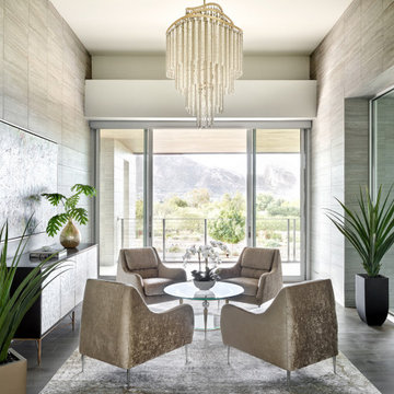
With nearly 14,000 square feet of transparent planar architecture, In Plane Sight, encapsulates — by a horizontal bridge-like architectural form — 180 degree views of Paradise Valley, iconic Camelback Mountain, the city of Phoenix, and its surrounding mountain ranges.
Large format wall cladding, wood ceilings, and an enviable glazing package produce an elegant, modernist hillside composition.
The challenges of this 1.25 acre site were few: a site elevation change exceeding 45 feet and an existing older home which was demolished. The client program was straightforward: modern and view-capturing with equal parts indoor and outdoor living spaces.
Though largely open, the architecture has a remarkable sense of spatial arrival and autonomy. A glass entry door provides a glimpse of a private bridge connecting master suite to outdoor living, highlights the vista beyond, and creates a sense of hovering above a descending landscape. Indoor living spaces enveloped by pocketing glass doors open to outdoor paradise.
The raised peninsula pool, which seemingly levitates above the ground floor plane, becomes a centerpiece for the inspiring outdoor living environment and the connection point between lower level entertainment spaces (home theater and bar) and upper outdoor spaces.
Project Details: In Plane Sight
Architecture: Drewett Works
Developer/Builder: Bedbrock Developers
Interior Design: Est Est and client
Photography: Werner Segarra
Awards
Room of the Year, Best in American Living Awards 2019
Platinum Award – Outdoor Room, Best in American Living Awards 2019
Silver Award – One-of-a-Kind Custom Home or Spec 6,001 – 8,000 sq ft, Best in American Living Awards 2019
 Cape Associates, Inc.
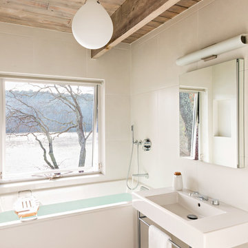
Overthinking a situation isn’t always a bad thing, particularly when the home in question is one in which the past is suddenly meeting the present. Originally designed by Finnish architect Olav Hammarstrom in 1952 for fellow architect Eero Saarinen, this unique home recently received its first transformation in decades. Still in its 1950s skin, it was completely gutted, inside and out. It was a serious undertaking, as the homeowner wanted modern upgrades, while keeping an eye toward retaining the home’s 1950s charm. She had a vision for her home, and she stuck to it from beginning to end.
Perched on a rise of land and overlooking the tranquil Wellfleet Herring Pond, the home initially appears split, with the guest house on the left, and the main house of the right, but both ends are connected with a breezeway. The original home’s bones were in good shape, but many upgrades and replacements were necessary to bring the house up to date.
New siding, roofing, gutters, insulation and mechanical systems were all replaced. Doors and windows with metal frames were custom made by a company in Long Island that fabricates doors for office buildings. Modern heating and cooling systems were added, and the three bathrooms were all updated. The footprint of the home remained unchanged. Inside, the only expansion was more closet space.
The attention to detail in retaining the 50s-style look took a lot of online searching, from handles and knobs to lighting fixtures, with bits and pieces arriving from all over the world, including a doorstop from New Zealand. The homeowner selected many of the fixtures herself, while a very detail-oriented foreman exhaustively researched as well, looking for just the right piece for each and every location.
High-end appliances were purchased to modernize the kitchen and all of the old cabinetry was removed, replaced and refaced with NUVACOR, a versatile surfacing material that not only provided a sleek, modern look, but added convenience and ease of use.
Bare, wood-beamed ceilings throughout give a nod to the home’s natural surroundings, while the main living area (formerly a fisherman’s cabin), with a brick fireplace, was completely trimmed in walnut, while multiple windows of varying sizes welcome sunlight to brighten the home. Here, the sheetrock ceiling with faux rafters provides an interesting and room-brightening feature.
Behind the house sits the serene pond, which can now be enjoyed from the stunning new deck. Here, decking material was not laid out side by side, as it typically is but, instead, meticulously laid out on edge, creating an unusual and eye-catching effect. A railing of tempered glass panels allows unobstructed views of the surrounding natural beauty, and keeps consistent with the open, airy feel of the place. A new outdoor shower is accessible via the deck and left open to the wilderness and the pond below, completing the bold yet sophisticated feeling of this retro-modern home.
 Anik Pearson Architect, P.C.
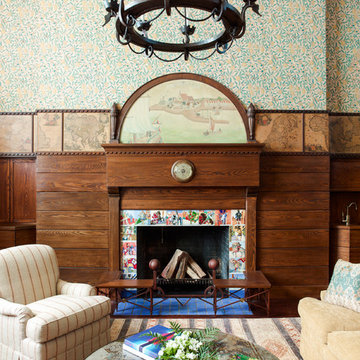
The historically-significant double-height library on the top floor of this Arts and Crafts townhouse features its original nautical maps, a seahorse chandelier and a mantle painting depicting the Bownell family ancestors’ arrival in New Amsterdam. Polychromatic tiles on the mantel surround showcase various knights in aristocratic tunics, doublets and armor, being that medieval times were common themes featured in the American Arts and Crafts period.
Photography by Eric Piasecki
Find the right local pro for your project
 Sun Design Remodeling Specialists, Inc.
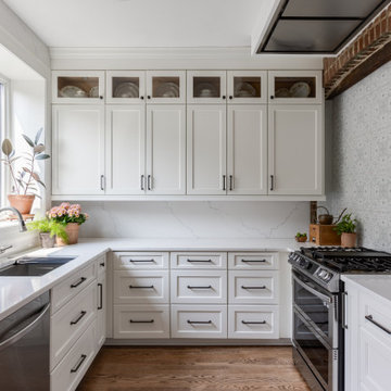
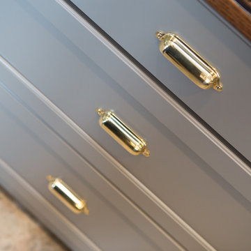
Inspiration for a timeless u-shaped medium tone wood floor and brown floor kitchen remodel in DC Metro with an undermount sink, recessed-panel cabinets, white cabinets, white backsplash, stone slab backsplash, stainless steel appliances, no island and white countertops
 Advance Design Studio, Ltd.
Jennifer and Dan have lived in their Deer Park Illinois home for 15 years, slowly making minor fixes like painting and decorating; but they had a new plan for their kitchen the entire time. An awkwardly placed garage door, and an island cooktop with a terrible downdraft made a full-scale kitchen remodel an absolute must. Jennifer had many ideas in mind and wanted to work with a company that could provide high-end work, while partnering with a designer that would tailor the kitchen to her ideas.
She was intrigued by the phrase “Common Sense Remodeling” in Advance Design’s feature she discovered while perusing an issue of the community’s Quintessential Barrington Magazine. Doing further research on the company’s website, as she looked through project profiles and read about Advance Design’s “Common Sense Remodeling” philosophy, she promptly scheduled an appointment to see if the people and ideas she read about were truly who they said they were. The more she read, the more she knew that the “Common Sense” approach to remodeling they described was exactly the type of company she was looking for.
The partnership was sealed after an initial consultation with Owner Todd Jurs and Project Designer Michelle Lecinski. They displayed a combination of friendliness, professionalism and respect that was unmatched by any of the other companies Jennifer talked to. She knew that with Advance Design, she would be able to retain the vision that she had in mind with high-quality craftsmanship.
“I reached out to Advance Design because of the ‘Common Sense Remodeling’ tagline,” Jennifer said. “That’s what lingered for me”. “Advance Design was the most respectful- of the house and of my design ideas, and the most professional of the handful of companies that looked at my project”.
Soon after the meeting Jennifer began working with Michelle on the project design. They quickly developed chemistry. Jennifer loved how Michelle researched and located every detail that Jennifer wanted for the kitchen. Between the two of them, every concept and idea was worked through and perfected. “Jennifer had definite ideas about what she wanted the new kitchen to look like, she just didn’t know how to bring it all together. We worked together really well to make her ideas into the practical reality necessary for a well-functioning kitchen, with the look and feel that she had envisioned”, says Michelle.
“Michelle was wonderful in using the CAD system she would show me new drawings every time we changed the layout while working through the design,” Jennifer said. “She was a really wonderful partner in execution, she made sure everything happened quickly and easily.”
The finished design drew out elements of Jennifer’s style and personality. The pair call the look “sophisticated farmhouse” to describe the kitchen renovation to family and friends. The result was a beautifully crafted, authentic-feeling space that satisfied Jennifer’s dreams 15 years in the making. The whole project consisted of a kitchen remodel, mudroom upgrade with powder room, and garage entry relocation. “The projects I personally like the best, are the ones that put the client’s dreams on display,” Project Designer Michelle said. “And this is one of those projects.”
The main focal point of the kitchen is custom zinc and brass ventilation hood with a vintage sheen, which was hand made to order by a small company in Indiana named Vogler Metalworking. “It’s like sculpture, a true work of art”, says Jennifer. Your eye is immediately drawn towards this elegant yet practical hood that eliminated the home’s downdraft problem and added a striking conversation piece at the same time. The carpenters had to use special gloves when transporting and installing it, so they didn’t smudge it with fingerprints. The beautiful hood centers proudly over the stunning black enamel and brass LaCornue Range. “I had a friend who had a LaCornue range and after learning how easy it was to cook perfect meals, I was convinced I wanted to have one”, says Jennifer. This unique, breathtaking combination anchors the entire kitchen and is apparent immediately as you walk into the great room the surrounds the space.
DuraSupreme Crestwood cabinets with a Kendall Panel add function and sophistication. A custom gray paint color paired with a storm blue was developed so that the new kitchen looked like it belonged to the existing space. Unlacquered brass faucets and hardware were important to Jennifer because she wanted the living finishes to age over time. Remarkable brass diamond mesh cabinet door inserts imported from the UK continue to add this one-of-a-kind kitchen renovation; giving it a “you won’t see this everywhere” quality. The use of old railcar flooring for the coffee bar countertop and reclaimed oak for the open shelving gives an authenticity to the space uncommon in kitchens today.
Jennifer and Michelle fell in love with the Limestone Grey Stone while they were investigating unique island countertop ideas. They liked the fact that the limestone as a living finish will age and change over time. Calcutta Miel Quartz countertops made for an excellent pairing around the perimeter, as it’s durable and perfect for cooking preparations. A textured white subway tile backsplash that runs to the ceiling keeps your eye moving towards the open shelving, and to the main focal point of the stunning range hood combination.
“The kitchen functions beautifully, and it’s gorgeous,” beams Jennifer as she gestures with both hands while smiling ear to ear. “The most important thing was I wanted a kitchen that had a wonderful flow, cooked beautiful meals and was a great gathering place for family and friends, and this space does that perfectly! Beauty wise, it turned out exactly how I had envisioned. I felt the function part was the hardest part, and that was nailed”!
Relocating the garage entry to the new mudroom was a huge priority and has finally separated the family’s arriving home functions from their kitchen. Now coats and shoes and bags have their own area for dropping once members arrive home. Matching gray DuraSupreme cabinetry helped create gorgeous, purposeful lockers for the family. A reclaimed vintage sink and custom wall paper were added to the tiny powder room to beautify the once previously only functional space. Advance Design was even able to create a custom space for their dog to sleep while the family is away.
“It was unbelievable that a project of this size was completed in such a short time, and I think that’s because of the large amount of planning and preparation that went into it,” Jennifer marveled, “When we started, we were ready, and everything was prepared”.
When it came to execution, Project Manager Justin Davis and his crew were quick, accessible, and organized. Projects like this kitchen are typically completed in as little as 8-10 weeks. Jennifer’s kitchen however despite the relocation of some challenging HVAC in a soffit and moving of an exterior door was completed remarkably fast in part because the team was working with an existing tile floor that ran throughout the first floor that the client really loved.
“You get to know these people really well because they’re living in your house while you’re living in your house. They were so fast and really good, it didn’t take as long as even planned” reported Jennifer. “I would text Justin and he always responded almost immediately. I got to know all the guys who were working in our house and they were all wonderful people”.
Details in a customized kitchen like this one require skill and care from the people who install it. “All the guys on the job were skilled at what the did. I wanted small details like little feet to look like furniture, that is where their carpentry skill came in to make these all perfect”, said Jennifer. “The tile guys were wonderful. They even let me determine how I wanted the texture with the grout to appear for a salt and pepper look; now that is a very skilled trade person making it custom”.
In Jennifer’s interview, she continued to reference Advance Design’s “Common Sense Remodeling”, so I took a minute to ask her exactly what that phrase meant to her and how it played out in her experience with her project and the Advance Design team. Here is what she said: “I was intrigued about Common Sense Remodeling and in my head that there would be clear costs and prices, great communication between the design team, the execution team and me”, said Jennifer. They did deliver on that, it was so clear about the cost breakdown, what I could expect from everyone who came to my house, and everything that we had ordered. That to me is the Common Sense”!
It’s great to see a client take literally our assertion that a well-planned remodeling project is simply “Common Sense”! She anticipated each step of the way would be clear, concise, and predictable, all the while protecting the outcome due to the careful upfront planning. “Advance Design delivered on their ‘Common Sense Remodeling’ promise,” Jennifer said. “From the design team, to the execution team - everything was straight forward like I imagined. The project turned out exactly how I envisioned, I enjoyed this process and absolutely would recommend Advance Design Studio to anyone.”
 TaylorPro Design and Remodeling, Inc.
"Kerry Taylor was professional and courteous from our first meeting forwards. We took a long time to decide on our final design but Kerry and his design team were patient and respectful and waited until we were ready to move forward. There was never a sense of being pushed into anything we didn’t like. They listened, carefully considered our requests and delivered an awesome plan for our new bathroom. Kerry also broke down everything so that we could consider several alternatives for features and finishes and was mindful to stay within our budget. He accommodated some on-the-fly changes, after construction was underway and suggested effective solutions for any unforeseen problems that arose.
Having construction done in close proximity to our master bedroom was a challenge but the excellent crew TaylorPro had on our job made it relatively painless: courteous and polite, arrived on time daily, worked hard, pretty much nonstop and cleaned up every day before leaving. If there were any delays, Kerry made sure to communicate with us quickly and was always available to talk when we had concerns or questions."
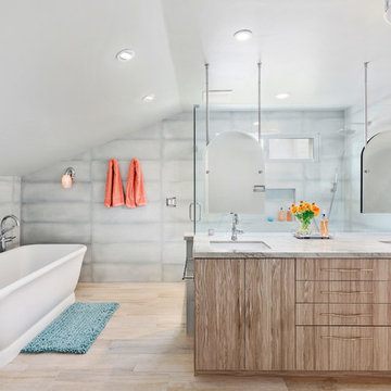
This Carlsbad couple yearned for a generous master bath that included a big soaking tub, double vanity, water closet, large walk-in shower, and walk in closet. Unfortunately, their current master bathroom was only 6'x12'.
Our design team went to work and came up with a solution to push the back wall into an unused 2nd floor vaulted space in the garage, and further expand the new master bath footprint into two existing closet areas. These inventive expansions made it possible for their luxurious master bath dreams to come true.
Just goes to show that, with TaylorPro Design & Remodeling, fitting a square peg in a round hole could be possible!
Photos by: Jon Upson

 30X40 Design Workshop
A residence designed for informal gathering and relaxation on a quiet cove near Acadia National Park. Conceived of as a compound of connected gathering spaces with adjacent private retreat spaces. The "village" of structures is designed to open and close seasonally with large sliding barn doors. These also modulate light, air and views into and out of the cottages.
Carefully positioned to take advantage of the rich variety of views and sloping topography, the cottages have integral terraces and retaining walls to negotiate the undulating land-form. One arrives at the high point of the site and the long barn axis and navigates between the cottages to the main entrance. Once inside, the home deliberately reveals unique views to the ocean, mountains and surrounding spruce forest.
 Richard Manion Architecture Inc.
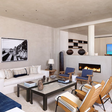
Our intent was to create a contemporary beach house that would combine the simplicity of geometrical spaces and volumes with warm materials. This family weekend house is entered at the upper street level through a translucent glass gate that is set between the simple geometric volumes of the house and adjacent monumental gate pier, giving the feeling of penetrating a solid volume of architecture to arrive at your destination.
This leads down to the entry courtyard space, defined by the bold architecture on three sides, dense landscape on the other side and a reflecting pool to contrast the manmade with the natural. The solid entry facade, creating intrigue and providing privacy, contrasts with the glass oceanside facades, providing view and transparency. The house is organized around a dramatic skylit central hall with a monumental stair made of wood treads that seem to float on brushed stainless steel supports—the stair is both art/sculpture and architecture. Materials in muted and warm colors—beige plaster walls, floors in random ashlar limestone at the lower seaside level, wire-brushed oak floors at the second floor and stair, and travertine baths—maintain a united color scheme that is punctuated by colorful fabrics and the owner’s collection of tribal art and modern furnishings.
Interior design by Atelier AM
Landscape architecture by Mark Beall
 Walter Studio Interior Design
Photography: Rustic White
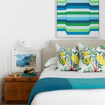
Mid-sized trendy guest light wood floor bedroom photo in Atlanta with white walls and no fireplace
Mid-sized trendy guest light wood floor bedroom photo in Atlanta with white walls and no fireplace

 Klopf Architecture
From Mid-Century Classic to the Present
An iconic design updated with comfort, function, and flow for today.
A Remodel That Balances Past and Present
What started as a desire to update a classic Eichler soon became an exploration of how Mid-Century Modern design can successfully evolve for today. The client, a tech professional with a passion for scuba diving and underwater photography, wanted a home that would both honor its original character and feel tailored to his daily life. A lifelong technology enthusiast, he still owns the very first Mac desktop he saved up for as a teenager working at Radio Shack, a detail that underscores his appreciation for design that melds function and form.
Honoring Separation While Expanding Possibility
Unlike many contemporary remodels where walls are opened up to create expansive living spaces, this project took a more restrained approach. The client valued the defined rooms of the original plan and wanted to preserve as much wall space as possible for displaying his large-format underwater photography. The emphasis was not on dramatic spatial reinvention, but on thoughtful refinements. Klopf Architecture shaped a gallery-like backdrop while also expanding the primary suite, modernizing materials and fixtures throughout the home, and improving the functionality and layout of the kitchen. The finished home feels at once timeless and renewed, an Eichler that continues to inspire while fully supporting the lifestyle of its present-day owner.
A major turning point came mid-design. The original project brief had not included an addition, but as the reconfiguration of the primary bedroom and bath unfolded, it became clear that an expansion was the best approach to achieve the client’s vision of a more spacious suite. Fortunately, the adjustment came at a stage when revisions were still manageable and was integrated seamlessly, showing how thoughtful course corrections can strengthen a project rather than hinder it.
Navigating Challenges With Precision
The design development included multiple conceptual rounds, balancing preservation with subtle expansion. During construction, an existing post previously thought to be load-bearing turned out not to be. The structural engineer was able to pivot quickly, and both the post and the cross beam that had been intended to replace it could be omitted, allowing the original rhythm of the Eichler beam bays to be preserved.
Sustainability was not just a checklist item, but a way to align the home with the client’s values of simplicity, efficiency, and long-term functionality. R-38 roof insulation reduced energy usage, solar panels with battery storage provided independence and resilience, and passive comfort strategies eliminated the need forenergy-intensive air conditioning. An electric vehicle charger and an on-demand hot water recirculation system (with call buttons as opposed to having constant circulation) add to the home’s long-term efficiency factors. Together, these moves created a home that is quieter, more comfortable, and better equipped for the future, qualities that supported the client’s pragmatic approach to design and living lightly.
Details That Respect the Eichler DNA
The remodel carries forward the Eichler’s original spirit while introducing new layers of modern livability. Originally, the house was approached along a deep, narrow walk, with the garage on one side and the house on the other, leaving the front door tucked far back within this chasm-like space. By pulling the entry forward, the design reshaped the arrival experience, creating a clearer threshold and a natural drop-off zone for bags, shoes, and keys. This shift also made room for a custom bench at the entry that extends seamlessly through the glass sidelight. The bench and drop-off zone now work together as a single, integrated sequence that supports everyday living while offering a tactile reminder of Eichler’s philosophy of connectedness.
At the client’s request, Klopf reintroduced a classic Eichler gesture by extending the exterior siding into the entry and living room. The detail reinforces a sense of indoor/outdoor continuity while providing a subtle architectural surface that allows the client’s photography to take visual precedence.
The signature concrete masonry wall at the front was reconstructed using blocks sourced to match the originals, now strengthened with rebar for seismic resilience while maintaining a private outdoor courtyard, visually extending the kitchen outward. A decorative trellis element, a detail borrowed from a neighboring Eichler, restores a familiar mid-century modern architectural motif. At the courtyard entry door, a custom etched glass sidelight with an ocean-themed design featuring kelp and jellyfish serves as a subtle homage to the client’s passion for deep-sea diving.
Landscaping became an integral part of the overall transformation. The homeowner engaged landscape architect Randi Johnsen of Third Nature Studio to shape a series of calm, inviting outdoor rooms that read as a natural extension of the interiors. While technically outside of the core construction scope, the landscape design proved central to achieving a sense of completeness and connectedness across the property. Such whole-property considerations often emerge as design ideas take shape, underscoring the importance of flexibility in planning and budgeting, as well as close collaboration among the design team starting early in the process.
The Value of Evolving Scope
As with many custom residential projects, the scope evolved during the design process. What began as a targeted remodel grew to include a new/expanded primary suite, a rebuilt CMU patio wall for strength and longevity, and a solar panel array and battery storage for energy resilience and carbon-reduction. Each thoughtful decision represented a conscious investment in the home’s performance and character, rather than a cost overrun.
The result was a project delivered on schedule, tailored precisely to the client’s lifestyle, and positioned to add long-term value both functionally and aesthetically. By embracing scope evolution as an opportunity rather than a challenge, and relying on good design paired with transparent communication, this remodel demonstrates how Eichler homes can be adapted for contemporary living without erasing their DNA.
Klopf Architecture project team: John Klopf, AIA, and Klara Kevane, Elise Webb and Nicholas LaNasa.
Contractor: Golden Cove Construction
Landscape Design: Third Nature Studio
Structural Engineer: Daniel Bastiao Design
Photography: ©2025 Mariko Reed
Year Completed: 2024
Location: Sunnyvale, CA
 Jane Vorbrodt
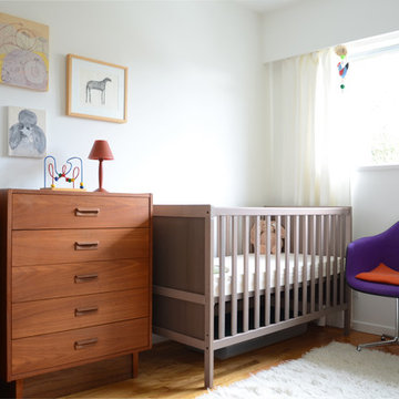
Example of a 1950s gender-neutral light wood floor nursery design in Vancouver with white walls
 PHELPS ARCHITECTS
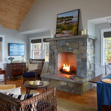
Inspiration for a coastal light wood floor living room remodel in Portland Maine with gray walls, a standard fireplace, a stone fireplace and no tv
 IDF Studio
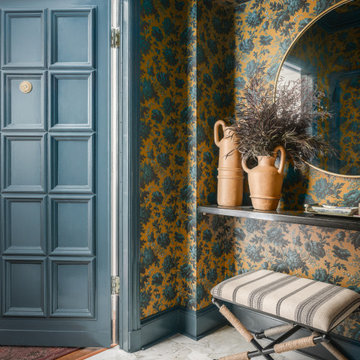
This foyer features traditional dark yellow and teal floral wallpaper paired with a dark teal painted door and trim. Marble tile floors add elegance, while a round brass mirror and an upholstered bench create a functional and stylish vignette. The combination of bold wallpaper, rich colors, and layered textures gives this entryway a warm, inviting, and timeless character.


 Yates Desygn
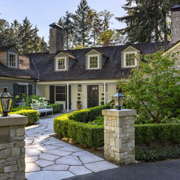
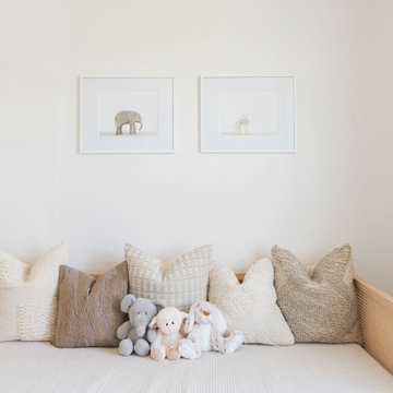
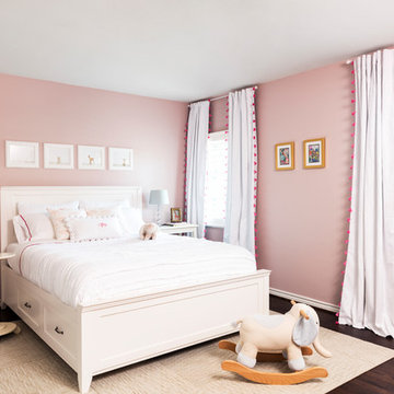
After purchasing this home my clients wanted to update the house to their lifestyle and taste. We remodeled the home to enhance the master suite, all bathrooms, paint, lighting, and furniture.
Photography: Michael Wiltbank
 Clark and Aldine
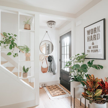
Entryway - contemporary entryway idea in Detroit with white walls and a black front door
 Carlton Edwards
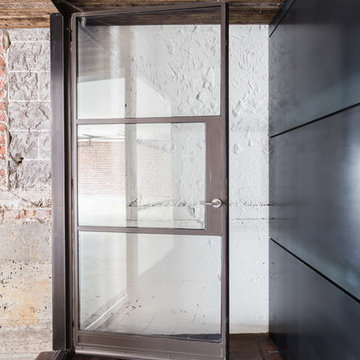
The entrance into the residence is through steel and glass doors, the floor is antique brick which was existing and of which we added an ebony stain. From the arrival side off of Wagner Place, the entry is through a new steel and glass door from a parking court. The ceiling treatment is integrated from the garage and pulls you into the foyer of the residence. It is out of reclaimed oak that mimics original lath that would've been behind the plaster.
Greg Baudouin, Interiors
Alyssa Rosenheck: photo
 Marcus Gleysteen Architects
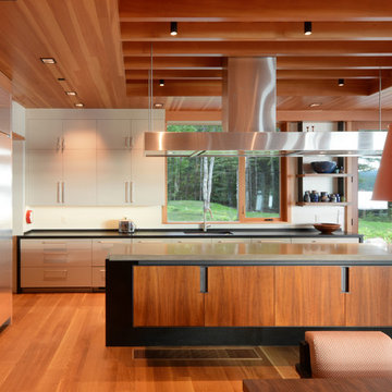
The Lake Point House is an interpretation of New Hampshire's lakeshore vernacular. While designed to maximize the lake experience, the house is carefully concealed from the shore and positioned to preserve trees and site features. The lake side of the house is a continuous wall of glass, capped by timbered eaves and anchored by monumental stone chimneys. Along the main entry sequence, the view is revealed through a series of thresholds that mark the progression of arrival and appreciation of this treasured place.
60