
Search results for "Attempt" in Home Design Ideas

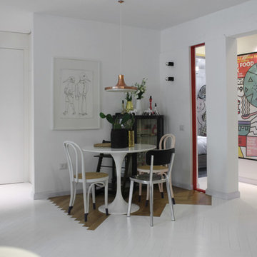
 Esther Hershcovich
Photo: Esther Hershcovic © 2016 Houzz
Inspiration for an industrial dining room remodel in Tel Aviv
Inspiration for an industrial dining room remodel in Tel Aviv
 Kirsten Pike Design
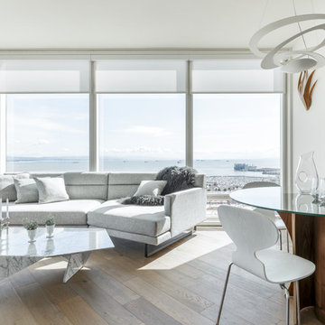
Inspiration for a contemporary open concept medium tone wood floor and brown floor living room remodel in San Francisco with gray walls
Find the right local pro for your project
 Corinthian Fine Homes
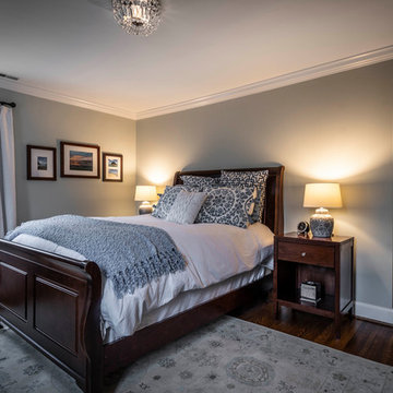
This delightful couple purchased this home with renovation in mind. It was situated in an ideal location, but required a serious update bringing modernization while keeping it’s 1940’s period charm. They asked us to design an elegant Master Suite, complete with a bedroom, master closet and elegant bathroom. While we make every attempt to maintain original walls and floors, this renovation required complete gutting of two bedrooms and closets to open the space and allow for all they wanted. In this process we were able to bring uneven floors and walls into level allowing for great end results. The finishing touches on this bathroom included custom white painted vanity and make-up table with White Carrara Marble countertops and a custom tile floor design using Carrara Marble tile. A free-standing tub and bridge faucets/ tub spout upped the game on a modern take on an old-world plumbing fixture. The glass shower completes this sophisticated space, which gives this master bath a modern twist on traditional. We then turned our attention to the master bedroom, touching it up with new paint and refinishing with a new master closet separating the bedroom from the bathroom.
 Patio Lane
CUSTOMER TESTIMONIAL
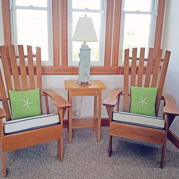
"I absolutely LOVE the cushions. This was my second attempt at getting custom cushions made for two chairs that my father made for me. The first pair of cushions lasted only two years and looked horrible after the first year.
"The cushions from Patio Lane are very comfortable, extremely well made and the craftsmanship is impeccable. I couldn't believe how quickly I received them! The bonus for me was the fact that you were able to use the same exact Sunbrella fabric that we chose for a new sofa earlier this year and these cushions coordinate nicely. They are absolutely beautiful and really compliment the chairs nicely. I'm very glad that I found- and took a chance on- Patio Lane!"
https://patiolane.com/blog/adirondack-chairs-shine-custom-outdura-sparkle-seat-cushions/
 Corinthian Fine Homes
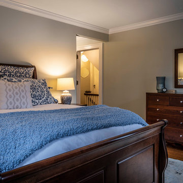
This delightful couple purchased this home with renovation in mind. It was situated in an ideal location, but required a serious update bringing modernization while keeping it’s 1940’s period charm. They asked us to design an elegant Master Suite, complete with a bedroom, master closet and elegant bathroom. While we make every attempt to maintain original walls and floors, this renovation required complete gutting of two bedrooms and closets to open the space and allow for all they wanted. In this process we were able to bring uneven floors and walls into level allowing for great end results. The finishing touches on this bathroom included custom white painted vanity and make-up table with White Carrara Marble countertops and a custom tile floor design using Carrara Marble tile. A free-standing tub and bridge faucets/ tub spout upped the game on a modern take on an old-world plumbing fixture. The glass shower completes this sophisticated space, which gives this master bath a modern twist on traditional. We then turned our attention to the master bedroom, touching it up with new paint and refinishing with a new master closet separating the bedroom from the bathroom.

 Dado Interior Design
Location: Denver, CO, USA
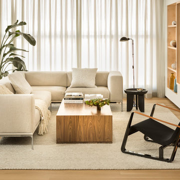
Dado designed this 4,000 SF condo from top to bottom. A full-scale buildout was required, with custom fittings throughout. The brief called for design solutions that catered to both the client’s desire for comfort and easy functionality, along with a modern aesthetic that could support their bold and colorful art collection.
The name of the game - calm modernism. Neutral colors and natural materials were used throughout.
"After a couple of failed attempts with other design firms we were fortunate to find Megan Moore. We were looking for a modern, somewhat minimalist design for our newly built condo in Cherry Creek North. We especially liked Megan’s approach to design: specifically to look at the entire space and consider its flow from every perspective. Megan is a gifted designer who understands the needs of her clients. She spent considerable time talking to us to fully understand what we wanted. Our work together felt like a collaboration and partnership. We always felt engaged and informed. We also appreciated the transparency with product selection and pricing.
Megan brought together a talented team of artisans and skilled craftsmen to complete the design vision. From wall coverings to custom furniture pieces we were always impressed with the quality of the workmanship. And, we were never surprised about costs or timing.
We’ve gone back to Megan several times since our first project together. Our condo is now a Zen-like place of calm and beauty that we enjoy every day. We highly recommend Megan as a designer."
Dado Interior Design

 ODS Architecture
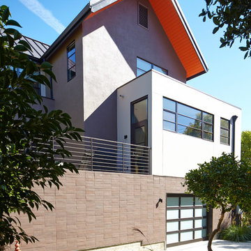
Originally a nearly three-story tall 1920’s European-styled home was turned into a modern villa for work and home. A series of low concrete retaining wall planters and steps gradually takes you up to the second level entry, grounding or anchoring the house into the site, as does a new wrap around veranda and trellis. Large eave overhangs on the upper roof were designed to give the home presence and were accented with a Mid-century orange color. The new master bedroom addition white box creates a better sense of entry and opens to the wrap around veranda at the opposite side. Inside the owners live on the lower floor and work on the upper floor with the garage basement for storage, archives and a ceramics studio. New windows and open spaces were created for the graphic designer owners; displaying their mid-century modern furnishings collection.
A lot of effort went into attempting to lower the house visually by bringing the ground plane higher with the concrete retaining wall planters, steps, wrap around veranda and trellis, and the prominent roof with exaggerated overhangs. That the eaves were painted orange is a cool reflection of the owner’s Dutch heritage. Budget was a driver for the project and it was determined that the footprint of the home should have minimal extensions and that the new windows remain in the same relative locations as the old ones. Wall removal was utilized versus moving and building new walls where possible.
Photo Credit: John Sutton Photography.
 Roundwood Interiors
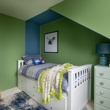
This space was special indeed! When the family moved into their home the daughter of the house immediately laid claim to this room - which included a half-height storage space, full of possibilities!
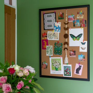
For the main space we chose a bright, fresh green to keep the space uplifting all through the year. I used a blue stripe to mimic the feel of a canopy and to make a feature of the sloped section of the ceiling rather than attempt to hide it.
The room is filled with storage to accommodate a growing wardrobe and features upcycled furniture to ensure the space is completely bespoke.
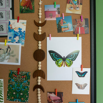
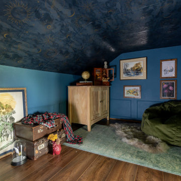
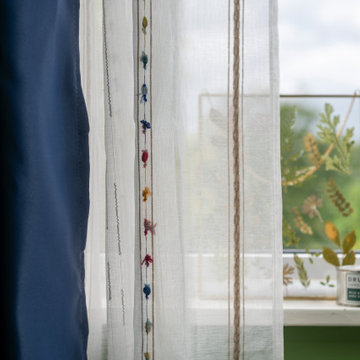
Hidden behind a poster is a secret library, painted a dark, moody blue and styled to give hints of Hogwarts. The ceiling is adorned with a navy, celestial print wallpaper and there are cosy touches dotted around to make this the perfect spot to curl up and while away hours with a good book. Floating candles lend a touch of fun and much needed light to the space.
 Roundwood Interiors
This space was special indeed! When the family moved into their home the daughter of the house immediately laid claim to this room - which included a half-height storage space, full of possibilities!
For the main space we chose a bright, fresh green to keep the space uplifting all through the year. I used a blue stripe to mimic the feel of a canopy and to make a feature of the sloped section of the ceiling rather than attempt to hide it.
The room is filled with storage to accommodate a growing wardrobe and features upcycled furniture to ensure the space is completely bespoke.
Hidden behind a poster is a secret library, painted a dark, moody blue and styled to give hints of Hogwarts. The ceiling is adorned with a navy, celestial print wallpaper and there are cosy touches dotted around to make this the perfect spot to curl up and while away hours with a good book. Floating candles lend a touch of fun and much needed light to the space.
 Roundwood Interiors
This space was special indeed! When the family moved into their home the daughter of the house immediately laid claim to this room - which included a half-height storage space, full of possibilities!
For the main space we chose a bright, fresh green to keep the space uplifting all through the year. I used a blue stripe to mimic the feel of a canopy and to make a feature of the sloped section of the ceiling rather than attempt to hide it.
The room is filled with storage to accommodate a growing wardrobe and features upcycled furniture to ensure the space is completely bespoke.
Hidden behind a poster is a secret library, painted a dark, moody blue and styled to give hints of Hogwarts. The ceiling is adorned with a navy, celestial print wallpaper and there are cosy touches dotted around to make this the perfect spot to curl up and while away hours with a good book. Floating candles lend a touch of fun and much needed light to the space.
 Roundwood Interiors
This space was special indeed! When the family moved into their home the daughter of the house immediately laid claim to this room - which included a half-height storage space, full of possibilities!
For the main space we chose a bright, fresh green to keep the space uplifting all through the year. I used a blue stripe to mimic the feel of a canopy and to make a feature of the sloped section of the ceiling rather than attempt to hide it.
The room is filled with storage to accommodate a growing wardrobe and features upcycled furniture to ensure the space is completely bespoke.
Hidden behind a poster is a secret library, painted a dark, moody blue and styled to give hints of Hogwarts. The ceiling is adorned with a navy, celestial print wallpaper and there are cosy touches dotted around to make this the perfect spot to curl up and while away hours with a good book. Floating candles lend a touch of fun and much needed light to the space.
 Roundwood Interiors
This space was special indeed! When the family moved into their home the daughter of the house immediately laid claim to this room - which included a half-height storage space, full of possibilities!
For the main space we chose a bright, fresh green to keep the space uplifting all through the year. I used a blue stripe to mimic the feel of a canopy and to make a feature of the sloped section of the ceiling rather than attempt to hide it.
The room is filled with storage to accommodate a growing wardrobe and features upcycled furniture to ensure the space is completely bespoke.
Hidden behind a poster is a secret library, painted a dark, moody blue and styled to give hints of Hogwarts. The ceiling is adorned with a navy, celestial print wallpaper and there are cosy touches dotted around to make this the perfect spot to curl up and while away hours with a good book. Floating candles lend a touch of fun and much needed light to the space.
 Kerbi Urbanowski Stained Glass
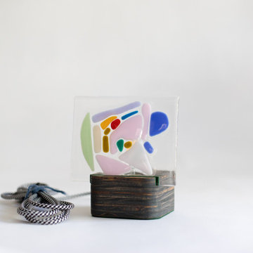
Designed by Kerbi Urbanowski, each piece incorporates shapes sketched, hand-cut, and then fired in a glass kiln at the Bullseye Glass Resource Center in Oakland, California. Its wooden base is a contemporary hybrid of the Edison Lamp X traditional stained glass Fan Lamp. "End of Day Glass" is an old glassmaker tradition, where you attempt to create something beautiful from the remaining broken glass pieces used that day.
Due to the individual nature of each item, please allow up to a 5-week turnaround. Each lamp comes with a naturally finished handmade wood base, cobalt blue cord, white in-line cord switch, cord grip, US standard plug, and one of a kind fused glass faceplate.
"When sketching, I tend to look at each composition as a unique challenge, an abstracted crossword puzzle that I have the enjoyment of solving. They take time, and if you bear with me, I promise to make you something special." - Kerbi
 Jeannine Williams Design
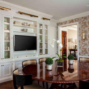
Park Avenue Penthouse - Dining Room
Photo by Kris Tamburello Photography
Trendy dining room photo in New York
Trendy dining room photo in New York
 AIA Pittsburgh
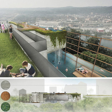
YOUNG ARCHITECTS STUDIO COMPETITION: Award of Excellence
PROJECT: BATHS at the Billboard
PARTICIPANTS: Jozef Petrak, Assoc. AIA; Brian Pagnotta; Patrick Russell; Ben Quint-Glick; Breanna Praechter
FIRM/SCHOOL: Renaissance 3 Architects
DESCRIPTION: Nestled into the hillside, the Baths at the Billboard uses reclaimed water to create a restorative experience with an unrivaled view. Once a symbol of corporate advertisement, the Bayer Billboard will be revitalized as a valuable recreational amenity that promotes ecological awareness and responsibility for the city of Pittsburgh.
JURY COMMENTS: This entry made a serious attempt at addressing the site. It retains the structure and a vestige of its original use without privileging that function. The jury expressed concern about creating a swimming venue on a steep slope but it could envision it becoming “The Hanging Water Gardens of Pittsburgh” – a unique first-day attraction for the city.
 Corinthian Fine Homes
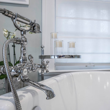
This delightful couple purchased this home with renovation in mind. It was situated in an ideal location, but required a serious update bringing modernization while keeping it’s 1940’s period charm. They asked us to design an elegant Master Suite, complete with a bedroom, master closet and elegant bathroom. While we make every attempt to maintain original walls and floors, this renovation required complete gutting of two bedrooms and closets to open the space and allow for all they wanted. In this process we were able to bring uneven floors and walls into level allowing for great end results. The finishing touches on this bathroom included custom white painted vanity and make-up table with White Carrara Marble countertops and a custom tile floor design using Carrara Marble tile. A free-standing tub and bridge faucets/ tub spout upped the game on a modern take on an old-world plumbing fixture. The glass shower completes this sophisticated space, which gives this master bath a modern twist on traditional.
 Roundwood Interiors
This space was special indeed! When the family moved into their home the daughter of the house immediately laid claim to this room - which included a half-height storage space, full of possibilities!
For the main space we chose a bright, fresh green to keep the space uplifting all through the year. I used a blue stripe to mimic the feel of a canopy and to make a feature of the sloped section of the ceiling rather than attempt to hide it.
The room is filled with storage to accommodate a growing wardrobe and features upcycled furniture to ensure the space is completely bespoke.
Hidden behind a poster is a secret library, painted a dark, moody blue and styled to give hints of Hogwarts. The ceiling is adorned with a navy, celestial print wallpaper and there are cosy touches dotted around to make this the perfect spot to curl up and while away hours with a good book. Floating candles lend a touch of fun and much needed light to the space.
28