
Search results for "Attempt" in Home Design Ideas

 Waring Architects
This is a prototypical home specially designed with a 200% structural engineering safety factor to easily withstand 150+ mph winds and designed to be extremely durable, low/no maintenance, effectively flood-proofed, super-structured, armored, super-insulted, and extremely energy-efficient. Every effort was made to make the house “fit” the site; it utilizes a Southern coastal vernacular archetype; it is oriented on the site to take advantage of year-round sun sets and moon rises and to minimize solar heat gain; and careful attention has been given to the breathtaking views. It is designed to harmoniously take advantage of both the latest in currently available technology and a site blessed with unparalleled natural beauty. We have attempted to provide an example of enduring environmentally-sensitive design without any compromise of convenience, aesthetics, or quality of life.
www.waringarchitects.com
 Esmoreit Koetsier Fine Art
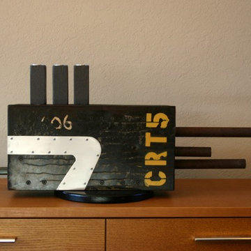
This project started as an attempt to experiment with used redwood. As I started to fabricate the wood structure, features were added with materials that were laying around the studio. One side was a piece of corten with a rough edge. Scrap carbon fiber fabric was epoxied to used galvanized steel sheet. The sheet was corrugated which had to be flattened hence the wavy look. I liked how everything started to take shape and I knew this was turning into something. The carbon fiber side needed an accent so aircraft vent flanges were added and filled with plaster. Rusted chromoly tubing became the front with nice used aluminum trim. On the tail end a technique was tried that I had never used before. This technique is called Bluing. All aluminum trim is hand cut and symbolizes aircraft skin cover plates. As for the name, CRT5 is completely random.
 Jody Petiya
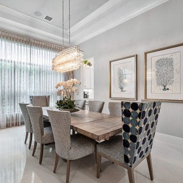
Dining room with wallpaper accent wall.
Large transitional marble floor, beige floor and coffered ceiling great room photo in Miami with blue walls
Large transitional marble floor, beige floor and coffered ceiling great room photo in Miami with blue walls
Find the right local pro for your project
 Sosna Inc
These lovely homeowners, in their late 60s and seasoned by life and travel, wanted a home that truly worked for their lifestyle. Their wish list was simple: comfort, functionality, and a space that felt welcoming for guests.
When Small Annoyances Become Big Dealbreakers
The main floor was no longer working. The kitchen was cramped, the wall between it and the dining room disrupted the flow, and two unused bedrooms wasted valuable space. Even the powder room was tucked away at the back. Upstairs, one shared bathroom, basement laundry, and a primary bedroom that overheated in the afternoon made daily life frustrating.
Facing Renovation Worries
The homeowners were excited but cautious. A previous renovation attempt with another company had fallen through, so trust was key. They also wanted to make sure their vision was achievable without stretching the budget.
The Transformation
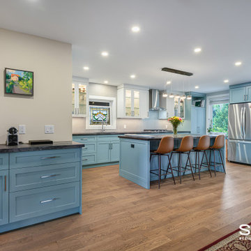
Relocating the stairs completely opened up the main floor. The kitchen, dining, and living areas now flow together beautifully, creating a bright, open, and welcoming space.
Smart Details for Everyday Living
The new kitchen features a large island, ample storage, and a raised dishwasher at standing height for easy loading and unloading. We also moved the powder room to the front and added a coffee and bar station near the dining area, perfect for morning routines or entertaining guests.
Comfort and Flow Upstairs
Upstairs, the primary bedroom was moved to the cooler side of the house and now connects to a spacious walk-in closet and new ensuite. Compact laundry machines were installed upstairs, and the former primary bedroom was converted into a private guest suite with its own en-suite and walk-in closet.
Finishes That Feel Like Home
Beautiful, low-maintenance materials complete the space: custom cabinetry, leather-finish quartz countertops, engineered hardwood on the main floor, and refinished hardwood upstairs. Porcelain tiles, a new gas fireplace, and oak stairs tie everything together.
The Final Takeaway
Life at home has completely transformed. Cooking, entertaining, and everyday living are now effortless and enjoyable. Every space flows, every detail feels intentional, and the home finally fits their lifestyle.
Ready to Love Your Home Again?
If your house no longer suits your lifestyle, we can help. Let’s explore how a thoughtful renovation can make your home work for you.
Contact us today to get started.
 Architectural Resource LLC
The Brooke Residence ‘Addi- tion by Subtraction’ remodeling project was recognized with numerous regional and national awards and was selected for Fine Homebuilding’s Annual Issue on Houses.
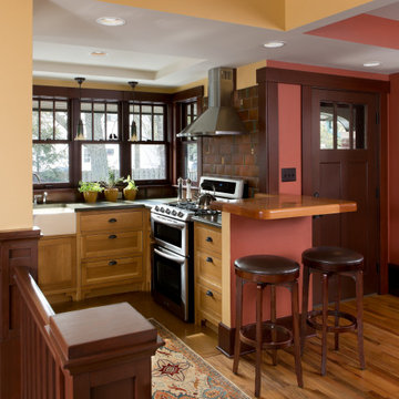
This 1920’s Craftsman Bungalow had been poorly modified in the 70’s in an attempt to address poor energy performance with a scabbed on solarium. The design solution removed the solarium and completely reimagined the floor plan: The kitchen was relocated to the rear; the stairway was relocated to enhance function, and a better connection to the family room was created.
 Gavin Historical Bricks
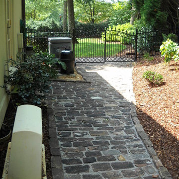
When incorporating pavers into a building project, you will have many choices for natural stones to pick from. A popular option great for a variety of building projects are granite cobblestones. Granite cobblestone pavers are an extremely versatile building material that can be used in a variety of outdoor applications such as when constructing driveways, walkways, patios, and outdoor dining areas. No matter what project you are attempting to complete on your property, granite cobblestone pavers are a great product that will greatly enhance the final look of your project.
Contact us for more information and a quote: https://www.historicalbricks.com/
 Roundwood Interiors
This space was special indeed! When the family moved into their home the daughter of the house immediately laid claim to this room - which included a half-height storage space, full of possibilities!
For the main space we chose a bright, fresh green to keep the space uplifting all through the year. I used a blue stripe to mimic the feel of a canopy and to make a feature of the sloped section of the ceiling rather than attempt to hide it.
The room is filled with storage to accommodate a growing wardrobe and features upcycled furniture to ensure the space is completely bespoke.
Hidden behind a poster is a secret library, painted a dark, moody blue and styled to give hints of Hogwarts. The ceiling is adorned with a navy, celestial print wallpaper and there are cosy touches dotted around to make this the perfect spot to curl up and while away hours with a good book. Floating candles lend a touch of fun and much needed light to the space.
 Excelsior Design Group & Danberry Building Corp
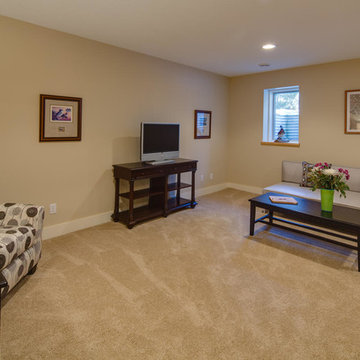
At the end of 2012, Danberry came across what was then a rundown home in the Casco Point neighborhood of Orono, in desperate need of some design help. A failed attempt by the previous owner to remodel it as an investment had left it abandoned for years. But when the Danberry’s got a glimpse of this diamond in the rough, they knew it had potential. The project included a completely remodeled kitchen, bathroom, basement and living room.
 Excelsior Design Group & Danberry Building Corp
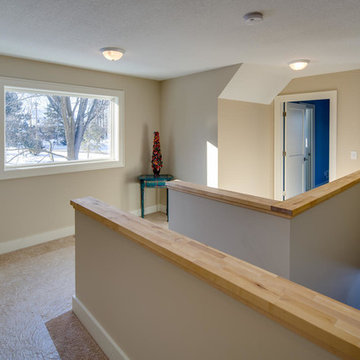
At the end of 2012, Danberry came across what was then a rundown home in the Casco Point neighborhood of Orono, in desperate need of some design help. A failed attempt by the previous owner to remodel it as an investment had left it abandoned for years. But when the Danberry’s got a glimpse of this diamond in the rough, they knew it had potential. The project included a completely remodeled kitchen, bathroom, basement and living room.
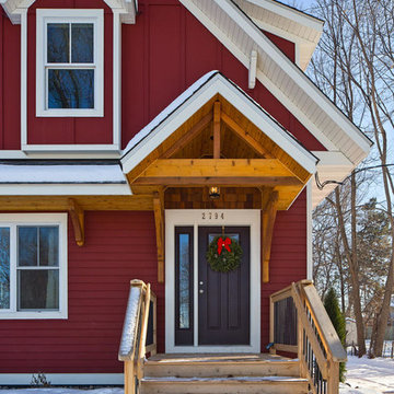 Excelsior Design Group & Danberry Building Corp
At the end of 2012, Danberry came across what was then a rundown home in the Casco Point neighborhood of Orono, in desperate need of some design help. A failed attempt by the previous owner to remodel it as an investment had left it abandoned for years. But when the Danberry’s got a glimpse of this diamond in the rough, they knew it had potential. The project included a completely remodeled kitchen, bathroom, basement and living room.
 Maggie Meahl
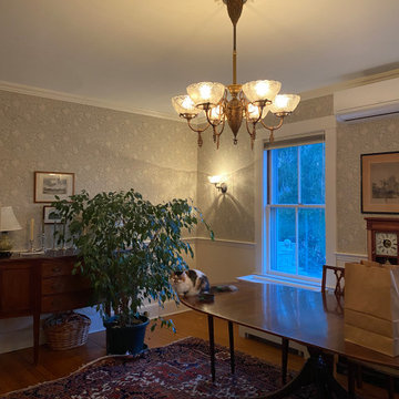
Our attempt at a North Shore Boston Victorian-era Dining Room. Although we do not entertain a lot, the room is very visible and was worth a complete overhaul from 1990s-era decor. We were propelled by a burst cast-iron pipe in the winter of 2021! The project is almost done now, just waiting for a 19th century sofa to be added (after its much-needed re-upholstery). Will update in early April with better photos.
 Architectural Resource LLC
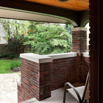
The Brooke Residence ‘Addi- tion by Subtraction’ remodeling project was recognized with numerous regional and national awards and was selected for Fine Homebuilding’s Annual Issue on Houses.
This 1920’s Craftsman Bungalow had been poorly modified in the 70’s in an attempt to address poor energy performance with a scabbed on solarium. The design solution removed the solarium and completely reimagined the floor plan: The kitchen was relocated to the rear; the stairway was relocated to enhance function, and a better connection to the family room was created.
 Magikflame
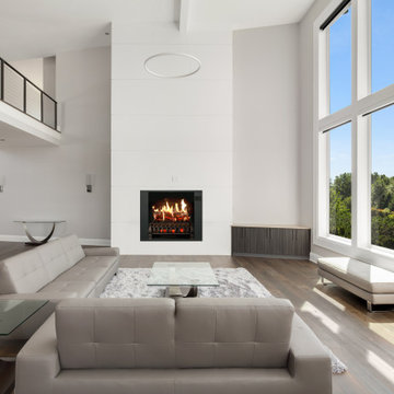
With the 28" Insert Only inspired by MagikFlame, you can upgrade your home décor and stay warm all winter long. Its easy-to-use controls and realistic flame effects make it a perfect addition to any living space. Discover MagikFlame electric fireplaces: https://magikflame.com/product-category/buy-electric-fireplaces/
Dimensions: 28"W x 32"T x 12"D
Our patented HoloFlame technology is a real game-changer. Others use a mechanical means to recreate the look of fire. Instead, we use actual video of real fire which we then project onto a physical log set making it look like those logs are actually burning. Therefore, you get all the details you would with real fire like wispy smoke and even burning embers which other fireplaces are not capable of producing. We spent 5 years of R&D to produce this cutting-edge technology.
At MagikFlame, our goal is to create the most realistic electric fireplaces ever made. We also believe in improving quality of life by providing people with the best possible cozy and relaxing environment every night. Using our patented holoflame technology, we've innovated the electric fireplace to bring you effortless cozy with friends and family. Because quality family time and relaxation after a hard workday or activity is life changing.
Experience 30 Flames. Built-In Heater. Sound.
Subscribe to our channel for tips on how to enhance your interior design, accessories, and focal points. Learn more about fireplace technology and the cozy, relaxation, and family atmosphere improvements to your home. We have everything you need to guide you on a journey to forge the American home and better living atmosphere.
Shop With Us Online: https://magikflame.com
Like MagikFlame on Facebook: https://www.facebook.com/MagikFlame
Follow MagikFlame on Instagram: https://www.instagram.com/magikflamefireplaces/
Tweet With Us: https://twitter.com/MagikFlameFire
Pin With Us: https://www.pinterest.com/MagikFlameElectricFireplaces
We attempt to be as accurate as possible. However, MagikFlame cannot guarantee that product descriptions, images or other content of products or services are 100% accurate, complete, reliable, current, or error-free. Some items may appear slightly larger or smaller than the actual size due to screen defaults and photography techniques. This also includes any momentary stutters or artifacts in frames of the flame video loop. Other items may be represented at a larger than the actual size in order to clearly show details, or smaller than the actual size to show the entire item.
 Rimartus
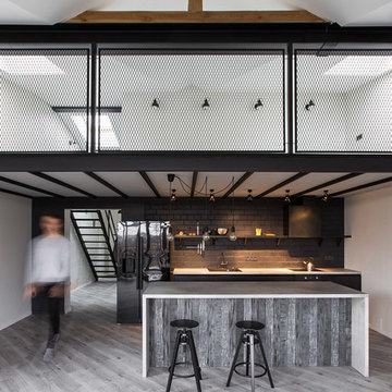
A Young couple appartment in Trakai became black and white loft. The greatest attention we paid to functional multipurpose spaces and architectural context. After new apartment planning was made, second level and roof windows were built. We attempted to create a cozy, artistic and romantic atmosphere including industrial design accents. It was left a lot of free space for clients future needs and self realization.
Photos: www.andstep.com
 Aanensen’s Designers Builders Craftsmen
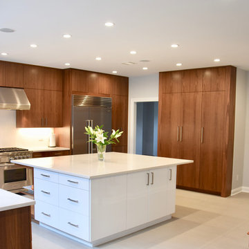
Each cabinet veneer was matched top to bottom and side to side. Adjacent cabinets were attempted to sequence as best possible
Inspiration for a large modern u-shaped gray floor and ceramic tile eat-in kitchen remodel in New York with a double-bowl sink, flat-panel cabinets, medium tone wood cabinets, quartz countertops, white backsplash, stone slab backsplash, stainless steel appliances, an island and white countertops
Inspiration for a large modern u-shaped gray floor and ceramic tile eat-in kitchen remodel in New York with a double-bowl sink, flat-panel cabinets, medium tone wood cabinets, quartz countertops, white backsplash, stone slab backsplash, stainless steel appliances, an island and white countertops
 Tile Doctor Ltd
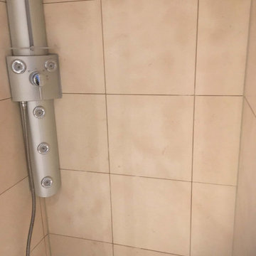
I was asked to look at renovating a shower cubicle at a property in in Manchester city centre that had been clad in White Limestone tiles. I understood the bathroom had been installed 12 years prior, but now the tiles were looking grubby, mouldy and dirty.
The client had lived at the property for the last two years and in an attempt to resolve the problems had used a few different household products such as flash and bleach, they had tried everything, and nothing had helped. I suspected that these strong acidic cleaners had actually made the problem worse by stripping off what was left of the sealer that was protecting the Limestone, allowing dirt to become ingrained in the stone.
I visited the property and ran a few cleaning tests in the shower cubicle with Tile Doctor products. This allows me to see which product will have the best results and gives the customer confidence that we can resolve their issues. The results were immediate, they could see the difference and they were happy to accept my quote and agree a date for my return to complete the work.
I arrived several weeks later and made a start. The tiles were scrubbed by hand with a strong dilution of Tile Doctor Remove and Go with excellent results. This product is designed to remove coatings and sealers, and in this case, it did a great job of drawing out the ingrained stains and dirt build-up. This removed what was left of the sealer and took off most of the dirt and mould. The Limestone tiles and grout were then rinsed with water to remove the soil.
Next I needed to restore the smooth surface of the limestone which had been etched by the use of strong acidic cleaning products. To do this I used a set of six-inch diamond burnishing pads attached to a hand buffer to hone and restore the stone.
I then dried the shower tiles and grout with a heat gun checking the moisture levels with damp meter until I was satisfied it was completely dry.
The last step was to re-seal the Limestone and Grout using a couple of coats of Tile Doctor Colour Grow. This is natural coloured intensifying sealer which provides durable protection to the surface allowing it to breathe and enhancing the colours.
The Customer was amazed with the difference and left the following feedback!
“Kamila was friendly, professional and kept me informed about what to expect before she took on the job and during the tile cleaning. The tiles look absolutely amazing after her work – I feel as though I have a brand new bathroom! Kamila also gave me helpful tips on looking after limestone tiles. I can’t recommend her highly enough.”
For future cleaning I recommended the use of Tile Doctor Aqua-Pro which is a pH neutral shower tile cleaner designed for use on sealed surfaces. Most cleaning products you find in supermarkets are overly strong and will erode the sealer prematurely, so when choosing a cleaning product always read the label and make sure it’s safe to use on Sealed Stone tiles.
Alex Logonzy
Greater Manchester Tile Doctor
 Betz Pools Limited
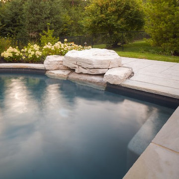
At this pool’s deep end a custom-hued natural stone diving rock was built in two tiers to provide easy access for little divers. The adjoining underwater swim out bench is handy, especially when repeat attempts are needed to perfect technique. This arrangement provides endless hours of fun!
 Roundwood Interiors
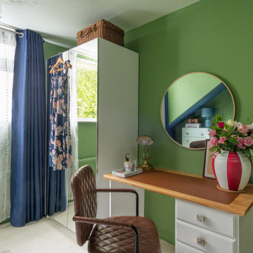
This space was special indeed! When the family moved into their home the daughter of the house immediately laid claim to this room - which included a half-height storage space, full of possibilities!
For the main space we chose a bright, fresh green to keep the space uplifting all through the year. I used a blue stripe to mimic the feel of a canopy and to make a feature of the sloped section of the ceiling rather than attempt to hide it.
The room is filled with storage to accommodate a growing wardrobe and features upcycled furniture to ensure the space is completely bespoke.
Hidden behind a poster is a secret library, painted a dark, moody blue and styled to give hints of Hogwarts. The ceiling is adorned with a navy, celestial print wallpaper and there are cosy touches dotted around to make this the perfect spot to curl up and while away hours with a good book. Floating candles lend a touch of fun and much needed light to the space.
 JandB Kitchen Designs
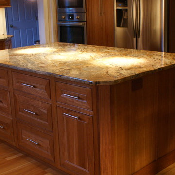
ISLAND'S NOT ONLY BIG, BUT HAS GREAT STORAGE AND OVERALL FUNCTIONALITY.....SEE ADDL. VIEWS BELOW.....FLOORING JUST COMPLETES AND ENHANCES THE EFFECT.....CAN'T BEAT THE WARMTH OF BROWN TONES.....NOTE FLUTED CLIPPED CORNERS ON THIS END OF ISLAND.....THEY MATCH SINK BASE AND COOKTOP BASE MAKING GREAT VISUAL AS YOU LOOK INTO THE KITCHEN!


27