
Search results for "Attempt" in Home Design Ideas
 Tom Ralston Concrete
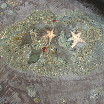
The Ingram job is unique in that it has lots of very interesting ocean shelf shapes and colors as well as a variety of embeds from the Monterey Bay that were placed into the concrete. There were sand dollars, starfish, moonsnails, and Monterey Bay aquarium sand just to name a few. We were going to attempt to use a very stout epoxy to seal one particular starfish but as it lay there the day after in wait…the Ingram's dog ate it. What was left when we pulled out the remains was a perfect impression of a starfish…almost like a petrified starfish. That feature as well as the rest of the patio, stairs, countertop and fire pit are amazing. Being about 30 feet from the ocean doesn't hurt the eyes either.
 Archer & Buchanan Architecture, Ltd.
Josh Barker Photography
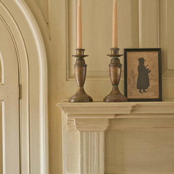
Inspiration for a timeless formal and enclosed medium tone wood floor living room remodel in Philadelphia with beige walls, a standard fireplace, a wood fireplace surround and no tv
Inspiration for a timeless formal and enclosed medium tone wood floor living room remodel in Philadelphia with beige walls, a standard fireplace, a wood fireplace surround and no tv

Find the right local pro for your project

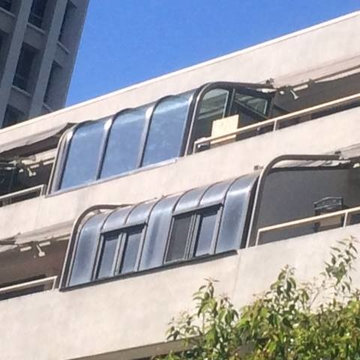
 California Deluxe Windows
For more information visit http://www.cdwindows.com.com or call (800) 639-9463.
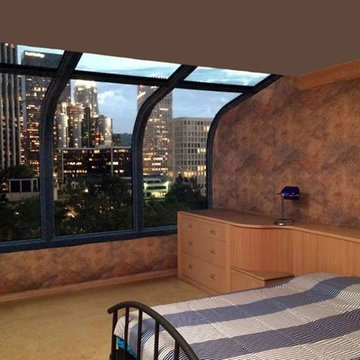
This curved window sunroom we made for our client David E. in Downtown Los Angeles, California was our most challenging and proudest project yet. We had to perfectly design a never-before-attempted template to remove the ugly grids his older, aluminum window frames had made. His majestic view of Los Angeles was replaced by 16 ugly aluminum windows which were deteriorating right before his eyes. His exact comments were, "Thank you for reminding me why I moved in here and purchased this home in the first place. You guys gave me my view back." We could not be happier.
 Built Construction & Electric
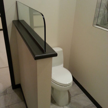
Double shower - mid-sized contemporary multicolored tile and porcelain tile porcelain tile double shower idea in Seattle with black cabinets, quartzite countertops, a two-piece toilet and yellow walls
 Quarry Mill
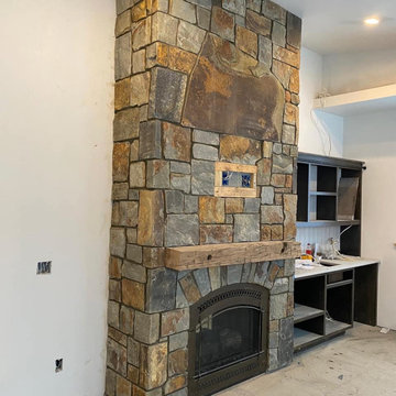
This stunning interior gas fireplace showcases the Quarry Mill's McGregor natural thin stone veneer. McGregor is a natural rocky mountain quartzite thin stone veneer. The stone consists of warm tans and earthy browns against cooler grey and gunmetal tones. McGregor natural stone comes as a loose mix of shapes in the fieldledge style. Our mockup attempts to show the stone exactly as it will come, however, the artistic talent of an experienced mason can be expressed beautifully with this product. The installation photos show how the stone can be installed more linearly in an ashlar style pattern. McGregor’s individual pieces have a deep depth of color with multiple colors showing in the same stone.
 Sandi Erdman Design LLC
Aaron Ziltener
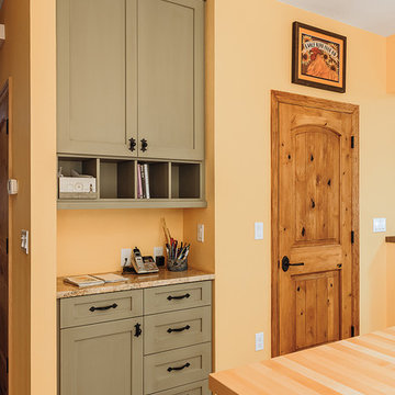
Eat-in kitchen - cottage eat-in kitchen idea in Portland with an undermount sink, shaker cabinets, granite countertops, green backsplash, ceramic backsplash and stainless steel appliances
Eat-in kitchen - cottage eat-in kitchen idea in Portland with an undermount sink, shaker cabinets, granite countertops, green backsplash, ceramic backsplash and stainless steel appliances
 Steiner-Houck & Associates, LLC
Peter Leach Photography
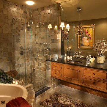
Inspiration for a rustic master multicolored tile slate floor corner bathtub remodel with an undermount sink and granite countertops
Inspiration for a rustic master multicolored tile slate floor corner bathtub remodel with an undermount sink and granite countertops
 Waring Architects
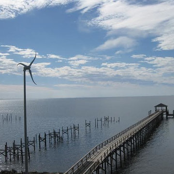
This is a prototypical home specially designed with a 200% structural engineering safety factor to easily withstand 150+ mph winds and designed to be extremely durable, low/no maintenance, effectively flood-proofed, super-structured, armored, super-insulted, and extremely energy-efficient. Every effort was made to make the house “fit” the site; it utilizes a Southern coastal vernacular archetype; it is oriented on the site to take advantage of year-round sun sets and moon rises and to minimize solar heat gain; and careful attention has been given to the breathtaking views. It is designed to harmoniously take advantage of both the latest in currently available technology and a site blessed with unparalleled natural beauty. We have attempted to provide an example of enduring environmentally-sensitive design without any compromise of convenience, aesthetics, or quality of life.
www.waringarchitects.com
 Envision Web
Stuart Wade, Envision Virtual Tours
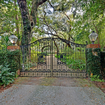
The second-largest and most developed of Georgia's barrier islands, St. Simons is approximately twelve miles long and nearly three miles wide at its widest stretch (roughly the size of Manhattan Island in New York). The island is located in Glynn County on Georgia's coast and lies east of Brunswick (the seat of Glynn County), south of Little St. Simons Island and the Hampton River, and north of Jekyll Island. The resort community of Sea Island is separated from St. Simons on the east by the Black Banks River. Known for its oak tree canopies and historic landmarks, St. Simons is both a tourist destination and, according to the 2010 U.S. census, home to 12,743 residents.
Early History
The earliest
St. Simons Island Village
record of human habitation on the island dates to the Late Archaic Period, about 5,000 to 3,000 years ago. Remnants of shell rings left behind by Native Americans from this era survive on many of the barrier islands, including St. Simons. Centuries later, during the period known by historians as the chiefdom era, the Guale Indians established a chiefdom centered on St. Catherines Island and used St. Simons as their hunting and fishing grounds. By 1500 the Guale had established a permanent village of about 200 people on St. Simons, which they called Guadalquini.
Beginning in 1568, the Spanish attempted to create missions along the Georgia coast. Catholic missions were the primary means by which Georgia's indigenous Native American chiefdoms were assimilated into the Spanish colonial system along the northern frontier of greater Spanish Florida. In the 1600s St. Simons became home to two Spanish missions: San Buenaventura de Guadalquini, on the southern tip of the island, and Santo Domingo de Asao (or Asajo), on the northern tip. Located on the inland side of the island were the pagan refugee villages of San Simón, the island's namesake, and Ocotonico. In 1684 pirate raids left the missions and villages largely abandoned.
Colonial History
As
Fort Frederica
early as 1670, with Great Britain's establishment of the colony of Carolina and its expansion into Georgia territory, Spanish rule was threatened by the English. The Georgia coast was considered "debatable land" by England and Spain, even though Spain had fully retreated from St. Simons by 1702. Thirty-one years later General James Edward Oglethorpe founded the English settlement of Savannah. In 1736 he established Fort Frederica, named after the heir to the British throne, Frederick Louis, prince of Wales, on the west side of St. Simons Island to protect Savannah and the Carolinas from the Spanish threat.
Between 1736 and 1749 Fort Frederica was the hub of British military operations along the Georgia frontier. A town of the same name grew up around the fort and was of great importance to the new colony. By 1740 Frederica's population was 1,000. In 1736 the congregation of what would become Christ Church was organized within Fort Frederica as a mission of the Church of England. Charles Wesley led the first services. In 1742 Britain's decisive victory over Spain in the Battle of Bloody Marsh, during the War of Jenkins' Ear, ended the Spanish threat to the Georgia coast. When the British regimen disbanded in 1749, most of the townspeople relocated to the mainland. Fort Frederica went into decline and, except for a short time of prosperity during the 1760s and 1770s under the leadership of merchant James Spalding, never fully recovered. Today the historic citadel's tabby ruins are maintained by the National Park Service.
Plantation Era
By the start of the American Revolution (1775-83), Fort Frederica was obsolete, and St. Simons was left largely uninhabited as most of its residents joined the patriot army. Besides hosting a small Georgia naval victory on the Fort Frederica River, providing guns from its famous fort for use at Fort Morris in Sunbury, and serving as an arena for pillaging by privateers and British soldiers, the island played almost no role in the war.
Following the war, many of the townspeople, their businesses destroyed, turned to agriculture. The island was transformed into fourteen cotton plantations after acres of live oak trees were cleared for farm land and used for building American warships, including the famous USS Constitution, or "Old Ironsides." Although rice was the predominant crop along the neighboring Altamaha River, St. Simons was known for its production of long-staple cotton, which soon came to be known as Sea Island cotton.
Between
Ebos Landing
the 1780s and the outbreak of the Civil War (1861-65), St. Simons's plantation culture flourished. The saline atmosphere and the availability of cheap slave labor proved an ideal combination for the cultivation of Sea Island cotton. In 1803 a group of Ebo slaves who survived the Middle Passage and arrived on the west side of St. Simons staged a rebellion and drowned themselves. The sacred site is known today as Ebos Landing.
One of the largest owners of land and slaves on St. Simons was Pierce Butler, master of Hampton Point Plantation, located on the northern end of the island. By 1793 Butler owned more than 500 slaves, who cultivated 800 acres of cotton on St. Simons and 300 acres of rice on Butler's Island in the Altamaha River delta. Butler's grandson, Pierce Mease Butler, who at the age of sixteen inherited a share of his grandfather's estate in 1826, was responsible for the largest sale of human beings in the history of the United States: in 1859, to restore his squandered fortune, he sold 429 slaves in Savannah for more than $300,000. The British actress and writer Fanny Kemble, whose tumultuous marriage to Pierce ended in divorce in 1849, published an eyewitness account of the evils of slavery on St. Simons in her book Journal of a Residence on a Georgian Plantation in 1838-1839 (1863).
Another
Retreat Plantation
large owner of land and slaves on St. Simons was Major William Page, a friend and employee of Pierce Butler Sr. Before purchasing Retreat Plantation on the southwestern tip of the island in 1804, Page managed the Hampton plantation and Butler's Island. Upon Page's death in 1827, Thomas Butler King inherited the land together with his wife, Page's daughter, Anna Matilda Page King. King expanded his father-in-law's planting empire on St. Simons as well as on the mainland, and by 1835 Retreat Plantation alone was home to as many as 355 slaves.
The center of life during the island's plantation era was Christ Church, Frederica. Organized in 1807 by a group of island planters, the Episcopal church is the second oldest in the Diocese of Georgia. Embargoes imposed by the War of 1812 (1812-15) prevented the parishioners from building a church structure, so they worshiped in the home of John Beck, which stood on the site of Oglethorpe's only St. Simons residence, Orange Hall.
The first Christ Church building, finished on the present site in 1820, was ruined by occupying Union troops during the Civil War. In 1884 the Reverend Anson Dodge Jr. rebuilt the church as a memorial to his first wife, Ellen. The cruciform building with a trussed gothic roof and stained-glass windows remains active today as Christ Church.
Civil War and Beyond
The
St. Simons Island Lighthouse
outbreak of the Civil War in 1861 put a sudden end to St. Simons's lucrative plantation era. In January of that year, Confederate troops were stationed at the south end of the island to guard the entrance to Brunswick Harbor. Slaves from Retreat Plantation, owned by Thomas Butler King, built earthworks and batteries. Plantation residents were scattered—the men joined the Confederate army and their families moved to the mainland. Cannon fire was heard on the island in December 1861, and Confederate troops retreated in February 1862, after dynamiting the lighthouse to keep its beacon from aiding Union troops. Soon thereafter, Union troops occupied the island, which was used as a camp for freed slaves. By August 1862 more than 500 former slaves lived on St. Simons, including Susie King Taylor, who organized a school for freed slave children. But in November the ex-slaves were taken to Hilton Head, South Carolina, and Fernandina, Florida, leaving the island abandoned.
After the Civil War the island never returned to its status as an agricultural community. The plantations lay dormant because there were no slaves to work the fields. After Union general William T. Sherman's January 1865 Special Field Order No. 15 —a demand that former plantations be divided and distributed to former slaves—was overturned by U.S. president Andrew Johnson less than a year later, freedmen and women were forced to work as sharecroppers on the small farms that dotted the land previously occupied by the sprawling plantations.
By
St. Simons Lumber Mills
1870 real economic recovery began with the reestablishment of the timber industry. Norman Dodge and Titus G. Meigs of New York set up lumber mill operations at Gascoigne Bluff, formerly Hamilton Plantation. The lumber mills provided welcome employment for both blacks and whites and also provided mail and passenger boats to the mainland. Such water traffic, together with the construction of a new lighthouse in 1872, designed by architect Charles B. Cluskey, marked the beginning of St. Simons's tourism industry. The keeper of the lighthouse created a small amusement park, which drew many visitors, as did the seemingly miraculous light that traveled from the top of the lighthouse tower to the bottom. The island became a summer retreat for families from the mainland, particularly from Baxley, Brunswick, and Waycross.
The island's resort industry was thriving by the 1880s. Beachfront structures, such as a new pier and grand hotel, were built on the southeastern end of the island and could be accessed by ferry. Around this time wealthy northerners began vacationing on the island.
Twentieth Century
The
St. Simons Island Pier and Village
opening in 1924 of the Brunswick–St. Simons Highway, today known as the Torras Causeway, was a milestone in the development of resorts in the area. St. Simons's beaches were now easily accessible to locals and tourists alike. More than 5,000 automobiles took the short drive from Brunswick to St. Simons via the causeway on its opening day, paving the way for convenient residential and resort development.
In 1926 automotive pioneer Howard Coffin of Detroit, Michigan, bought large tracts of land on St. Simons, including the former Retreat Plantation, and constructed a golf course, yacht club, paved roads, and a residential subdivision. Although the causeway had brought large numbers of summer people to the island, St. Simons remained a small community with only a few hundred permanent residents until the 1940s.
The
St. Simons Island
outbreak of World War II (1941-45) brought more visitors and residents to St. Simons. Troops stationed at Jacksonville, Florida; Savannah; and nearby Camp Stewart took weekend vacations on the island, and a new naval air base and radar school became home to even more officers and soldiers. The increased wartime population brought the island its first public school. With a major shipyard for the production of Liberty ships in nearby Brunswick, the waters of St. Simons became active with German U-boats. In April 1942, just off the coast, the Texas Company oil tanker S. S. Oklahoma and the S. S. Esso Baton Rouge were torpedoed by the Germans, bringing the war very close to home for island residents.
Due in large part to the military's improvement of the island's infrastructure during the war, development on the island boomed in the 1950s and 1960s. More permanent homes and subdivisions were built, and the island was no longer just a summer resort but also a thriving community. In 1950 the Methodist conference and retreat center Epworth by the Sea opened on Gascoigne Bluff. In 1961 novelist Eugenia Price visited St. Simons and began work on her first works of fiction, known as the St. Simons Trilogy. Inspired by real events on the island, Price's trilogy renewed interest in the history of Georgia's coast, and the novelist herself relocated to the island in 1965 and lived there for thirty-one years. St. Simons is also home to contemporary Georgia writer Tina McElroy Ansa.
Since
Epworth by the Sea
1980 St. Simons's population has doubled. The island's continued status as a vacation destination and its ongoing development boom have put historic landmarks and natural areas at risk. While such landmarks as the Fort Frederica ruins and the Battle of Bloody Marsh site are preserved and maintained by the National Park Service, and while the historic lighthouse is maintained by the Coastal Georgia Historical Society, historic Ebos Landing has been taken over by a sewage treatment plant.
Several coastal organizations have formed in recent years to save natural areas on the island. The St. Simons Land Trust, for example, has received donations of large tracts of land and plans to protect property in the island's three traditional African American neighborhoods. Despite its rapid growth and development, St. Simons remains one of the most beautiful and important islands on the Georgia coast.
 California Deluxe Windows
For more information visit http://www.cdwindows.com.com or call (800) 639-9463.
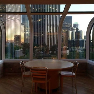
This curved window sunroom we made for our client David E. in Downtown Los Angeles, California was our most challenging and proudest project yet. We had to perfectly design a never-before-attempted template to remove the ugly grids his older, aluminum window frames had made. His majestic view of Los Angeles was replaced by 16 ugly aluminum windows which were deteriorating right before his eyes. His exact comments were, "Thank you for reminding me why I moved in here and purchased this home in the first place. You guys gave me my view back." We could not be happier.
 HTK Decor Enterprise
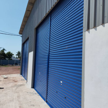
Jelutong Roller Shutter CALL 017-431 5233 HTK Pintu Shutter Penang
CALL 017-431 5233 HTK Pintu Shutter PERAK
WhatApps HTK 017-431 5233 Roller Shutter Door Expert
PRICE AS LOW AS RM25.00 Per Square Feet With Installation
WhatApps HTK 017-431 5233 Roller Shutter Door Expert
Min Order Only 200 Square Feet X RM 25.00 = RM5,000.00
Roller Shutter for your Shop-lot or Factory Warehouse.
WE ARE SPECIALIZED IN INSTALLING ROLLER SHUTTER USING HIGH-QUALITY MATERIAL FOR ALL OUR CLIENT.
WhatApps HTK 017-431 5233 Roller Shutter Door Expert
WhatApps HTK 017-431 5233 Roller Shutter Door Expert
Roller shutter doors are an excellent way of protecting the property, be it home or business, from rain and wind. In addition, by having a shutter in front of a window you are also protecting the window from burglary and vandalism attempts.
 Melissa Clark Interiors
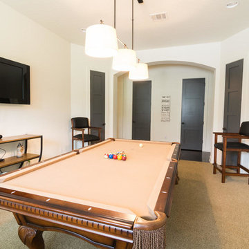
In this game room the wall color was gray and the door color a darker gray. The colors were fighting with the pool table felt and the carpet. We changed the wall color to a creamy white, the door color to a soft black and added a streamlined contemporary light fixture. The room feels pulled together and has perfect flow with the other rooms in the home. Here is what our client is saying: "Melissa did an amazing job bringing the right mix of traditional and contemporary to my home. She is so great to work with and her perfectionism in sizing lighting made all the difference over attempting to decorate on my own."
 CITYDESKSTUDIO, Inc.
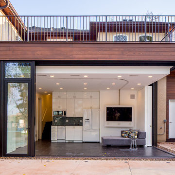
A family that spends a lot of time in and around their beautiful saltwater pool, did not have a place in their home that provided them a visual or physical connection. They also lacked any storage for all their pool “stuff”. With small children and a love for entertaining, they needed a room that served and supported their watery lifestyle. We took over an empty and unused notch along the back of the house adjacent to the pool patio to create a new bright and airy pool house.
The new out building attempts to unify 4 areas; an existing deck, an upper master bedroom balcony, a lower lawn, and the pool itself, and provide the missing storage. By locating the pool house at the juxtaposition of these areas, the new room was able to provide a new expanded rooftop balcony for the master, anchor and define the dining and barbeque deck, extend and connect to the pool and patio, and create a new access to integrate the lower lawn – and carve out the much needed storage for the variety of pool toys and equipment.
The building itself is 400 sf with bath, laundry, storage, mechanical, kitchen, and living. A single new secure connection is made into the house through the existing mudroom. Clad with crisply detailed ship lap cedar, it draws on the existing material palate of the house and nods to the boat aesthetic in expression and efficiency. With pocketing glass walls the pool house is both the utility building needed, and an expansion of the vibrant pool scene itself, inside and outside, along the poolside.
Photographer: Brandon Stengelwww.farmkidstudios.com
Location: Edina, MN
Completed: 2013
Project Team:
Ben Awes AIA, Principal-In-Charge
Bob Ganser AIA
Christian Dean AIA
Nate Dodge
 Ann C. Spooner Interior Designer
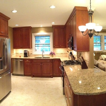
Crofton, MD The client wanted a small opening from the kitchen to a dark unused family room in attempt to make the space more desirable. I wanted to see the family room brighter, warmer and at the same time be part of the hub for entertaining. We removed half of the wall between the kitchen and family room. This then gave me the opportunity to create a peninsula counter with seating for gathering. By removing the wall between the 2 rooms the traffic flow was improved and more natural light was allowed to flood into the rooms from a pair of sliding glass doors.
Contractor, Artech Construction.
 California Deluxe Windows
For more information visit http://www.cdwindows.com.com or call (800) 639-9463.
This curved window sunroom we made for our client David E. in Downtown Los Angeles, California was our most challenging and proudest project yet. We had to perfectly design a never-before-attempted template to remove the ugly grids his older, aluminum window frames had made. His majestic view of Los Angeles was replaced by 16 ugly aluminum windows which were deteriorating right before his eyes. His exact comments were, "Thank you for reminding me why I moved in here and purchased this home in the first place. You guys gave me my view back." We could not be happier.
 Sarah Seung-McFarland
Photo: Sarah Seung-McFarland © 2017 Houzz
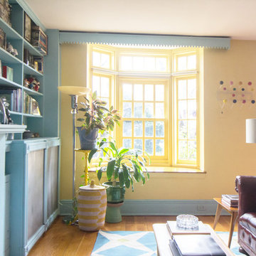
Example of an eclectic living room design in New York
Example of an eclectic living room design in New York


 The Decorator's Edge
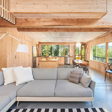
Living room - large transitional formal and open concept carpeted living room idea in Charlotte with brown walls, no fireplace and no tv
26