
Search results for "Attempt" in Home Design Ideas

 MC Design Studio
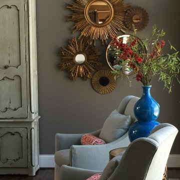
Starburst mirror collage was placed to reflect the light from the window and to move the eye up the vertical space. The tall armoire and high Lee swivel chairs, upholstered in a beautiful grey-green linen, helped to balance the height of the two-story tall living room walls and window. In the attempt to balance the heavy wood tones and the darker wall colors lighter and brighter was the mantra. This was seen in the furniture, accessories and lighting. This enabled us to meet the client's shabby chic aesthetic. The floor stain was custom.
 C.E. Pontz Sons
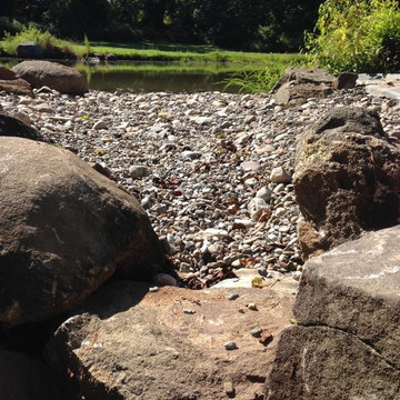
This Farm Pond Renovation in York, PA included removal of the existing land bridge at the back side of the pond that was blocking the stream water flow and also clearing the aquatic weed and other invasive plants from the stream to allow for a better water flow to the ponds edge. We snaked the existing overflow pipe and attempted to clear it of any debris blocking the flow of water. For the new overflow we cleared the existing embankment and excavated a swale at the edge of the pond and created a natural looking stream overflow similar to one we would create in a typical backyard pond or water feature. This was done to prevent and stabilize the eroding bank along the pond edge. Also installed was a large scale pond aerator and aeration system to aide in the overall health and clarity of the pond.
Find the right local pro for your project
 Worthington Design & Remodeling
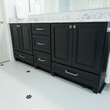
Drop-in bathtub - mid-sized traditional master white tile ceramic tile drop-in bathtub idea in Indianapolis with an undermount sink, raised-panel cabinets, black cabinets, quartz countertops, a two-piece toilet and blue walls
 Tom Ralston Concrete
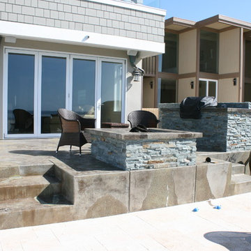
The Ingram job is unique in that it has lots of very interesting ocean shelf shapes and colors as well as a variety of embeds from the Monterey Bay that were placed into the concrete. There were sand dollars, starfish, moonsnails, and Monterey Bay aquarium sand just to name a few. We were going to attempt to use a very stout epoxy to seal one particular starfish but as it lay there the day after in wait…the Ingram's dog ate it. What was left when we pulled out the remains was a perfect impression of a starfish…almost like a petrified starfish. That feature as well as the rest of the patio, stairs, countertop and fire pit are amazing. Being about 30 feet from the ocean doesn't hurt the eyes either.
 Pacific Coast Custom Design
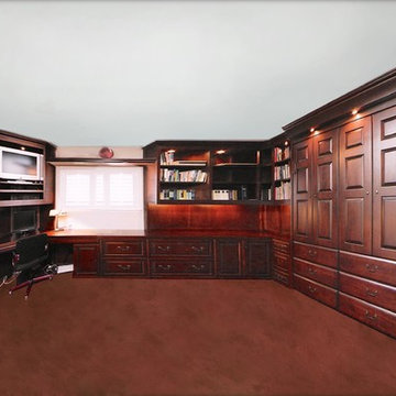
Wallbed home office room. Our attempt at photoshop to blend the images together so show the entire view is a bit distorted. But, it is still a great space.
 David Cannon Photography
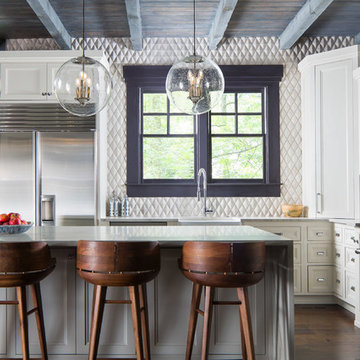
Interior design work by Katie DeRario and Hart & Lock Design (www.hartandlock.com).
Photo credit: David Cannon Photography (www.davidcannonphotography.com)
 Nor-Son Custom Builders
Scott Amundson Photography
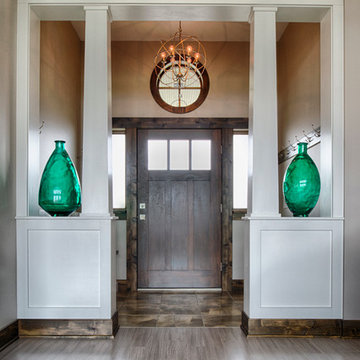
Example of a trendy foyer design in Minneapolis with gray walls and a dark wood front door
Example of a trendy foyer design in Minneapolis with gray walls and a dark wood front door
 C.E. Pontz Sons
This Farm Pond Renovation in York, PA included removal of the existing land bridge at the back side of the pond that was blocking the stream water flow and also clearing the aquatic weed and other invasive plants from the stream to allow for a better water flow to the ponds edge. We snaked the existing overflow pipe and attempted to clear it of any debris blocking the flow of water. For the new overflow we cleared the existing embankment and excavated a swale at the edge of the pond and created a natural looking stream overflow similar to one we would create in a typical backyard pond or water feature. This was done to prevent and stabilize the eroding bank along the pond edge. Also installed was a large scale pond aerator and aeration system to aide in the overall health and clarity of the pond.
 Tom Ralston Concrete
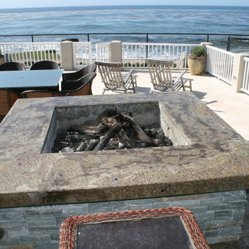
The Ingram job is unique in that it has lots of very interesting ocean shelf shapes and colors as well as a variety of embeds from the Monterey Bay that were placed into the concrete. There were sand dollars, starfish, moonsnails, and Monterey Bay aquarium sand just to name a few. We were going to attempt to use a very stout epoxy to seal one particular starfish but as it lay there the day after in wait…the Ingram's dog ate it. What was left when we pulled out the remains was a perfect impression of a starfish…almost like a petrified starfish. That feature as well as the rest of the patio, stairs, countertop and fire pit are amazing. Being about 30 feet from the ocean doesn't hurt the eyes either.
 Waring Architects
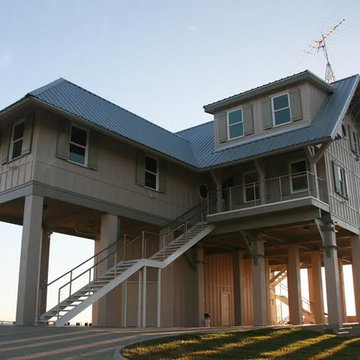
This is a prototypical home specially designed with a 200% structural engineering safety factor to easily withstand 150+ mph winds and designed to be extremely durable, low/no maintenance, effectively flood-proofed, super-structured, armored, super-insulted, and extremely energy-efficient. Every effort was made to make the house “fit” the site; it utilizes a Southern coastal vernacular archetype; it is oriented on the site to take advantage of year-round sun sets and moon rises and to minimize solar heat gain; and careful attention has been given to the breathtaking views. It is designed to harmoniously take advantage of both the latest in currently available technology and a site blessed with unparalleled natural beauty. We have attempted to provide an example of enduring environmentally-sensitive design without any compromise of convenience, aesthetics, or quality of life.
 Eldorado Stone
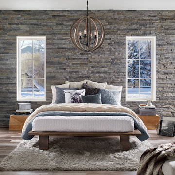
Introducing European Ledge®, A Modern Stone Fusion. European Ledge creates the perfect fusion between old-world stonework and modern design. Evoking a unique balance of weather-worn surface contours and precision-cut stone, this modern interpretation of split-face travertine is assembled into tightly stacked ledge pieces with varying surface heights and lengths. The distinctive appearance delivers a timeless feel to any exterior or interior environment.
Stone: European Ledge - Zinc
Get a Sample of European Ledge: https://shop.eldoradostone.com/products/european-ledge-sample
 Waring Architects
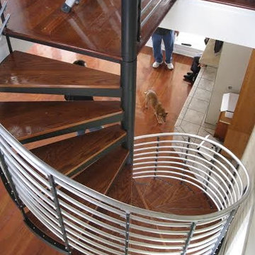
This is a prototypical home specially designed with a 200% structural engineering safety factor to easily withstand 150+ mph winds and designed to be extremely durable, low/no maintenance, effectively flood-proofed, super-structured, armored, super-insulted, and extremely energy-efficient. Every effort was made to make the house “fit” the site; it utilizes a Southern coastal vernacular archetype; it is oriented on the site to take advantage of year-round sun sets and moon rises and to minimize solar heat gain; and careful attention has been given to the breathtaking views. It is designed to harmoniously take advantage of both the latest in currently available technology and a site blessed with unparalleled natural beauty. We have attempted to provide an example of enduring environmentally-sensitive design without any compromise of convenience, aesthetics, or quality of life.
www.waringarchitects.com

 Waring Architects
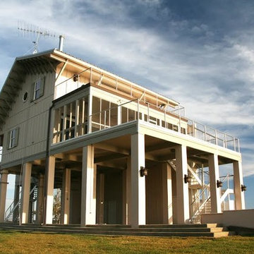
This is a prototypical home specially designed with a 200% structural engineering safety factor to easily withstand 150+ mph winds and designed to be extremely durable, low/no maintenance, effectively flood-proofed, super-structured, armored, super-insulted, and extremely energy-efficient. Every effort was made to make the house “fit” the site; it utilizes a Southern coastal vernacular archetype; it is oriented on the site to take advantage of year-round sun sets and moon rises and to minimize solar heat gain; and careful attention has been given to the breathtaking views. It is designed to harmoniously take advantage of both the latest in currently available technology and a site blessed with unparalleled natural beauty. We have attempted to provide an example of enduring environmentally-sensitive design without any compromise of convenience, aesthetics, or quality of life.
www.waringarchitects.com
www.facebook.com/waring architects
 Home Matters LLC
Gibeon Photography
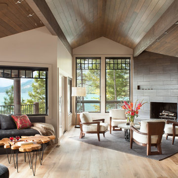
Living room - contemporary open concept medium tone wood floor and beige floor living room idea with a standard fireplace, a tile fireplace, beige walls and no tv
Living room - contemporary open concept medium tone wood floor and beige floor living room idea with a standard fireplace, a tile fireplace, beige walls and no tv
 Waring Architects
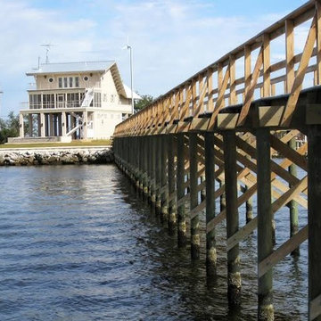
This is a prototypical home specially designed with a 200% structural engineering safety factor to easily withstand 150+ mph winds and designed to be extremely durable, low/no maintenance, effectively flood-proofed, super-structured, armored, super-insulted, and extremely energy-efficient. Every effort was made to make the house “fit” the site; it utilizes a Southern coastal vernacular archetype; it is oriented on the site to take advantage of year-round sun sets and moon rises and to minimize solar heat gain; and careful attention has been given to the breathtaking views. It is designed to harmoniously take advantage of both the latest in currently available technology and a site blessed with unparalleled natural beauty. We have attempted to provide an example of enduring environmentally-sensitive design without any compromise of convenience, aesthetics, or quality of life.
www.waringarchitects.com
 Waring Architects
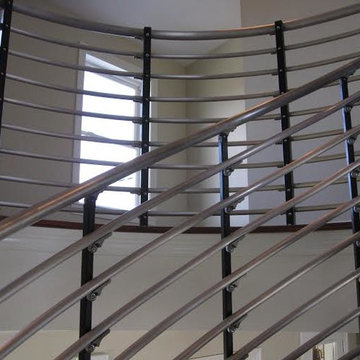
This is a prototypical home specially designed with a 200% structural engineering safety factor to easily withstand 150+ mph winds and designed to be extremely durable, low/no maintenance, effectively flood-proofed, super-structured, armored, super-insulted, and extremely energy-efficient. Every effort was made to make the house “fit” the site; it utilizes a Southern coastal vernacular archetype; it is oriented on the site to take advantage of year-round sun sets and moon rises and to minimize solar heat gain; and careful attention has been given to the breathtaking views. It is designed to harmoniously take advantage of both the latest in currently available technology and a site blessed with unparalleled natural beauty. We have attempted to provide an example of enduring environmentally-sensitive design without any compromise of convenience, aesthetics, or quality of life.
www.waringarchitects.com
 Twist Interior Design
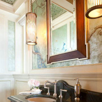
Our transformation of the poorly designed powder room was a project in itself. Before tackling the décor, we addressed issues of space utilization by reorganizing the layout of the plumbing fixtures, substituting super-insulated walls for an intrusive radiator, and doing away with the medicine cabinet mirror above a wall-mounted corner sink.
Millwork details were assigned a soothing paint and glaze finish with metallic accents, and the floor’s inlaid honey onyx mosaic complemented the shell’s quiet backdrop. Next, we selected more graceful plumbing fixtures, mounting the sink within a furniture-quality cabinet we designed to maximize space, and capped it with a stone top to emulate mossy groundcover. Grass shades, in perfect simplicity, address privacy needs at the windows, and make no attempt to draw attention away from their magical surroundings. The glow of the decorative pendants, hanging from new ceiling beams, is magnified by the surrounding mirrors and glass.

 Bhavna Misra Art
This is painted as part of Tree series. I chose Aspen for their lovely white trunks and flower-like leaves.
The artwork has been accepted to be displayed in the juried show.
Painted on premier quality canvas stretched on a 1.5 thick frame, using artist grade oil paints, the work is a humble attempt to bring focus on the beauty of nature.
Painting is sealed with acrylic varnish and sides are painted black. It is unframed and hangs with d-link and wire assembly.
It can be framed as needed.
The painting is shipped with certificate of authenticity and care instructions.
About Artist
About the Artist
Bhavna is a San Francisco based independent artist who tries to make a difference through her passion for arts and portraiture. More info at
https://bhavnamisra.com/
Email: bhavna.misra@gmail.com
24