
Search results for "Back up media" in Home Design Ideas
 Vision Interiors
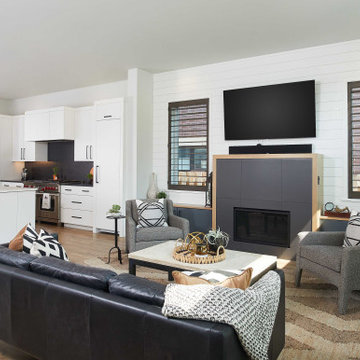
As a conceptual urban infill project, the Wexley is designed for a narrow lot in the center of a city block. The 26’x48’ floor plan is divided into thirds from front to back and from left to right. In plan, the left third is reserved for circulation spaces and is reflected in elevation by a monolithic block wall in three shades of gray. Punching through this block wall, in three distinct parts, are the main levels windows for the stair tower, bathroom, and patio. The right two-thirds of the main level are reserved for the living room, kitchen, and dining room. At 16’ long, front to back, these three rooms align perfectly with the three-part block wall façade. It’s this interplay between plan and elevation that creates cohesion between each façade, no matter where it’s viewed. Given that this project would have neighbors on either side, great care was taken in crafting desirable vistas for the living, dining, and master bedroom. Upstairs, with a view to the street, the master bedroom has a pair of closets and a skillfully planned bathroom complete with soaker tub and separate tiled shower. Main level cabinetry and built-ins serve as dividing elements between rooms and framing elements for views outside.
Architect: Visbeen Architects
Builder: J. Peterson Homes
Photographer: Ashley Avila Photography
 Klopf Architecture
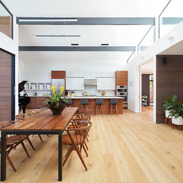
Klopf Architecture and Outer space Landscape Architects designed a new warm, modern, open, indoor-outdoor home in Los Altos, California. Inspired by mid-century modern homes but looking for something completely new and custom, the owners, a couple with two children, bought an older ranch style home with the intention of replacing it.
Created on a grid, the house is designed to be at rest with differentiated spaces for activities; living, playing, cooking, dining and a piano space. The low-sloping gable roof over the great room brings a grand feeling to the space. The clerestory windows at the high sloping roof make the grand space light and airy.
Upon entering the house, an open atrium entry in the middle of the house provides light and nature to the great room. The Heath tile wall at the back of the atrium blocks direct view of the rear yard from the entry door for privacy.
The bedrooms, bathrooms, play room and the sitting room are under flat wing-like roofs that balance on either side of the low sloping gable roof of the main space. Large sliding glass panels and pocketing glass doors foster openness to the front and back yards. In the front there is a fenced-in play space connected to the play room, creating an indoor-outdoor play space that could change in use over the years. The play room can also be closed off from the great room with a large pocketing door. In the rear, everything opens up to a deck overlooking a pool where the family can come together outdoors.
Wood siding travels from exterior to interior, accentuating the indoor-outdoor nature of the house. Where the exterior siding doesn’t come inside, a palette of white oak floors, white walls, walnut cabinetry, and dark window frames ties all the spaces together to create a uniform feeling and flow throughout the house. The custom cabinetry matches the minimal joinery of the rest of the house, a trim-less, minimal appearance. Wood siding was mitered in the corners, including where siding meets the interior drywall. Wall materials were held up off the floor with a minimal reveal. This tight detailing gives a sense of cleanliness to the house.
The garage door of the house is completely flush and of the same material as the garage wall, de-emphasizing the garage door and making the street presentation of the house kinder to the neighborhood.
The house is akin to a custom, modern-day Eichler home in many ways. Inspired by mid-century modern homes with today’s materials, approaches, standards, and technologies. The goals were to create an indoor-outdoor home that was energy-efficient, light and flexible for young children to grow. This 3,000 square foot, 3 bedroom, 2.5 bathroom new house is located in Los Altos in the heart of the Silicon Valley.
Klopf Architecture Project Team: John Klopf, AIA, and Chuang-Ming Liu
Landscape Architect: Outer space Landscape Architects
Structural Engineer: ZFA Structural Engineers
Staging: Da Lusso Design
Photography ©2018 Mariko Reed
Location: Los Altos, CA
Year completed: 2017
 Susan Manrao Design
Laure Joliet Photography
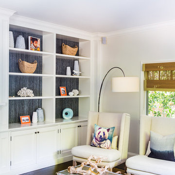
This casual living room was designed with family in mind. The existing media cabinet was given new life by wallpapering the back with Phillip Jefferies wallpaper and styled with pops of orange and shades of blue.
Find the right local pro for your project
 Morse Custom Homes and Remodeling
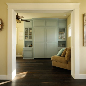
Built in night stand adjacent to the Murphy bed located in the guest/media room. Multiuse guest room with media and storage. 3 of 3 photos with the pocket doors and Murphy bed.
 Byggmeister Inc
Photo by Mike Casey
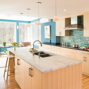
Cramped, uncomfortable, and out of date: when the owners of this home approached us about renovating their kitchen and adjoining sunroom, these were high on their list of complaints.
OPENING UP THE KITCHEN
Our plan kept the kitchen in the same location but took down the walls between both the dining room and the sunroom to create an expansive multi-purpose space with spectacular views to conservation land along the back of the property. We removed the powder room and in its place created a window-lined hallway to the living room—opening up direct access between these two previously disconnected spaces. We then built a new half bath between these two rooms, with a door along the back hallway. The result is a more private powder room that is easier to access than before.
Significantly improved cabinetry provides ample storage for both human and canine needs. An island countertop is functional and pleasant, enabling the owners to prep for and clean up from dinner all while enjoying the view of the woods behind their house.
CREATING COMFORT
We also completely rebuilt the sunroom, thickening the framing to allow for extra insulation and raising the roof to accommodate a higher ceiling and tall windows that let in as much natural light as the skylights they replaced, but much less of the solar gain that had made the room so intolerable in the summer.
We improved visual connections between spaces and admitted more natural light by converting the framing of the main stairway from full to half walls. We also insulated the attic and replaced an aging, inefficient central air conditioning system with ductless minisplit heat pumps, which can also be used as supplemental heat.
All in all, this was our kind of project: we made the home more attractive, more comfortable, and more energy-efficient—all over the course of a single, well-integrated project.
 Gregory Thomas, Residential Architect
Kitchen
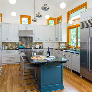
The kitchen is anchored as a gathering space with its blue-accented entertaining island. The island has plenty of seating for visiting with the cooks and for serving informal meals. The clean-up sink faces toward the east and the back deck and yard. To its right is a paneled dishwasher, and a built-in fridge that's readily accessible to the breakfast table (out of view here) and outdoor deck. To the left of the sink is an appliance garage with a lift-up door.
oak trim; new oak floors; Sub Zero refrigerator; Wolf range & hood; 3cm Brazilian Black granite counters with thumbnail edge detail; 3cm Verde Pavoa granite island with thumbnail edge; lower cabinets painted Seattle Mist by Benjamin Moore; upper cabinets painted Swiss Coffee by Benjamine Moore; island painted Dark Pewter by Benjamin Moore; 6" x 13" rhomboid glazed ceramic tile at backsplash by Walker Zanger.
Construction by CG&S Design-Build.
Photography by Tre Dunham, Fine focus Photography
 TKS Design Group
Free ebook, Creating the Ideal Kitchen. DOWNLOAD NOW
The Klimala’s and their three kids are no strangers to moving, this being their fifth house in the same town over the 20-year period they have lived there. “It must be the 7-year itch, because every seven years, we seem to find ourselves antsy for a new project or a new environment. I think part of it is being a designer, I see my own taste evolve and I want my environment to reflect that. Having easy access to wonderful tradesmen and a knowledge of the process makes it that much easier”.
This time, Klimala’s fell in love with a somewhat unlikely candidate. The 1950’s ranch turned cape cod was a bit of a mutt, but it’s location 5 minutes from their design studio and backing up to the high school where their kids can roll out of bed and walk to school, coupled with the charm of its location on a private road and lush landscaping made it an appealing choice for them.
“The bones of the house were really charming. It was typical 1,500 square foot ranch that at some point someone added a second floor to. Its sloped roofline and dormered bedrooms gave it some charm.” With the help of architect Maureen McHugh, Klimala’s gutted and reworked the layout to make the house work for them. An open concept kitchen and dining room allows for more frequent casual family dinners and dinner parties that linger. A dingy 3-season room off the back of the original house was insulated, given a vaulted ceiling with skylights and now opens up to the kitchen. This room now houses an 8’ raw edge white oak dining table and functions as an informal dining room. “One of the challenges with these mid-century homes is the 8’ ceilings. I had to have at least one room that had a higher ceiling so that’s how we did it” states Klimala.
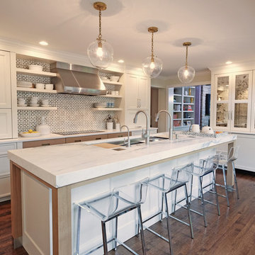
The kitchen features a 10’ island which houses a 5’0” Galley Sink. The Galley features two faucets, and double tiered rail system to which accessories such as cutting boards and stainless steel bowls can be added for ease of cooking. Across from the large sink is an induction cooktop. “My two teen daughters and I enjoy cooking, and the Galley and induction cooktop make it so easy.” A wall of tall cabinets features a full size refrigerator, freezer, double oven and built in coffeemaker. The area on the opposite end of the kitchen features a pantry with mirrored glass doors and a beverage center below.
The rest of the first floor features an entry way, a living room with views to the front yard’s lush landscaping, a family room where the family hangs out to watch TV, a back entry from the garage with a laundry room and mudroom area, one of the home’s four bedrooms and a full bath. There is a double sided fireplace between the family room and living room. The home features pops of color from the living room’s peach grass cloth to purple painted wall in the family room. “I’m definitely a traditionalist at heart but because of the home’s Midcentury roots, I wanted to incorporate some of those elements into the furniture, lighting and accessories which also ended up being really fun. We are not formal people so I wanted a house that my kids would enjoy, have their friends over and feel comfortable.”
The second floor houses the master bedroom suite, two of the kids’ bedrooms and a back room nicknamed “the library” because it has turned into a quiet get away area where the girls can study or take a break from the rest of the family. The area was originally unfinished attic, and because the home was short on closet space, this Jack and Jill area off the girls’ bedrooms houses two large walk-in closets and a small sitting area with a makeup vanity. “The girls really wanted to keep the exposed brick of the fireplace that runs up the through the space, so that’s what we did, and I think they feel like they are in their own little loft space in the city when they are up there” says Klimala.
Designed by: Susan Klimala, CKD, CBD
Photography by: Carlos Vergara
For more information on kitchen and bath design ideas go to: www.kitchenstudio-ge.com

Sponsored
Sunbury, OH

J.Holderby - Renovations
Franklin County's Leading General Contractors - 2X Best of Houzz!
 TKS Design Group
Download our free ebook, Creating the Ideal Kitchen. DOWNLOAD NOW
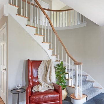
Lakefront property in the northwest suburbs of Chicago is hard to come by, so when we were hired by this young family with exactly that, we were immediately inspired by not just the unusually large footprint of this 1950’s colonial revival but also the lovely views of the manmade lake it was sited on. The large 5-bedroom home was solidly stuck in the 1980’s, but we saw tons of potential. We started out by updating the existing staircase with a fresh coat of paint and adding new herringbone slate to the entry hall.
The powder room off the entryway also got a refresh - new flooring, new cabinets and fixtures. We ran the new slate right through into this space for some consistency. A fun wallpaper and shiplap trim add a welcoming feel and set the tone for the home.
Next, we tackled the kitchen. Located away from the rest of the first floor, the kitchen felt a little isolated, so we immediately began planning for how to better connect it to the rest of the first floor. We landed on removing the wall between the kitchen and dining room and designed a modified galley style space with separate cooking and clean up zones. The cooking zone consists of the refrigerator, prep sink and cooktop, along with a nice long run of prep space at the island. The cleanup side of the kitchen consists of the main sink and dishwasher. Both areas are situated so that the user can view the lake during prep work and cleanup!
One of the home’s main puzzles was how to incorporate the mudroom and area in front of the patio doors at the back of the house. We already had a breakfast table area, so the space by the patio doors was a bit of a no man’s land. We decided to separate the kitchen proper from what became the new mudroom with a large set of barn doors. That way you can quickly hide any mudroom messes but have easy access to the light coming in through the patio doors as well as the outdoor grilling station. We also love the impact the barn doors add to the overall space.
The homeowners’ first words to us were “it’s time to ditch the brown,” so we did! We chose a lovely blue pallet that reflects the home’s location on the lake which is also vibrant yet easy on the eye. Countertops are white quartz, and the natural oak floor works well with the other honey accents. The breakfast table was given a refresh with new chairs, chandelier and window treatments that frame the gorgeous views of the lake out the back.
We coordinated the slate mudroom flooring with that used in the home’s main entrance for a consistent feel. The storage area consists of open and closed storage to allow for some clutter control as needed.
Next on our “to do” list was revamping the dated brown bar area in the neighboring dining room. We eliminated the clutter by adding some closed cabinets and did some easy updates to help the space feel more current. One snag we ran into here was the discovery of a beam above the existing open shelving that had to be modified with a smaller structural beam to allow for our new design to work. This was an unexpected surprise, but in the end we think it was well worth it!
We kept the colors here a bit more muted to blend with the homeowner’s existing furnishings. Open shelving and polished nickel hardware add some simple detail to the new entertainment zone which also looks out onto the lake!
Next we tackled the upstairs starting with the homeowner’s son’s bath. The bath originally had both a tub shower and a separate shower, so we decided to swap out the shower for a new laundry area. This freed up some space downstairs in what used to be the mudroom/laundry room and is much more convenient for daily laundry needs.
We continued the blue palette here with navy cabinetry and the navy tile in the shower. Porcelain floor tile and chrome fixtures keep maintenance to a minimum while matte black mirrors and lighting add some depth the design. A low maintenance runner adds some warmth underfoot and ties the whole space together.
We added a pocket door to the bathroom to minimize interference with the door swings. The left door of the laundry closet is on a 180 degree hinge to allow for easy full access to the machines. Next we tackled the master bath which is an en suite arrangement. The original was typical of the 1980’s with the vanity outside of the bathroom, situated near the master closet. And the brown theme continued here with multiple shades of brown.
Our first move was to segment off the bath and the closet from the master bedroom. We created a short hall from the bedroom to the bathroom with his and hers walk-in closets on the left and right as well as a separate toilet closet outside of the main bathroom for privacy and flexibility.
The original bathroom had a giant soaking tub with steps (dangerous!) as well as a small shower that did not work well for our homeowner who is 6’3”. With other bathtubs in the home, they decided to eliminate the tub and create an oversized shower which takes up the space where the old tub was located. The double vanity is on the opposite wall and a bench is located under the window for morning conversations and a place to set a couple of towels.
The pallet in here is light and airy with a mix of blond wood, creamy porcelain and marble tile, and brass accents. A simple roman shade adds some texture and it’s top-down mechanism allows for light and privacy.
This large whole house remodel gave our homeowners not only the ability to maximize the potential of their home but also created a lovely new frame from which to view their fabulous lake views.
Designed by: Susan Klimala, CKD, CBD
Photography by: Michael Kaskel
For more information on kitchen and bath design ideas go to: www.kitchenstudio-ge.com
 Adrienne DeRosa
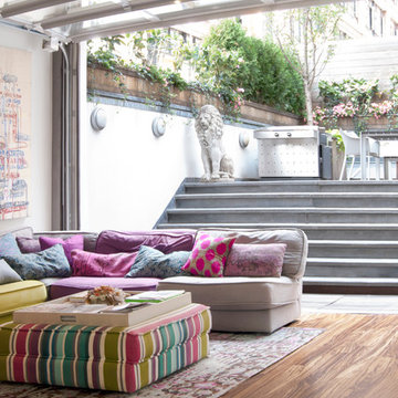
With their current home being their first project designed and built from the ground up, the Novogratzes chose details with an industrial edge. The glass garage door opens up to the back courtyard, abolishing the boundaries between inside and out. "This was our chance to make something truly new, and make everything distinctly ours", Cortney says. "it is the perfect mix of urban living with a relaxed feel."
Photo: Adrienne DeRosa Photography © 2014 Houzz
Design: Cortney and Robert Novogratz
 TKS Design Group
Free ebook, Creating the Ideal Kitchen. DOWNLOAD NOW
The Klimala’s and their three kids are no strangers to moving, this being their fifth house in the same town over the 20-year period they have lived there. “It must be the 7-year itch, because every seven years, we seem to find ourselves antsy for a new project or a new environment. I think part of it is being a designer, I see my own taste evolve and I want my environment to reflect that. Having easy access to wonderful tradesmen and a knowledge of the process makes it that much easier”.
This time, Klimala’s fell in love with a somewhat unlikely candidate. The 1950’s ranch turned cape cod was a bit of a mutt, but it’s location 5 minutes from their design studio and backing up to the high school where their kids can roll out of bed and walk to school, coupled with the charm of its location on a private road and lush landscaping made it an appealing choice for them.
“The bones of the house were really charming. It was typical 1,500 square foot ranch that at some point someone added a second floor to. Its sloped roofline and dormered bedrooms gave it some charm.” With the help of architect Maureen McHugh, Klimala’s gutted and reworked the layout to make the house work for them. An open concept kitchen and dining room allows for more frequent casual family dinners and dinner parties that linger. A dingy 3-season room off the back of the original house was insulated, given a vaulted ceiling with skylights and now opens up to the kitchen. This room now houses an 8’ raw edge white oak dining table and functions as an informal dining room. “One of the challenges with these mid-century homes is the 8’ ceilings. I had to have at least one room that had a higher ceiling so that’s how we did it” states Klimala.
The kitchen features a 10’ island which houses a 5’0” Galley Sink. The Galley features two faucets, and double tiered rail system to which accessories such as cutting boards and stainless steel bowls can be added for ease of cooking. Across from the large sink is an induction cooktop. “My two teen daughters and I enjoy cooking, and the Galley and induction cooktop make it so easy.” A wall of tall cabinets features a full size refrigerator, freezer, double oven and built in coffeemaker. The area on the opposite end of the kitchen features a pantry with mirrored glass doors and a beverage center below.
The rest of the first floor features an entry way, a living room with views to the front yard’s lush landscaping, a family room where the family hangs out to watch TV, a back entry from the garage with a laundry room and mudroom area, one of the home’s four bedrooms and a full bath. There is a double sided fireplace between the family room and living room. The home features pops of color from the living room’s peach grass cloth to purple painted wall in the family room. “I’m definitely a traditionalist at heart but because of the home’s Midcentury roots, I wanted to incorporate some of those elements into the furniture, lighting and accessories which also ended up being really fun. We are not formal people so I wanted a house that my kids would enjoy, have their friends over and feel comfortable.”
The second floor houses the master bedroom suite, two of the kids’ bedrooms and a back room nicknamed “the library” because it has turned into a quiet get away area where the girls can study or take a break from the rest of the family. The area was originally unfinished attic, and because the home was short on closet space, this Jack and Jill area off the girls’ bedrooms houses two large walk-in closets and a small sitting area with a makeup vanity. “The girls really wanted to keep the exposed brick of the fireplace that runs up the through the space, so that’s what we did, and I think they feel like they are in their own little loft space in the city when they are up there” says Klimala.
Designed by: Susan Klimala, CKD, CBD
Photography by: Carlos Vergara
For more information on kitchen and bath design ideas go to: www.kitchenstudio-ge.com
 TKS Design Group
Free ebook, Creating the Ideal Kitchen. DOWNLOAD NOW
The Klimala’s and their three kids are no strangers to moving, this being their fifth house in the same town over the 20-year period they have lived there. “It must be the 7-year itch, because every seven years, we seem to find ourselves antsy for a new project or a new environment. I think part of it is being a designer, I see my own taste evolve and I want my environment to reflect that. Having easy access to wonderful tradesmen and a knowledge of the process makes it that much easier”.
This time, Klimala’s fell in love with a somewhat unlikely candidate. The 1950’s ranch turned cape cod was a bit of a mutt, but it’s location 5 minutes from their design studio and backing up to the high school where their kids can roll out of bed and walk to school, coupled with the charm of its location on a private road and lush landscaping made it an appealing choice for them.
“The bones of the house were really charming. It was typical 1,500 square foot ranch that at some point someone added a second floor to. Its sloped roofline and dormered bedrooms gave it some charm.” With the help of architect Maureen McHugh, Klimala’s gutted and reworked the layout to make the house work for them. An open concept kitchen and dining room allows for more frequent casual family dinners and dinner parties that linger. A dingy 3-season room off the back of the original house was insulated, given a vaulted ceiling with skylights and now opens up to the kitchen. This room now houses an 8’ raw edge white oak dining table and functions as an informal dining room. “One of the challenges with these mid-century homes is the 8’ ceilings. I had to have at least one room that had a higher ceiling so that’s how we did it” states Klimala.
The kitchen features a 10’ island which houses a 5’0” Galley Sink. The Galley features two faucets, and double tiered rail system to which accessories such as cutting boards and stainless steel bowls can be added for ease of cooking. Across from the large sink is an induction cooktop. “My two teen daughters and I enjoy cooking, and the Galley and induction cooktop make it so easy.” A wall of tall cabinets features a full size refrigerator, freezer, double oven and built in coffeemaker. The area on the opposite end of the kitchen features a pantry with mirrored glass doors and a beverage center below.
The rest of the first floor features an entry way, a living room with views to the front yard’s lush landscaping, a family room where the family hangs out to watch TV, a back entry from the garage with a laundry room and mudroom area, one of the home’s four bedrooms and a full bath. There is a double sided fireplace between the family room and living room. The home features pops of color from the living room’s peach grass cloth to purple painted wall in the family room. “I’m definitely a traditionalist at heart but because of the home’s Midcentury roots, I wanted to incorporate some of those elements into the furniture, lighting and accessories which also ended up being really fun. We are not formal people so I wanted a house that my kids would enjoy, have their friends over and feel comfortable.”
The second floor houses the master bedroom suite, two of the kids’ bedrooms and a back room nicknamed “the library” because it has turned into a quiet get away area where the girls can study or take a break from the rest of the family. The area was originally unfinished attic, and because the home was short on closet space, this Jack and Jill area off the girls’ bedrooms houses two large walk-in closets and a small sitting area with a makeup vanity. “The girls really wanted to keep the exposed brick of the fireplace that runs up the through the space, so that’s what we did, and I think they feel like they are in their own little loft space in the city when they are up there” says Klimala.
Designed by: Susan Klimala, CKD, CBD
Photography by: Carlos Vergara
For more information on kitchen and bath design ideas go to: www.kitchenstudio-ge.com
 Ancient Surfaces
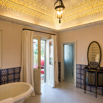
Project: Palazzo Margherita Bernalda Restoration
Elements used: Encaustic Tiles, Antique Limestone, antique stone fountain, antique stone fireplace.
Discover the cuisine, wines and history of the Basilicata region at the luxurious Palazzo Margherita. Set in the village of Bernalda, the well-preserved villa is close to the region’s white-sand beaches and the famed Sassi caves. The property was recently renovated by the Coppola family with decorator Jacques Grange, imbuing its luxurious traditional interiors with modern style.
Start each day of your stay with an included breakfast, then head out to read in the courtyard garden, lounge under an umbrella on the terrace by the pool or sip a mimosa at the al-fresco bar. Have dinner at one of the outdoor tables, then finish the evening in the media room. The property also has its own restaurant and bar, which are open to the public but separate from the house.
Traditional architecture, lush gardens and a few modern furnishings give the villa the feel of a grand old estate brought back to life. In the media room, a vaulted ceiling with ornate moldings speaks to the home’s past, while striped wallpaper in neutral tones is a subtly contemporary touch. The eat-in kitchen has a dramatically arched Kronos stone ceiling and a long, welcoming table with bistro-style chairs.
The nine suite-style bedrooms are each decorated with their own scheme and each have en-suite bathrooms, creating private retreats within the palazzo. There are three bedrooms with queen beds on the garden level; all three have garden access and one has a sitting area. Upstairs, there are six bedrooms with king beds, all of which have access to either a Juliet balcony, private balcony or furnished terrace.
From Palazzo Margherita’s location in Bernalda, it’s a 20-minute drive to several white-sand beaches on the Ionian Sea.
Photos courtesy of Luxury Retreats, Barbados.
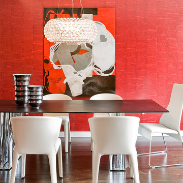
 Eric Roseff Designs
Dining area in a contemporary duplex in Boston's Back Bay neighborhood.
Michael J. Lee Photography
Trendy dark wood floor dining room photo in Boston with red walls
Trendy dark wood floor dining room photo in Boston with red walls

 Architect Heather Johnston
CASA 1O
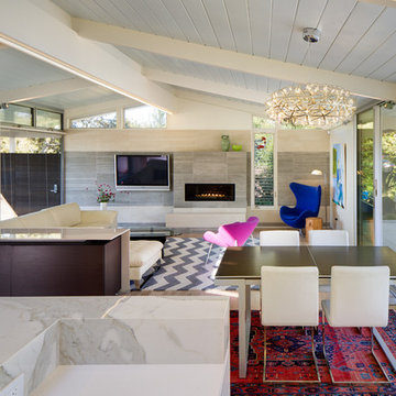
Contemporary on a Mid-century Scaffold.
Largely unmodified since its design by Russell Forester and construction in 1957, the structure housed the original family until 2013. An intimate 1,910 square foot space, the house acquired a separate 600 square foot cottage in the 70’s designed by another architect. New owners purchased the house with the idea of keeping the original architect’s intent intact – the simple accommodation of everyday life with a focus on outdoor living only possible in Southern California. At the same time the house needed insulation, new electrical, plumbing, siding – everything but new studs and foundations.
A single roof beam travels south from the north fireplace wall all the way to the bedrooms in the back. Functions occur to either side, with private access to exterior courtyards. How do we accentuate the uncomplicated while enhancing the qualities of the chosen materials? Contemporary applied to a mid-century scaffold.
We focused on reduction, a few things performing many tasks. Each component, material or color performs more than one duty.
Lighting is paramount, enhancing the design’s procession from front to back, north to south, public to private. Strip LED’s reinforce the beam’s linear presence and spot LED’s make punctuation points of the roof purlins. Hidden up and down-lights in the cabinets and elsewhere provide the rooms with a quiet glow.
Exterior grass plantings give the only vertical dimension to the design, waving as the breeze moves them. All else is horizontal: caramelized bamboo siding, porcelain tile, roof line and ocean horizon.
Architect: Heather Johnston Architect
Landscaping: HJA
Photography: Brady Architectural Photography
 UltraMedia, Inc.
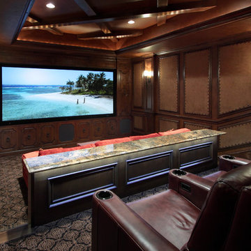
Building this exceptional home cinema system in Westlake, TX was a pleasure from day one. Our clients have owned multiple home theaters, and wanted to step up the performance in this new media room. The construction of the room is heavily reinforced with 2x6s. The entire room has been insulated to keep the sound inside the room and minimize leakage to the rest of the house. The riser base for the back row of chairs was reinforced with wood screws, and was fully insulated. In addition, the walls have been sheetrocked with Quietrock. This treatment substantially keeps the sound from traveling between walls because of its high density coefficient. Because the media room is on the 2nd floor, a sound barrier was added to the floors to provide an additional layer of sound control within the room. The finished walls were treated with custom acoustic panels from Auralex. We applied absorptive, reflective and diffusive treatments throughout the room to create a well-balanced acoustic environment for music and movies. The interior designer brought in a faux painter to create a leather-like texture on the walls. She very creatively faux painted the acoustic cloth panels to match the leather look and feel of the room. A
7.2 complement of Triad speakers are optimally located within the room. The front three LCR speakers are positioned behind an acoustically transparent Stewart video screen. The four surround speakers are located in a horseshoe-shaped configuration and fully envelope the listener with all the subtle (and not-so-subtle) special effects. Two Triad Gold subwoofers are placed in the corners and are dialed into the room for maximum output and tautness of bass. Triad builds an in-wall speaker that is fully baffled which minimizes any sound loss through the walls, and the performance is outstanding.
The electronics featured in this media room are cutting edge. A Wolf Cinema projector with a Variscope lens allows us to set up the most popular aspect ratios and project a brilliant light on a 143" diagonal screen. We utilized the latest pre/pro from Integra as well as Class D amplification from Bel Canto. The Integra incorporates Audyssey digital correction circuitry, which measures the room’s properties/acoustics and maximizes the sound in the room. The sources include an Oppo Blu ray player, AM/FM, DirecTV HD and AppleTV. The entire system is controlled by an RTI touchscreen remote for easy, intuitive control. The sound is effortless and it is a match made in heaven.
The room consists of two rows of seating. The front row is a very comfortable pit seating group and the second row utilizes leather theater chairs. All of this leads to a well-appointed, acoustically superior media room.
 Lincoln Lighthill Architect
Lincoln Lighthill Architect employed several discrete updates that collectively transform this existing row house.
At the heart of the home, a section of floor was removed at the top level to open up the existing stair and allow light from a new skylight to penetrate deep into the home. The stair itself received a new maple guardrail and planter, with a Fiddle-leaf fig tree growing up through the opening towards the skylight.
On the top living level, an awkwardly located entrance to a full bathroom directly off the main stair was moved around the corner and out of the way by removing a little used tub from the bathroom, as well as an outdated heater in the back corner. This created a more discrete entrance to the existing, now half-bath, and opened up a space for a wall of pantry cabinets with built-in refrigerator, and an office nook at the rear of the house with a huge new awning window to let in light and air.
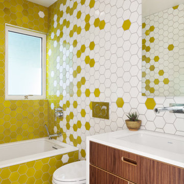
Downstairs, the two existing bathrooms were reconfigured and recreated as dedicated master and kids baths. The kids bath uses yellow and white hexagonal Heath tile to create a pixelated celebration of color. The master bath, hidden behind a flush wall of walnut cabinetry, utilizes another Heath tile color to create a calming retreat.
Throughout the home, walnut thin-ply cabinetry creates a strong contrast to the existing maple flooring, while the exposed blond edges of the material tie the two together. Rounded edges on integral pulls and door edges create pinstripe detailing that adds richness and a sense of playfulness to the design.
This project was featured by Houzz: https://tinyurl.com/stn2hcze
 Guy Ayers, Architect
Reverse Shed Eichler
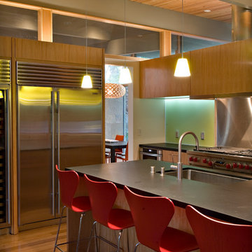
This project is part tear-down, part remodel. The original L-shaped plan allowed the living/ dining/ kitchen wing to be completely re-built while retaining the shell of the bedroom wing virtually intact. The rebuilt entertainment wing was enlarged 50% and covered with a low-slope reverse-shed roof sloping from eleven to thirteen feet. The shed roof floats on a continuous glass clerestory with eight foot transom. Cantilevered steel frames support wood roof beams with eaves of up to ten feet. An interior glass clerestory separates the kitchen and livingroom for sound control. A wall-to-wall skylight illuminates the north wall of the kitchen/family room. New additions at the back of the house add several “sliding” wall planes, where interior walls continue past full-height windows to the exterior, complimenting the typical Eichler indoor-outdoor ceiling and floor planes. The existing bedroom wing has been re-configured on the interior, changing three small bedrooms into two larger ones, and adding a guest suite in part of the original garage. A previous den addition provided the perfect spot for a large master ensuite bath and walk-in closet. Natural materials predominate, with fir ceilings, limestone veneer fireplace walls, anigre veneer cabinets, fir sliding windows and interior doors, bamboo floors, and concrete patios and walks. Landscape design by Bernard Trainor: www.bernardtrainor.com (see “Concrete Jungle” in April 2014 edition of Dwell magazine). Microsoft Media Center installation of the Year, 2008: www.cybermanor.com/ultimate_install.html (automated shades, radiant heating system, and lights, as well as security & sound).

Sponsored
Columbus, OH
Free consultation for landscape design!

Peabody Landscape Group
Columbus' Reliable Landscape Design & Contracting
 Guy Ayers, Architect
Reverse Shed Eichler
This project is part tear-down, part remodel. The original L-shaped plan allowed the living/ dining/ kitchen wing to be completely re-built while retaining the shell of the bedroom wing virtually intact. The rebuilt entertainment wing was enlarged 50% and covered with a low-slope reverse-shed roof sloping from eleven to thirteen feet. The shed roof floats on a continuous glass clerestory with eight foot transom. Cantilevered steel frames support wood roof beams with eaves of up to ten feet. An interior glass clerestory separates the kitchen and livingroom for sound control. A wall-to-wall skylight illuminates the north wall of the kitchen/family room. New additions at the back of the house add several “sliding” wall planes, where interior walls continue past full-height windows to the exterior, complimenting the typical Eichler indoor-outdoor ceiling and floor planes. The existing bedroom wing has been re-configured on the interior, changing three small bedrooms into two larger ones, and adding a guest suite in part of the original garage. A previous den addition provided the perfect spot for a large master ensuite bath and walk-in closet. Natural materials predominate, with fir ceilings, limestone veneer fireplace walls, anigre veneer cabinets, fir sliding windows and interior doors, bamboo floors, and concrete patios and walks. Landscape design by Bernard Trainor: www.bernardtrainor.com (see “Concrete Jungle” in April 2014 edition of Dwell magazine). Microsoft Media Center installation of the Year, 2008: www.cybermanor.com/ultimate_install.html (automated shades, radiant heating system, and lights, as well as security & sound).
 Haven Design and Construction
Matthew Niemann Photography
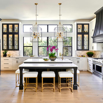
Example of a transitional u-shaped light wood floor and beige floor kitchen design in Austin with a farmhouse sink, raised-panel cabinets, gray backsplash, paneled appliances, an island, white countertops, quartz countertops, white cabinets and stone tile backsplash
Example of a transitional u-shaped light wood floor and beige floor kitchen design in Austin with a farmhouse sink, raised-panel cabinets, gray backsplash, paneled appliances, an island, white countertops, quartz countertops, white cabinets and stone tile backsplash
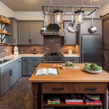
 Geschke Group Architecture
Tre Dunham
Inspiration for a large country l-shaped brick floor enclosed kitchen remodel in Austin with an undermount sink, shaker cabinets, gray cabinets, stainless steel appliances, an island and brick backsplash
Inspiration for a large country l-shaped brick floor enclosed kitchen remodel in Austin with an undermount sink, shaker cabinets, gray cabinets, stainless steel appliances, an island and brick backsplash
5