
Search results for "Back up media" in Home Design Ideas
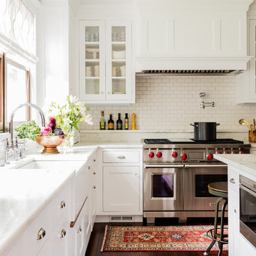
 Kathy Marshall Design
Major renovation to a beautiful old Victorian outside of Boston. We opened up the kitchen to expose the original pantry, restored the old wood cabinets and painted the interiors a beautiful shade of navy blue. Exposed brick and added on a much needed mudroom and new entry to the kitchen, we were able to expose the back stair case and added batten and board on the walls. Beautiful.
 Mary Cook
Taylor Photo
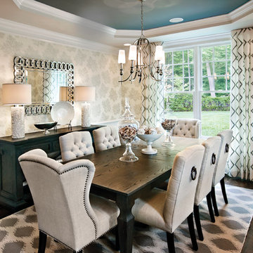
Inspiration for a transitional dark wood floor and brown floor dining room remodel in Chicago with beige walls
Inspiration for a transitional dark wood floor and brown floor dining room remodel in Chicago with beige walls
 Pool Environments, Inc.
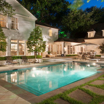
Originally designed by one of the most notable landscape architects in town, this once impressive project had faltered in recent years. The pool and spa still functioned well, and the client wanted to keep it intact. In addition, they wanted to keep as much of the existing landscaping as possible. The surrounding decks, walls, and steps were fair game. At first glance, one might think that our changes were simple material changes. Upon closer inspection, however, one can see the subtle, yet transformative changes that come together to update this classic pool in a tasteful, timeless manner, and improve the flow and usability of the deck areas, while softening the feel of the massive hardscape.
The subtle changes begin as soon as you walk out the back door of the house. The existing decking had a lot of what we call “tweeners”; areas that are overly generous walkways, yet not large enough to house furniture. The awkwardly small bluestone patio was expanded to accommodate a generous seating area, by pushing the step-down closer to the pool. Our talented stone mason carefully married the new bluestone into the existing, resulting in an imperceptible difference between the two. As you descend the new bluestone steps to the pool level, your bare feet will be thankful for the new smooth-finished limestone colored concrete, with a hand cut pattern carefully etched into its surface. The old red brick decking was so hot that the owners could not walk around the pool in bare feet. The brick coping was also replaced with an eased edge Pennsylvania Premier Stone which matches the new step treads throughout the project. Between the house and the pool, a large raised planter was reconfigured, giving additional space to the pool deck for a shaded lounge chair area.
Across the pool, a bank of rather tall painted brick retaining walls were cut down, shortened, and moved. This lessened the visual impact of the walls, which were rather overwhelming in the space, as well as opening up a new seating area, nestled under the arms of the massive pecan at the back of the property. Rather than continuing solid decking around the entire pool, the area near these walls has been transformed to large stone stepper pads set in a sea of beautiful St. Augustine lawn. This creates a visually softened area that is still suited to setting tables and chairs when the guest list calls for additional seating.
The spa area is quite possibly the most dramatic change on this project. Yet more raised planter walls divided this area into awkward spaces, unsuited to proper furniture placement. The planters were removed, new stone decks, once again expertly married into the existing, opening the area to house a large dining table and new built in bbq area. The spa itself was re-imagined with the bluestone coping, and painted brick veneer. The most impressive addition though is the new handmade glazed tiles that surround the existing cast stone water feature. This water feature was almost unnoticeable against the painted brick wall, but now the dramatic arch and pop of color draw the eye to this quaint little corner of the property.
Find the right local pro for your project
 Guy Ayers, Architect
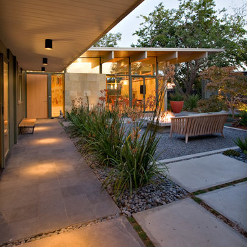
Reverse Shed Eichler
This project is part tear-down, part remodel. The original L-shaped plan allowed the living/ dining/ kitchen wing to be completely re-built while retaining the shell of the bedroom wing virtually intact. The rebuilt entertainment wing was enlarged 50% and covered with a low-slope reverse-shed roof sloping from eleven to thirteen feet. The shed roof floats on a continuous glass clerestory with eight foot transom. Cantilevered steel frames support wood roof beams with eaves of up to ten feet. An interior glass clerestory separates the kitchen and livingroom for sound control. A wall-to-wall skylight illuminates the north wall of the kitchen/family room. New additions at the back of the house add several “sliding” wall planes, where interior walls continue past full-height windows to the exterior, complimenting the typical Eichler indoor-outdoor ceiling and floor planes. The existing bedroom wing has been re-configured on the interior, changing three small bedrooms into two larger ones, and adding a guest suite in part of the original garage. A previous den addition provided the perfect spot for a large master ensuite bath and walk-in closet. Natural materials predominate, with fir ceilings, limestone veneer fireplace walls, anigre veneer cabinets, fir sliding windows and interior doors, bamboo floors, and concrete patios and walks. Landscape design by Bernard Trainor: www.bernardtrainor.com (see “Concrete Jungle” in April 2014 edition of Dwell magazine). Microsoft Media Center installation of the Year, 2008: www.cybermanor.com/ultimate_install.html (automated shades, radiant heating system, and lights, as well as security & sound).
 Haven Design and Construction
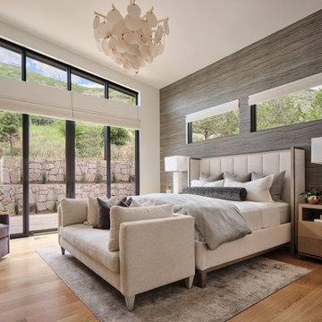
The primary bedroom suite in this mountain modern home is the picture of comfort and luxury. The striking wallpaper was selected to represent the textures of a rocky mountain's layers when it is split into. The earthy colors in the wallpaper--blue grays, rusts, tans and creams--make up the restful color scheme of the room. Textural bedding and upholstery fabrics add warmth and interest. The upholstered channel-back bed is flanked with woven sisal nightstands and substantial alabaster bedside lamps. On the opposite side of the room, a velvet swivel chair and oversized artwork add additional color and warmth. The home's striking windows feature remote control privacy shades to block out light for sleeping. The stone disk chandelier repeats the alabaster element in the room and adds a finishing touch of elegance to this inviting suite.
 Haven Design and Construction
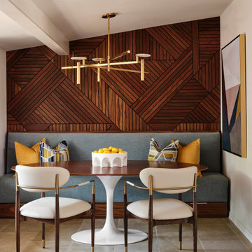
One functional challenge was that the home did not have a pantry. MCM closets were historically smaller than the walk-in closets and pantries of today. So, we printed out the home’s floorplan and began sketching ideas. The breakfast area was quite large, and it backed up to the primary bath on one side and it also adjoined the main hallway. We decided to reconfigure the large breakfast area by making part of it into a new walk-in pantry. This gave us the extra space we needed to create a new main hallway, enough space for a spacious walk-in pantry, and finally, we had enough space remaining in the breakfast area to add a cozy built-in walnut dining bench. Above the new dining bench, we designed and incorporated a geometric walnut accent wall to add warmth and texture.
 Tiffany Brooks, HGTV Host & Interior Designer
Inquire About Our Design Services
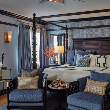
When we first started talking in the spring of 2015, I was impressed. She was witty, realistic, and understood that as much as she loves my shows on HGTV, design does not does not happen in 43 minutes! She told me about her space, and how she felt that her bedroom seemed “blah” to her. She had no retreat. Molly desperately longed for a place that she could spend time in, read in, play in and above all, relax in.
What we did:
Many people are terrified of hiring a designer. Rightfully so, they are investing a pretty penny in their homes. They want to make sure that everything, down to the last floral arrangement, is to their liking, because they will have to live it (and pay for it). Unfortunately, a client can unintentionally stifle a designer’s creativity through micro-management. This can produce lackluster results and ultimately cause more time (and money) to be spent on a project than is really necessary.
With Molly, that was never an issue. Before she even showed me the room in question, she said that I could have full creative license to do what I needed to do to her bedroom. SAY WHAAH!?
With Molly giving me complete creative freedom, I planned everything out and got down to business. The result: Bite-your-bottom-lip sexy. I don’t get jealous of too many of my clients’ spaces, but this one still takes my breath away every time I look at the pics!
The craziest part was that by adding more furniture, it actually made the space feel larger.
Molly and her husband Patrick loved the finished space, and promised me I will be back to finish the rest of the house!
Here’s the highlights of the rest of the project:
I came up with a space plan with three options.
Next, we reviewed mood boards and fabric schemes that would work for both Molly and her hubby Patrick.
We started with the bed. My goal was to add edge to its otherwise traditional style.
We decided to spice things up by painting the trim work in the room black.
We built in layers of lighting with dimmers. In a bedroom everything should be on dimmers, right? Right.
We designed and customized bedding, chairs and window treatments.
Together with Molly, we selected the most perfect wallpaper. This geometric “grasscloth” adds so much depth and dimension that was just missing before.
What I love:
That light fixture. I mean it is really, really amazing in person.
The porcupine mirror. This thing came packaged like it was the hope diamond, and everyone was terrified to handle it. But it really became a highlight of the room.

Sponsored
Columbus, OH

Wannemacher Interiors
Customized Award-Winning Interior Design Solutions in Franklin Cnty OH

 TKS Design Group
Download our free ebook, Creating the Ideal Kitchen. DOWNLOAD NOW
This client was referred to us from a past client. They are a busy 2-career household with young children and enjoy entertaining friends and family in their home. They have a beautiful open concept home but unfortunately the kitchen was not fitting for the rest of the home. They were not quite sure what to do with the space. We talked about trying to refresh it or do more of a minor remodel, but in the end they decided a full gut would get them to where they wanted to be.
One problem was there was no place for guests to hang out other than the large and awkward banquette area. The brick wall and tiled hood area were feeling a bit dated and tired. The space was just not functional for their lifestyle. There was no prep space near the cooktop and no landing area for items coming out of the ovens or refrigerator, plus a big dead zone in the center of the room.
Banquettes, like the one they previously had in the space, are great for small spaces, but when they get really large like this one, it makes getting in and out of the seating area awkward and uncomfortable. Plus, there was room for a large table, so we eliminated the awkward built in.
We started by removing the faux brick wall between the kitchen and back entry. We relocated the entry to the garage over a couple feet in order to get every last inch out of the new kitchen. We also made the decision to close up the primary window that faced the pretty ho hum brick wall of the neighbor’s house. There was plenty of light coming in from the seating area, so we just didn’t feel the window was adding much to the room.
Construction went smoothy. There was a bit of rework with electrical, flooring and HVAC, but in the end, we think it was well worth it.
The clients really wanted a sleek contemporary look, and we originally had planned for a full height slab backsplash, but due to it’s size, it was a budget buster. Instead, we got creative and settled on large format porcelain tiles that have a similar feel but were a fraction of the cost. We made sure the wall was plumb and level so that the fit and finish would mimic that of slab material.
The final space was quite a change. A large prep sink sits directly across from the new pro-style range with plenty additional prep space on the large island. The refrigerator and ovens now have miles of landing space, and a nice tight work triangle makes cooking a breeze.
Since we wanted a more contemporary feel, not many wall cabinets were included. Instead, we outfitted some of the drawers for dish storage with a peg system. Two large pantries flanking the refrigerator hold baking supplies and small appliances. Large drawers by the cooktop hold pots and pans, and an appliance garage tucked away to the left of the range hides away miscellaneous items. The large island also houses a microwave drawer and tons of storage, most of which is drawers offering maximum convenience.
The island now seats 5-6 people comfortably along with the new table in the seating area which can seat up to 8. Entertaining will be a breeze in this space. With such a clean backdrop, we knew we would need some drama with the lighting, so we chose two sets of staggered pendants, which we adjusted for the right visual balance above the island.
We also included a small coffee station to the right of the main kitchen, which helps keep the coffee clutter out of the kitchen proper. Two tones of complimentary gray are featured in this kitchen. The perimeter is a light gray that reads almost white. The island is a gray stain that adds some depth and interest with the visible wood texture. The countertops are clean white quartz, and the hardware, barstools and light fixtures add warm brass tones. I see lots of cooking and entertaining with family and friends in the near future in this bright and airy new space.
Designed by: Susan Klimala, CKD, CBD
Photography by: Michael Kaskel
For more information on kitchen and bath design ideas go to: www.kitchenstudio-ge.com
 emma delon
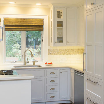
Maximizing the functionality of this space, and coordinating the new kitchen with the beautiful remodel completed previously by the client were the two most important aspects of this project. The existing spaces are elegantly decorated with an open plan, dark hardwood floors, and natural stone accents. The new, lighter, more open kitchen flows beautifully into the client’s existing dining room space. Satin nickel hardware blends with the stainless steel appliances and matches the satin nickel details throughout the home. The fully integrated refrigerator next to the narrow pull-out pantry cabinet, take up less visual weight than a traditional stainless steel appliance and the two combine to provide fantastic storage. The glass cabinet doors and decorative lighting beautifully highlight the client’s glassware and dishes. Finished with white subway tile, Dreamy Marfil quartz countertops, and a warm natural wood blind; the space warm, inviting, elegant, and extremely functional.
copyright 2013 marilyn peryer photography
 ODS Architecture
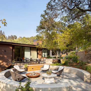
In a wooded area of Lafayette, a mid-century home was re-imagined for a graphic designer and kindergarten teacher couple and their three children. A major new design feature is a high ceiling great room that wraps from the front to the back yard, turning a corner at the kitchen and ending at the family room fireplace. This room was designed with a high flat roof to work in conjunction with existing roof forms to create a unified whole, and raise interior ceiling heights from eight to over ten feet. All new lighting and large floor to ceiling Fleetwood aluminum windows expand views of the trees beyond.
The existing home was enlarged by 700 square feet with a small exterior addition enlarging the kitchen over an existing deck, and a larger amount by excavating out crawlspace at the garage level to create a new home office with full bath, and separate laundry utility room. The remodeled residence became 3,847 square feet in total area including the garage.
Exterior curb appeal was improved with all new Fleetwood windows, stained wood siding and stucco. New steel railing and concrete steps lead up to the front entry. Front and rear yard new landscape design by Huettl Landscape Architecture dramatically alters the site. New planting was added at the front yard with landscape lighting and modern concrete pavers and the rear yard has multiple decks for family gatherings with the focal point a concrete conversation circle with central fire feature.
Everything revolves around the corner kitchen, large windows to the backyard, quartz countertops and cabinetry in painted and walnut finishes. The homeowners enjoyed the process of selecting Heath Tile for the kitchen backsplash and white oval tiles at the family room fireplace. Black brick tiles by Fireclay were used on the living room hearth. The kitchen flows into the family room all with views to the beautifully landscaped yards.
The primary suite has a built-in window seat with large windows overlooking the garden, walnut cabinetry in a skylit walk-in closet, and a large dramatic skylight bouncing light into the shower. The kid’s bath also has a skylight slot with light angling downward over double sinks. More colorful tile shows up in these spaces, as does a geometric patterned tile in the downstairs office bath shower.
The large yard is taken full advantage of with concrete paved walkways, stairs and firepit circle. New retaining walls in the rear yard helped to add more level usable outdoor space, with wood slats to visually blend them into the overall design.
The end result is a beautiful transformation of a mid-century home, that both captures the client’s personalities and elevates the house into the modern age.
 Change Your Bathroom©
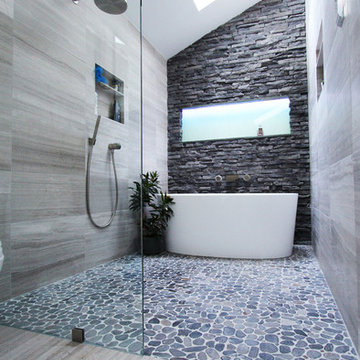
The goal of this project was to upgrade the builder grade finishes and create an ergonomic space that had a contemporary feel. This bathroom transformed from a standard, builder grade bathroom to a contemporary urban oasis. This was one of my favorite projects, I know I say that about most of my projects but this one really took an amazing transformation. By removing the walls surrounding the shower and relocating the toilet it visually opened up the space. Creating a deeper shower allowed for the tub to be incorporated into the wet area. Adding a LED panel in the back of the shower gave the illusion of a depth and created a unique storage ledge. A custom vanity keeps a clean front with different storage options and linear limestone draws the eye towards the stacked stone accent wall.
Houzz Write Up: https://www.houzz.com/magazine/inside-houzz-a-chopped-up-bathroom-goes-streamlined-and-swank-stsetivw-vs~27263720
The layout of this bathroom was opened up to get rid of the hallway effect, being only 7 foot wide, this bathroom needed all the width it could muster. Using light flooring in the form of natural lime stone 12x24 tiles with a linear pattern, it really draws the eye down the length of the room which is what we needed. Then, breaking up the space a little with the stone pebble flooring in the shower, this client enjoyed his time living in Japan and wanted to incorporate some of the elements that he appreciated while living there. The dark stacked stone feature wall behind the tub is the perfect backdrop for the LED panel, giving the illusion of a window and also creates a cool storage shelf for the tub. A narrow, but tasteful, oval freestanding tub fit effortlessly in the back of the shower. With a sloped floor, ensuring no standing water either in the shower floor or behind the tub, every thought went into engineering this Atlanta bathroom to last the test of time. With now adequate space in the shower, there was space for adjacent shower heads controlled by Kohler digital valves. A hand wand was added for use and convenience of cleaning as well. On the vanity are semi-vessel sinks which give the appearance of vessel sinks, but with the added benefit of a deeper, rounded basin to avoid splashing. Wall mounted faucets add sophistication as well as less cleaning maintenance over time. The custom vanity is streamlined with drawers, doors and a pull out for a can or hamper.
A wonderful project and equally wonderful client. I really enjoyed working with this client and the creative direction of this project.
Brushed nickel shower head with digital shower valve, freestanding bathtub, curbless shower with hidden shower drain, flat pebble shower floor, shelf over tub with LED lighting, gray vanity with drawer fronts, white square ceramic sinks, wall mount faucets and lighting under vanity. Hidden Drain shower system. Atlanta Bathroom.
 Rachel Reider Interiors
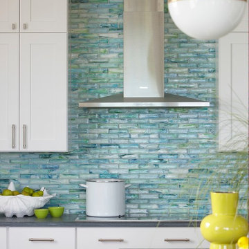
Backsplash - Lunada Bay Tile - Sumi-e 1 x 4 Mini Brick / Color - Izu Natural
Michael Partenio
Eat-in kitchen - coastal eat-in kitchen idea in Boston with shaker cabinets, white cabinets, glass tile backsplash, granite countertops, blue backsplash, stainless steel appliances and an island
Eat-in kitchen - coastal eat-in kitchen idea in Boston with shaker cabinets, white cabinets, glass tile backsplash, granite countertops, blue backsplash, stainless steel appliances and an island
 TKS Design Group
Free ebook, Creating the Ideal Kitchen. DOWNLOAD NOW
The Klimala’s and their three kids are no strangers to moving, this being their fifth house in the same town over the 20-year period they have lived there. “It must be the 7-year itch, because every seven years, we seem to find ourselves antsy for a new project or a new environment. I think part of it is being a designer, I see my own taste evolve and I want my environment to reflect that. Having easy access to wonderful tradesmen and a knowledge of the process makes it that much easier”.
This time, Klimala’s fell in love with a somewhat unlikely candidate. The 1950’s ranch turned cape cod was a bit of a mutt, but it’s location 5 minutes from their design studio and backing up to the high school where their kids can roll out of bed and walk to school, coupled with the charm of its location on a private road and lush landscaping made it an appealing choice for them.
“The bones of the house were really charming. It was typical 1,500 square foot ranch that at some point someone added a second floor to. Its sloped roofline and dormered bedrooms gave it some charm.” With the help of architect Maureen McHugh, Klimala’s gutted and reworked the layout to make the house work for them. An open concept kitchen and dining room allows for more frequent casual family dinners and dinner parties that linger. A dingy 3-season room off the back of the original house was insulated, given a vaulted ceiling with skylights and now opens up to the kitchen. This room now houses an 8’ raw edge white oak dining table and functions as an informal dining room. “One of the challenges with these mid-century homes is the 8’ ceilings. I had to have at least one room that had a higher ceiling so that’s how we did it” states Klimala.
The kitchen features a 10’ island which houses a 5’0” Galley Sink. The Galley features two faucets, and double tiered rail system to which accessories such as cutting boards and stainless steel bowls can be added for ease of cooking. Across from the large sink is an induction cooktop. “My two teen daughters and I enjoy cooking, and the Galley and induction cooktop make it so easy.” A wall of tall cabinets features a full size refrigerator, freezer, double oven and built in coffeemaker. The area on the opposite end of the kitchen features a pantry with mirrored glass doors and a beverage center below.
The rest of the first floor features an entry way, a living room with views to the front yard’s lush landscaping, a family room where the family hangs out to watch TV, a back entry from the garage with a laundry room and mudroom area, one of the home’s four bedrooms and a full bath. There is a double sided fireplace between the family room and living room. The home features pops of color from the living room’s peach grass cloth to purple painted wall in the family room. “I’m definitely a traditionalist at heart but because of the home’s Midcentury roots, I wanted to incorporate some of those elements into the furniture, lighting and accessories which also ended up being really fun. We are not formal people so I wanted a house that my kids would enjoy, have their friends over and feel comfortable.”
The second floor houses the master bedroom suite, two of the kids’ bedrooms and a back room nicknamed “the library” because it has turned into a quiet get away area where the girls can study or take a break from the rest of the family. The area was originally unfinished attic, and because the home was short on closet space, this Jack and Jill area off the girls’ bedrooms houses two large walk-in closets and a small sitting area with a makeup vanity. “The girls really wanted to keep the exposed brick of the fireplace that runs up the through the space, so that’s what we did, and I think they feel like they are in their own little loft space in the city when they are up there” says Klimala.
Designed by: Susan Klimala, CKD, CBD
Photography by: Carlos Vergara
For more information on kitchen and bath design ideas go to: www.kitchenstudio-ge.com
Sponsored
Delaware, OH

Buckeye Basements, Inc.
Central Ohio's Basement Finishing ExpertsBest Of Houzz '13-'21
 Klopf Architecture
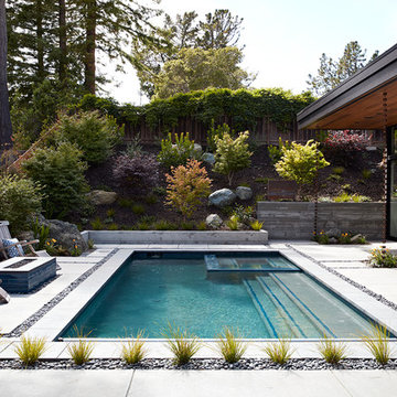
Klopf Architecture, Arterra Landscape Architects and Henry Calvert of Calvert Ventures Designed and built a new warm, modern, Eichler-inspired, open, indoor-outdoor home on a deeper-than-usual San Mateo Highlands property where an original Eichler house had burned to the ground.
The owners wanted multi-generational living and larger spaces than the original home offered, but all parties agreed that the house should respect the neighborhood and blend in stylistically with the other Eichlers. At first the Klopf team considered re-using what little was left of the original home and expanding on it. But after discussions with the owner and builder, all parties agreed that the last few remaining elements of the house were not practical to re-use, so Klopf Architecture designed a new home that pushes the Eichler approach in new directions.
One disadvantage of Eichler production homes is that the house designs were not optimized for each specific lot. A new custom home offered the team a chance to start over. In this case, a longer house that opens up sideways to the south fit the lot better than the original square-ish house that used to open to the rear (west). Accordingly, the Klopf team designed an L-shaped “bar” house with a large glass wall with large sliding glass doors that faces sideways instead of to the rear like a typical Eichler. This glass wall opens to a pool and landscaped yard designed by Arterra Landscape Architects.
Driving by the house, one might assume at first glance it is an Eichler because of the horizontality, the overhanging flat roof eaves, the dark gray vertical siding, and orange solid panel front door, but the house is designed for the 21st Century and is not meant to be a “Likeler.” You won't see any posts and beams in this home. Instead, the ceiling decking is a western red cedar that covers over all the beams. Like Eichlers, this cedar runs continuously from inside to out, enhancing the indoor / outdoor feeling of the house, but unlike Eichlers it conceals a cavity for lighting, wiring, and insulation. Ceilings are higher, rooms are larger and more open, the master bathroom is light-filled and more generous, with a separate tub and shower and a separate toilet compartment, and there is plenty of storage. The garage even easily fits two of today's vehicles with room to spare.
A massive 49-foot by 12-foot wall of glass and the continuity of materials from inside to outside enhance the inside-outside living concept, so the owners and their guests can flow freely from house to pool deck to BBQ to pool and back.
During construction in the rough framing stage, Klopf thought the front of the house appeared too tall even though the house had looked right in the design renderings (probably because the house is uphill from the street). So Klopf Architecture paid the framer to change the roofline from how we had designed it to be lower along the front, allowing the home to blend in better with the neighborhood. One project goal was for people driving up the street to pass the home without immediately noticing there is an "imposter" on this lot, and making that change was essential to achieve that goal.
This 2,606 square foot, 3 bedroom, 3 bathroom Eichler-inspired new house is located in San Mateo in the heart of the Silicon Valley.
Klopf Architecture Project Team: John Klopf, AIA, Klara Kevane
Landscape Architect: Arterra Landscape Architects
Contractor: Henry Calvert of Calvert Ventures
Photography ©2016 Mariko Reed
Location: San Mateo, CA
Year completed: 2016
 Change Your Bathroom©
The goal of this project was to upgrade the builder grade finishes and create an ergonomic space that had a contemporary feel. This bathroom transformed from a standard, builder grade bathroom to a contemporary urban oasis. This was one of my favorite projects, I know I say that about most of my projects but this one really took an amazing transformation. By removing the walls surrounding the shower and relocating the toilet it visually opened up the space. Creating a deeper shower allowed for the tub to be incorporated into the wet area. Adding a LED panel in the back of the shower gave the illusion of a depth and created a unique storage ledge. A custom vanity keeps a clean front with different storage options and linear limestone draws the eye towards the stacked stone accent wall.
Houzz Write Up: https://www.houzz.com/magazine/inside-houzz-a-chopped-up-bathroom-goes-streamlined-and-swank-stsetivw-vs~27263720
The layout of this bathroom was opened up to get rid of the hallway effect, being only 7 foot wide, this bathroom needed all the width it could muster. Using light flooring in the form of natural lime stone 12x24 tiles with a linear pattern, it really draws the eye down the length of the room which is what we needed. Then, breaking up the space a little with the stone pebble flooring in the shower, this client enjoyed his time living in Japan and wanted to incorporate some of the elements that he appreciated while living there. The dark stacked stone feature wall behind the tub is the perfect backdrop for the LED panel, giving the illusion of a window and also creates a cool storage shelf for the tub. A narrow, but tasteful, oval freestanding tub fit effortlessly in the back of the shower. With a sloped floor, ensuring no standing water either in the shower floor or behind the tub, every thought went into engineering this Atlanta bathroom to last the test of time. With now adequate space in the shower, there was space for adjacent shower heads controlled by Kohler digital valves. A hand wand was added for use and convenience of cleaning as well. On the vanity are semi-vessel sinks which give the appearance of vessel sinks, but with the added benefit of a deeper, rounded basin to avoid splashing. Wall mounted faucets add sophistication as well as less cleaning maintenance over time. The custom vanity is streamlined with drawers, doors and a pull out for a can or hamper.
A wonderful project and equally wonderful client. I really enjoyed working with this client and the creative direction of this project.
Brushed nickel shower head with digital shower valve, freestanding bathtub, curbless shower with hidden shower drain, flat pebble shower floor, shelf over tub with LED lighting, gray vanity with drawer fronts, white square ceramic sinks, wall mount faucets and lighting under vanity. Hidden Drain shower system. Atlanta Bathroom.
 Nar Design Group
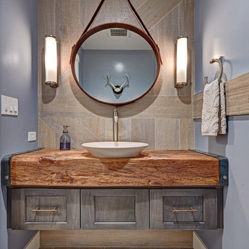
Our carpenters labored every detail from chainsaws to the finest of chisels and brad nails to achieve this eclectic industrial design. This project was not about just putting two things together, it was about coming up with the best solutions to accomplish the overall vision. A true meeting of the minds was required around every turn to achieve "rough" in its most luxurious state.
Featuring: Floating vanity, rough cut wood top, beautiful accent mirror and Porcelanosa wood grain tile as flooring and backsplashes.
PhotographerLink
 Board & Vellum
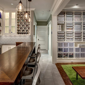
A custom built room for LEGO storage also provides a backdrop for a Media Room and a nearby bar. John Wilbanks Photography
Basement - transitional underground basement idea in Seattle with gray walls and a bar
Basement - transitional underground basement idea in Seattle with gray walls and a bar
Sponsored
Sunbury, OH

J.Holderby - Renovations
Franklin County's Leading General Contractors - 2X Best of Houzz!
 KS Designs LLC
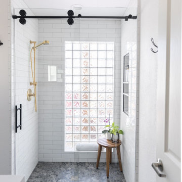
This guest bath has a light and airy feel with an organic element and pop of color. The custom vanity is in a midtown jade aqua-green PPG paint Holy Glen. It provides ample storage while giving contrast to the white and brass elements. A playful use of mixed metal finishes gives the bathroom an up-dated look. The 3 light sconce is gold and black with glass globes that tie the gold cross handle plumbing fixtures and matte black hardware and bathroom accessories together. The quartz countertop has gold veining that adds additional warmth to the space. The acacia wood framed mirror with a natural interior edge gives the bathroom an organic warm feel that carries into the curb-less shower through the use of warn toned river rock. White subway tile in an offset pattern is used on all three walls in the shower and carried over to the vanity backsplash. The shower has a tall niche with quartz shelves providing lots of space for storing shower necessities. The river rock from the shower floor is carried to the back of the niche to add visual interest to the white subway shower wall as well as a black Schluter edge detail. The shower has a frameless glass rolling shower door with matte black hardware to give the this smaller bathroom an open feel and allow the natural light in. There is a gold handheld shower fixture with a cross handle detail that looks amazing against the white subway tile wall. The white Sherwin Williams Snowbound walls are the perfect backdrop to showcase the design elements of the bathroom.
Photography by LifeCreated.

 IS Architecture
The kitchen, breakfast room and family room are all open to one another. The kitchen has a large twelve foot island topped with Calacatta marble and features a roll-out kneading table, and room to seat the whole family. The sunlight breakfast room opens onto the patio which has a built-in barbeque, and both bar top seating and a built in bench for outdoor dining. The large family room features a cozy fireplace, TV media, and a large built-in bookcase. The adjoining craft room is separated by a set of pocket french doors; where the kids can be visible from the family room as they do their homework.
 Conklin Limestone
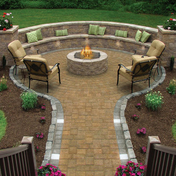
A perfect addition to your outdoor living is a seating wall surrounding a firepit. Cambridge Maytrx wall, Pyzique Fire Pit, Round table Pavers. Installed by Natural Green Landsacpe & Design in Lincoln, RI
3