
Search results for "Back up media" in Home Design Ideas
 H. Customs Audio Video
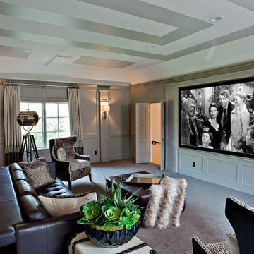
2013 Fort Worth Dream Home
Built by AG Builders, Featured in Fort Worth Magazine and Electronics design/installation performed by H. Customs Audio Video.
This media room features a 120" projection screen, 3 Episode Front Stage In-Wall Speakers, 4 - 8" In-Ceiling Surround Speakers, Episode Triple 10" Subwoofers, Onkyo Surround Sound Receiver, SnapAV Matrix Switcher, Bluray DVD, AppleTV, Custom Rack.
Design by H. Customs Audio Video and AG Builders
Entire home is Control4 automated.
For more information please contact H. Customs.
Photography by Fort Worth Magazine
 The Cousins
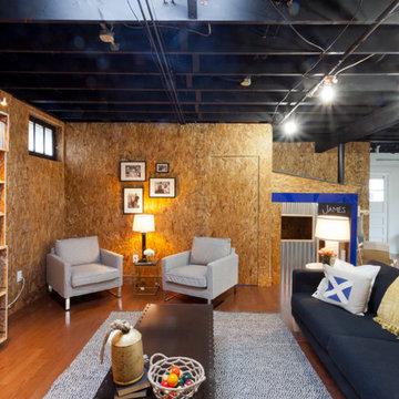
The new basement is the ultimate multi-functional space. A bar, foosball table, dartboard, and glass garage door with direct access to the back provide endless entertainment for guests; a cozy seating area with a whiteboard and pop-up television is perfect for Mike's work training sessions (or relaxing!); and a small playhouse and fun zone offer endless possibilities for the family's son, James.
 transFORM Home
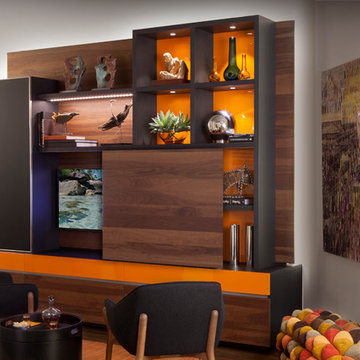
This custom living room unit and media center was designed to provide all that a Manhattan family needs for entertaining lots of guests or to just kick back, relax and watch some TV. The wall unit also shows off some of our favorite new material finishes with a combination of wood veneer, matte glass, and high gloss.
Color played a big role in the design of this entertainment center. It contrasts a radiant high gloss orange with a warm Smoked Walnut wood grain for a balanced and modern look. The orange high gloss adds an artistic accent to the unit, while keeping the design free from chaotic lines and color schemes. Our no-handle design is made possible by a brushed aluminum J-channel that provides a clean look and makes the drawers easy to access. Flat style doors and drawer fronts also contribute to the smooth and modern European look of the media center.
Our space saving entertainment system also delivers an abundant amount of floor to ceiling storage, both open and in drawers. There is ample room to store and display books, sculptures and home decor. Bottom cabinets are a suitable place to conceal and store media equipment. 1.5 inch thick floating shelves above the television and the box shelves alongside, featured in Midnight Ash, provide definition to the design and balance the high intensity orange elements. Top shelves provide space to arrange fragile keepsakes while bottom shelves can be used to display your favorite reads.
Opposite the open shelving is a matte black glass fronted cabinet to house your favorite drinks and glassware for quick entertaining. The black satin glass is defined by an aluminum door frame. Clear glass shelves are found within the glass door cabinet and provide a useful place for storing dry bar essentials like rocks glasses and your preferred liquor selection. The cabinet includes vertical profile LED strip lights on both side panels that illuminate when the door is opened. The lighting shines through the shelves and sparkles off the glassware, silver ice bucket and colorful drinks you might keep there.
The unit contains a sliding door that alternately hides a flat screen television and reveals a shelf. This feature paired with our wire management system helps keep your wall unit and your living area looking neat and tidy.
The hidden hardware adds a unique function to this design without drawing the eye. Short arm flap stays and drop-down flap hinges allow for the soft, almost automatic opening of the long panel faces that conceal the drawers behind. The drawers are easy to access and provide the storage of multiple drawers without cluttering the look of the media center.
This design is completed with integrated LED lighting. Behind the floating backing panel, adjustable LED lighting enhances the spacious look of the unit and provide mood lights for the living room. The shelves are equipped with recessed LED lights that make the orange high gloss color pop and showcase your displayed possessions. The floating shelves are equipped with horizontal profile LED strip lights to give the whole unit a warm glow. Our lighting systems offer features such as touch switches and dimmers, which add light, comfort and convenience to your living space.
Tell us what you want in your living room media center.
Find the right local pro for your project
 Designs by Cheryl
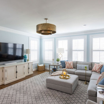
Transitional family room is tranquil and inviting The blue walls with luscious furnishings make it very cozy. The gold drum chandelier and gold accents makes this room very sophisticated. The decorative pillows adds pop of colors with the custom area rug. The patterns in the custom area rug and pillows, along with the blue walls makes it all balance. The off white rustic console adds flare and a perfect size for large Media wall T.V. The gold console lamps frames the Media center perfect. The gold floor lamps, and and gold chandelier brings a contemporary style into this space. The Large square ottoman in a neutral grey offsetting the carpet color makes it nice to prop up your feet. The gold drink tables in quite trendy and so functional and practical.
 Albertsson Hansen Architecture and Interior Design
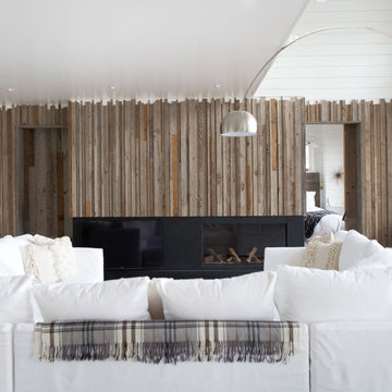
A cabin in Western Wisconsin is transformed from within to become a serene and modern retreat. In a past life, this cabin was a fishing cottage which was part of a resort built in the 1920’s on a small lake not far from the Twin Cities. The cabin has had multiple additions over the years so improving flow to the outdoor space, creating a family friendly kitchen, and relocating a bigger master bedroom on the lake side were priorities. The solution was to bring the kitchen from the back of the cabin up to the front, reduce the size of an overly large bedroom in the back in order to create a more generous front entry way/mudroom adjacent to the kitchen, and add a fireplace in the center of the main floor.
Photographer: Wing Ta
Interior Design: Jennaea Gearhart Design
 Alair Homes Plano
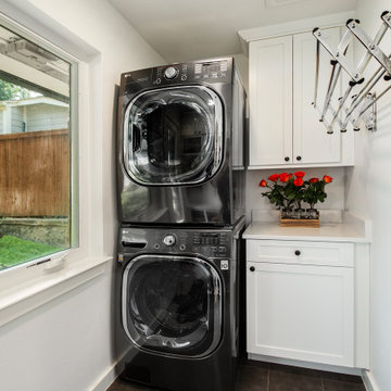
Our clients purchased this 1950 ranch style cottage knowing it needed to be updated. They fell in love with the location, being within walking distance to White Rock Lake. They wanted to redesign the layout of the house to improve the flow and function of the spaces while maintaining a cozy feel. They wanted to explore the idea of opening up the kitchen and possibly even relocating it. A laundry room and mudroom space needed to be added to that space, as well. Both bathrooms needed a complete update and they wanted to enlarge the master bath if possible, to have a double vanity and more efficient storage. With two small boys and one on the way, they ideally wanted to add a 3rd bedroom to the house within the existing footprint but were open to possibly designing an addition, if that wasn’t possible.
In the end, we gave them everything they wanted, without having to put an addition on to the home. They absolutely love the openness of their new kitchen and living spaces and we even added a small bar! They have their much-needed laundry room and mudroom off the back patio, so their “drop zone” is out of the way. We were able to add storage and double vanity to the master bathroom by enclosing what used to be a coat closet near the entryway and using that sq. ft. in the bathroom. The functionality of this house has completely changed and has definitely changed the lives of our clients for the better!
 Klopf Architecture
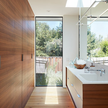
Klopf Architecture and Outer space Landscape Architects designed a new warm, modern, open, indoor-outdoor home in Los Altos, California. Inspired by mid-century modern homes but looking for something completely new and custom, the owners, a couple with two children, bought an older ranch style home with the intention of replacing it.
Created on a grid, the house is designed to be at rest with differentiated spaces for activities; living, playing, cooking, dining and a piano space. The low-sloping gable roof over the great room brings a grand feeling to the space. The clerestory windows at the high sloping roof make the grand space light and airy.
Upon entering the house, an open atrium entry in the middle of the house provides light and nature to the great room. The Heath tile wall at the back of the atrium blocks direct view of the rear yard from the entry door for privacy.
The bedrooms, bathrooms, play room and the sitting room are under flat wing-like roofs that balance on either side of the low sloping gable roof of the main space. Large sliding glass panels and pocketing glass doors foster openness to the front and back yards. In the front there is a fenced-in play space connected to the play room, creating an indoor-outdoor play space that could change in use over the years. The play room can also be closed off from the great room with a large pocketing door. In the rear, everything opens up to a deck overlooking a pool where the family can come together outdoors.
Wood siding travels from exterior to interior, accentuating the indoor-outdoor nature of the house. Where the exterior siding doesn’t come inside, a palette of white oak floors, white walls, walnut cabinetry, and dark window frames ties all the spaces together to create a uniform feeling and flow throughout the house. The custom cabinetry matches the minimal joinery of the rest of the house, a trim-less, minimal appearance. Wood siding was mitered in the corners, including where siding meets the interior drywall. Wall materials were held up off the floor with a minimal reveal. This tight detailing gives a sense of cleanliness to the house.
The garage door of the house is completely flush and of the same material as the garage wall, de-emphasizing the garage door and making the street presentation of the house kinder to the neighborhood.
The house is akin to a custom, modern-day Eichler home in many ways. Inspired by mid-century modern homes with today’s materials, approaches, standards, and technologies. The goals were to create an indoor-outdoor home that was energy-efficient, light and flexible for young children to grow. This 3,000 square foot, 3 bedroom, 2.5 bathroom new house is located in Los Altos in the heart of the Silicon Valley.
Klopf Architecture Project Team: John Klopf, AIA, and Chuang-Ming Liu
Landscape Architect: Outer space Landscape Architects
Structural Engineer: ZFA Structural Engineers
Staging: Da Lusso Design
Photography ©2018 Mariko Reed
Location: Los Altos, CA
Year completed: 2017

Sponsored
Columbus, OH
Free consultation for landscape design!

Peabody Landscape Group
Franklin County's Reliable Landscape Design & Contracting
 Decorating Den Interiors - Bromberek Design Team
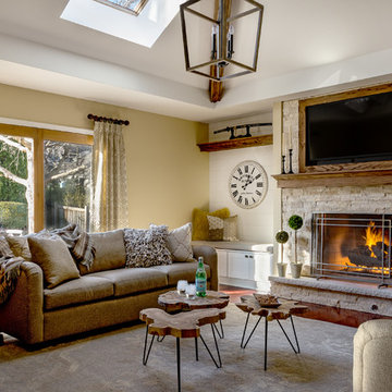
We replaced the brick with a Tuscan-colored stacked stone and added a wood mantel; the television was built-in to the stacked stone and framed out for a custom look. This created an updated design scheme for the room and a focal point. We also removed an entry wall on the east side of the home, and a wet bar near the back of the living area. This had an immediate impact on the brightness of the room and allowed for more natural light and a more open, airy feel, as well as increased square footage of the space. We followed up by updating the paint color to lighten the room, while also creating a natural flow into the remaining rooms of this first-floor, open floor plan.
After removing the brick underneath the shelving units, we added a bench storage unit and closed cabinetry for storage. The back walls were finalized with a white shiplap wall treatment to brighten the space and wood shelving for accessories. On the left side of the fireplace, we added a single floating wood shelf to highlight and display the sword.
The popcorn ceiling was scraped and replaced with a cleaner look, and the wood beams were stained to match the new mantle and floating shelves. The updated ceiling and beams created another dramatic focal point in the room, drawing the eye upward, and creating an open, spacious feel to the room. The room was finalized by removing the existing ceiling fan and replacing it with a rustic, two-toned, four-light chandelier in a distressed weathered oak finish on an iron metal frame.
Photo Credit: Nina Leone Photography
 Milgard Windows & Doors
The Kiguchi family moved into their Austin, Texas home in 1994. Built in the 1980’s as part of a neighborhood development, they happily raised their family here but longed for something more contemporary. Once they became empty nesters, they decided it was time for a major remodel. After spending many years visiting Austin AIA Home Tours that highlight contemporary residential architecture, they had a lot of ideas and in 2013 were ready to interview architects and get their renovation underway.
The project turned into a major remodel due to an unstable foundation. Architects Ben Arbib and Ed Hughey, of Arbib Hughey Design were hired to solve the structural issue and look for inspiration in the bones of the house, which sat on top of a hillside and was surrounded by great views.
Unfortunately, with the old floor plan, the beautiful views were hidden by small windows that were poorly placed. In order to bring more natural light into the house the window sizes and configurations had to be addressed, all while keeping in mind the homeowners desire for a modern look and feel.
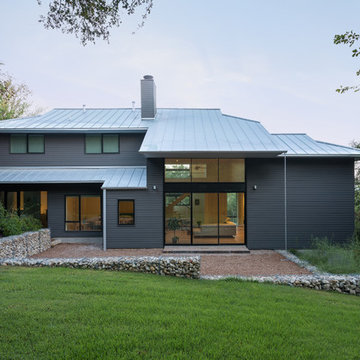
To achieve a more contemporary and sophisticated front of house, a new entry was designed that included removing a two-story bay window and porch. The entrance of the home also became more integrated with the landscape creating a template for new foliage to be planted. Older exterior materials were updated to incorporate a more muted palette of colors with a metal roof, dark grey siding in the back and white stucco in the front. Deep eaves were added over many of the new large windows for clean lines and sun protection.
“Inside it was about opening up the floor plan, expanding the views throughout the house, and updating the material palette to get a modern look that was also warm and inviting,” said Ben from Arbib Hughey Design. “Prior to the remodel, the house had the typical separation of rooms. We removed the walls between them and changed all of the windows to Milgard Thermally Improved Aluminum to connect the inside with the outside. No matter where you are you get nice views and natural light.”
The architects wanted to create some drama, which they accomplished with the window placement and opening up the interior floor plan to an open concept approach. Cabinetry was used to help delineate intimate spaces. To add warmth to an all-white living room, white-washed oak wood floors were installed and pine planks were used around the fireplace. The large windows served as artwork bringing the color of nature into the space.
An octagon shaped, elevated dining room, (named “the turret”), had a big impact on the design of the house. They architects rounded the corners and added larger window openings overlooking a new sunken garden. The great room was also softened by rounding out the corners and that circular theme continued throughout the house, being picked up in skylight wells and kitchen cabinetry. A staircase leading to a catwalk was added and the result was a two-story window wall that flooded the home with natural light.
When asked why Milgard® Thermally Improved Aluminum windows were selected, the architectural team listed many reasons:
1) Aesthetics: “We liked the slim profiles and narrow sightlines. The window frames never get in the way of the view and that was important to us. They also have a very contemporary look that went well with our design.”
2) Options: “We liked that we could get large sliding doors that matched the windows, giving us a very cohesive look and feel throughout the project.”
3) Cost Effective: “Milgard windows are affordable. You get a good product at a good price.”
4) Custom Sizes: “Milgard windows are customizable, which allowed us to get the right window for each location.”
Ready to take on your own traditional to modern home remodeling project? Arbib Hughey Design advises, “Work with a good architect. That means picking a team that is creative, communicative, listens well and is responsive. We think it’s important for an architect to listen to their clients and give them something they want, not something the architect thinks they should have. At the same time you want an architect who is willing and able to think outside the box and offer up design options that you may not have considered. Design is about a lot of back and forth, trying out ideas, getting feedback and trying again.”
The home was completely transformed into a unique, contemporary house perfectly integrated with its site. Internally the home has a natural flow for the occupants and externally it is integrated with the surroundings taking advantage of great natural light. As a side note, it was highly praised as part of the Austin AIA homes tour.
 Susan Yeley Homes
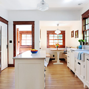
Like most of our projects, we can't gush about this reno—a new kitchen and mudroom, ensuite closet and pantry—without gushing about the people who live there. The best projects, we always say, are the ones in which client, contractor and design team are all present throughout, conception to completion, each bringing their particular expertise to the table and forming a cohesive, trustworthy team that is mutually invested in a smooth and successful process. They listen to each other, give the benefit of the doubt to each other, do what they say they'll do. This project exemplified that kind of team, and it shows in the results.
Most obvious is the opening up of the kitchen to the dining room, decompartmentalizing somewhat a century-old bungalow that was originally quite purposefully compartmentalized. As a result, the kitchen had to become a place one wanted to see clear through from the front door. Inset cabinets and carefully selected details make the functional heart of the house equal in elegance to the more "public" gathering spaces, with their craftsman depth and detail. An old back porch was converted to interior space, creating a mudroom and a much-needed ensuite walk-in closet. A new, larger deck went on: Phase One of an extensive design for outdoor living, that we all hope will be realized over the next few years. Finally, a duplicative back stairwell was repurposed into a walk-in pantry.
Modernizing often means opening spaces up for more casual living and entertaining, and/or making better use of dead space. In this re-conceptualized old house, we did all of that, creating a back-of-the-house that is now bright and cheerful and new, while carefully incorporating meaningful vintage and personal elements.
The best result of all: the clients are thrilled. And everyone who went in to the project came out of it friends.
Contractor: Stumpner Building Services
Cabinetry: Stoll’s Woodworking
Photographer: Gina Rogers
 J.P. Hoffman Design Build
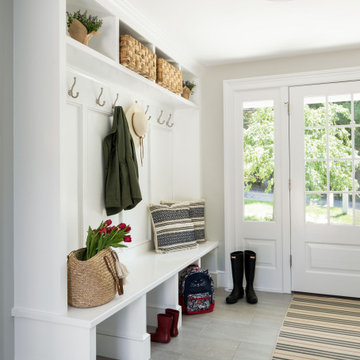
As seen in this photo, the front to back view offers homeowners and guests alike a direct view and access to the deck off the back of the house. In addition to holding access to the garage, this space holds two closets. One, the homeowners are using as a coat closest and the other, a pantry closet. You also see a custom built in unit with a bench and storage. There is also access to a powder room, a bathroom that was relocated from middle of the 1st floor layout. Relocating the bathroom allowed us to open up the floor plan, offering a view directly into and out of the playroom and dining room.
 Klopf Architecture
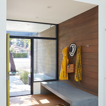
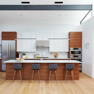
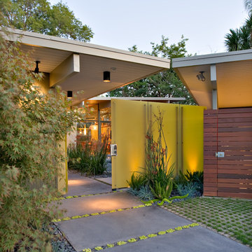
Klopf Architecture and Outer space Landscape Architects designed a new warm, modern, open, indoor-outdoor home in Los Altos, California. Inspired by mid-century modern homes but looking for something completely new and custom, the owners, a couple with two children, bought an older ranch style home with the intention of replacing it.
Created on a grid, the house is designed to be at rest with differentiated spaces for activities; living, playing, cooking, dining and a piano space. The low-sloping gable roof over the great room brings a grand feeling to the space. The clerestory windows at the high sloping roof make the grand space light and airy.
Upon entering the house, an open atrium entry in the middle of the house provides light and nature to the great room. The Heath tile wall at the back of the atrium blocks direct view of the rear yard from the entry door for privacy.
The bedrooms, bathrooms, play room and the sitting room are under flat wing-like roofs that balance on either side of the low sloping gable roof of the main space. Large sliding glass panels and pocketing glass doors foster openness to the front and back yards. In the front there is a fenced-in play space connected to the play room, creating an indoor-outdoor play space that could change in use over the years. The play room can also be closed off from the great room with a large pocketing door. In the rear, everything opens up to a deck overlooking a pool where the family can come together outdoors.
Wood siding travels from exterior to interior, accentuating the indoor-outdoor nature of the house. Where the exterior siding doesn’t come inside, a palette of white oak floors, white walls, walnut cabinetry, and dark window frames ties all the spaces together to create a uniform feeling and flow throughout the house. The custom cabinetry matches the minimal joinery of the rest of the house, a trim-less, minimal appearance. Wood siding was mitered in the corners, including where siding meets the interior drywall. Wall materials were held up off the floor with a minimal reveal. This tight detailing gives a sense of cleanliness to the house.
The garage door of the house is completely flush and of the same material as the garage wall, de-emphasizing the garage door and making the street presentation of the house kinder to the neighborhood.
The house is akin to a custom, modern-day Eichler home in many ways. Inspired by mid-century modern homes with today’s materials, approaches, standards, and technologies. The goals were to create an indoor-outdoor home that was energy-efficient, light and flexible for young children to grow. This 3,000 square foot, 3 bedroom, 2.5 bathroom new house is located in Los Altos in the heart of the Silicon Valley.
Klopf Architecture Project Team: John Klopf, AIA, and Chuang-Ming Liu
Landscape Architect: Outer space Landscape Architects
Structural Engineer: ZFA Structural Engineers
Staging: Da Lusso Design
Photography ©2018 Mariko Reed
Location: Los Altos, CA
Year completed: 2017
 Klopf Architecture
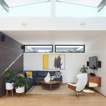
Klopf Architecture and Outer space Landscape Architects designed a new warm, modern, open, indoor-outdoor home in Los Altos, California. Inspired by mid-century modern homes but looking for something completely new and custom, the owners, a couple with two children, bought an older ranch style home with the intention of replacing it.
Created on a grid, the house is designed to be at rest with differentiated spaces for activities; living, playing, cooking, dining and a piano space. The low-sloping gable roof over the great room brings a grand feeling to the space. The clerestory windows at the high sloping roof make the grand space light and airy.
Upon entering the house, an open atrium entry in the middle of the house provides light and nature to the great room. The Heath tile wall at the back of the atrium blocks direct view of the rear yard from the entry door for privacy.
The bedrooms, bathrooms, play room and the sitting room are under flat wing-like roofs that balance on either side of the low sloping gable roof of the main space. Large sliding glass panels and pocketing glass doors foster openness to the front and back yards. In the front there is a fenced-in play space connected to the play room, creating an indoor-outdoor play space that could change in use over the years. The play room can also be closed off from the great room with a large pocketing door. In the rear, everything opens up to a deck overlooking a pool where the family can come together outdoors.
Wood siding travels from exterior to interior, accentuating the indoor-outdoor nature of the house. Where the exterior siding doesn’t come inside, a palette of white oak floors, white walls, walnut cabinetry, and dark window frames ties all the spaces together to create a uniform feeling and flow throughout the house. The custom cabinetry matches the minimal joinery of the rest of the house, a trim-less, minimal appearance. Wood siding was mitered in the corners, including where siding meets the interior drywall. Wall materials were held up off the floor with a minimal reveal. This tight detailing gives a sense of cleanliness to the house.
The garage door of the house is completely flush and of the same material as the garage wall, de-emphasizing the garage door and making the street presentation of the house kinder to the neighborhood.
The house is akin to a custom, modern-day Eichler home in many ways. Inspired by mid-century modern homes with today’s materials, approaches, standards, and technologies. The goals were to create an indoor-outdoor home that was energy-efficient, light and flexible for young children to grow. This 3,000 square foot, 3 bedroom, 2.5 bathroom new house is located in Los Altos in the heart of the Silicon Valley.
Klopf Architecture Project Team: John Klopf, AIA, and Chuang-Ming Liu
Landscape Architect: Outer space Landscape Architects
Structural Engineer: ZFA Structural Engineers
Staging: Da Lusso Design
Photography ©2018 Mariko Reed
Location: Los Altos, CA
Year completed: 2017

Sponsored
Delaware, OH

Buckeye Basements, Inc.
Central Ohio's Basement Finishing ExpertsBest Of Houzz '13-'21
 Klopf Architecture
Klopf Architecture and Outer space Landscape Architects designed a new warm, modern, open, indoor-outdoor home in Los Altos, California. Inspired by mid-century modern homes but looking for something completely new and custom, the owners, a couple with two children, bought an older ranch style home with the intention of replacing it.
Created on a grid, the house is designed to be at rest with differentiated spaces for activities; living, playing, cooking, dining and a piano space. The low-sloping gable roof over the great room brings a grand feeling to the space. The clerestory windows at the high sloping roof make the grand space light and airy.
Upon entering the house, an open atrium entry in the middle of the house provides light and nature to the great room. The Heath tile wall at the back of the atrium blocks direct view of the rear yard from the entry door for privacy.
The bedrooms, bathrooms, play room and the sitting room are under flat wing-like roofs that balance on either side of the low sloping gable roof of the main space. Large sliding glass panels and pocketing glass doors foster openness to the front and back yards. In the front there is a fenced-in play space connected to the play room, creating an indoor-outdoor play space that could change in use over the years. The play room can also be closed off from the great room with a large pocketing door. In the rear, everything opens up to a deck overlooking a pool where the family can come together outdoors.
Wood siding travels from exterior to interior, accentuating the indoor-outdoor nature of the house. Where the exterior siding doesn’t come inside, a palette of white oak floors, white walls, walnut cabinetry, and dark window frames ties all the spaces together to create a uniform feeling and flow throughout the house. The custom cabinetry matches the minimal joinery of the rest of the house, a trim-less, minimal appearance. Wood siding was mitered in the corners, including where siding meets the interior drywall. Wall materials were held up off the floor with a minimal reveal. This tight detailing gives a sense of cleanliness to the house.
The garage door of the house is completely flush and of the same material as the garage wall, de-emphasizing the garage door and making the street presentation of the house kinder to the neighborhood.
The house is akin to a custom, modern-day Eichler home in many ways. Inspired by mid-century modern homes with today’s materials, approaches, standards, and technologies. The goals were to create an indoor-outdoor home that was energy-efficient, light and flexible for young children to grow. This 3,000 square foot, 3 bedroom, 2.5 bathroom new house is located in Los Altos in the heart of the Silicon Valley.
Klopf Architecture Project Team: John Klopf, AIA, and Chuang-Ming Liu
Landscape Architect: Outer space Landscape Architects
Structural Engineer: ZFA Structural Engineers
Staging: Da Lusso Design
Photography ©2018 Mariko Reed
Location: Los Altos, CA
Year completed: 2017
 Pyramid Marble & Granite
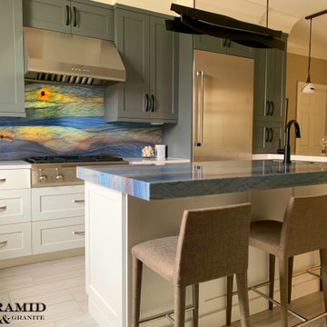
Check out this absolutely stunning Azul Macaubas quartzite! This client used the material on the island countertop and back splash. This material can be backlit meaning we install LED Panels behind the backsplash our countertops to make it light up! Our clients decided to back light the backsplash and WOW! The beautiful perimeters are done in a white quartz. Take notice in the island countertop as well, the client used a mitered edge giving the top depth and very modern detail. Of course, the pattern follows through with the edge as WE VEIN MATCH EVERYTHING! Love this look what do you think of this home??
Below is a quick tip for what to consider when choosing a countertop fabricator!
Remember when shopping for countertops to not settle for less than perfect craftsmanship. A few tips: They should always vein match any material that has a pattern or veining. This should be followed through with any seams, mitered detail work, backsplash, and waterfall edges. You also want to make sure the seam lines are not super noticeable. Make sure your fabricator has the right tooling, equipment, craftsmen, and machinery to do the job right. Here at Pyramid we always make sure all of our tops are vein matched to the Pyramid standard! We buy very large material and try to not seam countertops if we don't have to. If we do have to seam a countertop we well-known for our impeccable seams. (Our owner created the leading seaming machine in the stone industry). Okay, enough about us... just be sure when you are choosing your countertop fabricator you ask these helpful questions. And of course, be sure to get a quote from Pyramid, The Countertop Professionals.
 Change Your Bathroom©
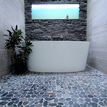
The goal of this project was to upgrade the builder grade finishes and create an ergonomic space that had a contemporary feel. This bathroom transformed from a standard, builder grade bathroom to a contemporary urban oasis. This was one of my favorite projects, I know I say that about most of my projects but this one really took an amazing transformation. By removing the walls surrounding the shower and relocating the toilet it visually opened up the space. Creating a deeper shower allowed for the tub to be incorporated into the wet area. Adding a LED panel in the back of the shower gave the illusion of a depth and created a unique storage ledge. A custom vanity keeps a clean front with different storage options and linear limestone draws the eye towards the stacked stone accent wall.
Houzz Write Up: https://www.houzz.com/magazine/inside-houzz-a-chopped-up-bathroom-goes-streamlined-and-swank-stsetivw-vs~27263720
The layout of this bathroom was opened up to get rid of the hallway effect, being only 7 foot wide, this bathroom needed all the width it could muster. Using light flooring in the form of natural lime stone 12x24 tiles with a linear pattern, it really draws the eye down the length of the room which is what we needed. Then, breaking up the space a little with the stone pebble flooring in the shower, this client enjoyed his time living in Japan and wanted to incorporate some of the elements that he appreciated while living there. The dark stacked stone feature wall behind the tub is the perfect backdrop for the LED panel, giving the illusion of a window and also creates a cool storage shelf for the tub. A narrow, but tasteful, oval freestanding tub fit effortlessly in the back of the shower. With a sloped floor, ensuring no standing water either in the shower floor or behind the tub, every thought went into engineering this Atlanta bathroom to last the test of time. With now adequate space in the shower, there was space for adjacent shower heads controlled by Kohler digital valves. A hand wand was added for use and convenience of cleaning as well. On the vanity are semi-vessel sinks which give the appearance of vessel sinks, but with the added benefit of a deeper, rounded basin to avoid splashing. Wall mounted faucets add sophistication as well as less cleaning maintenance over time. The custom vanity is streamlined with drawers, doors and a pull out for a can or hamper.
A wonderful project and equally wonderful client. I really enjoyed working with this client and the creative direction of this project.
Brushed nickel shower head with digital shower valve, freestanding bathtub, curbless shower with hidden shower drain, flat pebble shower floor, shelf over tub with LED lighting, gray vanity with drawer fronts, white square ceramic sinks, wall mount faucets and lighting under vanity. Hidden Drain shower system. Atlanta Bathroom.
 Urbanology Designs
A captivating transformation in the coveted neighborhood of University Park, Dallas
The heart of this home lies in the kitchen, where we embarked on a design endeavor that would leave anyone speechless. By opening up the main kitchen wall, we created a magnificent window system that floods the space with natural light and offers a breathtaking view of the picturesque surroundings. Suspended from the ceiling, a steel-framed marble vent hood floats a few inches from the window, showcasing a mesmerizing Lilac Marble. The same marble is skillfully applied to the backsplash and island, featuring a bold combination of color and pattern that exudes elegance.
Adding to the kitchen's allure is the Italian range, which not only serves as a showstopper but offers robust culinary features for even the savviest of cooks. However, the true masterpiece of the kitchen lies in the honed reeded marble-faced island. Each marble strip was meticulously cut and crafted by artisans to achieve a half-rounded profile, resulting in an island that is nothing short of breathtaking. This intricate process took several months, but the end result speaks for itself.
To complement the grandeur of the kitchen, we designed a combination of stain-grade and paint-grade cabinets in a thin raised panel door style. This choice adds an elegant yet simple look to the overall design. Inside each cabinet and drawer, custom interiors were meticulously designed to provide maximum functionality and organization for the day-to-day cooking activities. A vintage Turkish runner dating back to the 1960s, evokes a sense of history and character.
The breakfast nook boasts a stunning, vivid, and colorful artwork created by one of Dallas' top artist, Kyle Steed, who is revered for his mastery of his craft. Some of our favorite art pieces from the inspiring Haylee Yale grace the coffee station and media console, adding the perfect moment to pause and loose yourself in the story of her art.
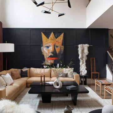
The project extends beyond the kitchen into the living room, where the family's changing needs and growing children demanded a new design approach. Accommodating their new lifestyle, we incorporated a large sectional for family bonding moments while watching TV. The living room now boasts bolder colors, striking artwork a coffered accent wall, and cayenne velvet curtains that create an inviting atmosphere. Completing the room is a custom 22' x 15' rug, adding warmth and comfort to the space. A hidden coat closet door integrated into the feature wall adds an element of surprise and functionality.
This project is not just about aesthetics; it's about pushing the boundaries of design and showcasing the possibilities. By curating an out-of-the-box approach, we bring texture and depth to the space, employing different materials and original applications. The layered design achieved through repeated use of the same material in various forms, shapes, and locations demonstrates that unexpected elements can create breathtaking results.
The reason behind this redesign and remodel was the homeowners' desire to have a kitchen that not only provided functionality but also served as a beautiful backdrop to their cherished family moments. The previous kitchen lacked the "wow" factor they desired, prompting them to seek our expertise in creating a space that would be a source of joy and inspiration.
Inspired by well-curated European vignettes, sculptural elements, clean lines, and a natural color scheme with pops of color, this design reflects an elegant organic modern style. Mixing metals, contrasting textures, and utilizing clean lines were key elements in achieving the desired aesthetic. The living room introduces bolder moments and a carefully chosen color scheme that adds character and personality.
The client's must-haves were clear: they wanted a show stopping centerpiece for their home, enhanced natural light in the kitchen, and a design that reflected their family's dynamic. With the transformation of the range wall into a wall of windows, we fulfilled their desire for abundant natural light and breathtaking views of the surrounding landscape.
Our favorite rooms and design elements are numerous, but the kitchen remains a standout feature. The painstaking process of hand-cutting and crafting each reeded panel in the island to match the marble's veining resulted in a labor of love that emanates warmth and hospitality to all who enter.
In conclusion, this tastefully lux project in University Park, Dallas is an extraordinary example of a full gut remodel that has surpassed all expectations. The meticulous attention to detail, the masterful use of materials, and the seamless blend of functionality and aesthetics create an unforgettable space. It serves as a testament to the power of design and the transformative impact it can have on a home and its inhabitants.
Project by Texas' Urbanology Designs. Their North Richland Hills-based interior design studio serves Dallas, Highland Park, University Park, Fort Worth, and upscale clients nationwide.
Sponsored
Columbus, OH

Structural Remodeling
Franklin County's Heavy Timber Specialists | Best of Houzz 2020!
 Guy Ayers, Architect
Reverse Shed Eichler
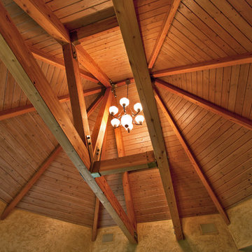
This project is part tear-down, part remodel. The original L-shaped plan allowed the living/ dining/ kitchen wing to be completely re-built while retaining the shell of the bedroom wing virtually intact. The rebuilt entertainment wing was enlarged 50% and covered with a low-slope reverse-shed roof sloping from eleven to thirteen feet. The shed roof floats on a continuous glass clerestory with eight foot transom. Cantilevered steel frames support wood roof beams with eaves of up to ten feet. An interior glass clerestory separates the kitchen and livingroom for sound control. A wall-to-wall skylight illuminates the north wall of the kitchen/family room. New additions at the back of the house add several “sliding” wall planes, where interior walls continue past full-height windows to the exterior, complimenting the typical Eichler indoor-outdoor ceiling and floor planes. The existing bedroom wing has been re-configured on the interior, changing three small bedrooms into two larger ones, and adding a guest suite in part of the original garage. A previous den addition provided the perfect spot for a large master ensuite bath and walk-in closet. Natural materials predominate, with fir ceilings, limestone veneer fireplace walls, anigre veneer cabinets, fir sliding windows and interior doors, bamboo floors, and concrete patios and walks. Landscape design by Bernard Trainor: www.bernardtrainor.com (see “Concrete Jungle” in April 2014 edition of Dwell magazine). Microsoft Media Center installation of the Year, 2008: www.cybermanor.com/ultimate_install.html (automated shades, radiant heating system, and lights, as well as security & sound).
 Imparfait Design Studio
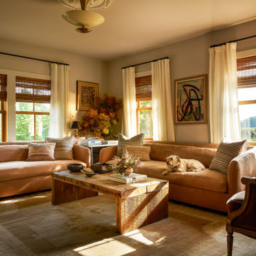
Over the course of 20 years, the owners of Imparfait and KitchenLab, Rebekah and Nick, have renovated twice, updated, saved and remodeled the barn, connected the barn to the house via a breezeway and screened in porch and put on an addition onto their beloved Michigan farmhouse. You could say they had vision, because the place was a complete mess when they bought it, complete aluminum siding, shag carpet, faux wood paneling, and sheet vinyl flooring - it was definitely a fixer-upper. At first they were weekend warriors, going back and forth between Chicago and Michigan for many years, even after their daughter, Hannah, was born in 2012 they still split their time between Wicker Park and Michigan, but when Covid hit they de-camped permanently and never looked back. Surrounded by grape vines on 4 sides and 10 miles from Lake Michigan, this little slice of heaven has been their sanctuary and home to 20 years of memories, family gatherings, holidays and friends visiting from near and far. Every tree, bush and flower you see they put in the ground…besides the mature Maples in back, the Red Bud in front and the ones they build the screened in porch around (dubious decision). The first renovation included opening up the kitchen to the dining room, adding French doors to the back yard, new siding, roof, windows, refinishing the floors and remodeling the bathrooms - both of which were on the 1st floor. The most recent remodel included an 8ft, 2 story addition giving them a master suite on the 2nd floor and a mirror image one below for their parents, turning one 1st floor bathroom into a walk-in pantry (life saving), converting the other 1st floor bath to a powder room with laundry (equally life-saving), and adding 2 full baths upstairs and a full bath downstairs. Their design studio is 15 minutes away in Lakeside Michigan which was completed just before the house remodel.
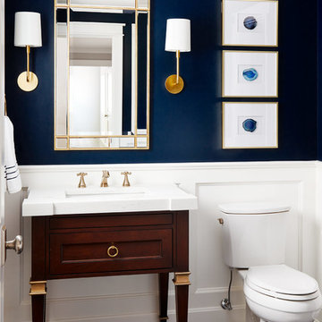
 Black Knight Group
This 1966 contemporary home was completely renovated into a beautiful, functional home with an up-to-date floor plan more fitting for the way families live today. Removing all of the existing kitchen walls created the open concept floor plan. Adding an addition to the back of the house extended the family room. The first floor was also reconfigured to add a mudroom/laundry room and the first floor powder room was transformed into a full bath. A true master suite with spa inspired bath and walk-in closet was made possible by reconfiguring the existing space and adding an addition to the front of the house.
1