
Search results for "Back up media" in Home Design Ideas
 TKS Design Group
Free ebook, Creating the Ideal Kitchen. DOWNLOAD NOW
The Klimala’s and their three kids are no strangers to moving, this being their fifth house in the same town over the 20-year period they have lived there. “It must be the 7-year itch, because every seven years, we seem to find ourselves antsy for a new project or a new environment. I think part of it is being a designer, I see my own taste evolve and I want my environment to reflect that. Having easy access to wonderful tradesmen and a knowledge of the process makes it that much easier”.
This time, Klimala’s fell in love with a somewhat unlikely candidate. The 1950’s ranch turned cape cod was a bit of a mutt, but it’s location 5 minutes from their design studio and backing up to the high school where their kids can roll out of bed and walk to school, coupled with the charm of its location on a private road and lush landscaping made it an appealing choice for them.
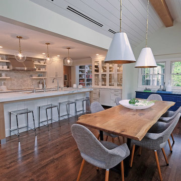
“The bones of the house were really charming. It was typical 1,500 square foot ranch that at some point someone added a second floor to. Its sloped roofline and dormered bedrooms gave it some charm.” With the help of architect Maureen McHugh, Klimala’s gutted and reworked the layout to make the house work for them. An open concept kitchen and dining room allows for more frequent casual family dinners and dinner parties that linger. A dingy 3-season room off the back of the original house was insulated, given a vaulted ceiling with skylights and now opens up to the kitchen. This room now houses an 8’ raw edge white oak dining table and functions as an informal dining room. “One of the challenges with these mid-century homes is the 8’ ceilings. I had to have at least one room that had a higher ceiling so that’s how we did it” states Klimala.
The kitchen features a 10’ island which houses a 5’0” Galley Sink. The Galley features two faucets, and double tiered rail system to which accessories such as cutting boards and stainless steel bowls can be added for ease of cooking. Across from the large sink is an induction cooktop. “My two teen daughters and I enjoy cooking, and the Galley and induction cooktop make it so easy.” A wall of tall cabinets features a full size refrigerator, freezer, double oven and built in coffeemaker. The area on the opposite end of the kitchen features a pantry with mirrored glass doors and a beverage center below.
The rest of the first floor features an entry way, a living room with views to the front yard’s lush landscaping, a family room where the family hangs out to watch TV, a back entry from the garage with a laundry room and mudroom area, one of the home’s four bedrooms and a full bath. There is a double sided fireplace between the family room and living room. The home features pops of color from the living room’s peach grass cloth to purple painted wall in the family room. “I’m definitely a traditionalist at heart but because of the home’s Midcentury roots, I wanted to incorporate some of those elements into the furniture, lighting and accessories which also ended up being really fun. We are not formal people so I wanted a house that my kids would enjoy, have their friends over and feel comfortable.”
The second floor houses the master bedroom suite, two of the kids’ bedrooms and a back room nicknamed “the library” because it has turned into a quiet get away area where the girls can study or take a break from the rest of the family. The area was originally unfinished attic, and because the home was short on closet space, this Jack and Jill area off the girls’ bedrooms houses two large walk-in closets and a small sitting area with a makeup vanity. “The girls really wanted to keep the exposed brick of the fireplace that runs up the through the space, so that’s what we did, and I think they feel like they are in their own little loft space in the city when they are up there” says Klimala.
Designed by: Susan Klimala, CKD, CBD
Photography by: Carlos Vergara
For more information on kitchen and bath design ideas go to: www.kitchenstudio-ge.com
 Kitchen & Bath Concepts
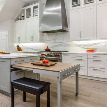
This dark and dated feeling kitchen and bar were completely renovated for this multi-generational global family. By re-configuring the space and incorporating the bar, removing several heavy columns and a wall, it made the kitchen open and accessible to the adjacent rooms and visible from the front door. Everything was lightened and brightened with new cabinetry, counter tops, appliances, flooring, paint, better windows, electrical and lighting. The old range top and down draft were enclosed in a massive brick structure, with no prep space, by removing it and centering the new range on the wall with a custom hood and full height stone back splash, a stunning focal point was created. The position of other key appliances and plumbing were moved or added to create several work stations throughout the large space, such as the refrigeration, full prep sink, coffee bar, baking station, cocktail bar and clean up island. Another special feature of this kitchen was roll out table from the end of the serving island.
Specialty features include:
A roll out table for eating, prep or serving; coffee bar and drink service area with beverage center; full size prep sink adjacent to refrigeration and cooking areas; steam oven and baking station; microwave/warming drawer; dual fuel range with double ovens, 6 burners and a griddle top; two separate islands, one for serving large family meals, one for clean up; specialty spice storage inserts and pull outs; corner turn outs for large items; two double pull outs for trash and recycling; stacked cabinetry with glass display at the top to take advantage of the 14' ceilings.
 Progressive Design Build
The Challenge
This beautiful waterfront home was begging for an update. Our clients wanted a contemporary design with modern finishes. They craved improved functionality in the kitchen, hardwood flooring in the living areas, and a spacious walk-in closet in the master bathroom. With two children in school, our clients also needed the project completed during their summer vacation – leaving a slim 90 days for the entire remodel. Could we do it? …Challenge accepted!
Our Solution
With their active summer travel schedule, our clients elected to vacate their home for the duration of the project. This was ideal for the intrusive nature of the scope of work.
In preparation, our design team created a project plan to suit our client’s needs. With such a clear timeline, we were able to select and order long-lead items in plenty of time for the project start date.
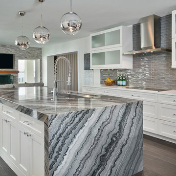
In the kitchen, we rearranged the layout to provide superior ventilation for the cooktop on the exterior wall. We added two large storage cabinets with glass doors, accented by a sleek mosaic backsplash of glass tile. We also incorporated a large contemporary waterfall island into the room. With seating at one end, the island provides both increased functionality and an eye-catching focal point for the center of the room. On the interior wall of the kitchen, we maximized storage with a wall of built-in cabinetry – complete with pullout pantry cabinets, a double oven, and a large stainless refrigerator.
Our clients wisely chose rich, dark-colored wood flooring to add warmth to the contemporary design. After installing the flooring in the kitchen, we brought it into the main living areas as well. In the great room, we wrapped the existing gas fireplace in a neutral stack stone. The effect of the stone on the media and window wall is breathtaking.
In the master bathroom, we expanded the closet by pushing the wall back into the adjacent pass-through hallway. The new walk-in closet now includes an impressive closet organization system.
Returning to the master bathroom, we removed the single vanity and repositioned the toilet, allowing for a new, curb-less glass shower and a his-and-hers vanity. The entire vanity and shower wall is finished in white 12×24 porcelain tile. The vertical glass mosaic accent band and backlit floating mirrors add to the clean, modern style. To the left of the master bathroom entry, we even added a matching make-up area.
Finally, we installed a number of elegant enhancements in the remaining rooms. The clients chose a bronze metal relief accent wall as well as some colorful finishes and artwork for the entry and hallway.
Exceptional Results
Our clients were simply thrilled with the final product! Not only did they return from their summer vacation to a gorgeous home remodel, but we concluded the project a full week ahead of schedule. As a result, the family was able to move in sooner than planned, giving them plenty of time to acclimate to the renovated space before their kids returned to school. Ultimately, we provided the outstanding results and customer experience that our clients had been searching for.
“We met with many other contractors leading up to signing with Progressive Design Build. When we met Mike, we finally felt safe. We had heard so many horror stories about contractors! Progressive was the best move we could have made. They made our dream house become a reality. Vernon was in charge of our project and everything went better than we expected. Our project was completed earlier than expected, too. Our questions and concerns were dealt with quickly and professionally, the job site was always clean, and all subs were friendly and professional. We had a wonderful experience with Progressive Design Build. We’re so grateful we found them.” – The Mader Family
Find the right local pro for your project
 Vaughan Creative Media
a kitchen update by USI Remodeling.
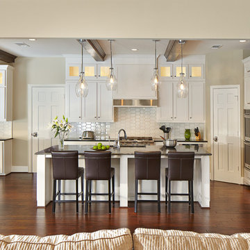
Inspiration for a transitional l-shaped dark wood floor kitchen remodel in Dallas with shaker cabinets, white cabinets, white backsplash, stainless steel appliances and an island
Inspiration for a transitional l-shaped dark wood floor kitchen remodel in Dallas with shaker cabinets, white cabinets, white backsplash, stainless steel appliances and an island

 Thyme & Place Design LLC
When my client had to move from her company office to work at home, she set up in the dining room. Despite her best efforts, this was not the long-term solution she was looking for. My client realized she needed a dedicated space not on the main floor of the home. On one hand, having your office space right next to the kitchen is handy. On the other hand, it made separating work and home life was not that easy.
The house was a ranch. In essence, the basement would run entire length of the home. As we came down the steps, we entered a time capsule. The house was built in the 1950’s. The walls were covered with original knotty pine paneling. There was a wood burning fireplace and considering this was a basement, high ceilings. In addition, there was everything her family could not store at their own homes. As we wound though the space, I though “wow this has potential”, Eventually, after walking through the laundry room we came to a small nicely lit room. This would be the office.
My client looked at me and asked what I thought. Undoubtedly, I said, this can be a great workspace, but do you really want to walk through this basement and laundry to get here? Without reservation, my client said where do we start?
Once the design was in place, we started the renovation. The knotty pine paneling had to go. Specifically, to add some insulation and control the dampness and humidity. The laundry room wall was relocated to create a hallway to the office.
At the far end of the room, we designated a workout zone. Weights, mats, exercise bike and television are at the ready for morning or afternoon workouts. The space can be concealed by a folding screen for party time. Doors to an old closet under the stairs were relocated to the workout area for hidden storage. Now we had nice wall for a beautiful console and mirror for storage and serving during parties.
In order to add architectural details, we covered the old ugly support columns with simple recessed millwork panels. This detail created a visual division between the bar area and the seating area in front of the fireplace. The old red brick on the fireplace surround was replaced with stack stone. A mantle was made from reclaimed wood. Additional reclaimed wood floating shelves left and right of the fireplace provides decorative display while maintaining a rustic element balancing the copper end table and leather swivel rocker.
We found an amazing rug which tied all of the colors together further defining the gathering space. Russet and burnt orange became the accent color unifying each space. With a bit of whimsy, a rather unusual light fixture which looks like roots from a tree growing through the ceiling is a conversation piece.
The office space is quite and removed from the main part of the basement. There is a desk large enough for multiple screens, a small bookcase holding office supplies and a comfortable chair for conference calls. Because working from home requires many online meetings, we added a shiplap wall painted in Hale Navy to contrast with the orange fabric on the chair. We finished the décor with a painting from my client’s father. This is the background online visitors will see.
The last and best part of the renovation is the beautiful bar. My client is an avid collector of wine. She already had the EuroCave refrigerator, so I incorporated it into the design. The cabinets are painted Temptation Grey from Benjamin Moore. The counter tops are my favorite hard working quartzite Brown Fantasy. The backsplash is a combination of rustic wood and old tin ceiling like porcelain tiles. Together with the textures of the reclaimed wood and hide poofs balanced against the smooth finish of the cabinets, we created a comfortable luxury for relaxing.
There is ample storage for bottles, cans, glasses, and anything else you can think of for a great party. In addition to the wine storage, we incorporated a beverage refrigerator, an ice maker, and a sink. Floating shelves with integrated lighting illuminate the back bar. The raised height of the front bar provides the perfect wine tasting and paring spot. I especially love the pendant lights which look like wine glasses.
Finally, I selected carpet for the stairs and office. It is perfect for noise reduction. Meanwhile for the overall flooring, I specifically selected a high-performance vinyl plank floor. We often use this product as it is perfect to install on a concrete floor. It is soft to walk on, easy to clean and does not reduce the overall height of the space.
 O’Hara Interiors
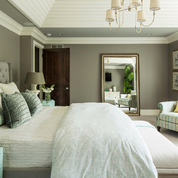
A great way to brighten up a bedroom is with painted nightstands. In this case, we wanted to maintain a calming environment with neutral wall colors and bedding. To add a bit of cheer to the space, we upholstered two lounge chairs and painted both nightstands similar shaded of aqua. Martha O'Hara Interiors, Interior Design | L. Cramer Builders + Remodelers, Builder | Troy Thies, Photography | Shannon Gale, Photo Styling
Please Note: All “related,” “similar,” and “sponsored” products tagged or listed by Houzz are not actual products pictured. They have not been approved by Martha O’Hara Interiors nor any of the professionals credited. For information about our work, please contact design@oharainteriors.com.
 BGI Design
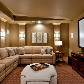
Media rooms don't have to be dark to be inviting and cozy, and our clients did NOT want the usual media room colors. So we designed a glamorous and inviting retreat in hues of cream, silver and gold accents. Three of the seats recline for the ultimate viewing experience. Custom created art work completes the look and ties the pillow fabrics together.
Sponsored
Delaware, OH

Buckeye Basements, Inc.
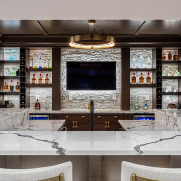
Central Ohio's Basement Finishing ExpertsBest Of Houzz '13-'21
 Bradford Smith - High Rock Real Estate
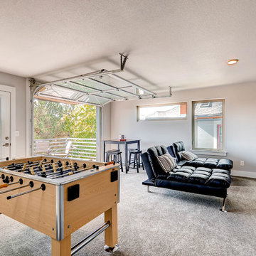
$8,000 Builder credit paid to you towards window coverings, closing costs or interest buy-down! Magazine quality kitchen w/ expensive high gloss white finish, frosted glass showcase and soft close / pull-out cabinetry * Upgraded touch faucet * Upgraded composite granite sink for durability * Upgraded GE Cafe SS appliances * Upgraded 4" solid hardwood flooring * Upgraded slimline fireplace * Upgraded tankless water heater for high efficiency* Upgraded solid core doors throughout (twice the price of standard hollow core) * Upgraded custom handmade wrought-iron rail / with butcher block wood stairsystem * Rec/Media Room w/ upgraded roll-up garage door double pane & insulated for energy efficiency * Expansive patio with panoramic unobstructed city skyline AND mountain views perfect for entertaining* Full wet bar w/ wine refrigerator, sink and storage * 4 bedroom potential (call broker for specs) * 2 car detached garage * Ample storage space in 14' garage and temp controlled 3' crawl space.
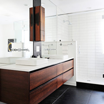
 Susan Yeley Homes
This gem of a house was built in the 1950s, when its neighborhood undoubtedly felt remote. The university footprint has expanded in the 70 years since, however, and today this home sits on prime real estate—easy biking and reasonable walking distance to campus.
When it went up for sale in 2017, it was largely unaltered. Our clients purchased it to renovate and resell, and while we all knew we'd need to add square footage to make it profitable, we also wanted to respect the neighborhood and the house’s own history. Swedes have a word that means “just the right amount”: lagom. It is a guiding philosophy for us at SYH, and especially applied in this renovation. Part of the soul of this house was about living in just the right amount of space. Super sizing wasn’t a thing in 1950s America. So, the solution emerged: keep the original rectangle, but add an L off the back.
With no owner to design with and for, SYH created a layout to appeal to the masses. All public spaces are the back of the home--the new addition that extends into the property’s expansive backyard. A den and four smallish bedrooms are atypically located in the front of the house, in the original 1500 square feet. Lagom is behind that choice: conserve space in the rooms where you spend most of your time with your eyes shut. Put money and square footage toward the spaces in which you mostly have your eyes open.
In the studio, we started calling this project the Mullet Ranch—business up front, party in the back. The front has a sleek but quiet effect, mimicking its original low-profile architecture street-side. It’s very Hoosier of us to keep appearances modest, we think. But get around to the back, and surprise! lofted ceilings and walls of windows. Gorgeous.
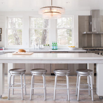
 Albertsson Hansen Architecture and Interior Design
A cabin in Western Wisconsin is transformed from within to become a serene and modern retreat. In a past life, this cabin was a fishing cottage which was part of a resort built in the 1920’s on a small lake not far from the Twin Cities. The cabin has had multiple additions over the years so improving flow to the outdoor space, creating a family friendly kitchen, and relocating a bigger master bedroom on the lake side were priorities. The solution was to bring the kitchen from the back of the cabin up to the front, reduce the size of an overly large bedroom in the back in order to create a more generous front entry way/mudroom adjacent to the kitchen, and add a fireplace in the center of the main floor.
Photographer: Wing Ta
Interior Design: Jennaea Gearhart Design
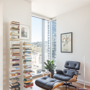
 Guggenheim Architecture + Design Studio
With sweeping views of the Willamette river and Mt. Hood, this Atwater Place condo was designed with a balance of minimalism and livability in mind. A complete kitchen remodel brought a dark interior kitchen to the light and a full furnishings package welcomed Los Angeles transplants home to their new modern and bright residence. Our clients, a retired camera operator for both feature films and television and a producer/production manager on numerous television series including Weeds and The Middle, relocated from their traditionally-styled LA bungalow to Portland in the Summer of 2014. The couple sought a design departure from their long-term California residence and a fresh start for their new life in the South Waterfront.
With only two pieces of sentimental furniture and a handful of artwork included in the plan, we set out to create a comfortable and clean-lined furnishings package complimenting the broad southeast views. Organically shaped upholstery pieces juxtaposed with angular steel and wood tables create a soft balance in the open floor plan. Several custom pieces, including a dining table designed by our studio and a custom hand-blown glass chandelier crafted by Scott Schiesel with Lightlite compliment timeless pieces from Knoll, Herman Miller, and B&B Italia.
The kitchen is designed to reflect light and create brilliance in a space that is otherwise naturally dark. A material balance of stainless steel, back painted glass, quartz composite, lacquer, and mirror all play their part in creating a vibrant cooking environment. We collectively decided to forgo the traditional island pendant for a linear commercial fixture that provides tremendous light to the prep surface and creates an unexpected architectural element. The mirrored prep island creates the illusion of open space while concealing casework and wine storage on the working side of the kitchen.
It is worth noting that this project was designed and installed almost entirely while our clients were still living in LA and wrapping up professional obligations and selling their home. This afforded us the tremendous opportunity to send our clients to showrooms not available in Portland to view key pieces before final specification. Textiles and finish samples were approved via mail and communication took place over e-mail, telephone, and an occasional office visit. This unique process lead to a successful result and a beautifully balanced living environment.
Josh Partee Photography
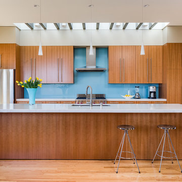
 Mark Brand Architecture
For this kitchen and bath remodel in San Francisco's Cole Valley, our client wanted us to open the kitchen up to the living room and create a new modern feel for all of the remodeled areas. Opening the kitchen to the living area provided a structural challenge as the wall we had to remove was load-bearing and there was a separately owned condo on the floor below. Working closely with a structural engineer, we created a strategy to carry the weight to the exterior walls of the building. In order to do this we had to tear off the entire roof and rebuild it with new structural joists which could span from property line to property line. To achieve a dramatic daylighting effect, we created a slot skylight over the back wall of the kitchen with the beams running through the skylight. Cerulean blue, back-painted glass for the backsplash and a thick waterfall edge for the island add more distinctive touches to this kitchen design. In the master bath we created a sinuous counter edge which tracks its way to the floor to create a curb for the shower. Green tile imported from Morocco adds a pop of color in the shower and a custom built indirect LED lighting cove creates a glow of light around the mirror. Photography by Christopher Stark.
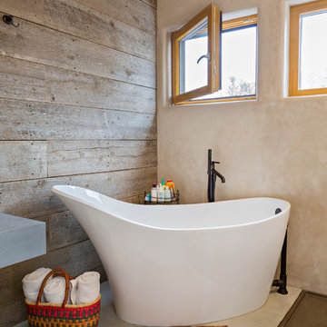
 Zola European Windows
This Boulder, Colorado remodel by fuentesdesign demonstrates the possibility of renewal in American suburbs, and Passive House design principles. Once an inefficient single story 1,000 square-foot ranch house with a forced air furnace, has been transformed into a two-story, solar powered 2500 square-foot three bedroom home ready for the next generation.
The new design for the home is modern with a sustainable theme, incorporating a palette of natural materials including; reclaimed wood finishes, FSC-certified pine Zola windows and doors, and natural earth and lime plasters that soften the interior and crisp contemporary exterior with a flavor of the west. A Ninety-percent efficient energy recovery fresh air ventilation system provides constant filtered fresh air to every room. The existing interior brick was removed and replaced with insulation. The remaining heating and cooling loads are easily met with the highest degree of comfort via a mini-split heat pump, the peak heat load has been cut by a factor of 4, despite the house doubling in size. During the coldest part of the Colorado winter, a wood stove for ambiance and low carbon back up heat creates a special place in both the living and kitchen area, and upstairs loft.
This ultra energy efficient home relies on extremely high levels of insulation, air-tight detailing and construction, and the implementation of high performance, custom made European windows and doors by Zola Windows. Zola’s ThermoPlus Clad line, which boasts R-11 triple glazing and is thermally broken with a layer of patented German Purenit®, was selected for the project. These windows also provide a seamless indoor/outdoor connection, with 9′ wide folding doors from the dining area and a matching 9′ wide custom countertop folding window that opens the kitchen up to a grassy court where mature trees provide shade and extend the living space during the summer months.
With air-tight construction, this home meets the Passive House Retrofit (EnerPHit) air-tightness standard of
Sponsored
Sunbury, OH

J.Holderby - Renovations
Franklin County's Leading General Contractors - 2X Best of Houzz!
 Banner's Cabinets
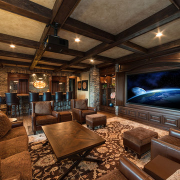
This media room has tri-folding doors beneath a paneled arched header to conceal the screen when not in use. Doors below the screen are on touch-catches for discreet equipment storage. The media center is flanked on both sides by open display cabinets. In the background to the left, you see the wet bar with custom leaded glass designs and a matching leaded glass interior door into the wine room - all by Banner's Cabinets.
 Susan Yeley Homes
This gem of a house was built in the 1950s, when its neighborhood undoubtedly felt remote. The university footprint has expanded in the 70 years since, however, and today this home sits on prime real estate—easy biking and reasonable walking distance to campus.
When it went up for sale in 2017, it was largely unaltered. Our clients purchased it to renovate and resell, and while we all knew we'd need to add square footage to make it profitable, we also wanted to respect the neighborhood and the house’s own history. Swedes have a word that means “just the right amount”: lagom. It is a guiding philosophy for us at SYH, and especially applied in this renovation. Part of the soul of this house was about living in just the right amount of space. Super sizing wasn’t a thing in 1950s America. So, the solution emerged: keep the original rectangle, but add an L off the back.
With no owner to design with and for, SYH created a layout to appeal to the masses. All public spaces are the back of the home--the new addition that extends into the property’s expansive backyard. A den and four smallish bedrooms are atypically located in the front of the house, in the original 1500 square feet. Lagom is behind that choice: conserve space in the rooms where you spend most of your time with your eyes shut. Put money and square footage toward the spaces in which you mostly have your eyes open.
In the studio, we started calling this project the Mullet Ranch—business up front, party in the back. The front has a sleek but quiet effect, mimicking its original low-profile architecture street-side. It’s very Hoosier of us to keep appearances modest, we think. But get around to the back, and surprise! lofted ceilings and walls of windows. Gorgeous.
 Forward Design Build Remodel
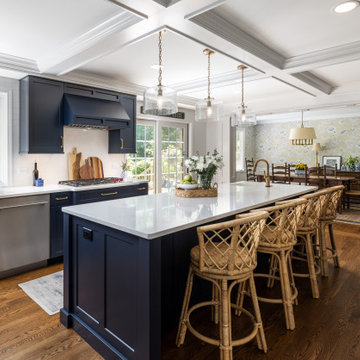
Our clients came to us wanting to update their kitchen while keeping their traditional and timeless style. They desired to open up the kitchen to the dining room and to widen doorways to make the kitchen feel less closed off from the rest of the home.
They wanted to create more functional storage and working space at the island. Other goals were to replace the sliding doors to the back deck, add mudroom storage and update lighting for a brighter, cleaner look.
We created a kitchen and dining space that brings our homeowners joy to cook, dine and spend time together in.
We installed a longer, more functional island with barstool seating in the kitchen. We added pantry cabinets with roll out shelves. We widened the doorways and opened up the wall between the kitchen and dining room.
We added cabinetry with glass display doors in the kitchen and also the dining room. We updated the lighting and replaced sliding doors to the back deck. In the mudroom, we added closed storage and a built-in bench.
 BANDD DESIGN
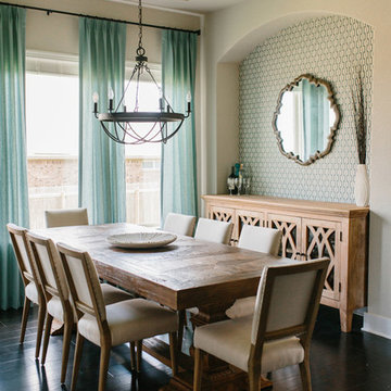
A farmhouse coastal styled home located in the charming neighborhood of Pflugerville. We merged our client's love of the beach with rustic elements which represent their Texas lifestyle. The result is a laid-back interior adorned with distressed woods, light sea blues, and beach-themed decor. We kept the furnishings tailored and contemporary with some heavier case goods- showcasing a touch of traditional. Our design even includes a separate hangout space for the teenagers and a cozy media for everyone to enjoy! The overall design is chic yet welcoming, perfect for this energetic young family.
Project designed by Sara Barney’s Austin interior design studio BANDD DESIGN. They serve the entire Austin area and its surrounding towns, with an emphasis on Round Rock, Lake Travis, West Lake Hills, and Tarrytown.
For more about BANDD DESIGN, click here: https://bandddesign.com/
To learn more about this project, click here: https://bandddesign.com/moving-water/

 Marcia Moore Design
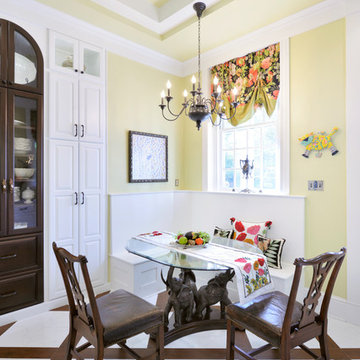
Best of Houzz 2016 Dining Room Design winner. The custom built-in banquette allowed the breakfast nook to seat 5 people comfortably and not encroach on the walking space. Custom dark wood cabinet houses breakfast dishes. Wood and marble look alike porcelain tiles set on the diagonal add interest to a large floor space. The coffers on the ceiling create the same interest on the ceiling. Notice the 3 elephants holding up the table top.
Michael Jacobs Photography
 Zola European Windows
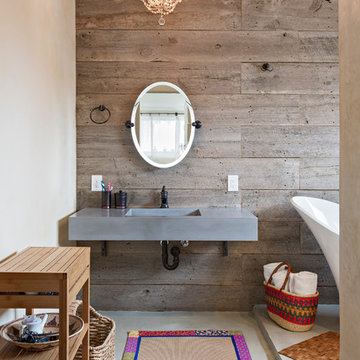
This Boulder, Colorado remodel by fuentesdesign demonstrates the possibility of renewal in American suburbs, and Passive House design principles. Once an inefficient single story 1,000 square-foot ranch house with a forced air furnace, has been transformed into a two-story, solar powered 2500 square-foot three bedroom home ready for the next generation.
The new design for the home is modern with a sustainable theme, incorporating a palette of natural materials including; reclaimed wood finishes, FSC-certified pine Zola windows and doors, and natural earth and lime plasters that soften the interior and crisp contemporary exterior with a flavor of the west. A Ninety-percent efficient energy recovery fresh air ventilation system provides constant filtered fresh air to every room. The existing interior brick was removed and replaced with insulation. The remaining heating and cooling loads are easily met with the highest degree of comfort via a mini-split heat pump, the peak heat load has been cut by a factor of 4, despite the house doubling in size. During the coldest part of the Colorado winter, a wood stove for ambiance and low carbon back up heat creates a special place in both the living and kitchen area, and upstairs loft.
This ultra energy efficient home relies on extremely high levels of insulation, air-tight detailing and construction, and the implementation of high performance, custom made European windows and doors by Zola Windows. Zola’s ThermoPlus Clad line, which boasts R-11 triple glazing and is thermally broken with a layer of patented German Purenit®, was selected for the project. These windows also provide a seamless indoor/outdoor connection, with 9′ wide folding doors from the dining area and a matching 9′ wide custom countertop folding window that opens the kitchen up to a grassy court where mature trees provide shade and extend the living space during the summer months.
With air-tight construction, this home meets the Passive House Retrofit (EnerPHit) air-tightness standard of
 TKS Design Group
Free ebook, Creating the Ideal Kitchen. DOWNLOAD NOW
The Klimala’s and their three kids are no strangers to moving, this being their fifth house in the same town over the 20-year period they have lived there. “It must be the 7-year itch, because every seven years, we seem to find ourselves antsy for a new project or a new environment. I think part of it is being a designer, I see my own taste evolve and I want my environment to reflect that. Having easy access to wonderful tradesmen and a knowledge of the process makes it that much easier”.
This time, Klimala’s fell in love with a somewhat unlikely candidate. The 1950’s ranch turned cape cod was a bit of a mutt, but it’s location 5 minutes from their design studio and backing up to the high school where their kids can roll out of bed and walk to school, coupled with the charm of its location on a private road and lush landscaping made it an appealing choice for them.
“The bones of the house were really charming. It was typical 1,500 square foot ranch that at some point someone added a second floor to. Its sloped roofline and dormered bedrooms gave it some charm.” With the help of architect Maureen McHugh, Klimala’s gutted and reworked the layout to make the house work for them. An open concept kitchen and dining room allows for more frequent casual family dinners and dinner parties that linger. A dingy 3-season room off the back of the original house was insulated, given a vaulted ceiling with skylights and now opens up to the kitchen. This room now houses an 8’ raw edge white oak dining table and functions as an informal dining room. “One of the challenges with these mid-century homes is the 8’ ceilings. I had to have at least one room that had a higher ceiling so that’s how we did it” states Klimala.
The kitchen features a 10’ island which houses a 5’0” Galley Sink. The Galley features two faucets, and double tiered rail system to which accessories such as cutting boards and stainless steel bowls can be added for ease of cooking. Across from the large sink is an induction cooktop. “My two teen daughters and I enjoy cooking, and the Galley and induction cooktop make it so easy.” A wall of tall cabinets features a full size refrigerator, freezer, double oven and built in coffeemaker. The area on the opposite end of the kitchen features a pantry with mirrored glass doors and a beverage center below.
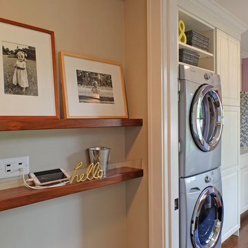
The rest of the first floor features an entry way, a living room with views to the front yard’s lush landscaping, a family room where the family hangs out to watch TV, a back entry from the garage with a laundry room and mudroom area, one of the home’s four bedrooms and a full bath. There is a double sided fireplace between the family room and living room. The home features pops of color from the living room’s peach grass cloth to purple painted wall in the family room. “I’m definitely a traditionalist at heart but because of the home’s Midcentury roots, I wanted to incorporate some of those elements into the furniture, lighting and accessories which also ended up being really fun. We are not formal people so I wanted a house that my kids would enjoy, have their friends over and feel comfortable.”
The second floor houses the master bedroom suite, two of the kids’ bedrooms and a back room nicknamed “the library” because it has turned into a quiet get away area where the girls can study or take a break from the rest of the family. The area was originally unfinished attic, and because the home was short on closet space, this Jack and Jill area off the girls’ bedrooms houses two large walk-in closets and a small sitting area with a makeup vanity. “The girls really wanted to keep the exposed brick of the fireplace that runs up the through the space, so that’s what we did, and I think they feel like they are in their own little loft space in the city when they are up there” says Klimala.
Designed by: Susan Klimala, CKD, CBD
Photography by: Carlos Vergara
For more information on kitchen and bath design ideas go to: www.kitchenstudio-ge.com
4