
Search results for "Back up media" in Home Design Ideas
 TKS Design Group
Free ebook, Creating the Ideal Kitchen. DOWNLOAD NOW
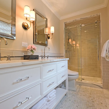
The Klimala’s and their three kids are no strangers to moving, this being their fifth house in the same town over the 20-year period they have lived there. “It must be the 7-year itch, because every seven years, we seem to find ourselves antsy for a new project or a new environment. I think part of it is being a designer, I see my own taste evolve and I want my environment to reflect that. Having easy access to wonderful tradesmen and a knowledge of the process makes it that much easier”.
This time, Klimala’s fell in love with a somewhat unlikely candidate. The 1950’s ranch turned cape cod was a bit of a mutt, but it’s location 5 minutes from their design studio and backing up to the high school where their kids can roll out of bed and walk to school, coupled with the charm of its location on a private road and lush landscaping made it an appealing choice for them.
“The bones of the house were really charming. It was typical 1,500 square foot ranch that at some point someone added a second floor to. Its sloped roofline and dormered bedrooms gave it some charm.” With the help of architect Maureen McHugh, Klimala’s gutted and reworked the layout to make the house work for them. An open concept kitchen and dining room allows for more frequent casual family dinners and dinner parties that linger. A dingy 3-season room off the back of the original house was insulated, given a vaulted ceiling with skylights and now opens up to the kitchen. This room now houses an 8’ raw edge white oak dining table and functions as an informal dining room. “One of the challenges with these mid-century homes is the 8’ ceilings. I had to have at least one room that had a higher ceiling so that’s how we did it” states Klimala.
The kitchen features a 10’ island which houses a 5’0” Galley Sink. The Galley features two faucets, and double tiered rail system to which accessories such as cutting boards and stainless steel bowls can be added for ease of cooking. Across from the large sink is an induction cooktop. “My two teen daughters and I enjoy cooking, and the Galley and induction cooktop make it so easy.” A wall of tall cabinets features a full size refrigerator, freezer, double oven and built in coffeemaker. The area on the opposite end of the kitchen features a pantry with mirrored glass doors and a beverage center below.
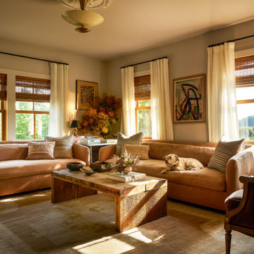
The rest of the first floor features an entry way, a living room with views to the front yard’s lush landscaping, a family room where the family hangs out to watch TV, a back entry from the garage with a laundry room and mudroom area, one of the home’s four bedrooms and a full bath. There is a double sided fireplace between the family room and living room. The home features pops of color from the living room’s peach grass cloth to purple painted wall in the family room. “I’m definitely a traditionalist at heart but because of the home’s Midcentury roots, I wanted to incorporate some of those elements into the furniture, lighting and accessories which also ended up being really fun. We are not formal people so I wanted a house that my kids would enjoy, have their friends over and feel comfortable.”
The second floor houses the master bedroom suite, two of the kids’ bedrooms and a back room nicknamed “the library” because it has turned into a quiet get away area where the girls can study or take a break from the rest of the family. The area was originally unfinished attic, and because the home was short on closet space, this Jack and Jill area off the girls’ bedrooms houses two large walk-in closets and a small sitting area with a makeup vanity. “The girls really wanted to keep the exposed brick of the fireplace that runs up the through the space, so that’s what we did, and I think they feel like they are in their own little loft space in the city when they are up there” says Klimala.
Designed by: Susan Klimala, CKD, CBD
Photography by: Carlos Vergara
For more information on kitchen and bath design ideas go to: www.kitchenstudio-ge.com
 Conklin Limestone
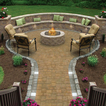
A perfect addition to your outdoor living is a seating wall surrounding a firepit. Cambridge Maytrx wall, Pyzique Fire Pit, Round table Pavers. Installed by Natural Green Landsacpe & Design in Lincoln, RI
 TKS Design Group
Download our free ebook, Creating the Ideal Kitchen. DOWNLOAD NOW
This client was referred to us from a past client. They are a busy 2-career household with young children and enjoy entertaining friends and family in their home. They have a beautiful open concept home but unfortunately the kitchen was not fitting for the rest of the home. They were not quite sure what to do with the space. We talked about trying to refresh it or do more of a minor remodel, but in the end they decided a full gut would get them to where they wanted to be.
One problem was there was no place for guests to hang out other than the large and awkward banquette area. The brick wall and tiled hood area were feeling a bit dated and tired. The space was just not functional for their lifestyle. There was no prep space near the cooktop and no landing area for items coming out of the ovens or refrigerator, plus a big dead zone in the center of the room.
Banquettes, like the one they previously had in the space, are great for small spaces, but when they get really large like this one, it makes getting in and out of the seating area awkward and uncomfortable. Plus, there was room for a large table, so we eliminated the awkward built in.
We started by removing the faux brick wall between the kitchen and back entry. We relocated the entry to the garage over a couple feet in order to get every last inch out of the new kitchen. We also made the decision to close up the primary window that faced the pretty ho hum brick wall of the neighbor’s house. There was plenty of light coming in from the seating area, so we just didn’t feel the window was adding much to the room.
Construction went smoothy. There was a bit of rework with electrical, flooring and HVAC, but in the end, we think it was well worth it.
The clients really wanted a sleek contemporary look, and we originally had planned for a full height slab backsplash, but due to it’s size, it was a budget buster. Instead, we got creative and settled on large format porcelain tiles that have a similar feel but were a fraction of the cost. We made sure the wall was plumb and level so that the fit and finish would mimic that of slab material.
The final space was quite a change. A large prep sink sits directly across from the new pro-style range with plenty additional prep space on the large island. The refrigerator and ovens now have miles of landing space, and a nice tight work triangle makes cooking a breeze.
Since we wanted a more contemporary feel, not many wall cabinets were included. Instead, we outfitted some of the drawers for dish storage with a peg system. Two large pantries flanking the refrigerator hold baking supplies and small appliances. Large drawers by the cooktop hold pots and pans, and an appliance garage tucked away to the left of the range hides away miscellaneous items. The large island also houses a microwave drawer and tons of storage, most of which is drawers offering maximum convenience.
The island now seats 5-6 people comfortably along with the new table in the seating area which can seat up to 8. Entertaining will be a breeze in this space. With such a clean backdrop, we knew we would need some drama with the lighting, so we chose two sets of staggered pendants, which we adjusted for the right visual balance above the island.
We also included a small coffee station to the right of the main kitchen, which helps keep the coffee clutter out of the kitchen proper. Two tones of complimentary gray are featured in this kitchen. The perimeter is a light gray that reads almost white. The island is a gray stain that adds some depth and interest with the visible wood texture. The countertops are clean white quartz, and the hardware, barstools and light fixtures add warm brass tones. I see lots of cooking and entertaining with family and friends in the near future in this bright and airy new space.
Designed by: Susan Klimala, CKD, CBD
Photography by: Michael Kaskel
For more information on kitchen and bath design ideas go to: www.kitchenstudio-ge.com
Find the right local pro for your project
 ODS Architecture
In a wooded area of Lafayette, a mid-century home was re-imagined for a graphic designer and kindergarten teacher couple and their three children. A major new design feature is a high ceiling great room that wraps from the front to the back yard, turning a corner at the kitchen and ending at the family room fireplace. This room was designed with a high flat roof to work in conjunction with existing roof forms to create a unified whole, and raise interior ceiling heights from eight to over ten feet. All new lighting and large floor to ceiling Fleetwood aluminum windows expand views of the trees beyond.
The existing home was enlarged by 700 square feet with a small exterior addition enlarging the kitchen over an existing deck, and a larger amount by excavating out crawlspace at the garage level to create a new home office with full bath, and separate laundry utility room. The remodeled residence became 3,847 square feet in total area including the garage.
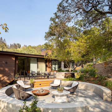
Exterior curb appeal was improved with all new Fleetwood windows, stained wood siding and stucco. New steel railing and concrete steps lead up to the front entry. Front and rear yard new landscape design by Huettl Landscape Architecture dramatically alters the site. New planting was added at the front yard with landscape lighting and modern concrete pavers and the rear yard has multiple decks for family gatherings with the focal point a concrete conversation circle with central fire feature.
Everything revolves around the corner kitchen, large windows to the backyard, quartz countertops and cabinetry in painted and walnut finishes. The homeowners enjoyed the process of selecting Heath Tile for the kitchen backsplash and white oval tiles at the family room fireplace. Black brick tiles by Fireclay were used on the living room hearth. The kitchen flows into the family room all with views to the beautifully landscaped yards.
The primary suite has a built-in window seat with large windows overlooking the garden, walnut cabinetry in a skylit walk-in closet, and a large dramatic skylight bouncing light into the shower. The kid’s bath also has a skylight slot with light angling downward over double sinks. More colorful tile shows up in these spaces, as does a geometric patterned tile in the downstairs office bath shower.
The large yard is taken full advantage of with concrete paved walkways, stairs and firepit circle. New retaining walls in the rear yard helped to add more level usable outdoor space, with wood slats to visually blend them into the overall design.
The end result is a beautiful transformation of a mid-century home, that both captures the client’s personalities and elevates the house into the modern age.
 Urbanology Designs
A captivating transformation in the coveted neighborhood of University Park, Dallas
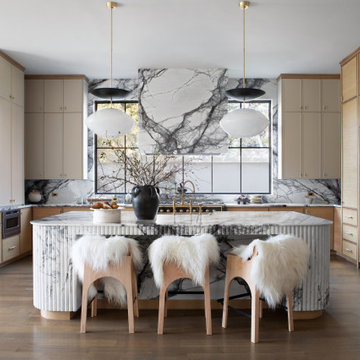
The heart of this home lies in the kitchen, where we embarked on a design endeavor that would leave anyone speechless. By opening up the main kitchen wall, we created a magnificent window system that floods the space with natural light and offers a breathtaking view of the picturesque surroundings. Suspended from the ceiling, a steel-framed marble vent hood floats a few inches from the window, showcasing a mesmerizing Lilac Marble. The same marble is skillfully applied to the backsplash and island, featuring a bold combination of color and pattern that exudes elegance.
Adding to the kitchen's allure is the Italian range, which not only serves as a showstopper but offers robust culinary features for even the savviest of cooks. However, the true masterpiece of the kitchen lies in the honed reeded marble-faced island. Each marble strip was meticulously cut and crafted by artisans to achieve a half-rounded profile, resulting in an island that is nothing short of breathtaking. This intricate process took several months, but the end result speaks for itself.
To complement the grandeur of the kitchen, we designed a combination of stain-grade and paint-grade cabinets in a thin raised panel door style. This choice adds an elegant yet simple look to the overall design. Inside each cabinet and drawer, custom interiors were meticulously designed to provide maximum functionality and organization for the day-to-day cooking activities. A vintage Turkish runner dating back to the 1960s, evokes a sense of history and character.
The breakfast nook boasts a stunning, vivid, and colorful artwork created by one of Dallas' top artist, Kyle Steed, who is revered for his mastery of his craft. Some of our favorite art pieces from the inspiring Haylee Yale grace the coffee station and media console, adding the perfect moment to pause and loose yourself in the story of her art.
The project extends beyond the kitchen into the living room, where the family's changing needs and growing children demanded a new design approach. Accommodating their new lifestyle, we incorporated a large sectional for family bonding moments while watching TV. The living room now boasts bolder colors, striking artwork a coffered accent wall, and cayenne velvet curtains that create an inviting atmosphere. Completing the room is a custom 22' x 15' rug, adding warmth and comfort to the space. A hidden coat closet door integrated into the feature wall adds an element of surprise and functionality.
This project is not just about aesthetics; it's about pushing the boundaries of design and showcasing the possibilities. By curating an out-of-the-box approach, we bring texture and depth to the space, employing different materials and original applications. The layered design achieved through repeated use of the same material in various forms, shapes, and locations demonstrates that unexpected elements can create breathtaking results.
The reason behind this redesign and remodel was the homeowners' desire to have a kitchen that not only provided functionality but also served as a beautiful backdrop to their cherished family moments. The previous kitchen lacked the "wow" factor they desired, prompting them to seek our expertise in creating a space that would be a source of joy and inspiration.
Inspired by well-curated European vignettes, sculptural elements, clean lines, and a natural color scheme with pops of color, this design reflects an elegant organic modern style. Mixing metals, contrasting textures, and utilizing clean lines were key elements in achieving the desired aesthetic. The living room introduces bolder moments and a carefully chosen color scheme that adds character and personality.
The client's must-haves were clear: they wanted a show stopping centerpiece for their home, enhanced natural light in the kitchen, and a design that reflected their family's dynamic. With the transformation of the range wall into a wall of windows, we fulfilled their desire for abundant natural light and breathtaking views of the surrounding landscape.
Our favorite rooms and design elements are numerous, but the kitchen remains a standout feature. The painstaking process of hand-cutting and crafting each reeded panel in the island to match the marble's veining resulted in a labor of love that emanates warmth and hospitality to all who enter.
In conclusion, this tastefully lux project in University Park, Dallas is an extraordinary example of a full gut remodel that has surpassed all expectations. The meticulous attention to detail, the masterful use of materials, and the seamless blend of functionality and aesthetics create an unforgettable space. It serves as a testament to the power of design and the transformative impact it can have on a home and its inhabitants.
Project by Texas' Urbanology Designs. Their North Richland Hills-based interior design studio serves Dallas, Highland Park, University Park, Fort Worth, and upscale clients nationwide.
 Milgard Windows & Doors
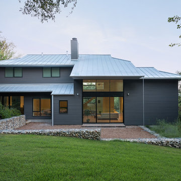
The Kiguchi family moved into their Austin, Texas home in 1994. Built in the 1980’s as part of a neighborhood development, they happily raised their family here but longed for something more contemporary. Once they became empty nesters, they decided it was time for a major remodel. After spending many years visiting Austin AIA Home Tours that highlight contemporary residential architecture, they had a lot of ideas and in 2013 were ready to interview architects and get their renovation underway.
The project turned into a major remodel due to an unstable foundation. Architects Ben Arbib and Ed Hughey, of Arbib Hughey Design were hired to solve the structural issue and look for inspiration in the bones of the house, which sat on top of a hillside and was surrounded by great views.
Unfortunately, with the old floor plan, the beautiful views were hidden by small windows that were poorly placed. In order to bring more natural light into the house the window sizes and configurations had to be addressed, all while keeping in mind the homeowners desire for a modern look and feel.
To achieve a more contemporary and sophisticated front of house, a new entry was designed that included removing a two-story bay window and porch. The entrance of the home also became more integrated with the landscape creating a template for new foliage to be planted. Older exterior materials were updated to incorporate a more muted palette of colors with a metal roof, dark grey siding in the back and white stucco in the front. Deep eaves were added over many of the new large windows for clean lines and sun protection.
“Inside it was about opening up the floor plan, expanding the views throughout the house, and updating the material palette to get a modern look that was also warm and inviting,” said Ben from Arbib Hughey Design. “Prior to the remodel, the house had the typical separation of rooms. We removed the walls between them and changed all of the windows to Milgard Thermally Improved Aluminum to connect the inside with the outside. No matter where you are you get nice views and natural light.”
The architects wanted to create some drama, which they accomplished with the window placement and opening up the interior floor plan to an open concept approach. Cabinetry was used to help delineate intimate spaces. To add warmth to an all-white living room, white-washed oak wood floors were installed and pine planks were used around the fireplace. The large windows served as artwork bringing the color of nature into the space.
An octagon shaped, elevated dining room, (named “the turret”), had a big impact on the design of the house. They architects rounded the corners and added larger window openings overlooking a new sunken garden. The great room was also softened by rounding out the corners and that circular theme continued throughout the house, being picked up in skylight wells and kitchen cabinetry. A staircase leading to a catwalk was added and the result was a two-story window wall that flooded the home with natural light.
When asked why Milgard® Thermally Improved Aluminum windows were selected, the architectural team listed many reasons:
1) Aesthetics: “We liked the slim profiles and narrow sightlines. The window frames never get in the way of the view and that was important to us. They also have a very contemporary look that went well with our design.”
2) Options: “We liked that we could get large sliding doors that matched the windows, giving us a very cohesive look and feel throughout the project.”
3) Cost Effective: “Milgard windows are affordable. You get a good product at a good price.”
4) Custom Sizes: “Milgard windows are customizable, which allowed us to get the right window for each location.”
Ready to take on your own traditional to modern home remodeling project? Arbib Hughey Design advises, “Work with a good architect. That means picking a team that is creative, communicative, listens well and is responsive. We think it’s important for an architect to listen to their clients and give them something they want, not something the architect thinks they should have. At the same time you want an architect who is willing and able to think outside the box and offer up design options that you may not have considered. Design is about a lot of back and forth, trying out ideas, getting feedback and trying again.”
The home was completely transformed into a unique, contemporary house perfectly integrated with its site. Internally the home has a natural flow for the occupants and externally it is integrated with the surroundings taking advantage of great natural light. As a side note, it was highly praised as part of the Austin AIA homes tour.
 Musso Design Group
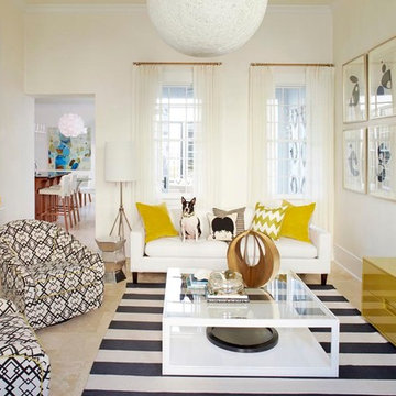
In the living room, a white Perennials upholstered sofa with large chevron patterned chartreuse pillows accompanied by a mod needlepoint Jonathan Adler pillow sits next to graphic patterned black and white barrel-back swivel chairs covered in outdoor fabric, and a white modern coffee table rests on a striped black and white rug. A large spherical white pendant light fixture from the 1970s is suspended above it all. More color was added to the room with the yellow media cabinet and the bright abstract painting hung above it.

Sponsored
Columbus, OH
Free consultation for landscape design!

Peabody Landscape Group
Columbus' Reliable Landscape Design & Contracting
 Klopf Architecture
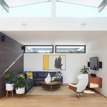
Klopf Architecture and Outer space Landscape Architects designed a new warm, modern, open, indoor-outdoor home in Los Altos, California. Inspired by mid-century modern homes but looking for something completely new and custom, the owners, a couple with two children, bought an older ranch style home with the intention of replacing it.
Created on a grid, the house is designed to be at rest with differentiated spaces for activities; living, playing, cooking, dining and a piano space. The low-sloping gable roof over the great room brings a grand feeling to the space. The clerestory windows at the high sloping roof make the grand space light and airy.
Upon entering the house, an open atrium entry in the middle of the house provides light and nature to the great room. The Heath tile wall at the back of the atrium blocks direct view of the rear yard from the entry door for privacy.
The bedrooms, bathrooms, play room and the sitting room are under flat wing-like roofs that balance on either side of the low sloping gable roof of the main space. Large sliding glass panels and pocketing glass doors foster openness to the front and back yards. In the front there is a fenced-in play space connected to the play room, creating an indoor-outdoor play space that could change in use over the years. The play room can also be closed off from the great room with a large pocketing door. In the rear, everything opens up to a deck overlooking a pool where the family can come together outdoors.
Wood siding travels from exterior to interior, accentuating the indoor-outdoor nature of the house. Where the exterior siding doesn’t come inside, a palette of white oak floors, white walls, walnut cabinetry, and dark window frames ties all the spaces together to create a uniform feeling and flow throughout the house. The custom cabinetry matches the minimal joinery of the rest of the house, a trim-less, minimal appearance. Wood siding was mitered in the corners, including where siding meets the interior drywall. Wall materials were held up off the floor with a minimal reveal. This tight detailing gives a sense of cleanliness to the house.
The garage door of the house is completely flush and of the same material as the garage wall, de-emphasizing the garage door and making the street presentation of the house kinder to the neighborhood.
The house is akin to a custom, modern-day Eichler home in many ways. Inspired by mid-century modern homes with today’s materials, approaches, standards, and technologies. The goals were to create an indoor-outdoor home that was energy-efficient, light and flexible for young children to grow. This 3,000 square foot, 3 bedroom, 2.5 bathroom new house is located in Los Altos in the heart of the Silicon Valley.
Klopf Architecture Project Team: John Klopf, AIA, and Chuang-Ming Liu
Landscape Architect: Outer space Landscape Architects
Structural Engineer: ZFA Structural Engineers
Staging: Da Lusso Design
Photography ©2018 Mariko Reed
Location: Los Altos, CA
Year completed: 2017
 Kitchen & Bath Concepts
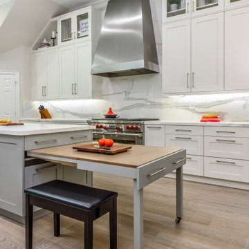
This dark and dated feeling kitchen and bar were completely renovated for this multi-generational global family. By re-configuring the space and incorporating the bar, removing several heavy columns and a wall, it made the kitchen open and accessible to the adjacent rooms and visible from the front door. Everything was lightened and brightened with new cabinetry, counter tops, appliances, flooring, paint, better windows, electrical and lighting. The old range top and down draft were enclosed in a massive brick structure, with no prep space, by removing it and centering the new range on the wall with a custom hood and full height stone back splash, a stunning focal point was created. The position of other key appliances and plumbing were moved or added to create several work stations throughout the large space, such as the refrigeration, full prep sink, coffee bar, baking station, cocktail bar and clean up island. Another special feature of this kitchen was roll out table from the end of the serving island.
Specialty features include:
A roll out table for eating, prep or serving; coffee bar and drink service area with beverage center; full size prep sink adjacent to refrigeration and cooking areas; steam oven and baking station; microwave/warming drawer; dual fuel range with double ovens, 6 burners and a griddle top; two separate islands, one for serving large family meals, one for clean up; specialty spice storage inserts and pull outs; corner turn outs for large items; two double pull outs for trash and recycling; stacked cabinetry with glass display at the top to take advantage of the 14' ceilings.
 Kelly Ferm Inc.
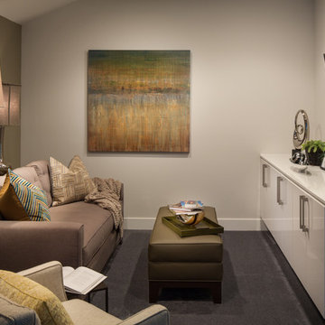
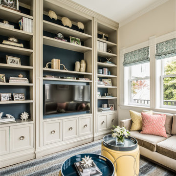
Catch up on your latest book or cuddle up to watch a movie in this cozy living room retreat.
Family room - small transitional enclosed carpeted family room idea in Los Angeles with gray walls, no fireplace and a wall-mounted tv
Family room - small transitional enclosed carpeted family room idea in Los Angeles with gray walls, no fireplace and a wall-mounted tv
 Sklar Studios
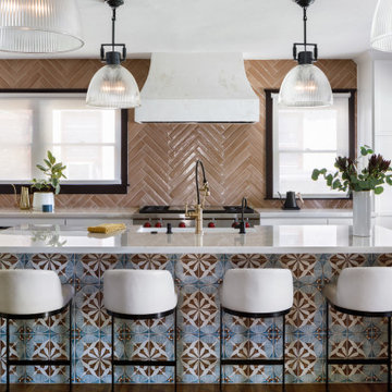
Removal of the walls that separated a once tiny kitchen from the dining room was like that feeling of relief when you unbutton those far too tight pants at the end of the day. It opened up the core of the house, let the daylight flood in, and provided a desired social connection between the cooking, dining, and entertaining experience, plus views to the front yard. One step towards achieving historic status to even apply for the MILS act - all the windows were replaced and returned back to their wood frame glory, and a previously modified window was returned back to it's orginal glass door and window configuration with direct access to the front porch. Existing harwood floors were patched and refinished, structural beams and footings were added as required, and all well worth the effort. The coveted island/ "command station" features a natural quartzite countertop, farmhouse sink, beautiful hand-painted tile, and uber comfortable counter height stools - perfectly proportioned to where the seat back will never get dinged up against the stone top and can tuck completely under the countertop when not in use. Tall, flanking pantries are convenient for everyday items, and deep lower drawers house all the necessities a home chef wants within arms reach.
 Valentini Kids Furniture Brooklyn NY
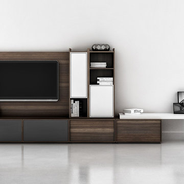
Modern Wall Unit Lyrics 18 by Up Huppe
Made in Canada
The Lyrics by Up Huppe is a modular line of wall units made out of a specially selected American walnut veneer and lacquered in a blend of micro-textured lacquer. The collection is equipped with the highest quality hardware, and the drawers, which are specially treated and stained to match the exterior, are able to close gently and silently due to the invisible, self-closing slow-motion slides. All the modules within the Lyric line can be set on a base, placed on the floor or hung on a wall to allow for the creation of unique configurations, with plenty of storage space within the modules to make them functional as well. The black smoked glass front of the TV base units are made so that they do not interrupt any wireless device signal, and the cut-outs on the back and the adjustable shelves of each unit help provide maximum ventilation for any electronics. Designed by Joel Dupras and manufactured in Canada by a passionate and professional team, the Lyrics line guarantees the highest build quality for each of its units. The Lyrics line offers flexibility with its design, providing you with the option to create your own composition through the many different units available, or giving you the option to choose from the many different pre-designed compositions available.
Features:
Designed by Joel Dupras
Modular line which allows for unique composition building
Veneered wood structure available in a natural, smoky, chocolate, espresso or tobacco walnut finish
TV base units feature cut-outs for wires and a black smoked glass front to prevent wireless device disruption
Front of the closed units and the T-shaped Top available in several lacquered finishes
Drawers are fully finished and equipped with invisible self-closing slow-motion slides
Optional LED Light can be ordered for the TV back panel (for the extra charge)
The starting price is for the Lyrics Wall Unit Composition 18 in a Tobacco Walnut and White Lacquered finish as shown in the main picture. (Glass Front TV Base W60" + Two Wooden Front TV Bases W30" + T-shaped Sliding Top W60" + TV Back Panel + 9046A Bookcase + 9046D Bookcase).
Dimensions:
Wall Unit: W150" x D21.5" x H61.5"
Individual Components:
TV Base W60": W60" x D21.5" x H15.5"
Wooden Front TV Base W30" (each): W30" x D21.5" x H15.5"
T-shaped Sliding Top: W60" x D17" x H17.6"
TV Back Panel: W60" x D2" x H44"
9046D Bookcase: W17.2" x D15.7" x H46"
9046A Bookcase: W12.7" x D15.7" x H46"
 UltraMedia, Inc.
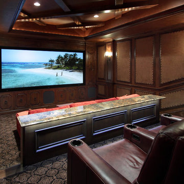
Building this exceptional home cinema system in Westlake, TX was a pleasure from day one. Our clients have owned multiple home theaters, and wanted to step up the performance in this new media room. The construction of the room is heavily reinforced with 2x6s. The entire room has been insulated to keep the sound inside the room and minimize leakage to the rest of the house. The riser base for the back row of chairs was reinforced with wood screws, and was fully insulated. In addition, the walls have been sheetrocked with Quietrock. This treatment substantially keeps the sound from traveling between walls because of its high density coefficient. Because the media room is on the 2nd floor, a sound barrier was added to the floors to provide an additional layer of sound control within the room. The finished walls were treated with custom acoustic panels from Auralex. We applied absorptive, reflective and diffusive treatments throughout the room to create a well-balanced acoustic environment for music and movies. The interior designer brought in a faux painter to create a leather-like texture on the walls. She very creatively faux painted the acoustic cloth panels to match the leather look and feel of the room. A
7.2 complement of Triad speakers are optimally located within the room. The front three LCR speakers are positioned behind an acoustically transparent Stewart video screen. The four surround speakers are located in a horseshoe-shaped configuration and fully envelope the listener with all the subtle (and not-so-subtle) special effects. Two Triad Gold subwoofers are placed in the corners and are dialed into the room for maximum output and tautness of bass. Triad builds an in-wall speaker that is fully baffled which minimizes any sound loss through the walls, and the performance is outstanding.
The electronics featured in this media room are cutting edge. A Wolf Cinema projector with a Variscope lens allows us to set up the most popular aspect ratios and project a brilliant light on a 143" diagonal screen. We utilized the latest pre/pro from Integra as well as Class D amplification from Bel Canto. The Integra incorporates Audyssey digital correction circuitry, which measures the room’s properties/acoustics and maximizes the sound in the room. The sources include an Oppo Blu ray player, AM/FM, DirecTV HD and AppleTV. The entire system is controlled by an RTI touchscreen remote for easy, intuitive control. The sound is effortless and it is a match made in heaven.
The room consists of two rows of seating. The front row is a very comfortable pit seating group and the second row utilizes leather theater chairs. All of this leads to a well-appointed, acoustically superior media room.

 Cook Construction
This four-story Victorian revival was amazing to see unfold; from replacing the foundation, building out the 1st floor, hoisting structural steel into place, and upgrading to in-floor radiant heat. This gorgeous “Old Lady” got all the bells and whistles.
This quintessential Victorian presented itself with all the complications imaginable when bringing an early 1900’s home back to life. Our favorite task? The Custom woodwork: hand carving and installing over 200 florets to match historical home details. Anyone would be hard-pressed to see the transitions from existing to new, but we invite you to come and try for yourselves!
 emma delon
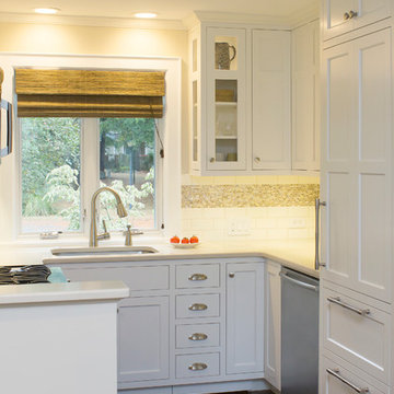
Maximizing the functionality of this space, and coordinating the new kitchen with the beautiful remodel completed previously by the client were the two most important aspects of this project. The existing spaces are elegantly decorated with an open plan, dark hardwood floors, and natural stone accents. The new, lighter, more open kitchen flows beautifully into the client’s existing dining room space. Satin nickel hardware blends with the stainless steel appliances and matches the satin nickel details throughout the home. The fully integrated refrigerator next to the narrow pull-out pantry cabinet, take up less visual weight than a traditional stainless steel appliance and the two combine to provide fantastic storage. The glass cabinet doors and decorative lighting beautifully highlight the client’s glassware and dishes. Finished with white subway tile, Dreamy Marfil quartz countertops, and a warm natural wood blind; the space warm, inviting, elegant, and extremely functional.
copyright 2013 marilyn peryer photography
 Paul Maue Associates Landscape Architects
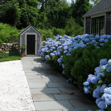
The crused shell driveway is traditional surface that is bordered by a bluestone walk that connects to both the front and back house entries. The relocated tool shed has an outdoor shower on the backside for cleaning up after coming back from the beach. Paul Maue
 Black Knight Group
This 1966 contemporary home was completely renovated into a beautiful, functional home with an up-to-date floor plan more fitting for the way families live today. Removing all of the existing kitchen walls created the open concept floor plan. Adding an addition to the back of the house extended the family room. The first floor was also reconfigured to add a mudroom/laundry room and the first floor powder room was transformed into a full bath. A true master suite with spa inspired bath and walk-in closet was made possible by reconfiguring the existing space and adding an addition to the front of the house.
Sponsored
Sunbury, OH

J.Holderby - Renovations
Franklin County's Leading General Contractors - 2X Best of Houzz!
 Imparfait Design Studio
Over the course of 20 years, the owners of Imparfait and KitchenLab, Rebekah and Nick, have renovated twice, updated, saved and remodeled the barn, connected the barn to the house via a breezeway and screened in porch and put on an addition onto their beloved Michigan farmhouse. You could say they had vision, because the place was a complete mess when they bought it, complete aluminum siding, shag carpet, faux wood paneling, and sheet vinyl flooring - it was definitely a fixer-upper. At first they were weekend warriors, going back and forth between Chicago and Michigan for many years, even after their daughter, Hannah, was born in 2012 they still split their time between Wicker Park and Michigan, but when Covid hit they de-camped permanently and never looked back. Surrounded by grape vines on 4 sides and 10 miles from Lake Michigan, this little slice of heaven has been their sanctuary and home to 20 years of memories, family gatherings, holidays and friends visiting from near and far. Every tree, bush and flower you see they put in the ground…besides the mature Maples in back, the Red Bud in front and the ones they build the screened in porch around (dubious decision). The first renovation included opening up the kitchen to the dining room, adding French doors to the back yard, new siding, roof, windows, refinishing the floors and remodeling the bathrooms - both of which were on the 1st floor. The most recent remodel included an 8ft, 2 story addition giving them a master suite on the 2nd floor and a mirror image one below for their parents, turning one 1st floor bathroom into a walk-in pantry (life saving), converting the other 1st floor bath to a powder room with laundry (equally life-saving), and adding 2 full baths upstairs and a full bath downstairs. Their design studio is 15 minutes away in Lakeside Michigan which was completed just before the house remodel.
 Klopf Architecture
Klopf Architecture and Outer space Landscape Architects designed a new warm, modern, open, indoor-outdoor home in Los Altos, California. Inspired by mid-century modern homes but looking for something completely new and custom, the owners, a couple with two children, bought an older ranch style home with the intention of replacing it.
Created on a grid, the house is designed to be at rest with differentiated spaces for activities; living, playing, cooking, dining and a piano space. The low-sloping gable roof over the great room brings a grand feeling to the space. The clerestory windows at the high sloping roof make the grand space light and airy.
Upon entering the house, an open atrium entry in the middle of the house provides light and nature to the great room. The Heath tile wall at the back of the atrium blocks direct view of the rear yard from the entry door for privacy.
The bedrooms, bathrooms, play room and the sitting room are under flat wing-like roofs that balance on either side of the low sloping gable roof of the main space. Large sliding glass panels and pocketing glass doors foster openness to the front and back yards. In the front there is a fenced-in play space connected to the play room, creating an indoor-outdoor play space that could change in use over the years. The play room can also be closed off from the great room with a large pocketing door. In the rear, everything opens up to a deck overlooking a pool where the family can come together outdoors.
Wood siding travels from exterior to interior, accentuating the indoor-outdoor nature of the house. Where the exterior siding doesn’t come inside, a palette of white oak floors, white walls, walnut cabinetry, and dark window frames ties all the spaces together to create a uniform feeling and flow throughout the house. The custom cabinetry matches the minimal joinery of the rest of the house, a trim-less, minimal appearance. Wood siding was mitered in the corners, including where siding meets the interior drywall. Wall materials were held up off the floor with a minimal reveal. This tight detailing gives a sense of cleanliness to the house.
The garage door of the house is completely flush and of the same material as the garage wall, de-emphasizing the garage door and making the street presentation of the house kinder to the neighborhood.
The house is akin to a custom, modern-day Eichler home in many ways. Inspired by mid-century modern homes with today’s materials, approaches, standards, and technologies. The goals were to create an indoor-outdoor home that was energy-efficient, light and flexible for young children to grow. This 3,000 square foot, 3 bedroom, 2.5 bathroom new house is located in Los Altos in the heart of the Silicon Valley.
Klopf Architecture Project Team: John Klopf, AIA, and Chuang-Ming Liu
Landscape Architect: Outer space Landscape Architects
Structural Engineer: ZFA Structural Engineers
Staging: Da Lusso Design
Photography ©2018 Mariko Reed
Location: Los Altos, CA
Year completed: 2017
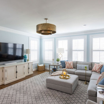
 Designs by Cheryl
Transitional family room is tranquil and inviting The blue walls with luscious furnishings make it very cozy. The gold drum chandelier and gold accents makes this room very sophisticated. The decorative pillows adds pop of colors with the custom area rug. The patterns in the custom area rug and pillows, along with the blue walls makes it all balance. The off white rustic console adds flare and a perfect size for large Media wall T.V. The gold console lamps frames the Media center perfect. The gold floor lamps, and and gold chandelier brings a contemporary style into this space. The Large square ottoman in a neutral grey offsetting the carpet color makes it nice to prop up your feet. The gold drink tables in quite trendy and so functional and practical.
2