
Search results for "Backing play" in Home Design Ideas
 Studio Bergtraun AIA
Treve Johnson
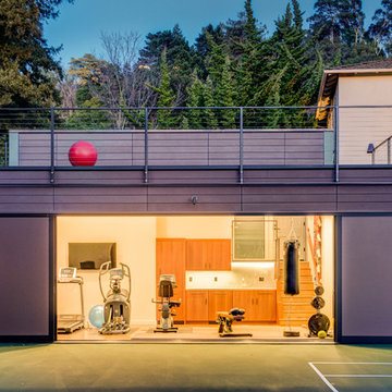
Multiuse home gym - mid-sized contemporary medium tone wood floor multiuse home gym idea in San Francisco with white walls
Multiuse home gym - mid-sized contemporary medium tone wood floor multiuse home gym idea in San Francisco with white walls
 41 West
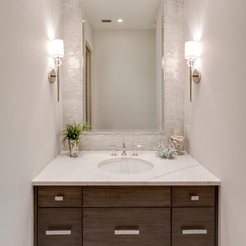
Powder room - transitional gray tile powder room idea in Miami with dark wood cabinets and white countertops
 Sherman Architects
Catherine Tighe
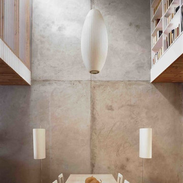
Inspiration for a mid-sized contemporary kitchen/dining room combo remodel in New York with gray walls
Inspiration for a mid-sized contemporary kitchen/dining room combo remodel in New York with gray walls
Find the right local pro for your project
 Klopf Architecture
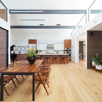
Klopf Architecture and Outer space Landscape Architects designed a new warm, modern, open, indoor-outdoor home in Los Altos, California. Inspired by mid-century modern homes but looking for something completely new and custom, the owners, a couple with two children, bought an older ranch style home with the intention of replacing it.
Created on a grid, the house is designed to be at rest with differentiated spaces for activities; living, playing, cooking, dining and a piano space. The low-sloping gable roof over the great room brings a grand feeling to the space. The clerestory windows at the high sloping roof make the grand space light and airy.
Upon entering the house, an open atrium entry in the middle of the house provides light and nature to the great room. The Heath tile wall at the back of the atrium blocks direct view of the rear yard from the entry door for privacy.
The bedrooms, bathrooms, play room and the sitting room are under flat wing-like roofs that balance on either side of the low sloping gable roof of the main space. Large sliding glass panels and pocketing glass doors foster openness to the front and back yards. In the front there is a fenced-in play space connected to the play room, creating an indoor-outdoor play space that could change in use over the years. The play room can also be closed off from the great room with a large pocketing door. In the rear, everything opens up to a deck overlooking a pool where the family can come together outdoors.
Wood siding travels from exterior to interior, accentuating the indoor-outdoor nature of the house. Where the exterior siding doesn’t come inside, a palette of white oak floors, white walls, walnut cabinetry, and dark window frames ties all the spaces together to create a uniform feeling and flow throughout the house. The custom cabinetry matches the minimal joinery of the rest of the house, a trim-less, minimal appearance. Wood siding was mitered in the corners, including where siding meets the interior drywall. Wall materials were held up off the floor with a minimal reveal. This tight detailing gives a sense of cleanliness to the house.
The garage door of the house is completely flush and of the same material as the garage wall, de-emphasizing the garage door and making the street presentation of the house kinder to the neighborhood.
The house is akin to a custom, modern-day Eichler home in many ways. Inspired by mid-century modern homes with today’s materials, approaches, standards, and technologies. The goals were to create an indoor-outdoor home that was energy-efficient, light and flexible for young children to grow. This 3,000 square foot, 3 bedroom, 2.5 bathroom new house is located in Los Altos in the heart of the Silicon Valley.
Klopf Architecture Project Team: John Klopf, AIA, and Chuang-Ming Liu
Landscape Architect: Outer space Landscape Architects
Structural Engineer: ZFA Structural Engineers
Staging: Da Lusso Design
Photography ©2018 Mariko Reed
Location: Los Altos, CA
Year completed: 2017
 Marty Rhein, CKD, CBD - BAC Design Group
Williamson Photography
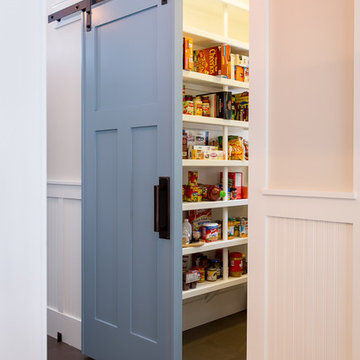
Kitchen pantry - coastal dark wood floor kitchen pantry idea in Other
Kitchen pantry - coastal dark wood floor kitchen pantry idea in Other
 Haus Interior Design
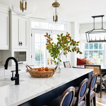
We love a kitchen transformation because it really impacts a family's lives! This bright and airy kitchen was dark and dated and in desperate need of an upgrade to accommodate a busy family. What used to be a 70s glass block wall is now the dramatic stone backsplash and a new rich blue island brings color and lots of extra storage to the space. We used beautiful custom counter stools to make the island a gathering or work-from-home spot, while the built-in banquette provides a comfortable setting for breakfast. There's a built-in coffee station with a metal mesh panel near the beverage center. We mixed soft brushed brass and matte black metal finishes for the hardware and plumbing.
 Klopf Architecture
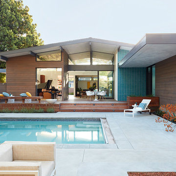
Klopf Architecture and Outer space Landscape Architects designed a new warm, modern, open, indoor-outdoor home in Los Altos, California. Inspired by mid-century modern homes but looking for something completely new and custom, the owners, a couple with two children, bought an older ranch style home with the intention of replacing it.
Created on a grid, the house is designed to be at rest with differentiated spaces for activities; living, playing, cooking, dining and a piano space. The low-sloping gable roof over the great room brings a grand feeling to the space. The clerestory windows at the high sloping roof make the grand space light and airy.
Upon entering the house, an open atrium entry in the middle of the house provides light and nature to the great room. The Heath tile wall at the back of the atrium blocks direct view of the rear yard from the entry door for privacy.
The bedrooms, bathrooms, play room and the sitting room are under flat wing-like roofs that balance on either side of the low sloping gable roof of the main space. Large sliding glass panels and pocketing glass doors foster openness to the front and back yards. In the front there is a fenced-in play space connected to the play room, creating an indoor-outdoor play space that could change in use over the years. The play room can also be closed off from the great room with a large pocketing door. In the rear, everything opens up to a deck overlooking a pool where the family can come together outdoors.
Wood siding travels from exterior to interior, accentuating the indoor-outdoor nature of the house. Where the exterior siding doesn’t come inside, a palette of white oak floors, white walls, walnut cabinetry, and dark window frames ties all the spaces together to create a uniform feeling and flow throughout the house. The custom cabinetry matches the minimal joinery of the rest of the house, a trim-less, minimal appearance. Wood siding was mitered in the corners, including where siding meets the interior drywall. Wall materials were held up off the floor with a minimal reveal. This tight detailing gives a sense of cleanliness to the house.
The garage door of the house is completely flush and of the same material as the garage wall, de-emphasizing the garage door and making the street presentation of the house kinder to the neighborhood.
The house is akin to a custom, modern-day Eichler home in many ways. Inspired by mid-century modern homes with today’s materials, approaches, standards, and technologies. The goals were to create an indoor-outdoor home that was energy-efficient, light and flexible for young children to grow. This 3,000 square foot, 3 bedroom, 2.5 bathroom new house is located in Los Altos in the heart of the Silicon Valley.
Klopf Architecture Project Team: John Klopf, AIA, and Chuang-Ming Liu
Landscape Architect: Outer space Landscape Architects
Structural Engineer: ZFA Structural Engineers
Staging: Da Lusso Design
Photography ©2018 Mariko Reed
Location: Los Altos, CA
Year completed: 2017

 austin outdoor design
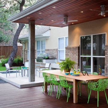
casual dining under a tigerwood ceiling on an ipe deck adjacent to a light limestone patio with an outdoor kitchen for a chef
designed & built by austin outdoor design
photo by ryann ford
 TVL Creative Ltd.
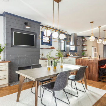
This 1910 West Highlands home was so compartmentalized that you couldn't help to notice you were constantly entering a new room every 8-10 feet. There was also a 500 SF addition put on the back of the home to accommodate a living room, 3/4 bath, laundry room and back foyer - 350 SF of that was for the living room. Needless to say, the house needed to be gutted and replanned.
Kitchen+Dining+Laundry-Like most of these early 1900's homes, the kitchen was not the heartbeat of the home like they are today. This kitchen was tucked away in the back and smaller than any other social rooms in the house. We knocked out the walls of the dining room to expand and created an open floor plan suitable for any type of gathering. As a nod to the history of the home, we used butcherblock for all the countertops and shelving which was accented by tones of brass, dusty blues and light-warm greys. This room had no storage before so creating ample storage and a variety of storage types was a critical ask for the client. One of my favorite details is the blue crown that draws from one end of the space to the other, accenting a ceiling that was otherwise forgotten.
Primary Bath-This did not exist prior to the remodel and the client wanted a more neutral space with strong visual details. We split the walls in half with a datum line that transitions from penny gap molding to the tile in the shower. To provide some more visual drama, we did a chevron tile arrangement on the floor, gridded the shower enclosure for some deep contrast an array of brass and quartz to elevate the finishes.
Powder Bath-This is always a fun place to let your vision get out of the box a bit. All the elements were familiar to the space but modernized and more playful. The floor has a wood look tile in a herringbone arrangement, a navy vanity, gold fixtures that are all servants to the star of the room - the blue and white deco wall tile behind the vanity.
Full Bath-This was a quirky little bathroom that you'd always keep the door closed when guests are over. Now we have brought the blue tones into the space and accented it with bronze fixtures and a playful southwestern floor tile.
Living Room & Office-This room was too big for its own good and now serves multiple purposes. We condensed the space to provide a living area for the whole family plus other guests and left enough room to explain the space with floor cushions. The office was a bonus to the project as it provided privacy to a room that otherwise had none before.
 Organized Living
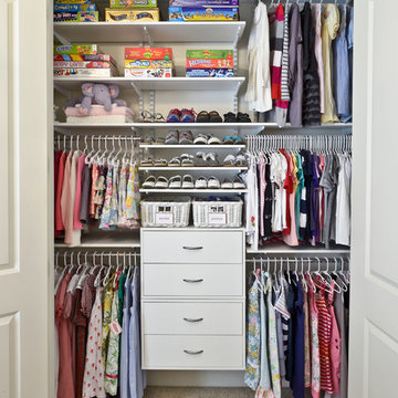
Organized Living freedomRail kids closet. This system grows with your child's needs - from infant to teen. Shelves and brackets adjust instantly without tools. Start with triple hang space for infants and toddlers then change to double hang and long hang later as they grow. See more kid's closet designs at http://organizedliving.com/home/get-inspired/areas-of-the-home/kid-closet
 TVL Creative Ltd.
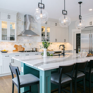
Our clients had just recently closed on their new house in Stapleton and were excited to transform it into their perfect forever home. They wanted to remodel the entire first floor to create a more open floor plan and develop a smoother flow through the house that better fit the needs of their family. The original layout consisted of several small rooms that just weren’t very functional, so we decided to remove the walls that were breaking up the space and restructure the first floor to create a wonderfully open feel.
After removing the existing walls, we rearranged their spaces to give them an office at the front of the house, a large living room, and a large dining room that connects seamlessly with the kitchen. We also wanted to center the foyer in the home and allow more light to travel through the first floor, so we replaced their existing doors with beautiful custom sliding doors to the back yard and a gorgeous walnut door with side lights to greet guests at the front of their home.
Living Room
Our clients wanted a living room that could accommodate an inviting sectional, a baby grand piano, and plenty of space for family game nights. So, we transformed what had been a small office and sitting room into a large open living room with custom wood columns. We wanted to avoid making the home feel too vast and monumental, so we designed custom beams and columns to define spaces and to make the house feel like a home. Aesthetically we wanted their home to be soft and inviting, so we utilized a neutral color palette with occasional accents of muted blues and greens.
Dining Room
Our clients were also looking for a large dining room that was open to the rest of the home and perfect for big family gatherings. So, we removed what had been a small family room and eat-in dining area to create a spacious dining room with a fireplace and bar. We added custom cabinetry to the bar area with open shelving for displaying and designed a custom surround for their fireplace that ties in with the wood work we designed for their living room. We brought in the tones and materiality from the kitchen to unite the spaces and added a mixed metal light fixture to bring the space together
Kitchen
We wanted the kitchen to be a real show stopper and carry through the calm muted tones we were utilizing throughout their home. We reoriented the kitchen to allow for a big beautiful custom island and to give us the opportunity for a focal wall with cooktop and range hood. Their custom island was perfectly complimented with a dramatic quartz counter top and oversized pendants making it the real center of their home. Since they enter the kitchen first when coming from their detached garage, we included a small mud-room area right by the back door to catch everyone’s coats and shoes as they come in. We also created a new walk-in pantry with plenty of open storage and a fun chalkboard door for writing notes, recipes, and grocery lists.
Office
We transformed the original dining room into a handsome office at the front of the house. We designed custom walnut built-ins to house all of their books, and added glass french doors to give them a bit of privacy without making the space too closed off. We painted the room a deep muted blue to create a glimpse of rich color through the french doors
Powder Room
The powder room is a wonderful play on textures. We used a neutral palette with contrasting tones to create dramatic moments in this little space with accents of brushed gold.
Master Bathroom
The existing master bathroom had an awkward layout and outdated finishes, so we redesigned the space to create a clean layout with a dream worthy shower. We continued to use neutral tones that tie in with the rest of the home, but had fun playing with tile textures and patterns to create an eye-catching vanity. The wood-look tile planks along the floor provide a soft backdrop for their new free-standing bathtub and contrast beautifully with the deep ash finish on the cabinetry.
 TVL Creative Ltd.
This 1910 West Highlands home was so compartmentalized that you couldn't help to notice you were constantly entering a new room every 8-10 feet. There was also a 500 SF addition put on the back of the home to accommodate a living room, 3/4 bath, laundry room and back foyer - 350 SF of that was for the living room. Needless to say, the house needed to be gutted and replanned.
Kitchen+Dining+Laundry-Like most of these early 1900's homes, the kitchen was not the heartbeat of the home like they are today. This kitchen was tucked away in the back and smaller than any other social rooms in the house. We knocked out the walls of the dining room to expand and created an open floor plan suitable for any type of gathering. As a nod to the history of the home, we used butcherblock for all the countertops and shelving which was accented by tones of brass, dusty blues and light-warm greys. This room had no storage before so creating ample storage and a variety of storage types was a critical ask for the client. One of my favorite details is the blue crown that draws from one end of the space to the other, accenting a ceiling that was otherwise forgotten.
Primary Bath-This did not exist prior to the remodel and the client wanted a more neutral space with strong visual details. We split the walls in half with a datum line that transitions from penny gap molding to the tile in the shower. To provide some more visual drama, we did a chevron tile arrangement on the floor, gridded the shower enclosure for some deep contrast an array of brass and quartz to elevate the finishes.
Powder Bath-This is always a fun place to let your vision get out of the box a bit. All the elements were familiar to the space but modernized and more playful. The floor has a wood look tile in a herringbone arrangement, a navy vanity, gold fixtures that are all servants to the star of the room - the blue and white deco wall tile behind the vanity.
Full Bath-This was a quirky little bathroom that you'd always keep the door closed when guests are over. Now we have brought the blue tones into the space and accented it with bronze fixtures and a playful southwestern floor tile.
Living Room & Office-This room was too big for its own good and now serves multiple purposes. We condensed the space to provide a living area for the whole family plus other guests and left enough room to explain the space with floor cushions. The office was a bonus to the project as it provided privacy to a room that otherwise had none before.
 KBE Design & Build
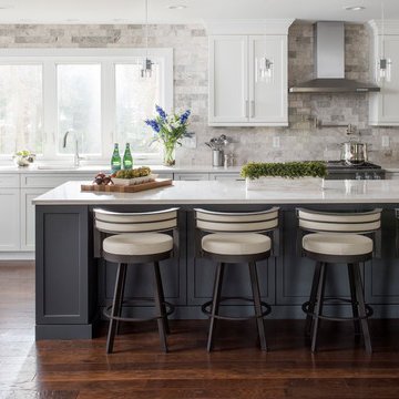
Inspiration for a large transitional l-shaped dark wood floor and brown floor kitchen remodel in Other with white cabinets, quartz countertops, gray backsplash, stainless steel appliances, an island, an undermount sink, shaker cabinets and stone tile backsplash
Sponsored
Delaware, OH

Buckeye Basements, Inc.
Central Ohio's Basement Finishing ExpertsBest Of Houzz '13-'21
 ZeroEnergy Design
This renovated brick rowhome in Boston’s South End offers a modern aesthetic within a historic structure, creative use of space, exceptional thermal comfort, a reduced carbon footprint, and a passive stream of income.
DESIGN PRIORITIES. The goals for the project were clear - design the primary unit to accommodate the family’s modern lifestyle, rework the layout to create a desirable rental unit, improve thermal comfort and introduce a modern aesthetic. We designed the street-level entry as a shared entrance for both the primary and rental unit. The family uses it as their everyday entrance - we planned for bike storage and an open mudroom with bench and shoe storage to facilitate the change from shoes to slippers or bare feet as they enter their home. On the main level, we expanded the kitchen into the dining room to create an eat-in space with generous counter space and storage, as well as a comfortable connection to the living space. The second floor serves as master suite for the couple - a bedroom with a walk-in-closet and ensuite bathroom, and an adjacent study, with refinished original pumpkin pine floors. The upper floor, aside from a guest bedroom, is the child's domain with interconnected spaces for sleeping, work and play. In the play space, which can be separated from the work space with new translucent sliding doors, we incorporated recreational features inspired by adventurous and competitive television shows, at their son’s request.
MODERN MEETS TRADITIONAL. We left the historic front facade of the building largely unchanged - the security bars were removed from the windows and the single pane windows were replaced with higher performing historic replicas. We designed the interior and rear facade with a vision of warm modernism, weaving in the notable period features. Each element was either restored or reinterpreted to blend with the modern aesthetic. The detailed ceiling in the living space, for example, has a new matte monochromatic finish, and the wood stairs are covered in a dark grey floor paint, whereas the mahogany doors were simply refinished. New wide plank wood flooring with a neutral finish, floor-to-ceiling casework, and bold splashes of color in wall paint and tile, and oversized high-performance windows (on the rear facade) round out the modern aesthetic.
RENTAL INCOME. The existing rowhome was zoned for a 2-family dwelling but included an undesirable, single-floor studio apartment at the garden level with low ceiling heights and questionable emergency egress. In order to increase the quality and quantity of space in the rental unit, we reimagined it as a two-floor, 1 or 2 bedroom, 2 bathroom apartment with a modern aesthetic, increased ceiling height on the lowest level and provided an in-unit washer/dryer. The apartment was listed with Jackie O'Connor Real Estate and rented immediately, providing the owners with a source of passive income.
ENCLOSURE WITH BENEFITS. The homeowners sought a minimal carbon footprint, enabled by their urban location and lifestyle decisions, paired with the benefits of a high-performance home. The extent of the renovation allowed us to implement a deep energy retrofit (DER) to address air tightness, insulation, and high-performance windows. The historic front facade is insulated from the interior, while the rear facade is insulated on the exterior. Together with these building enclosure improvements, we designed an HVAC system comprised of continuous fresh air ventilation, and an efficient, all-electric heating and cooling system to decouple the house from natural gas. This strategy provides optimal thermal comfort and indoor air quality, improved acoustic isolation from street noise and neighbors, as well as a further reduced carbon footprint. We also took measures to prepare the roof for future solar panels, for when the South End neighborhood’s aging electrical infrastructure is upgraded to allow them.
URBAN LIVING. The desirable neighborhood location allows the both the homeowners and tenant to walk, bike, and use public transportation to access the city, while each charging their respective plug-in electric cars behind the building to travel greater distances.
OVERALL. The understated rowhouse is now ready for another century of urban living, offering the owners comfort and convenience as they live life as an expression of their values.
Photography: Eric Roth Photo

 Change Your Bathroom©
The goal of this project was to upgrade the builder grade finishes and create an ergonomic space that had a contemporary feel. This bathroom transformed from a standard, builder grade bathroom to a contemporary urban oasis. This was one of my favorite projects, I know I say that about most of my projects but this one really took an amazing transformation. By removing the walls surrounding the shower and relocating the toilet it visually opened up the space. Creating a deeper shower allowed for the tub to be incorporated into the wet area. Adding a LED panel in the back of the shower gave the illusion of a depth and created a unique storage ledge. A custom vanity keeps a clean front with different storage options and linear limestone draws the eye towards the stacked stone accent wall.
Houzz Write Up: https://www.houzz.com/magazine/inside-houzz-a-chopped-up-bathroom-goes-streamlined-and-swank-stsetivw-vs~27263720
The layout of this bathroom was opened up to get rid of the hallway effect, being only 7 foot wide, this bathroom needed all the width it could muster. Using light flooring in the form of natural lime stone 12x24 tiles with a linear pattern, it really draws the eye down the length of the room which is what we needed. Then, breaking up the space a little with the stone pebble flooring in the shower, this client enjoyed his time living in Japan and wanted to incorporate some of the elements that he appreciated while living there. The dark stacked stone feature wall behind the tub is the perfect backdrop for the LED panel, giving the illusion of a window and also creates a cool storage shelf for the tub. A narrow, but tasteful, oval freestanding tub fit effortlessly in the back of the shower. With a sloped floor, ensuring no standing water either in the shower floor or behind the tub, every thought went into engineering this Atlanta bathroom to last the test of time. With now adequate space in the shower, there was space for adjacent shower heads controlled by Kohler digital valves. A hand wand was added for use and convenience of cleaning as well. On the vanity are semi-vessel sinks which give the appearance of vessel sinks, but with the added benefit of a deeper, rounded basin to avoid splashing. Wall mounted faucets add sophistication as well as less cleaning maintenance over time. The custom vanity is streamlined with drawers, doors and a pull out for a can or hamper.
A wonderful project and equally wonderful client. I really enjoyed working with this client and the creative direction of this project.
Brushed nickel shower head with digital shower valve, freestanding bathtub, curbless shower with hidden shower drain, flat pebble shower floor, shelf over tub with LED lighting, gray vanity with drawer fronts, white square ceramic sinks, wall mount faucets and lighting under vanity. Hidden Drain shower system. Atlanta Bathroom.

 brett zamore design
Brett Zamore Design
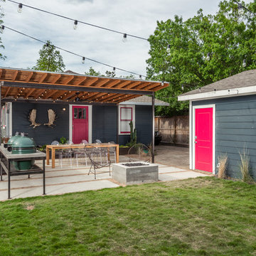
Trendy backyard concrete paver patio photo in Houston with a pergola and a bbq area
Trendy backyard concrete paver patio photo in Houston with a pergola and a bbq area
Sponsored
Sunbury, OH

J.Holderby - Renovations
Franklin County's Leading General Contractors - 2X Best of Houzz!
 Laney LA, Inc.
Rather than starting with an outcome in mind, this 1,400 square foot residence began from a polemic place - exploring shared conviction regarding the concentrated power of living with a smaller footprint. From the gabled silhouette to passive ventilation, the home captures the nostalgia for the past with the sustainable practices of the future.
While the exterior materials contrast a calm, minimal palette with the sleek lines of the gabled silhouette, the interior spaces embody a playful, artistic spirit. From the hand painted De Gournay wallpaper in the master bath to the rugged texture of the over-grouted limestone and Portuguese cobblestones, the home is an experience that encapsulates the unexpected and the timeless.
 austin outdoor design
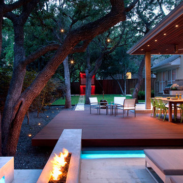
fire pit creates a visual and physical connection from the sunken sitting area to the modern play house at the end of the backyard. the tigerwood ceiling opens itself to a spacious ipe deck that leads down to conversation pit surrounding the fire or the outdoor kitchen patio. the space provides entertainment space for both the young and the old.
designed & built by austin outdoor design
photo by ryann ford
 Klopf Architecture
Klopf Architecture and Outer space Landscape Architects designed a new warm, modern, open, indoor-outdoor home in Los Altos, California. Inspired by mid-century modern homes but looking for something completely new and custom, the owners, a couple with two children, bought an older ranch style home with the intention of replacing it.
Created on a grid, the house is designed to be at rest with differentiated spaces for activities; living, playing, cooking, dining and a piano space. The low-sloping gable roof over the great room brings a grand feeling to the space. The clerestory windows at the high sloping roof make the grand space light and airy.
Upon entering the house, an open atrium entry in the middle of the house provides light and nature to the great room. The Heath tile wall at the back of the atrium blocks direct view of the rear yard from the entry door for privacy.
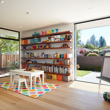
The bedrooms, bathrooms, play room and the sitting room are under flat wing-like roofs that balance on either side of the low sloping gable roof of the main space. Large sliding glass panels and pocketing glass doors foster openness to the front and back yards. In the front there is a fenced-in play space connected to the play room, creating an indoor-outdoor play space that could change in use over the years. The play room can also be closed off from the great room with a large pocketing door. In the rear, everything opens up to a deck overlooking a pool where the family can come together outdoors.
Wood siding travels from exterior to interior, accentuating the indoor-outdoor nature of the house. Where the exterior siding doesn’t come inside, a palette of white oak floors, white walls, walnut cabinetry, and dark window frames ties all the spaces together to create a uniform feeling and flow throughout the house. The custom cabinetry matches the minimal joinery of the rest of the house, a trim-less, minimal appearance. Wood siding was mitered in the corners, including where siding meets the interior drywall. Wall materials were held up off the floor with a minimal reveal. This tight detailing gives a sense of cleanliness to the house.
The garage door of the house is completely flush and of the same material as the garage wall, de-emphasizing the garage door and making the street presentation of the house kinder to the neighborhood.
The house is akin to a custom, modern-day Eichler home in many ways. Inspired by mid-century modern homes with today’s materials, approaches, standards, and technologies. The goals were to create an indoor-outdoor home that was energy-efficient, light and flexible for young children to grow. This 3,000 square foot, 3 bedroom, 2.5 bathroom new house is located in Los Altos in the heart of the Silicon Valley.
Klopf Architecture Project Team: John Klopf, AIA, and Chuang-Ming Liu
Landscape Architect: Outer space Landscape Architects
Structural Engineer: ZFA Structural Engineers
Staging: Da Lusso Design
Photography ©2018 Mariko Reed
Location: Los Altos, CA
Year completed: 2017
3