
Search results for "Barn conversion" in Home Design Ideas

 TVL Creative Ltd.
This project is an incredible transformation and the perfect example of successful style mixing! This client, and now a good friend of TVL (as they all become), is a wonderfully eclectic and adventurous one with immense interest in texture play, pops of color, and unique applications. Our scope in this home included a full kitchen renovation, main level powder room renovation, and a master bathroom overhaul. Taking just over a year to complete from the first design phases to final photos, this project was so insanely fun and packs an amazing amount of fun details and lively surprises. The original kitchen was large and fairly functional. However, the cabinetry was dated, the lighting was inefficient and frankly ugly, and the space was lacking personality in general. Our client desired maximized storage and a more personalized aesthetic. The existing cabinets were short and left the nice height of the space under-utilized. We integrated new gray shaker cabinets from Waypoint Living Spaces and ran them to the ceiling to really exaggerate the height of the space and to maximize usable storage as much as possible. The upper cabinets are glass and lit from within, offering display space or functional storage as the client needs. The central feature of this space is the large cobalt blue range from Viking as well as the custom made reclaimed wood range hood floating above. The backsplash along this entire wall is vertical slab of marble look quartz from Pental Surfaces. This matches the expanse of the same countertop that wraps the room. Flanking the range, we installed cobalt blue lantern penny tile from Merola Tile for a playful texture that adds visual interest and class to the entire room. We upgraded the lighting in the ceiling, under the cabinets, and within cabinets--we also installed accent sconces over each window on the sink wall to create cozy and functional illumination. The deep, textured front Whitehaven apron sink is a dramatic nod to the farmhouse aesthetic from KOHLER, and it's paired with the bold and industrial inspired Tournant faucet, also from Kohler. We finalized this space with other gorgeous appliances, a super sexy dining table and chair set from Room & Board, the Paxton dining light from Pottery Barn and a small bar area and pantry on the far end of the space. In the small powder room on the main level, we converted a drab builder-grade space into a super cute, rustic-inspired washroom. We utilized the Bonner vanity from Signature Hardware and paired this with the cute Ashfield faucet from Pfister. The most unique statements in this room include the water-drop light over the vanity from Shades Of Light, the copper-look porcelain floor tile from Pental Surfaces and the gorgeous Cashmere colored Tresham toilet from Kohler. Up in the master bathroom, elegance abounds. Using the same footprint, we upgraded everything in this space to reflect the client's desire for a more bright, patterned and pretty space. Starting at the entry, we installed a custom reclaimed plank barn door with bold large format hardware from Rustica Hardware. In the bathroom, the custom slate blue vanity from Tharp Cabinet Company is an eye catching statement piece. This is paired with gorgeous hardware from Amerock, vessel sinks from Kohler, and Purist faucets also from Kohler. We replaced the old built-in bathtub with a new freestanding soaker from Signature Hardware. The floor tile is a bold, graphic porcelain tile with a classic color scheme. The shower was upgraded with new tile and fixtures throughout: new clear glass, gorgeous distressed subway tile from the Castle line from TileBar, and a sophisticated shower panel from Vigo. We finalized the space with a small crystal chandelier and soft gray paint. This project is a stunning conversion and we are so thrilled that our client can enjoy these personalized spaces for years to come. Special thanks to the amazing Ian Burks of Burks Wurks Construction for bringing this to life!
 TKS Design Group
Download our free ebook, Creating the Ideal Kitchen. DOWNLOAD NOW
Lakefront property in the northwest suburbs of Chicago is hard to come by, so when we were hired by this young family with exactly that, we were immediately inspired by not just the unusually large footprint of this 1950’s colonial revival but also the lovely views of the manmade lake it was sited on. The large 5-bedroom home was solidly stuck in the 1980’s, but we saw tons of potential. We started out by updating the existing staircase with a fresh coat of paint and adding new herringbone slate to the entry hall.
The powder room off the entryway also got a refresh - new flooring, new cabinets and fixtures. We ran the new slate right through into this space for some consistency. A fun wallpaper and shiplap trim add a welcoming feel and set the tone for the home.
Next, we tackled the kitchen. Located away from the rest of the first floor, the kitchen felt a little isolated, so we immediately began planning for how to better connect it to the rest of the first floor. We landed on removing the wall between the kitchen and dining room and designed a modified galley style space with separate cooking and clean up zones. The cooking zone consists of the refrigerator, prep sink and cooktop, along with a nice long run of prep space at the island. The cleanup side of the kitchen consists of the main sink and dishwasher. Both areas are situated so that the user can view the lake during prep work and cleanup!
One of the home’s main puzzles was how to incorporate the mudroom and area in front of the patio doors at the back of the house. We already had a breakfast table area, so the space by the patio doors was a bit of a no man’s land. We decided to separate the kitchen proper from what became the new mudroom with a large set of barn doors. That way you can quickly hide any mudroom messes but have easy access to the light coming in through the patio doors as well as the outdoor grilling station. We also love the impact the barn doors add to the overall space.
The homeowners’ first words to us were “it’s time to ditch the brown,” so we did! We chose a lovely blue pallet that reflects the home’s location on the lake which is also vibrant yet easy on the eye. Countertops are white quartz, and the natural oak floor works well with the other honey accents. The breakfast table was given a refresh with new chairs, chandelier and window treatments that frame the gorgeous views of the lake out the back.
We coordinated the slate mudroom flooring with that used in the home’s main entrance for a consistent feel. The storage area consists of open and closed storage to allow for some clutter control as needed.
Next on our “to do” list was revamping the dated brown bar area in the neighboring dining room. We eliminated the clutter by adding some closed cabinets and did some easy updates to help the space feel more current. One snag we ran into here was the discovery of a beam above the existing open shelving that had to be modified with a smaller structural beam to allow for our new design to work. This was an unexpected surprise, but in the end we think it was well worth it!
We kept the colors here a bit more muted to blend with the homeowner’s existing furnishings. Open shelving and polished nickel hardware add some simple detail to the new entertainment zone which also looks out onto the lake!
Next we tackled the upstairs starting with the homeowner’s son’s bath. The bath originally had both a tub shower and a separate shower, so we decided to swap out the shower for a new laundry area. This freed up some space downstairs in what used to be the mudroom/laundry room and is much more convenient for daily laundry needs.
We continued the blue palette here with navy cabinetry and the navy tile in the shower. Porcelain floor tile and chrome fixtures keep maintenance to a minimum while matte black mirrors and lighting add some depth the design. A low maintenance runner adds some warmth underfoot and ties the whole space together.
We added a pocket door to the bathroom to minimize interference with the door swings. The left door of the laundry closet is on a 180 degree hinge to allow for easy full access to the machines. Next we tackled the master bath which is an en suite arrangement. The original was typical of the 1980’s with the vanity outside of the bathroom, situated near the master closet. And the brown theme continued here with multiple shades of brown.
Our first move was to segment off the bath and the closet from the master bedroom. We created a short hall from the bedroom to the bathroom with his and hers walk-in closets on the left and right as well as a separate toilet closet outside of the main bathroom for privacy and flexibility.
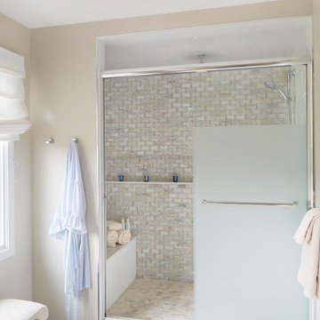
The original bathroom had a giant soaking tub with steps (dangerous!) as well as a small shower that did not work well for our homeowner who is 6’3”. With other bathtubs in the home, they decided to eliminate the tub and create an oversized shower which takes up the space where the old tub was located. The double vanity is on the opposite wall and a bench is located under the window for morning conversations and a place to set a couple of towels.
The pallet in here is light and airy with a mix of blond wood, creamy porcelain and marble tile, and brass accents. A simple roman shade adds some texture and it’s top-down mechanism allows for light and privacy.
This large whole house remodel gave our homeowners not only the ability to maximize the potential of their home but also created a lovely new frame from which to view their fabulous lake views.
Designed by: Susan Klimala, CKD, CBD
Photography by: Michael Kaskel
For more information on kitchen and bath design ideas go to: www.kitchenstudio-ge.com

 Affordable Chic
Mid-sized trendy master multicolored tile and porcelain tile porcelain tile alcove bathtub photo in Minneapolis with shaker cabinets, white cabinets, a two-piece toilet, beige walls, an undermount sink and quartz countertops
Find the right local pro for your project

 San Luis Kitchen Co.
The owners of a charming home in the hills west of Paso Robles recently decided to remodel their not-so-charming kitchen. Referred to San Luis Kitchen by several of their friends, the homeowners visited our showroom and soon decided we were the best people to design a kitchen fitting the style of their home. We were delighted to get to work on the project right away.
When we arrived at the house, we found a small, cramped and out-dated kitchen. The ceiling was low, the cabinets old fashioned and painted a stark dead white, and the best view in the house was neglected in a seldom-used breakfast nook (sequestered behind the kitchen peninsula). This kitchen was also handicapped by white tile counters with dark grout, odd-sized and cluttered cabinets, and small ‘desk’ tacked on to the side of the oven cabinet. Due to a marked lack of counter space & inadequate storage the homeowner had resorted to keeping her small appliances on a little cart parked in the corner and the garbage was just sitting by the wall in full view of everything! On the plus side, the kitchen opened into a nice dining room and had beautiful saltillo tile floors.
Mrs. Homeowner loves to entertain and often hosts dinner parties for her friends. She enjoys visiting with her guests in the kitchen while putting the finishing touches on the evening’s meal. Sadly, her small kitchen really limited her interactions with her guests – she often felt left out of the mix at her own parties! This savvy homeowner dreamed big – a new kitchen that would accommodate multiple workstations, have space for guests to gather but not be in the way, and maybe a prettier transition from the kitchen to the dining (wine service area or hutch?) – while managing the remodel budget by reusing some of her major appliances and keeping (patching as needed) her existing floors.
Responding to the homeowner’s stated wish list and the opportunities presented by the home's setting and existing architecture, the designers at San Luis Kitchen decided to expand the kitchen into the breakfast nook. This change allowed the work area to be reoriented to take advantage of the great view – we replaced the existing window and added another while moving the door to gain space. A second sink and set of refrigerator drawers (housing fresh fruits & veggies) were included for the convenience of this mainly vegetarian cook – her prep station. The clean-up area now boasts a farmhouse style single bowl sink – adding to the ‘cottage’ charm. We located a new gas cook-top between the two workstations for easy access from each. Also tucked in here is a pullout trash/recycle cabinet for convenience and additional drawers for storage.
Running parallel to the work counter we added a long butcher-block island with easy-to-access open shelves for the avid cook and seating for friendly guests placed just right to take in the view. A counter-top garage is used to hide excess small appliances. Glass door cabinets and open shelves are now available to display the owners beautiful dishware. The microwave was placed inconspicuously on the end of the island facing the refrigerator – easy access for guests (and extraneous family members) to help themselves to drinks and snacks while staying out of the cook’s way.
We also moved the pantry storage away from the dining room (putting it on the far wall and closer to the work triangle) and added a furniture-like hutch in its place allowing the more formal dining area to flow seamlessly into the up-beat work area of the kitchen. This space is now also home (opposite wall) to an under counter wine refrigerator, a liquor cabinet and pretty glass door wall cabinet for stemware storage – meeting Mr. Homeowner’s desire for a bar service area.
And then the aesthetic: an old-world style country cottage theme. The homeowners wanted the kitchen to have a warm feel while still loving the look of white cabinetry. San Luis Kitchen melded country-casual knotty pine base cabinets with vintage hand-brushed creamy white wall cabinets to create the desired cottage look. We also added bead board and mullioned glass doors for charm, used an inset doorstyle on the cabinets for authenticity, and mixed stone and wood counters to create an eclectic nuance in the space. All in all, the happy homeowners now boast a charming county cottage kitchen with plenty of space for entertaining their guests while creating gourmet meals to feed them.
Credits:
Custom cabinetry by Wood-Mode Fine Custom Cabinetry
Contracting by Michael Pezzato of Lost Coast Construction
Stone counters by Pyramid M.T.M.

 Infinite Home
Custom Home Built for Real Life
Our clients came to us with a clear vision: a home that could adapt to their lifestyle and growing family. They needed a home built with intention, designed with the future in mind, and built around the routines they loved and the people they loved more.
Open-Concept Living With Hosting in Mind
Our clients hosted often and lived actively, so the main level had to be flexible for all of life’s moments. The goal was a space that felt grand without losing its warmth.
Cooking together as a family mattered to our clients – the Wolf range, farmhouse sink, integrated appliances, and large island gave them a kitchen that flowed effortlessly while looking beautiful. This space also served as the bridge between other parts of the main level so that they would stay in view of the next. This created the perfect environment for gathering where everyone had their own spot without ever feeling apart from the whole group.
For the living room, our clients wanted space that felt open without losing its warmth. Soaring ceilings created that sense of scale, while warm tones and materials, like the wood coffered ceiling and fireplace wall, kept it grounded. That same warmth carried outside, where an outdoor lounge with a fireplace and dining area made sure guests felt welcomed the moment they stepped out.
A Backyard Built for Real Rest
Every corner of the backyard was designed with one goal: to be the ultimate outdoor retreat. The elevated, white-brick-framed pool and integrated spa hot tub gave them a place to truly exhale. As the sun set, the fire pit lounge next to the pool became the hangout spot when they hosted their youth groups and family gatherings.
Room to Grow
With kids in the house, “custom” had to also mean flexible. Our clients had 2 young sons and needed their rooms to grow with them through the years. The two bedrooms and a full bath sat beside a loft that served as both their hangout-and-homework spot. The guest suite sat on the same level where a four-poster bed, floor-to-ceiling wood-look tile, and a frameless glass shower welcomed their guests from day one.
A Retreat That’s Actually Theirs
Between hosting and raising kids, this couple needed a suite that felt like a true escape. The wood-planked tray ceiling and French doors grounded the room in warmth the moment you walked in, while the ensuite bathroom carried a spa-like feeling with a freestanding soaking tub, custom double vanity, and a glass-enclosed shower.
This Is What Approachable Luxury Looks Like
The approachable luxury experience meant starting with conversations about how they wanted their space to live with them – how they hosted, how their kids played, how they wanted to feel walking through their own front door, and how we took their goals and experience and used it as the foundation of every decision that was made from start to finish. We wanted our clients to feel taken care of through the process and, most importantly, feel heard.

 Esther Hershcovich
Photo: Esther Hershcovich © 2016 Houzz
Design: Sebastein Millette
Example of an urban kitchen design in Montreal
Example of an urban kitchen design in Montreal

Sponsored
Columbus, OH
Free consultation for landscape design!

Peabody Landscape Group
Franklin County's Reliable Landscape Design & Contracting

 Pinemar, Inc
Jeffrey Totaro
Pinemar, Inc.- Philadelphia General Contractor & Home Builder.
Inspiration for a farmhouse loft-style dark wood floor family room remodel in Philadelphia
Inspiration for a farmhouse loft-style dark wood floor family room remodel in Philadelphia
 Katie Hutchison Studio
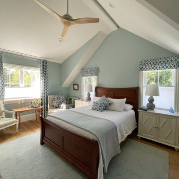
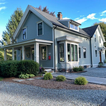
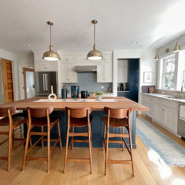
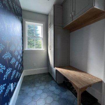
This project for a builder husband and interior-designer wife involved adding onto and restoring the luster of a c. 1883 Carpenter Gothic cottage in Barrington that they had occupied for years while raising their two sons. They were ready to ditch their small tacked-on kitchen that was mostly isolated from the rest of the house, views/daylight, as well as the yard, and replace it with something more generous, brighter, and more open that would improve flow inside and out. They were also eager for a better mudroom, new first-floor 3/4 bath, new basement stair, and a new second-floor master suite above.
The design challenge was to conceive of an addition and renovations that would be in balanced conversation with the original house without dwarfing or competing with it. The new cross-gable addition echoes the original house form, at a somewhat smaller scale and with a simplified more contemporary exterior treatment that is sympathetic to the old house but clearly differentiated from it.
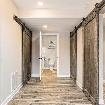
Renovations included the removal of replacement vinyl windows by others and the installation of new Pella black clad windows in the original house, a new dormer in one of the son’s bedrooms, and in the addition. At the first-floor interior intersection between the existing house and the addition, two new large openings enhance flow and access to daylight/view and are outfitted with pairs of salvaged oversized clear-finished wooden barn-slider doors that lend character and visual warmth.
A new exterior deck off the kitchen addition leads to a new enlarged backyard patio that is also accessible from the new full basement directly below the addition.
(Interior fit-out and interior finishes/fixtures by the Owners)

 Kraft Custom Construction
The homeowner of this old, detached garage wanted to create a functional living space with a kitchen, bathroom and second-story bedroom, while still maintaining a functional garage space. We salvaged hickory wood for the floors and built custom fir cabinets in the kitchen with patchwork tile backsplash and energy efficient appliances. As a historical home but without historical requirements, we had fun blending era-specific elements like traditional wood windows, French doors, and wood garage doors with modern elements like solar panels on the roof and accent lighting in the stair risers. In preparation for the next phase of construction (a full kitchen remodel and addition to the main house), we connected the plumbing between the main house and carriage house to make the project more cost-effective. We also built a new gate with custom stonework to match the trellis, expanded the patio between the main house and garage, and installed a gas fire pit to seamlessly tie the structures together and provide a year-round outdoor living space.
 Katie Hutchison Studio
This project for a builder husband and interior-designer wife involved adding onto and restoring the luster of a c. 1883 Carpenter Gothic cottage in Barrington that they had occupied for years while raising their two sons. They were ready to ditch their small tacked-on kitchen that was mostly isolated from the rest of the house, views/daylight, as well as the yard, and replace it with something more generous, brighter, and more open that would improve flow inside and out. They were also eager for a better mudroom, new first-floor 3/4 bath, new basement stair, and a new second-floor master suite above.
The design challenge was to conceive of an addition and renovations that would be in balanced conversation with the original house without dwarfing or competing with it. The new cross-gable addition echoes the original house form, at a somewhat smaller scale and with a simplified more contemporary exterior treatment that is sympathetic to the old house but clearly differentiated from it.
Renovations included the removal of replacement vinyl windows by others and the installation of new Pella black clad windows in the original house, a new dormer in one of the son’s bedrooms, and in the addition. At the first-floor interior intersection between the existing house and the addition, two new large openings enhance flow and access to daylight/view and are outfitted with pairs of salvaged oversized clear-finished wooden barn-slider doors that lend character and visual warmth.
A new exterior deck off the kitchen addition leads to a new enlarged backyard patio that is also accessible from the new full basement directly below the addition.
(Interior fit-out and interior finishes/fixtures by the Owners)

 Gardner Architects LLC
Photography by Ken Wyner
2101 Connecticut Avenue (c.1928), an 8-story brick and limestone Beaux Arts style building with spacious apartments, is said to have been “the finest apartment house to appear in Washington between the two World Wars.” (James M. Goode, Best Addresses, 1988.) As advertised for rent in 1928, the apartments were designed “to incorporate many details that would aid the residents in establishing a home atmosphere, one possessing charm and dignity usually found only in a private house… the character and tenancy (being) assured through careful selection of guests.” Home to Senators, Ambassadors, a Vice President and a Supreme Court Justice as well as numerous Washington socialites, the building still stands as one of the undisputed “best addresses” in Washington, DC.)
So well laid-out was this gracious 3,000 sf apartment that the basic floor plan remains unchanged from the original architect’s 1927 design. The organizing feature was, and continues to be, the grand “gallery” space in the center of the unit. Every room in the apartment can be accessed via the gallery, thus preserving it as the centerpiece of the “charm and dignity” which the original design intended. Programmatic modifications consisted of the addition of a small powder room off of the foyer, and the conversion of a corner “sun room” into a room for meditation and study. The apartment received a thorough updating of all systems, services and finishes, including a new kitchen and new bathrooms, several new built-in cabinetry units, and the consolidation of numerous small closets and passageways into more accessible and efficient storage spaces.
 Katie Hutchison Studio
This project for a builder husband and interior-designer wife involved adding onto and restoring the luster of a c. 1883 Carpenter Gothic cottage in Barrington that they had occupied for years while raising their two sons. They were ready to ditch their small tacked-on kitchen that was mostly isolated from the rest of the house, views/daylight, as well as the yard, and replace it with something more generous, brighter, and more open that would improve flow inside and out. They were also eager for a better mudroom, new first-floor 3/4 bath, new basement stair, and a new second-floor master suite above.
The design challenge was to conceive of an addition and renovations that would be in balanced conversation with the original house without dwarfing or competing with it. The new cross-gable addition echoes the original house form, at a somewhat smaller scale and with a simplified more contemporary exterior treatment that is sympathetic to the old house but clearly differentiated from it.
Renovations included the removal of replacement vinyl windows by others and the installation of new Pella black clad windows in the original house, a new dormer in one of the son’s bedrooms, and in the addition. At the first-floor interior intersection between the existing house and the addition, two new large openings enhance flow and access to daylight/view and are outfitted with pairs of salvaged oversized clear-finished wooden barn-slider doors that lend character and visual warmth.
A new exterior deck off the kitchen addition leads to a new enlarged backyard patio that is also accessible from the new full basement directly below the addition.
(Interior fit-out and interior finishes/fixtures by the Owners)
Sponsored
Sunbury, OH

J.Holderby - Renovations
Franklin County's Leading General Contractors - 2X Best of Houzz!
 Katie Hutchison Studio
This project for a builder husband and interior-designer wife involved adding onto and restoring the luster of a c. 1883 Carpenter Gothic cottage in Barrington that they had occupied for years while raising their two sons. They were ready to ditch their small tacked-on kitchen that was mostly isolated from the rest of the house, views/daylight, as well as the yard, and replace it with something more generous, brighter, and more open that would improve flow inside and out. They were also eager for a better mudroom, new first-floor 3/4 bath, new basement stair, and a new second-floor master suite above.
The design challenge was to conceive of an addition and renovations that would be in balanced conversation with the original house without dwarfing or competing with it. The new cross-gable addition echoes the original house form, at a somewhat smaller scale and with a simplified more contemporary exterior treatment that is sympathetic to the old house but clearly differentiated from it.
Renovations included the removal of replacement vinyl windows by others and the installation of new Pella black clad windows in the original house, a new dormer in one of the son’s bedrooms, and in the addition. At the first-floor interior intersection between the existing house and the addition, two new large openings enhance flow and access to daylight/view and are outfitted with pairs of salvaged oversized clear-finished wooden barn-slider doors that lend character and visual warmth.
A new exterior deck off the kitchen addition leads to a new enlarged backyard patio that is also accessible from the new full basement directly below the addition.
(Interior fit-out and interior finishes/fixtures by the Owners)
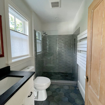 Katie Hutchison Studio
This project for a builder husband and interior-designer wife involved adding onto and restoring the luster of a c. 1883 Carpenter Gothic cottage in Barrington that they had occupied for years while raising their two sons. They were ready to ditch their small tacked-on kitchen that was mostly isolated from the rest of the house, views/daylight, as well as the yard, and replace it with something more generous, brighter, and more open that would improve flow inside and out. They were also eager for a better mudroom, new first-floor 3/4 bath, new basement stair, and a new second-floor master suite above.
The design challenge was to conceive of an addition and renovations that would be in balanced conversation with the original house without dwarfing or competing with it. The new cross-gable addition echoes the original house form, at a somewhat smaller scale and with a simplified more contemporary exterior treatment that is sympathetic to the old house but clearly differentiated from it.
Renovations included the removal of replacement vinyl windows by others and the installation of new Pella black clad windows in the original house, a new dormer in one of the son’s bedrooms, and in the addition. At the first-floor interior intersection between the existing house and the addition, two new large openings enhance flow and access to daylight/view and are outfitted with pairs of salvaged oversized clear-finished wooden barn-slider doors that lend character and visual warmth.
A new exterior deck off the kitchen addition leads to a new enlarged backyard patio that is also accessible from the new full basement directly below the addition.
(Interior fit-out and interior finishes/fixtures by the Owners)
 Gardner Architects LLC
Photography by Ken Wyner
2101 Connecticut Avenue (c.1928), an 8-story brick and limestone Beaux Arts style building with spacious apartments, is said to have been “the finest apartment house to appear in Washington between the two World Wars.” (James M. Goode, Best Addresses, 1988.) As advertised for rent in 1928, the apartments were designed “to incorporate many details that would aid the residents in establishing a home atmosphere, one possessing charm and dignity usually found only in a private house… the character and tenancy (being) assured through careful selection of guests.” Home to Senators, Ambassadors, a Vice President and a Supreme Court Justice as well as numerous Washington socialites, the building still stands as one of the undisputed “best addresses” in Washington, DC.)
So well laid-out was this gracious 3,000 sf apartment that the basic floor plan remains unchanged from the original architect’s 1927 design. The organizing feature was, and continues to be, the grand “gallery” space in the center of the unit. Every room in the apartment can be accessed via the gallery, thus preserving it as the centerpiece of the “charm and dignity” which the original design intended. Programmatic modifications consisted of the addition of a small powder room off of the foyer, and the conversion of a corner “sun room” into a room for meditation and study. The apartment received a thorough updating of all systems, services and finishes, including a new kitchen and new bathrooms, several new built-in cabinetry units, and the consolidation of numerous small closets and passageways into more accessible and efficient storage spaces.
 Gardner Architects LLC
Photography by Ken Wyner
2101 Connecticut Avenue (c.1928), an 8-story brick and limestone Beaux Arts style building with spacious apartments, is said to have been “the finest apartment house to appear in Washington between the two World Wars.” (James M. Goode, Best Addresses, 1988.) As advertised for rent in 1928, the apartments were designed “to incorporate many details that would aid the residents in establishing a home atmosphere, one possessing charm and dignity usually found only in a private house… the character and tenancy (being) assured through careful selection of guests.” Home to Senators, Ambassadors, a Vice President and a Supreme Court Justice as well as numerous Washington socialites, the building still stands as one of the undisputed “best addresses” in Washington, DC.)
So well laid-out was this gracious 3,000 sf apartment that the basic floor plan remains unchanged from the original architect’s 1927 design. The organizing feature was, and continues to be, the grand “gallery” space in the center of the unit. Every room in the apartment can be accessed via the gallery, thus preserving it as the centerpiece of the “charm and dignity” which the original design intended. Programmatic modifications consisted of the addition of a small powder room off of the foyer, and the conversion of a corner “sun room” into a room for meditation and study. The apartment received a thorough updating of all systems, services and finishes, including a new kitchen and new bathrooms, several new built-in cabinetry units, and the consolidation of numerous small closets and passageways into more accessible and efficient storage spaces.
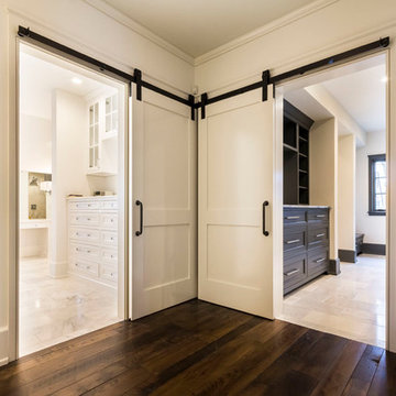

 Gardner Architects LLC
Photography by Ken Wyner
2101 Connecticut Avenue (c.1928), an 8-story brick and limestone Beaux Arts style building with spacious apartments, is said to have been “the finest apartment house to appear in Washington between the two World Wars.” (James M. Goode, Best Addresses, 1988.) As advertised for rent in 1928, the apartments were designed “to incorporate many details that would aid the residents in establishing a home atmosphere, one possessing charm and dignity usually found only in a private house… the character and tenancy (being) assured through careful selection of guests.” Home to Senators, Ambassadors, a Vice President and a Supreme Court Justice as well as numerous Washington socialites, the building still stands as one of the undisputed “best addresses” in Washington, DC.)
So well laid-out was this gracious 3,000 sf apartment that the basic floor plan remains unchanged from the original architect’s 1927 design. The organizing feature was, and continues to be, the grand “gallery” space in the center of the unit. Every room in the apartment can be accessed via the gallery, thus preserving it as the centerpiece of the “charm and dignity” which the original design intended. Programmatic modifications consisted of the addition of a small powder room off of the foyer, and the conversion of a corner “sun room” into a room for meditation and study. The apartment received a thorough updating of all systems, services and finishes, including a new kitchen and new bathrooms, several new built-in cabinetry units, and the consolidation of numerous small closets and passageways into more accessible and efficient storage spaces.
 Gardner Architects LLC
Photography by Ken Wyner
2101 Connecticut Avenue (c.1928), an 8-story brick and limestone Beaux Arts style building with spacious apartments, is said to have been “the finest apartment house to appear in Washington between the two World Wars.” (James M. Goode, Best Addresses, 1988.) As advertised for rent in 1928, the apartments were designed “to incorporate many details that would aid the residents in establishing a home atmosphere, one possessing charm and dignity usually found only in a private house… the character and tenancy (being) assured through careful selection of guests.” Home to Senators, Ambassadors, a Vice President and a Supreme Court Justice as well as numerous Washington socialites, the building still stands as one of the undisputed “best addresses” in Washington, DC.)
So well laid-out was this gracious 3,000 sf apartment that the basic floor plan remains unchanged from the original architect’s 1927 design. The organizing feature was, and continues to be, the grand “gallery” space in the center of the unit. Every room in the apartment can be accessed via the gallery, thus preserving it as the centerpiece of the “charm and dignity” which the original design intended. Programmatic modifications consisted of the addition of a small powder room off of the foyer, and the conversion of a corner “sun room” into a room for meditation and study. The apartment received a thorough updating of all systems, services and finishes, including a new kitchen and new bathrooms, several new built-in cabinetry units, and the consolidation of numerous small closets and passageways into more accessible and efficient storage spaces.
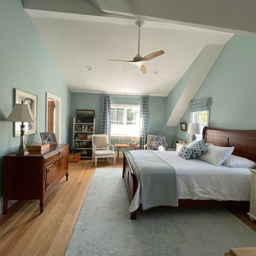 Katie Hutchison Studio
This project for a builder husband and interior-designer wife involved adding onto and restoring the luster of a c. 1883 Carpenter Gothic cottage in Barrington that they had occupied for years while raising their two sons. They were ready to ditch their small tacked-on kitchen that was mostly isolated from the rest of the house, views/daylight, as well as the yard, and replace it with something more generous, brighter, and more open that would improve flow inside and out. They were also eager for a better mudroom, new first-floor 3/4 bath, new basement stair, and a new second-floor master suite above.
The design challenge was to conceive of an addition and renovations that would be in balanced conversation with the original house without dwarfing or competing with it. The new cross-gable addition echoes the original house form, at a somewhat smaller scale and with a simplified more contemporary exterior treatment that is sympathetic to the old house but clearly differentiated from it.
Renovations included the removal of replacement vinyl windows by others and the installation of new Pella black clad windows in the original house, a new dormer in one of the son’s bedrooms, and in the addition. At the first-floor interior intersection between the existing house and the addition, two new large openings enhance flow and access to daylight/view and are outfitted with pairs of salvaged oversized clear-finished wooden barn-slider doors that lend character and visual warmth.
A new exterior deck off the kitchen addition leads to a new enlarged backyard patio that is also accessible from the new full basement directly below the addition.
(Interior fit-out and interior finishes/fixtures by the Owners)
159