
Search results for "Belongs" in Home Design Ideas

 Providence Design
Another shot of the Master Bathroom tub surrounded with custom drapery panels and hardware. Accented with a classic styled bergère chair and frosted glass chandelier.
Photography: Rett Peek
 Simply Home Decorating
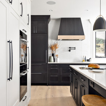
This beautiful North Vancouver home belongs to a nature-loving and health-conscious couple, Emma and Vince (names changed), their two young children, and their dog, Jasper. When they contacted us about renovating and furnishing their kitchen and family room, we walked in and saw a world of potential waiting to be uncovered.
Before: Larkhall Crescent Home:
Like many original North Vancouver homes, the interior was definitely dated. We encountered late ‘80s finishes in powder pink and teal green, old carpet, and a kitchen that wasn’t maximized to suit this family’s modern-day lifestyle. However, the size of the rooms offered us a ton of space with which to get creative.
Knowing our clients’ love of cooking, need for work spaces (Emma and Vince both work remotely), and growing family, we developed a design concept that would increase usable space, optimize storage, and create intimacy in this large area. As for the style, we were inspired by their European roots, inventing a new and modern take on “Belgian Farmhouse” style. Now, the home is truly one-of-a-kind.
After: Warm & Cozy Family Room:
Fresh, bright, and comfortable, this living area has been transformed! We started with the fireplace as a focal point, selecting aged brick tiles for added texture and a crisp wood mantle. The taupe-coloured sectional infuses the room with visual warmth and serves the added purpose of separating the family room from the kitchen.
Emma and Vince were also keen on using non-toxic materials in their home, and we were happy to oblige. To meet their needs, we sourced natural wood elements and sought out Canadian-made products - that adhere to high health standards - whenever possible.
Look closer at the elements of this space, and you will find this stunning, honeycomb-patterned rug in earthy gold, beige, and charcoal tones. It’s plush to the touch and full of visual texture that brings this room’s colour palette together. We sourced these two-tone chairs with caning, petrified wood side table, black sconces, and botanical prints in greyscale from local artist, Heather Johnston.
We topped off the space with this dark wood and rattan console that offers storage facing the kitchen and presents an opportunity to display cherished items. The result is a cozy lounging space brimming with comfort and functionality. It’s perfect for enjoying quality family time, or Emma can simply slide the coffee table away to make room for her morning yoga practice.
Now, let’s turn around and give some attention to the kitchen. Do you remember what the original kitchen looked like? If not, scroll back up, because the transformation is shocking…
Moody & Welcoming Kitchen for Healthy Living:
This kitchen looks very different from how it started, right? Though we didn’t touch any walls, the kitchen has almost doubled in usable space! We created a long, extended island with storage, an outlet for small appliances, and seating for comfortable prep, after-school snacking, or mingling among friends.
On the other side of the island, the family has even more storage and an integrated dishwasher within easy reach of the sink, perfect for quick clean-up. From this angle, you can also see the expansive custom Shaker cabinetry in white and the integrated double ovens. These facilitate their cooking experience and gave us the opportunity to add an additional surprise…
A coffee garage station and more hidden storage! Keeping these items located along the perimeter allows them to be accessed by the family or their guests without someone getting under the cook’s feet. These are the little details that make everyday life easier and more enjoyable.
Moving deeper into the kitchen, the seamless induction cooktop topped with a freestanding concealed hood fan commands attention in a soft yet prominent way. The natural wood accent mirrors the fireplace mantle, and the choice of off-black wood-grain cabinets not only continues our black-and-white colour palette but adds a sense of depth and contrast. The corner sink is located to the right and perfectly positioned with a view of their thriving backyard.
To invite more of this family’s character into the space, we mixed metals for interest — matte black, dark pewter, and warm brass — and created open shelves in white oak for their plants and decor. You can also glimpse the tumbled edge of the backsplash tile, which echoes the rustic brick of the fireplace. It adds that farmhouse charm while still feeling timeless and sophisticated.
Last but not least, we designed this dining banquette in the bay window (with integrated bench storage, of course), where the family can share a meal together, the kids can do homework, or Emma and Vince can work and enjoy a change of scenery from their offices. Like the other spaces in the home, it was designed to be beautiful, multi-functional, and long-lasting.
Praise from Our Clients:
It is clear that we love this home, but what did our clients have to say?
“Lori is a visionary and masters execution to the finest detail all at the same time. When she first met us to know more about who we are and how we live, she could right away envision how we could use the space in our kitchen and living room…The results exceeded our expectations.
Lori and her team were also a delight to work with — coordination with all the trades, fast problem-solving, regular updates, professional and friendly attitude of her entire team — made it the dream team. Thank you SHD for making our space so beautiful!”
In turn, we are so grateful for this family’s trust, their open communication, and for being wonderful people with whom to work. (So, thank you!)

 TVL Creative Ltd.
Our wonderful Baker clients were ready to remodel the kitchen in their c.1900 home shortly after moving in. They were looking to undo the 90s remodel that existed, and make the kitchen feel like it belonged in their historic home. We were able to design a balance that incorporated the vintage charm of their home and the modern pops that really give the kitchen its personality. We started by removing the mirrored wall that had separated their kitchen from the breakfast area. This allowed us the opportunity to open up their space dramatically and create a cohesive design that brings the two rooms together. To further our goal of making their kitchen appear more open we removed the wall cabinets along their exterior wall and replaced them with open shelves. We then incorporated a pantry cabinet into their refrigerator wall to balance out their storage needs. This new layout also provided us with the space to include a peninsula with counter seating so that guests can keep the cook company. We struck a fun balance of materials starting with the black & white hexagon tile on the floor to give us a pop of pattern. We then layered on simple grey shaker cabinets and used a butcher block counter top to add warmth to their kitchen. We kept the backsplash clean by utilizing an elongated white subway tile, and painted the walls a rich blue to add a touch of sophistication to the space.
Find the right local pro for your project
 AV Architects + Builders
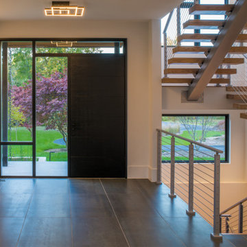
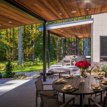
The Architect House is located on a breathtaking five-acre property in Great Falls, VA. This modern home was designed to shape itself into the site and landscape. By doing so each indoor space individually responds to the corresponding outdoor space. The entire house is then able to knit itself together with spaces that freely flow together from inside and out.
The orientation of the house allows sunlight to tell the time of the day while you are inside. Upon entering you see straight through a central atrium and into the landscape beyond. Natural light and views of nature are captured from every angle inside the home.
The modern exterior design of the house utilizes a linear brick at the base of the house that anchors it to the land. Gray and cedar colored modern architectural panel siding alternate patterns on all facades of the house, accentuating the different volumes. These volumes are then capped off by low sloping metal panel roofs. Exposed steel beans and columns are utilized to create long spans of covered outdoor spaces that then easily recede into the backdrop of the landscape.
The design of this modern home is in harmony with the site and landscape creating a warm welcoming feeling and one that conveys that the house belongs there.

 Regan Baker Design Inc.
Well-traveled. Relaxed. Timeless.
Our well-traveled clients were soon-to-be empty nesters when they approached us for help reimagining their Presidio Heights home. The expansive Spanish-Revival residence originally constructed in 1908 had been substantially renovated 8 year prior, but needed some adaptations to better suit the needs of a family with three college-bound teens. We evolved the space to be a bright, relaxed reflection of the family’s time together, revising the function and layout of the ground-floor rooms and filling them with casual, comfortable furnishings and artifacts collected abroad.
One of the key changes we made to the space plan was to eliminate the formal dining room and transform an area off the kitchen into a casual gathering spot for our clients and their children. The expandable table and coffee/wine bar means the room can handle large dinner parties and small study sessions with similar ease. The family room was relocated from a lower level to be more central part of the main floor, encouraging more quality family time, and freeing up space for a spacious home gym.
In the living room, lounge-worthy upholstery grounds the space, encouraging a relaxed and effortless West Coast vibe. Exposed wood beams recall the original Spanish-influence, but feel updated and fresh in a light wood stain. Throughout the entry and main floor, found artifacts punctate the softer textures — ceramics from New Mexico, religious sculpture from Asia and a quirky wall-mounted phone that belonged to our client’s grandmother.
 Closet Factory
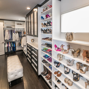
Welcome to the epitome of modern luxury and organization – your contemporary walk-in closet. This stylish haven is not just a storage space; it's a personalized boutique designed to elevate your wardrobe experience.
As you step into the room, the first thing you'll notice is the sleek design and ample natural light, accentuating the clean lines and neutral tones. The closet is thoughtfully organized, ensuring that every item has its designated place.
On either side of the closet, custom-built shelves showcase your impressive shoe collection. Each pair has its own dedicated spot, allowing you to easily find and admire your favorite footwear. The shelves are not just practical; they're a display of artistry, designed to turn your shoes into a visual feast.
Ample storage solutions line the walls, offering designated sections for hanging clothes, folded items, and accessories. The closet's intelligent design maximizes space, ensuring that every inch is utilized efficiently. Integrated lighting adds a touch of glamour, spotlighting specific areas and creating an ambiance that turns dressing into an experience.
The contemporary walk-in closet isn't just a space to store your belongings; it's a sanctuary where you curate your style. It's a reflection of your taste, a blend of functionality and aesthetics that makes getting ready each day a joy. Welcome to a space where organization meets opulence, and where your wardrobe dreams come to life.

 InsideWright
This was a HUGE project that I eventually had a lot of fun with. Another Feng Shui request existed here: this area of the home was supposed to have purples and golds and no unfinished projects or clutter of any kind. Well, this was a storage room. Boxes full of items that were never used, empty boxes to maybe use for shipping in the future, broken items that were intended to be fixed, and furniture that might one day be put to use. Purging was both challenging and incredibly rewarding. I pulled everything out of the room so that it could be plastered and painted and only brought back items that had a use and belonged in this room ... which became a functioning office and studio for a very creative individual. A 4 x 8' piece of Homasote was covered in an ooge patterned wallpaper to be used as a cork board for creative ideas. The ogee motif is repeated in the drapes, decorative paper in frames and backing wigs, and the rug. (The modernist lighting pendant lamp has a related wave-like pattern.) The ogee pattern was inspired by a pair of antique chairs that are too fragile to sit on, so became decorative accents. Not all of the clutter disappeared. It is an artist's studio, clutter is a natural part of the creative process. There's a "Modern Metallics Champagne" accent wall, and purple and gold accents scattered around the room. Purple and gold are not colors I wanted to drown this room in.
 Closet Factory
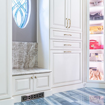
Welcome to the epitome of modern luxury and organization – your french baroque walk-in closet. This stylish haven is not just a storage space; it's a personalized boutique designed to elevate your wardrobe experience.
As you step into the room, the first thing you'll notice is the sleek design and ample natural light, accentuating the clean lines and neutral tones. The closet is thoughtfully organized, ensuring that every item has its designated place. The centerpiece of the room is a meticulously crafted island, adorned with a stylish countertop, providing a multifunctional space for folding clothes or laying out accessories.
On either side of the closet, custom-built shelves showcase your impressive shoe collection. Each pair has its own dedicated spot, allowing you to easily find and admire your favorite footwear. The shelves are not just practical; they're a display of artistry, designed to turn your shoes into a visual feast.
Ample storage solutions line the walls, offering designated sections for hanging clothes, folded items, and accessories. The closet's intelligent design maximizes space, ensuring that every inch is utilized efficiently. Integrated lighting adds a touch of glamour, spotlighting specific areas and creating an ambiance that turns dressing into an experience.
The french baroque walk-in closet isn't just a space to store your belongings; it's a sanctuary where you curate your style. It's a reflection of your taste, a blend of functionality and aesthetics that makes getting ready each day a joy. Welcome to a space where organization meets opulence, and where your wardrobe dreams come to life.
 AV Architects + Builders
The Architect House is located on a breathtaking five-acre property in Great Falls, VA. This modern home was designed to shape itself into the site and landscape. By doing so each indoor space individually responds to the corresponding outdoor space. The entire house is then able to knit itself together with spaces that freely flow together from inside and out.
The orientation of the house allows sunlight to tell the time of the day while you are inside. Upon entering you see straight through a central atrium and into the landscape beyond. Natural light and views of nature are captured from every angle inside the home.
The modern exterior design of the house utilizes a linear brick at the base of the house that anchors it to the land. Gray and cedar colored modern architectural panel siding alternate patterns on all facades of the house, accentuating the different volumes. These volumes are then capped off by low sloping metal panel roofs. Exposed steel beans and columns are utilized to create long spans of covered outdoor spaces that then easily recede into the backdrop of the landscape.
The design of this modern home is in harmony with the site and landscape creating a warm welcoming feeling and one that conveys that the house belongs there.

 Kitchen Studio: Kansas City
Matt Kocourek
Example of a mid-sized transitional galley medium tone wood floor open concept kitchen design in Kansas City with an undermount sink, recessed-panel cabinets, white cabinets, granite countertops, metallic backsplash, glass tile backsplash, stainless steel appliances and an island
Example of a mid-sized transitional galley medium tone wood floor open concept kitchen design in Kansas City with an undermount sink, recessed-panel cabinets, white cabinets, granite countertops, metallic backsplash, glass tile backsplash, stainless steel appliances and an island

 dRemodeling Design-Build
Chrome hardware was chosen in accompany with chrome fixtures to modernize the design.
Large minimalist master white tile and subway tile ceramic tile bathroom photo in Philadelphia with an undermount sink, shaker cabinets, gray cabinets, marble countertops and white walls
Large minimalist master white tile and subway tile ceramic tile bathroom photo in Philadelphia with an undermount sink, shaker cabinets, gray cabinets, marble countertops and white walls
 TVL Creative Ltd.
Our wonderful Baker clients were ready to remodel the kitchen in their c.1900 home shortly after moving in. They were looking to undo the 90s remodel that existed, and make the kitchen feel like it belonged in their historic home. We were able to design a balance that incorporated the vintage charm of their home and the modern pops that really give the kitchen its personality. We started by removing the mirrored wall that had separated their kitchen from the breakfast area. This allowed us the opportunity to open up their space dramatically and create a cohesive design that brings the two rooms together. To further our goal of making their kitchen appear more open we removed the wall cabinets along their exterior wall and replaced them with open shelves. We then incorporated a pantry cabinet into their refrigerator wall to balance out their storage needs. This new layout also provided us with the space to include a peninsula with counter seating so that guests can keep the cook company. We struck a fun balance of materials starting with the black & white hexagon tile on the floor to give us a pop of pattern. We then layered on simple grey shaker cabinets and used a butcher block counter top to add warmth to their kitchen. We kept the backsplash clean by utilizing an elongated white subway tile, and painted the walls a rich blue to add a touch of sophistication to the space.
 Regan Baker Design Inc.
Well-traveled. Relaxed. Timeless.
Our well-traveled clients were soon-to-be empty nesters when they approached us for help reimagining their Presidio Heights home. The expansive Spanish-Revival residence originally constructed in 1908 had been substantially renovated 8 year prior, but needed some adaptations to better suit the needs of a family with three college-bound teens. We evolved the space to be a bright, relaxed reflection of the family’s time together, revising the function and layout of the ground-floor rooms and filling them with casual, comfortable furnishings and artifacts collected abroad.
One of the key changes we made to the space plan was to eliminate the formal dining room and transform an area off the kitchen into a casual gathering spot for our clients and their children. The expandable table and coffee/wine bar means the room can handle large dinner parties and small study sessions with similar ease. The family room was relocated from a lower level to be more central part of the main floor, encouraging more quality family time, and freeing up space for a spacious home gym.
In the living room, lounge-worthy upholstery grounds the space, encouraging a relaxed and effortless West Coast vibe. Exposed wood beams recall the original Spanish-influence, but feel updated and fresh in a light wood stain. Throughout the entry and main floor, found artifacts punctate the softer textures — ceramics from New Mexico, religious sculpture from Asia and a quirky wall-mounted phone that belonged to our client’s grandmother.

 Cabinet Factory Outlet Plus
CHIPPER HATTER PHOTOGRAPHY
Eat-in kitchen - large modern l-shaped light wood floor eat-in kitchen idea in Omaha with dark wood cabinets, multicolored backsplash, stainless steel appliances, a farmhouse sink, granite countertops, an island, recessed-panel cabinets and mosaic tile backsplash
Eat-in kitchen - large modern l-shaped light wood floor eat-in kitchen idea in Omaha with dark wood cabinets, multicolored backsplash, stainless steel appliances, a farmhouse sink, granite countertops, an island, recessed-panel cabinets and mosaic tile backsplash
 Claude Clemaron Luxury Bespoke Furniture
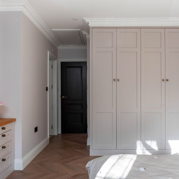
This bespoke fitted furniture for a child’s bedroom was created for our clients’ family home in Guildford, Surrey. Our clients wanted a made-to-measure suite of sustainable, handcrafted furniture in a classic design that would stand the test of time. The timeless shaker style and traditional construction in solid wood ensures a quality that will endure for generations.
The built-in furniture includes floor to ceiling wardrobes, drawers, display shelves and an integrated desk that all fit perfectly with the interior architecture of our clients’ home. While the mainly closed storage looks neater and helps to minimise clutter, a set of cubby holes has been created to display toys, books, and pictures.
The bespoke cabinetry is spray-painted with an eco-friendly paint from Farrow and Ball in Shadow White. This soft white with a hint of grey is a neutral, restful colour. Doors and drawers are dressed with antique brass knurled cupboard knobs. The worktop surface is a hardwearing natural light real oak wood veneer.
Fully integrated cabinetry
The floor to ceiling cabinetry is beautifully finished with a custom-made decorative plaster cornice. The cornice gives tall wardrobes and bookcases a finished, aesthetically pleasing look by providing a smooth transition from the top of the cabinets to the ceiling.
Pull-out trays for wardrobe interiors
The two low levels of full extension, soft glide trays are a super storage feature for all kinds of folded clothes, footwear, bags, and other belongings. The low-profile fronts provide easy access to the contents.
 Redecorating Vancouver
A modern home with an eclectic mix
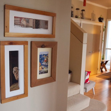
My clients in this space were divided. They were split by competing aesthetics. There were Vietnamese art pieces with modern motifs and bold colours mixed with hand-crafted rustic tables and antique Canadiana. I quickly identified a lack of cohesion and an uncomfortable conversation area as the primary issues that were causing my clients stress.
A change was in order. We partitioned their large connected dining room, living and entryway areas using the existing furniture and floor covering. We were able to create several distinct and cohesive areas that each brought out the best of their contents. Each grouping now seemed natural and harmonious. Smooth international contemporary style and rustic heritage pieces now coexisted in the same space without causing my clients decorating headaches. To organize future projects and to summarize personalized decorating tips, Redecorating Vancouver provided them with a written Design Plan at the conclusion of the consultation.
Family is important to me. I recognize that items in my clients' homes have unseen significance. In this instance, I was able to gather items to create a grand-parents nook to honour the couple's family. We took advantage of an heirloom antique radio that belonged to the client's grandfather and a meaningful handmade table. It is both pleasing to the eye and a daily reminder to the couple of who really matters in a home: the family that lives in it.

 Interior Anthology
Large Master Bathroom with freestanding tub and glass encased shower alcove. Mosaic marble accent tile throughout. White woven blinds added for privacy. Photography by Andrea Behrends.
 Laure Nell Interiors
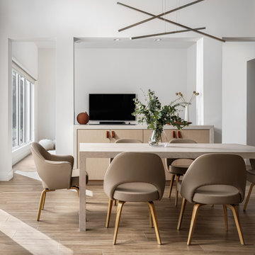
This 6,399-square-foot house in Boca Raton belongs to two surgeons who love to travel. And it needed a facelift in order to truly feel like a home that reflected their tastes, lifestyle and shared memories. So Laure Nell Interiors came on board to remodel and modernize their kitchen and dining room, create a dedicated office nook, and design an inviting mudroom clad in encaustic ceramic tile that greets the owners when they come home after a busy day at work.
The owners wanted a streamlined, European-inspired kitchen with Scandinavian, minimalist details where the stone-wrapped hood would be the hero. But it would also need to function for the wife who likes to bake often with their younger daughter. We created an integrated bar to house the owners’ beloved collection of Barollo wines from Italy, and custom shelving that displays their Murano glass pieces along with ceramics that were also brought back from Europe.
A creamy palette of white quartz with minimal veining provided a canvas for custom sandy-hued cabinetry—each door panel hand painted in a custom finish that preserves the natural variations of the wood. Taupe dining chairs harmonize with the color scheme, contrasted with pops of caramel from Demvel’s custom leather cabinet handles and leather seat in the mudroom, and barstools from Design Within Reach. Now the owners and their family can continue their Nordic adventures even when they’re still at home. Photography by Jack Cook

 Advance Design Studio, Ltd.
This well-loved home belonging to a family of seven was overdue for some more room. Renovations by the team at Advance Design Studio entailed both a lower and upper level addition to original home. Included in the project was a much larger kitchen, eating area, family room and mud room with a renovated powder room on the first floor. The new upper level included a new master suite with his and hers closets, a new master bath, outdoor balcony patio space, and a renovation to the only other full bath on in that part of the house.
Having five children formerly meant that when everyone was seated at the large kitchen table, they couldn’t open the refrigerator door! So naturally the main focus was on the kitchen, with a desire to create a gathering place where the whole family could hang out easily with room to spare. The homeowner had a love of all things Irish, and careful details in the crown molding, hardware and tile backsplash were a reflection. Rich cherry cabinetry and green granite counter tops complete a traditional look so as to fit right in with the elegant old molding and door profiles in this fine old home.
The second focus for these parents was a master suite and bathroom of their own! After years of sharing, this was an important feature in the new space. This simple yet efficient bath space needed to accommodate a long wall of windows to work with the exterior design. A generous shower enclosure with a comfortable bench seat is open visually to the his and hers vanity areas, and a spacious tub. The makeup table enjoys lots of natural light spilling through large windows and an exit door to the adult’s only exclusive coffee retreat on the rooftop adjacent.
Added square footage to the footprint of the house allowed for a spacious family room and much needed breakfast area. The dining room pass through was accentuated by a period appropriate transom detail encasing custom designed carved glass detailing that appears as if it’s been there all along. Reclaimed painted tin panels were added to the dining room ceiling amongst elegant crown molding for unique and dramatic dining room flair. An efficient dry bar area was tucked neatly between the great room spaces, offering an excellent entertainment area to circulating guests and family at any time.
This large family now enjoys regular Sunday breakfasts and dinners in a space that they all love to hang out in. The client reports that they spend more time as a family now than they did before because their house is more accommodating to them all. That’s quite a feat anyone with teenagers can relate to! Advance Design was thrilled to work on this project and bring this family the home they had been dreaming about for many, many years.
Photographer: Joe Nowak

 Design Fixation [Faith Provencher]
Photo: Faith Towers © 2017 Houzz
Inspiration for a transitional kitchen remodel in Boston
Inspiration for a transitional kitchen remodel in Boston
198