
Search results for "Brightener" in Home Design Ideas
 Bonnie Brock Landscape Design
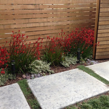
This is an example of a contemporary courtyard gravel landscaping in San Francisco.
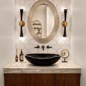
 Spaces Designed, Interior Design Studio, LLC
“We could never have envisioned what could be” – Steiner Ranch Homeowner and Client
It is an especially fulfilling Project for an Interior Designer when the outcome exceeds Client expectations, and imagination. This remodeling project required instilling modern sensibilities, openness, styles and textures into a dated house that was past its prime. Strategically, the goal was to tear down where it made sense without doing a complete teardown.
Starting with the soul of the home, the kitchen, we expanded out room by room to create a cohesiveness and flow that invites, supports and provides the warmth and relaxation that only a home can.
In the Kitchen, we started by removing the wooden beams and adding bright recessed lighting. We removed the old limestone accent wall and moved the sink and cooktop from the island on to the countertop – the key goal was to create room for the family to gather around the kitchen. We replaced all appliances with modern Energy Star ones, along with adding a wine rack.
The first order of business for the Living Room was to brighten it up by adding more lighting and replacing an unused section with a glass door to the backyard. Multi-section windows were replaced with large no-split glass overlooking the backyard. Once more, the limestone accent was removed to create a clean, modern look. Replacing the dated wooden staircase with the clean lines of a metal, wire and wooded staircase added interest and freshness. An odd bend in the staircase was removed to clean things up.
The Master Bedroom went from what looked like a motel room with green carpet and cheap blinds to an oasis of luxury and charm. A section of the wraparound doors were closed off to increase privacy, accentuate the best view from the bedroom and to add usable space. Artwork, rug, contemporary bed and other accent pieces brought together the seamless look across the home.
The Master Bathroom remodel started by replacing the standard windows with a single glass pane that enhanced the view of the outdoors. The dated shower was replaced by a walk-in shower and soaking tub to create the ultimate at-home spa experience. Lighted LED mirrors frame His & Hers sinks and bathe them in a soft light.
The flooring was upgraded throughout the house to reflect the contemporary color scheme.
Each of the smaller bedrooms were similarly upgraded to match the clean and modern décor of the rest of the house.
After such a transformation inside, it was only appropriate that the exterior needed an upgrade as well. All of the legacy limestone accents were replaced by stucco and the color scheme extended from the interior of the house to the gorgeous wrap around balconies, trim, garage doors etc. to complete the inside outside transformation.
 NS Builders
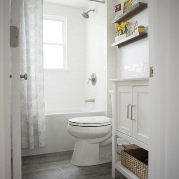
Example of a mid-sized beach style 3/4 white tile and subway tile porcelain tile bathroom design in Providence with shaker cabinets, white cabinets, white walls and an integrated sink
Find the right local pro for your project
 Rudloff Custom Builders
We are proud to say that this kitchen was featured in a Houzz Kitchen of the Week article!
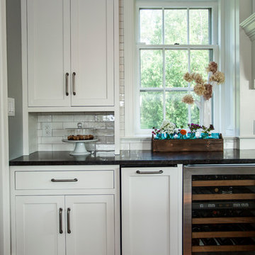
Creamy white cabinets sure do brighten up this once dark kitchen. A custom built in trashcan was added next to a stainless wine refrigerator.
Photography by Alicia's Art, LLC
RUDLOFF Custom Builders, is a residential construction company that connects with clients early in the design phase to ensure every detail of your project is captured just as you imagined. RUDLOFF Custom Builders will create the project of your dreams that is executed by on-site project managers and skilled craftsman, while creating lifetime client relationships that are build on trust and integrity.
We are a full service, certified remodeling company that covers all of the Philadelphia suburban area including West Chester, Gladwynne, Malvern, Wayne, Haverford and more.
As a 6 time Best of Houzz winner, we look forward to working with you on your next project.
 Kitchen Associates
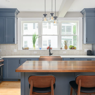
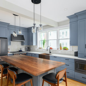
Blue painted Brookhaven cabinets with a mix of quartz and walnut plank countertops. The appliances are in a matte finish with copper accents that match the copper farmer sink.
 Irons Brothers Construction Inc
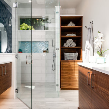
This stunning master bathroom started with a creative reconfiguration of space, but it’s the wall of shimmering blue dimensional tile that really makes this a “statement” bathroom.
The homeowners’, parents of two boys, wanted to add a master bedroom and bath onto the main floor of their classic mid-century home. Their objective was to be close to their kids’ rooms, but still have a quiet and private retreat.
To obtain space for the master suite, the construction was designed to add onto the rear of their home. This was done by expanding the interior footprint into their existing outside corner covered patio. To create a sizeable suite, we also utilized the current interior footprint of their existing laundry room, adjacent to the patio. The design also required rebuilding the exterior walls of the kitchen nook which was adjacent to the back porch. Our clients rounded out the updated rear home design by installing all new windows along the back wall of their living and dining rooms.
Once the structure was formed, our design team worked with the homeowners to fill in the space with luxurious elements to form their desired retreat with universal design in mind. The selections were intentional, mixing modern-day comfort and amenities with 1955 architecture.
The shower was planned to be accessible and easy to use at the couple ages in place. Features include a curb-less, walk-in shower with a wide shower door. We also installed two shower fixtures, a handheld unit and showerhead.
To brighten the room without sacrificing privacy, a clearstory window was installed high in the shower and the room is topped off with a skylight.
For ultimate comfort, heated floors were installed below the silvery gray wood-plank floor tiles which run throughout the entire room and into the shower! Additional features include custom cabinetry in rich walnut with horizontal grain and white quartz countertops. In the shower, oversized white subway tiles surround a mermaid-like soft-blue tile niche, and at the vanity the mirrors are surrounded by boomerang-shaped ultra-glossy marine blue tiles. These create a dramatic focal point. Serene and spectacular.
 Maria Causey Interior Design
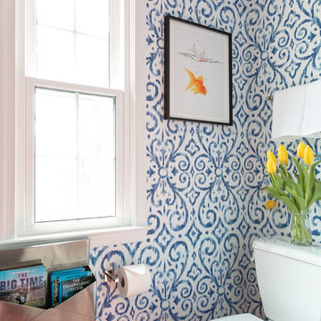
Sophisticated and fun were the themes in this design. This bathroom is used by three young children. The parents wanted a bathroom whose decor would be fun for the children, but "not a kiddy bathroom". This family travels to the beach quite often, so they wanted a beach resort (emphasis on resort) influence in the design. Storage of toiletries & medications, as well as a place to hang a multitude of towels, were the primary goals. Besides meeting the storage goals, the bathroom needed to be brightened and needed better lighting. Ocean-inspired blue & white wallpaper was paired with bright orange, Moroccan-inspired floor & accent tiles from Fireclay Tile to give the "resort" look the clients were looking for. Light fixtures with industrial style accents add additional interest, while a seagrass mirror adds texture & warmth.
Photos: Christy Kosnic
 Kitchen Design Concepts
We introduce to you one of our newer services we are providing here at Kitchen Design Concepts: spaces that just need a little reviving! As of recent, we are taking on projects that are in need of minimal updating, as in, spaces that don’t need a full-on remodel. Yes, you heard right! If your space has good bones, you like the layout of your kitchen, and you just need a few cosmetic changes, then today’s feature is for you! Recently, we updated a space where we did just this! The kitchen was in need of a little love, some fresh paint, and new finishes. And if we’re being honest here, the result looks almost as if the kitchen had a full-on remodel! To learn more about this space and how we did our magic, continue reading below:
The Before and After
First, see what an impact new finishes can make! The “before” image shows a kitchen with outdated finishes such as the tile countertops, backsplash, and cabinetry finish. The “after” image, is a kitchen that looks almost as if its brand new, the image speaks for itself!
Cabinetry
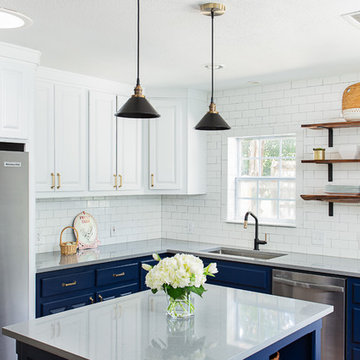
With the wooden cabinetry in this kitchen already having great bones, all we needed to do was our refinishing process that involved removing door and drawer fronts, sanding, priming, and painting. The main color of the cabinetry is white (Sherwin Williams Pure White 7005) and as an accent, we applied a deep navy blue that really pops in this space (Sherwin Willaims Naval 6244). As a special design element, we incorporated a natural wooden band across the hood which is subtle but adds an element of surprise.
Countertops
The original countertops in this space were a 12×12 tile with cracks and discolored grout from all the wear and tear. To replace the countertops, we installed a clean and crisp quartz that is not only durable but easy to maintain (no grout here!). The 3cm countertops are a Cambria quartz in a grey-tone color (Carrick).
Backsplash
Keeping things simple, yet classic, we installed a 3×6 subway tile from Interceramic. The crisp white pairs well with all the other finishes of the space and really brighten the space up! To spice things up, we paired the white tile with a contrasting grout color (Cape Grey) that matches the countertop. This is a simple method to add interest to your white backsplash!
Fixtures and Fittings
For the fixtures and fittings of the kitchen, we wanted pieces that made a statement. That’s why we selected this industrial style faucet from Brizo! The faucet is a Brizo LITZE™ PULL-DOWN FAUCET WITH ARC SPOUT AND INDUSTRIAL HANDLE (63044LF-BLGL). The matte black paired with the luxe gold elements really make a statement! To match the gold elements of the faucet, we installed cabinetry hardware from Topknobs in the same gold finish. The hardware is a Channing pull TK743HB. Lastly, the large single bowl sink (who doesn’t want a large sink?!) is a great functional touch to the kitchen. The sink is a Blanco Precision 16″ R10 super single with 16″ Drainer in stainless steel (516216).
 Kirk Riley Design
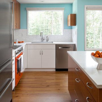
Example of a mid-sized mid-century modern l-shaped light wood floor and brown floor eat-in kitchen design in Seattle with an undermount sink, flat-panel cabinets, white cabinets, quartz countertops, white backsplash, ceramic backsplash, an island, white countertops and stainless steel appliances
 TVL Creative Ltd.
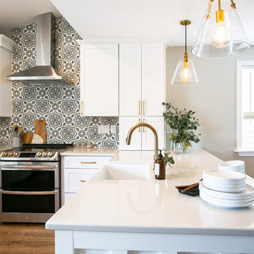
This kitchen took a tired, 80’s builder kitchen and revamped it into a personalized gathering space for our wonderful client. The existing space was split up by the dated configuration of eat-in kitchen table area to one side and cramped workspace on the other. It didn’t just under-serve our client’s needs; it flat out discouraged them from using the space. Our client desired an open kitchen with a central gathering space where family and friends could connect. To open things up, we removed the half wall separating the kitchen from the dining room and the wall that blocked sight lines to the family room and created a narrow hallway to the kitchen. The old oak cabinets weren't maximizing storage and were dated and dark. We used Waypoint Living Spaces cabinets in linen white to brighten up the room. On the east wall, we created a hutch-like stack that features an appliance garage that keeps often used countertop appliance on hand but out of sight. The hutch also acts as a transition from the cooking zone to the coffee and wine area. We eliminated the north window that looked onto the entry walkway and activated this wall as storage with refrigerator enclosure and pantry. We opted to leave the east window as-is and incorporated it into the new kitchen layout by creating a window well for growing plants and herbs. The countertops are Pental Quartz in Carrara. The sleek cabinet hardware is from our friends at Amerock in a gorgeous satin champagne bronze. One of the most striking features in the space is the pattern encaustic tile from Tile Shop. The pop of blue in the backsplash adds personality and contrast to the champagne accents. The reclaimed wood cladding surrounding the large east-facing window introduces a quintessential Colorado vibe, and the natural texture balances the crisp white cabinetry and geometric patterned tile. Minimalist modern lighting fixtures from Mitzi by Hudson Valley Lighting provide task lighting over the sink and at the wine/ coffee station. The visual lightness of the sink pendants maintains the openness and visual connection between the kitchen and dining room. Together the elements make for a sophisticated yet casual vibe-- a comfortable chic kitchen. We love the way this space turned out and are so happy that our clients now have such a bright and welcoming gathering space as the heart of their home!
 Construction Landscape, LLC.
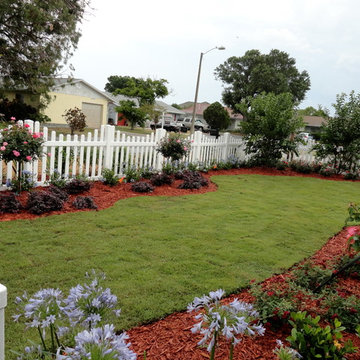
Transforming this once neglected front yard into a cozy cottage landscape see our youtube video for the entire transformation. Stop and smell the roses 46 of them and six rose trees can brighten anyones day. Call us today for your free landscape consultation 772.492.8382
 TOC design & construction inc.
DESIGNED BY TOC design
CONSTRUCTION BY TOC design & Construction inc.
PHOTOS BY : Tania Scardellato
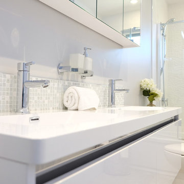
I was fortunate to have a young family approach me in desperate need to renovate there only 3 piece bathroom. This space was In dire need of a remodel, with old brown wall to wall tiles and a dated bulky yellow brown single sink vanity.
Storage was a must, lighting a necessity, and proper accessibility to the shower bath area.
We had a tight budget to respect, but a full gut of this bathroom was required. And a good thing too, once we started doing the demolition we noticed that mildew and rotting floors and walls had accumulated throughout the years. Doing it right the first time is no joke when dealing with water and electrical issues.
We discarded all reminisce of old and built from scratch, new walls, new plumbing, new electrical ,new insulation and a new window, a new fan that actually exhausted outside ( I say this laughing as you would be amazed at how many fans are installed but don’t exhaust outside, and you the client would never know unless you go inside the attic space.
Once all the hard stuff was done, the rest is just a matter of smart design. If you have a small bathroom here are some tips to guide you.
10 tips for making a small bathroom feel larger
Is your tiny bathroom cramping your functionality and style, leaving you longing for the enormous bathrooms gracing the pages of design magazines? Even if your bathroom is a fraction of the size, all it takes is some design savvy to make the most of the space you have. Consider these 10 smart tips that will help your bathroom look, feel and function like those larger contenders.
1-Get creative with corners
Space is at a premium in small bathrooms, so it's important to maximize every inch. Corners, for example, provide extra space for shelving, storage units and even hooks. Get creative and install unique design solutions that are not only functional, but also eye-catching. If you love the airiness of floating cabinets, add baskets or decorative boxes under for extra storage. If you are installing floating cabinets insure that they are installed securely to studs or plywood at wall.
2- Let solid colors shine
Busy patterns have a shrinking effect and make small bathrooms seem even smaller. Conversely, light natural hues make a space feel more open. If you're itching to get creative with design, experiment with textures but keep overpowering patterns to a minimum. Tone on tone is the best to achieve this.
3 - Maximize your bathtub
A bathtub takes up a significant portion of the room, but modern, compact options with curved basins, can make the tub feel larger when in use, all while conserving space.
4 - Select a smaller faucet
A faucet is jewelry for the bathroom. And just as accessories can overpower an outfit, a big bulky faucet isn't flattering in a small bath. Single-handle designs conserve counter space, while a wall-mount installation frees it up all together and can create quite the wow-factor, if the budget can accommodate the required changes to plumbing behind the wall.
5 - Make vanity storage simple
If you're in a storage war with your small bathroom, you're not alone in the battle. Toiletries and personal supplies without a place to call home only add clutter and chaos. Store smart with a space-saving vanity, the dual sink vanity shown here, looks quite simple, but in reality it has 4 sets of full extension drawers, and the vanity tower adds extra storage without overpowering the use of space.
6 - Show off the shower
Shower curtains may be pretty, but they interrupt the visual flow of a bathing space and make it feel significantly smaller. In bathrooms with small footprints, opt for a clear glass sliding shower door that doesn't require the clearance of one with a hinged design. Or as shown in this design and for fraction less expensive a half hinged panel installed on a fixed tempered glass panel. If you're embarking on a big remodel, create the illusion of more space by using same tile in the shower that's used throughout; instead of seeing them as two separate zones, the eye will read them as one.
7 - Discover the treasure of hidden storage
Work with a contractor, and you just might find some serious storage potential hidden behind your walls. Whether it's utilizing space between the studs for shallow shelving or a creating a small linen closet by annexing space from an adjacent room, even small additions can make a big difference.
8 - Focal Point
Tile is a beautiful, durable addition to any bathroom. For dainty spaces, consider installing tile at a diagonal to accentuate the focal point or as in this bathroom I used an oversized textured pattern to bring depth to the space at the window wall.
9 - Choose the right lights
Strategically install light to reflect and brighten a small bathroom to make it appear larger. Recessed lighting is an affordable solution for tiny rooms, offering ample light while taking up little space. Wall sconces alongside a mirror also reflect off the walls and make a room feel bright and airy. I always recommend going with LED lighting at 2800 to 3000K.
10 – Accessorize
This is your time to shine in your decorating skills, have fun with your towels, you can change the color scheme daily just by adding pops of color in your accessories, make sure to get items that serve a dual purpose, like baskets, boxes they can always be used as hampers, storing of towels and even a nice display for your guest.
 Kitchen Associates
Blue painted Brookhaven cabinets with a mix of quartz and walnut plank countertops. The appliances are in a matte finish with copper accents that match the copper farmer sink.

 Lourdes Gabriela Interiors
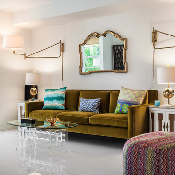
Inspiration for a small contemporary enclosed porcelain tile living room remodel in Miami with white walls and a wall-mounted tv

 Chi Renovation & Design
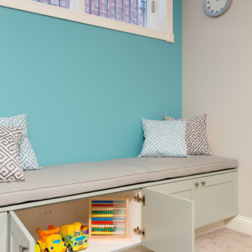
A fun updated to a once dated basement. We renovated this client’s basement to be the perfect play area for their children as well as a chic gathering place for their friends and family. In order to accomplish this, we needed to ensure plenty of storage and seating. Some of the first elements we installed were large cabinets throughout the basement as well as a large banquette, perfect for hiding children’s toys as well as offering ample seating for their guests. Next, to brighten up the space in colors both children and adults would find pleasing, we added a textured blue accent wall and painted the cabinetry a pale green.
Upstairs, we renovated the bathroom to be a kid-friendly space by replacing the stand-up shower with a full bath. The natural stone wall adds warmth to the space and creates a visually pleasing contrast of design.
Lastly, we designed an organized and practical mudroom, creating a perfect place for the whole family to store jackets, shoes, backpacks, and purses.
Designed by Chi Renovation & Design who serve Chicago and it's surrounding suburbs, with an emphasis on the North Side and North Shore. You'll find their work from the Loop through Lincoln Park, Skokie, Wilmette, and all of the way up to Lake Forest.
For more about Chi Renovation & Design, click here: https://www.chirenovation.com/
To learn more about this project, click here: https://www.chirenovation.com/portfolio/lincoln-square-basement-renovation/
 Terrace Creations
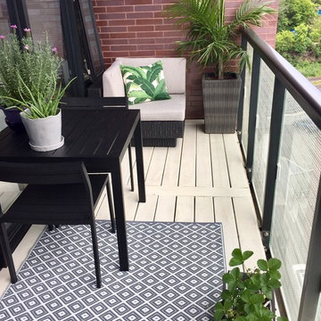
Although just a simple treated wood installation, this lovely balcony was changed completely by using some vertical boards to break up the pattern as well as the selection of a "washed white" stain that really brightened things up.
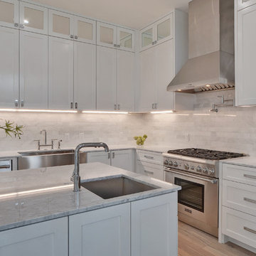
 Hardwood Bargains
Walk on sunshine with Skyline Floorscapes' Ivory White Oak. This smooth operator of floors adds charm to any room. Its delightfully light tones will have you whistling while you work, play, or relax at home.
This amazing reclaimed wood style is a perfect environmentally-friendly statement for a modern space, or it will match the design of an older house with its vintage style. The ivory color will brighten up any room.
This engineered wood is extremely strong with nine layers and a 3mm wear layer of White Oak on top. The wood is handscraped, adding to the lived-in quality of the wood. This will make it look like it has been in your home all along.
Each piece is 7.5-in. wide by 71-in. long by 5/8-in. thick in size. It comes with a 35-year finish warranty and a lifetime structural warranty.
This is a real wood engineered flooring product made from white oak. It has a beautiful ivory color with hand scraped, reclaimed planks that are finished in oil. The planks have a tongue & groove construction that can be floated, glued or nailed down.
 Nystrom Design
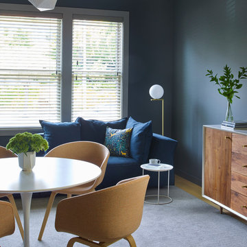
Balancing modern architectural elements with traditional Edwardian features was a key component of the complete renovation of this San Francisco residence. All new finishes were selected to brighten and enliven the spaces, and the home was filled with a mix of furnishings that convey a modern twist on traditional elements. The re-imagined layout of the home supports activities that range from a cozy family game night to al fresco entertaining.
Architect: AT6 Architecture
Builder: Citidev
Photographer: Ken Gutmaker Photography
103