
Search results for "Carefully deciding" in Home Design Ideas
 ESI Builders & Remodelers
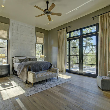
3,800sf, 4 bdrm, 3.5 bath with oversized 4 car garage and over 270sf Loggia; climate controlled wine room and bar, Tech Room, landscaping and pool. Solar, high efficiency HVAC and insulation was used which resulted in huge rebates from utility companies, enhancing the ROI. The challenge with this property was the downslope lot, sewer system was lower than main line at the street thus requiring a special pump system. Retaining walls to create a flat usable back yard.
ESI Builders is a subsidiary of EnergyWise Solutions, Inc. and was formed by Allan, Bob and Dave to fulfill an important need for quality home builders and remodeling services in the Sacramento region. With a strong and growing referral base, we decided to provide a convenient one-stop option for our clients and focus on combining our key services: quality custom homes and remodels, turnkey client partnering and communication, and energy efficient and environmentally sustainable measures in all we do. Through energy efficient appliances and fixtures, solar power, high efficiency heating and cooling systems, enhanced insulation and sealing, and other construction elements – we go beyond simple code compliance and give you immediate savings and greater sustainability for your new or remodeled home.
All of the design work and construction tasks for our clients are done by or supervised by our highly trained, professional staff. This not only saves you money, it provides a peace of mind that all of the details are taken care of and the job is being done right – to Perfection. Our service does not stop after we clean up and drive off. We continue to provide support for any warranty issues that arise and give you administrative support as needed in order to assure you obtain any energy-related tax incentives or rebates. This ‘One call does it all’ philosophy assures that your experience in remodeling or upgrading your home is an enjoyable one.
ESI Builders was formed by professionals with varying backgrounds and a common interest to provide you, our clients, with options to live more comfortably, save money, and enjoy quality homes for many years to come. As our company continues to grow and evolve, the expertise has been quickly growing to include several job foreman, tradesmen, and support staff. In response to our growth, we will continue to hire well-qualified staff and we will remain committed to maintaining a level of quality, attention to detail, and pursuit of perfection.
 Advance Design Studio, Ltd.
Jackie and Sean loved the Algonquin neighborhood they lived in with the peaceful neighborhood and the close proximity to work and school. What they didn’t love was how outdated their home had become. With a cramped kitchen and an unused dining room, they decided a remodel was the perfect solution to their problem. They would be able to continue to live in the area they loved, while at the same time they could have the dream home they envisioned.
After a thorough search, Jackie came across Advance Design Studio. She was impressed by all of the positive reviews she saw on the internet and saw herself identifying with all of the project stories she saw on the website. Once they met with designer Scott Christensen and owner Todd Jurs, they knew Advance Design was the right company to make their dreams a reality.
The project consisted of four main areas: the kitchen/dining/powder room, the laundry room, the master bathroom, and the kid’s bathroom. They wanted to expand the kitchen into the seldom used dining room and add a large island for hosting parties and family gatherings. They also wanted new hardwood flooring throughout the first level. The laundry room needed to be more functional, and all three bathrooms were in dire need of updating.
The closed off kitchen was opened up to create a sweeping space between the new eating area and the much larger kitchen. A handsome dry bar complete with a beverage refrigerator and lighted glass door cabinetry makes an elegant transition across from a peninsula area filled with storage. An additional decorative cabinet lighting up elegant dishware through the mullioned glass sits directly across from the drybar.
An expansive island was critical to the kitchen plans. Jackie, Sean and Scott worked closely together to create just the right details for their design. They wanted the island to be functional in addition to being the centerpiece of the room. Added storage for the kid’s school supplies was hidden behind cabinet doors so the children could do their schoolwork right at the island, and a microwave drawer glides open with the touch of a finger hidden inconspicuously within the island space. The easy to care for Cambria Britannica Quartz island top with its sweeping grey and white marble look perched atop hand-carved Craftsman corbels was absolutely what they were hoping for, blending both beauty and function perfectly.
Adding a nice contrast to the brightness of the quartz and the white cabinetry, Kodiak - Leather granite countertops were used to balance the light and dark tones of the space. Dura Supreme Classic White painted cabinets grace the perimeter, while Maple Poppy Seed stained cabinets with a beautiful soft grey woodgrain were used in the beverage center and island. The two tones compliment the large space balancing it out nicely creating interest and elegance with the simple Craftsman style full overlay doors.
A deep warm Barnwood White Oak flooring was added throughout the lower level. The new floor brings additional contrast to the bright kitchen and provides unity with the now open floorplan as it rolls in to the foyer and family room. Final details like the show-stopping lunar like duo light fixtures complete the space and intermix expertly with crisscross details of the glass door mullions, the island bar seating and even accessories in the space.
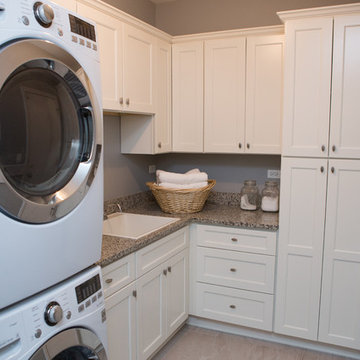
The small cluttered laundry room needed more space and more storage. With a busy family it seemed to overflow daily and did not have anywhere to hide the families “in and out stuff.” Scott designed the new space with a stackable washer and dryer and much more efficiently organized cabinetry. Doing laundry is now (almost!) a pleasure and keeping everyone’s “stuff” hidden, but readily accessible is now a snap.
The master bath was not a place where the couple enjoyed spending time getting ready for their day. The tub almost never was used, so removing it made it possible to build an extra-large shower, replacing the small cramped cube of the previous shower they hated. Clean, horizontal lines softly draw your eye around the space with porcelain tile called Driftwood Sea spray. Full overlay cabinetry in a soft white vanity with double sinks makes getting ready for the day much more convenient for the busy couple.
Long floor planks made of porcelain tile mimic real hardwood floors in a soft grey to compliment the shower, but with the ease and care of a tile surface. Cambrian Black Granite counters with a matte finish and under mount porcelain sinks with handsome brushed chrome hardware complete the handsome space. A real bonus in any master bath; a custom built in storage nook was tucked in the corner of the space for linens and heavenly storage.
The kid’s bath was in sad shape because it was original to the house. To keep the budget in control, the tub which was in great condition was retained, but focus was on the new large brick style porcelain charcoal tile on the floor, crisp white new Craftsman style cabinetry with pretty furniture details on the corner base, a striking granite top with white under mount porcelain sinks and fresh hardware and faucets. Some beautiful soft grey wood mirrors to match mom and dads were custom sized and placed under new lighting, and 4 hooks were smartly arranged down the wall for kids’ towels.
This couple was determined not to move, and made their house their dream home. Not only does their home function greatly now, but Jackie says, “When the neighbors come to visit, they’re asking if they can “steal” the design”! The added functionality, elegance, and open floor plan were exactly what this family needed in order to stay.
Advance Design Studio, Joe Nowak


Find the right local pro for your project
 The Englander Building Company
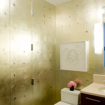
Design by Eche Martinez Interior Design. Construction by The Englander Building Company.
Example of a trendy powder room design in San Francisco
Example of a trendy powder room design in San Francisco
 Kathy Appel, ASID
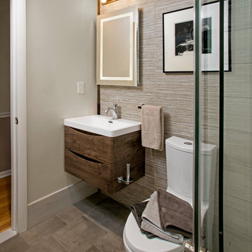
This tile accent wall was created using large format, stacked stone, tile and tobacco sticks. The dimensions of the tile and existing wall presented a challenge. Two tiles would cover all but 3" of the wall width. Rather than fill in with such a small piece of tile we decided to frame each side with a 1-1/2" width of wood it wood. The wood also needed to be 3/8" thick to match the thickness of the tile. You won't find those dimensions at a lumber yard, so we visited our local source for reclaimed materials. They had tobacco sticks which come in the odd sizes we wanted. The aged finish of the tobacco sticks was the perfect compliment to the vanity and the Industrial style light fixture. Sometimes the solution to a functional design dilemma also delivers extraordinary aesthetic results. The lighting in this bath is carefully layered. Recessed ceiling lights and the vanity mirror with LED backlighting are controlled by dimmer switches. The vanity light is fitted with Edison style bulbs which shed a warmer, softer level of light.
 The Artisans Group, Inc.
Winner of the 2018 Tour of Homes Best Remodel, this whole house re-design of a 1963 Bennet & Johnson mid-century raised ranch home is a beautiful example of the magic we can weave through the application of more sustainable modern design principles to existing spaces.
We worked closely with our client on extensive updates to create a modernized MCM gem.
Extensive alterations include:
- a completely redesigned floor plan to promote a more intuitive flow throughout
- vaulted the ceilings over the great room to create an amazing entrance and feeling of inspired openness
- redesigned entry and driveway to be more inviting and welcoming as well as to experientially set the mid-century modern stage
- the removal of a visually disruptive load bearing central wall and chimney system that formerly partitioned the homes’ entry, dining, kitchen and living rooms from each other
- added clerestory windows above the new kitchen to accentuate the new vaulted ceiling line and create a greater visual continuation of indoor to outdoor space
- drastically increased the access to natural light by increasing window sizes and opening up the floor plan
- placed natural wood elements throughout to provide a calming palette and cohesive Pacific Northwest feel
- incorporated Universal Design principles to make the home Aging In Place ready with wide hallways and accessible spaces, including single-floor living if needed
- moved and completely redesigned the stairway to work for the home’s occupants and be a part of the cohesive design aesthetic
- mixed custom tile layouts with more traditional tiling to create fun and playful visual experiences
- custom designed and sourced MCM specific elements such as the entry screen, cabinetry and lighting
- development of the downstairs for potential future use by an assisted living caretaker
- energy efficiency upgrades seamlessly woven in with much improved insulation, ductless mini splits and solar gain
 Kim Carroll Interiors
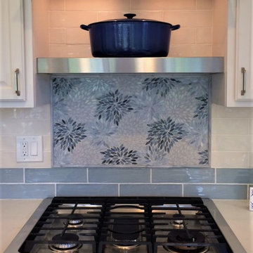
This kitchen was planned very carefully around the needs of my client, whose passions are family, friends and cooking. She wanted a very flexible kitchen that would enable her to easily prep for paella, roll out dough for Christmas strudel, or host a crowd for dinner. We decided on a movable island that has a hidden electrical outlet, flush to the floor. When in its central position in the kitchen, the island offers plenty of storage, in addition to a wide work surface. Electrical appliances can be easily used and then stowed away. Then the whole island can be unplugged and moved away near the windows. There, it can be plugged back in to another outlet, and it becomes a handy serving area for keeping Swedish meatballs hot or mixing up margaritas. The long tables that sit by the windows (and offer sunny intimate dining) are then moved to the center of the room, end-to-end, with their side leaves extended. This creates a long casual dining table for a crowd. Color inspiration for this kitchen came from a deep blue Dutch oven that my client uses often. It rests in a place of honor over the stove.
Sponsored
Columbus, OH

Hope Restoration & General Contracting
Columbus Design-Build, Kitchen & Bath Remodeling, Historic Renovations
 Main Street Custom Homes & Remodeling
Rather than renovating their own home, this couple decided to remodel and move into the mother's home to keep her in a familiar setting and create a multi-generational home under one roof.
Careful consideration was given to the design of the exterior of the home so that the second floor addition blended with the original home creating a unified façade. In addition, a portico was installed over the front entry, giving a more formal appearance and offering shelter from the elements.
It was necessary to design a single-floor living space for the aging parent who had recently broken a hip. The entire first floor layout was renovated with the focus on ease of mobility while maintaining a coherent, balanced design throughout the house. To allow for a “no-step” main level, the existing sunken family room floor was raised to bring it flush with the adjacent kitchen floor then converted into a spacious dining room. A new great room was constructed which boasts a beautiful corner wood burning stove. This addition created a comfortable and accessible place to relax, at the same time offering a space for larger family gatherings.
 Kathleen Jennison
An Arts & Crafts Bungalow is one of my favorite styles of homes. We have quite a few of them in our Stockton Mid-Town area. And when C&L called us to help them remodel their 1923 American Bungalow, I was beyond thrilled.
As per usual, when we get a new inquiry, we quickly Google the project location while we are talking to you on the phone. My excitement escalated when I saw the Google Earth Image of the sweet Sage Green bungalow in Mid-Town Stockton. "Yes, we would be interested in working with you," I said trying to keep my cool.
But what made it even better was meeting C&L and touring their home, because they are the nicest young couple, eager to make their home period perfect. Unfortunately, it had been slightly molested by some bad house-flippers, and we needed to bring the bathroom back to it "roots."
We knew we had to banish the hideous brown tile and cheap vanity quickly. But C&L complained about the condensation problems and the constant fight with mold. This immediately told me that improper remodeling had occurred and we needed to remedy that right away.
The Before: Frustrations with a Botched Remodel
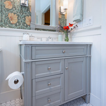
The bathroom needed to be brought back to period appropriate design with all the functionality of a modern bathroom. We thought of things like marble countertop, white mosaic floor tiles, white subway tile, board and batten molding, and of course a fabulous wallpaper.
This small (and only) bathroom on a tight budget required a little bit of design sleuthing to figure out how we could get the proper look and feel. Our goal was to determine where to splurge and where to economize and how to complete the remodel as quickly as possible because C&L would have to move out while construction was going on.
The Process: Hard Work to Remedy Design and Function
During our initial design study, (which included 2 hours in the owners’ home), we noticed framed images of William Morris Arts and Crafts textile patterns and knew this would be our design inspiration. We presented C&L with three options and they quickly selected the Pimpernel Design Concept.
We had originally selected the Black and Olive colors with a black vanity, mirror, and black and white floor tile. C&L liked it but weren’t quite sure about the black, We went back to the drawing board and decided the William & Co Pimpernel Wallpaper in Bayleaf and Manilla color with a softer gray painted vanity and mirror and white floor tile was more to their liking.
After the Design Concept was approved, we went to work securing the building permit, procuring all the elements, and scheduling our trusted tradesmen to perform the work.
We did uncover some shoddy work by the flippers such as live electrical wires hidden behind the wall, plumbing venting cut-off and buried in the walls (hence the constant dampness), the tub barely balancing on two fence boards across the floor joist, and no insulation on the exterior wall.
All of the previous blunders were fixed and the bathroom put back to its previous glory. We could feel the house thanking us for making it pretty again.
The After Reveal: Cohesive Design Decisions
We selected a simple white subway tile for the tub/shower. This is always classic and in keeping with the style of the house.
We selected a pre-fab vanity and mirror, but they look rich with the quartz countertop. There is much more storage in this small vanity than you would think.
The Transformation: A Period Perfect Refresh
We began the remodel just as the pandemic reared and stay-in-place orders went into effect. As C&L were already moved out and living with relatives, we got the go-ahead from city officials to get the work done (after all, how can you shelter in place without a bathroom?).
All our tradesmen were scheduled to work so that only one crew was on the job site at a time. We stayed on the original schedule with only a one week delay.
The end result is the sweetest little bathroom I've ever seen (and I can't wait to start work on C&L's kitchen next).
Thank you for joining me in this project transformation. I hope this inspired you to think about being creative with your design projects, determining what works best in keeping with the architecture of your space, and carefully assessing how you can have the best life in your home.
 Wine Cellar Innovations
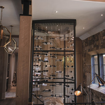
These Acrylic Bottle Supports are one of the available options in our Modern Wine Cellar series. If you haven’t heard of this yet, then you’re in for a treat! Wine Cellar Innovations launched this series after observing the growing trend towards more contemporary wine cellar designs. The series was carefully developed in order to appeal to the most discerning wine collector. The original design involves wood bottle supports. These are installed within platforms, ranging from the ceiling to the floor. The design for this project also reflects the cable racking system that WCI introduced just a few years back. It’s a minimalist but unique way to showcase your collection! We decided to bring it up a notch by offering the bottle supports in acrylic. Since acrylic is almost as transparent as glass, the effect is even more dramatic. The contemporary vibe is even more enhanced in this project with the use of black metal trim along with acrylic and glass. You might also be wondering how the client can reach the bottles given the insane floor-to-ceiling height of the racking assembly. Surprise, surprise! There’s actually an elevator at the bottom that allows the client to reach up to the highest bottle level.
 ElevationBuild, LLC
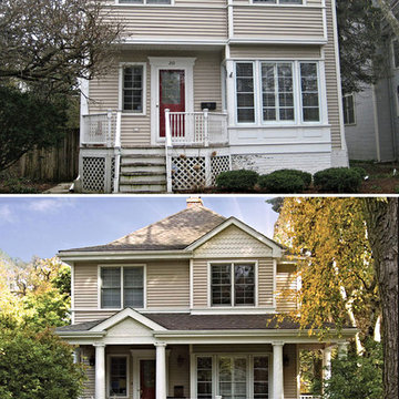
When we met the Daniels Family they were not our typical case study they had already replaced their windows, doors, siding and roof. So what else could we do? We built them a L shaped porch that extended their outdoor space. A few things were a must, they loved the design of the home and didn't want to sacrifice the look so we implemented similar designs. Once we tour down their stair way we built a deck with steel beam anchors that would hold the additional weight. Once the synthetic wood was placed we installed columns that would help holding the roofline which we had to find matching architectural shingles. When we built the roofline we made sure to line it properly for architectural purposes so that the split line was smoothened out and the levels flowed together. We decided to use half round to match the gable on the second floor, and to create a grand entrance we installed Roman like columns on either side of the stairway. We are proud to present to you the Daniel Residence.
Natalie Daniel: "We are so glad we contracted out ElevationBuild we couldn't of expected it any better, and thank you for your excellent customer care throughout the project."

 Windy City Painters
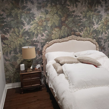
Masterful Wallpaper Installation Wicker Park: A Botanical Retreat
Professional Craftsmanship in the Heart of Chicago
When it comes to high-end interior design, Wallpaper Installation Wicker Park requires more than just a DIY spirit. It demands an eye for symmetry and a hand for precision. This recent project involved a complex, large-scale botanical pattern. Our goal was to create a seamless focal point behind a classic French-style headboard.
Overcoming the Challenge
Chicago’s historic homes often have walls that aren't perfectly square. This makes pattern matching extremely difficult. However, our team used laser levels to ensure a perfectly vertical start. Additionally, we handled the delicate paper with care to avoid over-stretching. We chose a high-tack, low-moisture adhesive. This prevents the paper from shrinking as it dries in our variable Chicago climate.
Pro Tip for Chicago Homeowners:
Always invest in a "wall liner" or high-quality primer before your Wallpaper Installation Wicker Park. This protects your drywall. Furthermore, it makes future removal much easier if you ever decide to change your style!
See our full gallery of transformations: https://windypainters.com/wallpaper/
Sponsored
Columbus, OH
Hope Restoration & General Contracting
Columbus Design-Build, Kitchen & Bath Remodeling, Historic Renovations
 kimberly peck architect
Photo by Pedro Marti
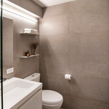
The client’s hired us to update this small post war apartment which didn’t appear to have ever been renovated since the buildings construction in 1964. The kitchen and bathroom were outdated and were fully gutted. In doing so we decided to open up the apartment in general by removing the wall that separated the kitchen from the living space to create a more open plan. The resulting design is an exercise in ultra-minimalism. The rear wall of the kitchen was outfitted with floor to ceiling cabinetry fit with custom satin lacquer doors and minimal white pulls. The custom paneled refrigerator integrates seamlessly within this wall to create a white backdrop for the kitchen. A peninsula was created opposite to give a work surface and to house the sink and range. Starkly contrasting black metal clad doors were chosen for this run of cabinetry. The unique metal doors have integrated pulls that are cut and folded from the metal cladding. The peninsula is topped in a faux concrete quartz surface. New wide plank walnut flooring was laid throughout the kitchen, living, and bedroom to giving the space a look of continuity. Trim was kept to a minimum, removing from all doors and windows and using only where absolutely necessary at the base of the walls. To achieve the look in the monochromatic bathroom, large format grey porcelain tile was laid in a careful grid; white metal floating shelves and the medicine cabinet were installed to precisely align with both the tile grid and the overhead linear LED fixture.
 Main Street Custom Homes & Remodeling
Rather than renovating their own home, this couple decided to remodel and move into the mother's home to keep her in a familiar setting and create a multi-generational home under one roof.
Careful consideration was given to the design of the exterior of the home so that the second floor addition blended with the original home creating a unified façade. In addition, a portico was installed over the front entry, giving a more formal appearance and offering shelter from the elements.
It was necessary to design a single-floor living space for the aging parent who had recently broken a hip. The entire first floor layout was renovated with the focus on ease of mobility while maintaining a coherent, balanced design throughout the house. To allow for a “no-step” main level, the existing sunken family room floor was raised to bring it flush with the adjacent kitchen floor then converted into a spacious dining room. A new great room was constructed which boasts a beautiful corner wood burning stove. This addition created a comfortable and accessible place to relax, at the same time offering a space for larger family gatherings.
 Tile Doctor Ltd
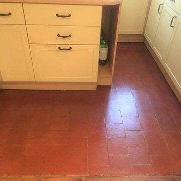
I received a call from this client in Old Marston around two miles north east of the centre of Oxford. They had lifted a lino floor in their kitchen and found an old Quarry Tiled floor underneath and decided to see if they could have it restored.
I went over to survey the floor and could see that the tiles had been covered with a thin layer of levelling screed to ensure the lino didn’t sink into the recesses. I ran some tests to demonstrate how the screed could be removed which worked well and it was apparent that the tiles underneath were intact and could be renovated. I submitted a quotation for removing all the screed, deep cleaning the Quarry tiles and then sealing the tiles to protect them. The client was really pleased that we could restore the floor and the quote was accepted, with a date booked to do the work.
To start the work, I applied undiluted Tile Doctor Grout Clean-up worked in with a small carbide brush attached to a hand-held rotary buffer. The combination of the acid in the Tile Doctor Grout Clean-up combined with the scrubbing action of the brush were effective at removing most of the screed. The small bits of remaining screed were carefully removed by hand, using a floor scraper. The floor was then rinsed with water and the soil removed with a wet vacuum.
For the second phase of the cleaning process I applied Tile Doctor Oxy-Gel which was scrubbed into the floor with a stiff brush rinsing after with water and the soil extracted again using the wet vacuum. After cleaning the floor to remove the dirt I could still see some evidence of the screed on the tiles, so I decided to give the floor an Acid Wash using Tile Doctor Acid Gel which was scrubbed into the floor and rinsed off as before. Tile Doctor Acid Gel is of course an acidic product so once it was removed, I decided to rinse the floor with Tile Doctor Neutral Cleaner to neutralise the pH levels in the floor. The wet vacuum was used again to remove as much moisture from the Quarry tiles as possible before leaving the now clean floor to dry off fully overnight.
I returned to seal this floor the next day. First, I checked the floor was fully dry with the damp meter, it was within the recommended range, so I was ready to complete the sealing process.
The client was not too sure if they wanted a matt or sheen finish, so I first put a coat of Tile Doctor Colour Grow on the floor to show them the matt finish. Colour Grow is an impregnating sealer that enhances natural colour and protects from within by occupying the pores in the tile. After reviewing the floor, they decided it was not for them, so I followed up by applying several coats of Tile Doctor Seal & Go which adds a nice sheen finish and is compatible with Colour Grow.
The combination of sealers worked very well together, and they were very satisfied with the final result and of course that we had been able to restore the Quarry tiles.
Barry Woodward
Oxfordshire Tile Doctor
 kimberly peck architect
Photo by Pedro Marti
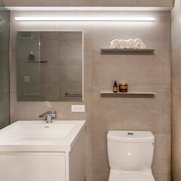
The client’s hired us to update this small post war apartment which didn’t appear to have ever been renovated since the buildings construction in 1964. The kitchen and bathroom were outdated and were fully gutted. In doing so we decided to open up the apartment in general by removing the wall that separated the kitchen from the living space to create a more open plan. The resulting design is an exercise in ultra-minimalism. The rear wall of the kitchen was outfitted with floor to ceiling cabinetry fit with custom satin lacquer doors and minimal white pulls. The custom paneled refrigerator integrates seamlessly within this wall to create a white backdrop for the kitchen. A peninsula was created opposite to give a work surface and to house the sink and range. Starkly contrasting black metal clad doors were chosen for this run of cabinetry. The unique metal doors have integrated pulls that are cut and folded from the metal cladding. The peninsula is topped in a faux concrete quartz surface. New wide plank walnut flooring was laid throughout the kitchen, living, and bedroom to giving the space a look of continuity. Trim was kept to a minimum, removing from all doors and windows and using only where absolutely necessary at the base of the walls. To achieve the look in the monochromatic bathroom, large format grey porcelain tile was laid in a careful grid; white metal floating shelves and the medicine cabinet were installed to precisely align with both the tile grid and the overhead linear LED fixture.
 Innovative Design Build
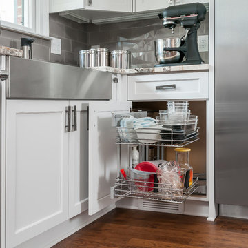
Five stars isn’t enough! Our project was to reconfigure and update the main floor of a house we recently purchased that was built in 1961. We wanted to maintain some of the unique feeling it originally had but bring it up-to-date and eliminate the closed-in rooms and downright weird layout that was the result of multiple, partial remodeling projects. We began with a long wishlist of changes which also required replacement of very antiquated plumbing, electrical wiring and HVAC. We even found a fireplace that had been walled in and needed major re-construction. Many other aspects and details on this incredible list we made included an all new kitchen layout, converting a bedroom into a master closet, adding new half-bath, completely rebuilding the master bath, and adding stone, tile and custom built cabinetry. Our design plans included many fixtures and details that we specified and required professional installation and careful handling. Innovative helped us make reasonable decisions. Their skilled staff took us through a design process that made sense. There were many questions and all were answered with sincere conversation and positive – innovation – on how we could achieve our goals. Innovative provided us with professional consultants, who listened and were courteous and creative, with solid knowledge and informative judgement. When they didn’t have an answer, they did the research. They developed a comprehensive project plan that exceeded our expectations. Every item on our long list was checked-off. All agreed on work was fulfilled and they completed all this in just under four months. Innovative took care of putting together a team of skilled professional specialists who were all dedicated to make everything right. Engineering, construction, supervision, and I cannot even begin to describe how much thanks we have for the demolition crew! Our multiple, detailed project designs from Raul and professional design advice from Mindy and the connections she recommended are all of the best quality. Diego Jr., Trevor and his team kept everything on track and neat and tidy every single day and Diego Sr., Mark, Ismael, Albert, Santiago and team are true craftsmen who follow-up and make the most minuscule woodworking details perfect. The cabinets by Tim and electrical work and installation of fixtures by Kemchan Harrilal-BB and Navindra Doolratram, and Augustine and his crew on tile and stone work – all perfection. Aisling and the office crew were always responsive to our calls and requests. And of course Clark and Eric who oversaw everything and gave us the best of the best! Apologies if we didn’t get everyone on this list – you’re all great! Thank you for your hard work and dedication. We can’t thank you enough Innovative Construction – we kind of want to do it again!
Dave Hallman & Matt DeGraffenreid
 Michael Nash Design, Build & Homes
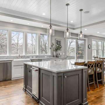
This couple have been living in their single-family Ashburn home for a wile and getting ready to update their home one step at the time.
Their kitchen was very small & dated. They would like to add sunroom. After talking to our designer, they come to conclusion to add sunroom/ Breakfast area to extend the kitchen & kill two birds with one stone.
Also, they decide to renovate two bathrooms upstairs. (Master bathroom & Hall bathroom)
Master bathroom was too small & after meeting with designer they agreed to take couple feet from bedroom & enlarge master bathroom.
She felt cramped and out dated in her old kitchen. A big pantry closet was taking way too much real estate out of her kitchen space.
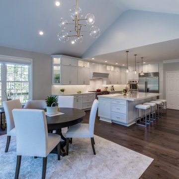
We have taken down bearing wall to adjacent family room to expand kitchen and implement 10’ feet long Island with sink, dishwasher and microwave into it.
The gas line and new 48” professional stove was relocated to west wall and now home for a long run of floor to ceiling cabinetry.
Display glass front lit cabinetry is place for her color full china’s
The north wall where closet used to be now is place for large scale refrigerator and freezer towers and pantry space. A tall unit of secondary oven and steam one is now placed in this wall
Installing matching wide plank espresso hardwood flooring has expanded this kitchen into all adjacent rooms.
New lighting plans, gorgeous pendent lighting make this center island to stand tall.
The traffic flow has been improved a lot allowing large gathering and entertainment much more than ever before.
She has carefully selected a soft tone backsplash to compliment the soapstone counter tops.
On the end they decided to have a stone patio right next to sunroom & enjoy their outdoor gathering as well.
 Michael Nash Design, Build & Homes
This couple have been living in their single-family Ashburn home for a wile and getting ready to update their home one step at the time.
Their kitchen was very small & dated. They would like to add sunroom. After talking to our designer, they come to conclusion to add sunroom/ Breakfast area to extend the kitchen & kill two birds with one stone.
Also, they decide to renovate two bathrooms upstairs. (Master bathroom & Hall bathroom)
Master bathroom was too small & after meeting with designer they agreed to take couple feet from bedroom & enlarge master bathroom.
She felt cramped and out dated in her old kitchen. A big pantry closet was taking way too much real estate out of her kitchen space.
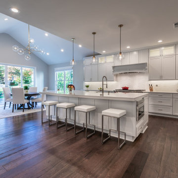
We have taken down bearing wall to adjacent family room to expand kitchen and implement 10’ feet long Island with sink, dishwasher and microwave into it.
The gas line and new 48” professional stove was relocated to west wall and now home for a long run of floor to ceiling cabinetry.
Display glass front lit cabinetry is place for her color full china’s
The north wall where closet used to be now is place for large scale refrigerator and freezer towers and pantry space. A tall unit of secondary oven and steam one is now placed in this wall
Installing matching wide plank espresso hardwood flooring has expanded this kitchen into all adjacent rooms.
New lighting plans, gorgeous pendent lighting make this center island to stand tall.
The traffic flow has been improved a lot allowing large gathering and entertainment much more than ever before.
She has carefully selected a soft tone backsplash to compliment the soapstone counter tops.
On the end they decided to have a stone patio right next to sunroom & enjoy their outdoor gathering as well.
23