Search results for "Charge items" in Home Design Ideas
Inspiration for a transitional home design remodel in San Francisco

Helena hardwood floors by Shaw feature a more rugged appearance with a more aggressive scraping technique. The surface texture varies from board to board like the color variation creating a truly unique visual unrivaled by any other product. Helena offers 4 colorations including Burnt Barnwood, Stonehenge, Warm Sunset, and Weathered Saddle (pictured).
In the flooring industry, there’s no shortage of competition. If you’re looking for hardwoods, you’ll find thousands of product options and hundreds of people willing to install them for you. The same goes for tile, carpet, laminate, etc.
At Fantastic Floors, our mission is to provide a quality product, at a competitive price, with a level of service that exceeds our competition. We don’t “sell” floors. We help you find the perfect floors for your family in our design center or bring the showroom to you free of charge. We take the time to listen to your needs and help you select the best flooring option to fit your budget and lifestyle. We can answer any questions you have about how your new floors are engineered and why they make sense for you…all in the comfort of our home or yours.
We work with designers, retail customers, commercial builders, and real estate investors to improve an existing space or create one that is totally new and unique...and we’d love to work with you.

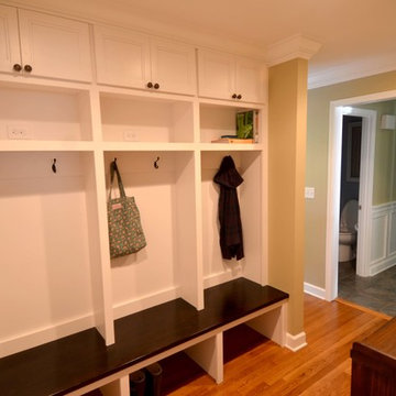
This busy family, with a house full of kids, dogs, and cats, needed a landing place for everyone as they arrived home, and the cramped entry hall was no longer working. A mudroom was designed with custom cabinets, including lockers and an island, to create a storage system for the family, and as importantly a place to hang out, do homework, and art projects.
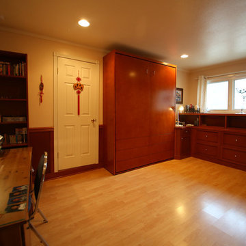
A desk area was built for Mom to be able to work from home, with a tower that houses the printer, router and other computer items behind closed doors, and filing cabinets below to keep everything close at hand.
This space also accommodates a washer and dryer with drying rack above tucked neatly out of site.
Find the right local pro for your project
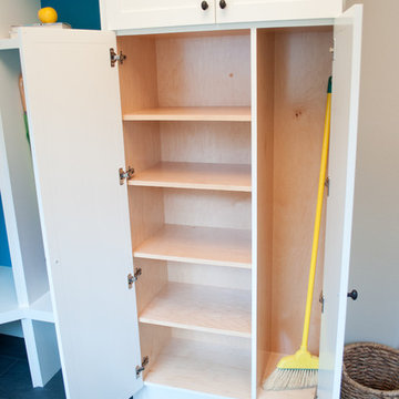
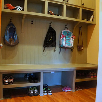
Custom cabinets to fit the exact project specification embody; seating, open floor shoe storage, coat and bag hanging space and even closed storage to catch surplus items. No detail is left unturned; each zone is even equipped with an outlet, creating personalized electronic recharging stations.

A repositioned sink allowed for better flow and adding cabinetry below the window created a better use of space for sorting and folding laundry.
A shelf & rod was added to allow for hang-dry items, while the upper cabinets keep the additional accoutrements hidden.
Marnie Swenson, MJFotography, Inc.

After six years of living in their Huntley IL home, Chris and Meghan were tired of their dark, dingy, outdated kitchen and it was finally time for a long-anticipated change. “The kitchen is the place where we live, it’s where we do everything,” Meghan said. “It was important that it be a space where we wanted to be.” Meghan loves cooking and enjoys including their girls in healthy meal prepping, this led them to want a brighter, more enjoyable kitchen with increased functionality and improved storage.
For Chris especially, the laundry room was an entirely dysfunctional eyesore. “We had a washer and a dryer, but it was all kind-of cobbled together!” Chris said. “There were always laundry piles everywhere, we weren’t really sure what we wanted to do in there, but it was time for us to make a change.” The mess of the space was stressful every time they walked in the door from the garage each day. Kids’ backpacks and shoes piled up haphazardly in the makeshift boot-bench closet left the family feeling disorganized and stressed. They needed space for folding clothes and locker cubbies to help keep the family organized.
Having known Christine and Todd in the Huntley community for years, Chris and Meghan were familiar with their work. “We already trusted them personally and having seen their projects for years we knew they did top notch work. After we reviewed the initial round of designs, we knew that hiring them was definitely the right choice,” Meghan and Chris said. Although Chris had done a lot of work in their home himself, the kitchen and laundry room renovation was such a large undertaking that he didn’t want to steal time away from his family to spend what would surely be many long weekends doing the job himself. “That would not have been a wise choice for us,” Chris laughed.
“Our designer, Michelle was very, very, easy to work with; anything we wanted to see or weren’t sure about, she went above and beyond to make this easy for us. She was easy to get hold of and always quick to respond,” the couple said. Michelle pulled ideas that mirrored the couple’s taste and style and was adept at directing the couple to limited choices that didn’t overwhelm them and kept the process moving. “I have a hard time making decisions. Michelle made the decision-making process so easy. I loved how she listened to what I liked and then presented three great options for me to choose from,” Meghan said.
The main objectives for the kitchen were better storage solutions, they wanted the space to reflect their lifestyle and taste, and they wanted it to last for years with low maintenance. One of the first steps in creating a more functional kitchen was relocating the refrigerator, creating an improved workflow for the busy family.
“We didn’t know that we could even move the refrigerator to a new location where it is now, that was something that we never would have thought of,” Chris said. “The new refrigerator location makes the kitchen feel so much bigger. We didn’t add any space, but our whole kitchen with the new design just seems like it’s so much larger than before!” Meghan said.
The perimeter mist colored cabinets helped warm and brighten the entire room, while the graphite colored cabinets on the island added contrast. Using this fresh, clean color palette satisfied the couple’s desire for a bright space that was the exact opposite of what they had before. Organization accessories were also added to the cabinets such as a spice drawer tray and roll outs to create hidden convenience.
“I absolutely love the hidden spices – it makes cooking so much more enjoyable!” Chris said. “And all the pull outs, and the double trash bin, who would think you could get so excited about organization!” the couple said in unison.
One thing they hated in their original kitchen was how dark the space felt. Added lighting on the ceiling with the new light fixtures combined with the lighter cabinetry colors throughout solved this problem. “Our new kitchen has this warm, almost cozy feeling that our old kitchen never had, it’s just a space that I love spending my time in now,” Meghan said. The light airy feeling was accentuated with the use of floating white shelves on either side of the decorative range hood. “We have so much cabinetry space, the new design is amazing we actually have more storage space than we will ever need,” Meghan said.
The island was extended to create more work surface and added space for stool seating. “The new island changes how we live. Now the kids can be in the kitchen with us, doing homework, eating breakfast, and the three of us have special dinners there when Chris is working late,” Meghan said.
The Carrara Marmi Quartz countertops were chosen because they are, not only beautiful, but are made from hard-working material that doesn’t require maintenance. The white subway tile backsplash that wraps to the ceiling behind the focal point cooktop range/hood compliments the crisp white countertops perfectly, while brushed brass hardware and light fixtures keep the design fresh and new.
The couple had a few fears at the beginning of the project, as most homeowners do. Their biggest fear was being out of their kitchen and laundry room for an extended time. The crew made it very easy for the family to work in a limited space keeping the washer and dryer hooked up the majority of the time, and also getting appliances working with minimal downtime.
“They above and beyond accommodated us to get us through the process,” Meghan said. “They did a great job making sure we were as comfortable as possible throughout the process,” Chris added.
“Our project manager DJ did a great job. He was very good at updating us on schedule changes, getting guys in as quickly as possible. Everyone that stepped in the house was nice and did great work,” said Chris. They thought Advance’s carpenter was phenomenal and were impressed when he took a conceptual idea from a photograph and worked with designer Michelle to create a one of a kind range/hood that has become the topic of conversation with friends and family who visit the new kitchen. “He was in our house literally every day for several weeks. He was easy to work with and good at what he did,” Meghan and Chris said.
The focal point of the kitchen; a hand-crafted, custom-built ventilation hood was clad with handpicked reclaimed barnwood. Advance Design’s carpenter built the framework and the cladding to create a one-of-a-kind design element that the couple loves.
“I think it was especially fun for him to create something unique from scratch, showcasing his talent in this area,” Meghan said. “I love that my kitchen is not like everyone else’s. I got to pick out the wood on my hood and watch it being built and was able to choose what pieces of wood went where on it. It’s totally unique.”
Red Oak flooring was toothed-in throughout the kitchen and the rest of the first floor anywhere changes were made. Then the whole floor was refinished to tone down the orange undertones in the existing floor stain, ultimately changing the color complexion of the entire first floor. The result is a completely new feeling to the entire home.
Renovating the laundry room was extremely important to Meghan and Chris, but they had trouble visualizing what the possibilities were for the seemingly small space. Michelle produced beautiful 3D illustrations that helped them envision the space in a whole new way.
“I must have told Michelle 100 times that I am a visual person, seeing the designs in 3D made it so easy to make decisions and see what we could really do with our space,” Meghan said.
A dividing wall and doorway were removed between the existing laundry room and hallway formerly containing a coat closet, providing space to design specialized graphite colored cabinetry matching the kitchen island to house custom storage cubbies for each family member. Adding the tall utility cabinetry in the new laundry area helped solve the storage issue, tucking away cleaning supplies, household items, and even the cat got its own cubby.
“I love how everything is now hidden in its own space. I can’t tell you how much I hated coming home and seeing everything sitting around on counters,” Chris said.
Electrical outlets were planned for the inside of utility cabinets, so devices could charge in hidden locations. Stacking the washer and dryer allowed for wider countertop space to provide a folding area and a special space for clothes to hang. “The way I do laundry has been completely transformed! I can actually fold clothes and hang them now right out of the washer and dryer,” Meghan said.
“The end result in the kitchen and the laundry/mud room was an updated light and bright space, with a smarter work flow that better meets the needs of this family,” Michelle said.
“I would totally recommend Advance Design,” Meghan said. “Sometimes I sit and just look at my kitchen and laundry room and think ‘Wow, I can’t believe I get to live here!’ It’s an understatement to say we love our new space.”

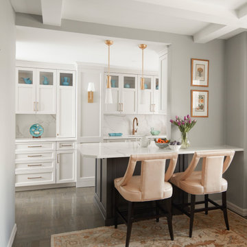
Bilotta Senior Designer, Thomas Vecchio, and Patrick J. Hamilton of Patrick James Hamilton Designs, partnered on this Manhattan upper east side kitchen renovation. This nondescript ‘60’s co-op and galley kitchen were reimagined into a pre-war era gem by adding architectural details: paneling, coffers, and moldings. Widening the opening created an open vista. Upper panes of glass on the Bilotta Collection wall cabinets echo the apartment’s transoms and unite the two sections that are interrupted by the paneled structural column. To compensate for the shorter wall, storage is optimized with plentiful pullouts, dividers, and specialized organizers. The “dead end” under the window was eliminated by continuing cabinetry and countertop materials around the room.
Countertop wall cabinets create a hutch in full view of the dining room. With dark gray paint, corner posts and furniture base molding, the peninsula reads like an island and bridges the two areas. Quartz countertops sport “lightning bolt” veins for pattern. Sophisticated on-
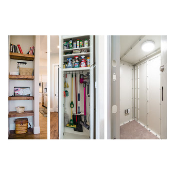
trend brushed brass was employed on the cabinet pulls and knobs, faucet, sconces, and pendants. A gamechanger was extending the footprint of the kitchen into the hallway with two tall cabinets. One is allocated for cleaning supplies, bulk items, recycling, and the vacuum. The other conceals a built-in wine rack; glassware and bar items; a docking drawer for charging devices; and a Penda-flex rack for files. An absolutely stunning metamorphosis.
Written by Paulette Gambacorta adapted for Houzz.
Bilotta Designer: Tom Vecchio
Interior Designer: Patrick J. Hamilton of Patrick James Hamilton Designs
Photographer: John Bessler

Sponsored
Columbus, OH
Hope Restoration & General Contracting
Columbus Design-Build, Kitchen & Bath Remodeling, Historic Renovations
Bilotta Senior Designer, Thomas Vecchio, and Patrick J. Hamilton of Patrick James Hamilton Designs, partnered on this Manhattan upper east side kitchen renovation. This nondescript ‘60’s co-op and galley kitchen were reimagined into a pre-war era gem by adding architectural details: paneling, coffers, and moldings. Widening the opening created an open vista. Upper panes of glass on the Bilotta Collection wall cabinets echo the apartment’s transoms and unite the two sections that are interrupted by the paneled structural column. To compensate for the shorter wall, storage is optimized with plentiful pullouts, dividers, and specialized organizers. The “dead end” under the window was eliminated by continuing cabinetry and countertop materials around the room.
Countertop wall cabinets create a hutch in full view of the dining room. With dark gray paint, corner posts and furniture base molding, the peninsula reads like an island and bridges the two areas. Quartz countertops sport “lightning bolt” veins for pattern. Sophisticated on-
trend brushed brass was employed on the cabinet pulls and knobs, faucet, sconces, and pendants. A gamechanger was extending the footprint of the kitchen into the hallway with two tall cabinets. One is allocated for cleaning supplies, bulk items, recycling, and the vacuum. The other conceals a built-in wine rack; glassware and bar items; a docking drawer for charging devices; and a Penda-flex rack for files. An absolutely stunning metamorphosis.
Written by Paulette Gambacorta adapted for Houzz.
Bilotta Designer: Tom Vecchio
Interior Designer: Patrick J. Hamilton of Patrick James Hamilton Designs
Photographer: John Bessler
This amazing white and gray kitchen is so bright, beautiful, and ORGANIZED! This client made sure that every item had the perfect spot. From a tea drawer, charging station, trash-pullouts, cutlery drawer, to a custom deep-drawer tray pullout cabinet, not one thing is out of place in this organizational dream kitchen.

Goodbye old, dated, dark, closed off kitchen and HELLO bright, white, cheery, glammy, happy kitchen that made this client finally LOVE her home.
We closed off the door to the formal dining and removed a peninsula to make a large L-shaped kitchen with and island. A cleverly concealed pantry hides behind a barn door that does not obstruct the dining nook, a drop zone is conveniently located at the opening to the kitchen and is the perfect place to drop the mail and purse and charge phones (out of the workspace!). Sparkly hardware, and pendant lights add a touch of glam and the mirrored cabinet doors reflect more light and give the illusion of more windows. Tons of extra storage under the seating area in the island for seasonal and entertaining items.
In the family room we removed a huge chunky stone fireplace that blocked any good place for a TV and replaced with a clean wall and home theater so that now the gathering space serves the function the homeowner actually wants.
In the space to the right of the entertainment center was a dated looking bar that we replaced with a "Barmoire" with AV components hidden below behind metal mesh doors that allow the components to breathe and all the glassware and bar items neatly stored and ready to open up and entertain out of. (Photo credit; Shawn Lober Construction).

Goodbye old, dated, dark, closed off kitchen and HELLO bright, white, cheery, glammy, happy kitchen that made this client finally LOVE her home.
We closed off the door to the formal dining and removed a peninsula to make a large L-shaped kitchen with and island. A cleverly concealed pantry hides behind a barn door that does not obstruct the dining nook, a drop zone is conveniently located at the opening to the kitchen and is the perfect place to drop the mail and purse and charge phones (out of the workspace!). Sparkly hardware, and pendant lights add a touch of glam and the mirrored cabinet doors reflect more light and give the illusion of more windows. Tons of extra storage under the seating area in the island for seasonal and entertaining items.
In the family room we removed a huge chunky stone fireplace that blocked any good place for a TV and replaced with a clean wall and home theater so that now the gathering space serves the function the homeowner actually wants.
In the space to the right of the entertainment center was a dated looking bar that we replaced with a "Barmoire" with AV components hidden below behind metal mesh doors that allow the components to breathe and all the glassware and bar items neatly stored and ready to open up and entertain out of. (Photo credit; Shawn Lober Construction).

This amazing white and gray kitchen is so bright, beautiful, and ORGANIZED! This client made sure that every item had the perfect spot. From a tea drawer, charging station, trash-pullouts, cutlery drawer, to a custom deep-drawer tray pullout cabinet, not one thing is out of place in this organizational dream kitchen.

This meticulously designed L-shaped kitchen not only boasts high-end appliances and elegant finishes but also incorporates thoughtful organization features to enhance both functionality and convenience. The expansive 123" x 62" island is complemented by Quartzite Moondust countertops with a mitered edge, while the mix of greige perimeter cabinetry and vintage wood island creates a warm, inviting atmosphere.
For kitchen organization, the space is equipped with a variety of practical storage solutions. Tray dividers keep baking sheets and larger items neatly separated, while a utensil pull-out and knife pull-out provide easy access to everyday tools. An appliance garage helps keep countertops clutter-free, offering a hidden space for small appliances. The full-height trash can pull-out ensures waste disposal is discreet and efficient. Pantry roll-outs make accessing pantry items simple, and cutlery dividers keep utensils organized and within reach. Wine cubbies provide a dedicated space for bottles, and a built-in charging station ensures your devices are always powered up.
High-end appliances include a 48" Wolf dual range with brushed brass handles, a 42" Sub-Zero Wolf fridge, a 30" microwave, and a 30" convection steam oven, along with 24" Sub-Zero freezer drawers and a 24" Sub-Zero beverage center for added convenience. The backsplash features a chic, homey milk glossy subway tile in a 3x10 size, completing the kitchen’s stylish and functional design. With a perfect blend of luxury and practicality, this kitchen is both beautiful and highly efficient.

Sponsored
Delaware, OH
Buckeye Basements, Inc.
Central Ohio's Basement Finishing ExpertsBest Of Houzz '13-'21
This amazing white and gray kitchen is so bright, beautiful, and ORGANIZED! This client made sure that every item had the perfect spot. From a tea drawer, charging station, trash-pullouts, cutlery drawer, to a custom deep-drawer tray pullout cabinet, not one thing is out of place in this organizational dream kitchen.

Docking Station made out of real 100% SOLID WALNUT hardwood. Also available in Sapele Mahogany PREMIUM Hardwood. Universal design, Qi wireless charger ready, more features, and a smart design that gracefully upgrades as newer smartphones/plug adapters become available. It's based on an age-old valet design with space for your iPhone, Android, iWatch, Fitbit, and tablet. When you get home these stations will keep you neatly organized – they house your electronic devices, wallet, watch, keys, pens, eyeglasses, sunglasses, jewelry, loose change, and an assortment of miscellaneous items living in your pocket - everything is ready for you to pick up when you go out the door.

This meticulously designed L-shaped kitchen not only boasts high-end appliances and elegant finishes but also incorporates thoughtful organization features to enhance both functionality and convenience. The expansive 123" x 62" island is complemented by Quartzite Moondust countertops with a mitered edge, while the mix of greige perimeter cabinetry and vintage wood island creates a warm, inviting atmosphere.
For kitchen organization, the space is equipped with a variety of practical storage solutions. Tray dividers keep baking sheets and larger items neatly separated, while a utensil pull-out and knife pull-out provide easy access to everyday tools. An appliance garage helps keep countertops clutter-free, offering a hidden space for small appliances. The full-height trash can pull-out ensures waste disposal is discreet and efficient. Pantry roll-outs make accessing pantry items simple, and cutlery dividers keep utensils organized and within reach. Wine cubbies provide a dedicated space for bottles, and a built-in charging station ensures your devices are always powered up.
High-end appliances include a 48" Wolf dual range with brushed brass handles, a 42" Sub-Zero Wolf fridge, a 30" microwave, and a 30" convection steam oven, along with 24" Sub-Zero freezer drawers and a 24" Sub-Zero beverage center for added convenience. The backsplash features a chic, homey milk glossy subway tile in a 3x10 size, completing the kitchen’s stylish and functional design. With a perfect blend of luxury and practicality, this kitchen is both beautiful and highly efficient.

This amazing white and gray kitchen is so bright, beautiful, and ORGANIZED! This client made sure that every item had the perfect spot. From a tea drawer, charging station, trash-pullouts, cutlery drawer, to a custom deep-drawer tray pullout cabinet, not one thing is out of place in this organizational dream kitchen.

Sponsored
Columbus, OH
Hope Restoration & General Contracting
Columbus Design-Build, Kitchen & Bath Remodeling, Historic Renovations
PROJECT | Duplicate-Duplex
TYPE | private residence / home-studio
LOCATION | Phayathai Rd., Bangkok, Thailand
OWNER | Ms. Najaree Ratanajiajaroen / Chanon Treenet
ARCHITECT | TOUCH Architect Co.,Ltd.
FLOOR AREA | 64 sq.m.
FLOOR AREA (by proposing) | 75 sq.m.
COMPLETION | 2018
PHOTOGRAPHER | Chalermwat Wongchompoo
CONTRACTOR | Legend Construction Group
A major pain point of staying in 64 sq.m. of duplex condominium unit, which is used for a home-studio for an animator and an artist, is that there is not enough space for dwelling. Moreover, a double-volume space of living area with a huge glass curtain wall, faces West. High temperature occurs all day long, since it allows direct sunlight to come inside.
In order to solve both mentioned problems, three addition items are proposed which are, GRID PARTITION, EXTENSION DECK, and STEPPING SPACE.
A glass partition not only dividing space between kitchen and living, but also helps reduce electricity charge from air-condition. Grid-like of double glass frame is for stuff and stationery hanging, as to serve the owners’ activities.
Extension deck would help filtrating heat from direct sunlight, since an existing high glass facade facing West.
An existing staircase for going up to the second-floor bedroom, is added by a proposed space above, since this condominium unit has no enough space for dwelling or storage. In order to utilize the space in a small condominium, creating another staircase above the existing one helps increase the space.
The grid partition and the extension deck help ‘decrease’ the electricity charge, while the extension deck and the stepping space help ‘increase’ the space for 11 sq.m.

Docking Station made out of real 100% SOLID WALNUT hardwood. Also available in Sapele Mahogany PREMIUM Hardwood. Universal design, Qi wireless charger ready, more features, and a smart design that gracefully upgrades as newer smartphones/plug adapters become available. It's based on an age-old valet design with space for your iPhone, Android, iWatch, Fitbit, and tablet. When you get home these stations will keep you neatly organized – they house your electronic devices, wallet, watch, keys, pens, eyeglasses, sunglasses, jewelry, loose change, and an assortment of miscellaneous items living in your pocket - everything is ready for you to pick up when you go out the door.

PROJECT | Duplicate-Duplex
TYPE | private residence / home-studio
LOCATION | Phayathai Rd., Bangkok, Thailand
OWNER | Ms. Najaree Ratanajiajaroen / Chanon Treenet
ARCHITECT | TOUCH Architect Co.,Ltd.
FLOOR AREA | 64 sq.m.
FLOOR AREA (by proposing) | 75 sq.m.
COMPLETION | 2018
PHOTOGRAPHER | Chalermwat Wongchompoo
CONTRACTOR | Legend Construction Group
A major pain point of staying in 64 sq.m. of duplex condominium unit, which is used for a home-studio for an animator and an artist, is that there is not enough space for dwelling. Moreover, a double-volume space of living area with a huge glass curtain wall, faces West. High temperature occurs all day long, since it allows direct sunlight to come inside.
In order to solve both mentioned problems, three addition items are proposed which are, GRID PARTITION, EXTENSION DECK, and STEPPING SPACE.
A glass partition not only dividing space between kitchen and living, but also helps reduce electricity charge from air-condition. Grid-like of double glass frame is for stuff and stationery hanging, as to serve the owners’ activities.
Extension deck would help filtrating heat from direct sunlight, since an existing high glass facade facing West.
An existing staircase for going up to the second-floor bedroom, is added by a proposed space above, since this condominium unit has no enough space for dwelling or storage. In order to utilize the space in a small condominium, creating another staircase above the existing one helps increase the space.
The grid partition and the extension deck help ‘decrease’ the electricity charge, while the extension deck and the stepping space help ‘increase’ the space for 11 sq.m.
11