
Search results for "Chocolate lined" in Home Design Ideas
 In Detail Interiors
Colorful and rich style
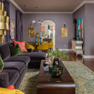
When a repeat client shows up on your doorstep with his third home to furnish and wants to start from scratch and go really bold, you just embrace him, scoot him right up to the resource room, and don’t ask questions! I mean, who does not love a client that embraces velvet, leather, silk and wallcoverings?
This lush, vibrant lounge space was all created from the want to really deep dive into something different, eclectic and more traveled. The original small, narrow, dimly lit room totally delivered on helping accomplish that mood. Mixing a little of that Ming dynasty-inspired strawberry red with a deep chocolate mohair on the sectional and cladding the room in a soft, amethyst woven wallcovering. We loved the interplay and “non-matchiness” that this space embraced.
Lighting and art were both about telling a story in this room – accenting conversational opportunities and an almost gallery-esque feel. Designating a more dynamic and unusual, sculptural feel – from the harder lines of the statement floor lamp in the living room across to the sprawling, slightly modern bloom of the dining area fixture.
Jewel of a space
The area rug had to ground the already bold furniture and lend itself to the darker wood floors, and a dusky green wool proved the ticket. We loved the almost pixelated pattern the hand-knotted wool lent to the overall design. A little hint of oxblood, chocolate and blue picked up in accents elsewhere, but the tone of almost jade really caught us about this piece.
Not enough can be said about the accent of a dining space either (which in terms of space planning was the only way to balance this long, narrow “hallway” of a room off the kitchen). Citron velvet on the low-profile chairs left the space feeling open, but fun for games and cocktail parties. Plus, the cerused wood dining table was a great complement – offering depth without a conflict to the existing flooring or nearby sectional.
Being able to view this space as a whole was very important to us! From the selection of sconces carried throughout (that wonky placement was existing and with so little opportunity to add cans we had to play up the new fixtures in a way that make them feel purposeful and desirable.), to the balance of color and temperature in each furniture grouping. Sometimes working floor to ceiling in an existing space can pose a lot of unique challenges when it comes to furnishing projects. However, we loved that the client embraced our drive to really punch up the visual feel of this living/dining combo. Also, we know the enjoyment he gets from the finished product is a testament to hunting for the right pieces, designing with unusual and luxe fabric combinations, and managing the inclusion of budget-friendly surprises that always balance a job well done.
What the client says
“From the moment that Cheryl arrived, I felt that she was definitely the designer that I needed to help facilitate & execute my vision for the space. I’m not the “cookie cutter” type, and I immediately realized that Cheryl had a knack for envisioning ideas that were unique, yet tasteful, timeless, and sophisticated.”
From its beginnings as a plain Jane envelope, this combination living/dining space becomes a study in texture and color!
 DreamMaker Bath & Kitchen
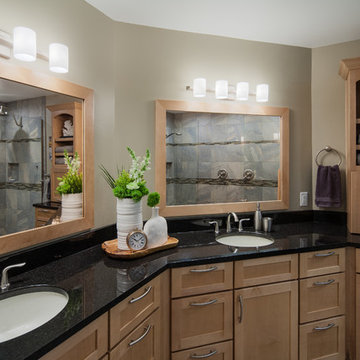
A once white master bath straight from the 1990s, the Ayer's Rock Master Bath is now a thing of modern beauty. The transitional style features maple Medallion cabinetry with a simple frame and brushed nickle arched handles. Black pearl granite countertops feature undermount sinks and Delta's Lahara line faucets. Beige and grey mingle in a beautiful porcelain rendition of natural, Ayer's Rock stone that covers the floor and climbs the walls of the master shower. Fred Golden Photography©
Find the right local pro for your project
 The Artisans Group, Inc.
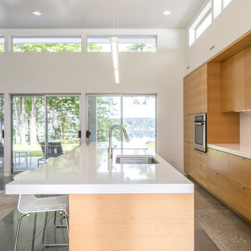
Our clients sought an elegant yet highly functional kitchen filled with natural light. The clean lines of modern design fit the bill.
Whether hosting intimate family gatherings or larger groups, this kitchen design is functional and elegant.
Photos by: Poppi Photography
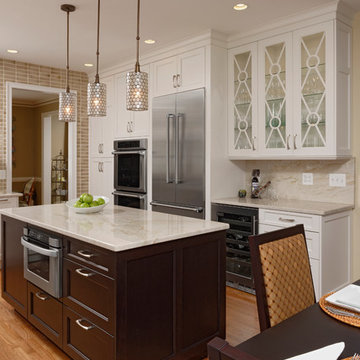
 Davida's Kitchen & Tiles
Bob Narod
Example of a large transitional l-shaped light wood floor eat-in kitchen design in DC Metro with an undermount sink, recessed-panel cabinets, white cabinets, granite countertops, gray backsplash, mosaic tile backsplash, stainless steel appliances and an island
Example of a large transitional l-shaped light wood floor eat-in kitchen design in DC Metro with an undermount sink, recessed-panel cabinets, white cabinets, granite countertops, gray backsplash, mosaic tile backsplash, stainless steel appliances and an island
 DreamMaker Bath and Kitchen - Utah
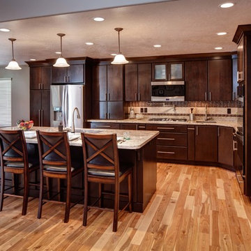
This beautiful kitchen was enlarged to create an open concept space in the home. The updates included granite counter tops, dark alder cabinets and light hardwood flooring. The kitchen features flat-panel cabinets with clean lined crown molding.
Andrea Hanks Photography
 Cabinet-S-Top
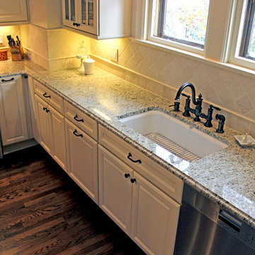
This kitchen renovation consisted of installing Medallion Silverline Maple Door Style: Winston in White Chocolate Finish on the perimeters and Silverline, Maple Door Style: Winston in the Chestnut Finish for the island accented with Top Knobs Normandy Knobs and Pulls in Patina Rouge. Artisan Granite Collection in Natural Stone Giallo Ornamental, with an Ogee Edge was used for the countertop and 4x4 Light Travertine, Tumbled tile for the backsplash. The color palette and finishes for the kitchen were selected to bring in character, elegance and charm that compliments the rest of the Shaker Heights home. Creamy painted maple cabinets with a contrasting island strike a balance between the refinished floor and new tile backsplash. A custom pot rack was designed using cabinetry molding pieces allowing the cookware to be accessible but to also make a statement in the room. The light creamy finishes are punctuated with darker accents that get noticed, like the bridge faucet, the medallion above the range and the cabinet hardware.

Sponsored
Columbus, OH

Wannemacher Interiors
Customized Award-Winning Interior Design Solutions in Franklin Cnty OH
 Valentini Kids Furniture Brooklyn NY
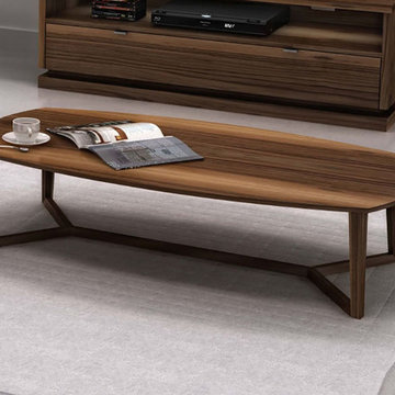
Escape Coffee Table by Up Huppe
Made in Canada
The Escape by Huppe is a collection of occasional tables entirely made of American black walnut. The line includes coffee table as well as small and large end tables. Escape tables are distinguished by the shape of their base which guarantees better durability. The coffee table and end tables are available in a natural, chocolate, espresso, smoky or tobacco walnut finish.
Features:
Oval Coffee table entirely made of black American walnut
Available in a natural, chocolate, espresso, smoky or tobacco walnut finish
Matching round end tables are available in two sizes: small and large
The starting price is for the Escape Coffee Table.
Dimensions:
Coffee Table: W50" x D27" x H12"
Small End Table: W16.5" x D16.5" x H16.5"
Large End Table: W21" x D21" x H21"
 Cabinets 4U, Inc.
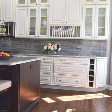
This Lemont kitchen is ready to be featured in a magazine! Mixing traditional details with a modern color palette gives this kitchen a fresh, unique personality.
Soaring ceilings allow the cabinetry to reach 108” tall. Decorative details include: Reeded Glass inserts, a Plate Rack, Wine Cubbies, and Bookcase cabinet create interesting storage and allow the homeowner’s taste to shine through.
Featured Suppliers: The lush cabinetry is from Kemper Distinctive Cabinets. It is the Bellmont door style, finished in Coconut on the perimeter, and in Chocolate on the island. The stunning countertops are a granite called Allura. The backsplash tile is from Floor & Decor, the Pure Wool color, Linear format. The Faucet is from the Kohler Artifacts® line.
 Valentini Kids Furniture Brooklyn NY
Moment Round Dining Table by Up Huppe
Made in Canada
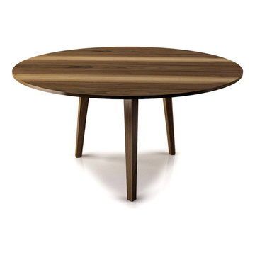
The Moment by Huppe is a modern round dining table manufactured in solid, specially selected american black walnut and american black walnut veneer, which is well known for its magnificent, light-colored veins. Moment is a part of the Up line and is characterized by the perfect balance it creates between the past and the present. The tables are available with two different types of bases: a regular or Y-shaped base, both of which are made out of solid black american walnut. The Moment table is available in a natural, chocolate, smoky, tobacco or espresso finish. Designed by Joel Dupras and manufactured in Canada by a passionate team, this product assures not only a solid design, but a solid build quality as well to make it last as long as possible. The Moment dining table is available in two sizes.
Features:
Designed by Joel Dupras
Round dining tabletop
Available with two different types types of legs: regular or Y-shaped base
Available in a natural, chocolate, smoky, tobacco or espresso walnut finish
Available in two sizes
The starting price is for the Moment Round Dining Table D46" with Regular Legs.
Dimensions:
Round Dining Table: D46" x H30"
Round Dining Table: D58" x H30"
 Cabinets 4U, Inc.
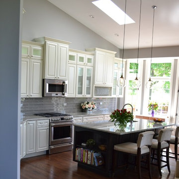
This Lemont kitchen is ready to be featured in a magazine! Mixing traditional details with a modern color palette gives this kitchen a fresh, unique personality.
Soaring ceilings allow the cabinetry to reach 108” tall. Decorative details include: Reeded Glass inserts, a Plate Rack, Wine Cubbies, and Bookcase cabinet create interesting storage and allow the homeowner’s taste to shine through.
Featured Suppliers: The lush cabinetry is from Kemper Distinctive Cabinets. It is the Bellmont door style, finished in Coconut on the perimeter, and in Chocolate on the island. The stunning countertops are a granite called Allura. The backsplash tile is from Floor & Decor, the Pure Wool color, Linear format. The Faucet is from the Kohler Artifacts® line.
 In Detail Interiors
Colorful and rich style
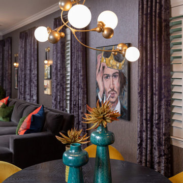
When a repeat client shows up on your doorstep with his third home to furnish and wants to start from scratch and go really bold, you just embrace him, scoot him right up to the resource room, and don’t ask questions! I mean, who does not love a client that embraces velvet, leather, silk and wallcoverings?
This lush, vibrant lounge space was all created from the want to really deep dive into something different, eclectic and more traveled. The original small, narrow, dimly lit room totally delivered on helping accomplish that mood. Mixing a little of that Ming dynasty-inspired strawberry red with a deep chocolate mohair on the sectional and cladding the room in a soft, amethyst woven wallcovering. We loved the interplay and “non-matchiness” that this space embraced.
Lighting and art were both about telling a story in this room – accenting conversational opportunities and an almost gallery-esque feel. Designating a more dynamic and unusual, sculptural feel – from the harder lines of the statement floor lamp in the living room across to the sprawling, slightly modern bloom of the dining area fixture.
Jewel of a space
The area rug had to ground the already bold furniture and lend itself to the darker wood floors, and a dusky green wool proved the ticket. We loved the almost pixelated pattern the hand-knotted wool lent to the overall design. A little hint of oxblood, chocolate and blue picked up in accents elsewhere, but the tone of almost jade really caught us about this piece.
Not enough can be said about the accent of a dining space either (which in terms of space planning was the only way to balance this long, narrow “hallway” of a room off the kitchen). Citron velvet on the low-profile chairs left the space feeling open, but fun for games and cocktail parties. Plus, the cerused wood dining table was a great complement – offering depth without a conflict to the existing flooring or nearby sectional.
Being able to view this space as a whole was very important to us! From the selection of sconces carried throughout (that wonky placement was existing and with so little opportunity to add cans we had to play up the new fixtures in a way that make them feel purposeful and desirable.), to the balance of color and temperature in each furniture grouping. Sometimes working floor to ceiling in an existing space can pose a lot of unique challenges when it comes to furnishing projects. However, we loved that the client embraced our drive to really punch up the visual feel of this living/dining combo. Also, we know the enjoyment he gets from the finished product is a testament to hunting for the right pieces, designing with unusual and luxe fabric combinations, and managing the inclusion of budget-friendly surprises that always balance a job well done.
What the client says
“From the moment that Cheryl arrived, I felt that she was definitely the designer that I needed to help facilitate & execute my vision for the space. I’m not the “cookie cutter” type, and I immediately realized that Cheryl had a knack for envisioning ideas that were unique, yet tasteful, timeless, and sophisticated.”
From its beginnings as a plain Jane envelope, this combination living/dining space becomes a study in texture and color!
 Valentini Kids Furniture Brooklyn NY
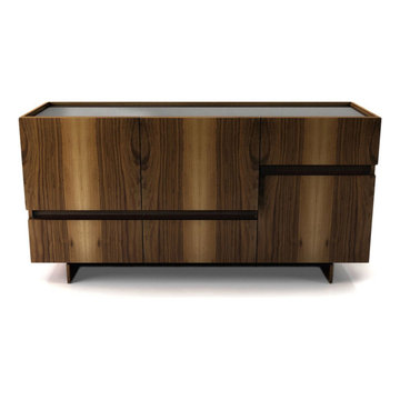
Magnolia Modern 3-Door Sideboard by Up Huppe
Made in Canada
The Magnolia by Huppe is a modern buffet manufactured in a specially selected american black walnut veneer as well as a solid american black walnut, which is well known for the magnificent lighter lines it creates in the grain of the wood. The Magnolia sideboard is available in a natural, chocolate, smoky, tobacco or espresso finish. The drawers and doors of the sideboard close softly and quietly thanks to hidden, self-closing slow motion slides. The drawer interiors are made of Russian birch, which is treated and stained like the unit and then finished in a silky finish. Designed by Joel Dupras and manufactured in Canada by passionate teams, this product assures an authentic, high quality build. The buffet is available in two versions.
Features:
Designed by Joel Dupras
Structure in a natural, chocolate, smoky, tobacco or espresso walnut finish
Drawer interiors are treated and stained like the furniture and have a silky finish
The drawers feature self-closing slow motions slides
Available in two versions: 3-door 3-drawer or 4-door 4-drawer sideboard
An optional lacquered glass is available for the top of the sideboard (for an extra charge)
The starting price is for the Magnolia 3-Door 3-Drawer Sideboard.
Dimensions:
3-Door 3-Drawer Sideboard: W60" x D19" x H30"
4-Door 4-Drawer Sideboard: W72" x D19" x H30"

 Archetype Design Studio, LLC
Craig Thompson Photography
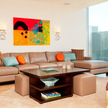
The client was looking for a contemporary but comfortable space as a gathering place for themselves, their family and friends in the city. They wanted color, which was right up my alley. The specific color requests were orange, aqua and purple. We used the orange and aqua in the main living space adding a rich chocolate to the mix to provide a bold color palette. One theme that was consistent in the design was the use of circles, ellipses, and flowing curves. This was evidenced in the fabrics, furniture, wall sconces, bar design, artwork, TV area wall covering, and artwork. Often times contemporary design is very angular, straight lined and rigid. This was not the desired look for this client.
They desired an open layout in the main living space to accentuate the breathtaking view. With these units there are always structural issues to be worked through. There is a structural column in an inopportune place in the main Living area. To make sense of this, it was incorporated into a bar that goes right up to the full height window. When sitting at the bar, it almost feels like you are floating in mid air, looking down on the hustle and bustle of the city. The bar is faced with dimensional glass tile with quartz countertops. An elliptical shaped floating bulkhead is intersected by the bold orange column. The bulkhead was finished in the dark chocolate with a silver deco molding around the face like a bracelet, architectural jewelry as I like to refer to it as. The bar creates an interesting architectural focal point, but also provides function for entertaining.
We did a softer version of the aqua, combined with gray and cream for the color palette in the Master suite. I was able to give the client her request for purple which we did in the Guest Bedroom (not photographed) as the accent wall behind the bed and combined it with gold to complete the scheme.
 Epic Interiors & Construction, Inc.
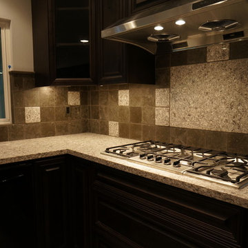
Corona Del Mar, CA is a great place to be a homeowner. With easy access to mountains, coastline, and wilderness areas, Corona Del Mar, CA residents can rightfully claim fantastic quality and ambiance while accommodating culinary needs in their "New Kitchen Design."
For this Kitchen Design in Corona Del Mar, CA, installed retro fit windows and custom casings were put in for a "Cape Cod look." The kitchen was aligned with Custom Cabinets in a Chocolate Pearl Finish, and new shaker style doors were installed. The upgraded Can Lighting on the Caesar Lime Stone and slate back splash accent the beautiful Quartz counter tops. The walls are lined with Chair rail molding and two tone paint. To add some warmth and further accent the Cape Cod Style throughout the kitchen, we installed "Wood Look Alike" ceramic tile flooring throughout.
This Kitchen Design in Corona Del Mar, CA was a an Epic success! The Client was ecstatic with her new remodel in Orange County..
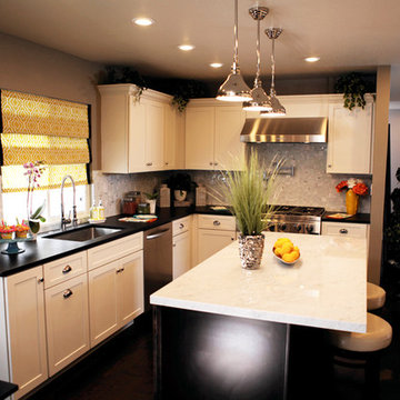
 Bay Area Cabinet Supply
Cabinet Line: Schrock
Door Style: Pleasant Hill
Finish: White Kitchen/Chocolate Island
Example of an eat-in kitchen design in San Francisco with shaker cabinets, white cabinets, stainless steel appliances and an island
Example of an eat-in kitchen design in San Francisco with shaker cabinets, white cabinets, stainless steel appliances and an island
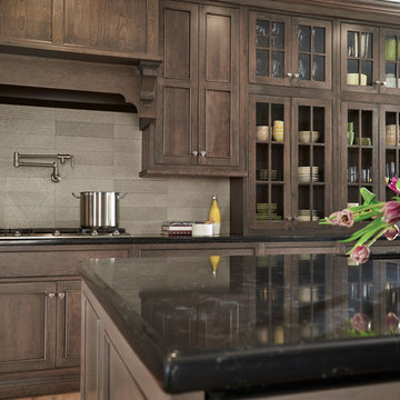
 Fieldstone Cabinetry
Example of a classic light wood floor kitchen design in Other with gray cabinets, white backsplash, stainless steel appliances and an island
Sponsored
Sunbury, OH

J.Holderby - Renovations
Franklin County's Leading General Contractors - 2X Best of Houzz!
 Sandra Curtis Design, LLC
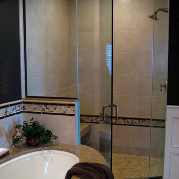
The goal was to create a warm space that flowed from the abutting master bedroom. The rest of the house has a down-to-earth sophistication that combines antiques, rich textures with a botanical theme. The master bedroom has a lush tapestry bedspread full of different leaves randomly scattered across the fabric. This became the inspiration for the bath. Taking a random fern as a motif, I initially found gorgeous wallpaper with the ferns against a rich chocolate background. Concerned with durability in certain areas of the bathroom, I shifted the approach to be a custom wall finish still using the deep chocolate background in a matte finish and adding hand-painted coppery bronze ferns randomly across the surface.
The homeowners wanted a vanity that incorporated a make-up area for her and plenty of counter space for both. In order to keep the wainscoting lines in check, the vanity section maintained the same counter height as the rest of the vanity therefore a custom height was required for the vanity stool. The wainscoting was kept relatively simple so as to find matching flexible moldings for the tub face.
The ivory trim color contrasts nicely with the browns. The cabinet finish was selected to bring out the coppery-bronze topped with complimenting granite. Kohler’s Vibrant Brushed Bronze finish lent itself perfectly to the palette. The rich brown colors are offset nicely with ivory tiles which are accented with bronze and Sonoma Tilemaker’s Tantrum glass tiles.
 In Detail Interiors
Colorful and rich style
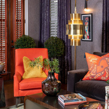
When a repeat client shows up on your doorstep with his third home to furnish and wants to start from scratch and go really bold, you just embrace him, scoot him right up to the resource room, and don’t ask questions! I mean, who does not love a client that embraces velvet, leather, silk and wallcoverings?
This lush, vibrant lounge space was all created from the want to really deep dive into something different, eclectic and more traveled. The original small, narrow, dimly lit room totally delivered on helping accomplish that mood. Mixing a little of that Ming dynasty-inspired strawberry red with a deep chocolate mohair on the sectional and cladding the room in a soft, amethyst woven wallcovering. We loved the interplay and “non-matchiness” that this space embraced.
Lighting and art were both about telling a story in this room – accenting conversational opportunities and an almost gallery-esque feel. Designating a more dynamic and unusual, sculptural feel – from the harder lines of the statement floor lamp in the living room across to the sprawling, slightly modern bloom of the dining area fixture.
Jewel of a space
The area rug had to ground the already bold furniture and lend itself to the darker wood floors, and a dusky green wool proved the ticket. We loved the almost pixelated pattern the hand-knotted wool lent to the overall design. A little hint of oxblood, chocolate and blue picked up in accents elsewhere, but the tone of almost jade really caught us about this piece.
Not enough can be said about the accent of a dining space either (which in terms of space planning was the only way to balance this long, narrow “hallway” of a room off the kitchen). Citron velvet on the low-profile chairs left the space feeling open, but fun for games and cocktail parties. Plus, the cerused wood dining table was a great complement – offering depth without a conflict to the existing flooring or nearby sectional.
Being able to view this space as a whole was very important to us! From the selection of sconces carried throughout (that wonky placement was existing and with so little opportunity to add cans we had to play up the new fixtures in a way that make them feel purposeful and desirable.), to the balance of color and temperature in each furniture grouping. Sometimes working floor to ceiling in an existing space can pose a lot of unique challenges when it comes to furnishing projects. However, we loved that the client embraced our drive to really punch up the visual feel of this living/dining combo. Also, we know the enjoyment he gets from the finished product is a testament to hunting for the right pieces, designing with unusual and luxe fabric combinations, and managing the inclusion of budget-friendly surprises that always balance a job well done.
What the client says
“From the moment that Cheryl arrived, I felt that she was definitely the designer that I needed to help facilitate & execute my vision for the space. I’m not the “cookie cutter” type, and I immediately realized that Cheryl had a knack for envisioning ideas that were unique, yet tasteful, timeless, and sophisticated.”
From its beginnings as a plain Jane envelope, this combination living/dining space becomes a study in texture and color!
 cossette interior design, llc
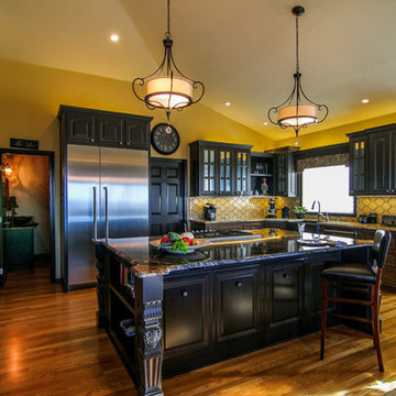
Kitchen remodel of circa 1990 home. Client wished for dark and dramatic look with top of the line appliances with optimal function. The couple is very attracted to large scale details, and the space could handle them so we went for bold legs on the large island with a chocolate paint and cafe over glaze. In order to balance the tones some of the cabinets are a mocha paint with the chocolate over glaze. Lighting was key, and the client can really set the mood with dimmers on the under- cabinet, above cabinet lighting as well as the pendants and recessed cans. The materials selected flow seamlessly with the existing adjacent family, living and dining spaces and were inspirational to the overall feel of the space.
21