
Search results for "Clients" in Home Design Ideas
 FineLine Kitchens, Inc.
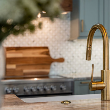
Hi everyone, I'm Sarah and Ogun we are here with fine line kitchens. So we are a couple working together. I do the interior design and remodeling of the space material selection meeting with the clients. And I handled operations outside, you know meaning all the construction work that is taking place the inside. The houses that we work in. I handle all the aspects of the construction, so today's project is very special. We're in Vienna and the client had a very big family. It's a family of seven that lives here. So we had a few aspects that we needed to keep in mind while designing this one. Having everybody be able to sit on the island. So we wanted plenty of seating all the way around. We didn't want anybody standing or anything like that. So what we did is we maximize the space. The center island is the biggest part of the kitchen. We use a natural stone to kind of give it a beautiful texture versus quartz. It's kind of standard white or kind of fabricated, so I wanted something very natural. We did this because I took my inspiration from the outside, so the inspiration if you look at the view right in front of me is there are so many greens there's a lot of brass accents and I wanted to bring this. Into this kitchen while designing it for my clients. She is very warm very. She wanted a very homey, comfy kind of look for the kitchen. So that's what we did today. As you can see, the cabinets are sage green, very light, so I still think it's a neutral, but it's a lighter color that again brings the outside in and we combine that with the oak right behind me so it's a slightly warm oak. It's not very dark. It's not very light. It's a medium brown and the same color went on the island. To kind of tie these two in and the backsplash, my favorite part is where you can see a little bit of design. It is, in my opinion still classic, but includes a pattern so the outside part is as we said in the beginning, is handled by my husband. I'd like him to speak a little bit about that. Thanks, Sarah, I want to talk to you guys a little bit about the construction part of this project. Originally this kitchen was located mostly in this area. They had their stove there sing. It was more of a peninsula layout in Sarah's and the customer vision they wanted. They wanted to get rid of the peninsula and they want to be able to have a huge island that can at least sit seven people because they're familiar with seven. So we wanted to make sure that we can achieve this design and bring it to life so that they can be happy with this layout. Some of the challenges we had, the house, the home being, you know, old home. There were a lot of you know the older electrical and plumbing that had to be replaced. We had to relocate the stove from here to this area. Over here we had put a nice foot fan that we had to relocate all the ductwork and the plumbing. Was being on the peninsula area. We had to relocate it to the center islands. So we achieved all this and kind of like bring it to bring in this kitchen up to date it looks beautiful. That's true, so yes, the old layout did not function for my clients because everything was kind of gathered on one side of the kitchen. So there was like a peninsula right there. So the end of this island kind of continued straight. And that was just the L shape. Kind of where everything was and there used to be another big table here, so they were using only kind of half of the space. So like I said at the beginning, our vision was to kind of feed everybody at the island, create some symmetry. 'cause I love that. So as you can see behind me, this is kind of the focal point symmetrical. Everything is kind of even we wanted to also panel the fridge here so it mimics the pantry and another size. So when you're looking at it, it is bringing again that symmetry back again. I hope you enjoyed this kitchen and this video and I'll see you soon. So how do you think this project turned out? It's nice. I like the color. I think it turned out nice. It's kind of like a little bit different color than what we always do. So I realize. Are you giving me a little bit of credit here that I did something different? Are you proud? I'm so proud of you. Other than that I like it. That they have kind of like a two sink. So if this was our kitchen, if we ever like you can have your own. I can have mine if we ever get into a fight then this can be like my own kitchen. Why are we gonna bring in a fight right now? So I'm cooking anyway. You're grilling most of the time, So what are you even talking about? My kitchen? That's my kitchen. You can just take the small sink. That's fine. It's always good to have your own space right there, so anyways. Thank you guys for watching. We hope to see you soon and if you have any questions please click the link below. It'll lead you to our website, house, YouTube and all of the social media is so nice to have you guys. We'll see you soon. Thanks bye bye-bye.
 Kitchen Design Concepts
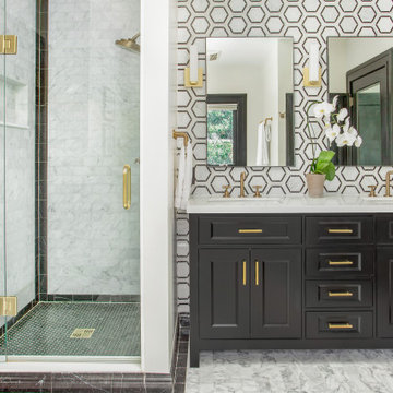
Black and white can never make a comeback, because it's always around. Such a classic combo that never gets old and we had lots of fun creating a fun and functional space in this jack and jill bathroom. Used by one of the client's sons as well as being the bathroom for overnight guests, this space needed to not only have enough foot space for two, but be "cool" enough for a teenage boy to appreciate and show off to his friends.
The vanity cabinet is a freestanding unit from WW Woods Shiloh collection in their Black paint color. A simple inset door style - Aspen - keeps it looking clean while really making it a furniture look. All of the tile is marble and sourced from Daltile, in Carrara White and Nero Marquina (black). The accent wall is the 6" hex black/white blend. All of the plumbing fixtures and hardware are from the Brizo Litze collection in a Luxe Gold finish. Countertop is Caesarstone Blizzard 3cm quartz.
 MSR Design
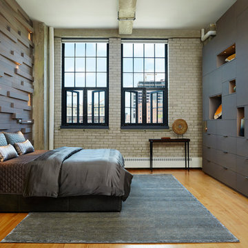
Varying the pattern of the wall installation and the texture of the wood itself provides a counterpoint to the cabinetry on the other side of the room and creates a beautiful backdrop for the client’s displayed artwork.
Alyssa Lee Photography
Find the right local pro for your project
 AV Architects + Builders
AV Architects + Builders
Location: Great Falls, VA, USA
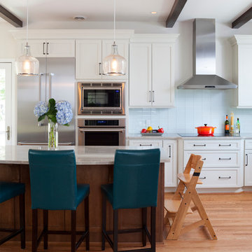
Our modern farm style home design was exactly what our clients were looking for. They had the charm and the landscape they wanted, but needed a boost to help accommodate a family of four. Our design saw us tear down their existing garage and transform the space into an entertaining family friendly kitchen. This addition moved the entry of the home to the other side and switched the view of the kitchen on the side of the home with more natural light. As for the ceilings, we went ahead and changed the traditional 7’8” ceilings to a 9’4” ceiling. Our decision to approach this home with smart design resulted in removing the existing stick frame roof and replacing it with engineered trusses to have a higher and wider roof, which allowed for the open plan to be implemented without the use of supporting beams. And once the finished product was complete, our clients had a home that doubled in space and created many more opportunities for entertaining and relaxing in style.
Stacy Zarin Photography
 Design Harmony
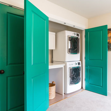
Here we transformed a guest bedroom into a home office. By adding two sets of double doors we hid the washer, dryer & all miscellaneous office equipment.
Using the clients' existing artwork as a basis for our palette, we incorporated color into the room by painting the doors this lush green.
Holland Photography - Cory Holland - HollandPhotography.biz
 Interiors by Popov
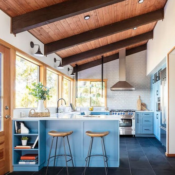
When we drove out to Mukilteo for our initial consultation, we immediately fell in love with this house. With its tall ceilings, eclectic mix of wood, glass and steel, and gorgeous view of the Puget Sound, we quickly nicknamed this project "The Mukilteo Gem". Our client, a cook and baker, did not like her existing kitchen. The main points of issue were short runs of available counter tops, lack of storage and shortage of light. So, we were called in to implement some big, bold ideas into a small footprint kitchen with big potential. We completely changed the layout of the room by creating a tall, built-in storage wall and a continuous u-shape counter top. Early in the project, we took inventory of every item our clients wanted to store in the kitchen and ensured that every spoon, gadget, or bowl would have a dedicated "home" in their new kitchen. The finishes were meticulously selected to ensure continuity throughout the house. We also played with the color scheme to achieve a bold yet natural feel.This kitchen is a prime example of how color can be used to both make a statement and project peace and balance simultaneously. While busy at work on our client's kitchen improvement, we also updated the entry and gave the homeowner a modern laundry room with triple the storage space they originally had.
End result: ecstatic clients and a very happy design team. That's what we call a big success!
John Granen.
 House of Brazier
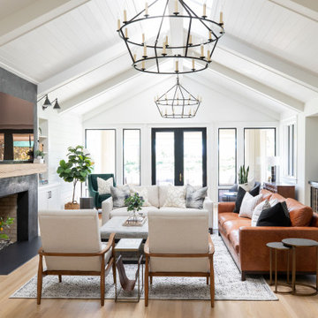
A full, custom remodel turned a once-dated great room into a spacious modern farmhouse with crisp black and white contrast, warm accents, custom black fireplace and plenty of space to entertain.

Sponsored
Columbus, OH

Snider & Metcalf Interior Design, LTD
Leading Interior Designers in Columbus, Ohio & Ponte Vedra, Florida
 Reclaimed Wood San Diego
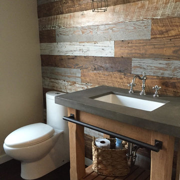
Client Reclaimed Douglas Fir wall
Bathroom - small rustic 3/4 dark wood floor bathroom idea in San Diego with open cabinets, distressed cabinets, a two-piece toilet, multicolored walls, an undermount sink and solid surface countertops
Bathroom - small rustic 3/4 dark wood floor bathroom idea in San Diego with open cabinets, distressed cabinets, a two-piece toilet, multicolored walls, an undermount sink and solid surface countertops
 GOGO Design Group
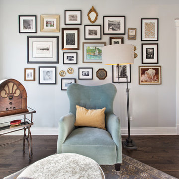
A Master Bedroom washed with sunlight and tranquil color
Establishing a serene gray and aqua color palette, the Master Bedroom serves as a family oasis, where our clients can share both alone time with each other and snuggle/reading time with their children. We created a seating zone flanked by a unique collage wall that documents the client’s connection to family and passion for travel. A treasured antique radio purchased by the man of the house perches on a pair of nesting tables and offers that Vintage flair that punctuates the entire home.
 T. Jerulle Construction, LLC
Matt Steeves Studio
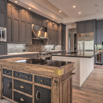
Inspiration for a huge transitional medium tone wood floor kitchen remodel in Miami with an undermount sink, recessed-panel cabinets, gray cabinets, gray backsplash, mosaic tile backsplash, stainless steel appliances and two islands
Inspiration for a huge transitional medium tone wood floor kitchen remodel in Miami with an undermount sink, recessed-panel cabinets, gray cabinets, gray backsplash, mosaic tile backsplash, stainless steel appliances and two islands
 M.J. Whelan Construction
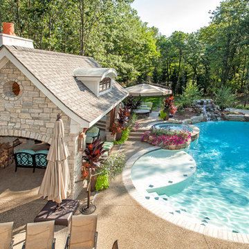
Without leaving the comfort of their home, our clients are able to relax and enjoy themselves in their own resort-like poolside cabana. This beautiful outdoor living space is located in the backyard of a European style luxury home. Surrounded by a wooded lot and lush landscaping and a stunning pool with a spa, this "dreamscape" is amazing. The cabana was built with natural full thickness stone and a vaulted ceiling complete with a fireplace and television. The ceiling is lined in cedar a holds two outdoor fans. The eyebrow arch widow above the front opening adds great interest and character. All outdoor furnishings were provided by our design teams that are comfortable as well as gorgeous. This space is open to a beautiful pool surrounded by gardens and many other amenities providing great oasis for family & friends to gather.
 FineLine Kitchens, Inc.
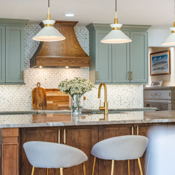
Hi everyone, I'm Sarah and Ogun we are here with fine line kitchens. So we are a couple working together. I do the interior design and remodeling of the space material selection meeting with the clients. And I handled operations outside, you know meaning all the construction work that is taking place the inside. The houses that we work in. I handle all the aspects of the construction, so today's project is very special. We're in Vienna and the client had a very big family. It's a family of seven that lives here. So we had a few aspects that we needed to keep in mind while designing this one. Having everybody be able to sit on the island. So we wanted plenty of seating all the way around. We didn't want anybody standing or anything like that. So what we did is we maximize the space. The center island is the biggest part of the kitchen. We use a natural stone to kind of give it a beautiful texture versus quartz. It's kind of standard white or kind of fabricated, so I wanted something very natural. We did this because I took my inspiration from the outside, so the inspiration if you look at the view right in front of me is there are so many greens there's a lot of brass accents and I wanted to bring this. Into this kitchen while designing it for my clients. She is very warm very. She wanted a very homey, comfy kind of look for the kitchen. So that's what we did today. As you can see, the cabinets are sage green, very light, so I still think it's a neutral, but it's a lighter color that again brings the outside in and we combine that with the oak right behind me so it's a slightly warm oak. It's not very dark. It's not very light. It's a medium brown and the same color went on the island. To kind of tie these two in and the backsplash, my favorite part is where you can see a little bit of design. It is, in my opinion still classic, but includes a pattern so the outside part is as we said in the beginning, is handled by my husband. I'd like him to speak a little bit about that. Thanks, Sarah, I want to talk to you guys a little bit about the construction part of this project. Originally this kitchen was located mostly in this area. They had their stove there sing. It was more of a peninsula layout in Sarah's and the customer vision they wanted. They wanted to get rid of the peninsula and they want to be able to have a huge island that can at least sit seven people because they're familiar with seven. So we wanted to make sure that we can achieve this design and bring it to life so that they can be happy with this layout. Some of the challenges we had, the house, the home being, you know, old home. There were a lot of you know the older electrical and plumbing that had to be replaced. We had to relocate the stove from here to this area. Over here we had put a nice foot fan that we had to relocate all the ductwork and the plumbing. Was being on the peninsula area. We had to relocate it to the center islands. So we achieved all this and kind of like bring it to bring in this kitchen up to date it looks beautiful. That's true, so yes, the old layout did not function for my clients because everything was kind of gathered on one side of the kitchen. So there was like a peninsula right there. So the end of this island kind of continued straight. And that was just the L shape. Kind of where everything was and there used to be another big table here, so they were using only kind of half of the space. So like I said at the beginning, our vision was to kind of feed everybody at the island, create some symmetry. 'cause I love that. So as you can see behind me, this is kind of the focal point symmetrical. Everything is kind of even we wanted to also panel the fridge here so it mimics the pantry and another size. So when you're looking at it, it is bringing again that symmetry back again. I hope you enjoyed this kitchen and this video and I'll see you soon. So how do you think this project turned out? It's nice. I like the color. I think it turned out nice. It's kind of like a little bit different color than what we always do. So I realize. Are you giving me a little bit of credit here that I did something different? Are you proud? I'm so proud of you. Other than that I like it. That they have kind of like a two sink. So if this was our kitchen, if we ever like you can have your own. I can have mine if we ever get into a fight then this can be like my own kitchen. Why are we gonna bring in a fight right now? So I'm cooking anyway. You're grilling most of the time, So what are you even talking about? My kitchen? That's my kitchen. You can just take the small sink. That's fine. It's always good to have your own space right there, so anyways. Thank you guys for watching. We hope to see you soon and if you have any questions please click the link below. It'll lead you to our website, house, YouTube and all of the social media is so nice to have you guys. We'll see you soon. Thanks bye bye-bye.
 Monarch & Maker
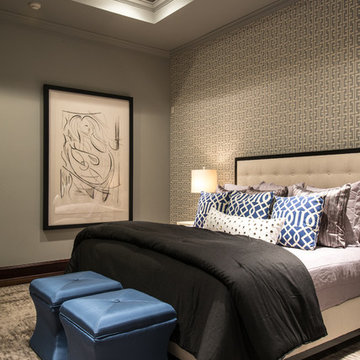
A flavor of some of our recent bedroom interior design projects in The Woodlands, TX, featuring custom-made pieces of furniture, luxurious fabrics and soothing lighting. Each room includes sourced materials and customized furniture items to meet the design briefs and exceed our clients' expectations.

Sponsored
Delaware, OH

Buckeye Basements, Inc.
Central Ohio's Basement Finishing ExpertsBest Of Houzz '13-'21
 TKS Design Group
Free ebook, Creating the Ideal Kitchen. DOWNLOAD NOW
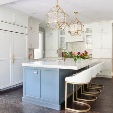
One of my favorite things to work on is older homes with a bit of history because I find it an interesting challenge to marry the historical architectural features of a home with modern design elements that work well for my client’s current lifestyle.
This home was particularly fun because it was the second kitchen we had done for this family and was quite a departure from the style of the first kitchen.
The before shot of the kitchen shows a view from the family room. See the dropped ceiling? We were curious, was this just part of the design or was the dropped ceiling there to hide mechanicals? Well we soon found out that it was mostly decorative (yay!), and with the exception of a little bit of work to some plumbing from an upstairs bathroom and rerouting of the ventilation system within the original floor joists, we were in the clear, phew! The shot of the completed kitchen from roughly the same vantage point shows how much taller the ceilings are. It makes a huge difference in the feel of the space. Dark and gloomy turned fresh and light!
Another serious consideration was what do we do with the skinny transom window above the refrigerator. After much back and forth, we decided to eliminate it and do some open shelving instead. This ended up being one of the nicest areas in the room. I am calling it the “fun zone” because it houses all the barware, wine cubbies and a bar fridge — the perfect little buffet spot for entertaining. It is flanked on either side by pull out pantries that I’m sure will get a ton of use. Since the neighboring room has literally three walls of almost full height windows, the kitchen gets plenty of light.
The gold shelving brackets, large pendant fixtures over the island and the tile mural behind the range all pay subtle homage to the home’s prairie style architecture and bring a bit of sparkle to the room.
Even though the room is quite large, the work triangle is very tight with the large Subzero fridge, sink and range all nearby for easy maneuvering during meal prep. There is seating for four at the island, and work aisles are generous.
Designed by: Susan Klimala, CKD, CBD
Photography by: LOMA Studios
For more information on kitchen and bath design ideas go to: www.kitchenstudio-ge.com
 Ann Lowengart Interiors
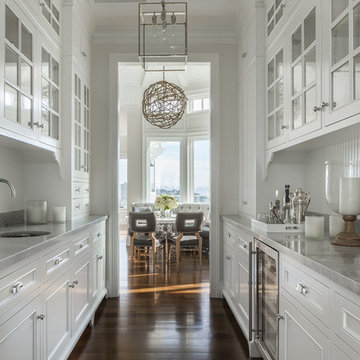
A curated selection of beautiful bar items and candles were used to create a special, bespoke feel in the butler’s pantry. Honing in on the client’s desire for a space where specialty drinks could be made, care and attention went into adding to this well-outfitted space.
Photo credit: David Duncan Livingston
 Carnes Home Builders
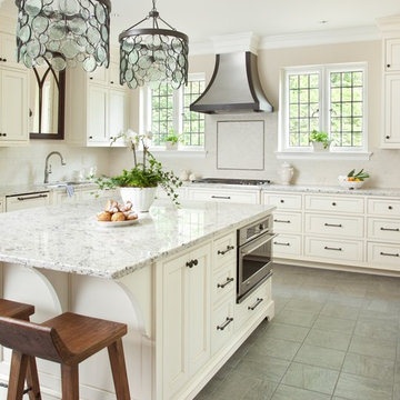
We reconfigured several spaces in this home to create one very large kitchen area. We love how bright and airy the space is. Custom cabinetry allowed our clients to personalize their kitchen.
 Horn & Co. (Previously JHLA)
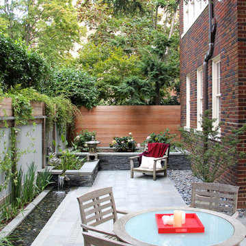
Our clients on this project were inspired by their travels to Asia and wanted to mimic this aesthetic at their DC property. We designed a water feature that effectively masks adjacent traffic noise and maintains a small footprint.
Sponsored
Columbus, OH

Wannemacher Interiors
Customized Award-Winning Interior Design Solutions in Franklin Cnty OH
 River Valley Landscapes
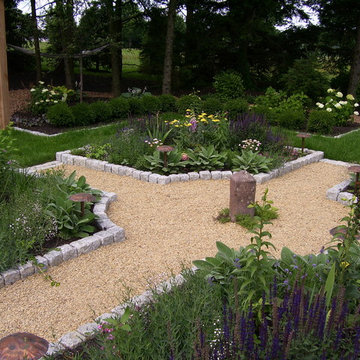
The property is one of the original farm houses located on the main street of a small town. It has been in the family for many years and our client just inherited the property. They were trying to have balance of preserving the old while realizing modern day living has its benefits too. The house had a large addition added using mostly old style materials, but designed with function and modern day luxuries. Our goal was to carry that theme to the outside.
Our first problem we had to address was how to transition between the first floor elevation changes. The lower room was the husband’s office. He stated in the future he may have clients over and it would be nice to have an area to sit outside. The wife’s main concern was to renew the four corner garden. She also felt it was very important to be able to see it from the kitchen area. Finally there was an old wishing well stuck right outside the kitchen. They both felt it would be neat to be able to incorporate this in some how. They wanted a patio area with a built in grill to accommodate there family and friends. They also wanted to keep a large play area for the kids.
We were able to pull this off successfully. We addressed the first issue by having a small lower level flagstone area. This area is large enough for 1 to 2 people to sit comfortably. It also provides a transition from his office to the larger patio area. We installed a simple small gravel sitting area opposite of the main patio. This provides our client a secluded place to relax or do business. Mrs.... told me she is amazed how much her and her husband enjoys this area. It is so peaceful looking at the small creek over a glass of wine.
We built a natural limestone retaining wall to create the patio terrace. The stone was chosen to extend the houses architectural elements into the landscape. Irregular broken flagstone was used to give it a more casual feel. We installed three Serviceberries into the patio terrace to replace some trees that were taken down during the remodeling. She was very concern that they would block the view of the four corner garden. We new they were crucial to nestle in the terrace, so we placed them for a couple days for her to decide. Fortunately she agreed they not only kept the view open, but helped frame the garden.
The four corner garden was designed to be viewed from afar and experienced up close. We wanted the space to have some formal structure while keeping with the casual farm house feel. Another natural limestone retaining wall was created. This leveled the garden terrace and helped associate it with the rest of the property. The four corner garden is nestled into the existing woods edge. This provides three distinct experiences to entering the garden; a more formal from the driveway, an open feel from the lower lawn, and a more natural / casual experience from the wooded area. The Plymouth brown gravel was used for the center of the garden. This helped highlight the stone post that was found during construction. The gravel also brings the sense of sound into the garden space. Lamb’s ear was chosen as a fun way to get kids interest in horticulture.
The balance of using the new to create the old feel is what makes this project a success. The property has already hosted a local historical society event and won an award for its preservation efforts. When Mrs.... can’t find her husband, she knows he is either reading the newspaper by the grill or resting in the hammock along the wood’s path.
 DHD Architecture and Interior Design
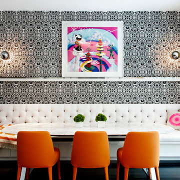
Located in stylish Chelsea, this updated five-floor townhouse incorporates both a bold, modern aesthetic and sophisticated, polished taste. Palettes range from vibrant and playful colors in the family and kids’ spaces to softer, rich tones in the master bedroom and formal dining room. DHD interiors embraced the client’s adventurous taste, incorporating dynamic prints and striking wallpaper into each room, and a stunning floor-to-floor stair runner. Lighting became one of the most crucial elements as well, as ornate vintage fixtures and eye-catching sconces are featured throughout the home.
Photography: Emily Andrews
Architect: Robert Young Architecture
3 Bedrooms / 4,000 Square Feet
 Melanie Love
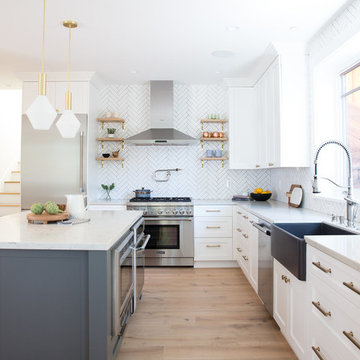
Two tone kitchen cabinets and herringbone subway tile. Photo by Megan Caudill
Transitional l-shaped light wood floor and beige floor kitchen photo in San Francisco with a farmhouse sink, shaker cabinets, white cabinets, quartz countertops, white backsplash, stainless steel appliances, an island and white countertops
Transitional l-shaped light wood floor and beige floor kitchen photo in San Francisco with a farmhouse sink, shaker cabinets, white cabinets, quartz countertops, white backsplash, stainless steel appliances, an island and white countertops
16