
Search results for "Collaborative approach" in Home Design Ideas
 Living with Lolo
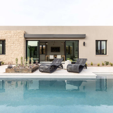
Pool House in Bronco | Key Feature: A Scottsdale new-build rooted in sculptural modernism, Bronco Revival balances bold black-and-white contrast with organic textures, natural wood elements, and statement lighting. As a groundbreaking “Live Lab” designer residence, it’s a first-of-its-kind space where luxury furnishings are tested in real-world conditions before being introduced into high-profile client homes.
Challenge: Because Bronco Revival was the designer’s personal residence, the project carried a unique level of pressure and intention. The challenge was creating a Scottsdale new-build that felt elevated and editorial while still functioning as a true family home. Every selection had to balance bold sculptural modernism (high contrast, statement lighting, architectural furnishings) with durability, comfort, and day-to-day livability. In addition, the home served as a “Live Lab,” meaning new vendors, materials, and luxury furnishings needed to be tested in real-life conditions before being trusted for future high-profile client projects.
Solution: We approached the project with a highly curated, test-and-refine design strategy, treating each space as both a finished interior and a real-world evaluation environment. Key furnishings, textiles, and materials were selected to support the modern organic vision while also standing up to the demands of everyday family life. We worked through selections intentionally, layering in bold contrast, natural woods, and sculptural statement pieces, while prioritizing performance materials, pet-friendly durability, and timeless foundational elements. By using the home as a lived-in showroom, we were able to validate what truly performs beautifully, refine our vendor relationships, and confidently carry those proven selections into future client designs.
Materials: MadeGoods: Sculptural Davion coffee tables |
Loloi: Custom performance rug collection |
Schumacher: Bespoke drapery fabrication |
Aesthetic Wall Coverings: Pioneering wallpaper application on ceiling beams |
Zac + Fox: Exclusive textile collaboration via Made Resource Group |
Budget ($ Range): $300K |
Timeline (Duration): 4 MONTHS
 Ariana Designs & Interiors
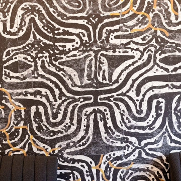
This dining area stands as the central gathering space of the office, embodying a creative and functional approach to commercial interior design. A bold abstract mural serves as a captivating focal point, drawing attention and encouraging conversation. The pairing of ribbed fabric benches with sleek wooden chairs strikes the perfect balance between comfort and elegance. Modern pendant lighting elevates the atmosphere, creating an ideal setting for informal meetings and team discussions.
 Amy Troute Inspired Interior Design
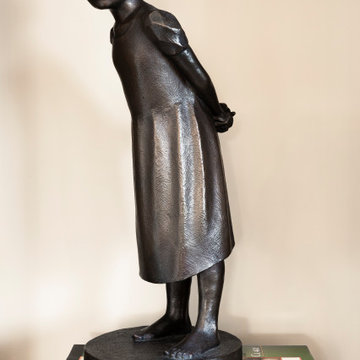
We were approached by a Karen, a renowned sculptor, and her husband Tim, a retired MD, to collaborate on a whole-home renovation and furnishings overhaul of their newly purchased and very dated “forever home” with sweeping mountain views in Tigard. Karen and I very quickly found that we shared a genuine love of color, and from day one, this project was artistic and thoughtful, playful, and spirited. We updated tired surfaces and reworked odd angles, designing functional yet beautiful spaces that will serve this family for years to come. Warm, inviting colors surround you in these rooms, and classic lines play with unique pattern and bold scale. Personal touches, including mini versions of Karen’s work, appear throughout, and pages from a vintage book of Audubon paintings that she’d treasured for “ages” absolutely shine displayed framed in the living room.
Partnering with a proficient and dedicated general contractor (LHL Custom Homes & Remodeling) makes all the difference on a project like this. Our clients were patient and understanding, and despite the frustrating delays and extreme challenges of navigating the 2020/2021 pandemic, they couldn’t be happier with the results.
Photography by Christopher Dibble
Find the right local pro for your project

 Renovisions
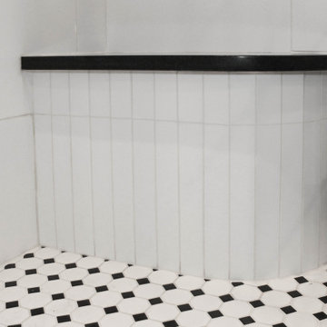
Perectly balanced, this dramatic black and white bathroom is a stunner. Thoughtful design was top of mind for these clients as they approached the Renovisions team to help narrow down their choices and bring it to life. Finding balance while mixing darker, heavier black finishes and lighter, white finishes was the task at hand and the goal was to create a modern look with an industrial/rustic feel.
The challenge on this project was incorporating all the desired elements and products in a tight spatial constraint of 9’ x 7.5’. The clients biggest concern in the old bathroom was inadequate storage, tired and under-utilized bathtub and they also needed an additional sink for their two daughters who often share this space. Renovisions recommended removing the wall between the shower and closet to gain additional floor space as you enter the bath, while providing wall space for the three towel bars.
Collaborating with the clients and searching to find the right fixtures paid off nicely. This newly remodeled Renovision accommodated two rectangular sinks, a walk-in shower with hand-held shower, wall-mounted shower head and two soft spray body jets. The oil-rubbed bronze fixtures not only provided a luxurious spa experience, but also added warmth and softness to the vintage feel. The glass shower enclosure is trimmed in a matte black grid that boasts an industrial aesthetic with retro feel while delivering modernistic function. It’s unique in appearance while allowing the chic white subway and black and white diamond tile to peek through.
The beautifully designed cabinetry in a matte black painted finish provides plenty of storage. This smart configuration included two banks of three drawers for toiletries and accessories, two towers with adjustable shelves for towels and two ‘garage’ doors for hair dryers.
Another unique design detail to capture attention was the black and white curvy geometric floor tile which plays off the straight lines of the cabinets and square grids of the shower enclosure.
The clients are thrilled with the results and their modern, high-contrast styled digs – a true customized relaxation sanctuary for the entire family.

 User
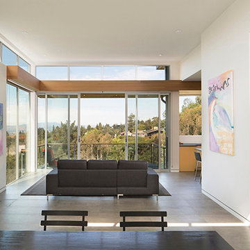
UserThis hillside home in Piedmont, CA was remodeled to change the style from a 1940's rancher with eight foot ceilings and dark interiors, into a modern geometric composition with vast white interiors for casual living and generous daylighting for displaying the artist-owner's works.
In a city known for rigorous and difficult design review, an addition, two variances, and a full stylistic change were unanimously approved on the first round. All sloped roofs and attics were eliminated and replaced by a series of stacked and overlapping flat roofs. This made the house taller on the inside and shorter on the outside, which helped earn design review cooperation in the community. Windows were concentrated toward the rear yard views or moved up high on the side walls for daylight and privacy, benefitting the owners as well as the neighbors.
At the start, the owner husband was so enthusiastic and engaged in transforming his house into something modern that he presented the architect with a scaled foamcore model, rather than the usual magazine clippings and wish list. He participated in the design decisions throughout the process. The owner wife is the artist who did all the artwork in the house. She had been craving a display space with large walls and good natural light. Both of them loved the location and great views.
The project was an opportunity to transform the style of an older traditional home into a modern one, while solving numerous problems. By rebuilding the 1800 ft2 top of the 3-story home it was possible to change the style of the whole building, since the lower floors were a neutral base, and also to change the lifestyle of the owners, who wanted to move their master suite upstairs and live primarily on the top floor as empty nesters.
Going into the project, the architect knew there were multiple encroachments into the setbacks and potential privacy issues with close by neighbors. He approached this as a complex puzzle made up of architectural and political pieces which all had to fit together elegantly. It took many careful moves, small and large, to arrive at a serene and cohesive result that tied old and new together seamlessly.
The design-build contractor worked closely with the owners and handled all of the construction phase documents and design adjustments, adding ideas of their own to make the project really sing.
The project was a collaboration in three acts. The owner had a strong design concept from the start. The architect developed it into a realistic project and garnered the design approvals. Then the contractor executed brilliantly.
 Living with Lolo
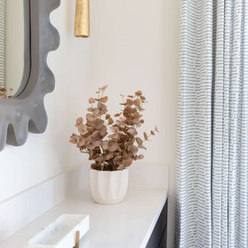
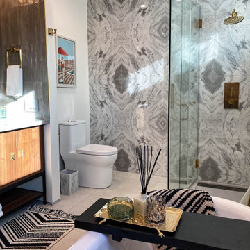
Bathroom in Bronco | Key Feature: A Scottsdale new-build rooted in sculptural modernism, Bronco Revival balances bold black-and-white contrast with organic textures, natural wood elements, and statement lighting. As a groundbreaking “Live Lab” designer residence, it’s a first-of-its-kind space where luxury furnishings are tested in real-world conditions before being introduced into high-profile client homes.
Challenge: Because Bronco Revival was the designer’s personal residence, the project carried a unique level of pressure and intention. The challenge was creating a Scottsdale new-build that felt elevated and editorial while still functioning as a true family home. Every selection had to balance bold sculptural modernism (high contrast, statement lighting, architectural furnishings) with durability, comfort, and day-to-day livability. In addition, the home served as a “Live Lab,” meaning new vendors, materials, and luxury furnishings needed to be tested in real-life conditions before being trusted for future high-profile client projects.
Solution: We approached the project with a highly curated, test-and-refine design strategy, treating each space as both a finished interior and a real-world evaluation environment. Key furnishings, textiles, and materials were selected to support the modern organic vision while also standing up to the demands of everyday family life. We worked through selections intentionally, layering in bold contrast, natural woods, and sculptural statement pieces, while prioritizing performance materials, pet-friendly durability, and timeless foundational elements. By using the home as a lived-in showroom, we were able to validate what truly performs beautifully, refine our vendor relationships, and confidently carry those proven selections into future client designs.
Materials: MadeGoods: Sculptural Davion coffee tables |
Loloi: Custom performance rug collection |
Schumacher: Bespoke drapery fabrication |
Aesthetic Wall Coverings: Pioneering wallpaper application on ceiling beams |
Zac + Fox: Exclusive textile collaboration via Made Resource Group |
Budget ($ Range): $300K |
Timeline (Duration): 4 MONTHS
 Amy Troute Inspired Interior Design
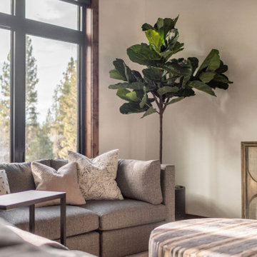
Home away from home is where we often meet our clients, especially in Bend. They crave a welcoming and approachable, yet luxurious and well curated vacation home. This custom home in Central Oregon’s Caldera Springs neighborhood was no exception. An investment property the owners and their family will use occasionally, the home had to speak to their overall aesthetic, while graciously accommodating rental guests throughout the year. Design for each space was a collaboration with our clients, who selected “inspiration” fabrics and artwork that tell a story and bring warmth and personality to the home. We designed hard-wearing custom furniture, composed layers of luxe bedding, placed photography by local artist and photographer Chris Murray, and added comfortable and low maintenance furniture outside, where everyone wants to be year-round in Bend. Working with the property manager, we checked every item off a comprehensive list to outfit the chef’s kitchen and ensure guests would have all the comforts of home. This home is available for short-term vacation rental through Bennington Properties in Sunriver, OR.
Photography by Kayla McKenzie Photography
 Fredman Design Group
Designers gave the house a wood-and-steel façade that blends traditional and industrial elements.Photography by Eric Hausman
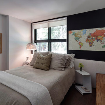
Designers gave the house a wood-and-steel façade that blends traditional and industrial elements. This home’s noteworthy steel shipping container construction material, offers a streamlined aesthetic and industrial vibe, with sustainable attributes and strength. Recycled shipping containers are fireproof, impervious to water and stronger than traditional building materials. Inside, muscular concrete walls, burnished cedar beams and custom oak cabinetry give the living spaces definition, decorative might, and storage and seating options.
For more than 40 years, Fredman Design Group has been in the business of Interior Design. Throughout the years, we’ve built long-lasting relationships with our clients through our client-centric approach. When creating designs, our decisions depend on the personality of our clients—their dreams and their aspirations. We manifest their lifestyle by incorporating elements of design with those of our clients to create a unique environment, down to the details of the upholstery and accessories. We love it when a home feels finished and lived in, with various layers and textures.
While each of our clients and their stories has varied over the years, they’ve come to trust us with their projects—whether it’s a single room to the larger complete renovation, addition, or new construction.
They value the collaborative team that is behind each project, embracing the diversity that each designer is able to bring to their project through their love of art, travel, fashion, nature, history, architecture or film—ultimately falling in love with the nurturing environments we create for them.
We are grateful for the opportunity to tell each of clients’ stories through design. What story can we help you tell?
Call us today to schedule your complimentary consultation - 312-587-9184
 Cabinet IQ
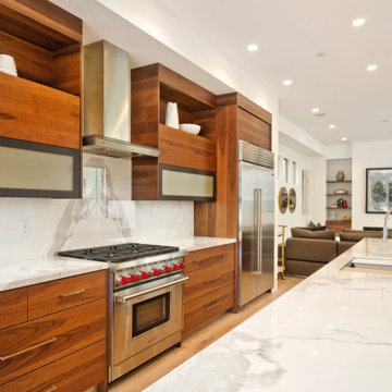
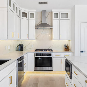
Our clients came to our North Showroom in Cedar Park, TX wanting to completely renovate the outdated cabinets and countertops in their newly purchased home. The flow of the kitchen was not aligning with their new family needs, and the style did not match their modern vision. The dated kitchen left a lot of unused space, and had pain points that disturbed the flow and symmetry of the space. We developed a design to take advantage of the room height, spacious area, and natural light from the bay window nook area.
Our designer Dave met with the clients in the showroom and discovered the needs and wants to make the kitchen remodel a success. After understanding the client’s vision and requirements, they begun the collaboration on their kitchen design. During this phase we concluded we could achieve the kitchen design with in-stock cabinets from Kitchen Cabinet Distributors (KCD), a national recognized in-stock cabinet provider. We could have chosen a custom kitchen cabinetry line, however KCD’s offerings were the perfect fit for the design and allowed for an opportunity to save some of the budget for full quartz backsplash vs. tile. Our designers help you navigate the different lines we carry and are thoughtful to not steer you to more than you need to succeed. The first order of business was to change the orientation of the island, and move its position to frame the new galley arrangement. This would allow for better egress around the island and prevent tight spaces for a busy new kitchen.
Secondly, now was the time to take advantage of the room height and install new stacked wall cabinets with clear glass panels on the top row. This made the kitchen renovation feel more grand, bright, and inviting. The glass provided opportunity to tie in the lighting scheme and lend more warmth to the design. Coupled with the toe kick and under cabinet lights in the base cabinets, the kitchen invites you in. Dave also took full advantage of the kitchen layout by using upper cabinets and no open shelving.
We also wanted to find a new home for the built-in microwave as a stainless hood was now going to frame the cooktop / oven combo. We modified the cabinet in the island to trim in a microwave, at the same time keeping it out of view from the living area. Building on this approach, we also took the trash bin out of the kitchen space and provided a dedicated double trash bin cabinet. Aesthetics were very important in this design.

 Renovisions
Perectly balanced, this dramatic black and white bathroom is a stunner. Thoughtful design was top of mind for these clients as they approached the Renovisions team to help narrow down their choices and bring it to life. Finding balance while mixing darker, heavier black finishes and lighter, white finishes was the task at hand and the goal was to create a modern look with an industrial/rustic feel.
The challenge on this project was incorporating all the desired elements and products in a tight spatial constraint of 9’ x 7.5’. The clients biggest concern in the old bathroom was inadequate storage, tired and under-utilized bathtub and they also needed an additional sink for their two daughters who often share this space. Renovisions recommended removing the wall between the shower and closet to gain additional floor space as you enter the bath, while providing wall space for the three towel bars.
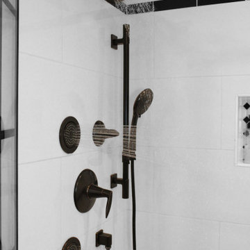
Collaborating with the clients and searching to find the right fixtures paid off nicely. This newly remodeled Renovision accommodated two rectangular sinks, a walk-in shower with hand-held shower, wall-mounted shower head and two soft spray body jets. The oil-rubbed bronze fixtures not only provided a luxurious spa experience, but also added warmth and softness to the vintage feel. The glass shower enclosure is trimmed in a matte black grid that boasts an industrial aesthetic with retro feel while delivering modernistic function. It’s unique in appearance while allowing the chic white subway and black and white diamond tile to peek through.
The beautifully designed cabinetry in a matte black painted finish provides plenty of storage. This smart configuration included two banks of three drawers for toiletries and accessories, two towers with adjustable shelves for towels and two ‘garage’ doors for hair dryers.
Another unique design detail to capture attention was the black and white curvy geometric floor tile which plays off the straight lines of the cabinets and square grids of the shower enclosure.
The clients are thrilled with the results and their modern, high-contrast styled digs – a true customized relaxation sanctuary for the entire family.
 Rodwin Architecture & Skycastle Construction
Rodwin Architecture & Skycastle Homes
Location: Boulder, Colorado, USA
Interior design, space planning and architectural details converge thoughtfully in this transformative project. A 15-year old, 9,000 sf. home with generic interior finishes and odd layout needed bold, modern, fun and highly functional transformation for a large bustling family. To redefine the soul of this home, texture and light were given primary consideration. Elegant contemporary finishes, a warm color palette and dramatic lighting defined modern style throughout. A cascading chandelier by Stone Lighting in the entry makes a strong entry statement. Walls were removed to allow the kitchen/great/dining room to become a vibrant social center. A minimalist design approach is the perfect backdrop for the diverse art collection. Yet, the home is still highly functional for the entire family. We added windows, fireplaces, water features, and extended the home out to an expansive patio and yard.
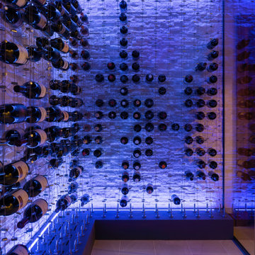
The cavernous beige basement became an entertaining mecca, with a glowing modern wine-room, full bar, media room, arcade, billiards room and professional gym.
Bathrooms were all designed with personality and craftsmanship, featuring unique tiles, floating wood vanities and striking lighting.
This project was a 50/50 collaboration between Rodwin Architecture and Kimball Modern
 Renovisions
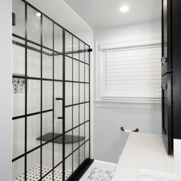
Perectly balanced, this dramatic black and white bathroom is a stunner. Thoughtful design was top of mind for these clients as they approached the Renovisions team to help narrow down their choices and bring it to life. Finding balance while mixing darker, heavier black finishes and lighter, white finishes was the task at hand and the goal was to create a modern look with an industrial/rustic feel.
The challenge on this project was incorporating all the desired elements and products in a tight spatial constraint of 9’ x 7.5’. The clients biggest concern in the old bathroom was inadequate storage, tired and under-utilized bathtub and they also needed an additional sink for their two daughters who often share this space. Renovisions recommended removing the wall between the shower and closet to gain additional floor space as you enter the bath, while providing wall space for the three towel bars.
Collaborating with the clients and searching to find the right fixtures paid off nicely. This newly remodeled Renovision accommodated two rectangular sinks, a walk-in shower with hand-held shower, wall-mounted shower head and two soft spray body jets. The oil-rubbed bronze fixtures not only provided a luxurious spa experience, but also added warmth and softness to the vintage feel. The glass shower enclosure is trimmed in a matte black grid that boasts an industrial aesthetic with retro feel while delivering modernistic function. It’s unique in appearance while allowing the chic white subway and black and white diamond tile to peek through.
The beautifully designed cabinetry in a matte black painted finish provides plenty of storage. This smart configuration included two banks of three drawers for toiletries and accessories, two towers with adjustable shelves for towels and two ‘garage’ doors for hair dryers.
Another unique design detail to capture attention was the black and white curvy geometric floor tile which plays off the straight lines of the cabinets and square grids of the shower enclosure.
The clients are thrilled with the results and their modern, high-contrast styled digs – a true customized relaxation sanctuary for the entire family.
 Kimberlee Marie Interiors
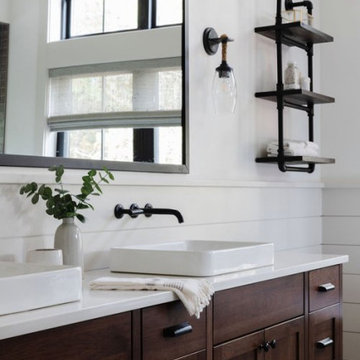
When our clients approached us about this project, they had a large vacant lot and a set of architectural plans in hand, and they needed our help to envision the interior of their dream home. As a busy family with young kids, they relied on KMI to help identify a design style that suited both of them and served their family's needs and lifestyle. One of the biggest challenges of the project was finding ways to blend their varying aesthetic desires, striking just the right balance between bright and cheery and rustic and moody. We also helped develop the exterior color scheme and material selections to ensure the interior and exterior of the home were cohesive and spoke to each other. With this project being a new build, there was not a square inch of the interior that KMI didn't touch.
In our material selections throughout the home, we sought to draw on the surrounding nature as an inspiration. The home is situated on a large lot with many large pine trees towering above. The goal was to bring some natural elements inside and make the house feel like it fits in its rustic setting. It was also a goal to create a home that felt inviting, warm, and durable enough to withstand all the life a busy family would throw at it. Slate tile floors, quartz countertops made to look like cement, rustic wood accent walls, and ceramic tiles in earthy tones are a few of the ways this was achieved.
There are so many things to love about this home, but we're especially proud of the way it all came together. The mix of materials, like iron, stone, and wood, helps give the home character and depth and adds warmth to some high-contrast black and white designs throughout the home. Anytime we do something truly unique and custom for a client, we also get a bit giddy, and the light fixture above the dining room table is a perfect example of that. A labor of love and the collaboration of design ideas between our client and us produced the one-of-a-kind fixture that perfectly fits this home. Bringing our client's dreams and visions to life is what we love most about being designers, and this project allowed us to do just that.
 Jessica Koltun Home
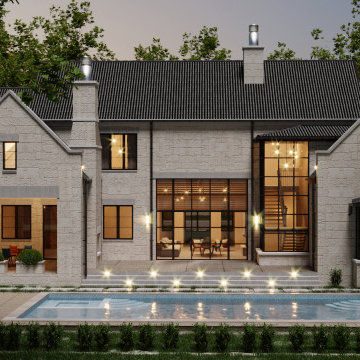
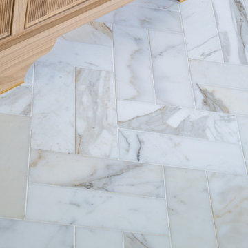
Located at 5827 Del Roy, this new construction home by Jessica Koltun Home reflects a refined approach to residential design, where architecture, proportion, and material selection come together seamlessly. Designed and built with a focus on clean lines and timeless curb appeal, the home showcases a balanced exterior elevation, cohesive finishes, and thoughtfully integrated details that elevate the overall structure.
From initial concept through construction, this project emphasizes functional layout planning and buildable design, ensuring both visual impact and long-term durability. Jessica Koltun Home worked closely within the construction process to deliver a home that feels intentional from every angle—blending modern and transitional elements with a focus on simplicity and structure.
As with all Jessica Koltun Home projects, 5827 Del Roy highlights a commitment to designing and building high-quality new construction homes while collaborating with builders to create cohesive, well-executed residential spaces.

 User
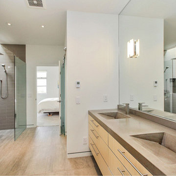
UserThis hillside home in Piedmont, CA was remodeled to change the style from a 1940's rancher with eight foot ceilings and dark interiors, into a modern geometric composition with vast white interiors for casual living and generous daylighting for displaying the artist-owner's works.
In a city known for rigorous and difficult design review, an addition, two variances, and a full stylistic change were unanimously approved on the first round. All sloped roofs and attics were eliminated and replaced by a series of stacked and overlapping flat roofs. This made the house taller on the inside and shorter on the outside, which helped earn design review cooperation in the community. Windows were concentrated toward the rear yard views or moved up high on the side walls for daylight and privacy, benefitting the owners as well as the neighbors.
At the start, the owner husband was so enthusiastic and engaged in transforming his house into something modern that he presented the architect with a scaled foamcore model, rather than the usual magazine clippings and wish list. He participated in the design decisions throughout the process. The owner wife is the artist who did all the artwork in the house. She had been craving a display space with large walls and good natural light. Both of them loved the location and great views.
The project was an opportunity to transform the style of an older traditional home into a modern one, while solving numerous problems. By rebuilding the 1800 ft2 top of the 3-story home it was possible to change the style of the whole building, since the lower floors were a neutral base, and also to change the lifestyle of the owners, who wanted to move their master suite upstairs and live primarily on the top floor as empty nesters.
Going into the project, the architect knew there were multiple encroachments into the setbacks and potential privacy issues with close by neighbors. He approached this as a complex puzzle made up of architectural and political pieces which all had to fit together elegantly. It took many careful moves, small and large, to arrive at a serene and cohesive result that tied old and new together seamlessly.
The design-build contractor worked closely with the owners and handled all of the construction phase documents and design adjustments, adding ideas of their own to make the project really sing.
The project was a collaboration in three acts. The owner had a strong design concept from the start. The architect developed it into a realistic project and garnered the design approvals. Then the contractor executed brilliantly.
51