
Search results for "Compete" in Home Design Ideas
 Tracy Tesmer Design Remodeling
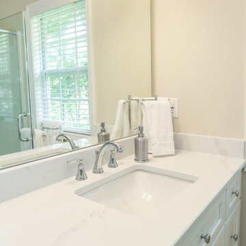
In our recently remodeled Migration Point master bath, we made changes to fixtures, countertops, cabinetry, and flooring that has helped give the space a more fresh, crisp and overall updated feel. The color choices are more subtle in this bathroom, as to not compete with the natural light and scenery that is showcased through the beautiful picture window. The shower was also completely re -equipped with a new glass front, shower surround, plumbing fixtures and grab bars to better meet the client’s needs.
 Janet Kelly Originals
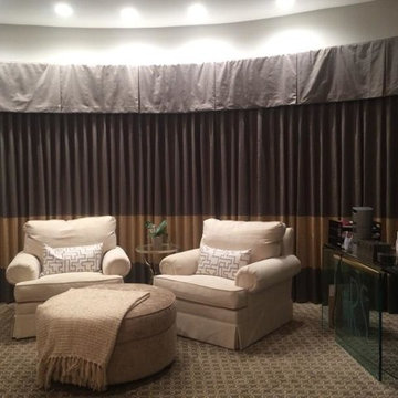
Custom window treatment created by Janet Kelly Originals, the curved architecture of the walls, multiple windows with casement openings and the fact that the walls are curved presents a window challenge. The box pleat valance and the draperies (that function on a curved traverse rod) is continuous mount to compliment and not compete with the curves within the space.
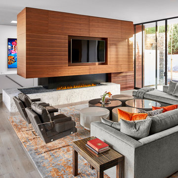
Family room - huge contemporary open concept light wood floor family room idea in Atlanta with a media wall
Find the right local pro for your project
 Demetriades + Walker
Peter Peirce
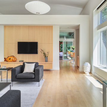
Inspiration for a contemporary living room remodel in Bridgeport with a wall-mounted tv
Inspiration for a contemporary living room remodel in Bridgeport with a wall-mounted tv
 Rogers Design Group
•Photo by Argonaut Architectural•
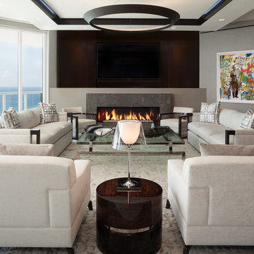
Inspiration for a large contemporary marble floor family room remodel in Miami with gray walls, a stone fireplace, a ribbon fireplace and a wall-mounted tv
Inspiration for a large contemporary marble floor family room remodel in Miami with gray walls, a stone fireplace, a ribbon fireplace and a wall-mounted tv
 Renovation Urbain Design
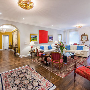
Living room - large contemporary formal and loft-style dark wood floor living room idea in Montreal with gray walls, a standard fireplace, a plaster fireplace and a concealed tv
 Mandeville Canyon Designs
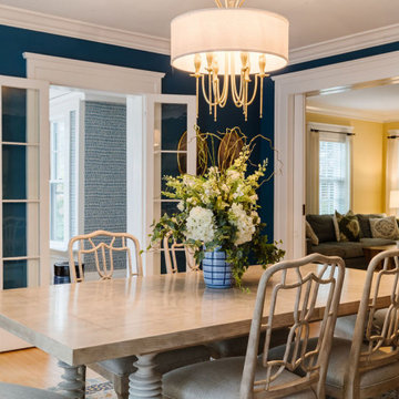
The deep enveloping blue on the walls create a cozy feeling for this dining room. I love how you can see the living room space and the sunroom from the dining room. We created a seamless design so that all of these spaces work together without competing with one another.
 User
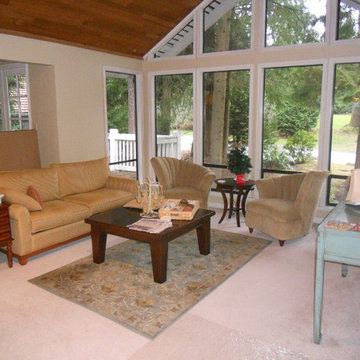
UserWith a view like this, why would you want the furnishings to compete? Keep it simple and expansive so the trees and the 2nd green across the street take center stage. You can't help but notice the gorgeous windows (left bare on purpose) and wonderful wood ceiling to bring Nature in.
 Pro-Pack Contracting & Design Inc.
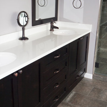
The built in GFI plug in put expertly in the rear splash does not clutter the space or compete with the towel ring. Photography by Davina
Inspiration for a large rustic master brown tile and porcelain tile porcelain tile claw-foot bathtub remodel in Vancouver with shaker cabinets, dark wood cabinets, a two-piece toilet, purple walls, an undermount sink and quartz countertops
Inspiration for a large rustic master brown tile and porcelain tile porcelain tile claw-foot bathtub remodel in Vancouver with shaker cabinets, dark wood cabinets, a two-piece toilet, purple walls, an undermount sink and quartz countertops
 Shoshi Designs
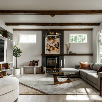
here we needed to handle two focal points as the homeowners did not want the tv over the fireplace. the fireplace surround design needed to consider the beautiful beams and the small windows on the sides it was decided to create a strong center and let everything around it enhance the ambiance . the wall unit was designed around the tv and was painted as the wall color with walnut movable dividers to complete the other walls rather than competing with them
 Eden LA Furniture and Interiors
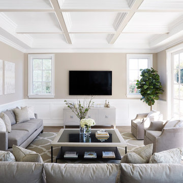
This large, devout family in West LA hired us to make their new construction, storybook traditional home dreams come true. And we had such a joy in working with them and love the end result. Small touches of contemporary lighting and art make the space feel updated and fresh, while materials and forms of the furnishings lent themselves to a truly timeless result. The basketweave backsplash lends beautiful interest while not competing with the cabinet design. We love a good traditional design, and had a wonderful time with this project and these clients.
 Tami Smight Interiors
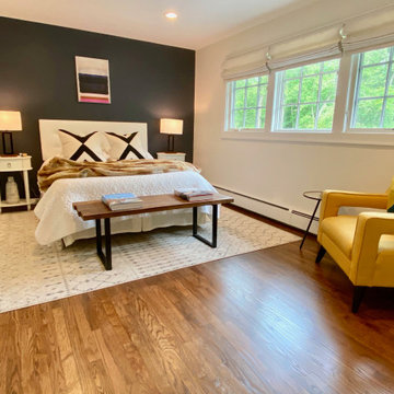
We designed a playful, Bohemian style for this guest bedroom. The ivory linen Roman Shades don't compete with the focal point wall. The mustard chair is a great spot to read before bed or lay out clothes for the day.
 Bilotta Kitchen & Home
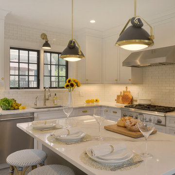
For this kitchen, designed by Peter Bittner, the client had a very clear idea of what she wanted right from the start. She did her research. The mother of a fast growing, young family, she wanted something as efficient as it was beautiful – on the simple, yet elegant side. Her requests were straightforward: white and light grey Bilotta cabinetry in a transitional style so as not to compete with the detailing inside her 1950s Tudor-style home; a heated tile floor (By Rye Ridge Tile); stainless appliances; white subway tile backsplash by Walker Zanger (again to keep it clean and not compete with its surroundings); and seating at the island for snacks and homework. The “pop” suggested by Peter was done through the satin brass hardware and lighting fixtures. The real challenge with this space was to fit as much as possible into the existing footprint which was overall on the smaller side. The solution was eliminating a doorway (with a swinging door that opened into the kitchen) and stairs from the kitchen to the basement. By moving the stairs and doorway, the usable space increased considerably. The typical working triangle became the focus for one side of the kitchen and the island overhang and seating became available on the other side. To make up for the limited amount of wall cabinets Peter designed shallow pantry-style cabinets along the back wall. Quartz Countertops by Rom Stone Fabrication. Designer: Peter Bittner Photographer: Peter Krupenye
 Bilotta Kitchen & Home
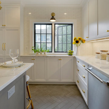
For this kitchen, designed by Peter Bittner, the client had a very clear idea of what she wanted right from the start. She did her research. The mother of a fast growing, young family, she wanted something as efficient as it was beautiful – on the simple, yet elegant side. Her requests were straightforward: white and light grey Bilotta cabinetry in a transitional style so as not to compete with the detailing inside her 1950s Tudor-style home; a heated tile floor (By Rye Ridge Tile); stainless appliances; white subway tile backsplash by Walker Zanger (again to keep it clean and not compete with its surroundings); and seating at the island for snacks and homework. The “pop” suggested by Peter was done through the satin brass hardware and lighting fixtures. The real challenge with this space was to fit as much as possible into the existing footprint which was overall on the smaller side. The solution was eliminating a doorway (with a swinging door that opened into the kitchen) and stairs from the kitchen to the basement. By moving the stairs and doorway, the usable space increased considerably. The typical working triangle became the focus for one side of the kitchen and the island overhang and seating became available on the other side. To make up for the limited amount of wall cabinets Peter designed shallow pantry-style cabinets along the back wall. Quartz Countertops by Rom Stone Fabrication. Designer: Peter Bittner Photographer: Peter Krupenye
 Janet Kelly Originals
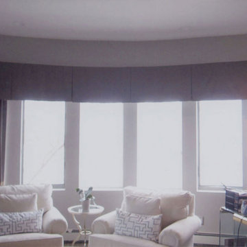
Custom window treatment created by Janet Kelly Originals, the curved architecture of the walls, multiple windows with casement openings and the fact that the walls are curved presents a window challenge. The box pleat valance and the draperies (that function on a curved traverse rod) is continuous mount to compliment and not compete with the curves within the space.
 Renovation Urbain Design
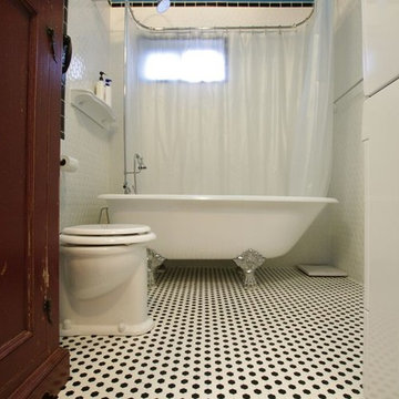
Example of a small eclectic master black and white tile and ceramic tile mosaic tile floor claw-foot bathtub design in Montreal with a pedestal sink, a two-piece toilet and blue walls
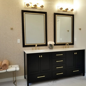
 APK Designs LLC
A compete renovation for this master bath included replacing all the fixtures, vanity, floor tile and adding a ledge along the tub, as well as commercial-grade wall covering on the vanity wall.
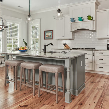
 Coastal Signature Homes
Inspiration for a timeless galley medium tone wood floor and brown floor kitchen remodel in Atlanta with an undermount sink, shaker cabinets, white cabinets, white backsplash, subway tile backsplash and an island
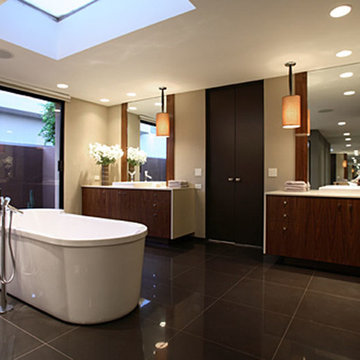
 Restoration Coston
Stan Sachley design circa "1980" The architect clearly understood the proper use of space and light, while still respecting earlier mid-century desert architecture. The floors were kept clean and polished, as not to compete with the existing split travertine which ran through glass walls. This effect, blurred the indoor/outdoor living spaces. Finishes selected, were chosen to highlight a more refined and modern environment.
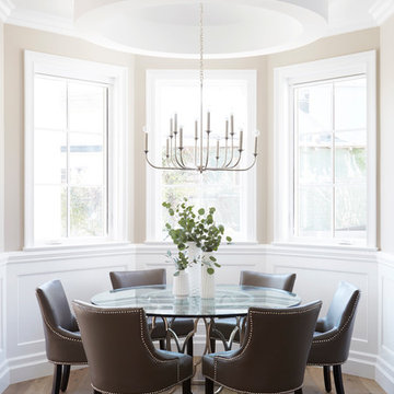 Eden LA Furniture and Interiors
This large, devout family in West LA hired us to make their new construction, storybook traditional home dreams come true. And we had such a joy in working with them and love the end result. Small touches of contemporary lighting and art make the space feel updated and fresh, while materials and forms of the furnishings lent themselves to a truly timeless result. The basketweave backsplash lends beautiful interest while not competing with the cabinet design. We love a good traditional design, and had a wonderful time with this project and these clients.
55