
Search results for "Competent" in Home Design Ideas
 Planeta Design Group
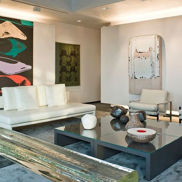
The owners wanted a space, which could house and showcase their substantial art collection. Boldly turning the floor plan’s wall angles out of parallel to the exterior building envelope and creating a sculptural rounded room allowed for interesting continuous flow through the space and an intriguing visual play from one room to the next. The lighting, shade control, and ceiling heights were all optimally designed to showcase the artwork. Likewise, the simple yet tasteful furnishings do not compete with the art. The finished residence creates a modern living space that showcases the owners' love for art.
Photography by AntonGrassl/Esto
 Bilotta Kitchen & Home
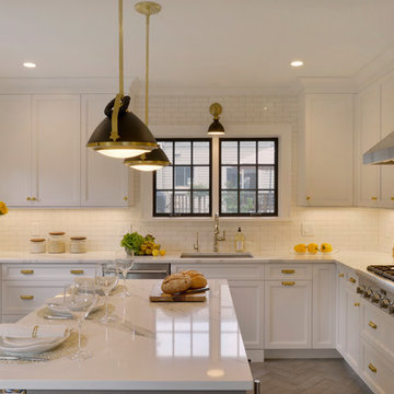
For this kitchen, designed by Peter Bittner, the client had a very clear idea of what she wanted right from the start. She did her research. The mother of a fast growing, young family, she wanted something as efficient as it was beautiful – on the simple, yet elegant side. Her requests were straightforward: white and light grey Bilotta cabinetry in a transitional style so as not to compete with the detailing inside her 1950s Tudor-style home; a heated tile floor (By Rye Ridge Tile); stainless appliances; white subway tile backsplash by Walker Zanger (again to keep it clean and not compete with its surroundings); and seating at the island for snacks and homework. The “pop” suggested by Peter was done through the satin brass hardware and lighting fixtures. The real challenge with this space was to fit as much as possible into the existing footprint which was overall on the smaller side. The solution was eliminating a doorway (with a swinging door that opened into the kitchen) and stairs from the kitchen to the basement. By moving the stairs and doorway, the usable space increased considerably. The typical working triangle became the focus for one side of the kitchen and the island overhang and seating became available on the other side. To make up for the limited amount of wall cabinets Peter designed shallow pantry-style cabinets along the back wall. Quartz Countertops by Rom Stone Fabrication. Designer: Peter Bittner Photographer: Peter Krupenye
 Powell Construction
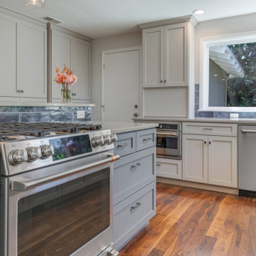
After undertaking a few minor updates over the years, these homeowners came to us ready to tear out their kitchen and start from scratch. The existing kitchen was large, but not laid out well for the everyday use it was getting. A bulky double fireplace in the center of the living space took up a lot of room and made the dining room feel disconnected from the kitchen, despite the substantial opening between the two. We removed the oversized wood burning fireplace and replaced it with a smaller gas one with shiplap above, creating a stylish featured piece. Meanwhile the kitchen was reimagined and reorganized into a functional space for a home chef that will work better for years to come.
These homeowners’ main concern was to update the style and function, as well as having quality materials that would stand the test of time. They wanted updated, gray cabinets; but didn’t want to lose any of the warm feeling of their home. Together with our design team they chose a light, warm gray for the perimeter cabinets and a darker gray to make the island a focal piece. The warm, light colored quartz countertops blend with the lighter gray and contrast nicely with the island. The textured dark blue backsplash tile adds a fun and exciting pop of color without stealing attention from any of the other pieces. To further maintain the warmth, they chose a rich walnut flooring with bold grain patterns.
When the homeowners fell in love with some contemporary brass colored light fixtures, they were nervous that they would compete with their stainless steel appliances and other silver toned pieces. By keeping all the lights in the same color family, we were able to achieve a look that feels intentional and modern. The corner 3-light pendant adds light and interest to the space. Not wanting to take up wall cabinet space with a bulky microwave, they opted for one built into a base cabinet. The other small appliances are neatly hidden away behind custom appliance garages.
For the fireplace, we focused on a clean, bright look that would stand out and look beautiful without competing with the neighboring kitchen. A small powder bathroom was also reorganized to better utilize the potential storage space and add counter space for guests. The style of the kitchen cabinetry was incorporated into the bathroom as well as into the dining room, which featured glass front cabinets to display dishes and mementos.
The redesigned space resulted in a warm and beautiful kitchen and dining area that will be enjoyed for years to come. The main floor living space now feels as cohesive as it was always meant to.
Find the right local pro for your project
 Powell Construction
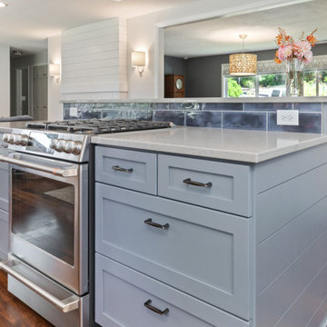
After undertaking a few minor updates over the years, these homeowners came to us ready to tear out their kitchen and start from scratch. The existing kitchen was large, but not laid out well for the everyday use it was getting. A bulky double fireplace in the center of the living space took up a lot of room and made the dining room feel disconnected from the kitchen, despite the substantial opening between the two. We removed the oversized wood burning fireplace and replaced it with a smaller gas one with shiplap above, creating a stylish featured piece. Meanwhile the kitchen was reimagined and reorganized into a functional space for a home chef that will work better for years to come.
These homeowners’ main concern was to update the style and function, as well as having quality materials that would stand the test of time. They wanted updated, gray cabinets; but didn’t want to lose any of the warm feeling of their home. Together with our design team they chose a light, warm gray for the perimeter cabinets and a darker gray to make the island a focal piece. The warm, light colored quartz countertops blend with the lighter gray and contrast nicely with the island. The textured dark blue backsplash tile adds a fun and exciting pop of color without stealing attention from any of the other pieces. To further maintain the warmth, they chose a rich walnut flooring with bold grain patterns.
When the homeowners fell in love with some contemporary brass colored light fixtures, they were nervous that they would compete with their stainless steel appliances and other silver toned pieces. By keeping all the lights in the same color family, we were able to achieve a look that feels intentional and modern. The corner 3-light pendant adds light and interest to the space. Not wanting to take up wall cabinet space with a bulky microwave, they opted for one built into a base cabinet. The other small appliances are neatly hidden away behind custom appliance garages.
For the fireplace, we focused on a clean, bright look that would stand out and look beautiful without competing with the neighboring kitchen. A small powder bathroom was also reorganized to better utilize the potential storage space and add counter space for guests. The style of the kitchen cabinetry was incorporated into the bathroom as well as into the dining room, which featured glass front cabinets to display dishes and mementos.
The redesigned space resulted in a warm and beautiful kitchen and dining area that will be enjoyed for years to come. The main floor living space now feels as cohesive as it was always meant to.
 Powell Construction
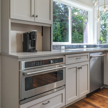
After undertaking a few minor updates over the years, these homeowners came to us ready to tear out their kitchen and start from scratch. The existing kitchen was large, but not laid out well for the everyday use it was getting. A bulky double fireplace in the center of the living space took up a lot of room and made the dining room feel disconnected from the kitchen, despite the substantial opening between the two. We removed the oversized wood burning fireplace and replaced it with a smaller gas one with shiplap above, creating a stylish featured piece. Meanwhile the kitchen was reimagined and reorganized into a functional space for a home chef that will work better for years to come.
These homeowners’ main concern was to update the style and function, as well as having quality materials that would stand the test of time. They wanted updated, gray cabinets; but didn’t want to lose any of the warm feeling of their home. Together with our design team they chose a light, warm gray for the perimeter cabinets and a darker gray to make the island a focal piece. The warm, light colored quartz countertops blend with the lighter gray and contrast nicely with the island. The textured dark blue backsplash tile adds a fun and exciting pop of color without stealing attention from any of the other pieces. To further maintain the warmth, they chose a rich walnut flooring with bold grain patterns.
When the homeowners fell in love with some contemporary brass colored light fixtures, they were nervous that they would compete with their stainless steel appliances and other silver toned pieces. By keeping all the lights in the same color family, we were able to achieve a look that feels intentional and modern. The corner 3-light pendant adds light and interest to the space. Not wanting to take up wall cabinet space with a bulky microwave, they opted for one built into a base cabinet. The other small appliances are neatly hidden away behind custom appliance garages.
For the fireplace, we focused on a clean, bright look that would stand out and look beautiful without competing with the neighboring kitchen. A small powder bathroom was also reorganized to better utilize the potential storage space and add counter space for guests. The style of the kitchen cabinetry was incorporated into the bathroom as well as into the dining room, which featured glass front cabinets to display dishes and mementos.
The redesigned space resulted in a warm and beautiful kitchen and dining area that will be enjoyed for years to come. The main floor living space now feels as cohesive as it was always meant to.
 Bilotta Kitchen & Home
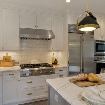
For this kitchen, designed by Peter Bittner, the client had a very clear idea of what she wanted right from the start. She did her research. The mother of a fast growing, young family, she wanted something as efficient as it was beautiful – on the simple, yet elegant side. Her requests were straightforward: white and light grey Bilotta cabinetry in a transitional style so as not to compete with the detailing inside her 1950s Tudor-style home; a heated tile floor (By Rye Ridge Tile); stainless appliances; white subway tile backsplash by Walker Zanger (again to keep it clean and not compete with its surroundings); and seating at the island for snacks and homework. The “pop” suggested by Peter was done through the satin brass hardware and lighting fixtures. The real challenge with this space was to fit as much as possible into the existing footprint which was overall on the smaller side. The solution was eliminating a doorway (with a swinging door that opened into the kitchen) and stairs from the kitchen to the basement. By moving the stairs and doorway, the usable space increased considerably. The typical working triangle became the focus for one side of the kitchen and the island overhang and seating became available on the other side. To make up for the limited amount of wall cabinets Peter designed shallow pantry-style cabinets along the back wall. Quartz Countertops by Rom Stone Fabrication. Designer: Peter Bittner Photographer: Peter Krupenye
 Rochman Design Build
Steve Kuzma Photography
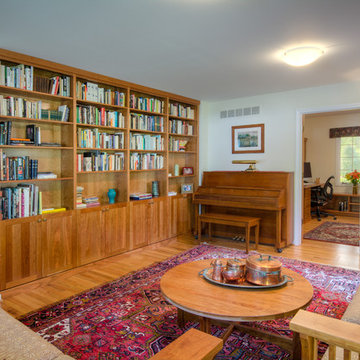
Living room - large transitional enclosed light wood floor living room idea in Detroit with yellow walls, no fireplace and no tv
Living room - large transitional enclosed light wood floor living room idea in Detroit with yellow walls, no fireplace and no tv
 Kansas City Landscape
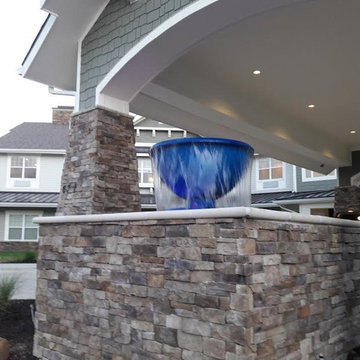
Kansas City Masonry, the Midwest's premier custom fountain builder, provides innovative and state of the art custom, as well as classic architectural motif, water feature design. From initial conception to expert installation and onto a definitive completion, Kansas City Masonry will deliver a stunning, one-of-a-kind creation that any client will be immensely proud of and thrilled to possess.
Providing unparalleled customer service to both commercial and residential clients through prompt, responsive communication, steadfast professionalism, and the ability to meet and exceed expectations, Kansas City Masonry is known for their incredible competence and dependability. Past clients include KU Medical Center, The City of Lawton, and Benedictine College. The contractor also maintains and repairs fountains, restores historic ones, and renders complete landscape design and implementation.
Backing the company's outstanding reputation with the knowledge and expertise that 30 years in the field provides, Kansas City Masonry's founder and CEO implements the type of skilled craftsmanship that is pivotal to successful fountain construction and results in a piece that is of the highest quality and whose magnificence is timeless. His high standards and passion for the craft make a property owner's dream become a reality in a smooth and satisfying transaction.
Contact Kansas City Masonry today for a friendly consultation:
KCMasonrycontractors@gmail.com
(816) 500-4198
Visit our webpages at:
http://www.cityoffountainsbuilders.com/
http://www.kansascitymasonrycontractors.com/
 Drury Design
The Setup
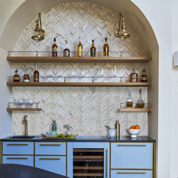
Situated between the front kitchen and the home’s primary living spaces, this bar was originally conceived as a modest bistro-style nook – a place to sit, watch TV, and enjoy a drink. As the design process evolved, both the homeowners and the design team recognized an opportunity to let the bar become something more: a visually compelling focal point that anchors circulation through the home while offering a distinct moment of hospitality.
Set within an arched recess and framed by a partial glass wall, the bar is visible from much of the public area of the home. Its location places it directly along the natural path between the kitchen, dining room, and family room, making it both highly accessible and impossible to ignore. From the outset, the goal was to ensure the bar felt intentional and complete – not an afterthought – while still complementing the adjacent kitchens rather than competing with them.
Design objectives:
Create a fully functional wet bar with refrigeration, ice, sink, waste storage, and liquor storage
Allow the bar to feel visually distinct while remaining cohesive with the surrounding spaces
Introduce color and character in a controlled, intentional way
Design the bar as a focal point within a highly visible circulation zone
Balance everyday usability with refined, layered design details
Design challenges to be solved:
Fitting a complete wet bar – including refrigeration, ice, sink, storage, and waste — into a base cabinetry run measuring under eight feet wide
Determining which appliances and storage functions were essential once upper cabinetry was eliminated
Providing adequate task lighting while also highlighting bottles and glassware on open shelving
Introducing texture and visual interest within the arched recess without overdesigning a compact space
Giving the bar a distinct identity that complements – but does not compete with – the adjacent kitchens
Design solutions:
Designing fully custom base cabinetry that prioritized core bar functions and used every inch efficiently, including split cabinetry and compact waste storage
Selecting a drawer-style refrigeration unit that combines refrigeration and freezer capabilities, allowing ice storage without sacrificing valuable width
Layering lighting with integrated LED strip lighting above and below the shelves, paired with decorative articulating fixtures to support both display and task lighting
Using a chevron-patterned natural stone tile backsplash to introduce movement, texture, and subtle color variation while keeping surrounding surfaces intentionally restrained
Specifying metal cabinetry in a soft blue tone with integrated brass framing to establish a distinctive visual identity that harmonizes with the home’s broader palette
A Space That Works on Its Own — and Within the Whole
Though compact in size, the bar carries significant visual and functional weight within the home. It stands confidently on its own as a richly detailed, fully functional destination, while also flowing naturally into the adjacent kitchens and living spaces. The result is a bar that feels purposeful rather than ornamental – a space designed to be used daily, noticed often, and appreciated over time.
 Powell Construction
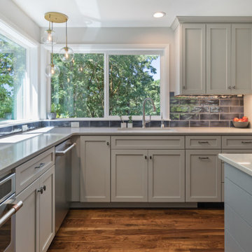
After undertaking a few minor updates over the years, these homeowners came to us ready to tear out their kitchen and start from scratch. The existing kitchen was large, but not laid out well for the everyday use it was getting. A bulky double fireplace in the center of the living space took up a lot of room and made the dining room feel disconnected from the kitchen, despite the substantial opening between the two. We removed the oversized wood burning fireplace and replaced it with a smaller gas one with shiplap above, creating a stylish featured piece. Meanwhile the kitchen was reimagined and reorganized into a functional space for a home chef that will work better for years to come.
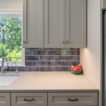
These homeowners’ main concern was to update the style and function, as well as having quality materials that would stand the test of time. They wanted updated, gray cabinets; but didn’t want to lose any of the warm feeling of their home. Together with our design team they chose a light, warm gray for the perimeter cabinets and a darker gray to make the island a focal piece. The warm, light colored quartz countertops blend with the lighter gray and contrast nicely with the island. The textured dark blue backsplash tile adds a fun and exciting pop of color without stealing attention from any of the other pieces. To further maintain the warmth, they chose a rich walnut flooring with bold grain patterns.
When the homeowners fell in love with some contemporary brass colored light fixtures, they were nervous that they would compete with their stainless steel appliances and other silver toned pieces. By keeping all the lights in the same color family, we were able to achieve a look that feels intentional and modern. The corner 3-light pendant adds light and interest to the space. Not wanting to take up wall cabinet space with a bulky microwave, they opted for one built into a base cabinet. The other small appliances are neatly hidden away behind custom appliance garages.
For the fireplace, we focused on a clean, bright look that would stand out and look beautiful without competing with the neighboring kitchen. A small powder bathroom was also reorganized to better utilize the potential storage space and add counter space for guests. The style of the kitchen cabinetry was incorporated into the bathroom as well as into the dining room, which featured glass front cabinets to display dishes and mementos.
The redesigned space resulted in a warm and beautiful kitchen and dining area that will be enjoyed for years to come. The main floor living space now feels as cohesive as it was always meant to.
 Powell Construction
After undertaking a few minor updates over the years, these homeowners came to us ready to tear out their kitchen and start from scratch. The existing kitchen was large, but not laid out well for the everyday use it was getting. A bulky double fireplace in the center of the living space took up a lot of room and made the dining room feel disconnected from the kitchen, despite the substantial opening between the two. We removed the oversized wood burning fireplace and replaced it with a smaller gas one with shiplap above, creating a stylish featured piece. Meanwhile the kitchen was reimagined and reorganized into a functional space for a home chef that will work better for years to come.
These homeowners’ main concern was to update the style and function, as well as having quality materials that would stand the test of time. They wanted updated, gray cabinets; but didn’t want to lose any of the warm feeling of their home. Together with our design team they chose a light, warm gray for the perimeter cabinets and a darker gray to make the island a focal piece. The warm, light colored quartz countertops blend with the lighter gray and contrast nicely with the island. The textured dark blue backsplash tile adds a fun and exciting pop of color without stealing attention from any of the other pieces. To further maintain the warmth, they chose a rich walnut flooring with bold grain patterns.
When the homeowners fell in love with some contemporary brass colored light fixtures, they were nervous that they would compete with their stainless steel appliances and other silver toned pieces. By keeping all the lights in the same color family, we were able to achieve a look that feels intentional and modern. The corner 3-light pendant adds light and interest to the space. Not wanting to take up wall cabinet space with a bulky microwave, they opted for one built into a base cabinet. The other small appliances are neatly hidden away behind custom appliance garages.
For the fireplace, we focused on a clean, bright look that would stand out and look beautiful without competing with the neighboring kitchen. A small powder bathroom was also reorganized to better utilize the potential storage space and add counter space for guests. The style of the kitchen cabinetry was incorporated into the bathroom as well as into the dining room, which featured glass front cabinets to display dishes and mementos.
The redesigned space resulted in a warm and beautiful kitchen and dining area that will be enjoyed for years to come. The main floor living space now feels as cohesive as it was always meant to.
 Paver House
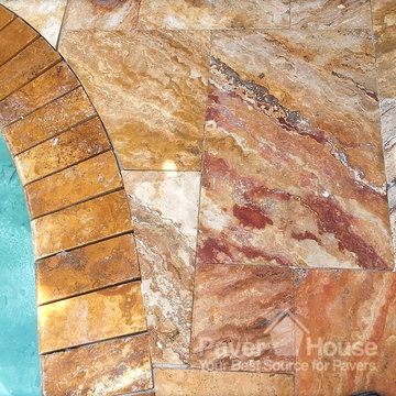
This Tampa Bay homeowner was looking into complete change his backyard. Most pools in Tampa are built with a connected spa. To increase his pool size, he ended up deciding for not to build spa, however, he still wanted an appealing focal point to his pool. To contrast with the beautiful green landscape around the backyard, our customer wanted to add color and movement to his outdoor area.
For the main pool deck area, our customer felt in love with the french pattern autumn blend tumbled travertine pavers. French Pattern Tumbled Autumn Blend Travertine Pavers contain a mixture of mostly red and gold, with some white, dark and light brown tones. Autumn Blend added the perfect amount of color and movement our customer wanted.
Travertine pavers offer a few unique color mixtures that make any outdoor space pops up from others.
A great accent color solution for the coping was the Desert Gold color on the 4×9 tumbled travertine copings. The beautifully blended Desert Gold may be bright and striking but does not lack for warmth and richness as well. To not compete with the strong colors of the pool deck, we advised our customer to add a lighter and more neutral pool tile: 2×2 autumn blend tumbled travertine tiles brought the perfect combination of contrast and harmony we were looking to achieve.
CREATIVITY ON YOUR POOL REMODEL WITH TRAVERTINE PAVER.
Pool remodel with travertine paver does not need to represent neutral colors only. Different than what most people believe, travertine pavers offer a few unique color mixtures that make any outdoor space pop up from others. Don’t be afraid of mixing different patterns, colors and textures to add more character to your outdoor space. Remember that, travertine pavers will display better their color when sealed, like the pictures from this pool remodel. If you are not sure if you would like your paver with the enhanced color, spray the sample with water first.
PREMIUM TRAVERTINE FRENCH PATTERN PAVERS
Pool remodel with travertine paver
POOL REMODEL WITH TRAVERTINE PAVERS
This Tampa Bay homeowner was looking into complete change his backyard. Most pools in Tampa are built with a connected spa. To increase his pool size, he ended up deciding for not to build spa, however, he still wanted an appealing focal point to his pool. To contrast with the beautiful green landscape around the backyard, our customer wanted to add color and movement to his outdoor area.
For the main pool deck area, our customer felt in love with the french pattern autumn blend tumbled travertine pavers. French Pattern Tumbled Autumn Blend Travertine Pavers contain a mixture of mostly red and gold, with some white, dark and light brown tones. Autumn Blend added the perfect amount of color and movement our customer wanted.
pool remodel with travertine paverpool remodel with travertine paverpool remodel with travertine paverpool remodel with travertine paverpool remodel with travertine paver
Previous
Next
Travertine pavers offer a few unique color mixtures that make any outdoor space pops up from others.
A great accent color solution for the coping was the Desert Gold color on the 4×9 tumbled travertine copings. The beautifully blended Desert Gold may be bright and striking but does not lack for warmth and richness as well. To not compete with the strong colors of the pool deck, we advised our customer to add a lighter and more neutral pool tile: 2×2 autumn blend tumbled travertine tiles brought the perfect combination of contrast and harmony we were looking to achieve.
CREATIVITY ON YOUR POOL REMODEL WITH TRAVERTINE PAVER.
Pool remodel with travertine paver does not need to represent neutral colors only. Different than what most people believe, travertine pavers offer a few unique color mixtures that make any outdoor space pop up from others. Don’t be afraid of mixing different patterns, colors and textures to add more character to your outdoor space. Remember that, travertine pavers will display better their color when sealed, like the pictures from this pool remodel. If you are not sure if you would like your paver with the enhanced color, spray the sample with water first.
PREMIUM TRAVERTINE FRENCH PATTERN PAVERS
On this pool remodel project, our customer preferred to use the French Pattern design, which is a good way to break up the monotony of the typical geometric or square appearance of large areas. Just like this outstanding pool deck remodel, patios and walkways will appear more fluid and mosaic by eliminating grout lines and the usual linear effect as well as the need for constant maintenance of the typical square or rectangular paver.
A French Pattern or a Versailles pattern is a paver pattern made up of four different sized tiles. Most French patterns are laid in stone, and nearly all are sold in “bundles” of tile that will cover 16 square feet.
Travertine pavers on your pool deck will reflect heat on hot days, remaining cool to the touch, unlike concrete surface options. Travertine does not discolor or become chalky after installation. The texture of travertine ensures that the stone remains slip resistant for wet feet, while its cool feel prevents burns. Another great advantage of travertine pavers is that there will be no visible grout lines; grout can be a source of both installation problems and added cost for future removal / replacement or up-keep.
 Bilotta Kitchen & Home
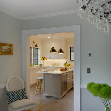
For this kitchen, designed by Peter Bittner, the client had a very clear idea of what she wanted right from the start. She did her research. The mother of a fast growing, young family, she wanted something as efficient as it was beautiful – on the simple, yet elegant side. Her requests were straightforward: white and light grey Bilotta cabinetry in a transitional style so as not to compete with the detailing inside her 1950s Tudor-style home; a heated tile floor (By Rye Ridge Tile); stainless appliances; white subway tile backsplash by Walker Zanger (again to keep it clean and not compete with its surroundings); and seating at the island for snacks and homework. The “pop” suggested by Peter was done through the satin brass hardware and lighting fixtures. The real challenge with this space was to fit as much as possible into the existing footprint which was overall on the smaller side. The solution was eliminating a doorway (with a swinging door that opened into the kitchen) and stairs from the kitchen to the basement. By moving the stairs and doorway, the usable space increased considerably. The typical working triangle became the focus for one side of the kitchen and the island overhang and seating became available on the other side. To make up for the limited amount of wall cabinets Peter designed shallow pantry-style cabinets along the back wall. Quartz Countertops by Rom Stone Fabrication. Designer: Peter Bittner Photographer: Peter Krupenye


 Bilotta Kitchen & Home
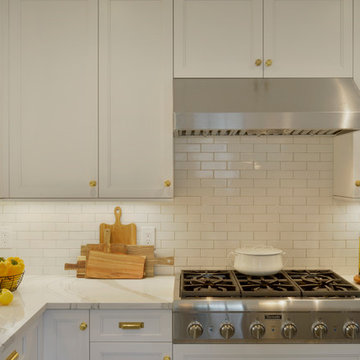
For this kitchen, designed by Peter Bittner, the client had a very clear idea of what she wanted right from the start. She did her research. The mother of a fast growing, young family, she wanted something as efficient as it was beautiful – on the simple, yet elegant side. Her requests were straightforward: white and light grey Bilotta cabinetry in a transitional style so as not to compete with the detailing inside her 1950s Tudor-style home; a heated tile floor (By Rye Ridge Tile); stainless appliances; white subway tile backsplash by Walker Zanger (again to keep it clean and not compete with its surroundings); and seating at the island for snacks and homework. The “pop” suggested by Peter was done through the satin brass hardware and lighting fixtures. The real challenge with this space was to fit as much as possible into the existing footprint which was overall on the smaller side. The solution was eliminating a doorway (with a swinging door that opened into the kitchen) and stairs from the kitchen to the basement. By moving the stairs and doorway, the usable space increased considerably. The typical working triangle became the focus for one side of the kitchen and the island overhang and seating became available on the other side. To make up for the limited amount of wall cabinets Peter designed shallow pantry-style cabinets along the back wall. Quartz Countertops by Rom Stone Fabrication. Designer: Peter Bittner Photographer: Peter Krupenye
 Paver House
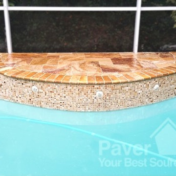
This Tampa Bay homeowner was looking into complete change his backyard. Most pools in Tampa are built with a connected spa. To increase his pool size, he ended up deciding for not to build spa, however, he still wanted an appealing focal point to his pool. To contrast with the beautiful green landscape around the backyard, our customer wanted to add color and movement to his outdoor area.
For the main pool deck area, our customer felt in love with the french pattern autumn blend tumbled travertine pavers. French Pattern Tumbled Autumn Blend Travertine Pavers contain a mixture of mostly red and gold, with some white, dark and light brown tones. Autumn Blend added the perfect amount of color and movement our customer wanted.
Travertine pavers offer a few unique color mixtures that make any outdoor space pops up from others.
A great accent color solution for the coping was the Desert Gold color on the 4×9 tumbled travertine copings. The beautifully blended Desert Gold may be bright and striking but does not lack for warmth and richness as well. To not compete with the strong colors of the pool deck, we advised our customer to add a lighter and more neutral pool tile: 2×2 autumn blend tumbled travertine tiles brought the perfect combination of contrast and harmony we were looking to achieve.
CREATIVITY ON YOUR POOL REMODEL WITH TRAVERTINE PAVER.
Pool remodel with travertine paver does not need to represent neutral colors only. Different than what most people believe, travertine pavers offer a few unique color mixtures that make any outdoor space pop up from others. Don’t be afraid of mixing different patterns, colors and textures to add more character to your outdoor space. Remember that, travertine pavers will display better their color when sealed, like the pictures from this pool remodel. If you are not sure if you would like your paver with the enhanced color, spray the sample with water first.
PREMIUM TRAVERTINE FRENCH PATTERN PAVERS
Pool remodel with travertine paver
POOL REMODEL WITH TRAVERTINE PAVERS
This Tampa Bay homeowner was looking into complete change his backyard. Most pools in Tampa are built with a connected spa. To increase his pool size, he ended up deciding for not to build spa, however, he still wanted an appealing focal point to his pool. To contrast with the beautiful green landscape around the backyard, our customer wanted to add color and movement to his outdoor area.
For the main pool deck area, our customer felt in love with the french pattern autumn blend tumbled travertine pavers. French Pattern Tumbled Autumn Blend Travertine Pavers contain a mixture of mostly red and gold, with some white, dark and light brown tones. Autumn Blend added the perfect amount of color and movement our customer wanted.
pool remodel with travertine paverpool remodel with travertine paverpool remodel with travertine paverpool remodel with travertine paverpool remodel with travertine paver
Previous
Next
Travertine pavers offer a few unique color mixtures that make any outdoor space pops up from others.
A great accent color solution for the coping was the Desert Gold color on the 4×9 tumbled travertine copings. The beautifully blended Desert Gold may be bright and striking but does not lack for warmth and richness as well. To not compete with the strong colors of the pool deck, we advised our customer to add a lighter and more neutral pool tile: 2×2 autumn blend tumbled travertine tiles brought the perfect combination of contrast and harmony we were looking to achieve.
CREATIVITY ON YOUR POOL REMODEL WITH TRAVERTINE PAVER.
Pool remodel with travertine paver does not need to represent neutral colors only. Different than what most people believe, travertine pavers offer a few unique color mixtures that make any outdoor space pop up from others. Don’t be afraid of mixing different patterns, colors and textures to add more character to your outdoor space. Remember that, travertine pavers will display better their color when sealed, like the pictures from this pool remodel. If you are not sure if you would like your paver with the enhanced color, spray the sample with water first.
PREMIUM TRAVERTINE FRENCH PATTERN PAVERS
On this pool remodel project, our customer preferred to use the French Pattern design, which is a good way to break up the monotony of the typical geometric or square appearance of large areas. Just like this outstanding pool deck remodel, patios and walkways will appear more fluid and mosaic by eliminating grout lines and the usual linear effect as well as the need for constant maintenance of the typical square or rectangular paver.
A French Pattern or a Versailles pattern is a paver pattern made up of four different sized tiles. Most French patterns are laid in stone, and nearly all are sold in “bundles” of tile that will cover 16 square feet.
Travertine pavers on your pool deck will reflect heat on hot days, remaining cool to the touch, unlike concrete surface options. Travertine does not discolor or become chalky after installation. The texture of travertine ensures that the stone remains slip resistant for wet feet, while its cool feel prevents burns. Another great advantage of travertine pavers is that there will be no visible grout lines; grout can be a source of both installation problems and added cost for future removal / replacement or up-keep.
 Powell Construction
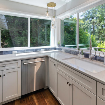
After undertaking a few minor updates over the years, these homeowners came to us ready to tear out their kitchen and start from scratch. The existing kitchen was large, but not laid out well for the everyday use it was getting. A bulky double fireplace in the center of the living space took up a lot of room and made the dining room feel disconnected from the kitchen, despite the substantial opening between the two. We removed the oversized wood burning fireplace and replaced it with a smaller gas one with shiplap above, creating a stylish featured piece. Meanwhile the kitchen was reimagined and reorganized into a functional space for a home chef that will work better for years to come.
These homeowners’ main concern was to update the style and function, as well as having quality materials that would stand the test of time. They wanted updated, gray cabinets; but didn’t want to lose any of the warm feeling of their home. Together with our design team they chose a light, warm gray for the perimeter cabinets and a darker gray to make the island a focal piece. The warm, light colored quartz countertops blend with the lighter gray and contrast nicely with the island. The textured dark blue backsplash tile adds a fun and exciting pop of color without stealing attention from any of the other pieces. To further maintain the warmth, they chose a rich walnut flooring with bold grain patterns.
When the homeowners fell in love with some contemporary brass colored light fixtures, they were nervous that they would compete with their stainless steel appliances and other silver toned pieces. By keeping all the lights in the same color family, we were able to achieve a look that feels intentional and modern. The corner 3-light pendant adds light and interest to the space. Not wanting to take up wall cabinet space with a bulky microwave, they opted for one built into a base cabinet. The other small appliances are neatly hidden away behind custom appliance garages.
For the fireplace, we focused on a clean, bright look that would stand out and look beautiful without competing with the neighboring kitchen. A small powder bathroom was also reorganized to better utilize the potential storage space and add counter space for guests. The style of the kitchen cabinetry was incorporated into the bathroom as well as into the dining room, which featured glass front cabinets to display dishes and mementos.
The redesigned space resulted in a warm and beautiful kitchen and dining area that will be enjoyed for years to come. The main floor living space now feels as cohesive as it was always meant to.
 Bilotta Kitchen & Home
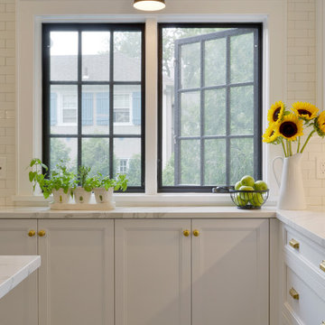
For this kitchen, designed by Peter Bittner, the client had a very clear idea of what she wanted right from the start. She did her research. The mother of a fast growing, young family, she wanted something as efficient as it was beautiful – on the simple, yet elegant side. Her requests were straightforward: white and light grey Bilotta cabinetry in a transitional style so as not to compete with the detailing inside her 1950s Tudor-style home; a heated tile floor (By Rye Ridge Tile); stainless appliances; white subway tile backsplash by Walker Zanger (again to keep it clean and not compete with its surroundings); and seating at the island for snacks and homework. The “pop” suggested by Peter was done through the satin brass hardware and lighting fixtures. The real challenge with this space was to fit as much as possible into the existing footprint which was overall on the smaller side. The solution was eliminating a doorway (with a swinging door that opened into the kitchen) and stairs from the kitchen to the basement. By moving the stairs and doorway, the usable space increased considerably. The typical working triangle became the focus for one side of the kitchen and the island overhang and seating became available on the other side. To make up for the limited amount of wall cabinets Peter designed shallow pantry-style cabinets along the back wall. Quartz Countertops by Rom Stone Fabrication. Designer: Peter Bittner Photographer: Peter Krupenye
 Powell Construction
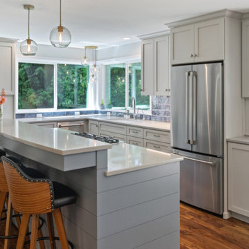
After undertaking a few minor updates over the years, these homeowners came to us ready to tear out their kitchen and start from scratch. The existing kitchen was large, but not laid out well for the everyday use it was getting. A bulky double fireplace in the center of the living space took up a lot of room and made the dining room feel disconnected from the kitchen, despite the substantial opening between the two. We removed the oversized wood burning fireplace and replaced it with a smaller gas one with shiplap above, creating a stylish featured piece. Meanwhile the kitchen was reimagined and reorganized into a functional space for a home chef that will work better for years to come.
These homeowners’ main concern was to update the style and function, as well as having quality materials that would stand the test of time. They wanted updated, gray cabinets; but didn’t want to lose any of the warm feeling of their home. Together with our design team they chose a light, warm gray for the perimeter cabinets and a darker gray to make the island a focal piece. The warm, light colored quartz countertops blend with the lighter gray and contrast nicely with the island. The textured dark blue backsplash tile adds a fun and exciting pop of color without stealing attention from any of the other pieces. To further maintain the warmth, they chose a rich walnut flooring with bold grain patterns.
When the homeowners fell in love with some contemporary brass colored light fixtures, they were nervous that they would compete with their stainless steel appliances and other silver toned pieces. By keeping all the lights in the same color family, we were able to achieve a look that feels intentional and modern. The corner 3-light pendant adds light and interest to the space. Not wanting to take up wall cabinet space with a bulky microwave, they opted for one built into a base cabinet. The other small appliances are neatly hidden away behind custom appliance garages.
For the fireplace, we focused on a clean, bright look that would stand out and look beautiful without competing with the neighboring kitchen. A small powder bathroom was also reorganized to better utilize the potential storage space and add counter space for guests. The style of the kitchen cabinetry was incorporated into the bathroom as well as into the dining room, which featured glass front cabinets to display dishes and mementos.
The redesigned space resulted in a warm and beautiful kitchen and dining area that will be enjoyed for years to come. The main floor living space now feels as cohesive as it was always meant to.
 Bilotta Kitchen & Home
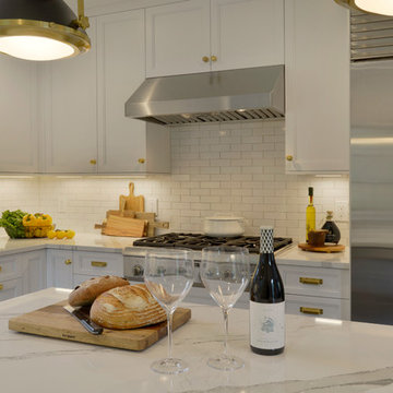
For this kitchen, designed by Peter Bittner, the client had a very clear idea of what she wanted right from the start. She did her research. The mother of a fast growing, young family, she wanted something as efficient as it was beautiful – on the simple, yet elegant side. Her requests were straightforward: white and light grey Bilotta cabinetry in a transitional style so as not to compete with the detailing inside her 1950s Tudor-style home; a heated tile floor (By Rye Ridge Tile); stainless appliances; white subway tile backsplash by Walker Zanger (again to keep it clean and not compete with its surroundings); and seating at the island for snacks and homework. The “pop” suggested by Peter was done through the satin brass hardware and lighting fixtures. The real challenge with this space was to fit as much as possible into the existing footprint which was overall on the smaller side. The solution was eliminating a doorway (with a swinging door that opened into the kitchen) and stairs from the kitchen to the basement. By moving the stairs and doorway, the usable space increased considerably. The typical working triangle became the focus for one side of the kitchen and the island overhang and seating became available on the other side. To make up for the limited amount of wall cabinets Peter designed shallow pantry-style cabinets along the back wall. Quartz Countertops by Rom Stone Fabrication. Designer: Peter Bittner Photographer: Peter Krupenye
26