
Search results for "Concentrate" in Home Design Ideas

 German Kitchen Center
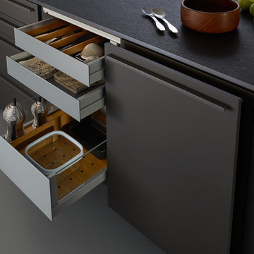
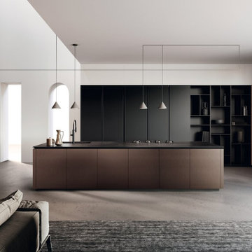
The longing for values, for what is genuine is becoming ever greater in a digitized world in which networking and mechanisation are becoming overpowering. In our personal environment, this is reflected in the search for the elegantly simple: people want to be surrounded by things which communicate calm, clarity and concentration on the essential. In conjunction with VALAIS LEICHT developed the new planning concept EVO.The seamless transition from worktop to fronts is sensational: the virtually invisible worktop with its surrounding metal edge has a flush finish with the fronts and gives the kitchen an exceedingly puristic air. The material mix too makes the ensemble all the more exciting: structured genuine wood meets velvety matt lacquer, the warm tone of the wood meets the cooler air of the carbon grey – a skilful combination of contrasts, also essential in the new planning concept.
 German Kitchen Center
The longing for values, for what is genuine is becoming ever greater in a digitized world in which networking and mechanisation are becoming overpowering. In our personal environment, this is reflected in the search for the elegantly simple: people want to be surrounded by things which communicate calm, clarity and concentration on the essential. In conjunction with VALAIS LEICHT developed the new planning concept EVO.The seamless transition from worktop to fronts is sensational: the virtually invisible worktop with its surrounding metal edge has a flush finish with the fronts and gives the kitchen an exceedingly puristic air. The material mix too makes the ensemble all the more exciting: structured genuine wood meets velvety matt lacquer, the warm tone of the wood meets the cooler air of the carbon grey – a skilful combination of contrasts, also essential in the new planning concept.

 Lucy G Printed Image Splashbacks
A more abstract digital artwork for kitchen splashbacks concentrating on colour and illusion - perfect for a more contemporary kitchen.
Printed 'image on glass' splashbacks create a visual masterpiece and WOW factor in your kitchen or bathroom.
The chosen image is direct printed the glass and the printed glass splashback is fixed with concealed fixings to the wall.
Glass is the perfect choice for a splashback - it's extremely tough, durable, scratch resistant, fireproof, easy to clean and hygienic .
Lucy G is a Auckland based landscape and fine art photographer and has hundreds images to choose from or you can get a custom design for your particular kitchen or bathroom.
Lucy can work with both NZ, Australian and International customers no problem !
Please email to enquire lucygdesign@xtra.co.nz or view her full website at www.lucygsplashbacks.co.nz
Find the right local pro for your project


 Classy Flooring ATL
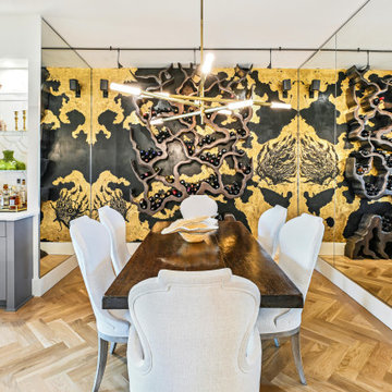
White oak herringbone in the dining room, beneath a gold and black feature wall with wine storage set into it. Satin was chosen across the whole floor for rooms like this one: the mirrored wall and the low pendant throw light at shallow angles, and a satin sheen returns that light evenly instead of concentrating it into hot spots. Sanded and finished in place with LOBA EasyPrime and two coats of LOBA 2K Duo. Installed by Classy Flooring ATL.

 ARNOLD Masonry & Landscape
A fun, custom and unique creation we designed and constructed which incorporates many facets to your outdoor living experience! With symmetry in mind we still wanted to bring forth a "softness" to this ensemble. Soft arches and curves combined with a balanced layout and symmetrically cut stone. We used one of our favorite types of stone for the facade- an Oklahoma thick flagstone called "Ozark". We installed this in a dry stack pattern for all vertical surfaces other than the sides of the chimney and pizza oven where we used a buff colored mortar to create a shadow joint. A thick Pennsylvania Bluestone was used for the counter top. The intricate "thin flag feather" insets and backsplash is a Tennessee thin flgastone veneer called "Crab Orchard ( gray). This was painstakingly cut and installed piece by piece in a dry stack pattern. Extremely time consuming but gorgeous! The chimney sits app. 12' tall and the pizza oven sits app. 9' tall. Plenty of room in between for the Green Egg, sink, refrigerator, grill and cabinets. Low voltage night lighting was also incorporated into the backsplash as well as surrounding landscape. We also recommend a clean burning wood for pizza ovens. This one is stocked with European White Birch.
These photos do not do this project justice, yet due to the season we will be posting better ones come summer time. Copper planters will also be placed on top of the 16" wide backsplash cap.
Our company concentrates on presenting our clients with unique, top quality additions to their home and life with the best products and professional artisans. All styles and types of landscape and hardscape designs coupled with quality and service is our goal. 30 years serving the Atlanta and North Atlanta community. Visit us at arnoldmasonryandlandscape.com and contact us!

 PLA Design Studio
PLA Design Studio is a Landscape Architecture firm specializing in high-end residential/estate planning and design, resort design and community identification and theming. We pride ourselves in our team approach and the high level of detail given to all aspects of the design process.
Our top priority is to DESIGN WITH INTENTION. We create spaces that reflect the lifestyle of our clients, a place where design meets life. Most of our work is concentrated in beautiful South Florida where we provide design services for “everything but the house.”
PLA DESIGN has extensive experience in Pool and Water Feature Design, Hardscape Design, Landscape Design, and Site Lighting Design. PLA Design takes great pride in fostering meaningful relationships with the teams of professionals and clients we have worked with over the years and are determined to create new long-lasting relationships with those of you we haven't had the opportunity to meet yet!

 Visbeen Architects
Graced with an abundance of windows, Alexandria’s modern meets traditional exterior boasts stylish stone accents, interesting rooflines and a pillared and welcoming porch. You’ll never lack for style or sunshine in this inspired transitional design perfect for a growing family. The timeless design merges a variety of classic architectural influences and fits perfectly into any neighborhood. A farmhouse feel can be seen in the exterior’s peaked roof, while the shingled accents reference the ever-popular Craftsman style. Inside, an abundance of windows flood the open-plan interior with light. Beyond the custom front door with its eye-catching sidelights is 2,350 square feet of living space on the first level, with a central foyer leading to a large kitchen and walk-in pantry, adjacent 14 by 16-foot hearth room and spacious living room with a natural fireplace. Also featured is a dining area and convenient home management center perfect for keeping your family life organized on the floor plan’s right side and a private study on the left, which lead to two patios, one covered and one open-air. Private spaces are concentrated on the 1,800-square-foot second level, where a large master suite invites relaxation and rest and includes built-ins, a master bath with double vanity and two walk-in closets. Also upstairs is a loft, laundry and two additional family bedrooms as well as 400 square foot of attic storage. The approximately 1,500-square-foot lower level features a 15 by 24-foot family room, a guest bedroom, billiards and refreshment area, and a 15 by 26-foot home theater perfect for movie nights.
Photographer: Ashley Avila Photography
 Master Blinds
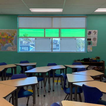
School settings require students to maintain concentration and sit still for long periods of time throughout the day. Needless to say, that can be tough not only for teenagers but adults as well. Harnessing sheer roller shades to cover classroom windows helps ensure sunlight doesn’t become a hindrance in the path of education, but a facilitator of better learning. By diffusing sunlight that enters the classrooms, students don’t suffer the negative cognitive impact of harsh glare that’s strainful on the eyes. Instead, they enjoy the benefits sunlight plays in maintaining alertness and attentiveness. Classroom window shades that provide better privacy also help to keep outside distractions from interfering with the lessons, keeping students focused on the subject at hand. The right use of colorful roller shades can also complement sensory cues for focus created by the classroom environment. Talk to Master Blinds’ design team to see what roller shades can offer your classroom spaces. Get in touch with us at 877-708-5883 to schedule a free in-person consultation with no obligation for more details!


 karmic stone
Architectural Gem of Doylestown, PA>
At the southeast corner of East State Street and South Main Street in Doylestown is Lenape Hall
One of the most distinctive buildings in Doylestown, the building was designed by architects Addison Hutton & Thomas Cernea and dedicated November 17th 1874.
It originally provided Doylestown with a large town hall for public meetings, a concentrated store area and a much-needed indoor market.
In the early 20th century, the Strand Theater showed movies here until the building of the New Strand Theater, in 1925. In effect it was a Victorian shopping mall, which had a strong influence on the town’s commercial identity.
from the doylestown historical society http://www.doylestownhistorical.org/BuildingRecognition/Lenape.htm
 PLA Design Studio
PLA Design Studio is a Landscape Architecture firm specializing in high-end residential/estate planning and design, resort design and community identification and theming. We pride ourselves in our team approach and the high level of detail given to all aspects of the design process.
Our top priority is to DESIGN WITH INTENTION. We create spaces that reflect the lifestyle of our clients, a place where design meets life. Most of our work is concentrated in beautiful South Florida where we provide design services for “everything but the house.”
PLA DESIGN has extensive experience in Pool and Water Feature Design, Hardscape Design, Landscape Design, and Site Lighting Design. PLA Design takes great pride in fostering meaningful relationships with the teams of professionals and clients we have worked with over the years and are determined to create new long-lasting relationships with those of you we haven't had the opportunity to meet yet!
 PLA Design Studio
PLA Design Studio is a Landscape Architecture firm specializing in high-end residential/estate planning and design, resort design and community identification and theming. We pride ourselves in our team approach and the high level of detail given to all aspects of the design process.
Our top priority is to DESIGN WITH INTENTION. We create spaces that reflect the lifestyle of our clients, a place where design meets life. Most of our work is concentrated in beautiful South Florida where we provide design services for “everything but the house.”
PLA DESIGN has extensive experience in Pool and Water Feature Design, Hardscape Design, Landscape Design, and Site Lighting Design. PLA Design takes great pride in fostering meaningful relationships with the teams of professionals and clients we have worked with over the years and are determined to create new long-lasting relationships with those of you we haven't had the opportunity to meet yet!
 PLA Design Studio
PLA Design Studio is a Landscape Architecture firm specializing in high-end residential/estate planning and design, resort design and community identification and theming. We pride ourselves in our team approach and the high level of detail given to all aspects of the design process.
Our top priority is to DESIGN WITH INTENTION. We create spaces that reflect the lifestyle of our clients, a place where design meets life. Most of our work is concentrated in beautiful South Florida where we provide design services for “everything but the house.”
PLA DESIGN has extensive experience in Pool and Water Feature Design, Hardscape Design, Landscape Design, and Site Lighting Design. PLA Design takes great pride in fostering meaningful relationships with the teams of professionals and clients we have worked with over the years and are determined to create new long-lasting relationships with those of you we haven't had the opportunity to meet yet!
 Aranelli Design
LAB
A FRAME WITH A TECHNOLOGICAL CORE.
Prominent and refined model with clean lines and large volumes expressing the lightness of the glass fronts and the strength of the aluminum frame supporting them. Design for better ergonomics, concentrating the washing and cooking areas in the central island to make kitchen chores easier. The simplicity of solids, emphasized by tall units doors and island bases with groove, does not contrast with the various translucent materials that introduce countless and rigorous reflections. A real laboratory where different materials and finishes are mixed with extreme knowledge: the right columns are model Lab matt glass Nero traffico finish, the left columns are model Bluna wood bilaminate Noce miele finish, while the island is model Bluna tech Alluminio brunito finish with the new Emme groove which gives a characteristic lightness to the 12 mm thick gres worktop Nero greco finish.

 Streeter Custom Builder
Dramatic home bar separated from dining area by chainmail curtain. Tile blacksplash and custom wine storage above custom dark wood cabinets with brass pulls.

 Genesis Architecture, LLC.
Kitchen view with maple cabinetry and concrete countertops
Inspiration for a modern kitchen remodel in Milwaukee
Inspiration for a modern kitchen remodel in Milwaukee
 PLA Design Studio
PLA Design Studio is a Landscape Architecture firm specializing in high-end residential/estate planning and design, resort design and community identification and theming. We pride ourselves in our team approach and the high level of detail given to all aspects of the design process.
Our top priority is to DESIGN WITH INTENTION. We create spaces that reflect the lifestyle of our clients, a place where design meets life. Most of our work is concentrated in beautiful South Florida where we provide design services for “everything but the house.”
PLA DESIGN has extensive experience in Pool and Water Feature Design, Hardscape Design, Landscape Design, and Site Lighting Design. PLA Design takes great pride in fostering meaningful relationships with the teams of professionals and clients we have worked with over the years and are determined to create new long-lasting relationships with those of you we haven't had the opportunity to meet yet!

 Frontier Custom Builders, Inc
Imagine soaking in the warmth of the Jacuzzi Tub, taking a nice hot bath while watching the flames dance on your custom Oak Surround fire place. Welcome to the Lap of Luxury.
There are many builders & designers who wrongfully concentrate a great deal of their efforts ONLY in the common areas of a home, or the areas most likely to be seen. This is a HUGE MISTAKE!
At Frontier Custom Builders, we believe that Every room in your custom home should be designed with the same precise attention to detail, never compromising even an inch of luxury, or style. This is especially true in the areas of the home that are more private. You deserve a sanctuary, your own private little piece of heaven and we can create it in a way in which art imitates life....

43