
Search results for "Consistent material" in Home Design Ideas
 Rachel Reider Interiors
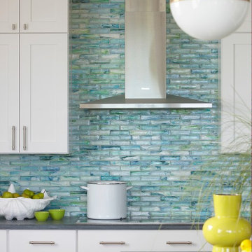
Backsplash - Lunada Bay Tile - Sumi-e 1 x 4 Mini Brick / Color - Izu Natural
Michael Partenio
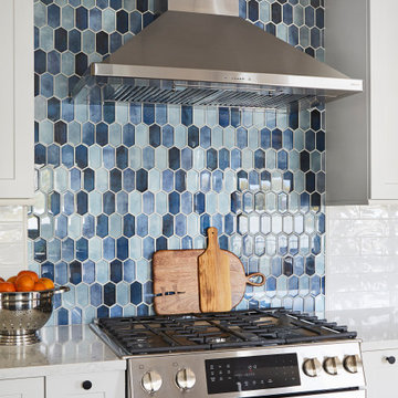
Eat-in kitchen - coastal eat-in kitchen idea in Boston with shaker cabinets, white cabinets, glass tile backsplash, granite countertops, blue backsplash, stainless steel appliances and an island
Eat-in kitchen - coastal eat-in kitchen idea in Boston with shaker cabinets, white cabinets, glass tile backsplash, granite countertops, blue backsplash, stainless steel appliances and an island
 CR Cabinetry Kitchen & Bath Design Studio
Featuring R.D. Henry & Company
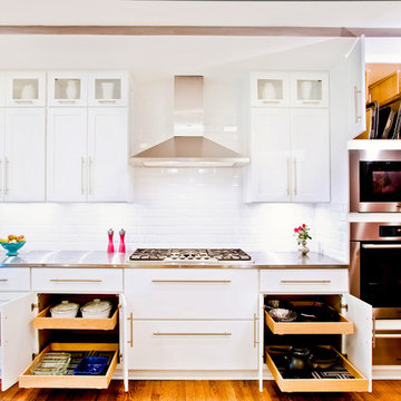
Mid-sized transitional single-wall medium tone wood floor kitchen photo in Chicago with shaker cabinets, white cabinets, white backsplash, subway tile backsplash, stainless steel appliances and stainless steel countertops
Mid-sized transitional single-wall medium tone wood floor kitchen photo in Chicago with shaker cabinets, white cabinets, white backsplash, subway tile backsplash, stainless steel appliances and stainless steel countertops
 YS BUILT, LLC
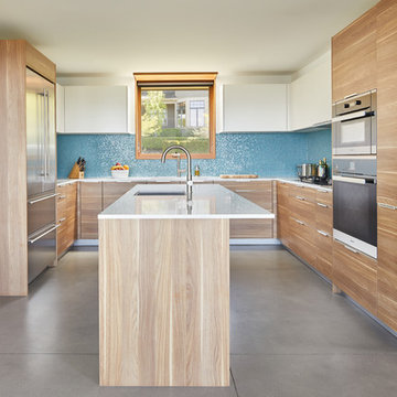
A new custom residence in the Harrison Views neighborhood of Issaquah Highlands.
The home incorporates high-performance envelope elements (a few of the strategies so far include alum-clad windows, rock wall house wrap insulation, green-roofs and provision for photovoltaic panels).
The building site has a unique upper bench and lower bench with a steep slope between them. The siting of the house takes advantage of this topography, creating a linear datum line that not only serves as a retaining wall but also as an organizing element for the home’s circulation.
The massing of the home is designed to maximize views, natural daylight and compliment the scale of the surrounding community. The living spaces are oriented to capture the panoramic views to the southwest and northwest, including Lake Washington and the Olympic mountain range as well as Seattle and Bellevue skylines.
A series of green roofs and protected outdoor spaces will allow the homeowners to extend their living spaces year-round.
With an emphasis on durability, the material palette will consist of a gray stained cedar siding, corten steel panels, cement board siding, T&G fir soffits, exposed wood beams, black fiberglass windows, board-formed concrete, glass railings and a standing seam metal roof.
A careful site analysis was done early on to suss out the best views and determine how unbuilt adjacent lots might be developed.
The total area is 3,425 SF of living space plus 575 SF for the garage.
Photos by Benjamin Benschneider. Architecture by Studio Zerbey Architecture + Design. Cabinets by LEICHT SEATTLE.
Find the right local pro for your project
 Kitchen & Bath Design + Construction
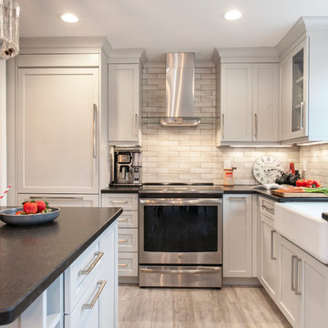
Lunar Gray cabinetry is from Ultracraft Cabinetry in their Avon style. The refrigerator and dishwasher is paneled to create a consistent, continuous look.
Photo by Chrissy Racho.
 Missy Stewart Designs
Bayou360
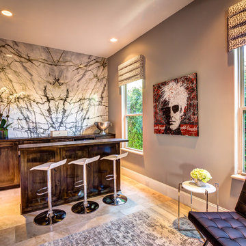
Small trendy galley ceramic tile and beige floor seated home bar photo in Houston with recessed-panel cabinets, dark wood cabinets, gray backsplash, stone slab backsplash and wood countertops
Small trendy galley ceramic tile and beige floor seated home bar photo in Houston with recessed-panel cabinets, dark wood cabinets, gray backsplash, stone slab backsplash and wood countertops
 TKS Design Group
Download our free ebook, Creating the Ideal Kitchen. DOWNLOAD NOW
Lakefront property in the northwest suburbs of Chicago is hard to come by, so when we were hired by this young family with exactly that, we were immediately inspired by not just the unusually large footprint of this 1950’s colonial revival but also the lovely views of the manmade lake it was sited on. The large 5-bedroom home was solidly stuck in the 1980’s, but we saw tons of potential. We started out by updating the existing staircase with a fresh coat of paint and adding new herringbone slate to the entry hall.
The powder room off the entryway also got a refresh - new flooring, new cabinets and fixtures. We ran the new slate right through into this space for some consistency. A fun wallpaper and shiplap trim add a welcoming feel and set the tone for the home.
Next, we tackled the kitchen. Located away from the rest of the first floor, the kitchen felt a little isolated, so we immediately began planning for how to better connect it to the rest of the first floor. We landed on removing the wall between the kitchen and dining room and designed a modified galley style space with separate cooking and clean up zones. The cooking zone consists of the refrigerator, prep sink and cooktop, along with a nice long run of prep space at the island. The cleanup side of the kitchen consists of the main sink and dishwasher. Both areas are situated so that the user can view the lake during prep work and cleanup!
One of the home’s main puzzles was how to incorporate the mudroom and area in front of the patio doors at the back of the house. We already had a breakfast table area, so the space by the patio doors was a bit of a no man’s land. We decided to separate the kitchen proper from what became the new mudroom with a large set of barn doors. That way you can quickly hide any mudroom messes but have easy access to the light coming in through the patio doors as well as the outdoor grilling station. We also love the impact the barn doors add to the overall space.
The homeowners’ first words to us were “it’s time to ditch the brown,” so we did! We chose a lovely blue pallet that reflects the home’s location on the lake which is also vibrant yet easy on the eye. Countertops are white quartz, and the natural oak floor works well with the other honey accents. The breakfast table was given a refresh with new chairs, chandelier and window treatments that frame the gorgeous views of the lake out the back.
We coordinated the slate mudroom flooring with that used in the home’s main entrance for a consistent feel. The storage area consists of open and closed storage to allow for some clutter control as needed.
Next on our “to do” list was revamping the dated brown bar area in the neighboring dining room. We eliminated the clutter by adding some closed cabinets and did some easy updates to help the space feel more current. One snag we ran into here was the discovery of a beam above the existing open shelving that had to be modified with a smaller structural beam to allow for our new design to work. This was an unexpected surprise, but in the end we think it was well worth it!
We kept the colors here a bit more muted to blend with the homeowner’s existing furnishings. Open shelving and polished nickel hardware add some simple detail to the new entertainment zone which also looks out onto the lake!
Next we tackled the upstairs starting with the homeowner’s son’s bath. The bath originally had both a tub shower and a separate shower, so we decided to swap out the shower for a new laundry area. This freed up some space downstairs in what used to be the mudroom/laundry room and is much more convenient for daily laundry needs.
We continued the blue palette here with navy cabinetry and the navy tile in the shower. Porcelain floor tile and chrome fixtures keep maintenance to a minimum while matte black mirrors and lighting add some depth the design. A low maintenance runner adds some warmth underfoot and ties the whole space together.
We added a pocket door to the bathroom to minimize interference with the door swings. The left door of the laundry closet is on a 180 degree hinge to allow for easy full access to the machines. Next we tackled the master bath which is an en suite arrangement. The original was typical of the 1980’s with the vanity outside of the bathroom, situated near the master closet. And the brown theme continued here with multiple shades of brown.
Our first move was to segment off the bath and the closet from the master bedroom. We created a short hall from the bedroom to the bathroom with his and hers walk-in closets on the left and right as well as a separate toilet closet outside of the main bathroom for privacy and flexibility.
The original bathroom had a giant soaking tub with steps (dangerous!) as well as a small shower that did not work well for our homeowner who is 6’3”. With other bathtubs in the home, they decided to eliminate the tub and create an oversized shower which takes up the space where the old tub was located. The double vanity is on the opposite wall and a bench is located under the window for morning conversations and a place to set a couple of towels.
The pallet in here is light and airy with a mix of blond wood, creamy porcelain and marble tile, and brass accents. A simple roman shade adds some texture and it’s top-down mechanism allows for light and privacy.
This large whole house remodel gave our homeowners not only the ability to maximize the potential of their home but also created a lovely new frame from which to view their fabulous lake views.
Designed by: Susan Klimala, CKD, CBD
Photography by: Michael Kaskel
For more information on kitchen and bath design ideas go to: www.kitchenstudio-ge.com
 Howell Custom Building Group
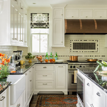
Built in 1860, this historic home is located next to Phillips Academy in Andover MA and has served as a home to the academy’s administrators. The kitchen was a utilitarian, dark and cramped space. The goal of the remodel was to create a brighter and more elegant kitchen. Two new windows on either side of the cooking area, bring in light and views of the backyard. A wood paneled raised ceiling with drop soffit was added, giving new depth and warmth to the room. A glass display cabinet with interior lighting lines one wall adding to the airy, bright ambiance. Elegant styling includes hand painted custom cabinetry from Jewett Farms with decorative furniture feet and a hand-hammered copper range hood.Cosmic black granite replaced the outdated Formica countertops. A custom designed backsplash tile consists of a traditional 3 x 6 subway tile with custom selected square mosaics which tie the dark counters in with the white cabinets. Coppery accents within the mosaics reflect the copper range hood and beautiful wood floors. The flooring throughout the first floor was replaced with antique reclaimed oak.
Sponsored
Columbus, OH

Trish Takacs Design
Award Winning & Highly Skilled Kitchen & Bath Designer in Columbus
 Ann Lowengart Interiors
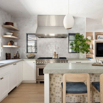
The three-level Mediterranean revival home started as a 1930s summer cottage that expanded downward and upward over time. We used a clean, crisp white wall plaster with bronze hardware throughout the interiors to give the house continuity. A neutral color palette and minimalist furnishings create a sense of calm restraint. Subtle and nuanced textures and variations in tints add visual interest. The stair risers from the living room to the primary suite are hand-painted terra cotta tile in gray and off-white. We used the same tile resource in the kitchen for the island's toe kick.
 TKS Design Group
Download our free ebook, Creating the Ideal Kitchen. DOWNLOAD NOW
Lakefront property in the northwest suburbs of Chicago is hard to come by, so when we were hired by this young family with exactly that, we were immediately inspired by not just the unusually large footprint of this 1950’s colonial revival but also the lovely views of the manmade lake it was sited on. The large 5-bedroom home was solidly stuck in the 1980’s, but we saw tons of potential. We started out by updating the existing staircase with a fresh coat of paint and adding new herringbone slate to the entry hall.
The powder room off the entryway also got a refresh - new flooring, new cabinets and fixtures. We ran the new slate right through into this space for some consistency. A fun wallpaper and shiplap trim add a welcoming feel and set the tone for the home.
Next, we tackled the kitchen. Located away from the rest of the first floor, the kitchen felt a little isolated, so we immediately began planning for how to better connect it to the rest of the first floor. We landed on removing the wall between the kitchen and dining room and designed a modified galley style space with separate cooking and clean up zones. The cooking zone consists of the refrigerator, prep sink and cooktop, along with a nice long run of prep space at the island. The cleanup side of the kitchen consists of the main sink and dishwasher. Both areas are situated so that the user can view the lake during prep work and cleanup!
One of the home’s main puzzles was how to incorporate the mudroom and area in front of the patio doors at the back of the house. We already had a breakfast table area, so the space by the patio doors was a bit of a no man’s land. We decided to separate the kitchen proper from what became the new mudroom with a large set of barn doors. That way you can quickly hide any mudroom messes but have easy access to the light coming in through the patio doors as well as the outdoor grilling station. We also love the impact the barn doors add to the overall space.
The homeowners’ first words to us were “it’s time to ditch the brown,” so we did! We chose a lovely blue pallet that reflects the home’s location on the lake which is also vibrant yet easy on the eye. Countertops are white quartz, and the natural oak floor works well with the other honey accents. The breakfast table was given a refresh with new chairs, chandelier and window treatments that frame the gorgeous views of the lake out the back.
We coordinated the slate mudroom flooring with that used in the home’s main entrance for a consistent feel. The storage area consists of open and closed storage to allow for some clutter control as needed.
Next on our “to do” list was revamping the dated brown bar area in the neighboring dining room. We eliminated the clutter by adding some closed cabinets and did some easy updates to help the space feel more current. One snag we ran into here was the discovery of a beam above the existing open shelving that had to be modified with a smaller structural beam to allow for our new design to work. This was an unexpected surprise, but in the end we think it was well worth it!
We kept the colors here a bit more muted to blend with the homeowner’s existing furnishings. Open shelving and polished nickel hardware add some simple detail to the new entertainment zone which also looks out onto the lake!
Next we tackled the upstairs starting with the homeowner’s son’s bath. The bath originally had both a tub shower and a separate shower, so we decided to swap out the shower for a new laundry area. This freed up some space downstairs in what used to be the mudroom/laundry room and is much more convenient for daily laundry needs.
We continued the blue palette here with navy cabinetry and the navy tile in the shower. Porcelain floor tile and chrome fixtures keep maintenance to a minimum while matte black mirrors and lighting add some depth the design. A low maintenance runner adds some warmth underfoot and ties the whole space together.
We added a pocket door to the bathroom to minimize interference with the door swings. The left door of the laundry closet is on a 180 degree hinge to allow for easy full access to the machines. Next we tackled the master bath which is an en suite arrangement. The original was typical of the 1980’s with the vanity outside of the bathroom, situated near the master closet. And the brown theme continued here with multiple shades of brown.
Our first move was to segment off the bath and the closet from the master bedroom. We created a short hall from the bedroom to the bathroom with his and hers walk-in closets on the left and right as well as a separate toilet closet outside of the main bathroom for privacy and flexibility.
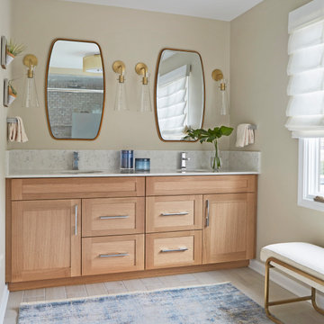
The original bathroom had a giant soaking tub with steps (dangerous!) as well as a small shower that did not work well for our homeowner who is 6’3”. With other bathtubs in the home, they decided to eliminate the tub and create an oversized shower which takes up the space where the old tub was located. The double vanity is on the opposite wall and a bench is located under the window for morning conversations and a place to set a couple of towels.
The pallet in here is light and airy with a mix of blond wood, creamy porcelain and marble tile, and brass accents. A simple roman shade adds some texture and it’s top-down mechanism allows for light and privacy.
This large whole house remodel gave our homeowners not only the ability to maximize the potential of their home but also created a lovely new frame from which to view their fabulous lake views.
Designed by: Susan Klimala, CKD, CBD
Photography by: Michael Kaskel
For more information on kitchen and bath design ideas go to: www.kitchenstudio-ge.com

 Advance Design Studio, Ltd.
Jennifer and Dan have lived in their Deer Park Illinois home for 15 years, slowly making minor fixes like painting and decorating; but they had a new plan for their kitchen the entire time. An awkwardly placed garage door, and an island cooktop with a terrible downdraft made a full-scale kitchen remodel an absolute must. Jennifer had many ideas in mind and wanted to work with a company that could provide high-end work, while partnering with a designer that would tailor the kitchen to her ideas.
She was intrigued by the phrase “Common Sense Remodeling” in Advance Design’s feature she discovered while perusing an issue of the community’s Quintessential Barrington Magazine. Doing further research on the company’s website, as she looked through project profiles and read about Advance Design’s “Common Sense Remodeling” philosophy, she promptly scheduled an appointment to see if the people and ideas she read about were truly who they said they were. The more she read, the more she knew that the “Common Sense” approach to remodeling they described was exactly the type of company she was looking for.
The partnership was sealed after an initial consultation with Owner Todd Jurs and Project Designer Michelle Lecinski. They displayed a combination of friendliness, professionalism and respect that was unmatched by any of the other companies Jennifer talked to. She knew that with Advance Design, she would be able to retain the vision that she had in mind with high-quality craftsmanship.
“I reached out to Advance Design because of the ‘Common Sense Remodeling’ tagline,” Jennifer said. “That’s what lingered for me”. “Advance Design was the most respectful- of the house and of my design ideas, and the most professional of the handful of companies that looked at my project”.
Soon after the meeting Jennifer began working with Michelle on the project design. They quickly developed chemistry. Jennifer loved how Michelle researched and located every detail that Jennifer wanted for the kitchen. Between the two of them, every concept and idea was worked through and perfected. “Jennifer had definite ideas about what she wanted the new kitchen to look like, she just didn’t know how to bring it all together. We worked together really well to make her ideas into the practical reality necessary for a well-functioning kitchen, with the look and feel that she had envisioned”, says Michelle.
“Michelle was wonderful in using the CAD system she would show me new drawings every time we changed the layout while working through the design,” Jennifer said. “She was a really wonderful partner in execution, she made sure everything happened quickly and easily.”
The finished design drew out elements of Jennifer’s style and personality. The pair call the look “sophisticated farmhouse” to describe the kitchen renovation to family and friends. The result was a beautifully crafted, authentic-feeling space that satisfied Jennifer’s dreams 15 years in the making. The whole project consisted of a kitchen remodel, mudroom upgrade with powder room, and garage entry relocation. “The projects I personally like the best, are the ones that put the client’s dreams on display,” Project Designer Michelle said. “And this is one of those projects.”
The main focal point of the kitchen is custom zinc and brass ventilation hood with a vintage sheen, which was hand made to order by a small company in Indiana named Vogler Metalworking. “It’s like sculpture, a true work of art”, says Jennifer. Your eye is immediately drawn towards this elegant yet practical hood that eliminated the home’s downdraft problem and added a striking conversation piece at the same time. The carpenters had to use special gloves when transporting and installing it, so they didn’t smudge it with fingerprints. The beautiful hood centers proudly over the stunning black enamel and brass LaCornue Range. “I had a friend who had a LaCornue range and after learning how easy it was to cook perfect meals, I was convinced I wanted to have one”, says Jennifer. This unique, breathtaking combination anchors the entire kitchen and is apparent immediately as you walk into the great room the surrounds the space.
DuraSupreme Crestwood cabinets with a Kendall Panel add function and sophistication. A custom gray paint color paired with a storm blue was developed so that the new kitchen looked like it belonged to the existing space. Unlacquered brass faucets and hardware were important to Jennifer because she wanted the living finishes to age over time. Remarkable brass diamond mesh cabinet door inserts imported from the UK continue to add this one-of-a-kind kitchen renovation; giving it a “you won’t see this everywhere” quality. The use of old railcar flooring for the coffee bar countertop and reclaimed oak for the open shelving gives an authenticity to the space uncommon in kitchens today.
Jennifer and Michelle fell in love with the Limestone Grey Stone while they were investigating unique island countertop ideas. They liked the fact that the limestone as a living finish will age and change over time. Calcutta Miel Quartz countertops made for an excellent pairing around the perimeter, as it’s durable and perfect for cooking preparations. A textured white subway tile backsplash that runs to the ceiling keeps your eye moving towards the open shelving, and to the main focal point of the stunning range hood combination.
“The kitchen functions beautifully, and it’s gorgeous,” beams Jennifer as she gestures with both hands while smiling ear to ear. “The most important thing was I wanted a kitchen that had a wonderful flow, cooked beautiful meals and was a great gathering place for family and friends, and this space does that perfectly! Beauty wise, it turned out exactly how I had envisioned. I felt the function part was the hardest part, and that was nailed”!
Relocating the garage entry to the new mudroom was a huge priority and has finally separated the family’s arriving home functions from their kitchen. Now coats and shoes and bags have their own area for dropping once members arrive home. Matching gray DuraSupreme cabinetry helped create gorgeous, purposeful lockers for the family. A reclaimed vintage sink and custom wall paper were added to the tiny powder room to beautify the once previously only functional space. Advance Design was even able to create a custom space for their dog to sleep while the family is away.
“It was unbelievable that a project of this size was completed in such a short time, and I think that’s because of the large amount of planning and preparation that went into it,” Jennifer marveled, “When we started, we were ready, and everything was prepared”.
When it came to execution, Project Manager Justin Davis and his crew were quick, accessible, and organized. Projects like this kitchen are typically completed in as little as 8-10 weeks. Jennifer’s kitchen however despite the relocation of some challenging HVAC in a soffit and moving of an exterior door was completed remarkably fast in part because the team was working with an existing tile floor that ran throughout the first floor that the client really loved.
“You get to know these people really well because they’re living in your house while you’re living in your house. They were so fast and really good, it didn’t take as long as even planned” reported Jennifer. “I would text Justin and he always responded almost immediately. I got to know all the guys who were working in our house and they were all wonderful people”.
Details in a customized kitchen like this one require skill and care from the people who install it. “All the guys on the job were skilled at what the did. I wanted small details like little feet to look like furniture, that is where their carpentry skill came in to make these all perfect”, said Jennifer. “The tile guys were wonderful. They even let me determine how I wanted the texture with the grout to appear for a salt and pepper look; now that is a very skilled trade person making it custom”.
In Jennifer’s interview, she continued to reference Advance Design’s “Common Sense Remodeling”, so I took a minute to ask her exactly what that phrase meant to her and how it played out in her experience with her project and the Advance Design team. Here is what she said: “I was intrigued about Common Sense Remodeling and in my head that there would be clear costs and prices, great communication between the design team, the execution team and me”, said Jennifer. They did deliver on that, it was so clear about the cost breakdown, what I could expect from everyone who came to my house, and everything that we had ordered. That to me is the Common Sense”!
It’s great to see a client take literally our assertion that a well-planned remodeling project is simply “Common Sense”! She anticipated each step of the way would be clear, concise, and predictable, all the while protecting the outcome due to the careful upfront planning. “Advance Design delivered on their ‘Common Sense Remodeling’ promise,” Jennifer said. “From the design team, to the execution team - everything was straight forward like I imagined. The project turned out exactly how I envisioned, I enjoyed this process and absolutely would recommend Advance Design Studio to anyone.”
 EKO Development
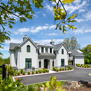
Located on a corner lot perched high up in the prestigious East Hill of Cresskill, NJ, this home has spectacular views of the Northern Valley to the west. Comprising of 7,200 sq. ft. of space on the 1st and 2nd floor, plus 2,800 sq. ft. of finished walk-out basement space, this home encompasses 10,000 sq. ft. of livable area.
The home consists of 6 bedrooms, 6 full bathrooms, 2 powder rooms, a 3-car garage, 4 fireplaces, huge kitchen, generous home office room, and 2 laundry rooms.
Unique features of this home include a covered porte cochere, a golf simulator room, media room, octagonal music room, dance studio, wine room, heated & screened loggia, and even a dog shower!
 ELEVATIONS | Design Solutions by Myers
Visit Our Showroom
8000 Locust Mill St.
Ellicott City, MD 21043
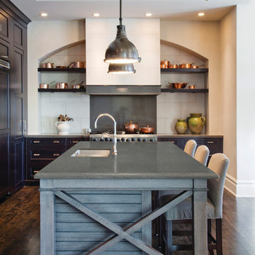
HanStone Sterling Grey Quartz Countertop
HanStone Quartz: This is a sample of Sterling Grey from the HanStone brand of quartz countertops. Han Stone quartz is the new and gorgeous lineup of quartz kitchen countertops offered by the large Korean congolmerate Hanwha.
 Cindy Smetana Interiors
Martin King
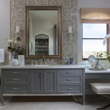
Large transitional master gray tile, white tile and mosaic tile gray floor and ceramic tile alcove shower photo in Orange County with an undermount sink, gray cabinets, gray walls, shaker cabinets, a two-piece toilet, quartz countertops and a hinged shower door
Large transitional master gray tile, white tile and mosaic tile gray floor and ceramic tile alcove shower photo in Orange County with an undermount sink, gray cabinets, gray walls, shaker cabinets, a two-piece toilet, quartz countertops and a hinged shower door

 TKS Design Group
Download our free ebook, Creating the Ideal Kitchen. DOWNLOAD NOW
Lakefront property in the northwest suburbs of Chicago is hard to come by, so when we were hired by this young family with exactly that, we were immediately inspired by not just the unusually large footprint of this 1950’s colonial revival but also the lovely views of the manmade lake it was sited on. The large 5-bedroom home was solidly stuck in the 1980’s, but we saw tons of potential. We started out by updating the existing staircase with a fresh coat of paint and adding new herringbone slate to the entry hall.
The powder room off the entryway also got a refresh - new flooring, new cabinets and fixtures. We ran the new slate right through into this space for some consistency. A fun wallpaper and shiplap trim add a welcoming feel and set the tone for the home.
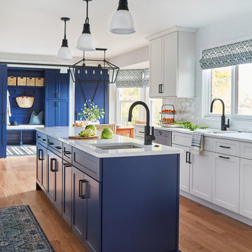
Next, we tackled the kitchen. Located away from the rest of the first floor, the kitchen felt a little isolated, so we immediately began planning for how to better connect it to the rest of the first floor. We landed on removing the wall between the kitchen and dining room and designed a modified galley style space with separate cooking and clean up zones. The cooking zone consists of the refrigerator, prep sink and cooktop, along with a nice long run of prep space at the island. The cleanup side of the kitchen consists of the main sink and dishwasher. Both areas are situated so that the user can view the lake during prep work and cleanup!
One of the home’s main puzzles was how to incorporate the mudroom and area in front of the patio doors at the back of the house. We already had a breakfast table area, so the space by the patio doors was a bit of a no man’s land. We decided to separate the kitchen proper from what became the new mudroom with a large set of barn doors. That way you can quickly hide any mudroom messes but have easy access to the light coming in through the patio doors as well as the outdoor grilling station. We also love the impact the barn doors add to the overall space.
The homeowners’ first words to us were “it’s time to ditch the brown,” so we did! We chose a lovely blue pallet that reflects the home’s location on the lake which is also vibrant yet easy on the eye. Countertops are white quartz, and the natural oak floor works well with the other honey accents. The breakfast table was given a refresh with new chairs, chandelier and window treatments that frame the gorgeous views of the lake out the back.
We coordinated the slate mudroom flooring with that used in the home’s main entrance for a consistent feel. The storage area consists of open and closed storage to allow for some clutter control as needed.
Next on our “to do” list was revamping the dated brown bar area in the neighboring dining room. We eliminated the clutter by adding some closed cabinets and did some easy updates to help the space feel more current. One snag we ran into here was the discovery of a beam above the existing open shelving that had to be modified with a smaller structural beam to allow for our new design to work. This was an unexpected surprise, but in the end we think it was well worth it!
We kept the colors here a bit more muted to blend with the homeowner’s existing furnishings. Open shelving and polished nickel hardware add some simple detail to the new entertainment zone which also looks out onto the lake!
Next we tackled the upstairs starting with the homeowner’s son’s bath. The bath originally had both a tub shower and a separate shower, so we decided to swap out the shower for a new laundry area. This freed up some space downstairs in what used to be the mudroom/laundry room and is much more convenient for daily laundry needs.
We continued the blue palette here with navy cabinetry and the navy tile in the shower. Porcelain floor tile and chrome fixtures keep maintenance to a minimum while matte black mirrors and lighting add some depth the design. A low maintenance runner adds some warmth underfoot and ties the whole space together.
We added a pocket door to the bathroom to minimize interference with the door swings. The left door of the laundry closet is on a 180 degree hinge to allow for easy full access to the machines. Next we tackled the master bath which is an en suite arrangement. The original was typical of the 1980’s with the vanity outside of the bathroom, situated near the master closet. And the brown theme continued here with multiple shades of brown.
Our first move was to segment off the bath and the closet from the master bedroom. We created a short hall from the bedroom to the bathroom with his and hers walk-in closets on the left and right as well as a separate toilet closet outside of the main bathroom for privacy and flexibility.
The original bathroom had a giant soaking tub with steps (dangerous!) as well as a small shower that did not work well for our homeowner who is 6’3”. With other bathtubs in the home, they decided to eliminate the tub and create an oversized shower which takes up the space where the old tub was located. The double vanity is on the opposite wall and a bench is located under the window for morning conversations and a place to set a couple of towels.
The pallet in here is light and airy with a mix of blond wood, creamy porcelain and marble tile, and brass accents. A simple roman shade adds some texture and it’s top-down mechanism allows for light and privacy.
This large whole house remodel gave our homeowners not only the ability to maximize the potential of their home but also created a lovely new frame from which to view their fabulous lake views.
Designed by: Susan Klimala, CKD, CBD
Photography by: Michael Kaskel
For more information on kitchen and bath design ideas go to: www.kitchenstudio-ge.com
 TKS Design Group
Download our free ebook, Creating the Ideal Kitchen. DOWNLOAD NOW
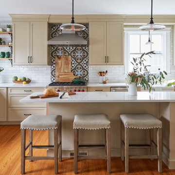
The homeowners came to us looking to update the kitchen in their historic 1897 home. The home had gone through an extensive renovation several years earlier that added a master bedroom suite and updates to the front façade. The kitchen however was not part of that update and a prior 1990’s update had left much to be desired. The client is an avid cook, and it was just not very functional for the family.
The original kitchen was very choppy and included a large eat in area that took up more than its fair share of the space. On the wish list was a place where the family could comfortably congregate, that was easy and to cook in, that feels lived in and in check with the rest of the home’s décor. They also wanted a space that was not cluttered and dark – a happy, light and airy room. A small powder room off the space also needed some attention so we set out to include that in the remodel as well.
See that arch in the neighboring dining room? The homeowner really wanted to make the opening to the dining room an arch to match, so we incorporated that into the design.
Another unfortunate eyesore was the state of the ceiling and soffits. Turns out it was just a series of shortcuts from the prior renovation, and we were surprised and delighted that we were easily able to flatten out almost the entire ceiling with a couple of little reworks.
Other changes we made were to add new windows that were appropriate to the new design, which included moving the sink window over slightly to give the work zone more breathing room. We also adjusted the height of the windows in what was previously the eat-in area that were too low for a countertop to work. We tried to keep an old island in the plan since it was a well-loved vintage find, but the tradeoff for the function of the new island was not worth it in the end. We hope the old found a new home, perhaps as a potting table.
Designed by: Susan Klimala, CKD, CBD
Photography by: Michael Kaskel
For more information on kitchen and bath design ideas go to: www.kitchenstudio-ge.com
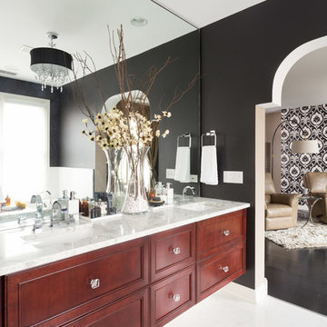
 Chi Renovation & Design
A large master bathroom that exudes glamor and edge. For this bathroom, we adorned the space with a large floating Alderwood vanity consisting of a gorgeous cherry wood finish, large crystal knobs, LED lights, and a mini bar and coffee station.
We made sure to keep a traditional glam look while adding in artistic features such as the creatively shaped entryway, dramatic black accent walls, and intricately designed shower niche.
Other features include a large crystal chandelier, porcelain tiled shower, and subtle recessed lights.
Home located in Glenview, Chicago. Designed by Chi Renovation & Design who serve Chicago and it's surrounding suburbs, with an emphasis on the North Side and North Shore. You'll find their work from the Loop through Lincoln Park, Skokie, Wilmette, and all of the way up to Lake Forest.
For more about Chi Renovation & Design, click here: https://www.chirenovation.com/
To learn more about this project, click here: https://www.chirenovation.com/portfolio/glenview-master-bathroom-remodeling/#bath-renovation
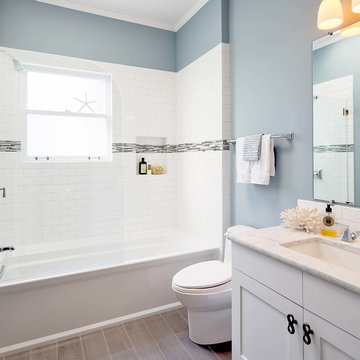
 Custom Kitchens by John Wilkins, Inc.
The layout of this bathroom was reconfigured by locating the new tub on the rear wall, and putting the toilet on the left of the vanity.
The wall on the left of the existing vanity was taken out.
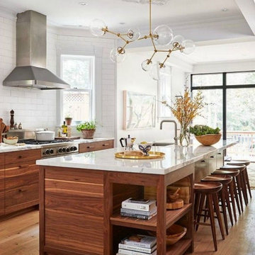

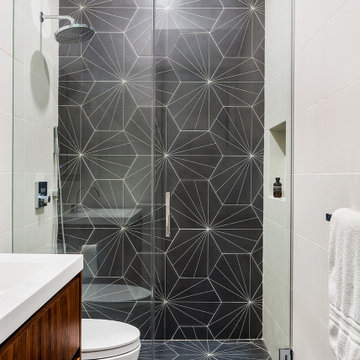
 kimberly peck architect
This brownstone, located in Harlem, consists of five stories which had been duplexed to create a two story rental unit and a 3 story home for the owners. The owner hired us to do a modern renovation of their home and rear garden. The garden was under utilized, barely visible from the interior and could only be accessed via a small steel stair at the rear of the second floor. We enlarged the owner’s home to include the rear third of the floor below which had walk out access to the garden. The additional square footage became a new family room connected to the living room and kitchen on the floor above via a double height space and a new sculptural stair. The rear facade was completely restructured to allow us to install a wall to wall two story window and door system within the new double height space creating a connection not only between the two floors but with the outside. The garden itself was terraced into two levels, the bottom level of which is directly accessed from the new family room space, the upper level accessed via a few stone clad steps. The upper level of the garden features a playful interplay of stone pavers with wood decking adjacent to a large seating area and a new planting bed. Wet bar cabinetry at the family room level is mirrored by an outside cabinetry/grill configuration as another way to visually tie inside to out. The second floor features the dining room, kitchen and living room in a large open space. Wall to wall builtins from the front to the rear transition from storage to dining display to kitchen; ending at an open shelf display with a fireplace feature in the base. The third floor serves as the children’s floor with two bedrooms and two ensuite baths. The fourth floor is a master suite with a large bedroom and a large bathroom bridged by a walnut clad hall that conceals a closet system and features a built in desk. The master bath consists of a tiled partition wall dividing the space to create a large walkthrough shower for two on one side and showcasing a free standing tub on the other. The house is full of custom modern details such as the recessed, lit handrail at the house’s main stair, floor to ceiling glass partitions separating the halls from the stairs and a whimsical builtin bench in the entry.
 Structure Home
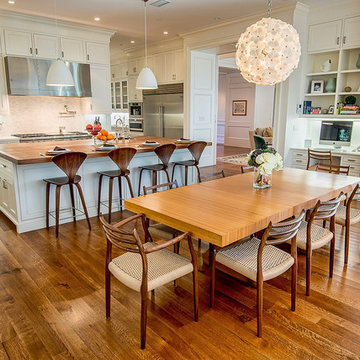
The featured Westwood home is a Classic Traditional style custom home. The home, architecturally designed by Karen Putman of p2 Design, consists of 6,158 square feet of livable area plus an outdoor covered living room and a two-car garage. The floor plan includes formal and informal living areas as well as 6 bedrooms, 5.5 baths plus a teen room lofted above the second floor. Photos By: Latham Architectural
 Cathie Hong Interiors
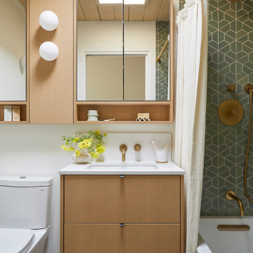
This Eichler remodel consisted of a new kitchen, two bathrooms, laundry/mudroom, and new lighting and paint throughout. We updated the previously poorly renovated Mediterranean style to match the original midcentury architectural style with a Japandi twist to best reflect the homeowners' cultural and stylistic preferences.
3