
Search results for "Construction zone" in Home Design Ideas

 Schumacher Homes
Built by Schumacher Homes, America's Largest Custom Home Builder, this stunning Olivia Carolina in Raleigh-Durham, North Carolina, effortlessly balances classic architectural details with modern elements. Truly the heart of the home, the high-end kitchen incorporates the latest trends in custom residential design, showcasing a massive central kitchen island with seating on two sides and picturesque views from the kitchen sink looking out into the backyard. Boosting day-to-day efficiency and layout flow, the floor plan features a highly innovative, oversized combined pantry and laundry room zone for seamless home organization. The main level's open-concept great room is anchored by a show-stopping, two-story stacked tile fireplace that draws the eye upward and creates a powerful, texturized focal point. This dramatic living area flows gracefully toward an architectural custom staircase, where striking metal railing serves as a sophisticated, modern design element.
The thoughtful layout continues across both levels to accommodate a bustling family lifestyle with effortless function. Upstairs, the secondary bedrooms are anchored by a highly practical Jack-and-Jill bathroom layout, ensuring morning routines run smoothly and on time for the entire family. Secluded from the rest of the residence, the luxurious primary owner's retreat serves as a private, main-level sanctuary. The suite features an enhanced owner's bath beautifully appointed with premium, modern champagne fixtures and dual vanities, creating a spa-like retreat designed for ultimate relaxation and a quiet escape at the end of the day.
 TKS Design Group
Download our free ebook, Creating the Ideal Kitchen. DOWNLOAD NOW
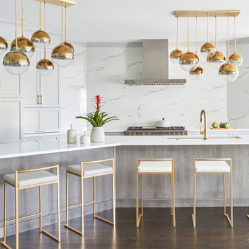
This client was referred to us from a past client. They are a busy 2-career household with young children and enjoy entertaining friends and family in their home. They have a beautiful open concept home but unfortunately the kitchen was not fitting for the rest of the home. They were not quite sure what to do with the space. We talked about trying to refresh it or do more of a minor remodel, but in the end they decided a full gut would get them to where they wanted to be.
One problem was there was no place for guests to hang out other than the large and awkward banquette area. The brick wall and tiled hood area were feeling a bit dated and tired. The space was just not functional for their lifestyle. There was no prep space near the cooktop and no landing area for items coming out of the ovens or refrigerator, plus a big dead zone in the center of the room.
Banquettes, like the one they previously had in the space, are great for small spaces, but when they get really large like this one, it makes getting in and out of the seating area awkward and uncomfortable. Plus, there was room for a large table, so we eliminated the awkward built in.
We started by removing the faux brick wall between the kitchen and back entry. We relocated the entry to the garage over a couple feet in order to get every last inch out of the new kitchen. We also made the decision to close up the primary window that faced the pretty ho hum brick wall of the neighbor’s house. There was plenty of light coming in from the seating area, so we just didn’t feel the window was adding much to the room.
Construction went smoothy. There was a bit of rework with electrical, flooring and HVAC, but in the end, we think it was well worth it.
The clients really wanted a sleek contemporary look, and we originally had planned for a full height slab backsplash, but due to it’s size, it was a budget buster. Instead, we got creative and settled on large format porcelain tiles that have a similar feel but were a fraction of the cost. We made sure the wall was plumb and level so that the fit and finish would mimic that of slab material.
The final space was quite a change. A large prep sink sits directly across from the new pro-style range with plenty additional prep space on the large island. The refrigerator and ovens now have miles of landing space, and a nice tight work triangle makes cooking a breeze.
Since we wanted a more contemporary feel, not many wall cabinets were included. Instead, we outfitted some of the drawers for dish storage with a peg system. Two large pantries flanking the refrigerator hold baking supplies and small appliances. Large drawers by the cooktop hold pots and pans, and an appliance garage tucked away to the left of the range hides away miscellaneous items. The large island also houses a microwave drawer and tons of storage, most of which is drawers offering maximum convenience.
The island now seats 5-6 people comfortably along with the new table in the seating area which can seat up to 8. Entertaining will be a breeze in this space. With such a clean backdrop, we knew we would need some drama with the lighting, so we chose two sets of staggered pendants, which we adjusted for the right visual balance above the island.
We also included a small coffee station to the right of the main kitchen, which helps keep the coffee clutter out of the kitchen proper. Two tones of complimentary gray are featured in this kitchen. The perimeter is a light gray that reads almost white. The island is a gray stain that adds some depth and interest with the visible wood texture. The countertops are clean white quartz, and the hardware, barstools and light fixtures add warm brass tones. I see lots of cooking and entertaining with family and friends in the near future in this bright and airy new space.
Designed by: Susan Klimala, CKD, CBD
Photography by: Michael Kaskel
For more information on kitchen and bath design ideas go to: www.kitchenstudio-ge.com
 KitchenLab Interiors
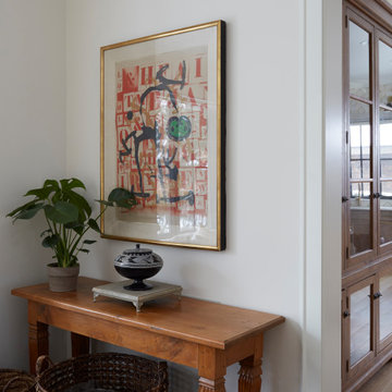
’ first, entirely new construction project in collaboration with GTH architects who designed the residence. KLI was responsible for all interior finishes, fixtures, furnishings, and design including the stairs, casework, interior doors, moldings and millwork. KLI also worked with the client on selecting the roof, exterior stucco and paint colors, stone, windows, and doors. The homeowners had purchased the existing home on a lakefront lot of the Valley Lo community in Glenview, thinking that it would be a gut renovation, but when they discovered a host of issues including mold, they decided to tear it down and start from scratch. The minute you look out the living room windows, you feel as though you're on a lakeside vacation in Wisconsin or Michigan. We wanted to help the homeowners achieve this feeling throughout the house - merging the causal vibe of a vacation home with the elegance desired for a primary residence. This project is unique and personal in many ways - Rebekah and the homeowner, Lorie, had grown up together in a small suburb of Columbus, Ohio. Lorie had been Rebekah's babysitter and was like an older sister growing up. They were both heavily influenced by the style of the late 70's and early 80's boho/hippy meets disco and 80's glam, and both credit their moms for an early interest in anything related to art, design, and style. One of the biggest challenges of doing a new construction project is that it takes so much longer to plan and execute and by the time tile and lighting is installed, you might be bored by the selections of feel like you've seen them everywhere already. “I really tried to pull myself, our team and the client away from the echo-chamber of Pinterest and Instagram. We fell in love with counter stools 3 years ago that I couldn't bring myself to pull the trigger on, thank god, because then they started showing up literally everywhere", Rebekah recalls. Lots of one of a kind vintage rugs and furnishings make the home feel less brand-spanking new. The best projects come from a team slightly outside their comfort zone. One of the funniest things Lorie says to Rebekah, "I gave you everything you wanted", which is pretty hilarious coming from a client to a designer.
Find the right local pro for your project
 Sosna Inc
This well-loved 1960’s split-level home was in need of a makeover both in terms of design and function!
OPEN CONCEPT
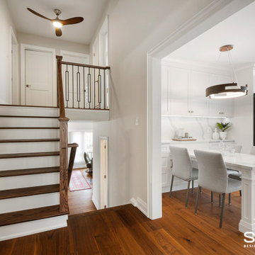
Our clients wanted an open-concept layout for their Lower-Level and Main Floor spaces. This was no easy feat, given that the split-level construction of this home isolated the Kitchen and Family Room from the rest of the house. But we rose to the challenge!
How did we do it?!
To bring more harmony to this 1960’s closed off split-level construction, we enlarged the entryways of the Kitchen and the Dining Room across the Hallway to brighten up the two rooms and allow for better traffic flow between them.
The worn out mixed flooring materials were replaced with new porcelain tiles in the Foyer and new beautiful engineered hardwood floors unified all three levels.
The 3 sets of staircases were updated for safety by raising the railing to Building Code Standards. Then they were redressed with new black metal pickets, Oak treads, posts and handrails.
KITCHEN
The tight kitchen with a dysfunctional layout was brought back to life with the creation of new dining and working zones and plenty of counter space and concealed storage.
How did we do it?!
A peninsula serving as the Breakfast table was installed along shallow-depth cabinetry as you enter the Kitchen. The fridge, stove and sink were relocated to the end of the Kitchen with big windows and more counter space. A row of tall pantries and an appliance garage were installed along one side of the room to offer plenty of storage and hide frequently used small appliances.
FAMILY ROOM
Our Clients spent a lot of time in their Family Room but felt isolated from the rest of the house when they were in it. The room was dim and the stone-clad wood burning fireplace, which they rarely used, took up a lot of space.
Here’s how we gave this Family Room a makeover
Removing dated wainscoting and wallpaper and replacing it with freshly painted walls in neutral tones with an accent colour catapulted this Family Room out of the stone ages!
The stone-clad fireplace in the middle of the room was removed and replaced with a slim electric fireplace at one end of the room. Add on the beautiful built-out clad with porcelain tiles and you’ve got a cozy and stylish reading nook.
When you and your home are ready for an upgrade, we're the Renovator You Can Count On™. It's our promise. Contact us to get started!

 Vetter Architects
A tea pot, being a vessel, is defined by the space it contains, it is not the tea pot that is important, but the space.
Crispin Sartwell
Located on a lake outside of Milwaukee, the Vessel House is the culmination of an intense 5 year collaboration with our client and multiple local craftsmen focused on the creation of a modern analogue to the Usonian Home.
As with most residential work, this home is a direct reflection of it’s owner, a highly educated art collector with a passion for music, fine furniture, and architecture. His interest in authenticity drove the material selections such as masonry, copper, and white oak, as well as the need for traditional methods of construction.
The initial diagram of the house involved a collection of embedded walls that emerge from the site and create spaces between them, which are covered with a series of floating rooves. The windows provide natural light on three sides of the house as a band of clerestories, transforming to a floor to ceiling ribbon of glass on the lakeside.
The Vessel House functions as a gallery for the owner’s art, motorcycles, Tiffany lamps, and vintage musical instruments – offering spaces to exhibit, store, and listen. These gallery nodes overlap with the typical house program of kitchen, dining, living, and bedroom, creating dynamic zones of transition and rooms that serve dual purposes allowing guests to relax in a museum setting.
Through it’s materiality, connection to nature, and open planning, the Vessel House continues many of the Usonian principles Wright advocated for.
Overview
Oconomowoc, WI
Completion Date
August 2015
Services
Architecture, Interior Design, Landscape Architecture

 The Leaders Realty
www.theleadersrealty.com/1909sharon, 1909 Sharon Lane A, Austin, TX 78703, 3 Beds, 2.5 Baths, 2,207 Sqft, $799,900, Live the downtown Austin lifestyle! Sleek Modern Design! Luxury Tarrytown condo nestled among the trees with deck and fenced yard. Light and bright condo with lots of windows, open floor plan, 3 beds, 2.5 baths, 2,207 sqft, 2 car carport, Bosch appliances (gas range, microwave, dishwasher), Rinnai tankless water heater, 5" white oak wood floors, large walk-in master closet, double sink vanities, recessed lighting, deco tile backsplash, Tpo roofing, 2x6 exterior walls, 3 cm Silestone quartz counters, dual zoned hvac (16 SEER), Milgard commercial windows and slider door, European style Grohe fixtures, stone wall with cedar privacy fence, professional landscaping, custom metal railing, custom painted cabinets, custom metal framing on front large windows, custom metal downspouts, spray foam insulation, siding and cmu wall, stained concrete floors, and center island with sink. Party wall constructed with 2 x 4” lumber filled with spray foam insulation with 1” airspace (vibration reducing element) on both sides of each unit. 2 layers of 5/8” fire wall + 3 layers of 5/8” sheetrock. Great location close to downtown Austin, Town Lake, Lake Austin, Westenfield park, Eilers park, Hula Hut, Deep Eddy, & more! Schools: Acclaimed Casis Elementary, O Henry Middle & Austin High School. For Showings Contact: Kristee Leonard, Broker, The Leaders Realty, 512-695-5144
 O'Brien Harris LLC
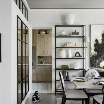
This project is new construction located in Hinsdale, Illinois. The scope included the kitchen, butler’s pantry, and mudroom. The clients are on the verge of being empty nesters and so they decided to right size. They came from a far more traditional home, and they were open to things outside of their comfort zone. O’Brien Harris Cabinetry in Chicago (OBH) collaborated on the project with the design team but especially with the builder from J. Jordan Homes. The architecture of this home is interesting and defined by large floor to ceiling windows. This created a challenge in the kitchen finding wall space for large appliances.
“In essence we only had one wall and so we chose to orient the cooking on that wall. That single wall is defined on the left by a window and on the right by the mudroom. That left us with another challenge – where to place the ovens and refrigerator. We then created a vertically clad wall disguising appliances which floats in between the kitchen and dining room”, says Laura O’Brien.
The room is defined by interior transom windows and a peninsula was created between the kitchen and the casual dining for separation but also for added storage. To keep it light and open a transparent brass and glass shelving was designed for dishes and glassware located above the peninsula.
The butler’s pantry is located behind the kitchen and between the dining room and a lg exterior window to front of the home. Its main function is to house additional appliances. The wall at the butler’s pantry portal was thickened to accommodate additional shelving for open storage. obrienharris.com


 Nix Group Architects
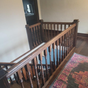
Openheimer-Montgomery Building - Historic Renovation and Remodel - Jim Nix - AIA - Austin Architect - Nix Group Architects – Residential and Commercial Architecture Firm - Austin Texas – 78701.
The historically landmarked two-story Openheimer-Montgomery Building constructed in 1894 in Austin, was completely renovated by our previous firm Shefelman and Nix Architects in 1981. Under the design effort of Jim Nix, the building was to serve as the firm’s new office upon completion. The first floor’s three bays were completely renovated into a large open lobby and conference room bay and two private office bays with restroom and break area. The second floor’s three bays were renovated into semi-open studio bays with restroom and break area. The firm also initiated and processed the building’s awarded Austin Historic Zoning and National Register Certification. The building’s final restoration and retrofit won both an Austin Chapter AIA “Honor Award” and a Heritage Society of Austin “Historic Preservation” Award. The building’s contemporary office and studio spaces, in its historic and downtown urban setting, has accommodated the firm ever since.
 Bradford Smith - High Rock Real Estate
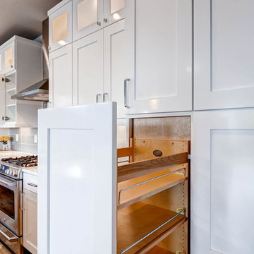
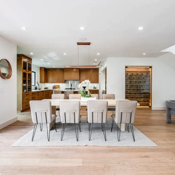
$8,000 Builder credit paid to you towards window coverings, closing costs or interest buy-down! Magazine quality kitchen w/ expensive high gloss white finish, frosted glass showcase and soft close / pull-out cabinetry * Upgraded touch faucet * Upgraded composite granite sink for durability * Upgraded GE Cafe SS appliances * Upgraded 4" solid hardwood flooring * Upgraded slimline fireplace * Upgraded tankless water heater for high efficiency* Upgraded solid core doors throughout (twice the price of standard hollow core) * Upgraded custom handmade wrought-iron rail / with butcher block wood stairsystem * Rec/Media Room w/ upgraded roll-up garage door double pane & insulated for energy efficiency * Expansive patio with panoramic unobstructed city skyline AND mountain views perfect for entertaining* Full wet bar w/ wine refrigerator, sink and storage * 4 bedroom potential (call broker for specs) * 2 car detached garage * Ample storage space in 14' garage and temp controlled 3' crawl space.

 Narofsky Architecture + ways2design
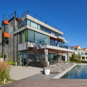
The site for this waterfront residence is located on the
Great Neck Peninsula, facing west to views of NYC and
the borough bridges. When purchased, there existed a
50-year-old house and pool structurally condemned
which required immediate removal. Once the site was
cleared, a year was devoted to stabilizing the seawall
and hill to accommodate the newly proposed home.
The lot size, shape and relationship to an easement
access road, overlaid with strict zoning regulations was
a key factor in the organization of the client’s program
elements. The arc contour of the easement road and
required setback informed the front facade shape,
which was designed as a privacy screen, as adjacent
homes are in close proximity. Due to strict height
requirements the house from the street appears to be
one story and then steps down the hill allowing for
three fully occupiable floors. The local jurisdiction also
granted special approval accepting the design of the
garage, within the front set back, as its roof is level with
the roadbed and fully landscaped. A path accesses a
hidden door to the bedroom level of the house. The
garage is accessed through a semicircular driveway
that leads to a depressed entry courtyard, offering
privacy to the main entrance.
The configuration of the home is a U-shape surrounding a
rear courtyard. This shape, along with suspended pods
assures water views to all occupants while not
compromising privacy from the adjacent homes.
The house is constructed on a steel frame, clad with fiber
cement, resin panels and an aluminum curtain wall
system. All roofs are accessible as either decks or
landscaped garden areas.
The lower level accesses decks, an outdoor kitchen, and
pool area which are perched on the edge of the upper
retaining wall.

 Michael Nash Design, Build & Homes
2010 NATIONAL NARI REGIONAL AWARD WINNER
Project Scope
The owners of this 7,000 square foot colonial in Oakton, Virginia, were seeking a multi-level Mediterranean-style indoor/outdoor living space off the back of their home. They turned to Michael Nash Design, Build & Homes for a design solution that would include a stone patio, a second-story deck, a screened-in porch and linking staircases.
While the structure was designed primarily for family dining and entertaining, it also had to accommodate periodic social gatherings of one hundred guests or more. To meet these needs, the project would include a fully-equipped outdoor kitchen, several serving counters with permanent refrigeration, and well-delineated socializing and dining zones.
The existing home’s setting offered several impressive assets the new outdoor living area was designed to exploit. The sprawling acreage features old stand trees, wooded paths and a private lake. Beautifully landscaped, it unfolds as an idyllic panorama that naturally draws people to the outdoors.
Challenges
Since the rear elevation was situated on a slope that drops away from the house, the Michael Nash team had to raise the grade two feet within in a 2,000 square foot area extending out from the back of the house. Infrastructure plans also called for a sophisticated drainage system that had to accommodate a whole series of water “runoff” considerations to be integrated into the decking itself. Excavation included constructing retaining walls to bolster the elevated grade—which also had to support a concrete slab, the primary foundation for the entire complex.
Solutions
The ground level decking consists of a 2,000 square foot flagstone patio level with the home’s lower level doors. There is a decorative water fountain mid-patio—an ornate collectible acquired in Florida. Food preparation is concentrated within a specially designed semi-circular wall that creates an “outdoor kitchen” equipped with a 60” Viking barbecue grill, a prep sink, a warming drawer, refrigerator and appropriate storage. There is a granite surfaced dining counter with seating for eight.
Wrought iron railing and approximately 20 decorative columns (some encasing steel vertical supports) are incorporated into the design scheme. Many of the columns house accent lights.
The top level—supported by horizontal steel beams– is a 2,500 square foot deck constructed entirely of Trex decking. The open air decking is, again, directly accessible from rooms on the second level of the house including the kitchen, sunroom and family room.
The platform’s most prominent feature is a U-shaped “kitchenette” with cedar shake shingle roofing. Like its counterpart one level below, the facility is equipped with grill, refrigerator and stainless steel cabinetry.
One portion of the deck has been allocated for a 16’ x 16’ octagonal screened-in porch crowned by a pair of 2’ x 4’ skylights. The porch can be accessed from the home’s conservatory via a set of French doors. With its mosaic tile flooring, stained cedar panel ceiling and honed granite counters, the interior is elegant and calming. Hand-painted stenciling and a wall-mounted water feature provide distinctive detailing.
Finally, the design introduced elements to highlight and reinforce an awareness of the lovely bucolic setting. Fountains and water features combined with textured surfaces and mosaic tiling and backsplashes to present a villa-like ambiance well-suited to the Virginia countryside.

 Innovate Building Solutions
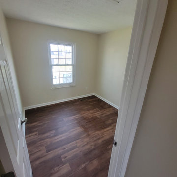
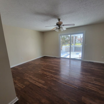
Ceramic wood floors create a rustic look without the maintenance of wood. Their larger format also minimizes grout joints.
Example of a mid-sized trendy kids' gray tile and ceramic tile ceramic tile doorless shower design in Columbus with an undermount sink, furniture-like cabinets, dark wood cabinets, marble countertops and gray walls
Example of a mid-sized trendy kids' gray tile and ceramic tile ceramic tile doorless shower design in Columbus with an undermount sink, furniture-like cabinets, dark wood cabinets, marble countertops and gray walls

 ING Construction
This kitchen pairs warm wood with sleek, modern surfaces for a look that is both inviting and polished. Flat-front lower cabinets in a rich walnut-style finish carry slim black edge pulls, and they contrast beautifully with the high-gloss cream upper cabinets, which run up toward the ceiling with a clean, handleless look. The two-tone approach adds depth and keeps the room from feeling heavy.
A dark, textured stone countertop with a leathered or honed finish gives the work surfaces a durable, matte presence. Above it, a backsplash of narrow, glossy stacked-mosaic tile in soft gray adds shimmer and fine texture, and under-cabinet lighting washes across it to bring out the detail. A brushed nickel pre-rinse style faucet with a spring neck sits over an undermount stainless sink, and a stainless steel double-drawer dishwasher is tucked neatly into the cabinet run, a smart, space-saving choice. At the right, a stainless steel range with a gas cooktop anchors the cooking zone.
Wide-plank oak flooring with natural variation in tone runs underfoot and carries into the adjoining hallway, adding warmth and tying the kitchen to the rest of the home. Recessed lighting keeps the whole space bright and evenly lit.
 Designs by BSB
This project aimed to cater to a multigenerational family that occupies the main floor of their home, with the kitchen being the central hub. With four adults passionate about cooking and entertaining, it was staged to be a unique project!
The primary aim was to enhance kitchen traffic flow and functionality, which was accomplished by introducing a nine-foot island with various features: trash/recycle, microwave, and storage for mixing bowls, utensils, and knives.
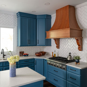
The range top was elegantly positioned at the kitchen's end, framed by a stylish cherry hood with sweeping curves and a classic herringbone tile pattern. This naturally formed a captivating focal point in the room. During the construction, we faced a hurdle due to a cross beam obstructing ceiling venting.
The formal dining room had two closely spaced doors, one from the kitchen and one from the hallway. To create a more functional pantry space and provide space for wall ovens, the kitchen entry was closed off. A highly efficient scullery-style pantry was designed with a 96” opening with 48" wide bi-passing doors; it features dedicated countertop zones for various large appliances that would be challenging to lift out of a cabinet.
The bookshelves were carefully designed to emphasize balance between the refrigerator and ovens, enhancing the flow and overall continuity of the expanded kitchen. The homeowner's vast cookbook collection, along with a few tchotchkes, adds personal character and color to the space. While this design element removed the option for a countertop next to the refrigerator and ovens, the homeowners were very comfortable with the sizeable adjacent island, which provides an ample landing zone.
Finally, the most daring choice is a bold blue hue. This topped with crisp white quartz countertops and warm cherry features, beautifully reflects the vibrant and joyful life of the family.
The spacious nook area transformed into an ideal indoor entertainment space that seamlessly complements gatherings inside and out. The choice of cherry cabinets, paired with striking black quartz countertops, was deliberate, as it added warmth to the area and established a solid connection to the stunning outdoor views.
Articulating arm sconces not only provided illumination but also highlighted the eclectic tiki-style glassware displayed on the floating shelves. Pendant lights strategically placed in front of each window improved countertop functionality, while the ceiling fan's light served as ambient illumination. The arm sconces, together with the brass-finished pendants, contributed to a cohesive design, extending the lighting theme from the adjacent nook area.
The old desk area provided the perfect space for an extended pantry and appliance workstation.
The extensive amount of cookbooks brought personalization, color, and texture to their new kitchen.
 Powell Construction
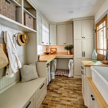
This charming mudroom was part of a larger main level remodel. Right off the wraparound porch and leading into new kitchen, this multipurpose mudroom serves as the family’s entry and has everything they need for ease of living. Balancing function and style, we designed this space custom fit for this family & their cherished pets!
As a utilitarian space, we meticulously considered every detail to maximize the storage and versatility of this space. A mix of tall storage cabinets and upper cabinets provide a wide range of options for this family. The ample counter space doubles as a landing zone for mail or for folding laundry, while the open under counter space is used for laundry hampers and dog crates…there’s even a custom pullout bin for their pet food. The built-in hall tree has open storage above, shaker-style peg rail for coats and purses, and a bench seat for slipping shoes on or off. A stunning utility sink with industrial faucet is the perfect place to wash up after a day spent working in the garden.
Second to function, we made sure that this mudroom was stylish too! The bead board cabinet details, oil- rubbed bronze hardware, brick floor, and maple butcher block counters combine to deliver the hints of New England that this family was inspired by. This room establishes the aesthetic for the rest of the home. The greige color chosen for the mudroom cabinetry is consistent with the contrasting trim and door color we used throughout the home. A new exterior door was installed that echoes the style carried throughout the rest of the home and is stained a complimentary tone. All these touches contribute to a completely refreshed and cohesive look for this beautiful home.
 Vetter Architects
A tea pot, being a vessel, is defined by the space it contains, it is not the tea pot that is important, but the space.
Crispin Sartwell
Located on a lake outside of Milwaukee, the Vessel House is the culmination of an intense 5 year collaboration with our client and multiple local craftsmen focused on the creation of a modern analogue to the Usonian Home.
As with most residential work, this home is a direct reflection of it’s owner, a highly educated art collector with a passion for music, fine furniture, and architecture. His interest in authenticity drove the material selections such as masonry, copper, and white oak, as well as the need for traditional methods of construction.
The initial diagram of the house involved a collection of embedded walls that emerge from the site and create spaces between them, which are covered with a series of floating rooves. The windows provide natural light on three sides of the house as a band of clerestories, transforming to a floor to ceiling ribbon of glass on the lakeside.
The Vessel House functions as a gallery for the owner’s art, motorcycles, Tiffany lamps, and vintage musical instruments – offering spaces to exhibit, store, and listen. These gallery nodes overlap with the typical house program of kitchen, dining, living, and bedroom, creating dynamic zones of transition and rooms that serve dual purposes allowing guests to relax in a museum setting.
Through it’s materiality, connection to nature, and open planning, the Vessel House continues many of the Usonian principles Wright advocated for.
Overview
Oconomowoc, WI
Completion Date
August 2015
Services
Architecture, Interior Design, Landscape Architecture
 Vetter Architects
The client’s request was quite common - a typical 2800 sf builder home with 3 bedrooms, 2 baths, living space, and den. However, their desire was for this to be “anything but common.” The result is an innovative update on the production home for the modern era, and serves as a direct counterpoint to the neighborhood and its more conventional suburban housing stock, which focus views to the backyard and seeks to nullify the unique qualities and challenges of topography and the natural environment.
The Terraced House cautiously steps down the site’s steep topography, resulting in a more nuanced approach to site development than cutting and filling that is so common in the builder homes of the area. The compact house opens up in very focused views that capture the natural wooded setting, while masking the sounds and views of the directly adjacent roadway. The main living spaces face this major roadway, effectively flipping the typical orientation of a suburban home, and the main entrance pulls visitors up to the second floor and halfway through the site, providing a sense of procession and privacy absent in the typical suburban home.
Clad in a custom rain screen that reflects the wood of the surrounding landscape - while providing a glimpse into the interior tones that are used. The stepping “wood boxes” rest on a series of concrete walls that organize the site, retain the earth, and - in conjunction with the wood veneer panels - provide a subtle organic texture to the composition.
The interior spaces wrap around an interior knuckle that houses public zones and vertical circulation - allowing more private spaces to exist at the edges of the building. The windows get larger and more frequent as they ascend the building, culminating in the upstairs bedrooms that occupy the site like a tree house - giving views in all directions.
The Terraced House imports urban qualities to the suburban neighborhood and seeks to elevate the typical approach to production home construction, while being more in tune with modern family living patterns.
Overview:
Elm Grove
Size:
2,800 sf,
3 bedrooms, 2 bathrooms
Completion Date:
September 2014
Services:
Architecture, Landscape Architecture
Interior Consultants: Amy Carman Design
 Aloha Kitchen, Bath & Design
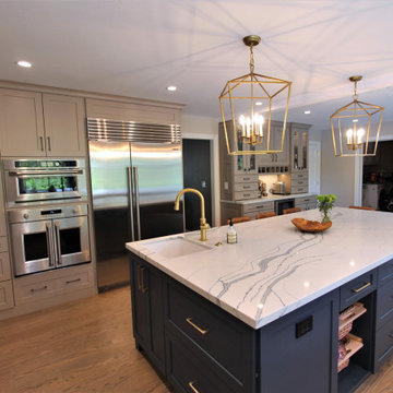
What used to be a dated 1980's u-shaped kitchen without any flow or interest is now an open and inviting gathering space with plenty of room to cook and for everyone to sit or walk around. We squared off the bay window area making cabinets with drawers and pull-outs a possibility, plus the extra deep sink cabinet has room for a filtered water/carbonated water system. The side windows are easy to reach, and one is a pass through to the BBQ area.
The island doubles as a large dining table and has a prep sink that can also be used by the bar area and refrigerator/microwave/leftovers area without bothering the chef. Also in the island is a Perlick ice maker, wicker pull out baskets for fruits and vegetable and an open bookcase for cookbooks and to tuck away school/homework supplies. All the tall items like the refrigerator, pantry and wall ovens are grouped together to one side to keep the room from getting too choppy.
The bar area has a beverage refrigerator and liquor and stemware storage but also has a charging station and drop zone storage since it is next to the door coming from the garage. (Photo credit; Shawn Lober Construction)
 ING Construction
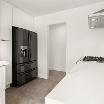
This corner of the kitchen shows how well the storage and cooking zones work together. A black stainless steel French-door refrigerator with a bottom freezer drawer and an exterior water and ice dispenser sits within a surround of white shaker cabinetry. Tall pantry cabinets on one side and upper cabinets reaching the ceiling above add generous storage, and the dark finish makes a bold contrast against the white.
On the right, a gas cooktop with cast-iron grates sits in a bright quartz-style countertop with soft, subtle veining, beneath a stainless steel wall-mounted hood with integrated lighting. The backsplash of long, handmade-look subway tile in soft cream and beige tones adds warmth and texture, and the varied glazes give the wall depth. Slim matte black pulls on the cabinet doors and drawers tie in with the refrigerator’s finish.
A gray stone-look tile floor grounds the space and leads to a cased doorway at the back, which connects the kitchen to the rest of the home.
176