
Search results for "Continual" in Home Design Ideas
 Wilson Lighting
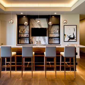
Inspiration for a large contemporary l-shaped medium tone wood floor and brown floor seated home bar remodel in Kansas City with open cabinets, black cabinets, multicolored backsplash, an undermount sink, granite countertops and stone slab backsplash
 Risinger Homes
Casey Dunn
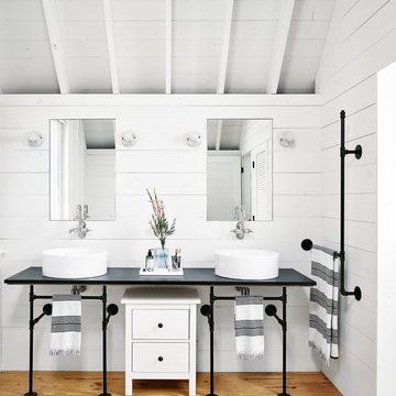
Example of a mid-sized farmhouse light wood floor bathroom design in Austin with white cabinets, white walls and a vessel sink
Example of a mid-sized farmhouse light wood floor bathroom design in Austin with white cabinets, white walls and a vessel sink
 Milgard Windows & Doors
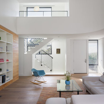
The Kiguchi family moved into their Austin, Texas home in 1994. Built in the 1980’s as part of a neighborhood development, they happily raised their family here but longed for something more contemporary. Once they became empty nesters, they decided it was time for a major remodel. After spending many years visiting Austin AIA Home Tours that highlight contemporary residential architecture, they had a lot of ideas and in 2013 were ready to interview architects and get their renovation underway.
The project turned into a major remodel due to an unstable foundation. Architects Ben Arbib and Ed Hughey, of Arbib Hughey Design were hired to solve the structural issue and look for inspiration in the bones of the house, which sat on top of a hillside and was surrounded by great views.
Unfortunately, with the old floor plan, the beautiful views were hidden by small windows that were poorly placed. In order to bring more natural light into the house the window sizes and configurations had to be addressed, all while keeping in mind the homeowners desire for a modern look and feel.
To achieve a more contemporary and sophisticated front of house, a new entry was designed that included removing a two-story bay window and porch. The entrance of the home also became more integrated with the landscape creating a template for new foliage to be planted. Older exterior materials were updated to incorporate a more muted palette of colors with a metal roof, dark grey siding in the back and white stucco in the front. Deep eaves were added over many of the new large windows for clean lines and sun protection.
“Inside it was about opening up the floor plan, expanding the views throughout the house, and updating the material palette to get a modern look that was also warm and inviting,” said Ben from Arbib Hughey Design. “Prior to the remodel, the house had the typical separation of rooms. We removed the walls between them and changed all of the windows to Milgard Thermally Improved Aluminum to connect the inside with the outside. No matter where you are you get nice views and natural light.”
The architects wanted to create some drama, which they accomplished with the window placement and opening up the interior floor plan to an open concept approach. Cabinetry was used to help delineate intimate spaces. To add warmth to an all-white living room, white-washed oak wood floors were installed and pine planks were used around the fireplace. The large windows served as artwork bringing the color of nature into the space.
An octagon shaped, elevated dining room, (named “the turret”), had a big impact on the design of the house. They architects rounded the corners and added larger window openings overlooking a new sunken garden. The great room was also softened by rounding out the corners and that circular theme continued throughout the house, being picked up in skylight wells and kitchen cabinetry. A staircase leading to a catwalk was added and the result was a two-story window wall that flooded the home with natural light.
When asked why Milgard® Thermally Improved Aluminum windows were selected, the architectural team listed many reasons:
1) Aesthetics: “We liked the slim profiles and narrow sightlines. The window frames never get in the way of the view and that was important to us. They also have a very contemporary look that went well with our design.”
2) Options: “We liked that we could get large sliding doors that matched the windows, giving us a very cohesive look and feel throughout the project.”
3) Cost Effective: “Milgard windows are affordable. You get a good product at a good price.”
4) Custom Sizes: “Milgard windows are customizable, which allowed us to get the right window for each location.”
Ready to take on your own traditional to modern home remodeling project? Arbib Hughey Design advises, “Work with a good architect. That means picking a team that is creative, communicative, listens well and is responsive. We think it’s important for an architect to listen to their clients and give them something they want, not something the architect thinks they should have. At the same time you want an architect who is willing and able to think outside the box and offer up design options that you may not have considered. Design is about a lot of back and forth, trying out ideas, getting feedback and trying again.”
The home was completely transformed into a unique, contemporary house perfectly integrated with its site. Internally the home has a natural flow for the occupants and externally it is integrated with the surroundings taking advantage of great natural light. As a side note, it was highly praised as part of the Austin AIA homes tour.
Find the right local pro for your project
 Mary Cook
JE Evans Photography (Columbus, OH)
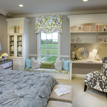
Inspiration for a transitional carpeted bedroom remodel in Columbus with beige walls
Inspiration for a transitional carpeted bedroom remodel in Columbus with beige walls
 V.I.Photography & Design
Vincent Ivicevic
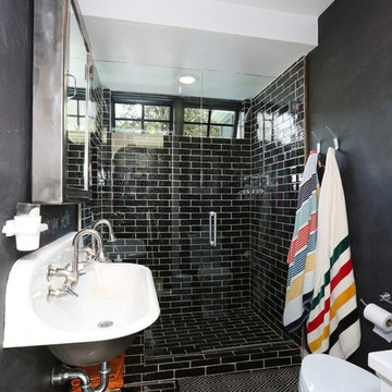
Inspiration for a small contemporary 3/4 black tile bathroom remodel in Orange County with a trough sink, black walls and a hinged shower door
Inspiration for a small contemporary 3/4 black tile bathroom remodel in Orange County with a trough sink, black walls and a hinged shower door
 CI DESIGN + BUILD
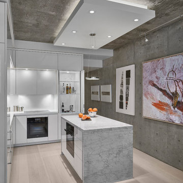
Within the scope of the project we were asked to completely redesign a Master Suite and Kitchen in a 1400 sf residence. The home is essentially an art gallery as the owner continues to grow his collection of modern art. The inspiration for our design was to create a sleek White palette to showcase the collection. The white cabinets, light floors, marble counter top and backlit floating panels really let the Art pop. The bar and wine fridge can be hidden when not entertaining to keep the sleek design. The Kitchen plays well off the master bath with refined design, clean lines and white palette.
Photos by: Tony Soluri

 Fabien Charuau Photography
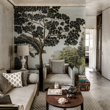
Living room - mediterranean concrete floor living room idea in Mumbai with gray walls
 Godwin Residential Construction
© Wing Wong
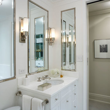
This two bedroom apartment on New York's Upper West Side underwent a gut renovation to allow continuous sight lines and views in three directions: east to Central Park, north to the George Washington Bridge, and east to the Hudson River. The master bedroom was reconfigured to create an adjacent study with two exposures. Mondrian-inspired pocket doors allow light to penetrate the apartment while also providing a private study. The project was completed in an accelerated time frame and within a strict budget.
 La Casa Builders Inc.
Dino Tonn Photography, Inc.
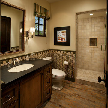
Inspiration for a mid-sized mediterranean 3/4 brick floor alcove shower remodel in Phoenix with an undermount sink, dark wood cabinets, beige walls and a two-piece toilet
Inspiration for a mid-sized mediterranean 3/4 brick floor alcove shower remodel in Phoenix with an undermount sink, dark wood cabinets, beige walls and a two-piece toilet
 DISC Interiors
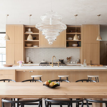
Kitchen in Santa Monica designed by DISC Interiors
Inspiration for a scandinavian eat-in kitchen remodel in Los Angeles with flat-panel cabinets, light wood cabinets, white backsplash, an island, ceramic backsplash and paneled appliances
Inspiration for a scandinavian eat-in kitchen remodel in Los Angeles with flat-panel cabinets, light wood cabinets, white backsplash, an island, ceramic backsplash and paneled appliances
 Esslinger Design Company
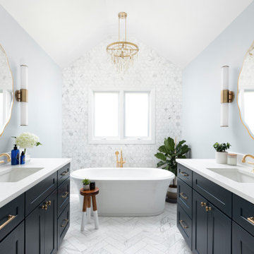
Bathroom - large transitional master white tile and marble tile marble floor, white floor, single-sink and vaulted ceiling bathroom idea in Chicago with shaker cabinets, blue cabinets, blue walls, an undermount sink, quartz countertops, a hinged shower door, white countertops, a niche and a built-in vanity
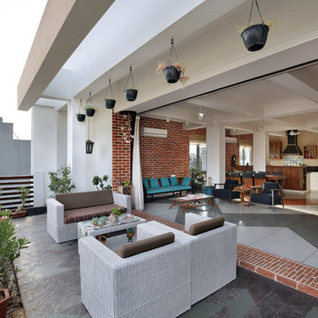

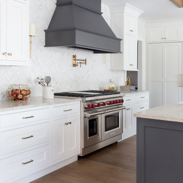
 IT'S ORGANIZED
This stunning kitchen features excellent storage so very little needs to live on the counters. Select items for display or easy access are situated there. However, even behind closed doors, the organization continues with logical groupings and plenty of clear labels!
 Kitchen Design Concepts
We introduce to you one of our newer services we are providing here at Kitchen Design Concepts: spaces that just need a little reviving! As of recent, we are taking on projects that are in need of minimal updating, as in, spaces that don’t need a full-on remodel. Yes, you heard right! If your space has good bones, you like the layout of your kitchen, and you just need a few cosmetic changes, then today’s feature is for you! Recently, we updated a space where we did just this! The kitchen was in need of a little love, some fresh paint, and new finishes. And if we’re being honest here, the result looks almost as if the kitchen had a full-on remodel! To learn more about this space and how we did our magic, continue reading below:
The Before and After
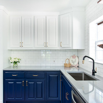
First, see what an impact new finishes can make! The “before” image shows a kitchen with outdated finishes such as the tile countertops, backsplash, and cabinetry finish. The “after” image, is a kitchen that looks almost as if its brand new, the image speaks for itself!
Cabinetry
With the wooden cabinetry in this kitchen already having great bones, all we needed to do was our refinishing process that involved removing door and drawer fronts, sanding, priming, and painting. The main color of the cabinetry is white (Sherwin Williams Pure White 7005) and as an accent, we applied a deep navy blue that really pops in this space (Sherwin Willaims Naval 6244). As a special design element, we incorporated a natural wooden band across the hood which is subtle but adds an element of surprise.
Countertops
The original countertops in this space were a 12×12 tile with cracks and discolored grout from all the wear and tear. To replace the countertops, we installed a clean and crisp quartz that is not only durable but easy to maintain (no grout here!). The 3cm countertops are a Cambria quartz in a grey-tone color (Carrick).
Backsplash
Keeping things simple, yet classic, we installed a 3×6 subway tile from Interceramic. The crisp white pairs well with all the other finishes of the space and really brighten the space up! To spice things up, we paired the white tile with a contrasting grout color (Cape Grey) that matches the countertop. This is a simple method to add interest to your white backsplash!
Fixtures and Fittings
For the fixtures and fittings of the kitchen, we wanted pieces that made a statement. That’s why we selected this industrial style faucet from Brizo! The faucet is a Brizo LITZE™ PULL-DOWN FAUCET WITH ARC SPOUT AND INDUSTRIAL HANDLE (63044LF-BLGL). The matte black paired with the luxe gold elements really make a statement! To match the gold elements of the faucet, we installed cabinetry hardware from Topknobs in the same gold finish. The hardware is a Channing pull TK743HB. Lastly, the large single bowl sink (who doesn’t want a large sink?!) is a great functional touch to the kitchen. The sink is a Blanco Precision 16″ R10 super single with 16″ Drainer in stainless steel (516216).
 LKID
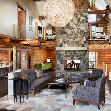
LKIDLiving room - rustic dark wood floor living room idea in Denver with a two-sided fireplace and a stone fireplace
 HomeBuild
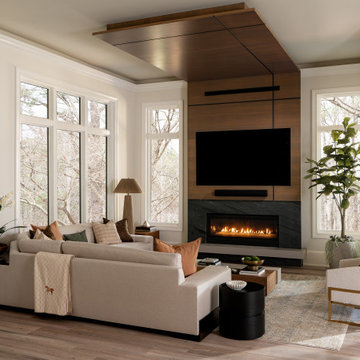
Mid-century modern gray floor living room photo in Raleigh with white walls and a ribbon fireplace
 kelly mcguill home
master bathroom
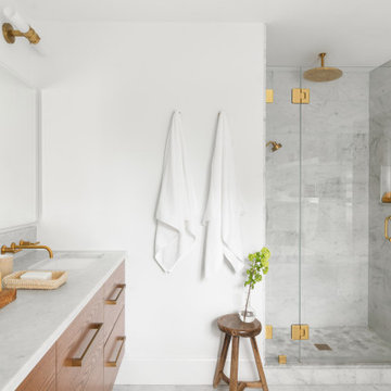
Transitional gray floor alcove shower photo in Boston with flat-panel cabinets, medium tone wood cabinets, white walls, an undermount sink and gray countertops
Transitional gray floor alcove shower photo in Boston with flat-panel cabinets, medium tone wood cabinets, white walls, an undermount sink and gray countertops
 StudioLAB
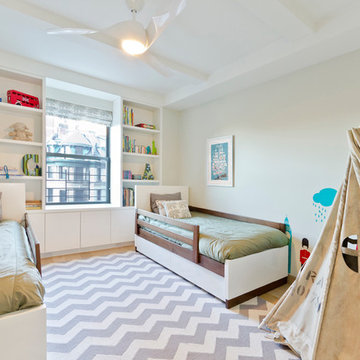
Steps from Riverside Park, the existing apartment had previously not been renovated for 30 years and was in dire need of a complete overhaul. StudioLAB was presented with the challenge of re-designing the space to fit a modern family’s lifestyle today with the flexibility to adjust as they evolve into their tomorrow. The existing formal closed kitchen and dining room were combined and opened up to allow the owners to entertain in an open living environment and allow natural light to permeate throughout different exposures of the apartment. Bathrooms were gutted, enlarged and reconfigured. Central air conditioning was added with minimal ducting as to be hidden and not seem clunky. Built-in bookshelves run the length of the perimeter walls below windows, concealing radiators and providing extra valuable storage in every room. A neutral color palette, minimalist details, and refined materials create a warm, modern atmosphere. Light brown oak veneered archways as well as LED cove ceilings are used to separate programmatic spaces visually without the use of physical partitions. A charcoal stained cube built-in was designed with in the foyer to create deep storage while continuing into the kitchen to hide the built-in refrigerator and pantry visually connecting the two spaces. The family’s two children share one large bedroom in order to create a playroom in the other which can also serves as a guest room when needed. The master bedroom features a full height grey stained ash veneered wall unit that serves as the predominant clothes storage. A panel housing the TV slides to reveal more clothes storage behind. To utilize the exiting formal maid’s room behind the kitchen, a small study and powder room were created that house laundry machines as well.
 Mel McDaniel Design
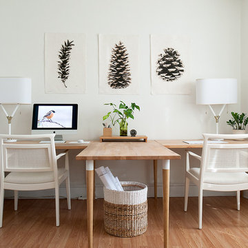
shared desk space for designer and assistant
Photo by Rebecca McAlpin
Study room - mid-sized transitional freestanding desk medium tone wood floor and beige floor study room idea in Philadelphia with white walls
Study room - mid-sized transitional freestanding desk medium tone wood floor and beige floor study room idea in Philadelphia with white walls
137