
Search results for "Continual" in Home Design Ideas
 Madison Creek Furnishings & Design
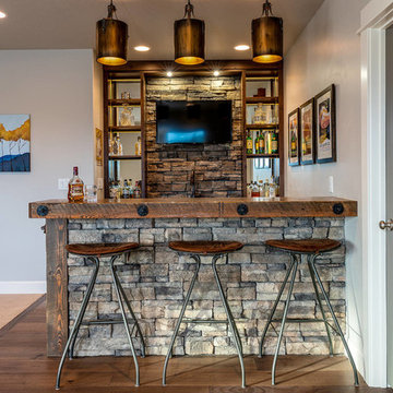
Wet bar - rustic galley medium tone wood floor and brown floor wet bar idea in Other with open cabinets, wood countertops, gray backsplash, stone tile backsplash and brown countertops
 Barker Associates Architecture Office
Francis Dzikowski/Esto
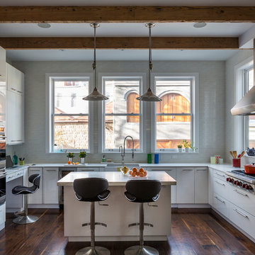
Trendy u-shaped dark wood floor kitchen photo in New York with an undermount sink, flat-panel cabinets, white cabinets, stainless steel appliances and an island
Trendy u-shaped dark wood floor kitchen photo in New York with an undermount sink, flat-panel cabinets, white cabinets, stainless steel appliances and an island
 Mosaic Architects SF
Jim Bartsch
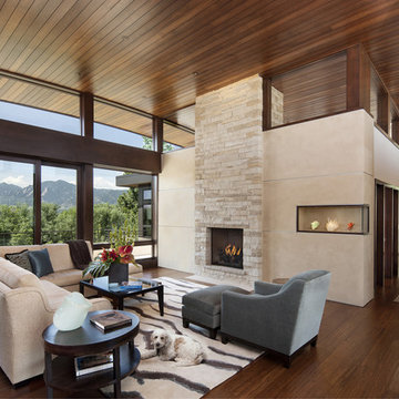
Example of a trendy open concept dark wood floor living room design in San Francisco with beige walls, a stone fireplace and no tv
Example of a trendy open concept dark wood floor living room design in San Francisco with beige walls, a stone fireplace and no tv
Find the right local pro for your project
 Flavin Architects
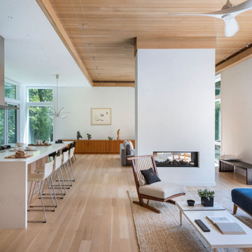
Our clients wanted to replace an existing suburban home with a modern house at the same Lexington address where they had lived for years. The structure the clients envisioned would complement their lives and integrate the interior of the home with the natural environment of their generous property. The sleek, angular home is still a respectful neighbor, especially in the evening, when warm light emanates from the expansive transparencies used to open the house to its surroundings. The home re-envisions the suburban neighborhood in which it stands, balancing relationship to the neighborhood with an updated aesthetic.
The floor plan is arranged in a “T” shape which includes a two-story wing consisting of individual studies and bedrooms and a single-story common area. The two-story section is arranged with great fluidity between interior and exterior spaces and features generous exterior balconies. A staircase beautifully encased in glass stands as the linchpin between the two areas. The spacious, single-story common area extends from the stairwell and includes a living room and kitchen. A recessed wooden ceiling defines the living room area within the open plan space.
Separating common from private spaces has served our clients well. As luck would have it, construction on the house was just finishing up as we entered the Covid lockdown of 2020. Since the studies in the two-story wing were physically and acoustically separate, zoom calls for work could carry on uninterrupted while life happened in the kitchen and living room spaces. The expansive panes of glass, outdoor balconies, and a broad deck along the living room provided our clients with a structured sense of continuity in their lives without compromising their commitment to aesthetically smart and beautiful design.
 Corynne Pless
Photo: Corynne Pless © 2013 Houzz
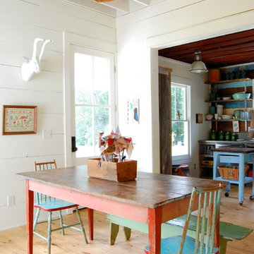
Dining room - cottage dining room idea in New York with white walls
Dining room - cottage dining room idea in New York with white walls
 dSPACE Studio Architecture
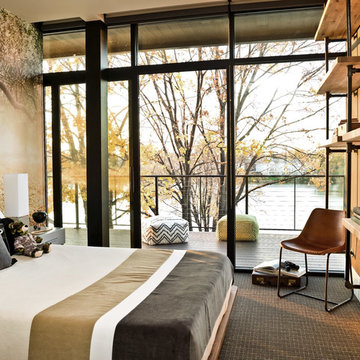
Kid's Bedroom with walk out balcony.
Inspiration for a mid-sized contemporary guest carpeted bedroom remodel in Chicago with brown walls
Inspiration for a mid-sized contemporary guest carpeted bedroom remodel in Chicago with brown walls

 Tom Archer Custom Homes & Design, LLC
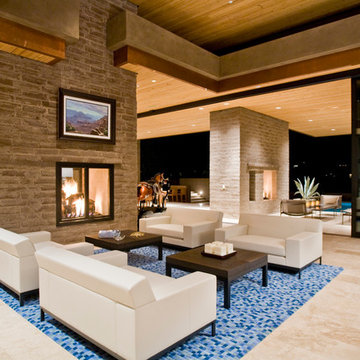
Living room - modern open concept and formal living room idea in Phoenix with a two-sided fireplace and a brick fireplace
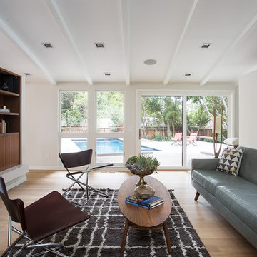
 Klopf Architecture
The owners of this property had been away from the Bay Area for many years, and looked forward to returning to an elegant mid-century modern house. The one they bought was anything but that. Faced with a “remuddled” kitchen from one decade, a haphazard bedroom / family room addition from another, and an otherwise disjointed and generally run-down mid-century modern house, the owners asked Klopf Architecture and Envision Landscape Studio to re-imagine this house and property as a unified, flowing, sophisticated, warm, modern indoor / outdoor living space for a family of five.
Opening up the spaces internally and from inside to out was the first order of business. The formerly disjointed eat-in kitchen with 7 foot high ceilings were opened up to the living room, re-oriented, and replaced with a spacious cook's kitchen complete with a row of skylights bringing light into the space. Adjacent the living room wall was completely opened up with La Cantina folding door system, connecting the interior living space to a new wood deck that acts as a continuation of the wood floor. People can flow from kitchen to the living / dining room and the deck seamlessly, making the main entertainment space feel at once unified and complete, and at the same time open and limitless.
Klopf opened up the bedroom with a large sliding panel, and turned what was once a large walk-in closet into an office area, again with a large sliding panel. The master bathroom has high windows all along one wall to bring in light, and a large wet room area for the shower and tub. The dark, solid roof structure over the patio was replaced with an open trellis that allows plenty of light, brightening the new deck area as well as the interior of the house.
All the materials of the house were replaced, apart from the framing and the ceiling boards. This allowed Klopf to unify the materials from space to space, running the same wood flooring throughout, using the same paint colors, and generally creating a consistent look from room to room. Located in Lafayette, CA this remodeled single-family house is 3,363 square foot, 4 bedroom, and 3.5 bathroom.
Klopf Architecture Project Team: John Klopf, AIA, Jackie Detamore, and Jeffrey Prose
Landscape Design: Envision Landscape Studio
Structural Engineer: Brian Dotson Consulting Engineers
Contractor: Kasten Builders
Photography ©2015 Mariko Reed
Staging: The Design Shop
Location: Lafayette, CA
Year completed: 2014
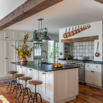
 Cummings Architecture + Interiors
With expansive fields and beautiful farmland surrounding it, this historic farmhouse celebrates these views with floor-to-ceiling windows from the kitchen and sitting area. Originally constructed in the late 1700’s, the main house is connected to the barn by a new addition, housing a master bedroom suite and new two-car garage with carriage doors. We kept and restored all of the home’s existing historic single-pane windows, which complement its historic character. On the exterior, a combination of shingles and clapboard siding were continued from the barn and through the new addition.
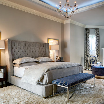
 Wesley-Wayne Interiors, LLC
We continued the gray, blue and gold color palette into the master bedroom. Custom bedding and luxurious shag area rugs brought sophistication, while placing colorful floral accents around the room made for an inviting space.
Design: Wesley-Wayne Interiors
Photo: Stephen Karlisch
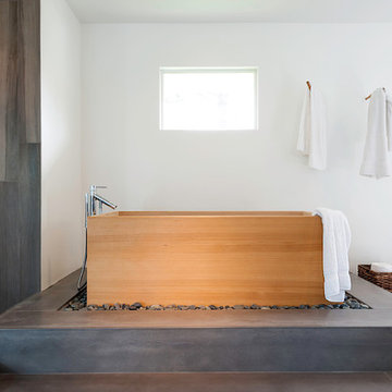
 KW Designs
Nader Essa Photography
Large minimalist master gray tile slate floor bathroom photo in San Diego with white walls
Large minimalist master gray tile slate floor bathroom photo in San Diego with white walls
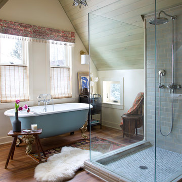
 Andrea Schumacher Interiors
Emily Minton Redfield
Inspiration for an eclectic gray tile medium tone wood floor bathroom remodel in Denver with beige walls
Inspiration for an eclectic gray tile medium tone wood floor bathroom remodel in Denver with beige walls
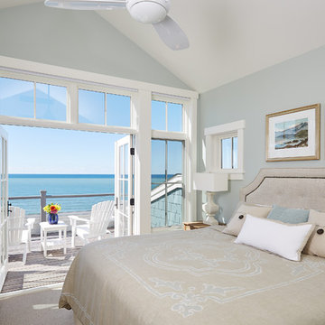
 Visbeen Architects
Designed with an open floor plan and layered outdoor spaces, the Onaway is a perfect cottage for narrow lakefront lots. The exterior features elements from both the Shingle and Craftsman architectural movements, creating a warm cottage feel. An open main level skillfully disguises this narrow home by using furniture arrangements and low built-ins to define each spaces’ perimeter. Every room has a view to each other as well as a view of the lake. The cottage feel of this home’s exterior is carried inside with a neutral, crisp white, and blue nautical themed palette. The kitchen features natural wood cabinetry and a long island capped by a pub height table with chairs. Above the garage, and separate from the main house, is a series of spaces for plenty of guests to spend the night. The symmetrical bunk room features custom staircases to the top bunks with drawers built in. The best views of the lakefront are found on the master bedrooms private deck, to the rear of the main house. The open floor plan continues downstairs with two large gathering spaces opening up to an outdoor covered patio complete with custom grill pit.
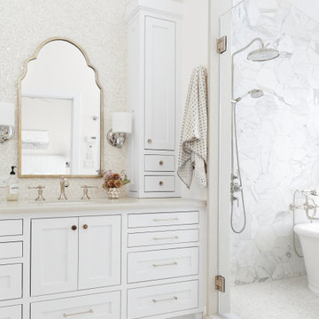
 KBG Design
Mid-sized beach style master white tile and mosaic tile white floor and marble floor bathroom photo in San Francisco with shaker cabinets, white cabinets, white walls, an undermount sink, gray countertops, quartz countertops and a hinged shower door
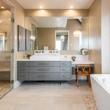
 Living Stone Design + Build
The midcentury modern bathroom at the Sennett Residence in Asheville, NC showcases a blend of elegance and functionality, designed by Living Stone Design + Build. Featuring sleek lines, high-quality fixtures, and natural materials, this beautifully designed space emphasizes comfort and style, creating a serene sanctuary that reflects a harmonious connection to the surrounding environment.
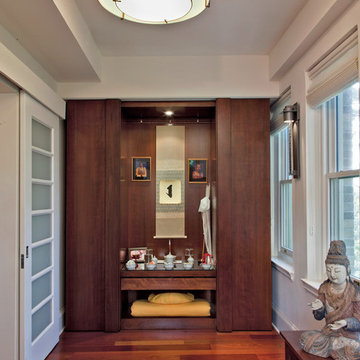
 Gardner Architects LLC
Photography by Ken Wyner
2101 Connecticut Avenue (c.1928), an 8-story brick and limestone Beaux Arts style building with spacious apartments, is said to have been “the finest apartment house to appear in Washington between the two World Wars.” (James M. Goode, Best Addresses, 1988.) As advertised for rent in 1928, the apartments were designed “to incorporate many details that would aid the residents in establishing a home atmosphere, one possessing charm and dignity usually found only in a private house… the character and tenancy (being) assured through careful selection of guests.” Home to Senators, Ambassadors, a Vice President and a Supreme Court Justice as well as numerous Washington socialites, the building still stands as one of the undisputed “best addresses” in Washington, DC.)
So well laid-out was this gracious 3,000 sf apartment that the basic floor plan remains unchanged from the original architect’s 1927 design. The organizing feature was, and continues to be, the grand “gallery” space in the center of the unit. Every room in the apartment can be accessed via the gallery, thus preserving it as the centerpiece of the “charm and dignity” which the original design intended. Programmatic modifications consisted of the addition of a small powder room off of the foyer, and the conversion of a corner “sun room” into a room for meditation and study. The apartment received a thorough updating of all systems, services and finishes, including a new kitchen and new bathrooms, several new built-in cabinetry units, and the consolidation of numerous small closets and passageways into more accessible and efficient storage spaces.
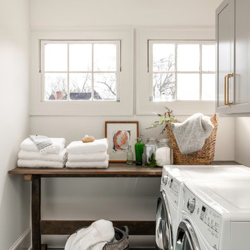
 JOMA Construction
Take a look at this two-story historical design that is both unique and welcoming. This laundry room continues the bright feel of the house and provides for plenty of space to wash, dry, and fold the weekly laundry.
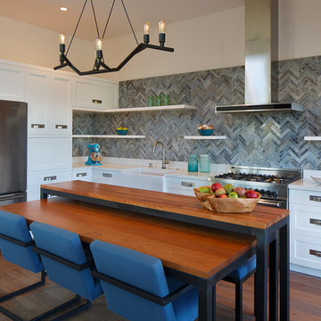
 Amy A. Alper, Architect
Example of a transitional l-shaped medium tone wood floor kitchen design in San Francisco with a farmhouse sink, shaker cabinets, white cabinets, metallic backsplash, stainless steel appliances and an island

 TKS Design Group
Download our free ebook, Creating the Ideal Kitchen. DOWNLOAD NOW
For many, extra time at home during COVID left them wanting more from their homes. Whether you realized the shortcomings of your space or simply wanted to combat boredom, a well-designed and functional home was no longer a want, it became a need. Tina found herself wanting more from her Old Irving Park home and reached out to The Kitchen Studio about adding function to her kitchen to make the most of the available real estate.
At the end of the day, there is nothing better than returning home to a bright and happy space you love. And this kitchen wasn’t that for Tina. Dark and dated, with a palette from the past and features that didn’t make the most of the available square footage, this remodel required vision and a fresh approach to the space. Lead designer, Stephanie Cole’s main design goal was better flow, while adding greater functionality with organized storage, accessible open shelving, and an overall sense of cohesion with the adjoining family room.
The original kitchen featured a large pizza oven, which was rarely used, yet its footprint limited storage space. The nearby pantry had become a catch-all, lacking the organization needed in the home. The initial plan was to keep the pizza oven, but eventually Tina realized she preferred the design possibilities that came from removing this cumbersome feature, with the goal of adding function throughout the upgraded and elevated space. Eliminating the pantry added square footage and length to the kitchen for greater function and more storage. This redesigned space reflects how she lives and uses her home, as well as her love for entertaining.
The kitchen features a classic, clean, and timeless palette. White cabinetry, with brass and bronze finishes, contrasts with rich wood flooring, and lets the large, deep blue island in Woodland’s custom color Harbor – a neutral, yet statement color – draw your eye.
The kitchen was the main priority. In addition to updating and elevating this space, Tina wanted to maximize what her home had to offer. From moving the location of the patio door and eliminating a window to removing an existing closet in the mudroom and the cluttered pantry, the kitchen footprint grew. Once the floorplan was set, it was time to bring cohesion to her home, creating connection between the kitchen and surrounding spaces.
The color palette carries into the mudroom, where we added beautiful new cabinetry, practical bench seating, and accessible hooks, perfect for guests and everyday living. The nearby bar continues the aesthetic, with stunning Carrara marble subway tile, hints of brass and bronze, and a design that further captures the vibe of the kitchen.
Every home has its unique design challenges. But with a fresh perspective and a bit of creativity, there is always a way to give the client exactly what they want [and need]. In this particular kitchen, the existing soffits and high slanted ceilings added a layer of complexity to the lighting layout and upper perimeter cabinets.
While a space needs to look good, it also needs to function well. This meant making the most of the height of the room and accounting for the varied ceiling features, while also giving Tina everything she wanted and more. Pendants and task lighting paired with an abundance of natural light amplify the bright aesthetic. The cabinetry layout and design compliments the soffits with subtle profile details that bring everything together. The tile selections add visual interest, drawing the eye to the focal area above the range. Glass-doored cabinets further customize the space and give the illusion of even more height within the room.
While her family may be grown and out of the house, Tina was focused on adding function without sacrificing a stunning aesthetic and dreamy finishes that make the kitchen the gathering place of any home. It was time to love her kitchen again, and if you’re wondering what she loves most, it’s the niche with glass door cabinetry and open shelving for display paired with the marble mosaic backsplash over the range and complimenting hood. Each of these features is a stunning point of interest within the kitchen – both brag-worthy additions to a perimeter layout that previously felt limited and lacking.
Whether your remodel is the result of special needs in your home or simply the excitement of focusing your energy on creating a fun new aesthetic, we are here for it. We love a good challenge because there is always a way to make a space better – adding function and beauty simultaneously.
136