
Search results for "Continual" in Home Design Ideas
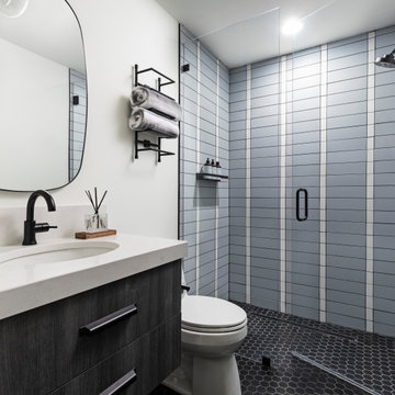

 Reliance Design Build
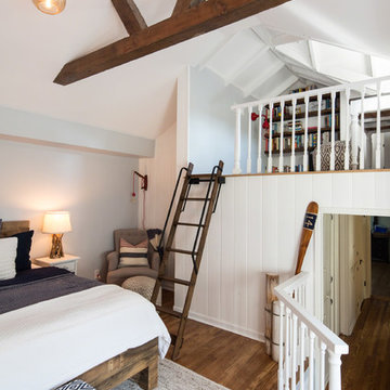
Small beach style loft-style medium tone wood floor bedroom photo in Los Angeles with gray walls and no fireplace
 FINNE Architects
The Mazama house is located in the Methow Valley of Washington State, a secluded mountain valley on the eastern edge of the North Cascades, about 200 miles northeast of Seattle.
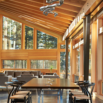
The house has been carefully placed in a copse of trees at the easterly end of a large meadow. Two major building volumes indicate the house organization. A grounded 2-story bedroom wing anchors a raised living pavilion that is lifted off the ground by a series of exposed steel columns. Seen from the access road, the large meadow in front of the house continues right under the main living space, making the living pavilion into a kind of bridge structure spanning over the meadow grass, with the house touching the ground lightly on six steel columns. The raised floor level provides enhanced views as well as keeping the main living level well above the 3-4 feet of winter snow accumulation that is typical for the upper Methow Valley.
To further emphasize the idea of lightness, the exposed wood structure of the living pavilion roof changes pitch along its length, so the roof warps upward at each end. The interior exposed wood beams appear like an unfolding fan as the roof pitch changes. The main interior bearing columns are steel with a tapered “V”-shape, recalling the lightness of a dancer.
The house reflects the continuing FINNE investigation into the idea of crafted modernism, with cast bronze inserts at the front door, variegated laser-cut steel railing panels, a curvilinear cast-glass kitchen counter, waterjet-cut aluminum light fixtures, and many custom furniture pieces. The house interior has been designed to be completely integral with the exterior. The living pavilion contains more than twelve pieces of custom furniture and lighting, creating a totality of the designed environment that recalls the idea of Gesamtkunstverk, as seen in the work of Josef Hoffman and the Viennese Secessionist movement in the early 20th century.
The house has been designed from the start as a sustainable structure, with 40% higher insulation values than required by code, radiant concrete slab heating, efficient natural ventilation, large amounts of natural lighting, water-conserving plumbing fixtures, and locally sourced materials. Windows have high-performance LowE insulated glazing and are equipped with concealed shades. A radiant hydronic heat system with exposed concrete floors allows lower operating temperatures and higher occupant comfort levels. The concrete slabs conserve heat and provide great warmth and comfort for the feet.
Deep roof overhangs, built-in shades and high operating clerestory windows are used to reduce heat gain in summer months. During the winter, the lower sun angle is able to penetrate into living spaces and passively warm the exposed concrete floor. Low VOC paints and stains have been used throughout the house. The high level of craft evident in the house reflects another key principle of sustainable design: build it well and make it last for many years!
Photo by Benjamin Benschneider
Find the right local pro for your project

 TKS Design Group
Download our free ebook, Creating the Ideal Kitchen. DOWNLOAD NOW
Lakefront property in the northwest suburbs of Chicago is hard to come by, so when we were hired by this young family with exactly that, we were immediately inspired by not just the unusually large footprint of this 1950’s colonial revival but also the lovely views of the manmade lake it was sited on. The large 5-bedroom home was solidly stuck in the 1980’s, but we saw tons of potential. We started out by updating the existing staircase with a fresh coat of paint and adding new herringbone slate to the entry hall.
The powder room off the entryway also got a refresh - new flooring, new cabinets and fixtures. We ran the new slate right through into this space for some consistency. A fun wallpaper and shiplap trim add a welcoming feel and set the tone for the home.
Next, we tackled the kitchen. Located away from the rest of the first floor, the kitchen felt a little isolated, so we immediately began planning for how to better connect it to the rest of the first floor. We landed on removing the wall between the kitchen and dining room and designed a modified galley style space with separate cooking and clean up zones. The cooking zone consists of the refrigerator, prep sink and cooktop, along with a nice long run of prep space at the island. The cleanup side of the kitchen consists of the main sink and dishwasher. Both areas are situated so that the user can view the lake during prep work and cleanup!
One of the home’s main puzzles was how to incorporate the mudroom and area in front of the patio doors at the back of the house. We already had a breakfast table area, so the space by the patio doors was a bit of a no man’s land. We decided to separate the kitchen proper from what became the new mudroom with a large set of barn doors. That way you can quickly hide any mudroom messes but have easy access to the light coming in through the patio doors as well as the outdoor grilling station. We also love the impact the barn doors add to the overall space.
The homeowners’ first words to us were “it’s time to ditch the brown,” so we did! We chose a lovely blue pallet that reflects the home’s location on the lake which is also vibrant yet easy on the eye. Countertops are white quartz, and the natural oak floor works well with the other honey accents. The breakfast table was given a refresh with new chairs, chandelier and window treatments that frame the gorgeous views of the lake out the back.
We coordinated the slate mudroom flooring with that used in the home’s main entrance for a consistent feel. The storage area consists of open and closed storage to allow for some clutter control as needed.
Next on our “to do” list was revamping the dated brown bar area in the neighboring dining room. We eliminated the clutter by adding some closed cabinets and did some easy updates to help the space feel more current. One snag we ran into here was the discovery of a beam above the existing open shelving that had to be modified with a smaller structural beam to allow for our new design to work. This was an unexpected surprise, but in the end we think it was well worth it!
We kept the colors here a bit more muted to blend with the homeowner’s existing furnishings. Open shelving and polished nickel hardware add some simple detail to the new entertainment zone which also looks out onto the lake!
Next we tackled the upstairs starting with the homeowner’s son’s bath. The bath originally had both a tub shower and a separate shower, so we decided to swap out the shower for a new laundry area. This freed up some space downstairs in what used to be the mudroom/laundry room and is much more convenient for daily laundry needs.
We continued the blue palette here with navy cabinetry and the navy tile in the shower. Porcelain floor tile and chrome fixtures keep maintenance to a minimum while matte black mirrors and lighting add some depth the design. A low maintenance runner adds some warmth underfoot and ties the whole space together.
We added a pocket door to the bathroom to minimize interference with the door swings. The left door of the laundry closet is on a 180 degree hinge to allow for easy full access to the machines. Next we tackled the master bath which is an en suite arrangement. The original was typical of the 1980’s with the vanity outside of the bathroom, situated near the master closet. And the brown theme continued here with multiple shades of brown.
Our first move was to segment off the bath and the closet from the master bedroom. We created a short hall from the bedroom to the bathroom with his and hers walk-in closets on the left and right as well as a separate toilet closet outside of the main bathroom for privacy and flexibility.
The original bathroom had a giant soaking tub with steps (dangerous!) as well as a small shower that did not work well for our homeowner who is 6’3”. With other bathtubs in the home, they decided to eliminate the tub and create an oversized shower which takes up the space where the old tub was located. The double vanity is on the opposite wall and a bench is located under the window for morning conversations and a place to set a couple of towels.
The pallet in here is light and airy with a mix of blond wood, creamy porcelain and marble tile, and brass accents. A simple roman shade adds some texture and it’s top-down mechanism allows for light and privacy.
This large whole house remodel gave our homeowners not only the ability to maximize the potential of their home but also created a lovely new frame from which to view their fabulous lake views.
Designed by: Susan Klimala, CKD, CBD
Photography by: Michael Kaskel
For more information on kitchen and bath design ideas go to: www.kitchenstudio-ge.com
 Modern Wall Art NYC
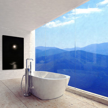
Inspiration for a modern master freestanding bathtub remodel in Other with white walls
 ZeroEnergy Design
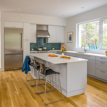
This modern green home offers both a vacation destination on Cape Cod near local family members and an opportunity for rental income.
FAMILY ROOTS. A West Coast couple living in the San Francisco Bay Area sought a permanent East Coast vacation home near family members living on Cape Cod. As academic professionals focused on sustainability, they sought a green, energy efficient home that was well-aligned with their values. With no green homes available for sale on Cape Cod, they decided to purchase land near their family and build their own.
SLOPED SITE. Comprised of a 3/4 acre lot nestled in the pines, the steeply sloping terrain called for a plan that embraced and took advantage of the slope. Of equal priority was optimizing solar exposure, preserving privacy from abutters, and creating outdoor living space. The design accomplished these goals with a simple, rectilinear form, offering living space on the both entry and lower/basement levels. The stepped foundation allows for a walk-out basement level with light-filled living space on the down-hill side of the home. The traditional basement on the eastern, up-hill side houses mechanical equipment and a home gym. The house welcomes natural light throughout, captures views of the forest, and delivers entertainment space that connects indoor living space to outdoor deck and dining patio.
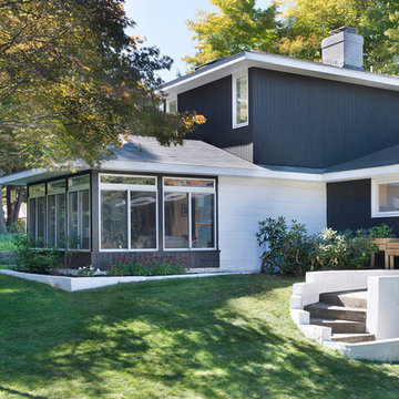
MODERN VISION. The clean building form and uncomplicated finishes pay homage to the modern architectural legacy on the outer Cape. Durable and economical fiber cement panels, fixed with aluminum channels, clad the primary form. Cedar clapboards provide a visual accent at the south-facing living room, which extends a single roof plane to cover the entry porch.
SMART USE OF SPACE. On the entry level, the “L”-shaped living, dining, and kitchen space connects to the exterior living, dining, and grilling spaces to effectively double the home’s summertime entertainment area. Placed at the western end of the entry level (where it can retain privacy but still claim expansive downhill views) is the master suite with a built-in study. The lower level has two guest bedrooms, a second full bathroom, and laundry. The flexibility of the space—crucial in a house with a modest footprint—emerges in one of the guest bedrooms, which doubles as home office by opening the barn-style double doors to connect it to the bright, airy open stair leading up to the entry level. Thoughtful design, generous ceiling heights and large windows transform the modest 1,100 sf* footprint into a well-lit, spacious home. *(total finished space is 1800 sf)
RENTAL INCOME. The property works for its owners by netting rental income when the owners are home in San Francisco. The house especially caters to vacationers bound for nearby Mayo Beach and includes an outdoor shower adjacent to the lower level entry door. In contrast to the bare bones cottages that are typically available on the Cape, this home offers prospective tenants a modern aesthetic, paired with luxurious and green features. Durable finishes inside and out will ensure longevity with the heavier use that comes with a rental property.
COMFORT YEAR-ROUND. The home is super-insulated and air-tight, with mechanical ventilation to provide continuous fresh air from the outside. High performance triple-paned windows complement the building enclosure and maximize passive solar gain while ensuring a warm, draft-free winter, even when sitting close to the glass. A properly sized air source heat pump offers efficient heating & cooling, and includes a carefully designed the duct distribution system to provide even comfort throughout the house. The super-insulated envelope allows us to significantly reduce the equipment capacity, duct size, and airflow quantities, while maintaining unparalleled thermal comfort.
ENERGY EFFICIENT. The building’s shell and mechanical systems play instrumental roles in the home’s exceptional performance. The building enclosure reduces the most significant energy glutton: heating. Continuous super-insulation, thorough air sealing, triple-pane windows, and passive solar gain work together to yield a miniscule heating load. All active energy consumers are extremely efficient: an air source heat pump for heating and cooling, a heat pump hot water heater, LED lighting, energy recovery ventilation (ERV), and high efficiency appliances. The result is a home that uses 70% less energy than a similar new home built to code requirements.
OVERALL. The home embodies the owners’ goals and values while comprehensively enabling thermal comfort, energy efficiency, a vacation respite, and supplementary income.
PROJECT TEAM
ZeroEnergy Design - Architect & Mechanical Designer
A.F. Hultin & Co. - Contractor
Pamet Valley Landscape Design - Landscape & Masonry
Lisa Finch - Original Artwork
European Architectural Supply - Windows
Eric Roth Photography - Photography
 The Artisans Group, Inc.
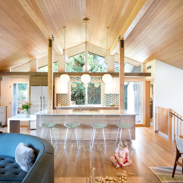
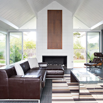
Winner of the 2018 Tour of Homes Best Remodel, this whole house re-design of a 1963 Bennet & Johnson mid-century raised ranch home is a beautiful example of the magic we can weave through the application of more sustainable modern design principles to existing spaces.
We worked closely with our client on extensive updates to create a modernized MCM gem.
Extensive alterations include:
- a completely redesigned floor plan to promote a more intuitive flow throughout
- vaulted the ceilings over the great room to create an amazing entrance and feeling of inspired openness
- redesigned entry and driveway to be more inviting and welcoming as well as to experientially set the mid-century modern stage
- the removal of a visually disruptive load bearing central wall and chimney system that formerly partitioned the homes’ entry, dining, kitchen and living rooms from each other
- added clerestory windows above the new kitchen to accentuate the new vaulted ceiling line and create a greater visual continuation of indoor to outdoor space
- drastically increased the access to natural light by increasing window sizes and opening up the floor plan
- placed natural wood elements throughout to provide a calming palette and cohesive Pacific Northwest feel
- incorporated Universal Design principles to make the home Aging In Place ready with wide hallways and accessible spaces, including single-floor living if needed
- moved and completely redesigned the stairway to work for the home’s occupants and be a part of the cohesive design aesthetic
- mixed custom tile layouts with more traditional tiling to create fun and playful visual experiences
- custom designed and sourced MCM specific elements such as the entry screen, cabinetry and lighting
- development of the downstairs for potential future use by an assisted living caretaker
- energy efficiency upgrades seamlessly woven in with much improved insulation, ductless mini splits and solar gain
Inspiration for a 1950s brown two-story mixed siding exterior home remodel in Boston with a hip roof
 Johnston Architects
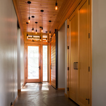
Mid-sized mountain style concrete floor and gray floor hallway photo in Seattle with white walls
 Susan Yeley Homes
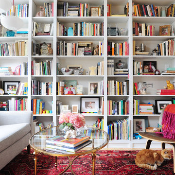
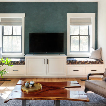
Our poster project for The Three P's, this small midcentury home south of campus has great bones but lacked vibrancy - a je ne sais quoi that the clients were searching to savoir once and for all. SYI worked with them to nail down a design direction and furniture plan, and they decided to invest in the big-impact items first: built-ins and lighting and a fresh paint job that included a beautiful deep blue-green line around the windows. The vintage rug was an Etsy score at an awesome price, but only after the client spent months scouring options and sources online that matched the vision and dimensions of the plan. A good year later, the West Elm sofa went on sale, so the client took advantage; some time after that, they painted the kitchen, created the drop zone / bench area, and rounded out the room with occasional tables and accessories. Their lesson: in patience, and details, there is beauty.
Photography by Gina Rogers Photography
 Splash Pools & Construction
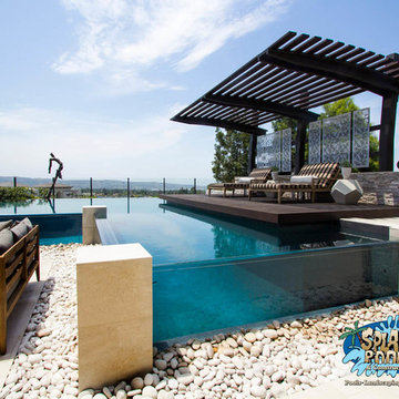
Located at the Toll Brothers Model Homes the Enclave at Yorba Linda. Toll Brothers envisioned a raised overflow pool with glass walls, allowing guests to see underwater from the outside. Extensive care was taken during the difficult design and build process to ensure that excellence was achieved and Toll Brothers was completely enamored with the results.
This pool features a very modern look with straight, clean lines, square columns and LED lights accenting the acrylic pool walls. The bar area touts an acrylic wall and in-pool bar stools, while the tile inside the pool matches the house, bringing continuity to the entire space.
An extreme amount of coordination was required for the 2.5 inch thick pieces of acrylic to fit perfectly within the slots on the columns while still maintaining the structural integrity of the pool. We were in continual communication with the structural engineer and acrylic manufacturer, ensuring that each piece fit perfectly. The completed acrylic walls were then craned over the house due to their weight.
With a vanishing edge on the front three sections and a negative edge along the back, it was absolutely imperative that the pool was perfectly level and that the water filtration system operated perfectly so that the flow was even over each wall. The water cascading over the front walls collects in a trough that ties into to the rear negative edge basin, where it recirculates back into the pool.
The rear negative edge was designed so as not to distract from the breathtaking view of the valley below, while the lounging deck overhangs the pool with a freestanding cover ensuring that the view is completely unobstructed.
An elegant piece of artwork frames the back of the pool, completing the look for this intriguing swimming pool.
 Dawson & Clinton
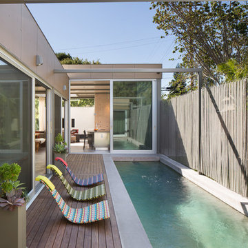
The design for this home in Palo Alto looked to create a union between the interior and exterior, blending the spaces in such a way as to allow residents to move seamlessly between the two environments. Expansive glazing was used throughout the home to complement this union, looking out onto a swimming pool centrally located within the courtyard.
Within the living room, a large operable skylight brings in plentiful sunlight, while utilizing self tinting glass that adjusts to various lighting conditions throughout the day to ensure optimal comfort.
For the exterior, a living wall was added to the garage that continues into the backyard. Extensive landscaping and a gabion wall was also created to provide privacy and contribute to the sense of the home as a tranquil oasis.
 Visbeen Architects
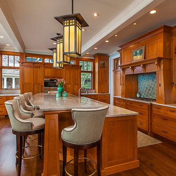
Inspired by the surrounding landscape, the Craftsman/Prairie style is one of the few truly American architectural styles. It was developed around the turn of the century by a group of Midwestern architects and continues to be among the most comfortable of all American-designed architecture more than a century later, one of the main reasons it continues to attract architects and homeowners today. Oxbridge builds on that solid reputation, drawing from Craftsman/Prairie and classic Farmhouse styles. Its handsome Shingle-clad exterior includes interesting pitched rooflines, alternating rows of cedar shake siding, stone accents in the foundation and chimney and distinctive decorative brackets. Repeating triple windows add interest to the exterior while keeping interior spaces open and bright. Inside, the floor plan is equally impressive. Columns on the porch and a custom entry door with sidelights and decorative glass leads into a spacious 2,900-square-foot main floor, including a 19 by 24-foot living room with a period-inspired built-ins and a natural fireplace. While inspired by the past, the home lives for the present, with open rooms and plenty of storage throughout. Also included is a 27-foot-wide family-style kitchen with a large island and eat-in dining and a nearby dining room with a beadboard ceiling that leads out onto a relaxing 240-square-foot screen porch that takes full advantage of the nearby outdoors and a private 16 by 20-foot master suite with a sloped ceiling and relaxing personal sitting area. The first floor also includes a large walk-in closet, a home management area and pantry to help you stay organized and a first-floor laundry area. Upstairs, another 1,500 square feet awaits, with a built-ins and a window seat at the top of the stairs that nod to the home’s historic inspiration. Opt for three family bedrooms or use one of the three as a yoga room; the upper level also includes attic access, which offers another 500 square feet, perfect for crafts or a playroom. More space awaits in the lower level, where another 1,500 square feet (and an additional 1,000) include a recreation/family room with nine-foot ceilings, a wine cellar and home office.
Photographer: Jeff Garland






 Western DuPage Landscaping, Inc.
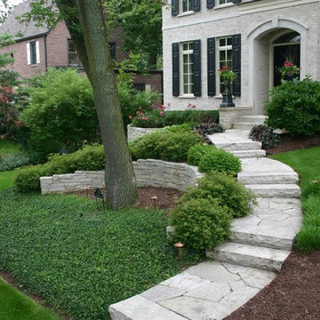
Since the completion of the home our company has maintained this property. Originally built by a local builder as a speculation home, it was purchased by two busy professionals.
Why is this important? Let's just say the clients are particular and like it when things aren't just so. Both have high level careers, travel often and expect their landscape to be pristine. Year after year our company rises to this challenge.
When originally installed, the builder wanted larger plant material to provide a full and mature look. The continued growth provides a pruning challenge, especially when the client prefers a clean, neat and "compact" landscape. We continually monitor growth and hand prune accordingly, including yearly winter pruning.
The backyard is particularly difficult due to the shade, moisture run-off from neighboring properties. The turf requires constant monitoring and adjustment to the irrigation system. The trees create a mess requiring clean up along with yearly power washing of the stone.
While the challenges are many, the fine maintenance has led to happy clients and numerous referrals.
48