
Search results for "Continually updating" in Home Design Ideas
 Klopf Architecture
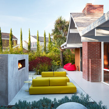
Klopf Architecture, Outer Space Landscape Architects, Sezen & Moon Structural Engineer and Flegels Construction updated a classic Eichler open, indoor-outdoor home.
Everyone loved the classic, original bones of this house, but it was in need of a major facelift both inside and out. The owners also wanted to remove the barriers between the kitchen and great room, and increase the size of the master bathroom as well as make other layout changes. No addition to the house was contemplated.
The owners worked with Klopf Architecture in part because of Klopf’s extensive mid-century modern / Eichler design portfolio, and in part because one of their neighbors who had worked with Klopf on their Eichler home remodel referred them. The Klopf team knew how to update the worn finishes to make a more sophisticated, higher quality home that both looks better and functions better.
In conjunction with the atrium and the landscaped rear yard / patio, the glassy living room feels open on both sides and allows an indoor / outdoor flow throughout. The new, natural wood exterior siding runs through the house from inside to outside to inside again, updating one of the classic design features of the Eichler homes.
Picking up on the wood siding, walnut vanities and cabinets offset the white walls. Gray porcelain tiles evoke the concrete slab floors and flow from interior to exterior to make the spaces appear to flow together. Similarly the ceiling decking has the same white-washed finish from inside to out. The continuity of materials and space enhances the sense of flow.
The large kitchen, perfect for entertaining, has a wall of built-ins and an oversized island. There’s plenty of storage and space for the whole group to prep and cook together.
One unique approach to the master bedroom is the bed wall. The head of the bed is tucked within a line of built-in wardrobes with a high window above. Replacing the master closet with this wall of wardrobes allowed for both a larger bathroom and a larger bedroom.
This 1,953 square foot, 4 bedroom, 2 bathroom Double Gable Eichler remodeled single-family house is located in Mountain View in the heart of the Silicon Valley.
Klopf Architecture Project Team: John Klopf, AIA, Klara Kevane, and Yegvenia Torres-Zavala
Landscape Architect: Outer Space Landscape Architects
Structural Engineer: Sezen & Moon
Contractor: Flegels Construction
Landscape Contractor: Roco's Gardening & Arroyo Vista Landscaping, Inc.
Photography ©2016 Mariko Reed
Location: Mountain View, CA
Year completed: 2015
 Klopf Architecture
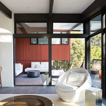
The Roger Lee designed house from 1962 was purchased by the current homeowners in almost original condition, as the previous owners elected to defer most maintenance projects over the years. The clients were able to see beyond the dated materials and finishes, single-paned glass and uninsulated walls and they approached Klopf Architecture to help them expand and update the entire home, one the family could settle into and enjoy for years to come. It was important that the new designs were aligned with Lee's original intent not only because of the client's appreciation for mid-century modern architecture, but also because the house was deemed historical. The Stanford Real Estate Office requires a stringent design review which safeguards the integrity of the community, which Klopf Architecture was happy to oblige going into their updated designs.
As with many original mid-century modern homes, the house was scaled to the 1960s lifestyle where rooms were smaller and openings to views were limited and tightly framed. The original conditions defined the direction the family of four would take in updating the house and making it comfortable for their modern lifestyle. Klopf designed a full gut remodel and major addition to bring the house into the 21st century and provide the living area needed for the client's family. The newly expanded house added just about 1,100 sf to create an airy, comfortable and family friendly house, taking full advantage of the beautiful southwestern views that extend out to the hills beyond. The enclosed garage created an additional 240 sf of covered space for long-term storage.
A cracked swimming pool created an eyesore taking up a majority of the backyard landscape, so it was one of the first elements to go during the transformation. Working with Outer Space Landscape Architects, the family asked for a mix of relaxing outdoor patio spaces that eventually blend into the native landscaping, extending their views outward toward the natural greenery of the trees beyond their property. Filling in the old pool was a smart way to expand the living spaces outward. The orientation of the house was designed to enjoy the views, but the original architecture provided the first homeowners with mere glimpses of the landscape outside.
Klopf was able to broaden those views, continuing and extending on the original architecture to take full advantage of the unobstructed natural views across the rear facade of the house. Small horizontal openings in the primary bedroom and office were replaced with much taller windows that now follow the angled roof line upward, extending across almost all of the facade. We worked with Western Windows, whose designs included an oblique-shaped, operable casement that allowed our design to rise with the slope. A new corner office added to the primary suite, offers a bright and functional work-from-home solution that looks out at the distant views and added natural light from the expanded window configuration that now wraps around the corner.
The existing lower level was designed by Lee as a utilitarian space, serving as a wet pool room with a drain in the center of the floor, bathroom, laundry and storage areas. Without the need for a pool room, Klopf was able to convert the area into a much more comfortable and functional living space with a new family room and guest suite. The new spaces enjoy easy access to a new outdoor patio through floor to ceiling, full-width glass sliders.
Continuing along the rear facade, a previously exposed deck extending from the living room and hallway provided access to the backyard through a single set of stairs leading toward the side of the house which made sense when the pool was in place. The new deck was re-envisioned as an extension of the main living room and now serves as a second outdoor living room. A new slatted pergola above provides the homeowners welcome relief from the hot afternoon sun. A second set of stairs now creates a better connection to the redesigned lower level. Klopf was able to reconfigure the spaces, extending the living room outward toward the views, where the family now claims it as the heart of the home, spending a large majority of their time outdoors.
Back inside, the original wood-burning Malm fireplace was beautifully restored and a gas burner installed to comply with California's strict air standards. It now rests in front of a wall of Heath accent tiles where a dated red brick wall used to stand. A new taller window brings more light and views into the refreshed interior living room. The original glass doors opposite the fireplace were replaced by larger sliders that when fully opened, create a seamless transition to the new outdoor living area so the two spaces feel like one connected space. The original utilitarian kitchen was needlessly tucked into the far back corner and closed-off, out of sight from the living room, so the clients asked Klopf to open it up and expand the kitchen forward so it felt more connected. Today the much larger kitchen is connected to the living area where a short wall with a cutout offers a visual glimpse into the kitchen and a handy pass-through counter for serving guests. A new breakfast nook was also added to create another spot where the family can gather for casual meals. Just outside, a new built-in outdoor grill and prep area extends the kitchen outside and connects to a new outdoor dining spot nestled amongst the trees, taking advantage of the views out back.
Klopf was able to expand the other two bedrooms, add a new laundry room and half-bath and convert the carport to an enclosed garage to add more storage areas which was lost when the pool house was converted to the family and guest room.
To maintain a historical connection to the original designs, the exterior siding was repeated on all exterior walls, a full-height stained glass window at the front entryway restored, and an interior slatted screen element repeated outside at the exterior entry courtyard and over the new outdoor living room to create a shade trellis. The new house stands proudly and shines against it's new landscaping features, while respecting and expanding on the original intent of Roger Lee's designs epitomizing the comforts of indoor-outdoor living in Northern California.
Completion year: 2020
Klopf Architecture project team: John Klopf, Klara Kevane, Noel Andrade
Contractor: ORB Construction, Brendan O'Reilly
Structural engineer: Sezen and Moon
Landscape architect: Outer space
Furnishings and decoration: Urbanism Designs
Photographer: Mariko Reed
 Klopf Architecture
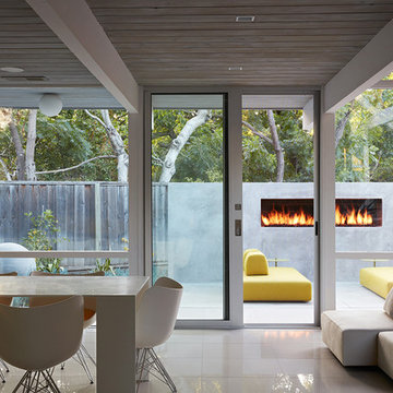
Klopf Architecture, Outer Space Landscape Architects, Sezen & Moon Structural Engineer and Flegels Construction updated a classic Eichler open, indoor-outdoor home.
Everyone loved the classic, original bones of this house, but it was in need of a major facelift both inside and out. The owners also wanted to remove the barriers between the kitchen and great room, and increase the size of the master bathroom as well as make other layout changes. No addition to the house was contemplated.
The owners worked with Klopf Architecture in part because of Klopf’s extensive mid-century modern / Eichler design portfolio, and in part because one of their neighbors who had worked with Klopf on their Eichler home remodel referred them. The Klopf team knew how to update the worn finishes to make a more sophisticated, higher quality home that both looks better and functions better.
In conjunction with the atrium and the landscaped rear yard / patio, the glassy living room feels open on both sides and allows an indoor / outdoor flow throughout. The new, natural wood exterior siding runs through the house from inside to outside to inside again, updating one of the classic design features of the Eichler homes.
Picking up on the wood siding, walnut vanities and cabinets offset the white walls. Gray porcelain tiles evoke the concrete slab floors and flow from interior to exterior to make the spaces appear to flow together. Similarly the ceiling decking has the same white-washed finish from inside to out. The continuity of materials and space enhances the sense of flow.
The large kitchen, perfect for entertaining, has a wall of built-ins and an oversized island. There’s plenty of storage and space for the whole group to prep and cook together.
One unique approach to the master bedroom is the bed wall. The head of the bed is tucked within a line of built-in wardrobes with a high window above. Replacing the master closet with this wall of wardrobes allowed for both a larger bathroom and a larger bedroom.
This 1,953 square foot, 4 bedroom, 2 bathroom Double Gable Eichler remodeled single-family house is located in Mountain View in the heart of the Silicon Valley.
Klopf Architecture Project Team: John Klopf, AIA, Klara Kevane, and Yegvenia Torres-Zavala
Landscape Architect: Outer Space Landscape Architects
Structural Engineer: Sezen & Moon
Contractor: Flegels Construction
Landscape Contractor: Roco's Gardening & Arroyo Vista Landscaping, Inc.
Photography ©2016 Mariko Reed
Location: Mountain View, CA
Year completed: 2015
Find the right local pro for your project
 Studio McGee
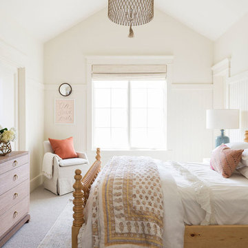
Large beach style guest carpeted and gray floor bedroom photo in Salt Lake City with white walls and no fireplace
 Stock & Associates, Inc.
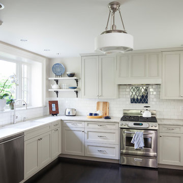
Sitting in one of Capital Hill’s beautiful neighborhoods, the exterior of this residence portrays a
bungalow style home as from the Arts and Craft era. By adding a large dormer to east side of the house,
the street appeal was maintained which allowed for a large master suite to be added to the second
floor. As a result, the two guest bedrooms and bathroom were relocated to give to master suite the
space it needs. Although much renovation was done to the Federalist interior, the original charm was
kept by continuing the formal molding and other architectural details throughout the house. In addition
to opening up the stair to the entry and floor above, the sense of gained space was furthered by opening
up the kitchen to the dining room and remodeling the space to provide updated finishes and appliances
as well as custom cabinetry and a hutch. The main level also features an added powder room with a
beautiful black walnut vanity.
 Refined Renovations & Refined Home
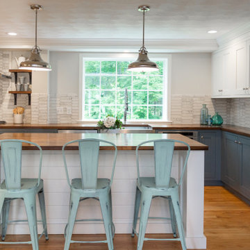
This farmhouse-chic kitchen is a combination of white and blue cabinets with wood countertops. These materials, paired with metal stools and lighting, clean backsplash tiles and a chalkboard wall give the kitchen an updated farmhouse feel.
 Windhill+Co.
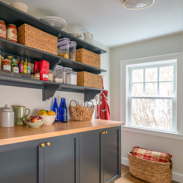
This family’s intention was clear – to create a well-functioning home for their busy family that will continue to be just as well-functioning in the future. With a wish list that included open kitchen and dining spaces, a guest bedroom, and a fresh, modernized master suite, this renovation left the owners delighted. The shifting of the kitchen created a mudroom area resulting in a happy landing space for the family returning from activities. The new mudroom casts a warm glow with an ample black walnut-topped bench. Handsfree entering the kitchen, the large island and coffered ceiling well defines this space. The cook’s Lacanche Saulieu black enamel range is a show-stopper, topped off with a uniquely custom maple hood. A pleasant hideaway, the Benjamin Moore wrought iron painted cabinetry and shelving in the butler’s pantry is both practical and pretty with a quick peek out to the backyard.
The upstairs bedrooms and bathrooms were reenergized with new tile, fixtures, and updated a/v. A Newburyport Blue vanity makes for a cheery children’s bath. A more sophisticated black satin vanity in the master bath compliments the basketweave tile rug created in cool and classy Walker Zanger stone tile. Lit from above, the frameless medicine cabinet mirrors’ simplicity let the gunmetal faucets ‘shine’. Down the hall, the family laundry room’s charming tile and easy function gives hope that every family member will chip in with the chores.
Sponsored
Columbus, OH

HomeCraft Remodeling
Custom Craftsmanship & Build Solutions in Franklin County, Ohio
 Factor Design Build
This 1912 traditional style house sits on the edge of Cheesman Park with four levels that needed updating to better suit the young family’s needs.
A custom wine room was constructed on the lower level to accommodate an area for entertaining guests. The main level was divided into a smaller family room area with a double door opening into the formal living room. The kitchen and butler’s pantry were combined and remodeled for better function.
The second level master bathroom was relocated and created out of an adjacent bedroom, incorporating an existing fireplace and Juliet balcony that looks out to the park.
A new staircase was constructed on the third level as a continuation of the grand staircase in the center of the house. A gathering and play space opens off the stairs and connects to the third-floor deck. A Jill & Jill bathroom remodel was constructed between the girls’ rooms.
 Interiors by Popov
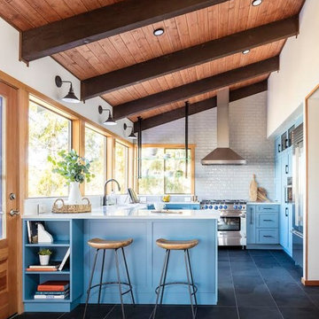
When we drove out to Mukilteo for our initial consultation, we immediately fell in love with this house. With its tall ceilings, eclectic mix of wood, glass and steel, and gorgeous view of the Puget Sound, we quickly nicknamed this project "The Mukilteo Gem". Our client, a cook and baker, did not like her existing kitchen. The main points of issue were short runs of available counter tops, lack of storage and shortage of light. So, we were called in to implement some big, bold ideas into a small footprint kitchen with big potential. We completely changed the layout of the room by creating a tall, built-in storage wall and a continuous u-shape counter top. Early in the project, we took inventory of every item our clients wanted to store in the kitchen and ensured that every spoon, gadget, or bowl would have a dedicated "home" in their new kitchen. The finishes were meticulously selected to ensure continuity throughout the house. We also played with the color scheme to achieve a bold yet natural feel.This kitchen is a prime example of how color can be used to both make a statement and project peace and balance simultaneously. While busy at work on our client's kitchen improvement, we also updated the entry and gave the homeowner a modern laundry room with triple the storage space they originally had.
End result: ecstatic clients and a very happy design team. That's what we call a big success!
John Granen.
 Lisa Shaffer
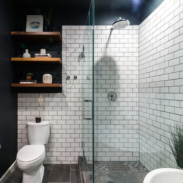
Custom floating shelves added just the right character for this modern bathroom
Bathroom - mid-sized modern master subway tile and white tile gray floor and limestone floor bathroom idea in DC Metro with shaker cabinets, dark wood cabinets, gray walls, an undermount sink, solid surface countertops, a hinged shower door, white countertops and a two-piece toilet
Bathroom - mid-sized modern master subway tile and white tile gray floor and limestone floor bathroom idea in DC Metro with shaker cabinets, dark wood cabinets, gray walls, an undermount sink, solid surface countertops, a hinged shower door, white countertops and a two-piece toilet
 CG&S Design-Build
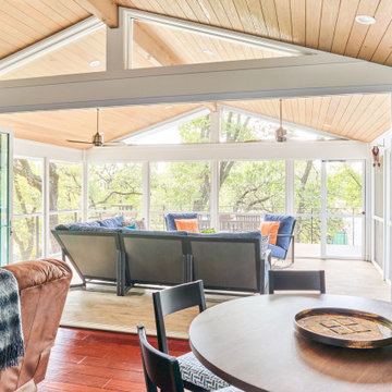
Example of a mid-sized trendy open concept medium tone wood floor living room design in Austin with white walls and no fireplace
 Klopf Architecture
Klopf Architecture and Jesse Ososki Art remodeled an existing Eichler atrium home into a brighter, more open, and more functional version of its original self.
The goals were to preserve the Eichler look and feel without the need to strictly adhere to it. The scope of work included re-configuring the master bedroom/bath, the kitchen, and the hall bath/laundry area, as well as updating interior finishes throughout to be more sophisticated.
The owners are detail-oriented and were very involved in the design process, down to the selection of lighting controls and stainless steel faceplates.Their design aesthetic leans toward the Scandinavian — light and bright, with simple straight lines and pure geometric shapes.
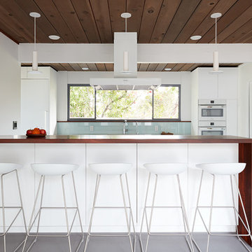
The finish flooring is large porcelain tile (24” x 24”) in a neutral grey tone, providing a uniform backdrop against which other materials can stand out. The same tile continues into the shower floor (with a different finish texture for slip-resistance) and up the shower/tub walls (in a smaller size). Heath Classic Field ceramic tile in Modern Blue was used sparingly, to add color at the hall bath vanity backsplash and at the shampoo niches in both bathrooms. Back-painted soda glass in pale blue to match the Heath tile was used at the kitchen backsplash. This same accent color was also used at the front entry atrium door. Kitchen cabinetry, countertops, appliances, and light fixtures are all white, making the kitchen feel more airy and light. Countertops are Caesarstone Blizzard.
The owners chose to keep some of the original Eichler elements: the concrete masonry fireplace; the stained tongue-and-groove redwood ceiling decking; and the luan wall paneling. The luan paneling was lightly sanded, cleaned, and re-stained. The owners also kept an added element that was installed by a previous owner: sliding shoji panels at all bedroom windows and sliding glass doors, for both privacy and sun control. Grooves were cut into the new tile flooring for the shoji panels to slide in, creating a more integrated look. Walnut was used to add warmth and contrast at the kitchen bar top and niche, the bathroom vanities, and the window sill/ledge under the kitchen window.
This Burlingame Eichler Remodel is a 2,121 sf, 4 bedroom/2 bath home located in the heart of Silicon Valley.
Klopf Architecture Project Team: John Klopf, Klara Kevane and Yegvenia Torres Zavala
Contractor: Jesse Ososki Art
Structural Engineer: Emmanuel Pun
Photography ©2018 Mariko Reed
Location: Burlingame, CA
Year completed: 2017
 Klopf Architecture
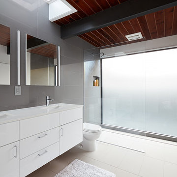
Klopf Architecture completely remodeled this once dark Eichler house in Palo Alto creating a more open, bright and functional family home. The reconfigured great room with new full height windows and sliding glass doors blends the indoors with the newly landscaped patio and seating areas outside. The former galley kitchen was relocated and was opened up to have clear sight lines through the great room and out to the patios and yard, including a large island and a beautiful walnut bar countertop with seating. An integrated small front addition was added allowing for a more spacious master bath and hall bath layouts. With the removal of the old brick fireplace, larger sliding glass doors and multiple skylights now flood the home with natural light.
The goals were to work within the Eichler style while creating a more open, indoor-outdoor flow and functional spaces, as well as a more efficient building envelope including a well insulated roof, providing solutions that many Eichler homeowners appreciate. The original entryway lacked unique details; the clients desired a more gracious front approach. The historic Eichler color palette was used to create a modern updated front facade.
Durable grey porcelain floor tiles unify the entire home, creating a continuous flow. They, along with white walls, provide a backdrop for the unique elements and materials to stand on their own, such as the brightly colored mosaic tiles, the walnut bar and furniture, and stained ceiling boards. A secondary living space was extended out to the patio with the addition of a bench and additional seating.
This Single family Eichler 4 bedroom 2 bath remodel is located in the heart of the Silicon Valley.
Klopf Architecture Project Team: John Klopf, Klara Kevane, and Ethan Taylor
Contractor: Coast to Coast Construction
Landscape Contractor: Discelli
Structural Engineer: Brian Dotson Consulting Engineer
Photography ©2018 Mariko Reed
Location: Palo Alto, CA
Year completed: 2017
Sponsored
Columbus, OH
HomeCraft Remodeling
Custom Craftsmanship & Build Solutions in Franklin County, Ohio
 Angela Flournoy
Photo: Angela Flournoy © 2017 Houzz
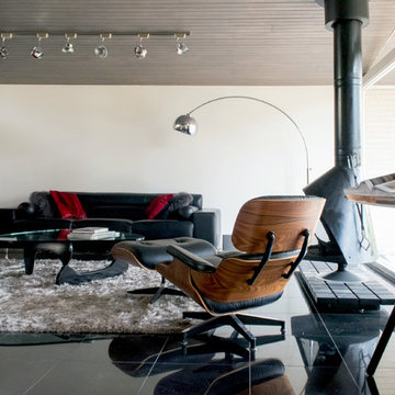
Inspiration for a 1950s living room remodel in Dallas
Inspiration for a 1950s living room remodel in Dallas
 MOTIV Interiors
Interior Designer: MOTIV Interiors LLC
Photographer: Sam Angel Photography
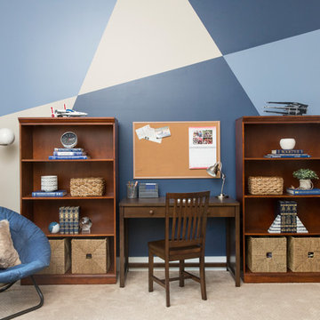
Design Challenge: This 8 year-old boy and girl were outgrowing their existing setup and needed to update their rooms with a plan that would carry them forward into middle school and beyond. In addition to gaining storage and study areas, could these twins show off their big personalities? Absolutely, we said! MOTIV Interiors tackled the rooms of these youngsters living in Nashville's 12th South Neighborhood and created an environment where the dynamic duo can learn, create, and grow together for years to come.
Design Solution:
In his room, we wanted to continue the feature wall fun, but with a different approach. Since our young explorer loves outer space, being a boy scout, and building with legos, we created a dynamic geometric wall that serves as the backdrop for our young hero’s control center. We started with a neutral mushroom color for the majority of the walls in the room, while our feature wall incorporated a deep indigo and sky blue that are as classic as your favorite pair of jeans. We focused on indoor air quality and used Sherwin Williams’ Duration paint in a satin sheen, which is a scrubbable/no-VOC coating.
We wanted to create a great reading corner, so we placed a comfortable denim lounge chair next to the window and made sure to feature a self-portrait created by our young client. For night time reading, we included a super-stellar floor lamp with white globes and a sleek satin nickel finish. Metal details are found throughout the space (such as the lounge chair base and nautical desk clock), and lend a utilitarian feel to the room. In order to balance the metal and keep the room from feeling too cold, we also snuck in woven baskets that work double-duty as decorative pieces and functional storage bins.
The large north-facing window got the royal treatment and was dressed with a relaxed roman shade in a shiitake linen blend. We added a fabulous fabric trim from F. Schumacher and echoed the look by using the same fabric for the bolster on the bed. Royal blue bedding brings a bit of color into the space, and is complimented by the rich chocolate wood tones seen in the furniture throughout. Additional storage was a must, so we brought in a glossy blue storage unit that can accommodate legos, encyclopedias, pinewood derby cars, and more!
Comfort and creativity converge in this space, and we were excited to get a big smile when we turned it over to its new commander.

 The Artisans Group, Inc.
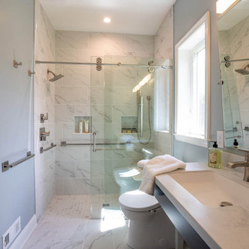
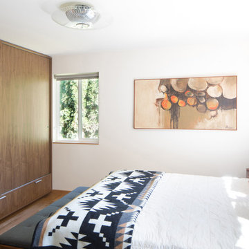
Winner of the 2018 Tour of Homes Best Remodel, this whole house re-design of a 1963 Bennet & Johnson mid-century raised ranch home is a beautiful example of the magic we can weave through the application of more sustainable modern design principles to existing spaces.
We worked closely with our client on extensive updates to create a modernized MCM gem.
Extensive alterations include:
- a completely redesigned floor plan to promote a more intuitive flow throughout
- vaulted the ceilings over the great room to create an amazing entrance and feeling of inspired openness
- redesigned entry and driveway to be more inviting and welcoming as well as to experientially set the mid-century modern stage
- the removal of a visually disruptive load bearing central wall and chimney system that formerly partitioned the homes’ entry, dining, kitchen and living rooms from each other
- added clerestory windows above the new kitchen to accentuate the new vaulted ceiling line and create a greater visual continuation of indoor to outdoor space
- drastically increased the access to natural light by increasing window sizes and opening up the floor plan
- placed natural wood elements throughout to provide a calming palette and cohesive Pacific Northwest feel
- incorporated Universal Design principles to make the home Aging In Place ready with wide hallways and accessible spaces, including single-floor living if needed
- moved and completely redesigned the stairway to work for the home’s occupants and be a part of the cohesive design aesthetic
- mixed custom tile layouts with more traditional tiling to create fun and playful visual experiences
- custom designed and sourced MCM specific elements such as the entry screen, cabinetry and lighting
- development of the downstairs for potential future use by an assisted living caretaker
- energy efficiency upgrades seamlessly woven in with much improved insulation, ductless mini splits and solar gain
Sponsored
Columbus, OH

Snider & Metcalf Interior Design, LTD
Leading Interior Designers in Columbus, Ohio & Ponte Vedra, Florida
 Wilsonart
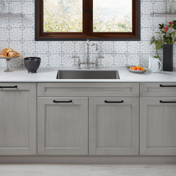
Sterling Calcutta - a large-scale veined calcutta design with soft grey features. This design has a semi-gloss sheen and a smooth surface.
Kitchen - kitchen idea in Austin
Kitchen - kitchen idea in Austin
 Rikki Snyder
Photo: Rikki Snyder © 2017 Houzz
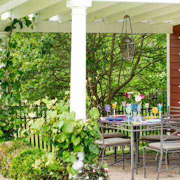
This is an example of a traditional landscaping in New York.
This is an example of a traditional landscaping in New York.
 TKS Design Group
Download our free ebook, Creating the Ideal Kitchen. DOWNLOAD NOW
Lakefront property in the northwest suburbs of Chicago is hard to come by, so when we were hired by this young family with exactly that, we were immediately inspired by not just the unusually large footprint of this 1950’s colonial revival but also the lovely views of the manmade lake it was sited on. The large 5-bedroom home was solidly stuck in the 1980’s, but we saw tons of potential. We started out by updating the existing staircase with a fresh coat of paint and adding new herringbone slate to the entry hall.
The powder room off the entryway also got a refresh - new flooring, new cabinets and fixtures. We ran the new slate right through into this space for some consistency. A fun wallpaper and shiplap trim add a welcoming feel and set the tone for the home.
Next, we tackled the kitchen. Located away from the rest of the first floor, the kitchen felt a little isolated, so we immediately began planning for how to better connect it to the rest of the first floor. We landed on removing the wall between the kitchen and dining room and designed a modified galley style space with separate cooking and clean up zones. The cooking zone consists of the refrigerator, prep sink and cooktop, along with a nice long run of prep space at the island. The cleanup side of the kitchen consists of the main sink and dishwasher. Both areas are situated so that the user can view the lake during prep work and cleanup!
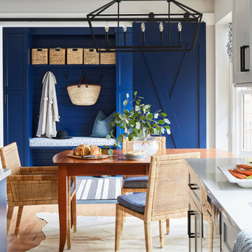
One of the home’s main puzzles was how to incorporate the mudroom and area in front of the patio doors at the back of the house. We already had a breakfast table area, so the space by the patio doors was a bit of a no man’s land. We decided to separate the kitchen proper from what became the new mudroom with a large set of barn doors. That way you can quickly hide any mudroom messes but have easy access to the light coming in through the patio doors as well as the outdoor grilling station. We also love the impact the barn doors add to the overall space.
The homeowners’ first words to us were “it’s time to ditch the brown,” so we did! We chose a lovely blue pallet that reflects the home’s location on the lake which is also vibrant yet easy on the eye. Countertops are white quartz, and the natural oak floor works well with the other honey accents. The breakfast table was given a refresh with new chairs, chandelier and window treatments that frame the gorgeous views of the lake out the back.
We coordinated the slate mudroom flooring with that used in the home’s main entrance for a consistent feel. The storage area consists of open and closed storage to allow for some clutter control as needed.
Next on our “to do” list was revamping the dated brown bar area in the neighboring dining room. We eliminated the clutter by adding some closed cabinets and did some easy updates to help the space feel more current. One snag we ran into here was the discovery of a beam above the existing open shelving that had to be modified with a smaller structural beam to allow for our new design to work. This was an unexpected surprise, but in the end we think it was well worth it!
We kept the colors here a bit more muted to blend with the homeowner’s existing furnishings. Open shelving and polished nickel hardware add some simple detail to the new entertainment zone which also looks out onto the lake!
Next we tackled the upstairs starting with the homeowner’s son’s bath. The bath originally had both a tub shower and a separate shower, so we decided to swap out the shower for a new laundry area. This freed up some space downstairs in what used to be the mudroom/laundry room and is much more convenient for daily laundry needs.
We continued the blue palette here with navy cabinetry and the navy tile in the shower. Porcelain floor tile and chrome fixtures keep maintenance to a minimum while matte black mirrors and lighting add some depth the design. A low maintenance runner adds some warmth underfoot and ties the whole space together.
We added a pocket door to the bathroom to minimize interference with the door swings. The left door of the laundry closet is on a 180 degree hinge to allow for easy full access to the machines. Next we tackled the master bath which is an en suite arrangement. The original was typical of the 1980’s with the vanity outside of the bathroom, situated near the master closet. And the brown theme continued here with multiple shades of brown.
Our first move was to segment off the bath and the closet from the master bedroom. We created a short hall from the bedroom to the bathroom with his and hers walk-in closets on the left and right as well as a separate toilet closet outside of the main bathroom for privacy and flexibility.
The original bathroom had a giant soaking tub with steps (dangerous!) as well as a small shower that did not work well for our homeowner who is 6’3”. With other bathtubs in the home, they decided to eliminate the tub and create an oversized shower which takes up the space where the old tub was located. The double vanity is on the opposite wall and a bench is located under the window for morning conversations and a place to set a couple of towels.
The pallet in here is light and airy with a mix of blond wood, creamy porcelain and marble tile, and brass accents. A simple roman shade adds some texture and it’s top-down mechanism allows for light and privacy.
This large whole house remodel gave our homeowners not only the ability to maximize the potential of their home but also created a lovely new frame from which to view their fabulous lake views.
Designed by: Susan Klimala, CKD, CBD
Photography by: Michael Kaskel
For more information on kitchen and bath design ideas go to: www.kitchenstudio-ge.com
12