
Search results for "Continually updating" in Home Design Ideas
 Gardner Architects LLC
Photography by Ken Wyner
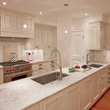
2101 Connecticut Avenue (c.1928), an 8-story brick and limestone Beaux Arts style building with spacious apartments, is said to have been “the finest apartment house to appear in Washington between the two World Wars.” (James M. Goode, Best Addresses, 1988.) As advertised for rent in 1928, the apartments were designed “to incorporate many details that would aid the residents in establishing a home atmosphere, one possessing charm and dignity usually found only in a private house… the character and tenancy (being) assured through careful selection of guests.” Home to Senators, Ambassadors, a Vice President and a Supreme Court Justice as well as numerous Washington socialites, the building still stands as one of the undisputed “best addresses” in Washington, DC.)
So well laid-out was this gracious 3,000 sf apartment that the basic floor plan remains unchanged from the original architect’s 1927 design. The organizing feature was, and continues to be, the grand “gallery” space in the center of the unit. Every room in the apartment can be accessed via the gallery, thus preserving it as the centerpiece of the “charm and dignity” which the original design intended. Programmatic modifications consisted of the addition of a small powder room off of the foyer, and the conversion of a corner “sun room” into a room for meditation and study. The apartment received a thorough updating of all systems, services and finishes, including a new kitchen and new bathrooms, several new built-in cabinetry units, and the consolidation of numerous small closets and passageways into more accessible and efficient storage spaces.
 Synergy Design & Construction
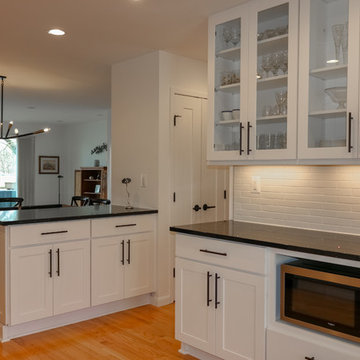
Our client wanted to retain a coat closet at the entry to the Kitchen, but with improved storage and an updated look. The closet doors match the Kitchen cabinetry but the remaining interior doors on the first floor were also replaced with Jeld-wen single panel doors for an updated look, with contrasting Schlage "Broadway" door hardware in matte black to bring the entire space together.
 Ogawa Fisher Architects
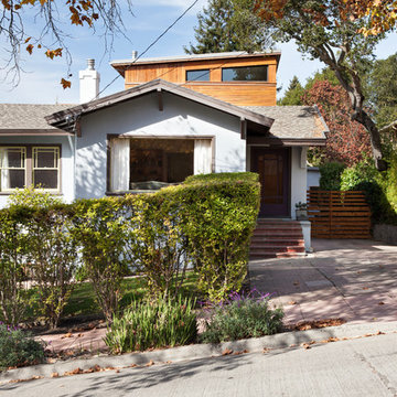
Street view of our Marin Avenue Residence.
www.marikoreed.com
Example of a mid-sized eclectic gray two-story wood exterior home design in San Francisco with a shed roof
Example of a mid-sized eclectic gray two-story wood exterior home design in San Francisco with a shed roof
Find the right local pro for your project
 Kimberlee Marie Interiors
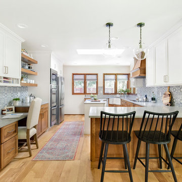
It’s always a blessing when your clients become friends - and that’s exactly what blossomed out of this two-phase remodel (along with three transformed spaces!). These clients were such a joy to work with and made what, at times, was a challenging job feel seamless. This project consisted of two phases, the first being a reconfiguration and update of their master bathroom, guest bathroom, and hallway closets, and the second a kitchen remodel.
In keeping with the style of the home, we decided to run with what we called “traditional with farmhouse charm” – warm wood tones, cement tile, traditional patterns, and you can’t forget the pops of color! The master bathroom airs on the masculine side with a mostly black, white, and wood color palette, while the powder room is very feminine with pastel colors.
When the bathroom projects were wrapped, it didn’t take long before we moved on to the kitchen. The kitchen already had a nice flow, so we didn’t need to move any plumbing or appliances. Instead, we just gave it the facelift it deserved! We wanted to continue the farmhouse charm and landed on a gorgeous terracotta and ceramic hand-painted tile for the backsplash, concrete look-alike quartz countertops, and two-toned cabinets while keeping the existing hardwood floors. We also removed some upper cabinets that blocked the view from the kitchen into the dining and living room area, resulting in a coveted open concept floor plan.
Our clients have always loved to entertain, but now with the remodel complete, they are hosting more than ever, enjoying every second they have in their home.
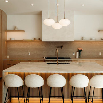
 RnD Builders Inc
RnD Builders Inc - Custom Home Builders | Woodland Hills
Trendy kitchen photo in Los Angeles
Trendy kitchen photo in Los Angeles
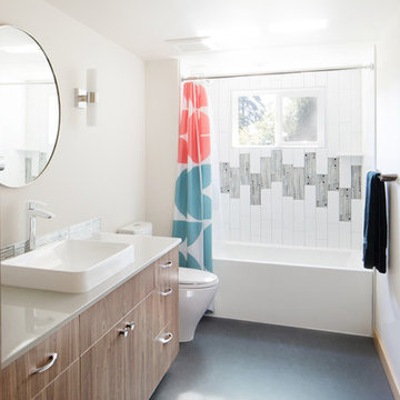
 The Artisans Group, Inc.
Winner of the 2018 Tour of Homes Best Remodel, this whole house re-design of a 1963 Bennet & Johnson mid-century raised ranch home is a beautiful example of the magic we can weave through the application of more sustainable modern design principles to existing spaces.
We worked closely with our client on extensive updates to create a modernized MCM gem.
Extensive alterations include:
- a completely redesigned floor plan to promote a more intuitive flow throughout
- vaulted the ceilings over the great room to create an amazing entrance and feeling of inspired openness
- redesigned entry and driveway to be more inviting and welcoming as well as to experientially set the mid-century modern stage
- the removal of a visually disruptive load bearing central wall and chimney system that formerly partitioned the homes’ entry, dining, kitchen and living rooms from each other
- added clerestory windows above the new kitchen to accentuate the new vaulted ceiling line and create a greater visual continuation of indoor to outdoor space
- drastically increased the access to natural light by increasing window sizes and opening up the floor plan
- placed natural wood elements throughout to provide a calming palette and cohesive Pacific Northwest feel
- incorporated Universal Design principles to make the home Aging In Place ready with wide hallways and accessible spaces, including single-floor living if needed
- moved and completely redesigned the stairway to work for the home’s occupants and be a part of the cohesive design aesthetic
- mixed custom tile layouts with more traditional tiling to create fun and playful visual experiences
- custom designed and sourced MCM specific elements such as the entry screen, cabinetry and lighting
- development of the downstairs for potential future use by an assisted living caretaker
- energy efficiency upgrades seamlessly woven in with much improved insulation, ductless mini splits and solar gain
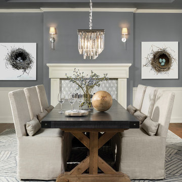
 Factor Design Build
This 1912 traditional style house sits on the edge of Cheesman Park with four levels that needed updating to better suit the young family’s needs.
A custom wine room was constructed on the lower level to accommodate an area for entertaining guests. The main level was divided into a smaller family room area with a double door opening into the formal living room. The kitchen and butler’s pantry were combined and remodeled for better function.
The second level master bathroom was relocated and created out of an adjacent bedroom, incorporating an existing fireplace and Juliet balcony that looks out to the park.
A new staircase was constructed on the third level as a continuation of the grand staircase in the center of the house. A gathering and play space opens off the stairs and connects to the third-floor deck. A Jill & Jill bathroom remodel was constructed between the girls’ rooms.
Sponsored
Columbus, OH

Snider & Metcalf Interior Design, LTD
Leading Interior Designers in Columbus, Ohio & Ponte Vedra, Florida
 Lark Architecture
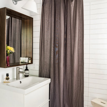
The compact but bright bathroom utilizes floor to ceiling oversized subway tiles in a stacked pattern to emphasize the height of the space. The continuation of the bright white color scheme brings a feeling of spaciousness to the diminutive room.
Photography by Cynthia Lynn Photography
 CG&S Design-Build
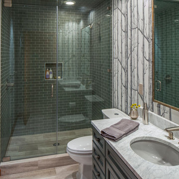
As construction moved forward, the clients could see how the renovation of the first floor enhanced the space and they wanted to continue the level of finish on the lower level. This meant updating the outdated guest bathroom. The old tub/shower unit was removed and a new shower took its place. Cool green glass shower tile and funky tree wallpaper modernized the bathroom while new vanity cabinets and counters continue the theme of the updated renovations. Recessed lighting and a vintage inspired mirror complete the look. |
Photo by Tre Dunham
 Pineapple House Interior Design
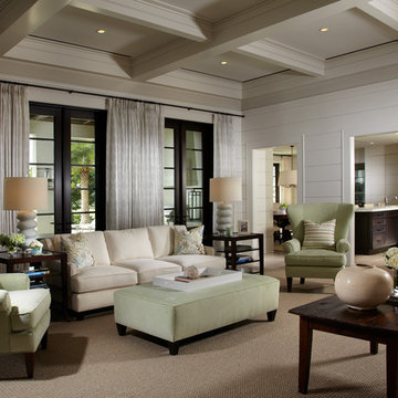
To maintain the home's visual flow, designers continued the horizontal wood plank wall motif throughout the home, including on two pantry doors and the kitchen back splash. They integrated the indoors with the outdoors by (a) opening up views (b) replacing three living room windows with French doors that open onto patio and (c) creating an exterior covered outdoor living, dining and kitchen area between the pool and house.
Daniel Newcomb Photography
 The Artisans Group, Inc.
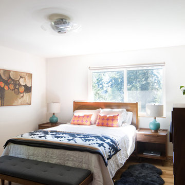
Winner of the 2018 Tour of Homes Best Remodel, this whole house re-design of a 1963 Bennet & Johnson mid-century raised ranch home is a beautiful example of the magic we can weave through the application of more sustainable modern design principles to existing spaces.
We worked closely with our client on extensive updates to create a modernized MCM gem.
Extensive alterations include:
- a completely redesigned floor plan to promote a more intuitive flow throughout
- vaulted the ceilings over the great room to create an amazing entrance and feeling of inspired openness
- redesigned entry and driveway to be more inviting and welcoming as well as to experientially set the mid-century modern stage
- the removal of a visually disruptive load bearing central wall and chimney system that formerly partitioned the homes’ entry, dining, kitchen and living rooms from each other
- added clerestory windows above the new kitchen to accentuate the new vaulted ceiling line and create a greater visual continuation of indoor to outdoor space
- drastically increased the access to natural light by increasing window sizes and opening up the floor plan
- placed natural wood elements throughout to provide a calming palette and cohesive Pacific Northwest feel
- incorporated Universal Design principles to make the home Aging In Place ready with wide hallways and accessible spaces, including single-floor living if needed
- moved and completely redesigned the stairway to work for the home’s occupants and be a part of the cohesive design aesthetic
- mixed custom tile layouts with more traditional tiling to create fun and playful visual experiences
- custom designed and sourced MCM specific elements such as the entry screen, cabinetry and lighting
- development of the downstairs for potential future use by an assisted living caretaker
- energy efficiency upgrades seamlessly woven in with much improved insulation, ductless mini splits and solar gain
 G.B. Construction and Development, Inc.
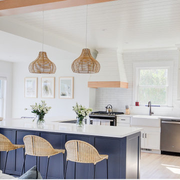
Completely remodeled beach house with an open floor plan, beautiful light wood floors and an amazing view of the water. After walking through the entry with the open living room on the right you enter the expanse with the sitting room at the left and the family room to the right. The original double sided fireplace is updated by removing the interior walls and adding a white on white shiplap and brick combination separated by a custom wood mantle the wraps completely around. Continue through the family room to the kitchen with a large island and an amazing dining area. The blue island and the wood ceiling beam add warmth to this white on white coastal design. The shiplap hood with the custom wood band tie the shiplap ceiling and the wood ceiling beam together to complete the design.
 Stock & Associates, Inc.
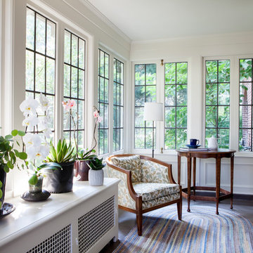
Sitting in one of Capital Hill’s beautiful neighborhoods, the exterior of this residence portrays a
bungalow style home as from the Arts and Craft era. By adding a large dormer to east side of the house,
the street appeal was maintained which allowed for a large master suite to be added to the second
floor. As a result, the two guest bedrooms and bathroom were relocated to give to master suite the
space it needs. Although much renovation was done to the Federalist interior, the original charm was
kept by continuing the formal molding and other architectural details throughout the house. In addition
to opening up the stair to the entry and floor above, the sense of gained space was furthered by opening
up the kitchen to the dining room and remodeling the space to provide updated finishes and appliances
as well as custom cabinetry and a hutch. The main level also features an added powder room with a
beautiful black walnut vanity.
Sponsored
Columbus, OH

HomeCraft Remodeling
Custom Craftsmanship & Build Solutions in Franklin County, Ohio
 Corinthian Fine Homes
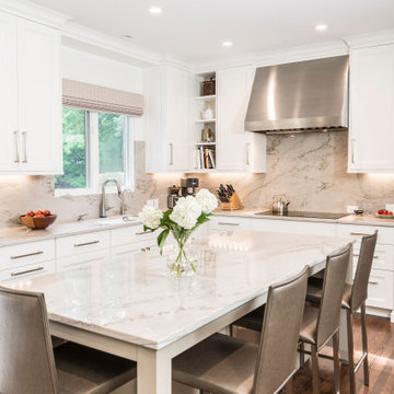
This homeowner came to us with her basic design ready for us to execute for her kitchen, but also asked us to design and update her entry, sunroom and fireplace. Her kitchen was 80’s standard builder grade cabinetry and laminate countertops and she had a knee wall separating her kitchen from the family room. We removed that wall and installed a custom cabinetry buffet to complement the cabinetry of the kitchen, allowing for access from all sides. We removed a desk area in the kitchen and converted it to a closed organization station complete with a charging station for phones and computers. Calcutta Quartzite countertops were used throughout and continued seamlessly up the walls as a backsplash to create a wow factor. We converted a closet into a pantry cabinet, and new stainless appliances, including a microwave drawer completed this renovation.
Additionally, we updated her sunroom by removing the “popcorn” textured ceiling and gave it a fresh updated coat of paint. We installed 12x24 tile floor giving the room a simple classic transformation. Finally, we renewed the fireplace area, by building a custom mantle and adding wood paneling and trim to soften the marble fireplace face and a simple coat of paint in the entry and a new chandelier brought a lighter and fresher impact upon entering the home.
 Gardner Architects LLC
Photography by Ken Wyner
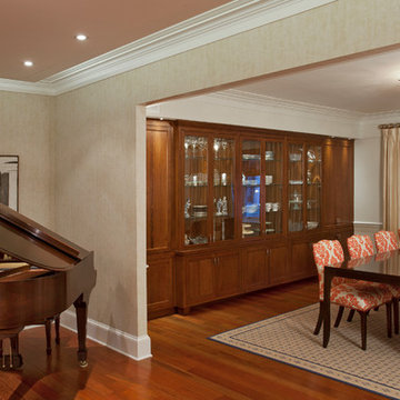
2101 Connecticut Avenue (c.1928), an 8-story brick and limestone Beaux Arts style building with spacious apartments, is said to have been “the finest apartment house to appear in Washington between the two World Wars.” (James M. Goode, Best Addresses, 1988.) As advertised for rent in 1928, the apartments were designed “to incorporate many details that would aid the residents in establishing a home atmosphere, one possessing charm and dignity usually found only in a private house… the character and tenancy (being) assured through careful selection of guests.” Home to Senators, Ambassadors, a Vice President and a Supreme Court Justice as well as numerous Washington socialites, the building still stands as one of the undisputed “best addresses” in Washington, DC.)
So well laid-out was this gracious 3,000 sf apartment that the basic floor plan remains unchanged from the original architect’s 1927 design. The organizing feature was, and continues to be, the grand “gallery” space in the center of the unit. Every room in the apartment can be accessed via the gallery, thus preserving it as the centerpiece of the “charm and dignity” which the original design intended. Programmatic modifications consisted of the addition of a small powder room off of the foyer, and the conversion of a corner “sun room” into a room for meditation and study. The apartment received a thorough updating of all systems, services and finishes, including a new kitchen and new bathrooms, several new built-in cabinetry units, and the consolidation of numerous small closets and passageways into more accessible and efficient storage spaces.
 TKS Design Group
Download our free ebook, Creating the Ideal Kitchen. DOWNLOAD NOW
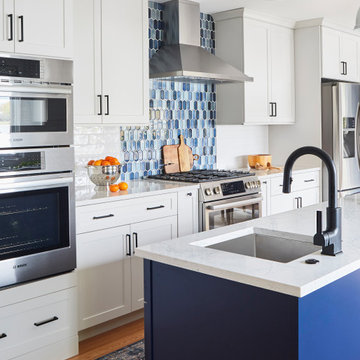
Lakefront property in the northwest suburbs of Chicago is hard to come by, so when we were hired by this young family with exactly that, we were immediately inspired by not just the unusually large footprint of this 1950’s colonial revival but also the lovely views of the manmade lake it was sited on. The large 5-bedroom home was solidly stuck in the 1980’s, but we saw tons of potential. We started out by updating the existing staircase with a fresh coat of paint and adding new herringbone slate to the entry hall.
The powder room off the entryway also got a refresh - new flooring, new cabinets and fixtures. We ran the new slate right through into this space for some consistency. A fun wallpaper and shiplap trim add a welcoming feel and set the tone for the home.
Next, we tackled the kitchen. Located away from the rest of the first floor, the kitchen felt a little isolated, so we immediately began planning for how to better connect it to the rest of the first floor. We landed on removing the wall between the kitchen and dining room and designed a modified galley style space with separate cooking and clean up zones. The cooking zone consists of the refrigerator, prep sink and cooktop, along with a nice long run of prep space at the island. The cleanup side of the kitchen consists of the main sink and dishwasher. Both areas are situated so that the user can view the lake during prep work and cleanup!
One of the home’s main puzzles was how to incorporate the mudroom and area in front of the patio doors at the back of the house. We already had a breakfast table area, so the space by the patio doors was a bit of a no man’s land. We decided to separate the kitchen proper from what became the new mudroom with a large set of barn doors. That way you can quickly hide any mudroom messes but have easy access to the light coming in through the patio doors as well as the outdoor grilling station. We also love the impact the barn doors add to the overall space.
The homeowners’ first words to us were “it’s time to ditch the brown,” so we did! We chose a lovely blue pallet that reflects the home’s location on the lake which is also vibrant yet easy on the eye. Countertops are white quartz, and the natural oak floor works well with the other honey accents. The breakfast table was given a refresh with new chairs, chandelier and window treatments that frame the gorgeous views of the lake out the back.
We coordinated the slate mudroom flooring with that used in the home’s main entrance for a consistent feel. The storage area consists of open and closed storage to allow for some clutter control as needed.
Next on our “to do” list was revamping the dated brown bar area in the neighboring dining room. We eliminated the clutter by adding some closed cabinets and did some easy updates to help the space feel more current. One snag we ran into here was the discovery of a beam above the existing open shelving that had to be modified with a smaller structural beam to allow for our new design to work. This was an unexpected surprise, but in the end we think it was well worth it!
We kept the colors here a bit more muted to blend with the homeowner’s existing furnishings. Open shelving and polished nickel hardware add some simple detail to the new entertainment zone which also looks out onto the lake!
Next we tackled the upstairs starting with the homeowner’s son’s bath. The bath originally had both a tub shower and a separate shower, so we decided to swap out the shower for a new laundry area. This freed up some space downstairs in what used to be the mudroom/laundry room and is much more convenient for daily laundry needs.
We continued the blue palette here with navy cabinetry and the navy tile in the shower. Porcelain floor tile and chrome fixtures keep maintenance to a minimum while matte black mirrors and lighting add some depth the design. A low maintenance runner adds some warmth underfoot and ties the whole space together.
We added a pocket door to the bathroom to minimize interference with the door swings. The left door of the laundry closet is on a 180 degree hinge to allow for easy full access to the machines. Next we tackled the master bath which is an en suite arrangement. The original was typical of the 1980’s with the vanity outside of the bathroom, situated near the master closet. And the brown theme continued here with multiple shades of brown.
Our first move was to segment off the bath and the closet from the master bedroom. We created a short hall from the bedroom to the bathroom with his and hers walk-in closets on the left and right as well as a separate toilet closet outside of the main bathroom for privacy and flexibility.
The original bathroom had a giant soaking tub with steps (dangerous!) as well as a small shower that did not work well for our homeowner who is 6’3”. With other bathtubs in the home, they decided to eliminate the tub and create an oversized shower which takes up the space where the old tub was located. The double vanity is on the opposite wall and a bench is located under the window for morning conversations and a place to set a couple of towels.
The pallet in here is light and airy with a mix of blond wood, creamy porcelain and marble tile, and brass accents. A simple roman shade adds some texture and it’s top-down mechanism allows for light and privacy.
This large whole house remodel gave our homeowners not only the ability to maximize the potential of their home but also created a lovely new frame from which to view their fabulous lake views.
Designed by: Susan Klimala, CKD, CBD
Photography by: Michael Kaskel
For more information on kitchen and bath design ideas go to: www.kitchenstudio-ge.com
 Lincoln Lighthill Architect
Lincoln Lighthill Architect employed several discrete updates that collectively transform this existing row house.
At the heart of the home, a section of floor was removed at the top level to open up the existing stair and allow light from a new skylight to penetrate deep into the home. The stair itself received a new maple guardrail and planter, with a Fiddle-leaf fig tree growing up through the opening towards the skylight.
On the top living level, an awkwardly located entrance to a full bathroom directly off the main stair was moved around the corner and out of the way by removing a little used tub from the bathroom, as well as an outdated heater in the back corner. This created a more discrete entrance to the existing, now half-bath, and opened up a space for a wall of pantry cabinets with built-in refrigerator, and an office nook at the rear of the house with a huge new awning window to let in light and air.
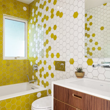
Downstairs, the two existing bathrooms were reconfigured and recreated as dedicated master and kids baths. The kids bath uses yellow and white hexagonal Heath tile to create a pixelated celebration of color. The master bath, hidden behind a flush wall of walnut cabinetry, utilizes another Heath tile color to create a calming retreat.
Throughout the home, walnut thin-ply cabinetry creates a strong contrast to the existing maple flooring, while the exposed blond edges of the material tie the two together. Rounded edges on integral pulls and door edges create pinstripe detailing that adds richness and a sense of playfulness to the design.
This project was featured by Houzz: https://tinyurl.com/stn2hcze
Sponsored
Columbus, OH
HomeCraft Remodeling
Custom Craftsmanship & Build Solutions in Franklin County, Ohio
 Corsini Stark Architects
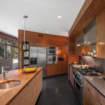
Lloyd Wright, son of Frank Lloyd Wright, designed the low-slung Gainsburg House in 1946 in the spirit of his father’s Usonian House prototypes of the 1930s. The new owners sought to reverse years of insensitive alterations while including a new kitchen, dining and family rooms, updated bathrooms, lighting and finishes, with accommodation for contemporary art display. The house was conceived as one area within an overall site geometry and the exterior can be seen from all interior angles and spaces. Our new palette compliments the original finishes and reinforces the existing geometry, enhancing a rhythm that moves throughout the house and engages the landscape in a continuous spatial composition. Images by Steve King Architectural Photography
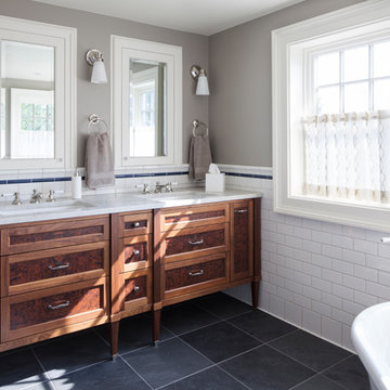 Stock & Associates, Inc.
Sitting in one of Capital Hill’s beautiful neighborhoods, the exterior of this residence portrays a
bungalow style home as from the Arts and Craft era. By adding a large dormer to east side of the house,
the street appeal was maintained which allowed for a large master suite to be added to the second
floor. As a result, the two guest bedrooms and bathroom were relocated to give to master suite the
space it needs. Although much renovation was done to the Federalist interior, the original charm was
kept by continuing the formal molding and other architectural details throughout the house. In addition
to opening up the stair to the entry and floor above, the sense of gained space was furthered by opening
up the kitchen to the dining room and remodeling the space to provide updated finishes and appliances
as well as custom cabinetry and a hutch. The main level also features an added powder room with a
beautiful black walnut vanity.

11