
Search results for "Continually updating" in Home Design Ideas
 DesignHAUS 24
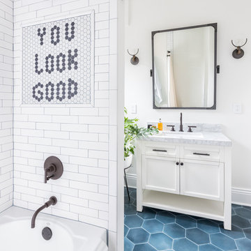
Inspiration for an eclectic gray tile, multicolored tile, white tile and subway tile blue floor bathroom remodel in DC Metro with shaker cabinets, white cabinets, white walls, an undermount sink and gray countertops
 Flavin Architects
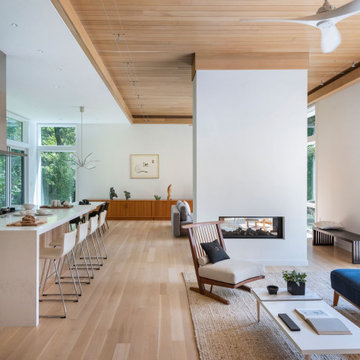
Our clients wanted to replace an existing suburban home with a modern house at the same Lexington address where they had lived for years. The structure the clients envisioned would complement their lives and integrate the interior of the home with the natural environment of their generous property. The sleek, angular home is still a respectful neighbor, especially in the evening, when warm light emanates from the expansive transparencies used to open the house to its surroundings. The home re-envisions the suburban neighborhood in which it stands, balancing relationship to the neighborhood with an updated aesthetic.
The floor plan is arranged in a “T” shape which includes a two-story wing consisting of individual studies and bedrooms and a single-story common area. The two-story section is arranged with great fluidity between interior and exterior spaces and features generous exterior balconies. A staircase beautifully encased in glass stands as the linchpin between the two areas. The spacious, single-story common area extends from the stairwell and includes a living room and kitchen. A recessed wooden ceiling defines the living room area within the open plan space.
Separating common from private spaces has served our clients well. As luck would have it, construction on the house was just finishing up as we entered the Covid lockdown of 2020. Since the studies in the two-story wing were physically and acoustically separate, zoom calls for work could carry on uninterrupted while life happened in the kitchen and living room spaces. The expansive panes of glass, outdoor balconies, and a broad deck along the living room provided our clients with a structured sense of continuity in their lives without compromising their commitment to aesthetically smart and beautiful design.
 Gardner Architects LLC
Photography by Ken Wyner
2101 Connecticut Avenue (c.1928), an 8-story brick and limestone Beaux Arts style building with spacious apartments, is said to have been “the finest apartment house to appear in Washington between the two World Wars.” (James M. Goode, Best Addresses, 1988.) As advertised for rent in 1928, the apartments were designed “to incorporate many details that would aid the residents in establishing a home atmosphere, one possessing charm and dignity usually found only in a private house… the character and tenancy (being) assured through careful selection of guests.” Home to Senators, Ambassadors, a Vice President and a Supreme Court Justice as well as numerous Washington socialites, the building still stands as one of the undisputed “best addresses” in Washington, DC.)
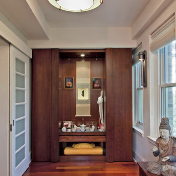
So well laid-out was this gracious 3,000 sf apartment that the basic floor plan remains unchanged from the original architect’s 1927 design. The organizing feature was, and continues to be, the grand “gallery” space in the center of the unit. Every room in the apartment can be accessed via the gallery, thus preserving it as the centerpiece of the “charm and dignity” which the original design intended. Programmatic modifications consisted of the addition of a small powder room off of the foyer, and the conversion of a corner “sun room” into a room for meditation and study. The apartment received a thorough updating of all systems, services and finishes, including a new kitchen and new bathrooms, several new built-in cabinetry units, and the consolidation of numerous small closets and passageways into more accessible and efficient storage spaces.
Find the right local pro for your project

 TKS Design Group
Download our free ebook, Creating the Ideal Kitchen. DOWNLOAD NOW
For many, extra time at home during COVID left them wanting more from their homes. Whether you realized the shortcomings of your space or simply wanted to combat boredom, a well-designed and functional home was no longer a want, it became a need. Tina found herself wanting more from her Old Irving Park home and reached out to The Kitchen Studio about adding function to her kitchen to make the most of the available real estate.
At the end of the day, there is nothing better than returning home to a bright and happy space you love. And this kitchen wasn’t that for Tina. Dark and dated, with a palette from the past and features that didn’t make the most of the available square footage, this remodel required vision and a fresh approach to the space. Lead designer, Stephanie Cole’s main design goal was better flow, while adding greater functionality with organized storage, accessible open shelving, and an overall sense of cohesion with the adjoining family room.
The original kitchen featured a large pizza oven, which was rarely used, yet its footprint limited storage space. The nearby pantry had become a catch-all, lacking the organization needed in the home. The initial plan was to keep the pizza oven, but eventually Tina realized she preferred the design possibilities that came from removing this cumbersome feature, with the goal of adding function throughout the upgraded and elevated space. Eliminating the pantry added square footage and length to the kitchen for greater function and more storage. This redesigned space reflects how she lives and uses her home, as well as her love for entertaining.
The kitchen features a classic, clean, and timeless palette. White cabinetry, with brass and bronze finishes, contrasts with rich wood flooring, and lets the large, deep blue island in Woodland’s custom color Harbor – a neutral, yet statement color – draw your eye.
The kitchen was the main priority. In addition to updating and elevating this space, Tina wanted to maximize what her home had to offer. From moving the location of the patio door and eliminating a window to removing an existing closet in the mudroom and the cluttered pantry, the kitchen footprint grew. Once the floorplan was set, it was time to bring cohesion to her home, creating connection between the kitchen and surrounding spaces.
The color palette carries into the mudroom, where we added beautiful new cabinetry, practical bench seating, and accessible hooks, perfect for guests and everyday living. The nearby bar continues the aesthetic, with stunning Carrara marble subway tile, hints of brass and bronze, and a design that further captures the vibe of the kitchen.
Every home has its unique design challenges. But with a fresh perspective and a bit of creativity, there is always a way to give the client exactly what they want [and need]. In this particular kitchen, the existing soffits and high slanted ceilings added a layer of complexity to the lighting layout and upper perimeter cabinets.
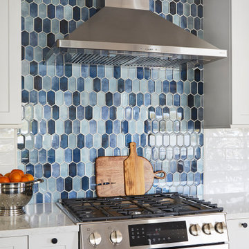
While a space needs to look good, it also needs to function well. This meant making the most of the height of the room and accounting for the varied ceiling features, while also giving Tina everything she wanted and more. Pendants and task lighting paired with an abundance of natural light amplify the bright aesthetic. The cabinetry layout and design compliments the soffits with subtle profile details that bring everything together. The tile selections add visual interest, drawing the eye to the focal area above the range. Glass-doored cabinets further customize the space and give the illusion of even more height within the room.
While her family may be grown and out of the house, Tina was focused on adding function without sacrificing a stunning aesthetic and dreamy finishes that make the kitchen the gathering place of any home. It was time to love her kitchen again, and if you’re wondering what she loves most, it’s the niche with glass door cabinetry and open shelving for display paired with the marble mosaic backsplash over the range and complimenting hood. Each of these features is a stunning point of interest within the kitchen – both brag-worthy additions to a perimeter layout that previously felt limited and lacking.
Whether your remodel is the result of special needs in your home or simply the excitement of focusing your energy on creating a fun new aesthetic, we are here for it. We love a good challenge because there is always a way to make a space better – adding function and beauty simultaneously.
 TKS Design Group
Download our free ebook, Creating the Ideal Kitchen. DOWNLOAD NOW
Lakefront property in the northwest suburbs of Chicago is hard to come by, so when we were hired by this young family with exactly that, we were immediately inspired by not just the unusually large footprint of this 1950’s colonial revival but also the lovely views of the manmade lake it was sited on. The large 5-bedroom home was solidly stuck in the 1980’s, but we saw tons of potential. We started out by updating the existing staircase with a fresh coat of paint and adding new herringbone slate to the entry hall.
The powder room off the entryway also got a refresh - new flooring, new cabinets and fixtures. We ran the new slate right through into this space for some consistency. A fun wallpaper and shiplap trim add a welcoming feel and set the tone for the home.
Next, we tackled the kitchen. Located away from the rest of the first floor, the kitchen felt a little isolated, so we immediately began planning for how to better connect it to the rest of the first floor. We landed on removing the wall between the kitchen and dining room and designed a modified galley style space with separate cooking and clean up zones. The cooking zone consists of the refrigerator, prep sink and cooktop, along with a nice long run of prep space at the island. The cleanup side of the kitchen consists of the main sink and dishwasher. Both areas are situated so that the user can view the lake during prep work and cleanup!
One of the home’s main puzzles was how to incorporate the mudroom and area in front of the patio doors at the back of the house. We already had a breakfast table area, so the space by the patio doors was a bit of a no man’s land. We decided to separate the kitchen proper from what became the new mudroom with a large set of barn doors. That way you can quickly hide any mudroom messes but have easy access to the light coming in through the patio doors as well as the outdoor grilling station. We also love the impact the barn doors add to the overall space.
The homeowners’ first words to us were “it’s time to ditch the brown,” so we did! We chose a lovely blue pallet that reflects the home’s location on the lake which is also vibrant yet easy on the eye. Countertops are white quartz, and the natural oak floor works well with the other honey accents. The breakfast table was given a refresh with new chairs, chandelier and window treatments that frame the gorgeous views of the lake out the back.
We coordinated the slate mudroom flooring with that used in the home’s main entrance for a consistent feel. The storage area consists of open and closed storage to allow for some clutter control as needed.
Next on our “to do” list was revamping the dated brown bar area in the neighboring dining room. We eliminated the clutter by adding some closed cabinets and did some easy updates to help the space feel more current. One snag we ran into here was the discovery of a beam above the existing open shelving that had to be modified with a smaller structural beam to allow for our new design to work. This was an unexpected surprise, but in the end we think it was well worth it!
We kept the colors here a bit more muted to blend with the homeowner’s existing furnishings. Open shelving and polished nickel hardware add some simple detail to the new entertainment zone which also looks out onto the lake!
Next we tackled the upstairs starting with the homeowner’s son’s bath. The bath originally had both a tub shower and a separate shower, so we decided to swap out the shower for a new laundry area. This freed up some space downstairs in what used to be the mudroom/laundry room and is much more convenient for daily laundry needs.
We continued the blue palette here with navy cabinetry and the navy tile in the shower. Porcelain floor tile and chrome fixtures keep maintenance to a minimum while matte black mirrors and lighting add some depth the design. A low maintenance runner adds some warmth underfoot and ties the whole space together.
We added a pocket door to the bathroom to minimize interference with the door swings. The left door of the laundry closet is on a 180 degree hinge to allow for easy full access to the machines. Next we tackled the master bath which is an en suite arrangement. The original was typical of the 1980’s with the vanity outside of the bathroom, situated near the master closet. And the brown theme continued here with multiple shades of brown.
Our first move was to segment off the bath and the closet from the master bedroom. We created a short hall from the bedroom to the bathroom with his and hers walk-in closets on the left and right as well as a separate toilet closet outside of the main bathroom for privacy and flexibility.
The original bathroom had a giant soaking tub with steps (dangerous!) as well as a small shower that did not work well for our homeowner who is 6’3”. With other bathtubs in the home, they decided to eliminate the tub and create an oversized shower which takes up the space where the old tub was located. The double vanity is on the opposite wall and a bench is located under the window for morning conversations and a place to set a couple of towels.
The pallet in here is light and airy with a mix of blond wood, creamy porcelain and marble tile, and brass accents. A simple roman shade adds some texture and it’s top-down mechanism allows for light and privacy.
This large whole house remodel gave our homeowners not only the ability to maximize the potential of their home but also created a lovely new frame from which to view their fabulous lake views.
Designed by: Susan Klimala, CKD, CBD
Photography by: Michael Kaskel
For more information on kitchen and bath design ideas go to: www.kitchenstudio-ge.com
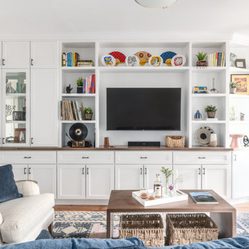
 Rooted By Design
Philadelphia Row Home Renovation focusing on maximizing storage for a young family of 5. We created a "mudroom" in the front of the row home with a large living room space for family time + hosting. We used kid-friendly furnishings with performance fabrics that are durable and easy to clean. Prioritized eco-friendly selections, utilizing locally sourced + American made pieces.
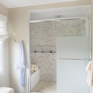 TKS Design Group
Download our free ebook, Creating the Ideal Kitchen. DOWNLOAD NOW
Lakefront property in the northwest suburbs of Chicago is hard to come by, so when we were hired by this young family with exactly that, we were immediately inspired by not just the unusually large footprint of this 1950’s colonial revival but also the lovely views of the manmade lake it was sited on. The large 5-bedroom home was solidly stuck in the 1980’s, but we saw tons of potential. We started out by updating the existing staircase with a fresh coat of paint and adding new herringbone slate to the entry hall.
The powder room off the entryway also got a refresh - new flooring, new cabinets and fixtures. We ran the new slate right through into this space for some consistency. A fun wallpaper and shiplap trim add a welcoming feel and set the tone for the home.
Next, we tackled the kitchen. Located away from the rest of the first floor, the kitchen felt a little isolated, so we immediately began planning for how to better connect it to the rest of the first floor. We landed on removing the wall between the kitchen and dining room and designed a modified galley style space with separate cooking and clean up zones. The cooking zone consists of the refrigerator, prep sink and cooktop, along with a nice long run of prep space at the island. The cleanup side of the kitchen consists of the main sink and dishwasher. Both areas are situated so that the user can view the lake during prep work and cleanup!
One of the home’s main puzzles was how to incorporate the mudroom and area in front of the patio doors at the back of the house. We already had a breakfast table area, so the space by the patio doors was a bit of a no man’s land. We decided to separate the kitchen proper from what became the new mudroom with a large set of barn doors. That way you can quickly hide any mudroom messes but have easy access to the light coming in through the patio doors as well as the outdoor grilling station. We also love the impact the barn doors add to the overall space.
The homeowners’ first words to us were “it’s time to ditch the brown,” so we did! We chose a lovely blue pallet that reflects the home’s location on the lake which is also vibrant yet easy on the eye. Countertops are white quartz, and the natural oak floor works well with the other honey accents. The breakfast table was given a refresh with new chairs, chandelier and window treatments that frame the gorgeous views of the lake out the back.
We coordinated the slate mudroom flooring with that used in the home’s main entrance for a consistent feel. The storage area consists of open and closed storage to allow for some clutter control as needed.
Next on our “to do” list was revamping the dated brown bar area in the neighboring dining room. We eliminated the clutter by adding some closed cabinets and did some easy updates to help the space feel more current. One snag we ran into here was the discovery of a beam above the existing open shelving that had to be modified with a smaller structural beam to allow for our new design to work. This was an unexpected surprise, but in the end we think it was well worth it!
We kept the colors here a bit more muted to blend with the homeowner’s existing furnishings. Open shelving and polished nickel hardware add some simple detail to the new entertainment zone which also looks out onto the lake!
Next we tackled the upstairs starting with the homeowner’s son’s bath. The bath originally had both a tub shower and a separate shower, so we decided to swap out the shower for a new laundry area. This freed up some space downstairs in what used to be the mudroom/laundry room and is much more convenient for daily laundry needs.
We continued the blue palette here with navy cabinetry and the navy tile in the shower. Porcelain floor tile and chrome fixtures keep maintenance to a minimum while matte black mirrors and lighting add some depth the design. A low maintenance runner adds some warmth underfoot and ties the whole space together.
We added a pocket door to the bathroom to minimize interference with the door swings. The left door of the laundry closet is on a 180 degree hinge to allow for easy full access to the machines. Next we tackled the master bath which is an en suite arrangement. The original was typical of the 1980’s with the vanity outside of the bathroom, situated near the master closet. And the brown theme continued here with multiple shades of brown.
Our first move was to segment off the bath and the closet from the master bedroom. We created a short hall from the bedroom to the bathroom with his and hers walk-in closets on the left and right as well as a separate toilet closet outside of the main bathroom for privacy and flexibility.
The original bathroom had a giant soaking tub with steps (dangerous!) as well as a small shower that did not work well for our homeowner who is 6’3”. With other bathtubs in the home, they decided to eliminate the tub and create an oversized shower which takes up the space where the old tub was located. The double vanity is on the opposite wall and a bench is located under the window for morning conversations and a place to set a couple of towels.
The pallet in here is light and airy with a mix of blond wood, creamy porcelain and marble tile, and brass accents. A simple roman shade adds some texture and it’s top-down mechanism allows for light and privacy.
This large whole house remodel gave our homeowners not only the ability to maximize the potential of their home but also created a lovely new frame from which to view their fabulous lake views.
Designed by: Susan Klimala, CKD, CBD
Photography by: Michael Kaskel
For more information on kitchen and bath design ideas go to: www.kitchenstudio-ge.com
Sponsored
Columbus, OH

HomeCraft Remodeling
Custom Craftsmanship & Build Solutions in Franklin County, Ohio
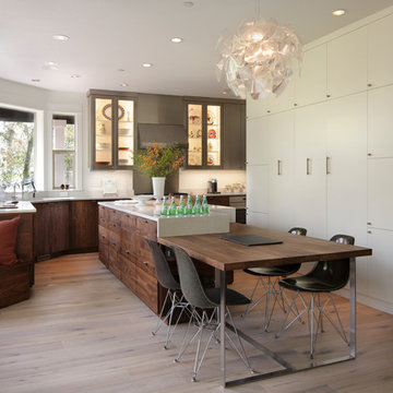
 Arciform
This custom walnut island is flanked by a full wall of pantry and storage on the right and a custom walnut sitting nook on the left. Kitchen Design by Kristyn Bester. Interiors by Barbara Sumner. Photo by Greg Kozawa
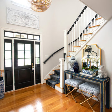
 Pine Street Carpenters & The Kitchen Studio
Example of a transitional entryway design in Philadelphia
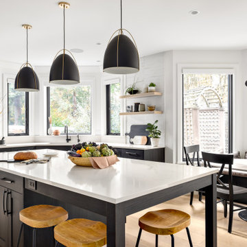
 Simply Home Decorating
This beautiful North Vancouver home belongs to a nature-loving and health-conscious couple, Emma and Vince (names changed), their two young children, and their dog, Jasper. When they contacted us about renovating and furnishing their kitchen and family room, we walked in and saw a world of potential waiting to be uncovered.
Before: Larkhall Crescent Home:
Like many original North Vancouver homes, the interior was definitely dated. We encountered late ‘80s finishes in powder pink and teal green, old carpet, and a kitchen that wasn’t maximized to suit this family’s modern-day lifestyle. However, the size of the rooms offered us a ton of space with which to get creative.
Knowing our clients’ love of cooking, need for work spaces (Emma and Vince both work remotely), and growing family, we developed a design concept that would increase usable space, optimize storage, and create intimacy in this large area. As for the style, we were inspired by their European roots, inventing a new and modern take on “Belgian Farmhouse” style. Now, the home is truly one-of-a-kind.
After: Warm & Cozy Family Room:
Fresh, bright, and comfortable, this living area has been transformed! We started with the fireplace as a focal point, selecting aged brick tiles for added texture and a crisp wood mantle. The taupe-coloured sectional infuses the room with visual warmth and serves the added purpose of separating the family room from the kitchen.
Emma and Vince were also keen on using non-toxic materials in their home, and we were happy to oblige. To meet their needs, we sourced natural wood elements and sought out Canadian-made products - that adhere to high health standards - whenever possible.
Look closer at the elements of this space, and you will find this stunning, honeycomb-patterned rug in earthy gold, beige, and charcoal tones. It’s plush to the touch and full of visual texture that brings this room’s colour palette together. We sourced these two-tone chairs with caning, petrified wood side table, black sconces, and botanical prints in greyscale from local artist, Heather Johnston.
We topped off the space with this dark wood and rattan console that offers storage facing the kitchen and presents an opportunity to display cherished items. The result is a cozy lounging space brimming with comfort and functionality. It’s perfect for enjoying quality family time, or Emma can simply slide the coffee table away to make room for her morning yoga practice.
Now, let’s turn around and give some attention to the kitchen. Do you remember what the original kitchen looked like? If not, scroll back up, because the transformation is shocking…
Moody & Welcoming Kitchen for Healthy Living:
This kitchen looks very different from how it started, right? Though we didn’t touch any walls, the kitchen has almost doubled in usable space! We created a long, extended island with storage, an outlet for small appliances, and seating for comfortable prep, after-school snacking, or mingling among friends.
On the other side of the island, the family has even more storage and an integrated dishwasher within easy reach of the sink, perfect for quick clean-up. From this angle, you can also see the expansive custom Shaker cabinetry in white and the integrated double ovens. These facilitate their cooking experience and gave us the opportunity to add an additional surprise…
A coffee garage station and more hidden storage! Keeping these items located along the perimeter allows them to be accessed by the family or their guests without someone getting under the cook’s feet. These are the little details that make everyday life easier and more enjoyable.
Moving deeper into the kitchen, the seamless induction cooktop topped with a freestanding concealed hood fan commands attention in a soft yet prominent way. The natural wood accent mirrors the fireplace mantle, and the choice of off-black wood-grain cabinets not only continues our black-and-white colour palette but adds a sense of depth and contrast. The corner sink is located to the right and perfectly positioned with a view of their thriving backyard.
To invite more of this family’s character into the space, we mixed metals for interest — matte black, dark pewter, and warm brass — and created open shelves in white oak for their plants and decor. You can also glimpse the tumbled edge of the backsplash tile, which echoes the rustic brick of the fireplace. It adds that farmhouse charm while still feeling timeless and sophisticated.
Last but not least, we designed this dining banquette in the bay window (with integrated bench storage, of course), where the family can share a meal together, the kids can do homework, or Emma and Vince can work and enjoy a change of scenery from their offices. Like the other spaces in the home, it was designed to be beautiful, multi-functional, and long-lasting.
Praise from Our Clients:
It is clear that we love this home, but what did our clients have to say?
“Lori is a visionary and masters execution to the finest detail all at the same time. When she first met us to know more about who we are and how we live, she could right away envision how we could use the space in our kitchen and living room…The results exceeded our expectations.
Lori and her team were also a delight to work with — coordination with all the trades, fast problem-solving, regular updates, professional and friendly attitude of her entire team — made it the dream team. Thank you SHD for making our space so beautiful!”
In turn, we are so grateful for this family’s trust, their open communication, and for being wonderful people with whom to work. (So, thank you!)

 Klopf Architecture
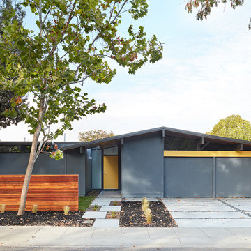
Klopf Architecture completely remodeled this once dark Eichler house in Palo Alto creating a more open, bright and functional family home. The reconfigured great room with new full height windows and sliding glass doors blends the indoors with the newly landscaped patio and seating areas outside. The former galley kitchen was relocated and was opened up to have clear sight lines through the great room and out to the patios and yard, including a large island and a beautiful walnut bar countertop with seating. An integrated small front addition was added allowing for a more spacious master bath and hall bath layouts. With the removal of the old brick fireplace, larger sliding glass doors and multiple skylights now flood the home with natural light.
The goals were to work within the Eichler style while creating a more open, indoor-outdoor flow and functional spaces, as well as a more efficient building envelope including a well insulated roof, providing solutions that many Eichler homeowners appreciate. The original entryway lacked unique details; the clients desired a more gracious front approach. The historic Eichler color palette was used to create a modern updated front facade.
Durable grey porcelain floor tiles unify the entire home, creating a continuous flow. They, along with white walls, provide a backdrop for the unique elements and materials to stand on their own, such as the brightly colored mosaic tiles, the walnut bar and furniture, and stained ceiling boards. A secondary living space was extended out to the patio with the addition of a bench and additional seating.
This Single family Eichler 4 bedroom 2 bath remodel is located in the heart of the Silicon Valley.
Klopf Architecture Project Team: John Klopf, Klara Kevane, and Ethan Taylor
Contractor: Coast to Coast Construction
Landscape Contractor: Discelli
Structural Engineer: Brian Dotson Consulting Engineer
Photography ©2018 Mariko Reed
Location: Palo Alto, CA
Year completed: 2017
 Casework Inter Design
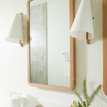
This 1950’s mid century ranch had good bones, but was not all that it could be - especially for a family of four. The entrance, bathrooms and mudroom lacked storage space and felt dark and dingy.
The main bathroom was transformed back to its original charm with modern updates by moving the tub underneath the window, adding in a double vanity and a built-in laundry hamper and shelves. Casework used satin nickel hardware, handmade tile, and a custom oak vanity with finger pulls instead of hardware to create a neutral, clean bathroom that is still inviting and relaxing.
The entry reflects this natural warmth with a custom built-in bench and subtle marbled wallpaper. The combined laundry, mudroom and boy's bath feature an extremely durable watery blue cement tile and more custom oak built-in pieces. Overall, this renovation created a more functional space with a neutral but warm palette and minimalistic details.
Interior Design: Casework
General Contractor: Raven Builders
Photography: George Barberis
Press: Rebecca Atwood, Rue Magazine
On the Blog: SW Ranch Master Bath Before & After
Sponsored
Columbus, OH
HomeCraft Remodeling
Custom Craftsmanship & Build Solutions in Franklin County, Ohio
 Klopf Architecture
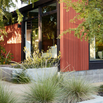
The Roger Lee designed house from 1962 was purchased by the current homeowners in almost original condition, as the previous owners elected to defer most maintenance projects over the years. The clients were able to see beyond the dated materials and finishes, single-paned glass and uninsulated walls and they approached Klopf Architecture to help them expand and update the entire home, one the family could settle into and enjoy for years to come. It was important that the new designs were aligned with Lee's original intent not only because of the client's appreciation for mid-century modern architecture, but also because the house was deemed historical. The Stanford Real Estate Office requires a stringent design review which safeguards the integrity of the community, which Klopf Architecture was happy to oblige going into their updated designs.
As with many original mid-century modern homes, the house was scaled to the 1960s lifestyle where rooms were smaller and openings to views were limited and tightly framed. The original conditions defined the direction the family of four would take in updating the house and making it comfortable for their modern lifestyle. Klopf designed a full gut remodel and major addition to bring the house into the 21st century and provide the living area needed for the client's family. The newly expanded house added just about 1,100 sf to create an airy, comfortable and family friendly house, taking full advantage of the beautiful southwestern views that extend out to the hills beyond. The enclosed garage created an additional 240 sf of covered space for long-term storage.
A cracked swimming pool created an eyesore taking up a majority of the backyard landscape, so it was one of the first elements to go during the transformation. Working with Outer Space Landscape Architects, the family asked for a mix of relaxing outdoor patio spaces that eventually blend into the native landscaping, extending their views outward toward the natural greenery of the trees beyond their property. Filling in the old pool was a smart way to expand the living spaces outward. The orientation of the house was designed to enjoy the views, but the original architecture provided the first homeowners with mere glimpses of the landscape outside.
Klopf was able to broaden those views, continuing and extending on the original architecture to take full advantage of the unobstructed natural views across the rear facade of the house. Small horizontal openings in the primary bedroom and office were replaced with much taller windows that now follow the angled roof line upward, extending across almost all of the facade. We worked with Western Windows, whose designs included an oblique-shaped, operable casement that allowed our design to rise with the slope. A new corner office added to the primary suite, offers a bright and functional work-from-home solution that looks out at the distant views and added natural light from the expanded window configuration that now wraps around the corner.
The existing lower level was designed by Lee as a utilitarian space, serving as a wet pool room with a drain in the center of the floor, bathroom, laundry and storage areas. Without the need for a pool room, Klopf was able to convert the area into a much more comfortable and functional living space with a new family room and guest suite. The new spaces enjoy easy access to a new outdoor patio through floor to ceiling, full-width glass sliders.
Continuing along the rear facade, a previously exposed deck extending from the living room and hallway provided access to the backyard through a single set of stairs leading toward the side of the house which made sense when the pool was in place. The new deck was re-envisioned as an extension of the main living room and now serves as a second outdoor living room. A new slatted pergola above provides the homeowners welcome relief from the hot afternoon sun. A second set of stairs now creates a better connection to the redesigned lower level. Klopf was able to reconfigure the spaces, extending the living room outward toward the views, where the family now claims it as the heart of the home, spending a large majority of their time outdoors.
Back inside, the original wood-burning Malm fireplace was beautifully restored and a gas burner installed to comply with California's strict air standards. It now rests in front of a wall of Heath accent tiles where a dated red brick wall used to stand. A new taller window brings more light and views into the refreshed interior living room. The original glass doors opposite the fireplace were replaced by larger sliders that when fully opened, create a seamless transition to the new outdoor living area so the two spaces feel like one connected space. The original utilitarian kitchen was needlessly tucked into the far back corner and closed-off, out of sight from the living room, so the clients asked Klopf to open it up and expand the kitchen forward so it felt more connected. Today the much larger kitchen is connected to the living area where a short wall with a cutout offers a visual glimpse into the kitchen and a handy pass-through counter for serving guests. A new breakfast nook was also added to create another spot where the family can gather for casual meals. Just outside, a new built-in outdoor grill and prep area extends the kitchen outside and connects to a new outdoor dining spot nestled amongst the trees, taking advantage of the views out back.
Klopf was able to expand the other two bedrooms, add a new laundry room and half-bath and convert the carport to an enclosed garage to add more storage areas which was lost when the pool house was converted to the family and guest room.
To maintain a historical connection to the original designs, the exterior siding was repeated on all exterior walls, a full-height stained glass window at the front entryway restored, and an interior slatted screen element repeated outside at the exterior entry courtyard and over the new outdoor living room to create a shade trellis. The new house stands proudly and shines against it's new landscaping features, while respecting and expanding on the original intent of Roger Lee's designs epitomizing the comforts of indoor-outdoor living in Northern California.
Completion year: 2020
Klopf Architecture project team: John Klopf, Klara Kevane, Noel Andrade
Contractor: ORB Construction, Brendan O'Reilly
Structural engineer: Sezen and Moon
Landscape architect: Outer space
Furnishings and decoration: Urbanism Designs
Photographer: Mariko Reed
 Klopf Architecture
Klopf Architecture, Outer Space Landscape Architects, Sezen & Moon Structural Engineer and Flegels Construction updated a classic Eichler open, indoor-outdoor home.
Everyone loved the classic, original bones of this house, but it was in need of a major facelift both inside and out. The owners also wanted to remove the barriers between the kitchen and great room, and increase the size of the master bathroom as well as make other layout changes. No addition to the house was contemplated.
The owners worked with Klopf Architecture in part because of Klopf’s extensive mid-century modern / Eichler design portfolio, and in part because one of their neighbors who had worked with Klopf on their Eichler home remodel referred them. The Klopf team knew how to update the worn finishes to make a more sophisticated, higher quality home that both looks better and functions better.
In conjunction with the atrium and the landscaped rear yard / patio, the glassy living room feels open on both sides and allows an indoor / outdoor flow throughout. The new, natural wood exterior siding runs through the house from inside to outside to inside again, updating one of the classic design features of the Eichler homes.
Picking up on the wood siding, walnut vanities and cabinets offset the white walls. Gray porcelain tiles evoke the concrete slab floors and flow from interior to exterior to make the spaces appear to flow together. Similarly the ceiling decking has the same white-washed finish from inside to out. The continuity of materials and space enhances the sense of flow.
The large kitchen, perfect for entertaining, has a wall of built-ins and an oversized island. There’s plenty of storage and space for the whole group to prep and cook together.
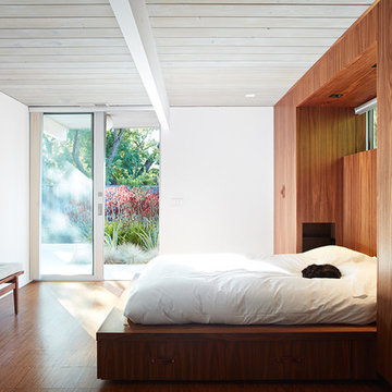
One unique approach to the master bedroom is the bed wall. The head of the bed is tucked within a line of built-in wardrobes with a high window above. Replacing the master closet with this wall of wardrobes allowed for both a larger bathroom and a larger bedroom.
This 1,953 square foot, 4 bedroom, 2 bathroom Double Gable Eichler remodeled single-family house is located in Mountain View in the heart of the Silicon Valley.
Klopf Architecture Project Team: John Klopf, AIA, Klara Kevane, and Yegvenia Torres-Zavala
Landscape Architect: Outer Space Landscape Architects
Structural Engineer: Sezen & Moon
Contractor: Flegels Construction
Landscape Contractor: Roco's Gardening & Arroyo Vista Landscaping, Inc.
Photography ©2016 Mariko Reed
Location: Mountain View, CA
Year completed: 2015
 Judith Wright Design
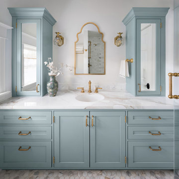
A compact bathroom was updated with finishes honoring the historic home. Maximum storage is incorporated into the vanity. Inset mirrors help expand the brightness and feeling of space. Living un-lacquered brass fixtures are used through out the home to honor its vintage charm.
 Klopf Architecture
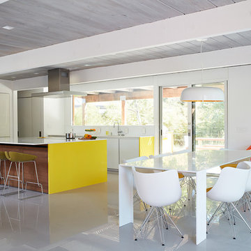
Klopf Architecture, Outer Space Landscape Architects, Sezen & Moon Structural Engineer and Flegels Construction updated a classic Eichler open, indoor-outdoor home.
Everyone loved the classic, original bones of this house, but it was in need of a major facelift both inside and out. The owners also wanted to remove the barriers between the kitchen and great room, and increase the size of the master bathroom as well as make other layout changes. No addition to the house was contemplated.
The owners worked with Klopf Architecture in part because of Klopf’s extensive mid-century modern / Eichler design portfolio, and in part because one of their neighbors who had worked with Klopf on their Eichler home remodel referred them. The Klopf team knew how to update the worn finishes to make a more sophisticated, higher quality home that both looks better and functions better.
In conjunction with the atrium and the landscaped rear yard / patio, the glassy living room feels open on both sides and allows an indoor / outdoor flow throughout. The new, natural wood exterior siding runs through the house from inside to outside to inside again, updating one of the classic design features of the Eichler homes.
Picking up on the wood siding, walnut vanities and cabinets offset the white walls. Gray porcelain tiles evoke the concrete slab floors and flow from interior to exterior to make the spaces appear to flow together. Similarly the ceiling decking has the same white-washed finish from inside to out. The continuity of materials and space enhances the sense of flow.
The large kitchen, perfect for entertaining, has a wall of built-ins and an oversized island. There’s plenty of storage and space for the whole group to prep and cook together.
One unique approach to the master bedroom is the bed wall. The head of the bed is tucked within a line of built-in wardrobes with a high window above. Replacing the master closet with this wall of wardrobes allowed for both a larger bathroom and a larger bedroom.
This 1,953 square foot, 4 bedroom, 2 bathroom Double Gable Eichler remodeled single-family house is located in Mountain View in the heart of the Silicon Valley.
Klopf Architecture Project Team: John Klopf, AIA, Klara Kevane, and Yegvenia Torres-Zavala
Landscape Architect: Outer Space Landscape Architects
Structural Engineer: Sezen & Moon
Contractor: Flegels Construction
Landscape Contractor: Roco's Gardening & Arroyo Vista Landscaping, Inc.
Photography ©2016 Mariko Reed
Location: Mountain View, CA
Year completed: 2015
Sponsored
Columbus, OH

Snider & Metcalf Interior Design, LTD
Leading Interior Designers in Columbus, Ohio & Ponte Vedra, Florida
 Holly Phillips @ The English Room
Mekenzie France
Inspiration for an eclectic carpeted great room remodel in Charlotte with white walls
Inspiration for an eclectic carpeted great room remodel in Charlotte with white walls
 Corinthian Fine Homes
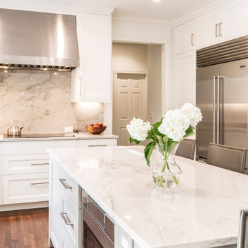
This homeowner came to us with her basic design ready for us to execute for her kitchen, but also asked us to design and update her entry, sunroom and fireplace. Her kitchen was 80’s standard builder grade cabinetry and laminate countertops and she had a knee wall separating her kitchen from the family room. We removed that wall and installed a custom cabinetry buffet to complement the cabinetry of the kitchen, allowing for access from all sides. We removed a desk area in the kitchen and converted it to a closed organization station complete with a charging station for phones and computers. Calcutta Quartzite countertops were used throughout and continued seamlessly up the walls as a backsplash to create a wow factor. We converted a closet into a pantry cabinet, and new stainless appliances, including a microwave drawer completed this renovation.
Additionally, we updated her sunroom by removing the “popcorn” textured ceiling and gave it a fresh updated coat of paint. We installed 12x24 tile floor giving the room a simple classic transformation. Finally, we renewed the fireplace area, by building a custom mantle and adding wood paneling and trim to soften the marble fireplace face and a simple coat of paint in the entry and a new chandelier brought a lighter and fresher impact upon entering the home.
 Klopf Architecture
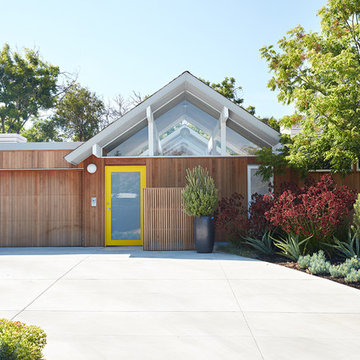
Klopf Architecture, Outer Space Landscape Architects, Sezen & Moon Structural Engineer and Flegels Construction updated a classic Eichler open, indoor-outdoor home.
Everyone loved the classic, original bones of this house, but it was in need of a major facelift both inside and out. The owners also wanted to remove the barriers between the kitchen and great room, and increase the size of the master bathroom as well as make other layout changes. No addition to the house was contemplated.
The owners worked with Klopf Architecture in part because of Klopf’s extensive mid-century modern / Eichler design portfolio, and in part because one of their neighbors who had worked with Klopf on their Eichler home remodel referred them. The Klopf team knew how to update the worn finishes to make a more sophisticated, higher quality home that both looks better and functions better.
In conjunction with the atrium and the landscaped rear yard / patio, the glassy living room feels open on both sides and allows an indoor / outdoor flow throughout. The new, natural wood exterior siding runs through the house from inside to outside to inside again, updating one of the classic design features of the Eichler homes.
Picking up on the wood siding, walnut vanities and cabinets offset the white walls. Gray porcelain tiles evoke the concrete slab floors and flow from interior to exterior to make the spaces appear to flow together. Similarly the ceiling decking has the same white-washed finish from inside to out. The continuity of materials and space enhances the sense of flow.
The large kitchen, perfect for entertaining, has a wall of built-ins and an oversized island. There’s plenty of storage and space for the whole group to prep and cook together.
One unique approach to the master bedroom is the bed wall. The head of the bed is tucked within a line of built-in wardrobes with a high window above. Replacing the master closet with this wall of wardrobes allowed for both a larger bathroom and a larger bedroom.
This 1,953 square foot, 4 bedroom, 2 bathroom Double Gable Eichler remodeled single-family house is located in Mountain View in the heart of the Silicon Valley.
Klopf Architecture Project Team: John Klopf, AIA, Klara Kevane, and Yegvenia Torres-Zavala
Landscape Architect: Outer Space Landscape Architects
Structural Engineer: Sezen & Moon
Contractor: Flegels Construction
Landscape Contractor: Roco's Gardening & Arroyo Vista Landscaping, Inc.
Photography ©2016 Mariko Reed
Location: Mountain View, CA
Year completed: 2015
10