
Search results for "Continue reading" in Home Design Ideas
 Rocky Tops Granite & Marble LLC
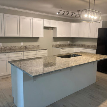
This kitchen came together with Ornamental White granite on the counters. No waterfall, no fancy backsplash story here, just solid granite doing what granite does best, holding up to real cooking and real life in a busy South Carolina kitchen.
We finished the edges with an eased profile, which is the detail people don't think about until they're leaning on the counter every day. An eased edge takes the sharp corner off the slab and rounds it just enough so it's comfortable to work against, without adding a bunch of extra machining that can chip or crack down the line. It's a clean, classic look that doesn't fight with the granite's natural pattern, and it wears well over years of use.
Granite is still one of the best choices you can put in a kitchen. It's hard, it's heat resistant, and you can set a hot pan on it without worrying. It'll take a knife dragged across it by accident and shrug it off. Every slab has its own movement in the stone, its own crystal structure catching light differently depending on where you stand, and templating a kitchen like this means matching that pattern at the seams so it reads like one continuous piece instead of two pieces bolted together.
Day to day, this countertop is going to earn its keep. Granite seals up easily and, once it's sealed, it resists staining from wine, oil, coffee, whatever gets set down on it. It doesn't scratch from normal kitchen use, and it doesn't dull over time the way some softer stones can. That's why we keep coming back to it for kitchens that actually get used, not just looked at.
We fabricate and install jobs like this all over the Midlands, and it's the same story every time: good stone, cut right, set level, edges finished clean. That's what makes a countertop last for decades instead of years, and that's what you're getting here.
 Powell Construction
These homeowners came to us wanting to upgrade the curb appeal of their home and improve the layout of the interior. They hoped for an entry that would welcome guests to their home both inside and out, while also creating more defined and purposeful space within the home. The main goals of the project were to add a covered wrap around porch, add more windows for natural light, create a formal entry that housed the client’s baby grand piano, and add a home office for the clients to work from home.
With a dated exterior and facade that lacked dimension, there was little charm to be had. The front door was hidden from visitors and a lack of windows made the exterior unoriginal. We approached the exterior design pulling inspiration from the farmhouse style, southern porches, and craftsman style homes. Eventually we landed on a design that added numerous windows to the front façade, reminiscent of a farmhouse, and turned a Dutch hipped roof into an extended gable roof, creating a large front porch and adding curb appeal interest. By relocating the entry door to the front of the house and adding a gable accent over this new door, it created a focal point for guests and passersby. In addition to those design elements, we incorporated some exterior shutters rated for our northwest climate that echoed the southern style homes our client loved. A greige paint color (Benjamin Moore Cape May Cobblestone) accented with a white trim (Benjamin Moore Swiss Coffee) and a black front door, shutters, and window box (Sherwin Williams Black Magic) all work together to create a charming and welcoming façade.
On the interior we removed a half wall and coat closet that separated the original cramped entryway from the front room. The front room was a multipurpose space that didn’t have a designated use for the family, it became a catch-all space that was easily cluttered. Through the design process we came up with a plan to split the spaces into 2 rooms, a large open semi-formal entryway and a home office. The semi-formal entryway was intentionally designed to house the homeowner’s baby grand piano – a real showstopper. The flow created by this entryway is welcoming and ushers you into a beautifully curated home.
A new office now sits right off the entryway with beautiful French doors, built-in cabinetry, and an abundance of natural light – everything that one dreams of for their home office. The home office looks out to the front porch and front yard as well as the pastural side yard where the children frequently play. The office is an ideal location for a moment of inspiration, reflection, and focus. A warm white paint (Benjamin Moore Swiss Coffee) combined with the newly installed light oak luxury vinyl plank flooring runs throughout the home, creating continuity and a neutral canvas. Traditional and schoolhouse style statement light fixtures coordinate with the black door hardware for an added level of contrast.
There is one more improvement that made a big difference to this family. In the family room, we added a built-in window seat. This created a cozy nook that is used by all for reading and extra seating. This relatively small improvement had a big impact on how the family uses and enjoys the space.
 LaMantia Design and Remodeling
Our empty nester clients purchased a lovely Burr Ridge cottage with the plan to create their dream home. Their main objective when they first met with LaMantia architectural designer Jackie Prazak was to create a kitchen large enough to accommodate their extended (and now grown) family. After several design revisions the clients agreed to give up a Bedroom and a Powder Room to gain the enlarged Kitchen, Walk-in Master Closet and a separate double-entry Laundry Room they so desired.
By moving the kitchen wall 3’ we were able to accommodate the large Kitchen and Island the clients so desired.
The main entry to the Kitchen was both moved and enlarged to enhance the arrival and the view into the enlarged space.
We were also able to reclaim attic space and create the volume ceiling with added beams to continue the theme of the Living and Dining Room ceilings. At this point LaMantia kitchen designer Katie Suva, CKD, CBD joined the team to begin the detailing of the cabinet layout.
The Family Room, with its new large stone flooring was recreated with specialties galore; including a walk-up wet Bar. We were also able to re-purpose the existing Study into a Guest Bedroom with built-in closets and cabinetry. What was once a laundry space now became a new large Laundry Room accessed from both the Master Walk-in Closet and the hallway.
In the Master Bedroom the exterior entry door was replaced with large open glass window panels. The Master Bath ceiling was reworked to accommodate a soaring Master Shower. And then there was the enlarged Master Closet that speaks for itself!
The existing Solarium took on a different personality with a re-aligned entry door and built-in cabinetry. This room now houses all the home office and craft activities.
The scope of this project included every room in the residence, with the utmost attention paid to every detail, and the outcome is definitely worthy of the Professional Remodeling 2014 Gold Award it just won!
Follow the link below to read about the designer of this project Jackie Prazak http://lamantia.com/designers/jackie-prazak/
Find the right local pro for your project
 Century Stair Company
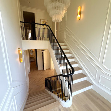
On first glance, this staircase reads as restrained. White oak treads rise with natural warmth, metal balusters hold their disciplined rhythm, and the painted black railing traces a clean, straight path upward. Then you notice the elliptical stringer wrap, and the whole composition shifts. Unlike a circular curve drawn with a compass, an ellipse requires mathematical calculation and a craftsman who knows how to make that complexity disappear. Here, it does exactly that.
Natural light finishes the story. Moving through the space across the day, it deepens the oak grain, catches the metal, and lets the black railing guide the eye along the handrail's elliptical path from start to finish. Restraint brought the design this far. One well-executed curve made it memorable.
1976-2026 © Century Stair Company
 Build Trust Remodeling
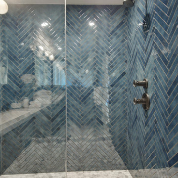
The blue tile carries into the shower without a change of material, so the room reads as one continuous surface. A marble bench cantilevers off the back wall over a mosaic floor, and the bronze fittings pick up the warmth in the glaze.
 TVL Creative Ltd.
[Our Clients]
We were so excited to help these new homeowners re-envision their split-level diamond in the rough. There was so much potential in those walls, and we couldn’t wait to delve in and start transforming spaces. Our primary goal was to re-imagine the main level of the home and create an open flow between the space. So, we started by converting the existing single car garage into their living room (complete with a new fireplace) and opening up the kitchen to the rest of the level.
[Kitchen]
The original kitchen had been on the small side and cut-off from the rest of the home, but after we removed the coat closet, this kitchen opened up beautifully. Our plan was to create an open and light filled kitchen with a design that translated well to the other spaces in this home, and a layout that offered plenty of space for multiple cooks. We utilized clean white cabinets around the perimeter of the kitchen and popped the island with a spunky shade of blue. To add a real element of fun, we jazzed it up with the colorful escher tile at the backsplash and brought in accents of brass in the hardware and light fixtures to tie it all together. Through out this home we brought in warm wood accents and the kitchen was no exception, with its custom floating shelves and graceful waterfall butcher block counter at the island.
[Dining Room]
The dining room had once been the home’s living room, but we had other plans in mind. With its dramatic vaulted ceiling and new custom steel railing, this room was just screaming for a dramatic light fixture and a large table to welcome one-and-all.
[Living Room]
We converted the original garage into a lovely little living room with a cozy fireplace. There is plenty of new storage in this space (that ties in with the kitchen finishes), but the real gem is the reading nook with two of the most comfortable armchairs you’ve ever sat in.
[Master Suite]
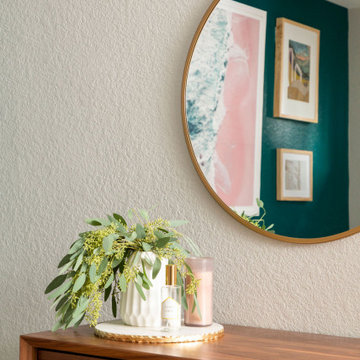
This home didn’t originally have a master suite, so we decided to convert one of the bedrooms and create a charming suite that you’d never want to leave. The master bathroom aesthetic quickly became all about the textures. With a sultry black hex on the floor and a dimensional geometric tile on the walls we set the stage for a calm space. The warm walnut vanity and touches of brass cozy up the space and relate with the feel of the rest of the home. We continued the warm wood touches into the master bedroom, but went for a rich accent wall that elevated the sophistication level and sets this space apart.
[Hall Bathroom]
The floor tile in this bathroom still makes our hearts skip a beat. We designed the rest of the space to be a clean and bright white, and really let the lovely blue of the floor tile pop. The walnut vanity cabinet (complete with hairpin legs) adds a lovely level of warmth to this bathroom, and the black and brass accents add the sophisticated touch we were looking for.
[Office]
We loved the original built-ins in this space, and knew they needed to always be a part of this house, but these 60-year-old beauties definitely needed a little help. We cleaned up the cabinets and brass hardware, switched out the formica counter for a new quartz top, and painted wall a cheery accent color to liven it up a bit. And voila! We have an office that is the envy of the neighborhood.
 Etheredge Design Associates, Inc.
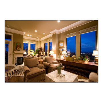
Using a "lifetime of collected pieces" from a sprawling ranch style home and introducing them into an urban mid-rise is an exciting challenge.
Designed for a couple down sizing from the sale of their home, the unit is quite small with a total of 1,807 square feet laid out in an open gallery floor plan with bedrooms at each end. The design was planned to accommodate the couple's extensive art collection, primitive antiques and textiles to maintain an atmosphere which replicated their former home. One of the challenges of this project was a requirement of the owners to incorporate the large scale antique pieces into this small space.
The window walls provide a dramatic view of the city and also dictate that the location for the taller antiques would be on the two remaining walls. The primary living space was divided into three separate areas: a dining area, a media area, and an area for reading and enjoying the fireplace on a winter day or evening. Hardwood flooring throughout creates continuity and an easy transition into the bedrooms adjacent to the primary space. To unify the suite and create the illusion of spaciousness, the walls throughout were painted the same rich yet neutral toast color, and all of the beautiful ceiling and floor molding are finished in a soft white. The finished space is all the owners desired in a residence that reflects their varied tastes, incorporates their interests and provides a comfortable home for entertaining family and friends.

Sponsored
Sunbury, OH

J.Holderby - Renovations
Franklin County's Leading General Contractors - 2X Best of Houzz!
 Burgin Design • Remodel
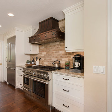
The Jordan family came to Burgin Construction Inc. because they were interested in having a bright and open design-build kitchen remodel in their Yorba Linda home.
Their renovation was complete with copper hood detailing, custom crafted cabinets, countertops, all new appliances, refinished flooring and fresh new paint.
Continue on to take a look at how the Burgin team worked hand-in-hand with the Jordan family to make their dreams a reality.
Take a moment to read the Jordan's review here: https://www.houzz.com/viewReview/792491/Burgin-Construction-review.
Are you ready to start making your living space more livable? Contact us and our design-build team will work hand-in-hand with you to make your dreams a reality.
 Cutuli Homes
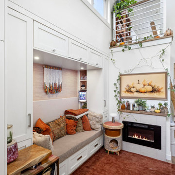
Built in 2024 by Cutuli Homes, this custom detached accessory dwelling unit was designed as a true mother-in-law home—a private, beautifully finished residence that allows three generations of one family to live close together while maintaining their own individual spaces.
The DADU was built as a companion to the homeowners' main residence, which Cutuli Homes had extensively remodeled and expanded two years earlier. Rather than treating the new structure as an afterthought, the goal was to create a home that felt architecturally connected to the existing property. Its traditional exterior, white siding, steeply pitched roof, generous windows and carefully proportioned trim give the small residence the character of an established home.
The project was created for the homeowners' mother, who downsized from her large lakefront home in the Midwest to move closer to her family and young grandchild. The result captures one of the greatest advantages of multigenerational living: family and shared community just steps away, balanced with the independence, privacy and comfort of a home of her own.
Inside, every inch was carefully considered. The compact footprint feels remarkably open thanks to a vaulted, white-paneled ceiling, abundant natural light, tall windows and an open vertical design that draws the eye upward. A loft level expands the usable living space without sacrificing the airy feeling of the main floor.
Traditional white Shaker-style cabinetry provides extensive built-in storage throughout the home and gives the interior a clean, timeless architectural character. In the kitchen, cabinetry extends upward to take advantage of the available height, while warm neutral countertops and a textured herringbone-pattern backsplash introduce subtle depth and contrast. Stainless-steel appliances are thoughtfully incorporated into the compact layout, creating a highly functional kitchen without overwhelming the living space.
One of the home's most charming features is the intimate living area tucked beneath custom built-in cabinetry. A built-in upholstered window-seat-style sofa with drawers below transforms what could have been unused space into a comfortable place to read, relax or visit. Across from it, a contemporary fireplace is integrated into a compact feature wall, with a wood display ledge above providing space for artwork, plants and personal collections.
Warm wood accents soften the predominantly white interior. Natural wood ledges, shelving, flooring and the loft ladder bring warmth and texture to the rooms, while greenery and personal furnishings give the home the comfortable character of a full-size residence rather than a conventional accessory dwelling unit.
The private sleeping area demonstrates the same emphasis on intelligent space planning. Built-in cabinetry surrounds the bed and continues overhead, providing substantial storage without requiring bulky freestanding furniture. A softly textured wall treatment, warm wood shelving and abundant natural light make the compact bedroom feel inviting and finished.
Above, the loft takes advantage of the dramatic roofline with a white tongue-and-groove style paneled ceiling extending from wall to wall. Built-in storage is incorporated beneath the sloped portions of the ceiling, turning otherwise difficult spaces into useful cabinetry while preserving an open central area for a desk, music, hobbies or additional flexible living space.
Even the exterior reflects the home's attention to detail. Large windows bring daylight deep into the interior, while the private patio extends the living space outdoors. Traditional siding and trim allow the DADU to complement the architecture of the main residence while still having an identity of its own.
At every turn, this project demonstrates that downsizing does not have to mean compromising on craftsmanship, beauty, storage or individuality. Through custom cabinetry, creative built-ins, vertical space planning and carefully considered architectural details, Cutuli Homes transformed a modest footprint into an elegant and highly personalized residence.
More than simply a DADU, this is a thoughtfully designed multigenerational home—close enough for grandparents, parents and grandchildren to share everyday life, while giving everyone the privacy and independence of having a place of their own.
 Globe Electric
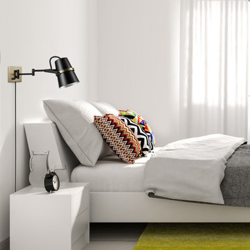
The modern industrial decor trend continues to be a must-have for any space and the stylish design of the McKibbin 1-Light Swing Arm Wall Sconce is the perfect accessory. It's not just the ultra-functional swing arm that makes it perfect - the shade pivots so the light can be pointed in various directions. The matte black finish is expertly accessorized with brass accents and is a knock-out against an exposed brick or concrete wall. The 2-in-1 design allows you to place the light anywhere you want. You're not restricted by the need for an existing hardwire connection – simply use the six-foot cord to place your sconce anywhere there's an outlet. The options are endless! Decorate with the Novogratz and Globe Electric - lighting made easy.

 Talianko Design Group, LLC
The patios are open from the living room, guest bedroom and master bedroom and overlook a gorgeous pool below. Contemporary metal furniture continues the contemporary style from inside and complements the architecture of the building. Two loveseats with granite top tables are the perfect place for lounging in the afternoon. Pillows and an outdoor rug bring interesting textures to the patio. Behind the loveseats is a pub table for dining and entertaining. Off of the Guest Bedroom and Master Bedroom are more private seating areas for a quite morning cup of coffee or a reading in the afternoons. Plants were added to the space for extra privacy and color. Photography by Erika Bierman
 LaMantia Design and Remodeling
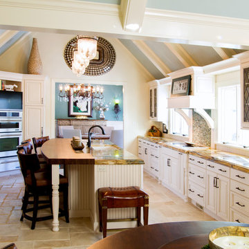
Our empty nester clients purchased a lovely Burr Ridge cottage with the plan to create their dream home. Their main objective when they first met with LaMantia architectural designer Jackie Prazak was to create a kitchen large enough to accommodate their extended (and now grown) family. After several design revisions the clients agreed to give up a Bedroom and a Powder Room to gain the enlarged Kitchen, Walk-in Master Closet and a separate double-entry Laundry Room they so desired.
By moving the kitchen wall 3’ we were able to accommodate the large Kitchen and Island the clients so desired.
The main entry to the Kitchen was both moved and enlarged to enhance the arrival and the view into the enlarged space.
We were also able to reclaim attic space and create the volume ceiling with added beams to continue the theme of the Living and Dining Room ceilings. At this point LaMantia kitchen designer Katie Suva, CKD, CBD joined the team to begin the detailing of the cabinet layout.
The Family Room, with its new large stone flooring was recreated with specialties galore; including a walk-up wet Bar. We were also able to re-purpose the existing Study into a Guest Bedroom with built-in closets and cabinetry. What was once a laundry space now became a new large Laundry Room accessed from both the Master Walk-in Closet and the hallway.
In the Master Bedroom the exterior entry door was replaced with large open glass window panels. The Master Bath ceiling was reworked to accommodate a soaring Master Shower. And then there was the enlarged Master Closet that speaks for itself!
The existing Solarium took on a different personality with a re-aligned entry door and built-in cabinetry. This room now houses all the home office and craft activities.
The scope of this project included every room in the residence, with the utmost attention paid to every detail, and the outcome is definitely worthy of the Professional Remodeling 2014 Gold Award it just won!
Follow the link below to read about the designer of this project Jackie Prazak http://lamantia.com/designers/jackie-prazak/
 Florida Green Construction Inc.
Certified Green Home!
Save Money approx. $150+ monthly savings on utility bills, approx. $20,000 in savings for 10 years and thousands in continued savings over the lifetime of the home, Certified Energy Star and FPL Build Smart Home.
Stay Healthy Attention people with allergies and breathing problems. This home is virtually allergen, dust, mold free. EPA certified indoor AirPLUS. You will be excited after reading our customer testimonials about how great they are feeling, living in a green home.
Be Wise by purchasing this certified Green home. Comparable cost to traditionally built homes. The home of the future at today’s price!
Your major benefits of investing in Green home: in addition to being healthy and economical, the Denise is built with sustainable construction technologies, that will keep your home competitive in the future housing market with newly built homes even in the next 10 – 15 years. Buying a Green home, you are making the best investment for your family.
Stay Safe the Denise with ICF walls is hurricane, tornado, fire resistant & sound suppressant. Substantially lower insurance premiums.
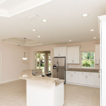
The split floor plan of this elegant & cozy home features an open living area with large great room that flows into the dining room & spacious gourmet kitchen with granite counter tops. This exquisite yet modest home is truly luxurious with ceramic tile & laminate floors throughout, large master suite, plus 2 additional bedrooms.


 Buffum Homes LLC
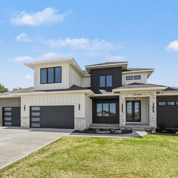
For the past several years, Buffum Homes has proudly featured Parade Homes within our own developments, and each year they have been a tremendous success. The Spring 2026 Parade of Homes was no exception. This year, we showcased our Sydney floor plan, one of Buffum Homes’ most popular 1.5-story home designs. Time and time again, homeowners are drawn to this plan because of its thoughtful layout, functional design, and ability to be customized to fit a variety of lifestyles.
From the moment visitors arrived, this home made a statement. Its striking modern exterior immediately stood out within the development and offered exceptional curb appeal. The design team selected beautiful masonry accents that perfectly complemented the home’s color palette, creating a sophisticated and welcoming first impression. Every exterior detail was intentionally chosen to enhance the architecture and showcase the home’s unique character.
Upon entry to this home, guests are welcomed through impressive double front doors that lead into a warm and inviting foyer. Immediately beyond, the stunning two-story great room creates a grand first impression. An overlooking loft from the second floor enhances the open feel of the space while allowing an abundance of natural daylight to pour throughout the home. A beautiful masonry fireplace chase serves as the focal point of the room, adding warmth, texture, and character to the heart of the home.
Just off the foyer is a private office featuring a thoughtfully designed custom built-in, creating the perfect space for working from home, studying, or staying organized. The attention to detail found throughout this space is a great example of the craftsmanship that Buffum Homes is known for.
Tucked away off the main living area is the primary suite, a comfortable retreat designed with both beauty and functionality in mind. The bedroom features a stunning tray ceiling accented with white oak detailing, creating a warm and sophisticated atmosphere. The primary bathroom includes a custom tiled shower, private water closet, dual-sink vanity, and a spacious walk-in closet. Every element was carefully considered to maximize both comfort and everyday convenience.
Buffum Homes has become known for incorporating unique trim details throughout our homes, and this Parade Home was certainly no exception. From feature walls and ceiling treatments to custom built-ins and carefully crafted millwork, thoughtful details can be found around every corner.
The great room flows seamlessly into the dining area and spacious U-shaped kitchen, creating an ideal layout for entertaining and everyday living. This updated version of the Sydney floor plan features a massive walk-in pantry with abundant shelving and countertop space, providing exceptional storage and organization. Within the kitchen, a stunning custom hood vent serves as a beautiful statement piece while built-in nooks offer convenient storage for cooking oils, spices, and other kitchen essentials.
Just beyond the kitchen, the mudroom provides a practical transition space from the garage into the home. Complete with custom built-in lockers, a convenient half bath, and a large laundry room, this area was designed to keep daily life organized and efficient. The home also features a spacious three-stall garage, offering plenty of room for vehicles, storage, and recreational equipment.
Spanning roughly 1,500 square feet, the main floor was thoughtfully designed to maximize functionality while maintaining an open and inviting feel. Every space serves a purpose while still providing the custom details and architectural features that make this home stand out.
Ascending to the second floor, homeowners are welcomed by a spacious open loft overlooking the great room below. This versatile area provides additional living space and can be customized to fit a variety of needs. Whether used as a play area for children or grandchildren, a reading nook, a homework station, or simply a secondary gathering space, the loft adds both functionality and character to the home while maintaining a connection to the main living areas below.
Also located on the second floor are three additional bedrooms and a full bathroom, providing plenty of room for family members and guests. The thoughtful layout allows for privacy while still keeping everyone connected through the open loft space.
With approximately 1,000 square feet on the upper level, the second floor complements the main level perfectly while adding flexibility for growing families and changing needs over time.
The lower level offers just under 1,100 square feet of future finish potential, providing homeowners with the flexibility to expand their living space as their needs evolve. Thoughtfully designed and well laid out, the basement is ready to accommodate a variety of future uses while maintaining excellent flow and functionality.
The available space is ideal for adding two future bedrooms, a spacious family room, and a future full bathroom, making it perfect for growing families, hosting guests, or creating additional recreational space. Even with these future living areas, there is still plenty of room remaining for storage, ensuring homeowners have ample space for seasonal items, hobbies, and household essentials.
One of the greatest advantages of the Sydney floor plan is its ability to grow alongside its homeowners. While the home already offers approximately 2,500 square feet of beautifully finished above-grade living space, completing the lower level would bring the total finished living area to over 3,600 square feet. This creates a truly expansive home that provides exceptional flexibility, comfort, and long-term value.
In its current configuration, this home offers 4 bedrooms, 2.5 bathrooms, and approximately 2,500 square feet above grade. With a future lower level finish, homeowners have the opportunity to expand to 6 bedrooms, 3.5 bathrooms, and over 3,600 square feet of finished living space. The flexibility built into this design is one of the many reasons the Sydney continues to be one of our most requested floor plans.
This home was filled with thoughtful details and custom touches throughout. From the carefully selected finishes and trim work to the intentional layout decisions, every aspect of the home was designed to maximize space, natural light, and everyday functionality. The result is a home that not only looks beautiful but also lives exceptionally well for years to come.
It was a pleasure featuring this home in the Parade of Homes and welcoming so many visitors through its doors. We always enjoy the opportunity to showcase our craftsmanship, creativity, and attention to detail while sharing the quality that Buffum Homes brings to every project throughout West Michigan.
As you browse through the photos below, we hope you’ll find inspiration for your own future home and discover ideas that fit your lifestyle and vision. Whether it is a favorite finish, layout feature, built-in detail, or design element, this home is a great example of how personalized a Buffum Home can be.
When you’re ready to begin your custom home journey, we’d love to help create a customized version of the Sydney floor plan tailored specifically to your family’s needs, style, and goals. We can’t wait to help bring your dream home to life.
 Home House Interiors
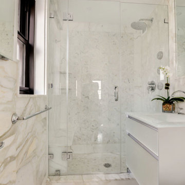
A compact yet beautifully resolved Upper East Side bathroom featuring marble field tile and a floral mosaic inset from Artistic Tile. The floating Robern vanity and under-cabinet lighting introduce a sense of lift and calm, while custom mirrors and shower doors create continuity. Refined Callista fittings and natural stone detailing bring quiet order and refinement.
Read more about composed bathrooms here:
https://homehouseinteriors.com/composed-bathroom-design-new-york/
 Century Stair Company
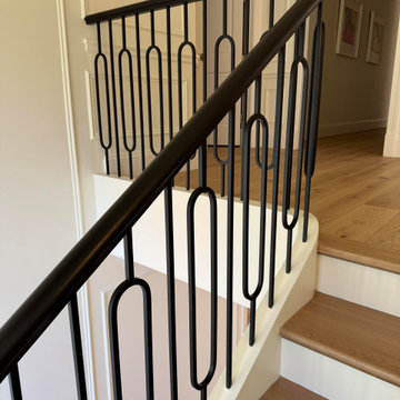
On first glance, this staircase reads as restrained. White oak treads rise with natural warmth, metal balusters hold their disciplined rhythm, and the painted black railing traces a clean, straight path upward. Then you notice the elliptical stringer wrap, and the whole composition shifts. Unlike a circular curve drawn with a compass, an ellipse requires mathematical calculation and a craftsman who knows how to make that complexity disappear. Here, it does exactly that.
Natural light finishes the story. Moving through the space across the day, it deepens the oak grain, catches the metal, and lets the black railing guide the eye along the handrail's elliptical path from start to finish. Restraint brought the design this far. One well-executed curve made it memorable.
1976-2026 © Century Stair Company
 LaMantia Design and Remodeling
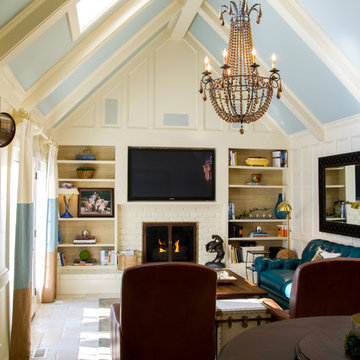
Our empty nester clients purchased a lovely Burr Ridge cottage with the plan to create their dream home. Their main objective when they first met with LaMantia architectural designer Jackie Prazak was to create a kitchen large enough to accommodate their extended (and now grown) family. After several design revisions the clients agreed to give up a Bedroom and a Powder Room to gain the enlarged Kitchen, Walk-in Master Closet and a separate double-entry Laundry Room they so desired.
By moving the kitchen wall 3’ we were able to accommodate the large Kitchen and Island the clients so desired.
The main entry to the Kitchen was both moved and enlarged to enhance the arrival and the view into the enlarged space.
We were also able to reclaim attic space and create the volume ceiling with added beams to continue the theme of the Living and Dining Room ceilings. At this point LaMantia kitchen designer Katie Suva, CKD, CBD joined the team to begin the detailing of the cabinet layout.
The Family Room, with its new large stone flooring was recreated with specialties galore; including a walk-up wet Bar. We were also able to re-purpose the existing Study into a Guest Bedroom with built-in closets and cabinetry. What was once a laundry space now became a new large Laundry Room accessed from both the Master Walk-in Closet and the hallway.
In the Master Bedroom the exterior entry door was replaced with large open glass window panels. The Master Bath ceiling was reworked to accommodate a soaring Master Shower. And then there was the enlarged Master Closet that speaks for itself!
The existing Solarium took on a different personality with a re-aligned entry door and built-in cabinetry. This room now houses all the home office and craft activities.
The scope of this project included every room in the residence, with the utmost attention paid to every detail, and the outcome is definitely worthy of the Professional Remodeling 2014 Gold Award it just won!
Follow the link below to read about the designer of this project Jackie Prazak http://lamantia.com/designers/jackie-prazak/
Sponsored
Sunbury, OH
J.Holderby - Renovations
Franklin County's Leading General Contractors - 2X Best of Houzz!
 Century Stair Company
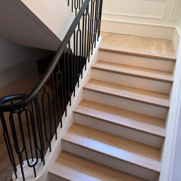
On first glance, this staircase reads as restrained. White oak treads rise with natural warmth, metal balusters hold their disciplined rhythm, and the painted black railing traces a clean, straight path upward. Then you notice the elliptical stringer wrap, and the whole composition shifts. Unlike a circular curve drawn with a compass, an ellipse requires mathematical calculation and a craftsman who knows how to make that complexity disappear. Here, it does exactly that.
Natural light finishes the story. Moving through the space across the day, it deepens the oak grain, catches the metal, and lets the black railing guide the eye along the handrail's elliptical path from start to finish. Restraint brought the design this far. One well-executed curve made it memorable.
1976-2026 © Century Stair Company

 Rocky Tops Granite & Marble LLC
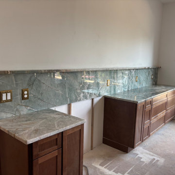
Tiffany Crystal quartzite is one of those stones that earns its keep in a kitchen. It's got that cool, crystalline background, whites and grays moving quietly across the surface with enough sparkle in the light to keep it from feeling flat. It reads clean and bright without going stark, which is why it works so well in a kitchen where people actually cook and gather, not just admire counters from across the room.
Quartzite is real stone, not engineered, so it comes with natural hardness that holds up to daily kitchen abuse. It resists scratching and handles heat well, though we still tell folks to use a trivet, because no counter needs a hot pan set straight on it just to prove a point. Sealing it right after install and keeping up with it over the years keeps the surface performing the way it should, and Tiffany Crystal takes a seal well because of its tight, dense structure.
Fabricating a slab like this takes some care in the layout. We spend real time bookmatching and dry-fitting pieces so the movement in the stone flows across seams instead of fighting itself at the corners. On a kitchen island or a run of perimeter counters, getting that continuity right is what separates a good installation from one that just gets the measurements correct. We kept the edge eased here, which is the right call on a stone with this much personality. It doesn't need extra shaping to draw the eye, the stone's already doing that work.
Day to day, this is a kitchen counter that's going to live hard and look good doing it. Quartzite shrugs off knife marks, stands up to acidic spills, and cleans up with regular dish soap and water. It's the kind of surface you stop babying after the first few months because it simply holds up.
Jobs like this one in Lexington are what we like seeing come through the shop. It's a straightforward kitchen application done with a stone that's got real depth to it, installed by people who care about how the seams and the veining line up when the job's done. That's the kind of work that keeps the Midlands trade honest.
53