
Search results for "Continue reading" in Home Design Ideas

 Tile Doctor Ltd
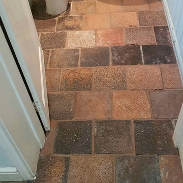
We were contacted by a client from Formby asking for advice on how to remove a thick layer of floor leveller from her Quarry tiled floor. I suspect at some point in the past a previous owner had decided to cover the tiles with lino and a cement-based levelling compound was applied to level the floor first. My client had tried to remove it herself but found it very hard going and after realising she had quite a project on her hands decided to call us instead and see if we could help with the restoration.
I worked out a quote for the client which would include removing the self-levelling compound, cleaning up the tiles and then sealing them to improve its appearance and protect it going forward. The quote was accepted, and a date agreed for the restoration to be completed which would take two days.
We have a variety of tools that we can use for removing cement but in this case, I decided to use an air operated pin gun. The head of the gun has long pins of different length which are fired at the floor gently chipping away at the floor compound, this made short work of breaking up the cement so it could be swept away. A lot easier than the method the client had previously tried.
With the floor clear of cement, it was given an acid wash with Tile Doctor Acid Gel scrubbed in with a buffing machine fitted with a black pad. The acidic formula cleans up the stone of old cement including fine particles of dust. Afterwards the gel was rinsed off the floor with water and extracted with a wet vacuum.
We let the floor dry out overnight and returned the next morning to apply the sealer. For the best results, the stone needs to be dry so before sealing I always take several moisture readings with a damp meter to make sure. The results were good so the first of what would be three coats of sealer were applied to the floor. I used Tile Doctor Colour Grow for sealing, it is an impregnating sealer that works by occupying the pores in the store thereby protecting it from within, it also brings out the colour in the stone.
Once done the floor looked great, the old self-levelling compound was gone and the rich colours in the tile had been restored. In fact is was only when finished did we realise these were in fact Baked Clay Quarry Tiles, minerals are added during manufacturing to give then colour, although 95% clay they are very tough like stone. The client was over the moon with the outcome, the floor had been restored to its’ former glory.
For aftercare I recommended the use of Tile Doctor Neutral Tile Cleaner to keep the floor in good condition. It is pH neutral so will ensure the newly applied sealer is not compromised and the floor will continue to look good for a long while to come.
Andrew Robb
Merseyside Tile Doctor
 Premier Cabinets of Virginia, LLC
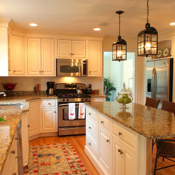
Inset-style cabinetry with raised panel doors and profiled, slab drawer fronts. White lacquer on maple. Clipped corner on island accommodates angled wall with large window and breakfast table.
Find the right local pro for your project
 Renovisions
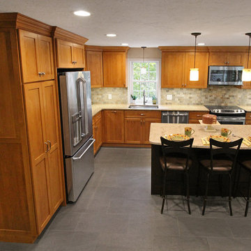
These Hanover, MA clients came to Renovisions as they wanted a local design-build company to rework and expand their small and outdated 1980’s colonial kitchen.
We collaborated and created an expanded 12’x15’ addition space to accommodate a newly designed kitchen which is now 21’x15’. Before we began with the construction process, proper structural engineering presented a challenge as the property was built on ledge. As expected, we determined that several concrete supports were necessary and needed to be built to support the expanded structure.
Our plan included both creative aesthetic and functional layout modifications to transform this ordinary kitchen into a spacious, well-lit, highly functional, stylish and welcoming space to cook, gather and entertain. The bump-out allowed for more functional cabinetry and a dining table which before was placed in a corner of the previous cramped kitchen. Now, there is a wide open space from the adjacent living room and a clear path to a 5’ French door opening to the pool deck. The homeowners also elected for us to extend a new roof over their existing deck creating a nice shaded space to entertain guests.
The island, which serves as the central gathering spot. is eye catching with contrasting dark cocoa colored cabinets and stunning natural looking Cambria quartz countertops. Large, easily accessible deep drawers provide much needed storage for pots, pans and lids as well as expansive countertop space for everyday prep and family get-togethers.
Overall, the clients were thrilled with their Renovision and cannot wait to throw a party to show off their stunning kitchen.
“There is not a single choice we aren’t happy with; it is so us! I love all of the storage and I have a feeling we are going to do a lot of entertaining this summer.”
“Dear Cathy and Ed, We are abundantly grateful for the entire Renovisions Team that have provided us with a beautiful kitchen and porch to enjoy. We will continue to make family memories for many years to come with this new addition. From the first time we met with you at the showroom, we were confident that high quality workmanship would go into our new construction. Mike, Brad, and Tom were very trustworthy and worked very hard every day they were on the job site. They were very flexible and always put the homeowners safety first. They even offered a bit of comic relief! Every night the site was cleaned meticulously, never leaving tools or sharp edges of any sort in the open space. We were also very pleased with the help offered when designing and choosing cabinets, tile and other finishes. Liz was always very helpful and patient to answer questions when we came by the showroom. We are extremely pleased with all the choices and on a daily basis we enjoy the warmth and amazing space it provides.
We recently hosted a retirement party for 70 people and it never felt crowed! We relax under the covered porch in the morning for coffee, the afternoon for lunch and to watch the grandkids in the pool. And of course in the evening while we read or catch up on emails. It is an amazing space! Thank you all again, for your hard work and passion for your craftsmanship. We will be in touch soon to set up a date for you all to drop by to see the finishing touches and to enjoy refreshments.”
- Paul & Beth H. (Hanover)
 Talianko Design Group, LLC
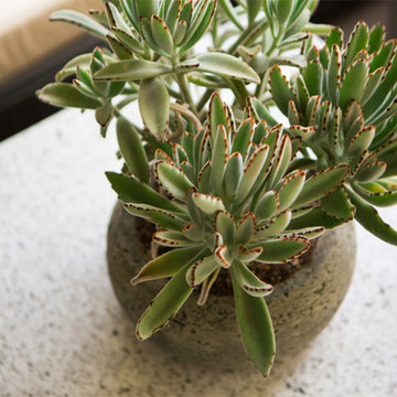
The patios are open from the living room, guest bedroom and master bedroom and overlook a gorgeous pool below. Contemporary metal furniture continues the contemporary style from inside and complements the architecture of the building. Two loveseats with granite top tables are the perfect place for lounging in the afternoon. Pillows and an outdoor rug bring interesting textures to the patio. Behind the loveseats is a pub table for dining and entertaining. Off of the Guest Bedroom and Master Bedroom are more private seating areas for a quite morning cup of coffee or a reading in the afternoons. Plants were added to the space for extra privacy and color. Photography by Erika Bierman
 Lola Cwikowski Studio
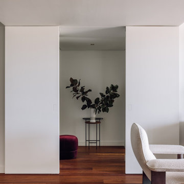
A couple relocating to Lisbon found a property in a recently upgraded building with open layouts and modernized features. Our studio was entrusted to bring elegant comfort to the interior with carefully curated, custom-designed furniture and decor. From a blank canvas, the home was enlivened with walnut furnishings by Portuguese producers, warm-hued textiles in botanical motifs, and accents of delicate brass lighting.
The entryway leads toward a spacious living room, where hand-woven rugs delineate areas for different activities. The first features a dining collection with upholstered shell chairs that comfortably envelop end-of-evening conversation. Midway, a daybed and display shelving system nestled under the lowered ceiling offer an intimate, yet versatile space. Stepping into the lounge, theatrical curtains reveal the pastel medley of Lisbon’s built landscape, the river, and hills in the distance. The dialogue of the room continues around a multi-tiered center table and featherweight pendant: a Brazilian modernist armchair faces a bespoke tufted-leather sofa, its throw cushions tailored to the palette of the media cabinet.
Outside, the balcony’s slate lacquered dining set caters to convivial meals. Private appreciation is found in a pair of leisurely chairs adjacent to the bedroom, with a side table quoting the terracotta background.
The main suite is endued with a crafted spindle bed dressed in deep blue linens and a lively made-to-measure embroidered bedspread. White Estremoz marble nightstands were designed to organize reading material and provide cable management. Circular ceramic lamps and bedside tables complement an ample upholstered bed to accommodate guests, and a floating console offers a discreet solution for remote meetings.
 House of Meraki
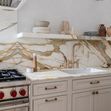
Taking on this pre-war building renovation was the ultimate design challenge. We combined two units into one massive home. By moving the dining table into the great room, we were able to double the size of the kitchen, allowing for a large island in the center of the space. The wolf range topped with a custom hood was on the utilitary side of the kitchen, next the the shaws sink and House of Rohl faucet. The Calacatta Paonazzo marble from Artistic tile in a honed finished continued from the counters to the backsplash and floating shelf, serving the wow factor this light kitchen deserved. On the opposite wall, floor to ceiling custom cabinetry housed a coffee station and ample storage. There’s even a reading nook window seat, perfect for morning coffee. The two glass blown pendants from Gabriel Scott float on top of the island while the Hudson Valley sconces illuminate the marble shelf. Lead designer, Stevi Fourouli added the final touch by painting lime-wash on the walls to accentuate the old-world feeling of this building.

Sponsored
Sunbury, OH

J.Holderby - Renovations
Franklin County's Leading General Contractors - 2X Best of Houzz!
 Coastline Builders Group
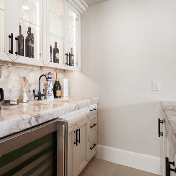
Custom wet bar from a complete luxury home remodel in Newport Coast, built by Coastline Builders Group between the kitchen and family room. The bar carries a natural stone slab countertop and full-height slab backsplash in dramatic veining, beneath glass-front upper cabinets displaying the collection, with an under-counter wine refrigerator, bar faucet in black, and the same custom cabinetry build and hardware as the kitchen beyond. Small rooms with full slab treatment are where fabrication discipline shows — the backsplash reads as one continuous stone composition from counter to crown.
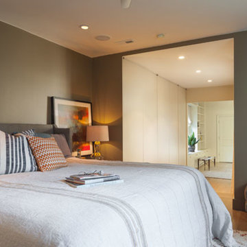
 Larson Shores Architects
This interior remodel in the Dolores Park neighborhood emphasized light, views and continuity between spaces and a pared down modern aesthetic. Unique and elegant lighting and luxurious textures in upholstery and other finishes add drama and personality to the spaces. Movement through the home culminates in the penthouse space, a private respite from which to take in the dramatic skyline view of San Francisco.
 Century Stair Company
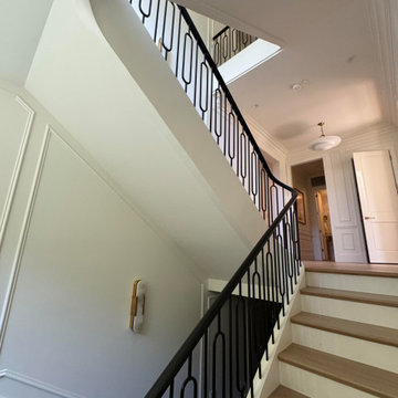
On first glance, this staircase reads as restrained. White oak treads rise with natural warmth, metal balusters hold their disciplined rhythm, and the painted black railing traces a clean, straight path upward. Then you notice the elliptical stringer wrap, and the whole composition shifts. Unlike a circular curve drawn with a compass, an ellipse requires mathematical calculation and a craftsman who knows how to make that complexity disappear. Here, it does exactly that.
Natural light finishes the story. Moving through the space across the day, it deepens the oak grain, catches the metal, and lets the black railing guide the eye along the handrail's elliptical path from start to finish. Restraint brought the design this far. One well-executed curve made it memorable.
1976-2026 © Century Stair Company
 Bilotta Kitchen & Home
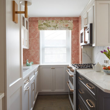
Bilotta Senior Designer, Thomas Vecchio, and Patrick J. Hamilton of Patrick James Hamilton Designs, partnered on this Manhattan upper east side kitchen renovation. This nondescript ‘60’s co-op and galley kitchen were reimagined into a pre-war era gem by adding architectural details: paneling, coffers, and moldings. Widening the opening created an open vista. Upper panes of glass on the Bilotta Collection wall cabinets echo the apartment’s transoms and unite the two sections that are interrupted by the paneled structural column. To compensate for the shorter wall, storage is optimized with plentiful pullouts, dividers, and specialized organizers. The “dead end” under the window was eliminated by continuing cabinetry and countertop materials around the room.
Countertop wall cabinets create a hutch in full view of the dining room. With dark gray paint, corner posts and furniture base molding, the peninsula reads like an island and bridges the two areas. Quartz countertops sport “lightning bolt” veins for pattern. Sophisticated on-
trend brushed brass was employed on the cabinet pulls and knobs, faucet, sconces, and pendants. A gamechanger was extending the footprint of the kitchen into the hallway with two tall cabinets. One is allocated for cleaning supplies, bulk items, recycling, and the vacuum. The other conceals a built-in wine rack; glassware and bar items; a docking drawer for charging devices; and a Penda-flex rack for files. An absolutely stunning metamorphosis.
Written by Paulette Gambacorta adapted for Houzz.
Bilotta Designer: Tom Vecchio
Interior Designer: Patrick J. Hamilton of Patrick James Hamilton Designs
Photographer: John Bessler
 Bilotta Kitchen & Home
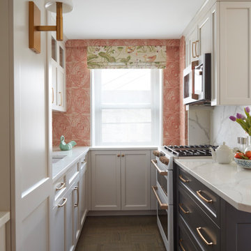
Bilotta Senior Designer, Thomas Vecchio, and Patrick J. Hamilton of Patrick James Hamilton Designs, partnered on this Manhattan upper east side kitchen renovation. This nondescript ‘60’s co-op and galley kitchen were reimagined into a pre-war era gem by adding architectural details: paneling, coffers, and moldings. Widening the opening created an open vista. Upper panes of glass on the Bilotta Collection wall cabinets echo the apartment’s transoms and unite the two sections that are interrupted by the paneled structural column. To compensate for the shorter wall, storage is optimized with plentiful pullouts, dividers, and specialized organizers. The “dead end” under the window was eliminated by continuing cabinetry and countertop materials around the room.
Countertop wall cabinets create a hutch in full view of the dining room. With dark gray paint, corner posts and furniture base molding, the peninsula reads like an island and bridges the two areas. Quartz countertops sport “lightning bolt” veins for pattern. Sophisticated on-
trend brushed brass was employed on the cabinet pulls and knobs, faucet, sconces, and pendants. A gamechanger was extending the footprint of the kitchen into the hallway with two tall cabinets. One is allocated for cleaning supplies, bulk items, recycling, and the vacuum. The other conceals a built-in wine rack; glassware and bar items; a docking drawer for charging devices; and a Penda-flex rack for files. An absolutely stunning metamorphosis.
Written by Paulette Gambacorta adapted for Houzz.
Bilotta Designer: Tom Vecchio
Interior Designer: Patrick J. Hamilton of Patrick James Hamilton Designs
Photographer: John Bessler
 Kingdom & Co.
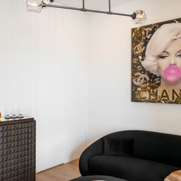
A detail of the sitting area corner highlights the hidden closet door in its closed position, where it sits completely flush within the floor-to-ceiling fluted panel wall. The textured dark wood bar cabinet with a crystal decanter set and the pop art canvas anchor the room while the matte black crystal globe chandelier provides ambient overhead light. Without knowing the door is there, the paneled wall reads as a continuous architectural feature.


 House of Meraki
aking on this pre-war building renovation was the ultimate design challenge. We combined two units into one massive home. By moving the dining table into the great room, we were able to double the size of the kitchen, allowing for a large island in the center of the space. The wolf range topped with a custom hood was on the utilitary side of the kitchen, next the the shaws sink and House of Rohl faucet. The Calacatta Paonazzo marble from Artistic tile in a honed finished continued from the counters to the backsplash and floating shelf, serving the wow factor this light kitchen deserved. On the opposite wall, floor to ceiling custom cabinetry housed a coffee station and ample storage. There’s even a reading nook window seat, perfect for morning coffee. The two glass blown pendants from Gabriel Scott float on top of the island while the Hudson Valley sconces illuminate the marble shelf.
 Garden Metalwork
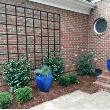
I wanted a large, simple trellis to fill a blank, uninteresting wall that forms the main approach to my front door. I chose a plant (Espalier Camellia) that would not grow into the brick and mortar since I have read this can compromise the integrity of the brickwork and is difficult to remove. The challenge was finding a large enough trellis that would also look good. I thought metal would be the best material for the trellis since I knew it would be durable over the years and I worried that a wooden trellis would start to fall apart from moisture and under the weight of the mature plants as they grew. I did not want my trellis to start failing just as my plants were reaching their most beautiful stage! I found some rod iron trellises but, they were all too small and not nearly the height and scale I needed. The Garden Metalwork trellis was perfect since it had a beautiful dark bronze finish and because the metal is aluminum it was also lightweight and very durable. A rod iron trellis (if you could find one) in the size of the Garden Metalwork aluminum trellis would weigh a ton! Now I have a worry-free, beautiful trellis for my plants to climb that will last for years and continue to get more beautiful over time. The wall already looks so much better since the trellis adds dimension with a material that compliments the brickwork. And once the plants form around the trellis it will be a beautiful focal point to my entranceway!
 Steven Allen Designs, LLC
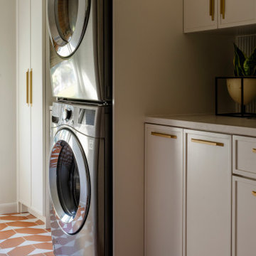
Originally built in 1958, the home became an opportunity to explore what midcentury modernism looks like when filtered through place and blending the optimism and color language of the late ’50s with influences from Santa Fe, the Texas Gulf Coast, and the relaxed, sun-washed rhythms of vacation architecture.
Rather than pursuing a strict restoration, the project embraces evolution over replication. Soft pinks, deep greens, terrazzo flooring, breeze-block screening, and warm wood tones nod to the home’s original era while allowing contemporary interventions to feel both intentional and playful. The new addition was designed to read as a natural continuation of the original structure, respecting scale, rooflines, and materiality, while opening the home to light, texture, and a stronger indoor-outdoor connection.
Throughout the interior, color and form work together to create rooms that feel collected rather than styled. A green-draped sitting area grounded in texture, a kitchen anchored by warm cabinetry and terrazzo, and a powder bath that leans fully into pattern and mood. The home reflects how we live today, but with an unmistakable sense of time and place.
 Century Stair Company
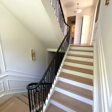
On first glance, this staircase reads as restrained. White oak treads rise with natural warmth, metal balusters hold their disciplined rhythm, and the painted black railing traces a clean, straight path upward. Then you notice the elliptical stringer wrap, and the whole composition shifts. Unlike a circular curve drawn with a compass, an ellipse requires mathematical calculation and a craftsman who knows how to make that complexity disappear. Here, it does exactly that.
Natural light finishes the story. Moving through the space across the day, it deepens the oak grain, catches the metal, and lets the black railing guide the eye along the handrail's elliptical path from start to finish. Restraint brought the design this far. One well-executed curve made it memorable.
1976-2026 © Century Stair Company
Sponsored
Sunbury, OH
J.Holderby - Renovations
Franklin County's Leading General Contractors - 2X Best of Houzz!
 Lola Cwikowski Studio
A couple relocating to Lisbon found a property in a recently upgraded building with open layouts and modernized features. Our studio was entrusted to bring elegant comfort to the interior with carefully curated, custom-designed furniture and decor. From a blank canvas, the home was enlivened with walnut furnishings by Portuguese producers, warm-hued textiles in botanical motifs, and accents of delicate brass lighting.
The entryway leads toward a spacious living room, where hand-woven rugs delineate areas for different activities. The first features a dining collection with upholstered shell chairs that comfortably envelop end-of-evening conversation. Midway, a daybed and display shelving system nestled under the lowered ceiling offer an intimate, yet versatile space. Stepping into the lounge, theatrical curtains reveal the pastel medley of Lisbon’s built landscape, the river, and hills in the distance. The dialogue of the room continues around a multi-tiered center table and featherweight pendant: a Brazilian modernist armchair faces a bespoke tufted-leather sofa, its throw cushions tailored to the palette of the media cabinet.
Outside, the balcony’s slate lacquered dining set caters to convivial meals. Private appreciation is found in a pair of leisurely chairs adjacent to the bedroom, with a side table quoting the terracotta background.
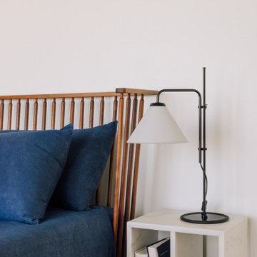
The main suite is endued with a crafted spindle bed dressed in deep blue linens and a lively made-to-measure embroidered bedspread. White Estremoz marble nightstands were designed to organize reading material and provide cable management. Circular ceramic lamps and bedside tables complement an ample upholstered bed to accommodate guests, and a floating console offers a discreet solution for remote meetings.
 Cutuli Homes
Built in 2023 by Cutuli Homes, this custom detached accessory dwelling unit was designed as a true mother-in-law home—a private, beautifully finished residence that allows three generations of one family to live close together while maintaining their own individual spaces.
The DADU was built as a companion to the homeowners' main residence, which Cutuli Homes had extensively remodeled and expanded two years earlier. Rather than treating the new structure as an afterthought, the goal was to create a home that felt architecturally connected to the existing property. Its traditional exterior, white siding, steeply pitched roof, generous windows and carefully proportioned trim give the small residence the character of an established home.
The project was created for the homeowners' mother, who downsized from her large lakefront home in the Midwest to move closer to her family and young grandchild. The result captures one of the greatest advantages of multigenerational living: family and shared community just steps away, balanced with the independence, privacy and comfort of a home of her own.
Inside, every inch was carefully considered. The compact footprint feels remarkably open thanks to a vaulted, white-paneled ceiling, abundant natural light, tall windows and an open vertical design that draws the eye upward. A loft level expands the usable living space without sacrificing the airy feeling of the main floor.
Traditional white Shaker-style cabinetry provides extensive built-in storage throughout the home and gives the interior a clean, timeless architectural character. In the kitchen, cabinetry extends upward to take advantage of the available height, while warm neutral countertops and a textured herringbone-pattern backsplash introduce subtle depth and contrast. Stainless-steel appliances are thoughtfully incorporated into the compact layout, creating a highly functional kitchen without overwhelming the living space.
One of the home's most charming features is the intimate living area tucked beneath custom built-in cabinetry. A built-in upholstered window-seat-style sofa with drawers below transforms what could have been unused space into a comfortable place to read, relax or visit. Across from it, a contemporary fireplace is integrated into a compact feature wall, with a wood display ledge above providing space for artwork, plants and personal collections.
Warm wood accents soften the predominantly white interior. Natural wood ledges, shelving, flooring and the loft ladder bring warmth and texture to the rooms, while greenery and personal furnishings give the home the comfortable character of a full-size residence rather than a conventional accessory dwelling unit.
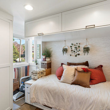
The private sleeping area demonstrates the same emphasis on intelligent space planning. Built-in cabinetry surrounds the bed and continues overhead, providing substantial storage without requiring bulky freestanding furniture. A softly textured wall treatment, warm wood shelving and abundant natural light make the compact bedroom feel inviting and finished.
Above, the loft takes advantage of the dramatic roofline with a white tongue-and-groove style paneled ceiling extending from wall to wall. Built-in storage is incorporated beneath the sloped portions of the ceiling, turning otherwise difficult spaces into useful cabinetry while preserving an open central area for a desk, music, hobbies or additional flexible living space.
Even the exterior reflects the home's attention to detail. Large windows bring daylight deep into the interior, while the private patio extends the living space outdoors. Traditional siding and trim allow the DADU to complement the architecture of the main residence while still having an identity of its own.
At every turn, this project demonstrates that downsizing does not have to mean compromising on craftsmanship, beauty, storage or individuality. Through custom cabinetry, creative built-ins, vertical space planning and carefully considered architectural details, Cutuli Homes transformed a modest footprint into an elegant and highly personalized residence.
More than simply a DADU, this is a thoughtfully designed multigenerational home—close enough for grandparents, parents and grandchildren to share everyday life, while giving everyone the privacy and independence of having a place of their own.
 Arcturus, LLC
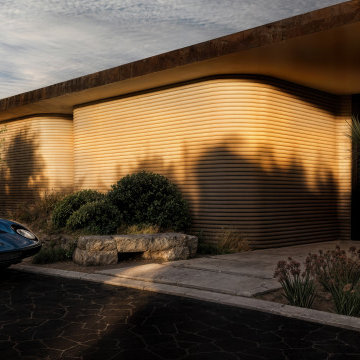
The home presents itself as a continuous, sculpted facade, its layered 3d printed walls shaped by light and shadow throughout the day. Set low against the landscape, the architecture reads as both shelter and landform, emphasizing horizontality, material honesty, and a measured sense of arrival.
56