
Search results for "Coordinate activities" in Home Design Ideas
 Rockledge Design + Architecture
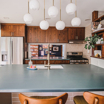
Built in 1979, this home in Pittsburgh’s Bradford Woods borough snuck in at the very tail end of Mid-Century Modern architecture. As lovers of that era, you can imagine our excitement when our clients explained their vision to lean in to that style with their planned kitchen renovation. We collaborated to design a beautiful and functional space that not only better suits this young family’s lifestyle, but truly feels like it has always been a part of the home.
Starting with the layout, we opened the kitchen up to neighboring dining room and eat-in spaces, allowing for a more cohesive main level floorplan. Along with some slight reconfiguring of the refrigerator and pantry locations, a new island created an opportunity for the main kitchen workspace to stay connected for both entertaining and day-to-day activities. Custom open shelving anchors the end of the island without blocking sightlines from the front of the home into the kitchen.
New light oak flooring throughout adds a contemporary nod, integrating two adjoining family rooms. It also creates a nice contrast for the kitchen and dining room’s custom cabinetry in a rich walnut finish. Slab style doors with minimal brass hardware help deliver the streamlined Mid-Century aesthetic. Custom radial edges at the island and coffee bar add a whimsical flair, highlighting the matte green solid surface countertops. To coordinate with the original tile found in the entryway, a neutral choice with rustic handmade detail adds warmth and texture to the backsplash and island base.
Rounding out the rest of this sunny space, Mid-Mod inspired light fixtures, bold patterned wallpaper, a mix of the client’s new and vintage furniture, plus curated textiles and accessories lend the “just right” amount of personality.
 Anderson Tuftex
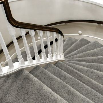
Prato is an artfully inspired, cut and loop carpet that features a random gradation of color and texture variation. Its sophisticated styling and unique design creates dimension and interest on the floor. Prato, which is part of the Artisan Collection, is made of STAINMASTER® Luxerell® nylon fiber and part of the Active Family™ brand.It is available in a palette of thirty stunning hues that coordinate with the other Artisan styles. Prato is perfect for wall-to-wall installations, staircases, and area rugs.
 Sheila Rich Interiors, LLC
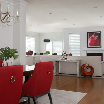
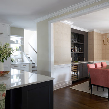
In open floor plans, the rooms need to coordinate. Here we used a subtle neutral palette with white walls, a medium-toned hardwood floor and white cabinetry. Punches of color and contrast are added to the gray textures with red chairs, throw pillows and artwork.
The dining room is warmed by an area rug; an elegant chandelier fills ceiling volume and defines the space.
Find the right local pro for your project
 TKS Design Group
Download our free ebook, Creating the Ideal Kitchen. DOWNLOAD NOW
As with most projects, it all started with the kitchen layout. The home owners came to us wanting to upgrade their kitchen and overall aesthetic in their suburban home, with a combination of fresh paint, updated finishes, and improved flow for more ease when doing everyday activities.
A monochromatic, earth-toned palette left the kitchen feeling uninspired. It lacked the brightness they wanted from their space. An eat-in table underutilized the available square footage. The butler’s pantry was out of the way and hard to access, and the dining room felt detached from the kitchen.
Lead Designer, Stephanie Cole, saw an improved layout for the spaces that were no longer working for this family. By eliminating an existing wall between the kitchen and dining room, and relocating the bar area to the dining room, we opened up the kitchen, providing all the space we needed to create a dreamy and functional layout. A new perimeter configuration promoted circulation while also making space for a large and functional island loaded with seating – a must for any family. Because an island that isn’t big enough for everyone (and a few more) is a recipe for disaster. The light white cabinetry is fresh and contrasts with the deeper tones in the wood flooring, creating a modern aesthetic that is elevated, yet approachable for everyday living.
With better flow as the overarching goal, we made some structural changes too. To remove a bottleneck in the entryway, we angled one of the dining room walls to create more natural separation between rooms and facilitate ease of movement throughout the large space.
At The Kitchen Studio, we believe a well-designed kitchen uses every square inch to the fullest. By starting from scratch, it was possible to rethink the entire kitchen layout and design the space according to how it is used, because the kitchen shouldn’t make it harder to feed the family. A new location for the existing range, flanked by a new column refrigerator and freezer on each side, worked to anchor the space. The very large and very spacious island (a dream island if we do say so ourselves) now houses the primary sink and provides ample space for food prep and family gathering.
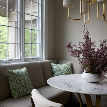
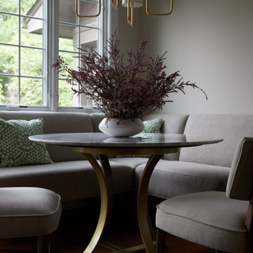
The new kitchen table and coordinating banquette seating provide a cozy nook for quick breakfasts before school or work, and evening homework sessions. Elegant gold details catch the natural light, elevating the aesthetic.
The dining room was transformed into one of this client’s favorite spaces and we couldn’t agree more. We saw an opportunity to give the dining room a more distinguished identity by closing off the entrance from the foyer. The relocated wet bar enhances the sophisticated vibe of this gathering space, complete with beautiful antique mirror tiles and open shelving encased by moody built-in cabinets.
Updated furnishings add warmth. A rich walnut table is paired with custom chairs in a muted coral fabric. The large, transitional chandelier grounds the room, pairing beautifully with the gold finishes prevalent in the faucet and cabinet hardware. Linen-inspired wallpaper and cream-toned window treatments add to the glamorous feel of this entertainment space.
There is no way around it. The laundry room was cramped. The large washer and dryer blocked access to the sink and left little room for the space to serve its other essential function – as a mudroom. Because we reworked the kitchen layout to create more space overall, we could rethink the mudroom too – an essential for any busy family. The first step was moving the washer and dryer to an existing area on the second floor, where most of the family’s laundry lives (no one wants to carry laundry up and down the stairs if they don’t have to anyway). This is a more functional solution and opened up the space for all the mudroom necessities – including the existing kitchen refrigerator, loads of built-in cubbies, and a bench.
It’s hard to not fall in love with every detail of a new space, especially when it serves your day-to-day life. But that doesn’t mean the clients didn’t have their favorite features they use on the daily. This remodel was focused largely on function with a new kitchen layout. And it’s the functional features that have the biggest impact. The large island provides much needed workspace in the kitchen and is a spot where everyone gathers together – it grounds the space and the family. And the custom counter stools are the icing on the cake. The nearby mudroom has everything their previous space was lacking – ample storage, space for everyone’s essentials, and the beloved cement floor tiles that are both durable and artistic.

 RINEKWALL
All RINEKWALL designs are available on wallcovering. Combining wallcoverings with coordinating RINEKWALL designs on fabrics from a series or collection can create a unique style and theme for an entire space.
Our wallcovering is a high performance, dimensionally stable, breathable, and eco-friendly material. The Rainforest Alliance and FSC Certified paper is made with 10% post-consumer waste, achieving a sustainable advantage over traditional vinyl materials. It meets the strict California 01350 standards for indoor air quality, a prerequisite for LEED credit certification, and carries a class “A” fire rating based on ASTM E-84.
Wallcovering is available in two weights. Our Commercial Wallcovering is a 10pt paper. Our Standard Wallcovering is a 6pt paper.
Engineered to be easy to install, the paper is pre-pasted. Simply spraying the back of the paper with water activates the adhesive and in one minute the paper is ready to install.
 TKS Design Group
Download our free ebook, Creating the Ideal Kitchen. DOWNLOAD NOW
As with most projects, it all started with the kitchen layout. The home owners came to us wanting to upgrade their kitchen and overall aesthetic in their suburban home, with a combination of fresh paint, updated finishes, and improved flow for more ease when doing everyday activities.
A monochromatic, earth-toned palette left the kitchen feeling uninspired. It lacked the brightness they wanted from their space. An eat-in table underutilized the available square footage. The butler’s pantry was out of the way and hard to access, and the dining room felt detached from the kitchen.
Lead Designer, Stephanie Cole, saw an improved layout for the spaces that were no longer working for this family. By eliminating an existing wall between the kitchen and dining room, and relocating the bar area to the dining room, we opened up the kitchen, providing all the space we needed to create a dreamy and functional layout. A new perimeter configuration promoted circulation while also making space for a large and functional island loaded with seating – a must for any family. Because an island that isn’t big enough for everyone (and a few more) is a recipe for disaster. The light white cabinetry is fresh and contrasts with the deeper tones in the wood flooring, creating a modern aesthetic that is elevated, yet approachable for everyday living.
With better flow as the overarching goal, we made some structural changes too. To remove a bottleneck in the entryway, we angled one of the dining room walls to create more natural separation between rooms and facilitate ease of movement throughout the large space.
At The Kitchen Studio, we believe a well-designed kitchen uses every square inch to the fullest. By starting from scratch, it was possible to rethink the entire kitchen layout and design the space according to how it is used, because the kitchen shouldn’t make it harder to feed the family. A new location for the existing range, flanked by a new column refrigerator and freezer on each side, worked to anchor the space. The very large and very spacious island (a dream island if we do say so ourselves) now houses the primary sink and provides ample space for food prep and family gathering.
The new kitchen table and coordinating banquette seating provide a cozy nook for quick breakfasts before school or work, and evening homework sessions. Elegant gold details catch the natural light, elevating the aesthetic.
The dining room was transformed into one of this client’s favorite spaces and we couldn’t agree more. We saw an opportunity to give the dining room a more distinguished identity by closing off the entrance from the foyer. The relocated wet bar enhances the sophisticated vibe of this gathering space, complete with beautiful antique mirror tiles and open shelving encased by moody built-in cabinets.
Updated furnishings add warmth. A rich walnut table is paired with custom chairs in a muted coral fabric. The large, transitional chandelier grounds the room, pairing beautifully with the gold finishes prevalent in the faucet and cabinet hardware. Linen-inspired wallpaper and cream-toned window treatments add to the glamorous feel of this entertainment space.
There is no way around it. The laundry room was cramped. The large washer and dryer blocked access to the sink and left little room for the space to serve its other essential function – as a mudroom. Because we reworked the kitchen layout to create more space overall, we could rethink the mudroom too – an essential for any busy family. The first step was moving the washer and dryer to an existing area on the second floor, where most of the family’s laundry lives (no one wants to carry laundry up and down the stairs if they don’t have to anyway). This is a more functional solution and opened up the space for all the mudroom necessities – including the existing kitchen refrigerator, loads of built-in cubbies, and a bench.
It’s hard to not fall in love with every detail of a new space, especially when it serves your day-to-day life. But that doesn’t mean the clients didn’t have their favorite features they use on the daily. This remodel was focused largely on function with a new kitchen layout. And it’s the functional features that have the biggest impact. The large island provides much needed workspace in the kitchen and is a spot where everyone gathers together – it grounds the space and the family. And the custom counter stools are the icing on the cake. The nearby mudroom has everything their previous space was lacking – ample storage, space for everyone’s essentials, and the beloved cement floor tiles that are both durable and artistic.
 American Freight Furniture, Mattress, Appliance
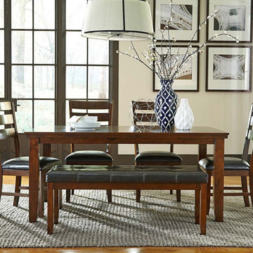
Casually styled with a sturdy profile, the Anniston 5 Piece Dining Set is ready to take on the daily activities of any busy home. The dining table, the heavy ladder back chairs, with square legs that taper slightly at the foot and the coordinating bench are all stained in a warm brown color. The warm brown faux leather upholstery on the chairs and bench seat is in a fabric that can be easily cleaned.
 Guild Hall Home Furnishings
Guild Hall Home Furnishings
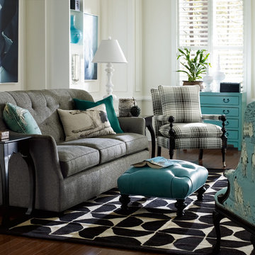
Living rooms are the centers of activity in our homes, from relaxing at the end of a long day to a space where your children play. With a variety of comfortable couches and chairs to the right tables and cabinets to hold your entertainment systems, our wide selection of living room furniture offers options to meet your needs.
 Inspired Closets of Greater Boston
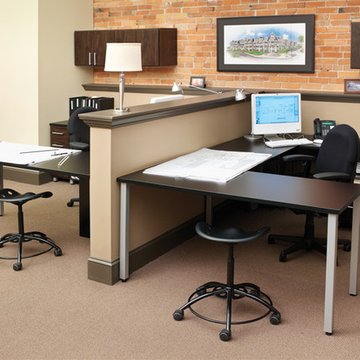
Wrap-around office desks and open shelves store documents and support work activities. Coordinated finishes and hardware integrate with your architecture.
 TKS Design Group
Download our free ebook, Creating the Ideal Kitchen. DOWNLOAD NOW
As with most projects, it all started with the kitchen layout. The home owners came to us wanting to upgrade their kitchen and overall aesthetic in their suburban home, with a combination of fresh paint, updated finishes, and improved flow for more ease when doing everyday activities.
A monochromatic, earth-toned palette left the kitchen feeling uninspired. It lacked the brightness they wanted from their space. An eat-in table underutilized the available square footage. The butler’s pantry was out of the way and hard to access, and the dining room felt detached from the kitchen.
Lead Designer, Stephanie Cole, saw an improved layout for the spaces that were no longer working for this family. By eliminating an existing wall between the kitchen and dining room, and relocating the bar area to the dining room, we opened up the kitchen, providing all the space we needed to create a dreamy and functional layout. A new perimeter configuration promoted circulation while also making space for a large and functional island loaded with seating – a must for any family. Because an island that isn’t big enough for everyone (and a few more) is a recipe for disaster. The light white cabinetry is fresh and contrasts with the deeper tones in the wood flooring, creating a modern aesthetic that is elevated, yet approachable for everyday living.
With better flow as the overarching goal, we made some structural changes too. To remove a bottleneck in the entryway, we angled one of the dining room walls to create more natural separation between rooms and facilitate ease of movement throughout the large space.
At The Kitchen Studio, we believe a well-designed kitchen uses every square inch to the fullest. By starting from scratch, it was possible to rethink the entire kitchen layout and design the space according to how it is used, because the kitchen shouldn’t make it harder to feed the family. A new location for the existing range, flanked by a new column refrigerator and freezer on each side, worked to anchor the space. The very large and very spacious island (a dream island if we do say so ourselves) now houses the primary sink and provides ample space for food prep and family gathering.
The new kitchen table and coordinating banquette seating provide a cozy nook for quick breakfasts before school or work, and evening homework sessions. Elegant gold details catch the natural light, elevating the aesthetic.
The dining room was transformed into one of this client’s favorite spaces and we couldn’t agree more. We saw an opportunity to give the dining room a more distinguished identity by closing off the entrance from the foyer. The relocated wet bar enhances the sophisticated vibe of this gathering space, complete with beautiful antique mirror tiles and open shelving encased by moody built-in cabinets.
Updated furnishings add warmth. A rich walnut table is paired with custom chairs in a muted coral fabric. The large, transitional chandelier grounds the room, pairing beautifully with the gold finishes prevalent in the faucet and cabinet hardware. Linen-inspired wallpaper and cream-toned window treatments add to the glamorous feel of this entertainment space.
There is no way around it. The laundry room was cramped. The large washer and dryer blocked access to the sink and left little room for the space to serve its other essential function – as a mudroom. Because we reworked the kitchen layout to create more space overall, we could rethink the mudroom too – an essential for any busy family. The first step was moving the washer and dryer to an existing area on the second floor, where most of the family’s laundry lives (no one wants to carry laundry up and down the stairs if they don’t have to anyway). This is a more functional solution and opened up the space for all the mudroom necessities – including the existing kitchen refrigerator, loads of built-in cubbies, and a bench.
It’s hard to not fall in love with every detail of a new space, especially when it serves your day-to-day life. But that doesn’t mean the clients didn’t have their favorite features they use on the daily. This remodel was focused largely on function with a new kitchen layout. And it’s the functional features that have the biggest impact. The large island provides much needed workspace in the kitchen and is a spot where everyone gathers together – it grounds the space and the family. And the custom counter stools are the icing on the cake. The nearby mudroom has everything their previous space was lacking – ample storage, space for everyone’s essentials, and the beloved cement floor tiles that are both durable and artistic.
 Arani Construction
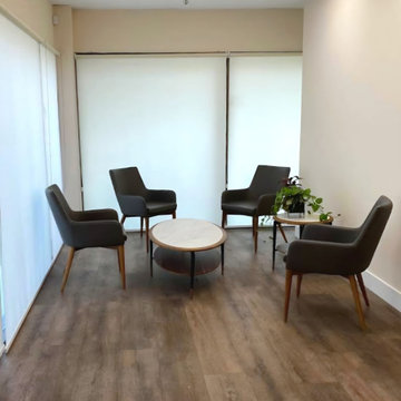
This commercial renovation at 3020 Lincoln Avenue in Coquitlam involved a targeted tenant improvement for a professional notary office. The scope focused on modernizing the interior environment to create a calm, welcoming, and functional client reception area while maintaining durability and code compliance standards required for commercial spaces.
New commercial-grade flooring was installed throughout, paired with updated lighting to enhance brightness and improve overall spatial clarity. The layout was optimized to support client flow and privacy, while finishes were selected to reflect a clean, professional aesthetic appropriate for a legal services environment.
Executing renovations within an active commercial setting requires structured scheduling, material coordination, and strict adherence to strata and municipal requirements. Arani Construction delivers commercial tenant improvements across Coquitlam and the Greater Vancouver area with an emphasis on organization, technical precision, and minimal operational disruption.
 RINEKWALL
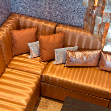
All RINEKWALL designs are available on wallcovering. Combining wallcoverings with coordinating RINEKWALL designs on fabrics from a series or collection can create a unique style and theme for an entire space.
Our wallcovering is a high performance, dimensionally stable, breathable, and eco-friendly material. The Rainforest Alliance and FSC Certified paper is made with 10% post-consumer waste, achieving a sustainable advantage over traditional vinyl materials. It meets the strict California 01350 standards for indoor air quality, a prerequisite for LEED credit certification, and carries a class “A” fire rating based on ASTM E-84.
Wallcovering is available in two weights. Our Commercial Wallcovering is a 10pt paper. Our Standard Wallcovering is a 6pt paper.
Engineered to be easy to install, the paper is pre-pasted. Simply spraying the back of the paper with water activates the adhesive and in one minute the paper is ready to install.
 RINEKWALL
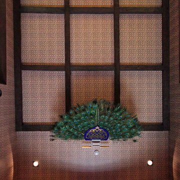
All RINEKWALL designs are available on wallcovering. Combining wallcoverings with coordinating RINEKWALL designs on fabrics from a series or collection can create a unique style and theme for an entire space.
Our wallcovering is a high performance, dimensionally stable, breathable, and eco-friendly material. The Rainforest Alliance and FSC Certified paper is made with 10% post-consumer waste, achieving a sustainable advantage over traditional vinyl materials. It meets the strict California 01350 standards for indoor air quality, a prerequisite for LEED credit certification, and carries a class “A” fire rating based on ASTM E-84.
Wallcovering is available in two weights. Our Commercial Wallcovering is a 10pt paper. Our Standard Wallcovering is a 6pt paper.
Engineered to be easy to install, the paper is pre-pasted. Simply spraying the back of the paper with water activates the adhesive and in one minute the paper is ready to install.
 Advance Design Studio, Ltd.
When you see the before photos of this kitchen, the finished product is nearly unrecognizable! This is because the original kitchen was 10x10, and wall separated the kitchen area from the eating area. Opening up the 2 spaces was exactly what this new kitchen needed!
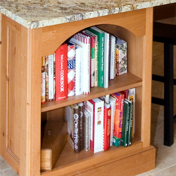
Since the dining area was directly adjacent to the family room, the designer at Advance Design created a low wall of matching decorative book case cabinets with a granite top to create separation needed between the spaces. This bank also eloquently held a beautifully wood appointed supporting column necessary for the structural ceiling load.
The focal point of the new kitchen is the hand-painted backsplash centered under a wooden hood in the chef’s special cooking area. A completely functional island now has space for several stools, and even has a decorative touch with the shelving unit facing the eating area.
The space next to the refrigerator became an efficiently organized bill paying area for the lady of the house, complete with pull out file drawers hidden behind matching kitchen cabinets. Replacing the “black hole” of a pantry; pull out shelves grace the interior of new pantry units suitable for the family of five busy people.
Existing hardwood oak was repaired and refinished on the entire first floor. A light patterned gold granite works effortlessly with the tumbled marble backsplash that enjoys hints of weathered iron looking details that coordinate nicely with the cabinetry hardware.
What makes this kitchen special is how elegant it appears despite the rustic feel of the knotty alder cabinetry. Clean design lines lend an air of sophistication to the otherwise “rustic” looking materials. Now this active family can enjoy the open space, cooking and hanging out together is now an enjoyable pastime.

 United Express Construction Inc.
This photo highlights the active construction phase of the bathroom remodel, where skilled trades are completing essential rough plumbing and structural work behind the walls. The space has been fully demolished down to the framing, allowing the team to upgrade plumbing, electrical, and ventilation systems to support the new custom bathroom layout. Visible framing modifications and utility installations demonstrate the detailed craftsmanship and coordination required before finishing materials can be installed. This stage reflects the foundation of a high-quality remodel, ensuring long-term durability, functionality, and a seamless final design.
 TOC design & construction inc.
It’s all about living by Tania Scardellato – TOC design
Some look edgy and modern, while others seem coordinated and traditional. Whatever your design style, the family room is a place to gather together with those you love
Whether you call it a living room, family room, gathering room or den, what we do most in this space in our homes is live. At TOC design we will help you make your living room more than just livable, but also an enjoyable and relaxing place for you and your family and friends to be.
Good design can make any room look great, and living rooms are no exception. When designing your living room, begin with establishing your style along with correct balance, proportion and scale of furnishings and decor. After that, everything else will fall perfectly into place.
The focal point of a room is the place where the lines of the room meet. Since our eyes tend to naturally follow lines, this will be the place that our attention will first be drawn to in a room.
Since our eyes follow the lines in a room, the furniture and activity in a room will usually revolve around the focal point. So what do you do with a room that doesn’t have a focal point? You create one!
Creating a fabulous focal point in a room is a great way to reenergize a space. Creating a focal point is also a great way to take the focus off of the less attractive features of a room.
 Barbara Wilson Landscape Architect, LLC
Photo by Barbara Wilson Landscape Architect, LLC
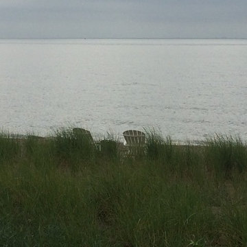
A small residential, seaside property located on Fairfield Beach, Fairfield was renovated by the new owners and adapted for their active family. Barbara was the landscape architect in charge of all of the landscape elements upgrades. She designed new bluestone curving paths to access the front and side doors and designed new landscape lighting to enhance the walks. The existing trees were saved and she designed new shade and salt-tolerant plantings which were added to provide seasonal color and interest while respecting the existing plantings. Along the beach front additional native beach grasses were added to stabilize the dunes while removing some invasive plantings. This work will be phased over the next few years in an effort to keep the sand stable. Beach roses were incorporated into a hollow in the dunes. A small lawn area was renovated and the surrounding Black Pines pruned to provide a small play area and respite from the sun. Beautiful reblooming hydrangeas line the edge of the gravel driveway. Rounded beach stones were used instead of mulch in the island planting along the edge of the adjacent road planted with Miscanthus, Mugo pine and yucca.
Barbara designed a custom kayak rack, custom garbage enclosure, a new layout of the existing wooden deck to facilitate access to the side doors, and detailed how to renovate the front door into only an emergency access with new railings and steps.
She coordinating obtaining bids and then supervised the installation of all elements for the new landscape the project.
The interiors were designed by Jack Montgomery Design of Greenwich, CT and NYC . Tree work was completed by Bartlett Tree Experts. Freddy’s Landscape Company of Fairfield, CT installed the new plantings, installed all the new masonry work and provides landscape maintenance services. JT Low Voltage and Electric installed the landscape lighting.
 Anderson Tuftex
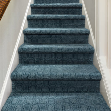
Genoa is a stylish, geometric cut and loop pattern that is soft and ultra-luxurious. Its artistic appeal and tonal variations in color create a dramatic statement on the floor. Genoa, which is part of the Artisan Collection, is made of STAINMASTER® Luxerell® nylon fiber and part of the Active Family™ brand. It is available in a palette of thirty beautiful hues that coordinate with the other Artisan styles. Genoa is perfect for wall-to-wall installations, staircases, and area rugs.
 Bennett Design Co.
This project features a six-foot addition on the back of the home, allowing us to open up the kitchen and family room for this young and active family. These spaces were redesigned to accommodate a large open kitchen, featuring cabinets in a beautiful sage color, that opens onto the dining area and family room. Natural stone countertops add texture to the space without dominating the room.
The powder room footprint stayed the same, but new cabinetry, mirrors, and fixtures compliment the bold wallpaper, making this space surprising and fun, like a piece of statement jewelry in the middle of the home.
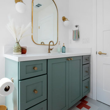
The kid's bathroom is youthful while still being able to age with the children. An ombre pink and white floor tile is complimented by a greenish/blue vanity and a coordinating shower niche accent tile. White walls and gold fixtures complete the space.
The primary bathroom is more sophisticated but still colorful and full of life. The wood-style chevron floor tiles anchor the room while more light and airy tones of white, blue, and cream finish the rest of the space. The freestanding tub and large shower make this the perfect retreat after a long day.
 Walczak Design And Build
When this family came to us, they loved their home — but their bathrooms were failing them. The kids' bathroom had a non-functioning tub, a serious problem with two young children in the house. The primary bathroom was battling an active shower leak, a poor layout, and finishes well past their prime. Both spaces needed to be gutted. We got to work.
The Primary Bath: Elevated, Effortless, Unmistakably Theirs
Our clients arrived with a clear vision and a beautiful, refined sense of style. The layout was reconfigured from the ground up, and at the heart of the room sits a custom double vanity in a soft, sophisticated sage, topped with a stunning marble countertop and coordinating backsplash. Paired with elegant walnut-framed mirrors, a sculptural black and brass sconce, and wall-mounted polished nickel faucets, the vanity wall is a showpiece. Custom woven shades add warmth without sacrificing light.
The walk-in shower delivers — floor-to-ceiling white subway tile, a mosaic marble floor, transom windows, and frameless glass. Schluter DITRA radiant floor heating adds the kind of quiet luxury you feel every morning. Both marble surfaces were professionally sealed with StoneGuard to protect the investment for the long haul.
The Kids' Bath: Cheerful, Timeless, Built to Last
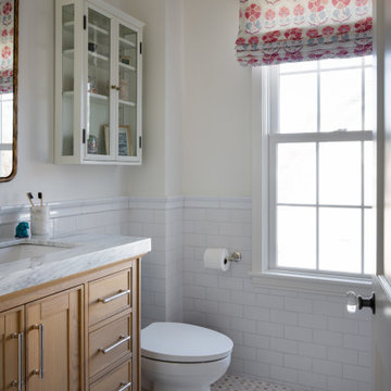
The girls' bathroom is designed with just as much intention as any room in the house. A warm white oak vanity with marble countertop anchors the space, paired with an antique brass-framed mirror and raspberry custom sconce shades that bring personality without being precious. A botanical-print Roman shade layers in pattern and charm.
The fully rebuilt tub-shower features wall-to-wall white subway tile, polished nickel fixtures, and a beautiful geometric floor tile in cream and warm taupe. A glass-front wall cabinet keeps things tidy, and tile wainscoting wraps the room for durability where it counts. Schluter DITRA radiant heat runs underfoot here too — because warm floors aren't just for adults.
Two bathrooms. Completely distinct. Completely intentional. Built for a family that already loved their home — and loves it even more now.
14