
Search results for "Couples decide" in Home Design Ideas
 ReVision Design + Build
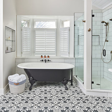
The black and white claw-foot tub creates a focal point beneath the bay window of this master bathroom. Large format subway tile, and black and white patterned tile give this bathroom an eclectic look that's a little farmhouse, a little vintage and a little industrial.
© Lassiter Photography 2018
 Haus Interior Design
Photos by Stacy Zarin Goldberg
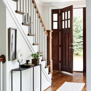
Inspiration for a mid-sized transitional brown floor and dark wood floor entryway remodel in DC Metro with beige walls and a dark wood front door
Inspiration for a mid-sized transitional brown floor and dark wood floor entryway remodel in DC Metro with beige walls and a dark wood front door
 Kathryn J. LeMaster Art & Design
Rett Peek
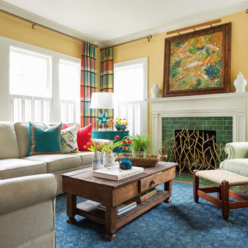
Mid-sized eclectic enclosed medium tone wood floor and brown floor living room photo in Little Rock with yellow walls, a tile fireplace and a standard fireplace
Mid-sized eclectic enclosed medium tone wood floor and brown floor living room photo in Little Rock with yellow walls, a tile fireplace and a standard fireplace
Find the right local pro for your project

 TKS Design Group
Download our free ebook, Creating the Ideal Kitchen. DOWNLOAD NOW
This client was referred to us from a past client. They are a busy 2-career household with young children and enjoy entertaining friends and family in their home. They have a beautiful open concept home but unfortunately the kitchen was not fitting for the rest of the home. They were not quite sure what to do with the space. We talked about trying to refresh it or do more of a minor remodel, but in the end they decided a full gut would get them to where they wanted to be.
One problem was there was no place for guests to hang out other than the large and awkward banquette area. The brick wall and tiled hood area were feeling a bit dated and tired. The space was just not functional for their lifestyle. There was no prep space near the cooktop and no landing area for items coming out of the ovens or refrigerator, plus a big dead zone in the center of the room.
Banquettes, like the one they previously had in the space, are great for small spaces, but when they get really large like this one, it makes getting in and out of the seating area awkward and uncomfortable. Plus, there was room for a large table, so we eliminated the awkward built in.
We started by removing the faux brick wall between the kitchen and back entry. We relocated the entry to the garage over a couple feet in order to get every last inch out of the new kitchen. We also made the decision to close up the primary window that faced the pretty ho hum brick wall of the neighbor’s house. There was plenty of light coming in from the seating area, so we just didn’t feel the window was adding much to the room.
Construction went smoothy. There was a bit of rework with electrical, flooring and HVAC, but in the end, we think it was well worth it.
The clients really wanted a sleek contemporary look, and we originally had planned for a full height slab backsplash, but due to it’s size, it was a budget buster. Instead, we got creative and settled on large format porcelain tiles that have a similar feel but were a fraction of the cost. We made sure the wall was plumb and level so that the fit and finish would mimic that of slab material.
The final space was quite a change. A large prep sink sits directly across from the new pro-style range with plenty additional prep space on the large island. The refrigerator and ovens now have miles of landing space, and a nice tight work triangle makes cooking a breeze.
Since we wanted a more contemporary feel, not many wall cabinets were included. Instead, we outfitted some of the drawers for dish storage with a peg system. Two large pantries flanking the refrigerator hold baking supplies and small appliances. Large drawers by the cooktop hold pots and pans, and an appliance garage tucked away to the left of the range hides away miscellaneous items. The large island also houses a microwave drawer and tons of storage, most of which is drawers offering maximum convenience.
The island now seats 5-6 people comfortably along with the new table in the seating area which can seat up to 8. Entertaining will be a breeze in this space. With such a clean backdrop, we knew we would need some drama with the lighting, so we chose two sets of staggered pendants, which we adjusted for the right visual balance above the island.
We also included a small coffee station to the right of the main kitchen, which helps keep the coffee clutter out of the kitchen proper. Two tones of complimentary gray are featured in this kitchen. The perimeter is a light gray that reads almost white. The island is a gray stain that adds some depth and interest with the visible wood texture. The countertops are clean white quartz, and the hardware, barstools and light fixtures add warm brass tones. I see lots of cooking and entertaining with family and friends in the near future in this bright and airy new space.
Designed by: Susan Klimala, CKD, CBD
Photography by: Michael Kaskel
For more information on kitchen and bath design ideas go to: www.kitchenstudio-ge.com
 MANDARINA STUDIO interior design
Ben Gebo
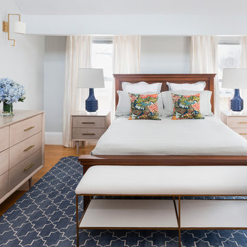
Example of a transitional master bedroom design in Boston with gray walls
Example of a transitional master bedroom design in Boston with gray walls
 Tango Design Studio
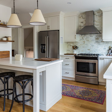
Inspiration for a transitional l-shaped kitchen remodel in Toronto with a double-bowl sink, shaker cabinets, white cabinets, quartz countertops, multicolored backsplash, stone tile backsplash, stainless steel appliances and an island
 Blackbird Architects
Jim Bartsch
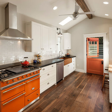
Inspiration for a transitional single-wall dark wood floor kitchen remodel in Santa Barbara with a farmhouse sink, shaker cabinets, white cabinets, white backsplash, subway tile backsplash, stainless steel appliances and no island
Inspiration for a transitional single-wall dark wood floor kitchen remodel in Santa Barbara with a farmhouse sink, shaker cabinets, white cabinets, white backsplash, subway tile backsplash, stainless steel appliances and no island
Sponsored
Columbus, OH

Hope Restoration & General Contracting
Columbus Design-Build, Kitchen & Bath Remodeling, Historic Renovations
 Haefele Design
Mark Lohman
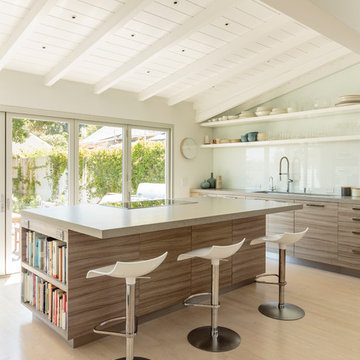
Trendy light wood floor kitchen photo in Santa Barbara with flat-panel cabinets, medium tone wood cabinets, white backsplash, glass sheet backsplash and an island
Trendy light wood floor kitchen photo in Santa Barbara with flat-panel cabinets, medium tone wood cabinets, white backsplash, glass sheet backsplash and an island
 Tiffany Brooks, HGTV Host & Interior Designer
Inquire About Our Design Services
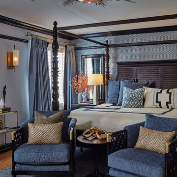
When we first started talking in the spring of 2015, I was impressed. She was witty, realistic, and understood that as much as she loves my shows on HGTV, design does not does not happen in 43 minutes! She told me about her space, and how she felt that her bedroom seemed “blah” to her. She had no retreat. Molly desperately longed for a place that she could spend time in, read in, play in and above all, relax in.
What we did:
Many people are terrified of hiring a designer. Rightfully so, they are investing a pretty penny in their homes. They want to make sure that everything, down to the last floral arrangement, is to their liking, because they will have to live it (and pay for it). Unfortunately, a client can unintentionally stifle a designer’s creativity through micro-management. This can produce lackluster results and ultimately cause more time (and money) to be spent on a project than is really necessary.
With Molly, that was never an issue. Before she even showed me the room in question, she said that I could have full creative license to do what I needed to do to her bedroom. SAY WHAAH!?
With Molly giving me complete creative freedom, I planned everything out and got down to business. The result: Bite-your-bottom-lip sexy. I don’t get jealous of too many of my clients’ spaces, but this one still takes my breath away every time I look at the pics!
The craziest part was that by adding more furniture, it actually made the space feel larger.
Molly and her husband Patrick loved the finished space, and promised me I will be back to finish the rest of the house!
Here’s the highlights of the rest of the project:
I came up with a space plan with three options.
Next, we reviewed mood boards and fabric schemes that would work for both Molly and her hubby Patrick.
We started with the bed. My goal was to add edge to its otherwise traditional style.
We decided to spice things up by painting the trim work in the room black.
We built in layers of lighting with dimmers. In a bedroom everything should be on dimmers, right? Right.
We designed and customized bedding, chairs and window treatments.
Together with Molly, we selected the most perfect wallpaper. This geometric “grasscloth” adds so much depth and dimension that was just missing before.
What I love:
That light fixture. I mean it is really, really amazing in person.
The porcupine mirror. This thing came packaged like it was the hope diamond, and everyone was terrified to handle it. But it really became a highlight of the room.
 Laura Lee Home
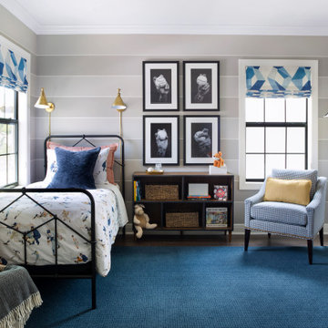
When you dad is a professional pitcher, it is pretty easy to decide that you want a baseball themed bedroom. Our client had various pitching grips photographed which are the focal point of this space and will be an heirloom for the family. Stripes in muted tones wrap around the entire room and will be a backdrop as the little boy grows up. A classic iron bed topped with vintage baseball themed bedding add subtle color and pattern. Reading lamps above the bed make bedtime story time easy.
 D E Rink Construction
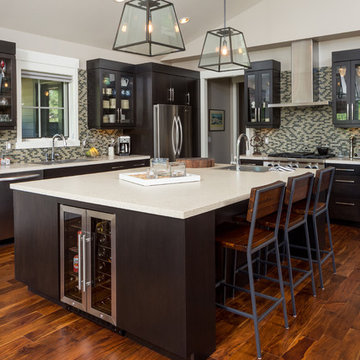
When our client bought their lot in Broken Top they did not build for years. Living in San Diego,they decided in 2011 to build a vacation home/ future retirement abode. Their vision included a welcoming single level with relaxing Master bedroom and bath, a kitchen/living/dining space to entertain family and friends, and an outdoor living space to enjoy the sunsets.Their vision became reality!! It also includes a wonderful second bedroom perfect for guests, with a separate entrance and a private bath with walk-in shower. The third bedroom doubles as an office with lots of windows.
The home is rustic from the front. Upon entering one notices the open floor plan and contemporary kitchen design as well as the beautiful rock fireplace and abundance of light. An extra-large island in the kitchen includes a wine cooler, bar sink, and eating area. The décor of the home is comfortable and warm. And the stunning dark Acacia wood flooring runs throughout the main living area.
This home is 3210 square feet on a single level. Natural mature landscaping surrounds the home giving it a settled-in feeling. This is a perfect home for retirees who host guests, or a small family. In this case,the couple will use it as their vacation get-away with retirement in their scope.
Ross Chandler
 Custom Kitchens by John Wilkins, Inc.
Mike Kaskel
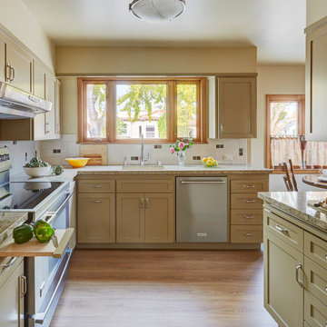
Example of a transitional l-shaped light wood floor and brown floor kitchen design in San Francisco with an undermount sink, shaker cabinets, beige cabinets, white backsplash, stainless steel appliances and beige countertops
Example of a transitional l-shaped light wood floor and brown floor kitchen design in San Francisco with an undermount sink, shaker cabinets, beige cabinets, white backsplash, stainless steel appliances and beige countertops
 Guggenheim Architecture + Design Studio
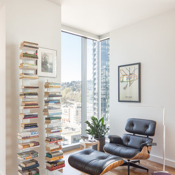
With sweeping views of the Willamette river and Mt. Hood, this Atwater Place condo was designed with a balance of minimalism and livability in mind. A complete kitchen remodel brought a dark interior kitchen to the light and a full furnishings package welcomed Los Angeles transplants home to their new modern and bright residence. Our clients, a retired camera operator for both feature films and television and a producer/production manager on numerous television series including Weeds and The Middle, relocated from their traditionally-styled LA bungalow to Portland in the Summer of 2014. The couple sought a design departure from their long-term California residence and a fresh start for their new life in the South Waterfront.
With only two pieces of sentimental furniture and a handful of artwork included in the plan, we set out to create a comfortable and clean-lined furnishings package complimenting the broad southeast views. Organically shaped upholstery pieces juxtaposed with angular steel and wood tables create a soft balance in the open floor plan. Several custom pieces, including a dining table designed by our studio and a custom hand-blown glass chandelier crafted by Scott Schiesel with Lightlite compliment timeless pieces from Knoll, Herman Miller, and B&B Italia.
The kitchen is designed to reflect light and create brilliance in a space that is otherwise naturally dark. A material balance of stainless steel, back painted glass, quartz composite, lacquer, and mirror all play their part in creating a vibrant cooking environment. We collectively decided to forgo the traditional island pendant for a linear commercial fixture that provides tremendous light to the prep surface and creates an unexpected architectural element. The mirrored prep island creates the illusion of open space while concealing casework and wine storage on the working side of the kitchen.
It is worth noting that this project was designed and installed almost entirely while our clients were still living in LA and wrapping up professional obligations and selling their home. This afforded us the tremendous opportunity to send our clients to showrooms not available in Portland to view key pieces before final specification. Textiles and finish samples were approved via mail and communication took place over e-mail, telephone, and an occasional office visit. This unique process lead to a successful result and a beautifully balanced living environment.
Josh Partee Photography
Sponsored
Columbus, OH
Hope Restoration & General Contracting
Columbus Design-Build, Kitchen & Bath Remodeling, Historic Renovations
 User
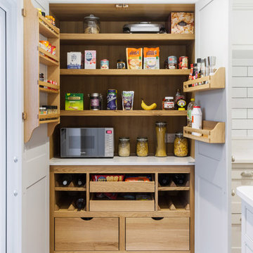
UserWith their children growing up, Mr & Mrs Hills in Southend-On-Sea decided it was time to give their much loved family kitchen a well deserved renovation, creating a space for all the family to use and enjoy.
They wanted a kitchen that had plenty of storage and was user friendly for all the family, so commissioned Burlanes to transform their cramped and dated kitchen into a spacious and open-plan room. Walking into Burlanes Chelmsford, the couple took an instant like to our Wellsdown kitchen; our take on the classic Georgian country kitchen; built on the notions of good proportions and symmetry, combining traditional charm with all the benefits of modern living.

 Caroline Sharpnack
Photo: Caroline Sharpnack © 2018 Houzz
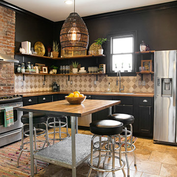
Example of an eclectic l-shaped brown floor kitchen design in Nashville with a drop-in sink, recessed-panel cabinets, black cabinets, wood countertops, beige backsplash, stainless steel appliances, an island and brown countertops
Example of an eclectic l-shaped brown floor kitchen design in Nashville with a drop-in sink, recessed-panel cabinets, black cabinets, wood countertops, beige backsplash, stainless steel appliances, an island and brown countertops
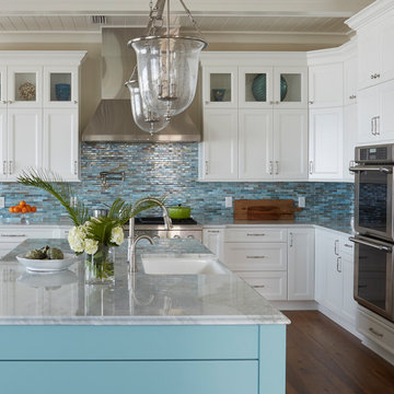
 Saltwater Kitchen & Bath Studio
Retirement home designed for extended family! I loved this couple! They decided to build their retirement dream home before retirement so that they could enjoy entertaining their grown children and their newly started families. A bar area with 2 beer taps, space for air hockey, a large balcony, a first floor kitchen with a large island opening to a fabulous pool and the ocean are just a few things designed with the kids in mind. The color palette is casual beach with pops of aqua and turquoise that add to the relaxed feel of the home.
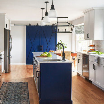 TKS Design Group
Download our free ebook, Creating the Ideal Kitchen. DOWNLOAD NOW
Lakefront property in the northwest suburbs of Chicago is hard to come by, so when we were hired by this young family with exactly that, we were immediately inspired by not just the unusually large footprint of this 1950’s colonial revival but also the lovely views of the manmade lake it was sited on. The large 5-bedroom home was solidly stuck in the 1980’s, but we saw tons of potential. We started out by updating the existing staircase with a fresh coat of paint and adding new herringbone slate to the entry hall.
The powder room off the entryway also got a refresh - new flooring, new cabinets and fixtures. We ran the new slate right through into this space for some consistency. A fun wallpaper and shiplap trim add a welcoming feel and set the tone for the home.
Next, we tackled the kitchen. Located away from the rest of the first floor, the kitchen felt a little isolated, so we immediately began planning for how to better connect it to the rest of the first floor. We landed on removing the wall between the kitchen and dining room and designed a modified galley style space with separate cooking and clean up zones. The cooking zone consists of the refrigerator, prep sink and cooktop, along with a nice long run of prep space at the island. The cleanup side of the kitchen consists of the main sink and dishwasher. Both areas are situated so that the user can view the lake during prep work and cleanup!
One of the home’s main puzzles was how to incorporate the mudroom and area in front of the patio doors at the back of the house. We already had a breakfast table area, so the space by the patio doors was a bit of a no man’s land. We decided to separate the kitchen proper from what became the new mudroom with a large set of barn doors. That way you can quickly hide any mudroom messes but have easy access to the light coming in through the patio doors as well as the outdoor grilling station. We also love the impact the barn doors add to the overall space.
The homeowners’ first words to us were “it’s time to ditch the brown,” so we did! We chose a lovely blue pallet that reflects the home’s location on the lake which is also vibrant yet easy on the eye. Countertops are white quartz, and the natural oak floor works well with the other honey accents. The breakfast table was given a refresh with new chairs, chandelier and window treatments that frame the gorgeous views of the lake out the back.
We coordinated the slate mudroom flooring with that used in the home’s main entrance for a consistent feel. The storage area consists of open and closed storage to allow for some clutter control as needed.
Next on our “to do” list was revamping the dated brown bar area in the neighboring dining room. We eliminated the clutter by adding some closed cabinets and did some easy updates to help the space feel more current. One snag we ran into here was the discovery of a beam above the existing open shelving that had to be modified with a smaller structural beam to allow for our new design to work. This was an unexpected surprise, but in the end we think it was well worth it!
We kept the colors here a bit more muted to blend with the homeowner’s existing furnishings. Open shelving and polished nickel hardware add some simple detail to the new entertainment zone which also looks out onto the lake!
Next we tackled the upstairs starting with the homeowner’s son’s bath. The bath originally had both a tub shower and a separate shower, so we decided to swap out the shower for a new laundry area. This freed up some space downstairs in what used to be the mudroom/laundry room and is much more convenient for daily laundry needs.
We continued the blue palette here with navy cabinetry and the navy tile in the shower. Porcelain floor tile and chrome fixtures keep maintenance to a minimum while matte black mirrors and lighting add some depth the design. A low maintenance runner adds some warmth underfoot and ties the whole space together.
We added a pocket door to the bathroom to minimize interference with the door swings. The left door of the laundry closet is on a 180 degree hinge to allow for easy full access to the machines. Next we tackled the master bath which is an en suite arrangement. The original was typical of the 1980’s with the vanity outside of the bathroom, situated near the master closet. And the brown theme continued here with multiple shades of brown.
Our first move was to segment off the bath and the closet from the master bedroom. We created a short hall from the bedroom to the bathroom with his and hers walk-in closets on the left and right as well as a separate toilet closet outside of the main bathroom for privacy and flexibility.
The original bathroom had a giant soaking tub with steps (dangerous!) as well as a small shower that did not work well for our homeowner who is 6’3”. With other bathtubs in the home, they decided to eliminate the tub and create an oversized shower which takes up the space where the old tub was located. The double vanity is on the opposite wall and a bench is located under the window for morning conversations and a place to set a couple of towels.
The pallet in here is light and airy with a mix of blond wood, creamy porcelain and marble tile, and brass accents. A simple roman shade adds some texture and it’s top-down mechanism allows for light and privacy.
This large whole house remodel gave our homeowners not only the ability to maximize the potential of their home but also created a lovely new frame from which to view their fabulous lake views.
Designed by: Susan Klimala, CKD, CBD
Photography by: Michael Kaskel
For more information on kitchen and bath design ideas go to: www.kitchenstudio-ge.com
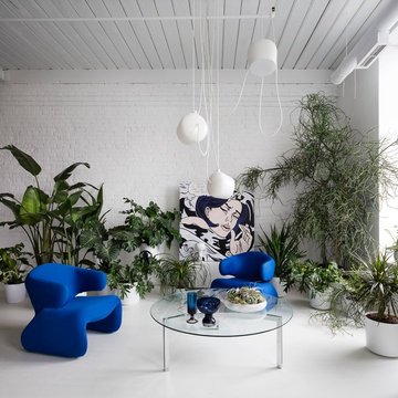
 stephane chamard
lisa pétrole
Example of an eclectic open concept white floor living room design in Toronto with white walls and no tv
Example of an eclectic open concept white floor living room design in Toronto with white walls and no tv
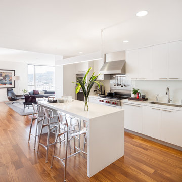 Guggenheim Architecture + Design Studio
With sweeping views of the Willamette river and Mt. Hood, this Atwater Place condo was designed with a balance of minimalism and livability in mind. A complete kitchen remodel brought a dark interior kitchen to the light and a full furnishings package welcomed Los Angeles transplants home to their new modern and bright residence. Our clients, a retired camera operator for both feature films and television and a producer/production manager on numerous television series including Weeds and The Middle, relocated from their traditionally-styled LA bungalow to Portland in the Summer of 2014. The couple sought a design departure from their long-term California residence and a fresh start for their new life in the South Waterfront.
With only two pieces of sentimental furniture and a handful of artwork included in the plan, we set out to create a comfortable and clean-lined furnishings package complimenting the broad southeast views. Organically shaped upholstery pieces juxtaposed with angular steel and wood tables create a soft balance in the open floor plan. Several custom pieces, including a dining table designed by our studio and a custom hand-blown glass chandelier crafted by Scott Schiesel with Lightlite compliment timeless pieces from Knoll, Herman Miller, and B&B Italia.
The kitchen is designed to reflect light and create brilliance in a space that is otherwise naturally dark. A material balance of stainless steel, back painted glass, quartz composite, lacquer, and mirror all play their part in creating a vibrant cooking environment. We collectively decided to forgo the traditional island pendant for a linear commercial fixture that provides tremendous light to the prep surface and creates an unexpected architectural element. The mirrored prep island creates the illusion of open space while concealing casework and wine storage on the working side of the kitchen.
It is worth noting that this project was designed and installed almost entirely while our clients were still living in LA and wrapping up professional obligations and selling their home. This afforded us the tremendous opportunity to send our clients to showrooms not available in Portland to view key pieces before final specification. Textiles and finish samples were approved via mail and communication took place over e-mail, telephone, and an occasional office visit. This unique process lead to a successful result and a beautifully balanced living environment.
28