
Search results for "Creating strong" in Home Design Ideas

 Alie Zandstra ASID
This remodel in Burlingame was fun the owners wanted to create a space that had a strong craftsman feel. To that end beams were added to the ceiling to create a coffered appearance and a inlayed border was added to the family room floor. They wanted the island to accommodate seating for casual dining and a cooking station on the other side with storage for spices and pots and pans. Alie Zandstra

 ModaScapes Interior Design
Setting the tone for the whole home is this little vignette created in the entry of the home. It promises that you will enjoy black and white with warm woods, metallic golds, strong geometry and the celebration of their union. The hexagon on the stand is a sample tile we had from another project- it made the PERFECT decoration for this shelf.

 Braswell Design+Build
The new white bead-board ceiling and wood floors in the kitchen match that of the family room, creating a natural continuity of parallel lines between rooms. The winding veins in the gray and white granite, used as both counter and backsplash, create a subtle and beautiful contrast to the strong lines of the white cabinetry. The brushed nickel hardware and faucets offer shiny, modern accents, and the custom X detail on interior lit cabinets provide a striking focal point for this lovely, duo-tone kitchen. Photos by Greg Hadley
Find the right local pro for your project

 Karen Berkemeyer Home
Huge transitional u-shaped medium tone wood floor and brown floor eat-in kitchen photo in New York with an undermount sink, shaker cabinets, white cabinets, blue backsplash, stainless steel appliances, an island and gray countertops

 Thomas & Jayne Interior Design
Creating a clean, contemporary home was the goal. I chose warm neutral grays with strong accent colors: orange and teals in the main living space. The use of sophisticated neutrals with well-placed color accents creates a warm and inviting yet clean and contemporary home for the family.
This is the craft room adjacent to the home office. Anne Buskirk Photography
 TVL Creative Ltd.
This 1910 West Highlands home was so compartmentalized that you couldn't help to notice you were constantly entering a new room every 8-10 feet. There was also a 500 SF addition put on the back of the home to accommodate a living room, 3/4 bath, laundry room and back foyer - 350 SF of that was for the living room. Needless to say, the house needed to be gutted and replanned.
Kitchen+Dining+Laundry-Like most of these early 1900's homes, the kitchen was not the heartbeat of the home like they are today. This kitchen was tucked away in the back and smaller than any other social rooms in the house. We knocked out the walls of the dining room to expand and created an open floor plan suitable for any type of gathering. As a nod to the history of the home, we used butcherblock for all the countertops and shelving which was accented by tones of brass, dusty blues and light-warm greys. This room had no storage before so creating ample storage and a variety of storage types was a critical ask for the client. One of my favorite details is the blue crown that draws from one end of the space to the other, accenting a ceiling that was otherwise forgotten.
Primary Bath-This did not exist prior to the remodel and the client wanted a more neutral space with strong visual details. We split the walls in half with a datum line that transitions from penny gap molding to the tile in the shower. To provide some more visual drama, we did a chevron tile arrangement on the floor, gridded the shower enclosure for some deep contrast an array of brass and quartz to elevate the finishes.
Powder Bath-This is always a fun place to let your vision get out of the box a bit. All the elements were familiar to the space but modernized and more playful. The floor has a wood look tile in a herringbone arrangement, a navy vanity, gold fixtures that are all servants to the star of the room - the blue and white deco wall tile behind the vanity.
Full Bath-This was a quirky little bathroom that you'd always keep the door closed when guests are over. Now we have brought the blue tones into the space and accented it with bronze fixtures and a playful southwestern floor tile.
Living Room & Office-This room was too big for its own good and now serves multiple purposes. We condensed the space to provide a living area for the whole family plus other guests and left enough room to explain the space with floor cushions. The office was a bonus to the project as it provided privacy to a room that otherwise had none before.

 Amy Carman Design
This modern home is artfully tucked into a wooded hillside, and much of the home's beauty rests in its direct connection to the outdoors. Floor-to-ceiling glass panels slide open to connect the interior with the expansive deck outside, nearly doubling the living space during the warmer months of the year. A palette of exposed concrete, glass, black steel, and wood create a simple but strong mix of materials that are repeated throughout the residence. That balance of texture and color is echoed in the choice of interior materials, from the flooring and millwork to the furnishings, artwork and textiles.
Sponsored
Columbus, OH

Hope Restoration & General Contracting
Columbus Design-Build, Kitchen & Bath Remodeling, Historic Renovations

 Tofan Interior Design
The strong statement is created by a rustic hallway wall .
Example of a large trendy wooden straight open staircase design in Toronto
Example of a large trendy wooden straight open staircase design in Toronto

 DHD Architecture and Interior Design
The Watermill House is a beautiful example of a classic Hamptons wood shingle style home. The design and renovation would maintain the character of the exterior while transforming the interiors to create an open and airy getaway for a busy and active family. The house comfortably sits within its one acre lot surrounded by tall hedges, old growth trees, and beautiful hydrangeas. The landscape influenced the design approach of the main floor interiors. Walls were removed and the kitchen was relocated to the front of the house to create an open plan for better flow and views to both the front and rear yards. The kitchen was designed to be both practical and beautiful. The u-shape design features modern appliances, white cabinetry and Corian countertops, and is anchored by a beautiful island with a knife-edge marble countertop. The island and the dining room table create a strong axis to the living room at the rear of the house. To further strengthen the connection to the outdoor decks and pool area of the rear yard, a full height sliding glass window system was installed. The clean lines and modern profiles of the window frames create unobstructed views and virtually remove the barrier between the interior and exterior spaces. The open plan allowed a new sitting area to be created between the dining room and stair. A screen, comprised of vertical fins, allows for a degree of openness, while creating enough separation to make the sitting area feel comfortable and nestled in its own area. The stair at the entry of the house was redesigned to match the new elegant and sophisticated spaces connected to it. New treads were installed to articulate and contrast the soft palette of finishes of the floors, walls, and ceilings. The new metal and glass handrail was intended to reduce visual noise and create subtle reflections of light.
Photo by Guillaume Gaudet

 Astro Design Inc.
Design & Supply - Astro Design Centre, Ottawa Canada
Photo credit: Doublespace Photography.
Knowing we wanted to maximize the amount of light and keep the Scandinavian feel, lots of white and blonde woods were used. 6” wide wire-brushed white oak flooring was installed. Farrow & Ball No.2001 Strong White was used on all walls, ceiling and trim. The existing brick fireplace was painted in No.2001 as well to create subtle texture. All interior & exterior doors were then painted out in Farrow & Ball No.31 Railings for a deep inky blue black contrast. The kitchen cabinetry is a combination of natural quarter sawn white oak and matte lacquer maple all done in Astro’s House Brand cabinetry. Simple matte black square knobs complete with back-plate create a crisp graphic quality to warm bright kitchen. The counters are a combination of Caesarstone 1141 Pure White quartz created the low maintenance hardworking surface needed for a young family. Along the stove wall a subtle backsplash was installed. The marble mosaic from Montreal’s very own MUD Tile (sold exclusively via Astro), was used to create depth, elongated hexagon Rock Salt mosaic nods toward the Scandinavian arts and crafts movement. A simple drywall hood fan was used against the mosaic. The fan was painted out in Farrow & Ball’s No.269 Cabbage White to pull the pastel green out of the mosaic.
 Thomas & Jayne Interior Design
Creating a clean, contemporary home was the goal. I chose warm neutral grays with strong accent colors: eye-catching reds, blues and purples in the bedrooms. The use of sophisticated neutrals with well-placed color accents creates a warm and inviting yet clean and contemporary home for the family. Anne Buskirk Photography
 Interior Design Imports
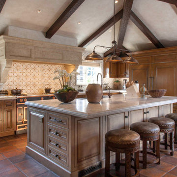
An historic Spanish Colonial residence built in 1925 being redesigned and furnished for a modern-day Southern California family was the challenge. The interiors of the main house needed the backgrounds set and then a timeless collection created for its furnishings. Lifestyle was always a consideration as well as the interiors relating to the strong architecture of the residence. Natural colors such as terra cotta, tans, blues, greens, old red and soft vintage shades were incorporated throughout. Our goal was to maintain the historic character of the residence combining design elements and materials considered classic in Southern California Spanish Colonial architecture. Natural fiber textiles, leathers and woven linens were the predominated upholstery choices. A 7000 square foot basement was added and furnished to provide a gym, Star Wars theater, game areas, spa area and a simulator for indoor golf and other sports.
Antiques were selected throughout the world, fine art from major galleries, custom reproductions fabricated in the old-world style. Collectible carpets were selected for the reclaimed hardwood flooring in all the areas. An estancia and garden over the basement were created and furnished with old world designs and materials as reclaimed woods, terra cotta and French limestone flooring.

 Creative Landscapes
Example of a mid-sized minimalist backyard concrete and rectangular lap hot tub design in Los Angeles
Sponsored
Columbus, OH
Hope Restoration & General Contracting
Columbus Design-Build, Kitchen & Bath Remodeling, Historic Renovations

 Cutts Carpentry
6' treated fence with large 48" wide arbor gate to allow easy access of snowmobile quads for backyard storage. 6"x6" posts set 4' into the ground with 165lbs of concrete to create a solid gate. Arbor style gate gives the fence a stand out look from the road and helps maintain a strong structure to provide a sag free gate.

 Sundance Landscaping Limited
Strong architectural character is created in this entry and arrival space.
Photo of a large traditional front yard stone garden path in Calgary.
Photo of a large traditional front yard stone garden path in Calgary.



 MODANI
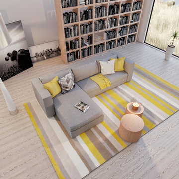
Neutral finishes and clean lines create an atmosphere perfect for lounging, while modern-style seating keeps the look on-trend. Providing a plush, relaxed seating experience, the Edison Small Sectional Sofa in Gray showcases that design can be strong and handsome with a soft side. The wooden frame lends structural support and ensures the designs longevity. With a lavish gray appearance, this contemporary sofa adds style and personality to any living space.
 Storie Collective
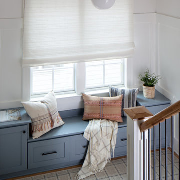
In this new build project, our objective was to create light and airy spaces and rooms that evoke warmth and coziness, including a main level floor plan that elicits open concept and separate spaces through architectural details. We love that our client felt inspired by minimal, clean and modern design elements that incorporate interest through movement in natural materials yet also adored traditional elements and beachside inspiration. By juxtaposing strong raw wood elements against soft linen curves and contrasting soft neutral colors against moody tones, we strove to create balance within the design. The space provides the perfect amount of richness and depth to ensure coastal vibes are respected not overwhelming. Bringing the outdoors in, through greenery and living plants, we created a soothing and natural ease about this family home.

 The Brooklyn Studio
This residence was a complete gut renovation of a 4-story row house in Park Slope, and included a new rear extension and penthouse addition. The owners wished to create a warm, family home using a modern language that would act as a clean canvas to feature rich textiles and items from their world travels. As with most Brooklyn row houses, the existing house suffered from a lack of natural light and connection to exterior spaces, an issue that Principal Brendan Coburn is acutely aware of from his experience re-imagining historic structures in the New York area. The resulting architecture is designed around moments featuring natural light and views to the exterior, of both the private garden and the sky, throughout the house, and a stripped-down language of detailing and finishes allows for the concept of the modern-natural to shine.
Upon entering the home, the kitchen and dining space draw you in with views beyond through the large glazed opening at the rear of the house. An extension was built to allow for a large sunken living room that provides a family gathering space connected to the kitchen and dining room, but remains distinctly separate, with a strong visual connection to the rear garden. The open sculptural stair tower was designed to function like that of a traditional row house stair, but with a smaller footprint. By extending it up past the original roof level into the new penthouse, the stair becomes an atmospheric shaft for the spaces surrounding the core. All types of weather – sunshine, rain, lightning, can be sensed throughout the home through this unifying vertical environment. The stair space also strives to foster family communication, making open living spaces visible between floors. At the upper-most level, a free-form bench sits suspended over the stair, just by the new roof deck, which provides at-ease entertaining. Oak was used throughout the home as a unifying material element. As one travels upwards within the house, the oak finishes are bleached to further degrees as a nod to how light enters the home.
The owners worked with CWB to add their own personality to the project. The meter of a white oak and blackened steel stair screen was designed by the family to read “I love you” in Morse Code, and tile was selected throughout to reference places that hold special significance to the family. To support the owners’ comfort, the architectural design engages passive house technologies to reduce energy use, while increasing air quality within the home – a strategy which aims to respect the environment while providing a refuge from the harsh elements of urban living.
This project was published by Wendy Goodman as her Space of the Week, part of New York Magazine’s Design Hunting on The Cut.
Photography by Kevin Kunstadt
71