
Search results for "Creating substantial" in Home Design Ideas
 Structural Associates
Patterson Architecture + Interior Photography
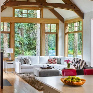
Example of a mountain style medium tone wood floor living room design in Denver with gray walls
Example of a mountain style medium tone wood floor living room design in Denver with gray walls
 Studio M Interiors
Scott Amundson
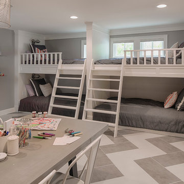
Bedroom and mid-sized elegant gender-neutral multicolored floor and porcelain tile kids' bedroom photo in Minneapolis with gray walls
Bedroom and mid-sized elegant gender-neutral multicolored floor and porcelain tile kids' bedroom photo in Minneapolis with gray walls
 OLSON LEWIS + Architects
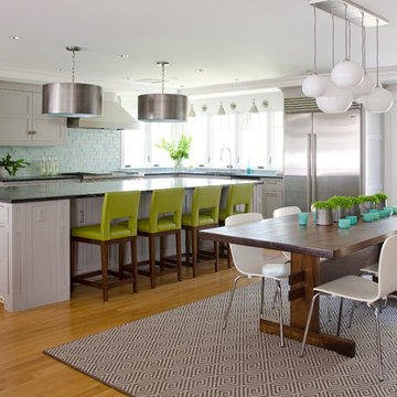
This New England home has the essence of a traditional home, yet offers a modern appeal. The home renovation and addition involved moving the kitchen to the addition, leaving the resulting space to become a formal dining and living area.
The extension over the garage created an expansive open space on the first floor. The large, cleverly designed space seamlessly integrates the kitchen, a family room, and an eating area.
A substantial center island made of soapstone slabs has ample space to accommodate prepping for dinner on one side, and the kids doing their homework on the other. The pull-out drawers at the end contain extra refrigerator and freezer space. Additionally, the glass backsplash tile offers a refreshing luminescence to the area. A custom designed informal dining table fills the space adjacent to the center island.
Paint colors in keeping with the overall color scheme were given to the children. Their resulting artwork sits above the family computers. Chalkboard paint covers the wall opposite the kitchen area creating a drawing wall for the kids. Around the corner from this, a reclaimed door from the grandmother's home hangs in the opening to the pantry. Details such as these provide a sense of family and history to the central hub of the home.
Builder: Anderson Contracting Service
Interior Designer: Kristina Crestin
Photographer: Jamie Salomon
Find the right local pro for your project
 Ryals Cabinet & Millwork
J.W. Boom Photography
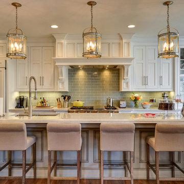
Elegant dark wood floor kitchen photo with recessed-panel cabinets, white cabinets, green backsplash, subway tile backsplash, paneled appliances and an island
Elegant dark wood floor kitchen photo with recessed-panel cabinets, white cabinets, green backsplash, subway tile backsplash, paneled appliances and an island
 HOBBS INC
Architect: Amanda Martocchio Architecture & Design
Photography: Michael Moran
Project Year:2016
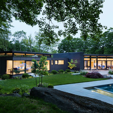
This LEED-certified project was a substantial rebuild of a 1960's home, preserving the original foundation to the extent possible, with a small amount of new area, a reconfigured floor plan, and newly envisioned massing. The design is simple and modern, with floor to ceiling glazing along the rear, connecting the interior living spaces to the landscape. The design process was informed by building science best practices, including solar orientation, triple glazing, rain-screen exterior cladding, and a thermal envelope that far exceeds code requirements.

 David Heide Design Studio
Architecture & Interior Design: David Heide Design Studio
Photography: William Wright
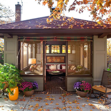
Example of an arts and crafts backyard and detached brick guesthouse design in Minneapolis
Example of an arts and crafts backyard and detached brick guesthouse design in Minneapolis
Sponsored
Delaware, OH

Buckeye Basements, Inc.
Central Ohio's Basement Finishing ExpertsBest Of Houzz '13-'21
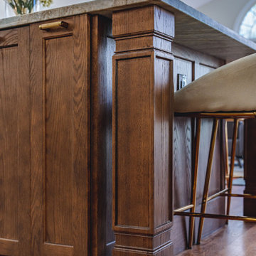
 FineLine Kitchens, Inc.
Hi everyone, I'm Sarah and Ogun we are here with fine line kitchens. So we are a couple working together. I do the interior design and remodeling of the space material selection meeting with the clients. And I handled operations outside, you know meaning all the construction work that is taking place the inside. The houses that we work in. I handle all the aspects of the construction, so today's project is very special. We're in Vienna and the client had a very big family. It's a family of seven that lives here. So we had a few aspects that we needed to keep in mind while designing this one. Having everybody be able to sit on the island. So we wanted plenty of seating all the way around. We didn't want anybody standing or anything like that. So what we did is we maximize the space. The center island is the biggest part of the kitchen. We use a natural stone to kind of give it a beautiful texture versus quartz. It's kind of standard white or kind of fabricated, so I wanted something very natural. We did this because I took my inspiration from the outside, so the inspiration if you look at the view right in front of me is there are so many greens there's a lot of brass accents and I wanted to bring this. Into this kitchen while designing it for my clients. She is very warm very. She wanted a very homey, comfy kind of look for the kitchen. So that's what we did today. As you can see, the cabinets are sage green, very light, so I still think it's a neutral, but it's a lighter color that again brings the outside in and we combine that with the oak right behind me so it's a slightly warm oak. It's not very dark. It's not very light. It's a medium brown and the same color went on the island. To kind of tie these two in and the backsplash, my favorite part is where you can see a little bit of design. It is, in my opinion still classic, but includes a pattern so the outside part is as we said in the beginning, is handled by my husband. I'd like him to speak a little bit about that. Thanks, Sarah, I want to talk to you guys a little bit about the construction part of this project. Originally this kitchen was located mostly in this area. They had their stove there sing. It was more of a peninsula layout in Sarah's and the customer vision they wanted. They wanted to get rid of the peninsula and they want to be able to have a huge island that can at least sit seven people because they're familiar with seven. So we wanted to make sure that we can achieve this design and bring it to life so that they can be happy with this layout. Some of the challenges we had, the house, the home being, you know, old home. There were a lot of you know the older electrical and plumbing that had to be replaced. We had to relocate the stove from here to this area. Over here we had put a nice foot fan that we had to relocate all the ductwork and the plumbing. Was being on the peninsula area. We had to relocate it to the center islands. So we achieved all this and kind of like bring it to bring in this kitchen up to date it looks beautiful. That's true, so yes, the old layout did not function for my clients because everything was kind of gathered on one side of the kitchen. So there was like a peninsula right there. So the end of this island kind of continued straight. And that was just the L shape. Kind of where everything was and there used to be another big table here, so they were using only kind of half of the space. So like I said at the beginning, our vision was to kind of feed everybody at the island, create some symmetry. 'cause I love that. So as you can see behind me, this is kind of the focal point symmetrical. Everything is kind of even we wanted to also panel the fridge here so it mimics the pantry and another size. So when you're looking at it, it is bringing again that symmetry back again. I hope you enjoyed this kitchen and this video and I'll see you soon. So how do you think this project turned out? It's nice. I like the color. I think it turned out nice. It's kind of like a little bit different color than what we always do. So I realize. Are you giving me a little bit of credit here that I did something different? Are you proud? I'm so proud of you. Other than that I like it. That they have kind of like a two sink. So if this was our kitchen, if we ever like you can have your own. I can have mine if we ever get into a fight then this can be like my own kitchen. Why are we gonna bring in a fight right now? So I'm cooking anyway. You're grilling most of the time, So what are you even talking about? My kitchen? That's my kitchen. You can just take the small sink. That's fine. It's always good to have your own space right there, so anyways. Thank you guys for watching. We hope to see you soon and if you have any questions please click the link below. It'll lead you to our website, house, YouTube and all of the social media is so nice to have you guys. We'll see you soon. Thanks bye bye-bye.

 Twelve Stones Designs, LLC
The owners of this kitchen had spent the money to upgrade the finishes in their kitchen upon building the home 12 years ago, but after living in the space for several years they realized how nonfunctional the layout really was. The (then) two preschool aged children had grown into busy, hungry teenagers with many friends who also liked to hang out at the house. So the family needed a more functional kitchen with better traffic flow, space for daily activities revolving around the kitchen at different times of day, and a kitchen that could accommodate cooking for and serving large groups. Furthermore, the dark, traditional finishes no longer reflected the homeowners’ style. They requested a brighter, more relaxed, coastal style that reflected their love of the seaside cities they like to visit.
Originally, the kitchen was U-shaped with a narrow island in the middle. The island created narrow aisles that bottle-necked at the dishwasher, refrigerator, and cooktop areas. There was a pass-through from the foyer into the kitchen, but the owners never liked that the pass-through was also located so close to the powder room. The awkward proximity was unappealing and made guests feel uncomfortable.
The kitchen’s storage was made up of lots of narrow cabinets, apothecary drawers, clipped corner units, and very few drawers. It lacked useful storage for the larger items the family used on a daily basis. And the kitchen’s only pantry was small closet that had only builder-grade, narrow shelving with no illumination to be able to see the contents inside.
Overall, the kitchen’s lighting plan was poorly executed. Only six recessed cans illuminated the entire kitchen and nook areas. The under cabinet lighting was not evenly distributed either. In fact, the builder had mis-placed the under cabinet lighting around the decorative pilasters which made for choppy, dark cubbies. Further, the builder didn’t include any lighting over the sink or the bar area, which meant whoever was doing the dishes was always in their own shadow. That, coupled with the steep overhang of the game room above made the bar area feel like a dim, cavernous space that wasn’t inviting or task oriented. The kitchen looked out into the main living space, but the raised bar and a narrow wall (which held the only large cabinet in the kitchen) created more of a barrier than a relationship to the living room or breakfast nook. In fact, one couldn’t even see the breakfast nook from the cooktop or sink areas due to its orientation. The raised bar top was too narrow to comfortably sit to either dine at or chat from due to the lack of knee space. The the homeowners confided that the kitchen felt more like a dark, dirty prison than place where the family, or their guests, wanted to gather and commune.
The clients' needs and desires were:
➢ to create a kitchen that would be a space the family loved to be in; to relate to the adjacent spaces all around, and to have better flow for entertaining large groups
➢ to remove the walls between the breakfast nook and living area and to be able to utilize the natural light from the windows in both those areas
➢ to incorporate a functional chopping block for prepping fresh food for home cooked meals, an island with a large sink and drain board, 2 pull out trash cans, and seating for at least the 2 teens to eat or do homework
➢ to design a kitchen and breakfast nook with an airy, coastal, relaxed vibe that blended with the rest of the house's coastal theme
➢ to integrate a layered lighting plan which would include ample general illumination, specific task lighting, decorative lighting, and lots of illuminated storage
➢ to design a kitchen with not only more storage for all the husband’s kitchen gadgets and collection of oils and spices, but smart storage, including a coffee/breakfast bar and a place to store and conceal the toaster oven and microwave
➢ to find a way to utilize the large open space between the kitchen, pantry area, and breakfast nook
Twelve Stones Designs achieved the owner's goals by:
➢ removing the walls between the kitchen and living room to allow the natural light to filter in from the adjacent rooms and to create a connection between the kitchen, nook, and living spaces for a sense of unity and communion
➢ removing the existing pantry and designing 3 large pantry style cabinets with LED tape lights and rollout drawers to house lots of kitchen appliances, gadgets, and tons of groceries. We also took the cabinets all the way up to the 9’ ceiling for additional storage for seasonal items and bulk storage.
➢ designing 2 islands - 1 with a gorgeous black walnut chopping block that houses a drawer for chopping and carving knives and a custom double pull out trash unit for point of use utilization - and 1 that houses the dishwasher, a large Blanco Gourmet sink with integrated drain board, woven baskets for fresh root vegetables and kitchen towels, plenty of drawer storage for kitchen items, and bar seating for up to 4 diners.
➢ closing off the space between the kitchen and the powder room to create a beautiful new private alcove for the powder room as well as adding some decorative storage. This also gave us space to include more tall storage near the new range for precision placement of the husband’s extensive oil and spice collection as well as a location for a combo-steam oven the wife wanted for baking and cooking healthy meals.
The project is enhanced functionally by:
➢ incorporated USB and standard receptacles for the kids’ laptops and phone charging in the large island
➢ designing the small island to include additional open shelving for items used on a daily basis such as a variety of bowls, plates, and colanders. This set up also works well for the husband who prefers to “plate” his dinners in restaurant-style fashion before presenting them to the table.
➢ the integration of specific storage units, such as double stacked cutlery drawers, a custom spice pull-out, a Kuerig coffee and tea pod drawer, and custom double stacked utensil drawers
➢ moving the refrigerator to the old oven location - this eliminated the bottle neck as well as created a better relationship to the eating table. It also utilizes the floor space between the pantry, nook, and kitchen
➢ creating a banquet style breakfast nook - this banquette seating not only doubles the amount of seating for large gatherings but it better utilizes the odd space between the kitchen and the previous nook area. It also helps to create a distinct pathway from the mudroom room through the pantry area, kitchen, nook, and living room.
➢ the coffee/breakfast bar area which includes the perfect location for the concealed microwave and toaster oven, convenient storage for the coffee pods and tea accoutrements. Roll-out drawers below also house the smoothie maker, hot water kettle, and a plethora of smoothie-making ingredients such as protein powders, smoothie additives, etc. Furthermore, the drawers below the Keurig house measuring utensil, cutlery, baking supplies and tupperware storage.
➢ incorporating lots of wide drawers and pullouts to accommodate large cookware.
➢ utilizing as much vertical space as possible by building storage to the ceiling which accommodates the family’s abundant amount of serving platters, baking sheets, bakeware, casserole dishes, and additional cutting boards.
The project is enhanced aesthetically by:
➢ new 5-piece Versailles pattern porcelain tile that now seamlessly joins the entire down stairs area together creating a bright, cohesiveness feeling instead of choppy separated spaces - it also adds a coastal feeling
➢ designing a cabinet to conceal the microwave and toaster oven
➢ the coastal influenced light fixtures over the nook table and island
➢ the sandy colors of the Langdon Cambria countertops. The swirling pattern and sparkling quartz pieces remind the homeowner of black-and-tan sandy beaches
➢ the striped banquet seating whose creamy white background and blue-green stripes were the inspiration for the cabinet and wall colors.
➢ All the interior doors were painted black to coordinate with the blacks and grays in the backsplash tile and countertop. This also adds a hint of tailored formality to an otherwise casual space.
➢ the use of WAC's Oculux small aperture LED units for the overhead lighting complimented with Diode LED strips for task lighting under the cabinets and inside the pantry and glass wall cabinets. All of the lighting applications are on separate dimmer switches.
Innovative uses of materials or construction methods by Realty Restoration LLC:
➢ Each 1-1/2” x 3” block of reclaimed end-grain black walnut that makes up the center island chopping block was hand milled and built in the shop. It was designed to look substantial and proportional to the surrounding elements, executed by creating the 4 inch tall top with a solid wood chamfered edge band.
➢ The metal doors on either side of the vent hood were also custom designed for this project and built in the Realty Restoration LLC shop. They are made 1x2, 11-gauge mild steel with ribbed glass. Weighing 60 lbs a piece, heavy duty cabinet hinges were added to support the weight of the door and keep them from sagging.
➢ Under-cabinet receptacles were added along the range wall in order to have a clean, uninterrupted backsplash.
Design obstacles to overcome:
➢ Because we were removing the demising walls between the kitchen and living room, we had to find a way to plumb and vent the new island. We did this by tunneling through the slab (the slab had post tension cables which prevented us from just trenching) to run a new wet vent through a nearby structural wall. We pulled the existing hot and cold lines between upper floor joists and ran them down the structural wall as well and up through a conduit in the tunnel.
➢ Since we were converting from wall overs to a gas range it allowed us to utilize the 220 feed for the wall ovens to provide a new sub panel for all the new kitchen circuits
➢ Due to framing deficiencies inherited from the original build there was a 1-1/2” differential in the floor-to-ceiling height over a 20 foot span; by utilizing the process of cutting and furring coupled with the crown moulding details on the cabinet elevations we were able to mask the problem and provide seamless transitions between the cabinet components.
Evidence of superior craftsmanship:
➢ uniquely designed, one-of-a-kind metal “X” end panels on the large island. The end panels were custom made in the Realty Restoration LLC shop and fitted to the exact dimensions of the island. The welding seams are completely indistinguishable - the posts look like they are cut from a single sheet of metal
➢ square metal posts on the small island were also custom made and designed to compliment and carry through the metal element s throughout the kitchen
➢ the beautiful, oversized end panels on the pantry cabinets which give the breakfast nook a tailored look
➢ integrating a large format 5 piece Versailles tile pattern to seamlessly flow from the existing spaces into the new kitchen space
➢ By constructing a custom cabinet that jogged around a corner we could not remodel (housing the entry way coat closet) we were able to camouflage the adjacent wall offset within the upper and lower cabinets. By designing around the existing jog in the structural walls we accomplished a few things: we were able to find the space to house, and hide, the microwave and toaster oven yet still have a clean cohesive appearance from the kitchen side. Additionally, the owners were able to keep their much needed coat closet and we didn’t have to increase the budget with unnecessary structural work.
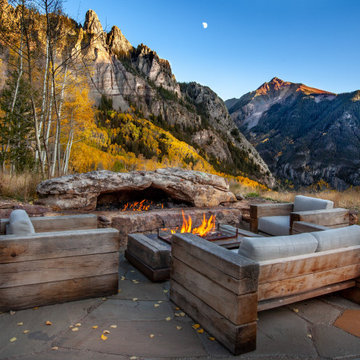
 Artisan Builders LLC
Huge mountain style backyard stone patio photo in Denver with no cover and a fire pit
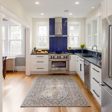
 Jordan Design Build Group
This charming Lyon Park house was built in 1925, when the typical kitchen was small, modest and closed-off from the rest of the home. For a family that loves to cook and bake, the cramped, outdated and dysfunctional kitchen was a source of constant frustration. Our new design expanded the kitchen into an adjacent sunroom, opening it up to the rest of the home and creating a spacious, light and updated kitchen that now serves as the heart of the home. We more than doubled the amount of countertop space and added much needed pantry storage as well as a dedicated coffee nook. The bold blue herringbone backsplash, honed black granite, white shaker cabinets and substantial matte black pulls complement the rustic modern style of the adjoining living space.
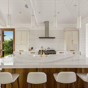
 Pu'uwai Design & Construction
This breathtaking kitchen was designed for entertaining. The large kitchen island is teak and features a Brittanicca Cambria countertop with a flawless waterfall edge. The 48" gas wolf range is practically a work of art framed by a modern stainless steel range hood and by the quartz panels that meld seamlessly with the wood paneling through out the great room. The modern white cabinets are punctuated with the use of built-in custom gold hardware. The vaulted ceilings create an airy and bright space which is complimented by the use of glass pendants above the bar. The gray porcelain tile flooring used through out the home flows outside to the lanai and entry to punctuate the indoor outdoor design.
 Hammer & Hand
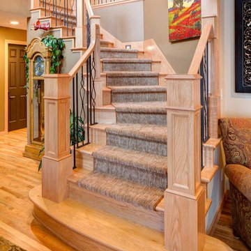
H&H, Amy Griffith of Broken Box Designs, and interior designer Vida Shore teamed up to transform a series of chopped up, under-utilized rooms into a open communal space. The team added a substantial beam in the ceiling and removed multiple walls to create a larger kitchen and more connected living space. This first floor remodel included the addition of custom pocket dog gates, a staircase remodel, kitchen remodel, and new built-in shelving.
Photos by Jeff Amram Photography.

Sponsored
Delaware, OH
Buckeye Basements, Inc.
Central Ohio's Basement Finishing ExpertsBest Of Houzz '13-'21
 DD Ford Construction
Lepere Studio
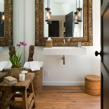
Inspiration for a mid-sized mediterranean master medium tone wood floor powder room remodel in Santa Barbara with a wall-mount sink and white walls
Inspiration for a mid-sized mediterranean master medium tone wood floor powder room remodel in Santa Barbara with a wall-mount sink and white walls
 OLSON LEWIS + Architects
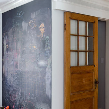
This New England home has the essence of a traditional home, yet offers a modern appeal. The home renovation and addition involved moving the kitchen to the addition, leaving the resulting space to become a formal dining and living area.
The extension over the garage created an expansive open space on the first floor. The large, cleverly designed space seamlessly integrates the kitchen, a family room, and an eating area.
A substantial center island made of soapstone slabs has ample space to accommodate prepping for dinner on one side, and the kids doing their homework on the other. The pull-out drawers at the end contain extra refrigerator and freezer space. Additionally, the glass backsplash tile offers a refreshing luminescence to the area. A custom designed informal dining table fills the space adjacent to the center island.
Paint colors in keeping with the overall color scheme were given to the children. Their resulting artwork sits above the family computers. Chalkboard paint covers the wall opposite the kitchen area creating a drawing wall for the kids. Around the corner from this, a reclaimed door from the grandmother's home hangs in the opening to the pantry. Details such as these provide a sense of family and history to the central hub of the home.
Builder: Anderson Contracting Service
Interior Designer: Kristina Crestin
Photographer: Jamie Salomon
 HOBBS INC
Jane Beiles
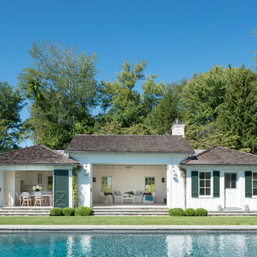
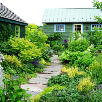
Inspiration for a mid-sized country backyard rectangular pool house remodel in New York
Inspiration for a mid-sized country backyard rectangular pool house remodel in New York

Sponsored
Delaware, OH
Buckeye Basements, Inc.
Central Ohio's Basement Finishing ExpertsBest Of Houzz '13-'21
 Joan Heaton Architects
Bob Schatz
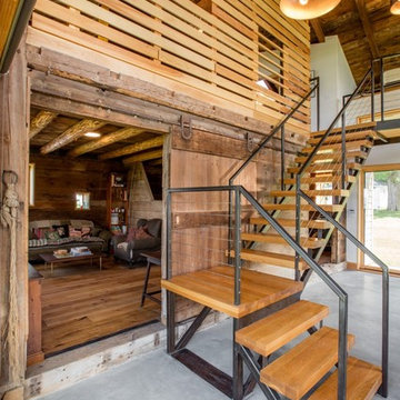
Inspiration for a rustic wooden l-shaped open staircase remodel in Burlington
Inspiration for a rustic wooden l-shaped open staircase remodel in Burlington
 Décor Aid
Having a small child, loving to entertain and looking to declutter and kid-proof the gathering spaces of their home in the quaint village of Rockville Centre, Long Island, a stone’s throw from Manhattan, our client’s main objective was to have their living room and den transformed with a family friendly home makeover with mid-century modern tones boasting a formal, yet relaxed spirit
Stepping into the home we found their living room and den both architecturally well appointed yet in need of modern transitional furniture pieces and the pops of color our clients admired, as there was a substantial amount of cool, cold grays in the rooms.
Decor Aid designer Vivian C. approached the design and placement of the pieces sourced to be kid-friendly while remaining sophisticated and practical for entertaining.
“We played off of the clients love for blush pinks, mid-century modern and turquoise. We played with the use of gold and silver metals to mix it up.”
In the living room, we used the prominent bay window and its illuminating natural light as the main architectural focal point, while the fireplace and mantels soft white tone helped inform the minimalist color palette for which we styled the room around.
To add warmth to the living room we played off of the clients love for blush pinks and turquoise while elevating the room with flashes of gold and silver metallic pieces. For a sense of play and to tie the space together we punctuated the kid-friendly living room with an eclectic juxtaposition of colors and materials, from a beautifully patchworked geometric cowhide rug from All Modern, to a whimsical mirror placed over an unexpected, bold geometric credenza, to the blush velvet barrel chair and abstract blue watercolor pillows.
“When sourcing furniture and objects, we chose items that had rounded edges and were shatter proof as it was vital to keep each room’s decor childproof.” Vivian ads.
Their vision for the den remained chic, with comfort and practical functionality key to create an area for the young family to come together.
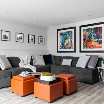
For the den, our main challenge was working around the pre-existing dark gray sectional sofa. To combat its chunkiness, we played off of the hues in the cubist framed prints placed above and focused on blue and orange accents which complement and play off of each other well. We selected orange storage ottomans in easy to clean, kid-friendly leather to maximize space and functionality. To personalize the appeal of the den we included black and white framed family photos. In the end, the result created a fun, relaxed space where our clients can enjoy family moments or watch a game while taking in the scenic view of their backyard.
For harmony between the rooms, the overall tone for each room is mid-century modern meets bold, yet classic contemporary through the use of mixed materials and fabrications including marble, stone, metals and plush velvet, creating a cozy yet sophisticated enough atmosphere for entertaining family and friends and raising a young children.
“The result od this family friendly room was really fantastic! Adding some greenery, more pillows and throws really made the space pop.” Vivian C. Decor Aid’s Designer
 Linc Thelen Design
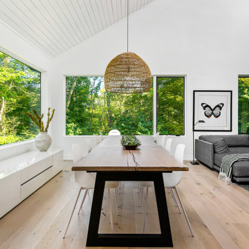
This couple purchased a second home as a respite from city living. Living primarily in downtown Chicago the couple desired a place to connect with nature. The home is located on 80 acres and is situated far back on a wooded lot with a pond, pool and a detached rec room. The home includes four bedrooms and one bunkroom along with five full baths.
The home was stripped down to the studs, a total gut. Linc modified the exterior and created a modern look by removing the balconies on the exterior, removing the roof overhang, adding vertical siding and painting the structure black. The garage was converted into a detached rec room and a new pool was added complete with outdoor shower, concrete pavers, ipe wood wall and a limestone surround.
Dining Room and Den Details:
Features a custom 10’ live edge white oak table. Linc designed it and built it himself in his shop with Owl Lumber and Home Things. This room was an addition along with the porch.
-Large picture windows
-Sofa, Blu Dot
-Credenza, Poliform
-White shiplap ceiling with white oak beams
-Flooring is rough wide plank white oak and distressed
3