
Search results for "Csa s moving" in Home Design Ideas

 Custom Kitchens by John Wilkins, Inc.
Francis Combes
Alcove bathtub - small contemporary master gray tile and porcelain tile porcelain tile and gray floor alcove bathtub idea in San Francisco with flat-panel cabinets, gray cabinets, a two-piece toilet, gray walls, an undermount sink, marble countertops and a hinged shower door
Alcove bathtub - small contemporary master gray tile and porcelain tile porcelain tile and gray floor alcove bathtub idea in San Francisco with flat-panel cabinets, gray cabinets, a two-piece toilet, gray walls, an undermount sink, marble countertops and a hinged shower door

 Haas Development and Construction
Elegant and functional, the glass-enclosed shower showcases white subway tiles and a hexagonal tile floor. A built-in niche offers convenient storage, framed by a lattice pattern that adds visual interest. This thoughtful touch enhances the timeless aesthetic, blending style with practicality for a serene shower experience.

 Kenowa Builders
Stoffer Photography
Mid-sized transitional freestanding desk carpeted and gray floor study room photo in Grand Rapids with multicolored walls and no fireplace
Mid-sized transitional freestanding desk carpeted and gray floor study room photo in Grand Rapids with multicolored walls and no fireplace
Find the right local pro for your project

 Blue Gator Photography
Terry Domingue, Photography
Example of a classic built-in desk dark wood floor craft room design in San Francisco with gray walls
Example of a classic built-in desk dark wood floor craft room design in San Francisco with gray walls


 Mari Kushino Design
Classic Shaker Kitchen In A Small Space.
Design by Mari Kushino Design,
Cabinets by South Shore Cabinetry,
Photography by Tony Colangelo Photography.

 Andrew Heiser
Example of a large urban open concept laminate floor and brown floor living room design in Los Angeles with black walls

Sponsored
Sunbury, OH

J.Holderby - Renovations
Franklin County's Leading General Contractors - 2X Best of Houzz!

 E Design Home
Photo: Jim Decker Photography.
Inspiration for a transitional living room remodel in Las Vegas with a music area
Inspiration for a transitional living room remodel in Las Vegas with a music area

 Magleby Construction
Large cottage galley slate floor and gray floor dedicated laundry room photo in Salt Lake City with granite countertops, a side-by-side washer/dryer, gray countertops, recessed-panel cabinets, gray cabinets and gray walls

 Sabrina Alfin Interiors
Dean J. Birinyi Photography
Kitchen - transitional kitchen idea in San Francisco
Kitchen - transitional kitchen idea in San Francisco

 JAUREGUI Architecture Interiors Construction
Photography: Piston Design
Example of a classic backyard custom-shaped infinity pool design in Houston
Example of a classic backyard custom-shaped infinity pool design in Houston

 KN Remodeling
Freestanding bathtub - large contemporary master ceramic tile porcelain tile and gray floor freestanding bathtub idea in Los Angeles with flat-panel cabinets, black cabinets, gray walls, an undermount sink, quartz countertops and white countertops

 S-Squared // Architecture + Interiors + Landscape
photo: Mark Pinkerton, VI360
Inspiration for a contemporary gender-neutral light wood floor and beige floor walk-in closet remodel in San Francisco with open cabinets and medium tone wood cabinets
Inspiration for a contemporary gender-neutral light wood floor and beige floor walk-in closet remodel in San Francisco with open cabinets and medium tone wood cabinets


 Kathleen Jennison
An Arts & Crafts Bungalow is one of my favorite styles of homes. We have quite a few of them in our Stockton Mid-Town area. And when C&L called us to help them remodel their 1923 American Bungalow, I was beyond thrilled.
As per usual, when we get a new inquiry, we quickly Google the project location while we are talking to you on the phone. My excitement escalated when I saw the Google Earth Image of the sweet Sage Green bungalow in Mid-Town Stockton. "Yes, we would be interested in working with you," I said trying to keep my cool.
But what made it even better was meeting C&L and touring their home, because they are the nicest young couple, eager to make their home period perfect. Unfortunately, it had been slightly molested by some bad house-flippers, and we needed to bring the bathroom back to it "roots."
We knew we had to banish the hideous brown tile and cheap vanity quickly. But C&L complained about the condensation problems and the constant fight with mold. This immediately told me that improper remodeling had occurred and we needed to remedy that right away.
The Before: Frustrations with a Botched Remodel
The bathroom needed to be brought back to period appropriate design with all the functionality of a modern bathroom. We thought of things like marble countertop, white mosaic floor tiles, white subway tile, board and batten molding, and of course a fabulous wallpaper.
This small (and only) bathroom on a tight budget required a little bit of design sleuthing to figure out how we could get the proper look and feel. Our goal was to determine where to splurge and where to economize and how to complete the remodel as quickly as possible because C&L would have to move out while construction was going on.
The Process: Hard Work to Remedy Design and Function
During our initial design study, (which included 2 hours in the owners’ home), we noticed framed images of William Morris Arts and Crafts textile patterns and knew this would be our design inspiration. We presented C&L with three options and they quickly selected the Pimpernel Design Concept.
We had originally selected the Black and Olive colors with a black vanity, mirror, and black and white floor tile. C&L liked it but weren’t quite sure about the black, We went back to the drawing board and decided the William & Co Pimpernel Wallpaper in Bayleaf and Manilla color with a softer gray painted vanity and mirror and white floor tile was more to their liking.
After the Design Concept was approved, we went to work securing the building permit, procuring all the elements, and scheduling our trusted tradesmen to perform the work.
We did uncover some shoddy work by the flippers such as live electrical wires hidden behind the wall, plumbing venting cut-off and buried in the walls (hence the constant dampness), the tub barely balancing on two fence boards across the floor joist, and no insulation on the exterior wall.
All of the previous blunders were fixed and the bathroom put back to its previous glory. We could feel the house thanking us for making it pretty again.
The After Reveal: Cohesive Design Decisions
We selected a simple white subway tile for the tub/shower. This is always classic and in keeping with the style of the house.
We selected a pre-fab vanity and mirror, but they look rich with the quartz countertop. There is much more storage in this small vanity than you would think.
The Transformation: A Period Perfect Refresh
We began the remodel just as the pandemic reared and stay-in-place orders went into effect. As C&L were already moved out and living with relatives, we got the go-ahead from city officials to get the work done (after all, how can you shelter in place without a bathroom?).
All our tradesmen were scheduled to work so that only one crew was on the job site at a time. We stayed on the original schedule with only a one week delay.
The end result is the sweetest little bathroom I've ever seen (and I can't wait to start work on C&L's kitchen next).
Thank you for joining me in this project transformation. I hope this inspired you to think about being creative with your design projects, determining what works best in keeping with the architecture of your space, and carefully assessing how you can have the best life in your home.

 Taylor & Taylor, Inc.
The Tudor style arch on the carved stone fireplace is one of the many found throughout the house. An opulently patterned wool and silk rug from Stark Carpet and a French nineteenth century chandelier add Old-World touches.

 MAWCHICAGO1 LLC
Example of a trendy single-wall dark wood floor and brown floor wet bar design in Chicago with an undermount sink, shaker cabinets, white cabinets, mirror backsplash and white countertops

 TKS Design Group
Download our free ebook, Creating the Ideal Kitchen. DOWNLOAD NOW
The homeowners came to us looking to update the kitchen in their historic 1897 home. The home had gone through an extensive renovation several years earlier that added a master bedroom suite and updates to the front façade. The kitchen however was not part of that update and a prior 1990’s update had left much to be desired. The client is an avid cook, and it was just not very functional for the family.
The original kitchen was very choppy and included a large eat in area that took up more than its fair share of the space. On the wish list was a place where the family could comfortably congregate, that was easy and to cook in, that feels lived in and in check with the rest of the home’s décor. They also wanted a space that was not cluttered and dark – a happy, light and airy room. A small powder room off the space also needed some attention so we set out to include that in the remodel as well.
See that arch in the neighboring dining room? The homeowner really wanted to make the opening to the dining room an arch to match, so we incorporated that into the design.
Another unfortunate eyesore was the state of the ceiling and soffits. Turns out it was just a series of shortcuts from the prior renovation, and we were surprised and delighted that we were easily able to flatten out almost the entire ceiling with a couple of little reworks.
Other changes we made were to add new windows that were appropriate to the new design, which included moving the sink window over slightly to give the work zone more breathing room. We also adjusted the height of the windows in what was previously the eat-in area that were too low for a countertop to work. We tried to keep an old island in the plan since it was a well-loved vintage find, but the tradeoff for the function of the new island was not worth it in the end. We hope the old found a new home, perhaps as a potting table.
Designed by: Susan Klimala, CKD, CBD
Photography by: Michael Kaskel
For more information on kitchen and bath design ideas go to: www.kitchenstudio-ge.com

 Drury Design
THE SETUP
“You have to figure out how to rebuild a life worth living,” Basia Kozub’s client says. Her husband passed away suddenly three years ago. Holidays with family became more important, and she found herself struggling with a 37-year old kitchen that was falling apart. “I made a decision to move forward,” she says. “I went, ‘You know what? I’m redoing the kitchen.'”
The big task of getting started was as easy as having a conversation – literally. Basia was on the job, helping the client sort through priorities, wishes and ideas. Basia’s client is 5′ 4″, likes keeping an eye on the kiddoes in the backyard and wanted certain things to have their own place.
THE REMODEL
The objectives were:
Enlarge and open the space
Find a classic look that incorporates blues
Upgrade to easy-to-use appliances
Hide an office space within the space
Ample storage for dishes
Design challenges:
Uneven window alignment on the back wall
Original kitchen smaller than desired, stuctural concerns if walls to be moved
Keep folks close – figure out seating for entertaining
Main sink in corner is ideal, but windows are hard to reach
Lots of storage needed for dishes, glass collection, pantry items, bar bottles and office supplies
Specific storage needs for oft-used spices and utensils
THE RENEWED SPACE
Design solutions:
Replace back wall windows, establish window size continuity
Take out two walls to open up the space, tall shallow cabinet and a tall filler added to conceal a new header
Large island that seats six easily
Custom corner sink cabinet with recessed edge allows vertically challenged homeowner to reach the windows
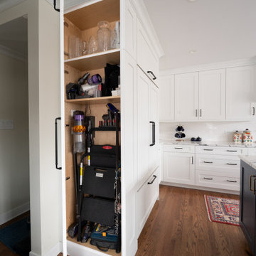
Mindful storage planning features: plenty of cabinets, pull-out bar bottle storage, file drawers & cubbies with pocket doors for office appliances, magic corner pullouts, and appliance garages with pocket doors
Shelf behind range for easy access to daily-use spices and oils. Also: spice and utensil pullouts on either side of range
The clients says every priority and wish box got checked. The highly functional design absorbed everything that used to be in that area of the house, but now those things are out of the way.
“In the past, we were all spread out when we gathered for the holidays, because we had to spread out. Now, we’re all in here together, including my 92-year old mother. We’re visiting, cooking, laughing… everyone is here. And I’m really learning how to use these appliances. This kitchen has given me a whole new life.”


 Flavin Architects
Mid-Century Remodel on Tabor Hill
This sensitively sited house was designed by Robert Coolidge, a renowned architect and grandson of President Calvin Coolidge. The house features a symmetrical gable roof and beautiful floor to ceiling glass facing due south, smartly oriented for passive solar heating. Situated on a steep lot, the house is primarily a single story that steps down to a family room. This lower level opens to a New England exterior. Our goals for this project were to maintain the integrity of the original design while creating more modern spaces. Our design team worked to envision what Coolidge himself might have designed if he'd had access to modern materials and fixtures.
With the aim of creating a signature space that ties together the living, dining, and kitchen areas, we designed a variation on the 1950's "floating kitchen." In this inviting assembly, the kitchen is located away from exterior walls, which allows views from the floor-to-ceiling glass to remain uninterrupted by cabinetry.
We updated rooms throughout the house; installing modern features that pay homage to the fine, sleek lines of the original design. Finally, we opened the family room to a terrace featuring a fire pit. Since a hallmark of our design is the diminishment of the hard line between interior and exterior, we were especially pleased for the opportunity to update this classic work.
98