
Search results for "Cumbersome" in Home Design Ideas
 Schulte Design Build
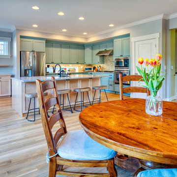
This kitchen project is in a newer build home (2007). The family liked everything about the space except for the island layout and location. Both ends of it were pinch points which made it cumbersome for multiple people to be in the space at a time. They liked the granite countertops but the one on the island was damaged and needed to be replaced to accommodate the new island configuration. Due to this, it made sense to replace all the countertops with quartz. The perimeter cabinets were in good shape but were a dark color which made the space dark and uninviting. We solved this by painting them a bright green/blue color with a two-part water-based paint. We added a couple of other cabinets in the adjacent spaces to provide them with more needed storage which did not impact the kitchen space. We relocated the existing 3 recessed lights over the island which saved them from the landfill. We replaced the old under cabinet fluorescent light fixtures with new energy efficient LED channel fixtures that provide much better counter task lighting. We painted both the ceiling and walls to freshen up the space. As you can see, we were able to solve this family’s kitchen problems in both an environmentally and budget conscious way with creative solutions.
 JAMES DIXON ARCHITECT PC
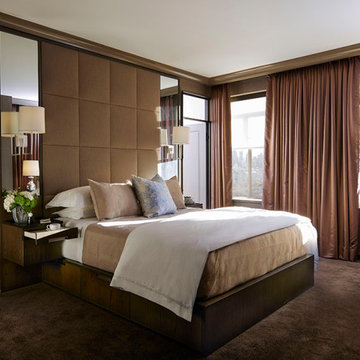
We were hired to transform this small apartment into a tranquil pied-a-terre. Perched atop an historic landmark, the unit features unparalleled views of Manhattan. However, the layout was awkward and the finishes dated. One of the many challenges was staying within the confines of the numerous structural columns and plumbing risers.
A larger foyer was created by removing a cumbersome millwork unit. Folding glass panels open the new kitchen to the view. Two, discrete bathrooms were created from one large one. All mechanical and electrical systems were updated, and each of the windows replaced to meet stringent preservation requirements. A neutral palette for the interiors was chosen to bring a sense of calm to the urban surroundings.
The project was a collaboration between James Dixon Architect PC and Powell & Bonnell Decorators
Photos by John Bessler
 Sandra Hambley
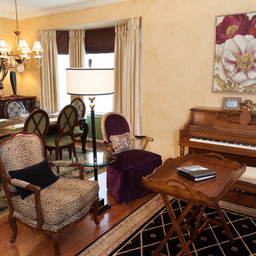
The dining room shares the same space as the living room, which necessitated that they be the same style. The cumbersome pedestal table was replaced with a two-toned table that can accommodate ten. Custom dining chairs with a unique “x” back feature one fabric on the chair back and another on the seat to create a one of a kind look. The china cabinet was swapped for a tall server that provides plenty of storage. A lovely round mirror with buffet lamps completes the look. A new, casual roman valance in a chocolate fabric with side panels coordinates with the living room window treatments.
Find the right local pro for your project
 Bilotta Kitchen & Home
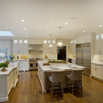
This kitchen, designed by David Arnoff, features Bilotta Collection cabinetry in a classic Frosty White paint on the perimeter and Rift Cut White Oak with a “Driftwood” stain for the island. The kitchen prior to renovation had a small island and a peninsula that blocked the flow into the other rooms. It also had a massive wood hood that flanked both sides of the range all the way down to the countertop which was very cumbersome and restrictive. The client wanted to reuse their appliances which were fairly new. So the cabinetry had to be designed around those models but laid out with a much more functional flow. David chose to eliminate the existing peninsula to allow access to the sun room and living area. He opted instead for a larger island to give back the space lost by removing the peninsula. This gave the same amount of cabinet and counter space and was far more functional and easier to move around. Since the one wall of cabinets (where the main sink is) had no wall cabinets, David designed the opposite wall with double stacked cabinets for additional storage – with glass fronts for aesthetics. They also raised the custom hood, by Amore, allowing for more countertop space around the range. The countertops are polished quartz, Aurea Stone by Eastern Stone. The Backsplash is a basket weave marble from Greenwich Tile Marble. Sink and faucets by Kohler. Appliances are a mix of Subzero and Wolf.
Designer: David Arnoff
Photo Credit: Peter Krupenye
 Vladimir Radutny Architects
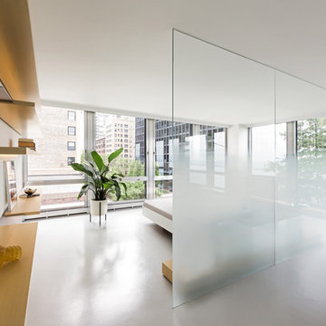
Gradient Glass Partition - Bill Zbaren
Bedroom - small contemporary loft-style concrete floor bedroom idea in Chicago with white walls
Bedroom - small contemporary loft-style concrete floor bedroom idea in Chicago with white walls
 Decor & More, LLC
Debbie Slovin
This was a long term project that took almost a year to complete. Owners bought a unique Sea Pines home that required some major remodeling. We also added artwork and furniture to complete the modern design. The plexiglass and brass railing was replaced with a sleek wire, metal and wood design. A cumbersome back staircase was removed and a sleek spiral staircase added to the living room. We used the clients existing coffee table, console table and end table from the early sixties and painted them a glossy black. They add a mid-century look to the design. The long hallways on either side of the living room were used to display abstract art.
 Total Home
photo credit: Sarah Terranova
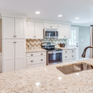
Out with the cumbersome wall, and in with wide open space! The peninsula island is the maximum that the floorpan would allow for. It works to serve up the daily meals, and often is used as a work from home surface.
We combined cabinet styles of Shaker and Recessed-panel cabinets are accented by the zig zag pattern we chose for the backsplash.
 Trish Barmettler Designs
My Bennington clients wanted a complete 1700 sf basement finish to include main entertaining space complete with a fabulous bar, wine room, scotch tasting area, home office, playroom, bedroom, and still have adequate storage. They wanted a specialty ceiling feature over the bar, so we incorporated a wood and metal structure that would be unique but not cumbersome. They wanted reclaimed wood in several specific areas, in addition to ceiling beams to give it the rustic look they were wanting. The flooring in luxury vinyl tile instead of carpet for the easy maintenance and long-lasting wearability. We created the perfect entertainment space and man cave! They were thrilled with the results.
 Bilotta Kitchen & Home
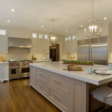
This kitchen, designed by David Arnoff, features Bilotta Collection cabinetry in a classic Frosty White paint on the perimeter and Rift Cut White Oak with a “Driftwood” stain for the island. The kitchen prior to renovation had a small island and a peninsula that blocked the flow into the other rooms. It also had a massive wood hood that flanked both sides of the range all the way down to the countertop which was very cumbersome and restrictive. The client wanted to reuse their appliances which were fairly new. So the cabinetry had to be designed around those models but laid out with a much more functional flow. David chose to eliminate the existing peninsula to allow access to the sun room and living area. He opted instead for a larger island to give back the space lost by removing the peninsula. This gave the same amount of cabinet and counter space and was far more functional and easier to move around. Since the one wall of cabinets (where the main sink is) had no wall cabinets, David designed the opposite wall with double stacked cabinets for additional storage – with glass fronts for aesthetics. They also raised the custom hood, by Amore, allowing for more countertop space around the range. The countertops are polished quartz, Aurea Stone by Eastern Stone. The Backsplash is a basket weave marble from Greenwich Tile Marble. Sink and faucets by Kohler. Appliances are a mix of Subzero and Wolf.
Designer: David Arnoff
Photo Credit: Peter Krupenye
 User
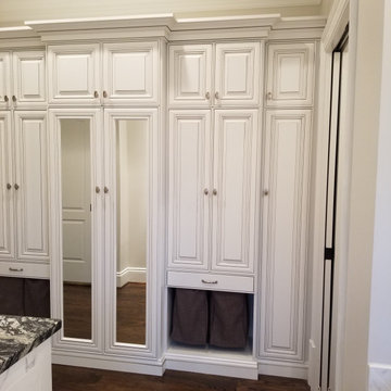
UserMy client had some wasted space in the hallway leading to her closets and we came up with a beautiful solution that flows seamlessly with her bathroom cabinetry.
This cabinet has extra shoe shelves, tie storage, jewelry storage, 4 hampers, handbag storage and a large cabinet to hide the cumbersome steamer and ironing board.
 Urbanhaus Designs
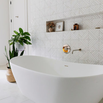
This beautiful marble mosaic tile creates the perfect backdrop for a large double slipper free-standing bathtub. The bubble chandelier is fitting for above a bathtub plus an extra-long built-in storage niche provides ample space for all bath supplies and decor. Marble can be cumbersome to maintain, so we opted to install it on the wall where zero traffic means zero maintenance. Tiling all the way to the ceiling created a show-stopping splash that is stunning AND stress-free.
 Sweeney Design Remodel
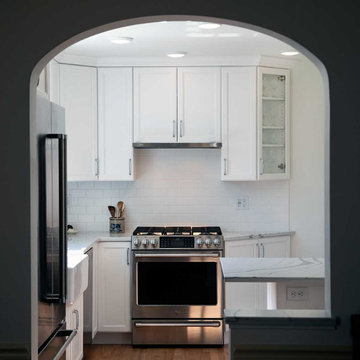
In order to open up the kitchen and create a brighter atmosphere, Sweeney Design Remodel widened the doorway between the kitchen and dining room and designed it to match the colonial-style archways found in the rest of the home.
While the kitchen footprint did not change, new white DuraSupreme cabinets were designed into the space to accommodate modern built-in appliances, including a larger stainless steel refrigerator. This minor adjustment also had a significant impact on improving the visual balance of the kitchen. The new easy-to-clean, marble-inspired quartz on the peninsula now offers plenty of eat-in space for two. The classic white subway tile backsplash and large farmhouse sink anchor the room.
Hardwood flooring used in the dining and living rooms was extended into the kitchen to flow the rooms seamlessly together. The original kitchen window that was cumbersome for one person to operate was replaced with a new easy-to-open window. In addition, to create proper soft general lighting, Sweeney replaced a large fluorescent light fixture with disk lights.
 komandor
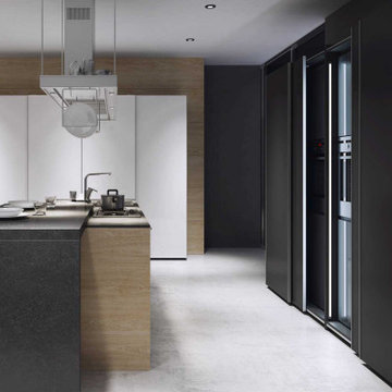
Kitchen, Sliding Doors & Storage by Komandor. With any good kitchen layout, storage and flow are key. Continuing from last week’s theme…sliding doors can be a great addition to your kitchen or pantry. The main features being the increase in flow and the decrease in clutter in the kitchen. An open cabinet door protruding into your space is always cumbersome. Sliding doors can save valuable space and increase flow in high traffic areas. Not to mention that they are right on trend! Sliding doors can also be used to create a work station with a counter top and extra storage above and below. Food prep and frequently working appliances can be hidden away with the push of a door. Unexpected guests…no problem…with sliding doors a tidy kitchen is always just a slide away!
 Decor & More, LLC
Debbie Slovin
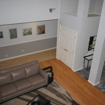
This was a long term project that took almost a year to complete. Owners bought a unique Sea Pines home that required some major remodeling. We also added artwork and furniture to complete the modern design. The plexiglass and brass railing was replaced with a sleek wire, metal and wood design. A cumbersome back staircase was removed and a sleek spiral staircase added to the living room. We used the clients existing coffee table, console table and end table from the early sixties and painted them a glossy black. They add a mid-century look to the design. The long hallways on either side of the living room were used to display abstract art.
 Katie Hutchison Studio
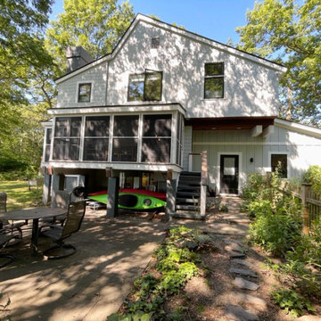
Custom-built in the early eighties, this contemporary home was cloaked in all brown board siding with brown windows and a cumbersome street-facing carport. The current owners had raised their family there on property that borders serene conservation land. Now they were ready for a new, brighter exterior look that would include all new windows to take in the exquisite view, unobscured by the fog of failing window seals; new siding that wouldn’t be subject to woodpecker wear and tear; a refinished screen porch; a new garage to replace the undersized carport; and new entry access. On the interior, they wanted the new, fresh vibe to extend to the design of three renovated modern bathrooms.
In response, KHS proposed black-framed windows throughout in simpler configurations; fiber-cement (and PVC) exterior cladding in three textures to differentiate functions and features; a unifying light-gray and white palette teamed with clear-finished mahogany/sapele to carry across the exterior as well as the bathroom renovations; a stream-lined screen porch with cable rails; a new shed-roofed garage to resolve the exterior massing; and a new covered walkway entrance delivering those arriving into a repurposed interior space.
Once the overall design was resolved, the owners elected to complete the work in phases over several years. Phase 1 included renovating the powder room, guest bathroom, and primary bathroom, and refreshing the screen porch. See the reconceived modern bathrooms here on the KHS website. Next came constructing the new garage and entry, which on the interior included new floor tile and a new entry wall-paneling system to conceal electrical, solar, and security panels/controls. Phase III involved installing the rest of the new windows and completing the comprehensive new exterior cladding and palette to tie the earlier phases together. To cap it off, KHS worked with the owners to select new clean-lined furnishings for the living area in colors inspired by their coastal view.
 Archadeck of West Central and Southwest Ohio
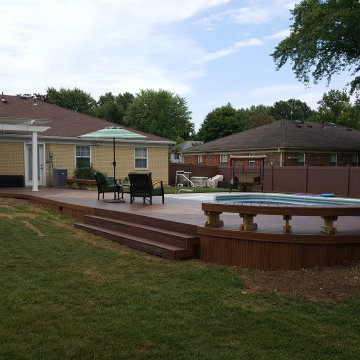
When we initially met with these Centerville, OH, homeowners to discuss improving their backyard for the better we had a checklist of items they wanted to address. The first was the navigation issues with their existing deck design. Their current deck design made accessibility into other areas of the backyard cumbersome. The second issue was their desire for a low-maintenance deck as their existing one was wooden and showing signs of age and wear. Archadeck of West Central & Southwest Ohio was able to improve both of these concerns with one cohesive and sleek new pool deck design!
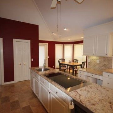 Decor & More, LLC
Debbie Slovin
This was a long term project that took almost a year to complete. Owners bought a unique Sea Pines home that required some major remodeling. We also added artwork and furniture to complete the modern design. The plexiglass and brass railing was replaced with a sleek wire, metal and wood design. A cumbersome back staircase was removed and a sleek spiral staircase added to the living room. We used the clients existing coffee table, console table and end table from the early sixties and painted them a glossy black. They add a mid-century look to the design. The long hallways on either side of the living room were used to display abstract art.
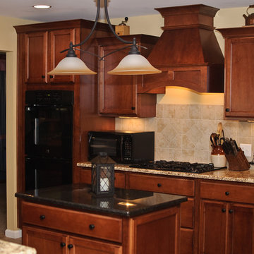
 Total Quality Construction
Custom kitchens are considered a work of art here at TQC. Kitchen remodels can be quite cumbersome if you don't have the right company managing the project. What we can offer is aid in the pre-planning and designing of your kitchen. More ideas can be found on our website at www.totalqualityconstruction.com. Plus we offer over 10,000 cabinet ideas as an authorized Wellborn Cabinet Contractor.
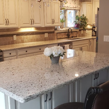
 Kitchen and Bath Renovations
This elegant kitchen features beautiful glazed cabinets with soft close and roll outs. The oil rubbed bronze hardware lends a nice contrast to the light cabinets and dark glazing. With this being a large space conveniences like a pot filler shorten the steps and lend to an ease of function in a large space. The light multi tone granite counters blend seamlessly but pop against the dark floors. Dimming chandeliers can set a soft tone while recessed cans and under cabinet lighting provide enough light to prepare gourmet meals. The open floor plan was achieved by removing existing pillars, removing a wall, building a new space to house the refrigerator, and closing off a cumbersome entry. The sight lines in the space are now completely open for this family to host parties and keep a better eye on their young family.
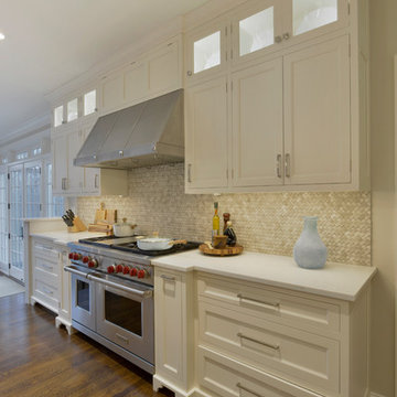 Bilotta Kitchen & Home
This kitchen, designed by David Arnoff, features Bilotta Collection cabinetry in a classic Frosty White paint on the perimeter and Rift Cut White Oak with a “Driftwood” stain for the island. The kitchen prior to renovation had a small island and a peninsula that blocked the flow into the other rooms. It also had a massive wood hood that flanked both sides of the range all the way down to the countertop which was very cumbersome and restrictive. The client wanted to reuse their appliances which were fairly new. So the cabinetry had to be designed around those models but laid out with a much more functional flow. David chose to eliminate the existing peninsula to allow access to the sun room and living area. He opted instead for a larger island to give back the space lost by removing the peninsula. This gave the same amount of cabinet and counter space and was far more functional and easier to move around. Since the one wall of cabinets (where the main sink is) had no wall cabinets, David designed the opposite wall with double stacked cabinets for additional storage – with glass fronts for aesthetics. They also raised the custom hood, by Amore, allowing for more countertop space around the range. The countertops are polished quartz, Aurea Stone by Eastern Stone. The Backsplash is a basket weave marble from Greenwich Tile Marble. Sink and faucets by Kohler. Appliances are a mix of Subzero and Wolf.
Designer: David Arnoff
Photo Credit: Peter Krupenye
12