
Search results for "Cumbersome" in Home Design Ideas
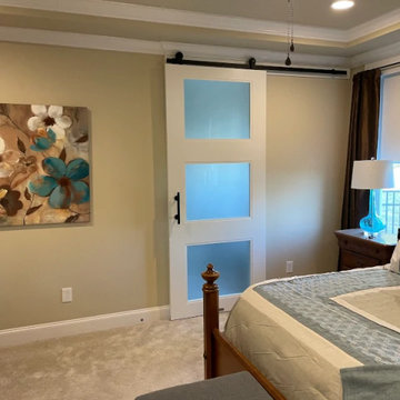
 Tennessee Barn Doors
Double swing doors were in the way, a single rolling door fixes that
Inspiration for a modern bedroom remodel in Nashville
Inspiration for a modern bedroom remodel in Nashville

 LEIVARS
Nick Smith
Transitional 3/4 white tile and subway tile corner shower photo in London with flat-panel cabinets and gray cabinets
Transitional 3/4 white tile and subway tile corner shower photo in London with flat-panel cabinets and gray cabinets

 Nu Interiors
Compact master bathroom with spa like glass tub enclosure and rainfall shower, lots of creative storage.
Freestanding bathtub - small eclectic master white tile and subway tile slate floor freestanding bathtub idea in San Francisco with an undermount sink, white cabinets, quartz countertops, a two-piece toilet and gray walls
Freestanding bathtub - small eclectic master white tile and subway tile slate floor freestanding bathtub idea in San Francisco with an undermount sink, white cabinets, quartz countertops, a two-piece toilet and gray walls
Find the right local pro for your project

 Jodi Fleming Design
Inspiration for a rustic master carpeted bedroom remodel in Orange County with white walls

 WUNDERGROUND architecture + design
Bathroom - contemporary white tile and marble tile bathroom idea in New York with marble countertops, flat-panel cabinets and dark wood cabinets

 Adrienne DeRosa
"Creating a dramatic set of stairs without cumbersome framing" is what Franklin considers the greatest dilemma during the design process. Connecting three stories, he came up with a plan of opposing staircases that creates dynamic space rather than obscure it.
Although massive in its footprint, the stair design retains the open-air feeling of the home without compromising strength. Without posts and framework to support them, the staircases seemingly float in the space. "The combination of steel stringers and rails, along with the hardwood steps," Franklin explains, "created enough strength for each set of stairs to, literally, be anchored by only four bolts."
Adrienne DeRosa Photography

 Lucy Call
Photo: Lucy Call © 2013 Houzz
Mid-century modern concrete floor home office photo in Salt Lake City
Mid-century modern concrete floor home office photo in Salt Lake City

Trendy 3/4 white tile and subway tile green floor bathroom photo in Vancouver with flat-panel cabinets, medium tone wood cabinets, an undermount sink, a hinged shower door and a wall-mount toilet

 CC Woodcrafters of New England
Mid-sized elegant ceramic tile mudroom photo in Providence with beige walls and a white front door

 Lynne Scalo Design
Bedroom - transitional medium tone wood floor bedroom idea in New York with gray walls

 Sustainable Home
The vintage desk creates a compact space to do work. The bright colors of the lucite panel chandelier and the hand stiched Indian bedspread pick up the colors of the surfboards in the large format photo of Avila Beach. The client wanted guests to feel welcomed by a California vibe.
Photos by- Michele Lee Willson


 Francesca Owings Interior Design
Beach style dark wood floor dining room photo in Grand Rapids with white walls

 TKS Design Group
Download our free ebook, Creating the Ideal Kitchen. DOWNLOAD NOW
For many, extra time at home during COVID left them wanting more from their homes. Whether you realized the shortcomings of your space or simply wanted to combat boredom, a well-designed and functional home was no longer a want, it became a need. Tina found herself wanting more from her Old Irving Park home and reached out to The Kitchen Studio about adding function to her kitchen to make the most of the available real estate.
At the end of the day, there is nothing better than returning home to a bright and happy space you love. And this kitchen wasn’t that for Tina. Dark and dated, with a palette from the past and features that didn’t make the most of the available square footage, this remodel required vision and a fresh approach to the space. Lead designer, Stephanie Cole’s main design goal was better flow, while adding greater functionality with organized storage, accessible open shelving, and an overall sense of cohesion with the adjoining family room.
The original kitchen featured a large pizza oven, which was rarely used, yet its footprint limited storage space. The nearby pantry had become a catch-all, lacking the organization needed in the home. The initial plan was to keep the pizza oven, but eventually Tina realized she preferred the design possibilities that came from removing this cumbersome feature, with the goal of adding function throughout the upgraded and elevated space. Eliminating the pantry added square footage and length to the kitchen for greater function and more storage. This redesigned space reflects how she lives and uses her home, as well as her love for entertaining.
The kitchen features a classic, clean, and timeless palette. White cabinetry, with brass and bronze finishes, contrasts with rich wood flooring, and lets the large, deep blue island in Woodland’s custom color Harbor – a neutral, yet statement color – draw your eye.
The kitchen was the main priority. In addition to updating and elevating this space, Tina wanted to maximize what her home had to offer. From moving the location of the patio door and eliminating a window to removing an existing closet in the mudroom and the cluttered pantry, the kitchen footprint grew. Once the floorplan was set, it was time to bring cohesion to her home, creating connection between the kitchen and surrounding spaces.
The color palette carries into the mudroom, where we added beautiful new cabinetry, practical bench seating, and accessible hooks, perfect for guests and everyday living. The nearby bar continues the aesthetic, with stunning Carrara marble subway tile, hints of brass and bronze, and a design that further captures the vibe of the kitchen.
Every home has its unique design challenges. But with a fresh perspective and a bit of creativity, there is always a way to give the client exactly what they want [and need]. In this particular kitchen, the existing soffits and high slanted ceilings added a layer of complexity to the lighting layout and upper perimeter cabinets.
While a space needs to look good, it also needs to function well. This meant making the most of the height of the room and accounting for the varied ceiling features, while also giving Tina everything she wanted and more. Pendants and task lighting paired with an abundance of natural light amplify the bright aesthetic. The cabinetry layout and design compliments the soffits with subtle profile details that bring everything together. The tile selections add visual interest, drawing the eye to the focal area above the range. Glass-doored cabinets further customize the space and give the illusion of even more height within the room.
While her family may be grown and out of the house, Tina was focused on adding function without sacrificing a stunning aesthetic and dreamy finishes that make the kitchen the gathering place of any home. It was time to love her kitchen again, and if you’re wondering what she loves most, it’s the niche with glass door cabinetry and open shelving for display paired with the marble mosaic backsplash over the range and complimenting hood. Each of these features is a stunning point of interest within the kitchen – both brag-worthy additions to a perimeter layout that previously felt limited and lacking.
Whether your remodel is the result of special needs in your home or simply the excitement of focusing your energy on creating a fun new aesthetic, we are here for it. We love a good challenge because there is always a way to make a space better – adding function and beauty simultaneously.


 Urbana Design Studio
After much debate on appliances and appliances garages, the clients opted for a sleek, functional aluminum appliance garage roll up that houses all of the small appliances. We also convinced them to install a Miele steam oven for quick and easy meals and entertaining.
Kate Falconer Photography
 TKS Design Group
Download our free ebook, Creating the Ideal Kitchen. DOWNLOAD NOW
For many, extra time at home during COVID left them wanting more from their homes. Whether you realized the shortcomings of your space or simply wanted to combat boredom, a well-designed and functional home was no longer a want, it became a need. Tina found herself wanting more from her Old Irving Park home and reached out to The Kitchen Studio about adding function to her kitchen to make the most of the available real estate.
At the end of the day, there is nothing better than returning home to a bright and happy space you love. And this kitchen wasn’t that for Tina. Dark and dated, with a palette from the past and features that didn’t make the most of the available square footage, this remodel required vision and a fresh approach to the space. Lead designer, Stephanie Cole’s main design goal was better flow, while adding greater functionality with organized storage, accessible open shelving, and an overall sense of cohesion with the adjoining family room.
The original kitchen featured a large pizza oven, which was rarely used, yet its footprint limited storage space. The nearby pantry had become a catch-all, lacking the organization needed in the home. The initial plan was to keep the pizza oven, but eventually Tina realized she preferred the design possibilities that came from removing this cumbersome feature, with the goal of adding function throughout the upgraded and elevated space. Eliminating the pantry added square footage and length to the kitchen for greater function and more storage. This redesigned space reflects how she lives and uses her home, as well as her love for entertaining.
The kitchen features a classic, clean, and timeless palette. White cabinetry, with brass and bronze finishes, contrasts with rich wood flooring, and lets the large, deep blue island in Woodland’s custom color Harbor – a neutral, yet statement color – draw your eye.
The kitchen was the main priority. In addition to updating and elevating this space, Tina wanted to maximize what her home had to offer. From moving the location of the patio door and eliminating a window to removing an existing closet in the mudroom and the cluttered pantry, the kitchen footprint grew. Once the floorplan was set, it was time to bring cohesion to her home, creating connection between the kitchen and surrounding spaces.
The color palette carries into the mudroom, where we added beautiful new cabinetry, practical bench seating, and accessible hooks, perfect for guests and everyday living. The nearby bar continues the aesthetic, with stunning Carrara marble subway tile, hints of brass and bronze, and a design that further captures the vibe of the kitchen.
Every home has its unique design challenges. But with a fresh perspective and a bit of creativity, there is always a way to give the client exactly what they want [and need]. In this particular kitchen, the existing soffits and high slanted ceilings added a layer of complexity to the lighting layout and upper perimeter cabinets.
While a space needs to look good, it also needs to function well. This meant making the most of the height of the room and accounting for the varied ceiling features, while also giving Tina everything she wanted and more. Pendants and task lighting paired with an abundance of natural light amplify the bright aesthetic. The cabinetry layout and design compliments the soffits with subtle profile details that bring everything together. The tile selections add visual interest, drawing the eye to the focal area above the range. Glass-doored cabinets further customize the space and give the illusion of even more height within the room.
While her family may be grown and out of the house, Tina was focused on adding function without sacrificing a stunning aesthetic and dreamy finishes that make the kitchen the gathering place of any home. It was time to love her kitchen again, and if you’re wondering what she loves most, it’s the niche with glass door cabinetry and open shelving for display paired with the marble mosaic backsplash over the range and complimenting hood. Each of these features is a stunning point of interest within the kitchen – both brag-worthy additions to a perimeter layout that previously felt limited and lacking.
Whether your remodel is the result of special needs in your home or simply the excitement of focusing your energy on creating a fun new aesthetic, we are here for it. We love a good challenge because there is always a way to make a space better – adding function and beauty simultaneously.

 Prime 1 Builders
This project won in the 2013 Builders Association of Metropolitan Pittsburgh Housing Excellence Award for Best Urban Renewal Renovation Project. The glass bowl was made in the glass studio owned by the owner which is adjacent to the residence. The mirror is a repurposed window. The door is repurposed from a boarding house.
George Mendel


 designstiles
Transitional Dining Room with custom drapery and custom accent pillows.
Photo Credit: Amy Bartlam
Large elegant medium tone wood floor and brown floor enclosed dining room photo in Los Angeles with gray walls and no fireplace
Large elegant medium tone wood floor and brown floor enclosed dining room photo in Los Angeles with gray walls and no fireplace
1