
Search results for "Dating request" in Home Design Ideas
 Renovisions
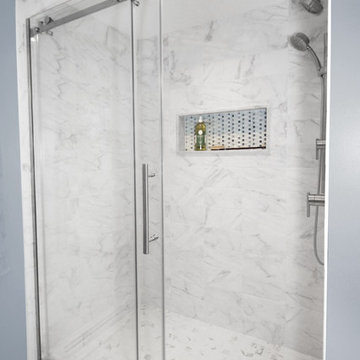
This master bath ‘Renovision’ came with three main requests from the homeowner: more storage, a larger shower and a luxurious look that feels like being at an upscale hotel. The Renovisions team accomplished these wishes and exceeded the clients expectations.
Request number 1: more storage. The existing closet was reconfigured to accommodate better storage for towels and bath supplies making it both functional and attractive. The custom built pull-out hamper was perfect. The long vanity and center tower offers much more cabinet space and drawer storage compared to what they had, especially with the increased vanity height.
Request number 2: A larger shower. Working within the existing footprint we were able to build a shower that is nearly a foot deeper as space was available. Creating a large rectangular cubby provides plenty of space for shampoos and soaps. The frameless sliding glass shower enclosure keeps the space open and airy while allowing the beautiful Carrera-look porcelain wall tiles to be the focus of this master bath.
Request number 3: a luxurious look. Turning their once boring, builder grade bathroom into an upscale hotel-like space was challenging, however, not a problem for the Renovisions team and their creative ways of resolving design snags along the way. Re-locating the doorway to the bathroom was one way to create a more spacious flow in and out of the space. Having the right design to start was half the battle – installing the beautiful products right the first time to ensure a proper fit and finish worthy of the upscale feel is the other half. The delicate tile detail in the shower cubby is the ‘jewelry’ in the room – the soft curves of this 2-tone wave design tile adds a dramatic feel and enlightened mood this client loves.
Overall, the homeowner was happy with every solution-based approach to all requests – their once dated builders bath is now bright, open and airy with a soft grey wall color adding to the soothing feel of this master bath.
 Renovisions
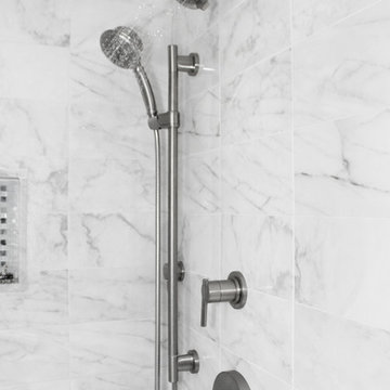
This master bath ‘Renovision’ came with three main requests from the homeowner: more storage, a larger shower and a luxurious look that feels like being at an upscale hotel. The Renovisions team accomplished these wishes and exceeded the clients expectations.
Request number 1: more storage. The existing closet was reconfigured to accommodate better storage for towels and bath supplies making it both functional and attractive. The custom built pull-out hamper was perfect. The long vanity and center tower offers much more cabinet space and drawer storage compared to what they had, especially with the increased vanity height.
Request number 2: A larger shower. Working within the existing footprint we were able to build a shower that is nearly a foot deeper as space was available. Creating a large rectangular cubby provides plenty of space for shampoos and soaps. The frameless sliding glass shower enclosure keeps the space open and airy while allowing the beautiful Carrera-look porcelain wall tiles to be the focus of this master bath.
Request number 3: a luxurious look. Turning their once boring, builder grade bathroom into an upscale hotel-like space was challenging, however, not a problem for the Renovisions team and their creative ways of resolving design snags along the way. Re-locating the doorway to the bathroom was one way to create a more spacious flow in and out of the space. Having the right design to start was half the battle – installing the beautiful products right the first time to ensure a proper fit and finish worthy of the upscale feel is the other half. The delicate tile detail in the shower cubby is the ‘jewelry’ in the room – the soft curves of this 2-tone wave design tile adds a dramatic feel and enlightened mood this client loves.
Overall, the homeowner was happy with every solution-based approach to all requests – their once dated builders bath is now bright, open and airy with a soft grey wall color adding to the soothing feel of this master bath.
 Vetter Architects
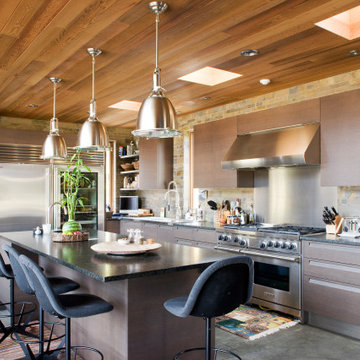
The owners requested that their home harmonize with the spirit of the surrounding Colorado mountain setting and enhance their outdoor recreational lifestyle - while reflecting their contemporary architectural tastes. The site was burdened with a myriad of strict design criteria enforced by the neighborhood covenants and architectural review board. Creating a distinct design challenge, the covenants included a narrow interpretation of a “mountain style” home which established predetermined roof pitches, glazing percentages and material palettes - at direct odds with the client‘s vision of a flat-roofed, glass, “contemporary” home.
Our solution finds inspiration and opportunities within the site covenant’s strict definitions. It promotes and celebrates the client’s outdoor lifestyle and resolves the definition of a contemporary “mountain style” home by reducing the architecture to its most basic vernacular forms and relying upon local materials.
The home utilizes a simple base, middle and top that echoes the surrounding mountains and vegetation. The massing takes its cues from the prevalent lodgepole pine trees that grow at the mountain’s high altitudes. These pine trees have a distinct growth pattern, highlighted by a single vertical trunk and a peaked, densely foliated growth zone above a sparse base. This growth pattern is referenced by placing the wood-clad body of the home at the second story above an open base composed of wood posts and glass. A simple peaked roof rests lightly atop the home - visually floating above a triangular glass transom. The home itself is neatly inserted amongst an existing grove of lodgepole pines and oriented to take advantage of panoramic views of the adjacent meadow and Continental Divide beyond.
The main functions of the house are arranged into public and private areas and this division is made apparent on the home’s exterior. Two large roof forms, clad in pre-patinated zinc, are separated by a sheltering central deck - which signals the main entry to the home. At this connection, the roof deck is opened to allow a cluster of aspen trees to grow – further reinforcing nature as an integral part of arrival.
Outdoor living spaces are provided on all levels of the house and are positioned to take advantage of sunrise and sunset moments. The distinction between interior and exterior space is blurred via the use of large expanses of glass. The dry stacked stone base and natural cedar cladding both reappear within the home’s interior spaces.
This home offers a unique solution to the client’s requests while satisfying the design requirements of the neighborhood covenants. The house provides a variety of indoor and outdoor living spaces that can be utilized in all seasons. Most importantly, the house takes its cues directly from its natural surroundings and local building traditions to become a prototype solution for the “modern mountain house”.
Overview
Ranch Creek Ranch
Winter Park, Colorado
Completion Date
October, 2007
Services
Architecture, Interior Design, Landscape Architecture
Find the right local pro for your project
 CairnsCraft Design & Remodel
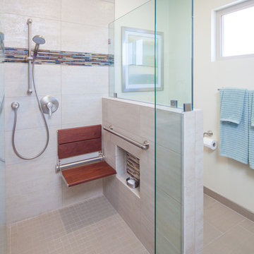
Our client requested a design that reflected their need to renovate their dated bathroom into a transitional floor plan that would provide accessibility and function. The new shower design consists of a pony wall with a glass enclosure that has beautiful details of brushed nickel square glass clamps.
The interior shower fittings entail geometric lines that lend a contemporary finish. A curbless shower and linear drain added an extra dimension of accessibility to the plan. In addition, a balance bar above the accessory niche was affixed to the wall for extra stability.
The shower area also includes a folding teak wood bench seat that also adds to the comfort of the bathroom as well as to the accessibility factors. Improved lighting was created with LED Damp-location rated recessed lighting. LED sconces were also used to flank the Robern medicine cabinet which created realistic and flattering light. Designer: Marie Cairns
Contractor: Charles Cairns
Photographer: Michael Andrew
 Dura Supreme Cabinetry
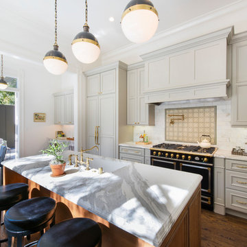
With an ideal location in the Pacific Heights neighborhood of San Francisco, this dated Victorian residence had "beautiful bones" but had been sitting on the market for a year before being purchased with plans to revitalize the interior. Interior designer, Noel Han, explained, "Historical Victorian homes in this area often have beautiful architectural elements that I aim to preserve, but the floor plan and layout tend to be stuffy, not live-able and not light filled. Modern families want bright, light-filled, spacious rooms that take advantage of outdoor views and living spaces, and function well for storage, meals and entertaining."
Preserving the architectural integrity and special features of the home was one of Han's goals but at the same time, she re-designed the space, moving walls and adding windows to create an open floorplan that flowed easily between the kitchen and outdoor living spaces. Where the range once stood in the original design, now an entire wall of windows provides panoramic views of the outdoors and fills the kitchen with light. Below the windows, Han designed a long bank of base cabinets with drawers to provide plenty of storage and work surface. Light now pours into the space even on foggy days. The range was moved to the opposite wall so that beautiful window views could be added to the kitchen.
Han selected a palette of finishes with an eye toward creating a "soft color aesthetic". "White painted finishes are very popular right now but would have felt stark and cold in this space," she explained. "The French grey paint from Dura Supreme was a perfect complement for this vintage Victorian home, to create a classic color scheme".
"This beautiful home already had hardware elements with a vintage brass finish, so I carefully selected antiqued, brushed brass hardware, plumbing and metal finishes to blend with the original elements," said Han. She continued, "The La Cornue French Range adds modern function with a French antique look."
"I appreciate working with Dura Supreme cabinetry because of the quality of the cabinetry, fast delivery and the custom options. I'm able to create beautiful architectural details like the pull-out columns on both sides of the range and the curved mullion doors on the furniture hutch, and they offer a stunning palette of finishes and styles," explained Han. For the bath cabinetry, Han created a similar palette of finishes and styles to create a complementary look throughout the entire home.
Product Details:
Perimeter: Dura Supreme Cabinetry shown in the St. Augustine door style and Mullion Pattern #15 door style with a “Zinc” painted finish.
Kitchen Island: Dura Supreme Cabinetry shown in the St. Augustine door style with a Clove stain and Black Accent finish on Cherry wood.
For more information about Noel Han, Interior Designer, click to her website here www.atelnoel.com.
For more information about Gilmans Kitchens and Baths, click to their website here www.gkandb.com.
Photography by: Ned Bonzi www.nedbonzi.com.
Request a FREE Dura Supreme Brochure Packet:
http://www.durasupreme.com/request-brochure
 JRP Design & Remodel
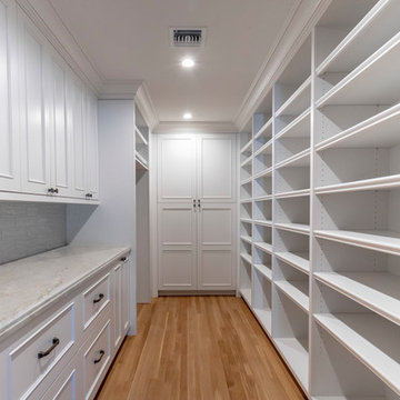
After purchasing their ideal ranch style home built in the ‘70s, our clients had requested some major updates and needs throughout the house. The couple loved to cook and desired a large kitchen with professional appliances and a space that connects with the family room for ultimate entertaining. The husband wanted a retreat of his own with office space and a separate bathroom. Both clients disliked the ‘70s aesthetic of their outdated master suite and agreed that too would need a complete update.
The JRP Team focused on the strategic removal of several walls between the entrance, living room, and kitchen to establish a new balance by creating an open floor plan that embraces the natural flow of the home. The luxurious kitchen turned out to be the highlight of the home with beautifully curated materials and double islands. The expanded master bedroom creates space for a relocated and enlarged master bath with walk-in closet. Adding new four panel doors to the backyard of the master suite anchors the room, filling the space with natural light. A large addition was necessary to accommodate the "Man Cave" which provides an exclusive retreat complete with wet bar– perfect for entertaining or relaxing. The remodel took a dated, choppy and disconnected floor plan to a bespoke haven sparkling with natural light and gorgeous finishes.
PROJECT DETAILS:
• Style: Traditional
• Countertops: Quartzite - White Pearl (Cloudy)
• Cabinets: Dewils, Lakewood (Frameless), Maple, Just White
• Flooring: White Oak – Galleher, Limestone / Brushed
• Paint Color: Perspective
• Photographer: J.R. Maddox
 Renovisions
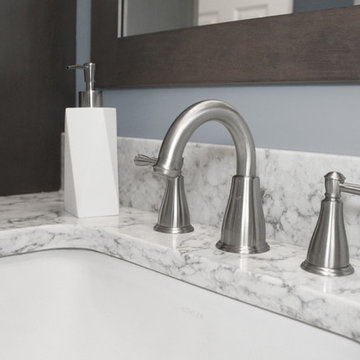
This master bath ‘Renovision’ came with three main requests from the homeowner: more storage, a larger shower and a luxurious look that feels like being at an upscale hotel. The Renovisions team accomplished these wishes and exceeded the clients expectations.
Request number 1: more storage. The existing closet was reconfigured to accommodate better storage for towels and bath supplies making it both functional and attractive. The custom built pull-out hamper was perfect. The long vanity and center tower offers much more cabinet space and drawer storage compared to what they had, especially with the increased vanity height.
Request number 2: A larger shower. Working within the existing footprint we were able to build a shower that is nearly a foot deeper as space was available. Creating a large rectangular cubby provides plenty of space for shampoos and soaps. The frameless sliding glass shower enclosure keeps the space open and airy while allowing the beautiful Carrera-look porcelain wall tiles to be the focus of this master bath.
Request number 3: a luxurious look. Turning their once boring, builder grade bathroom into an upscale hotel-like space was challenging, however, not a problem for the Renovisions team and their creative ways of resolving design snags along the way. Re-locating the doorway to the bathroom was one way to create a more spacious flow in and out of the space. Having the right design to start was half the battle – installing the beautiful products right the first time to ensure a proper fit and finish worthy of the upscale feel is the other half. The delicate tile detail in the shower cubby is the ‘jewelry’ in the room – the soft curves of this 2-tone wave design tile adds a dramatic feel and enlightened mood this client loves.
Overall, the homeowner was happy with every solution-based approach to all requests – their once dated builders bath is now bright, open and airy with a soft grey wall color adding to the soothing feel of this master bath.
 TKS Design Group
Download our free ebook, Creating the Ideal Kitchen. DOWNLOAD NOW
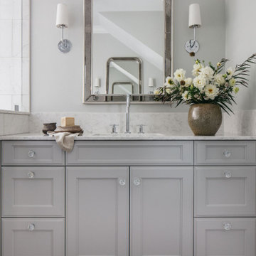
Our clients were in the market for an upgrade from builder grade in their Glen Ellyn bathroom! They came to us requesting a more spa like experience and a designer’s eye to create a more refined space.
A large steam shower, bench and rain head replaced a dated corner bathtub. In addition, we added heated floors for those cool Chicago months and several storage niches and built-in cabinets to keep extra towels and toiletries out of sight. The use of circles in the tile, cabinetry and new window in the shower give this primary bath the character it was lacking, while lowering and modifying the unevenly vaulted ceiling created symmetry in the space. The end result is a large luxurious spa shower, more storage space and improvements to the overall comfort of the room. A nice upgrade from the existing builder grade space!
Photography by @margaretrajic
Photo stylist @brandidevers
Do you have an older home that has great bones but needs an upgrade? Contact us here to see how we can help!
 TKS Design Group
Download our free ebook, Creating the Ideal Kitchen. DOWNLOAD NOW
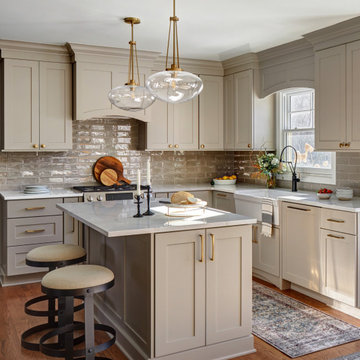
This family from Wheaton was ready to remodel their kitchen, dining room and powder room. The project didn’t call for any structural or space planning changes but the makeover still had a massive impact on their home. The homeowners wanted to change their dated 1990’s brown speckled granite and light maple kitchen. They liked the welcoming feeling they got from the wood and warm tones in their current kitchen, but this style clashed with their vision of a deVOL type kitchen, a London-based furniture company. Their inspiration came from the country homes of the UK that mix the warmth of traditional detail with clean lines and modern updates.
To create their vision, we started with all new framed cabinets with a modified overlay painted in beautiful, understated colors. Our clients were adamant about “no white cabinets.” Instead we used an oyster color for the perimeter and a custom color match to a specific shade of green chosen by the homeowner. The use of a simple color pallet reduces the visual noise and allows the space to feel open and welcoming. We also painted the trim above the cabinets the same color to make the cabinets look taller. The room trim was painted a bright clean white to match the ceiling.
In true English fashion our clients are not coffee drinkers, but they LOVE tea. We created a tea station for them where they can prepare and serve tea. We added plenty of glass to showcase their tea mugs and adapted the cabinetry below to accommodate storage for their tea items. Function is also key for the English kitchen and the homeowners. They requested a deep farmhouse sink and a cabinet devoted to their heavy mixer because they bake a lot. We then got rid of the stovetop on the island and wall oven and replaced both of them with a range located against the far wall. This gives them plenty of space on the island to roll out dough and prepare any number of baked goods. We then removed the bifold pantry doors and created custom built-ins with plenty of usable storage for all their cooking and baking needs.
The client wanted a big change to the dining room but still wanted to use their own furniture and rug. We installed a toile-like wallpaper on the top half of the room and supported it with white wainscot paneling. We also changed out the light fixture, showing us once again that small changes can have a big impact.
As the final touch, we also re-did the powder room to be in line with the rest of the first floor. We had the new vanity painted in the same oyster color as the kitchen cabinets and then covered the walls in a whimsical patterned wallpaper. Although the homeowners like subtle neutral colors they were willing to go a bit bold in the powder room for something unexpected. For more design inspiration go to: www.kitchenstudio-ge.com
 Meredith Hayward Richard
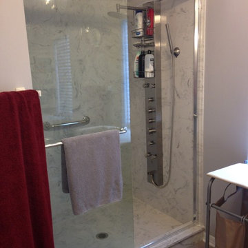
This was a repeat client. We had done their kitchen the previous year, and they were no ready to tackle their master bathroom. Their shower surround had been leaking for quite sometime and desperately need to be replaced. The tile was dated and worn, as was the shower door. We preserved the bathroom floor per the clients request. We replaced the vanity cabinets with fresh new shaker cabinetry and a vanity top with integrated sink to match the new cultured marble shower surround.
 Rain Garden Nursery LandscapeMakeoverDesignStaging
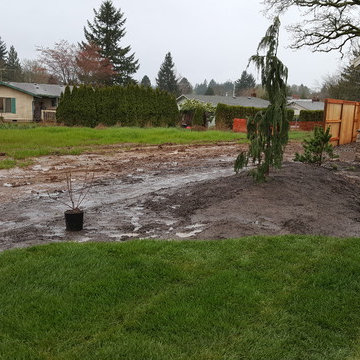
Scott Buley, HTT&T, High Tech Turf & Trees, LandscapeMakeover.biz, Rain Garden Nursery. Front yard BEFORE PHOTO, showing the extreme conditions we worked on during this project. We added at no additional cost, another several loads of 4-way soil mix to complete this project, during a wet period that would have never allowed responsible construction to take place without it. On our last visits there, the owners confirmed that several neighbors commented that their project/landscape/home was the most attractive in this new community. We made so many return trips for follow-up, that we definitely feel we've gone far beyond the "extra-mile" to accommodate these customers. We are particularly proud of the fact we worked thru weather extremes, utilizing innovative techniques to continue despite the conditions (planking over saturated soils, etc.) to help the new owners meet their landscape deadlines to assist in their meeting their Move-In date they requested for this new home.
 Vetter Architects
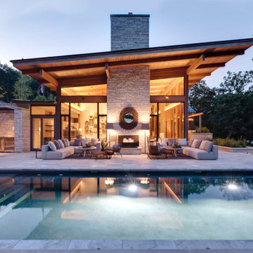
The owners requested a Private Resort that catered to their love for entertaining friends and family, a place where 2 people would feel just as comfortable as 42. Located on the western edge of a Wisconsin lake, the site provides a range of natural ecosystems from forest to prairie to water, allowing the building to have a more complex relationship with the lake - not merely creating large unencumbered views in that direction. The gently sloping site to the lake is atypical in many ways to most lakeside lots - as its main trajectory is not directly to the lake views - allowing for focus to be pushed in other directions such as a courtyard and into a nearby forest.
The biggest challenge was accommodating the large scale gathering spaces, while not overwhelming the natural setting with a single massive structure. Our solution was found in breaking down the scale of the project into digestible pieces and organizing them in a Camp-like collection of elements:
- Main Lodge: Providing the proper entry to the Camp and a Mess Hall
- Bunk House: A communal sleeping area and social space.
- Party Barn: An entertainment facility that opens directly on to a swimming pool & outdoor room.
- Guest Cottages: A series of smaller guest quarters.
- Private Quarters: The owners private space that directly links to the Main Lodge.
These elements are joined by a series green roof connectors, that merge with the landscape and allow the out buildings to retain their own identity. This Camp feel was further magnified through the materiality - specifically the use of Doug Fir, creating a modern Northwoods setting that is warm and inviting. The use of local limestone and poured concrete walls ground the buildings to the sloping site and serve as a cradle for the wood volumes that rest gently on them. The connections between these materials provided an opportunity to add a delicate reading to the spaces and re-enforce the camp aesthetic.
The oscillation between large communal spaces and private, intimate zones is explored on the interior and in the outdoor rooms. From the large courtyard to the private balcony - accommodating a variety of opportunities to engage the landscape was at the heart of the concept.
Overview
Chenequa, WI
Size
Total Finished Area: 9,543 sf
Completion Date
May 2013
Services
Architecture, Landscape Architecture, Interior Design

 Dreamstar Custom Homes
Trendy gray floor alcove shower photo in Miami with louvered cabinets, dark wood cabinets, blue walls, a vessel sink, tile countertops and gray countertops
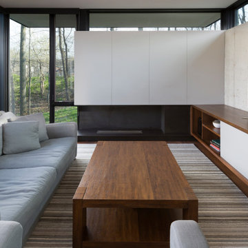 Vetter Architects
The client’s request was quite common - a typical 2800 sf builder home with 3 bedrooms, 2 baths, living space, and den. However, their desire was for this to be “anything but common.” The result is an innovative update on the production home for the modern era, and serves as a direct counterpoint to the neighborhood and its more conventional suburban housing stock, which focus views to the backyard and seeks to nullify the unique qualities and challenges of topography and the natural environment.
The Terraced House cautiously steps down the site’s steep topography, resulting in a more nuanced approach to site development than cutting and filling that is so common in the builder homes of the area. The compact house opens up in very focused views that capture the natural wooded setting, while masking the sounds and views of the directly adjacent roadway. The main living spaces face this major roadway, effectively flipping the typical orientation of a suburban home, and the main entrance pulls visitors up to the second floor and halfway through the site, providing a sense of procession and privacy absent in the typical suburban home.
Clad in a custom rain screen that reflects the wood of the surrounding landscape - while providing a glimpse into the interior tones that are used. The stepping “wood boxes” rest on a series of concrete walls that organize the site, retain the earth, and - in conjunction with the wood veneer panels - provide a subtle organic texture to the composition.
The interior spaces wrap around an interior knuckle that houses public zones and vertical circulation - allowing more private spaces to exist at the edges of the building. The windows get larger and more frequent as they ascend the building, culminating in the upstairs bedrooms that occupy the site like a tree house - giving views in all directions.
The Terraced House imports urban qualities to the suburban neighborhood and seeks to elevate the typical approach to production home construction, while being more in tune with modern family living patterns.
Overview:
Elm Grove
Size:
2,800 sf,
3 bedrooms, 2 bathrooms
Completion Date:
September 2014
Services:
Architecture, Landscape Architecture
Interior Consultants: Amy Carman Design
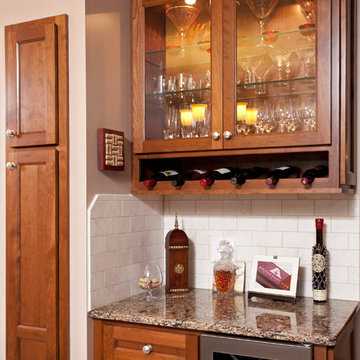
 The Cabinet Store + Culina Design
Over the course of six weeks we took their home from slightly outdated to stylishly modern. We began our work in the kitchen. Their existing space included oak raised panel cabinets and laminate countertops. We identified two problems right off the bat. First, the kitchen was home to an unfortunately placed island that broke up the room and made for horrible traffic flow. Second, the family was “oaked out,” with obviously dated oak cabinets abounding. The homeowners also requested that their countertops be replaced with a durable and low-maintenance material.
To begin, we replaced the island and created a peninsula to open up the kitchen. We upgraded the cabinets with Showplace Wood cherry cabinets in a truffle finish that matched the home’s entertainment center in the adjacent living room. Next, we replaced the family’s door with a Showplace Wood Concord style for a more modern feel. Finally, we swapped the existing laminate counters with Cambria natural quartz countertops in the Canterbury finish for a beautiful, maintenance free work surface.
Moving into the laundry room, we installed matching cabinets in this space as well. Last but not least, we installed new Wilsonart HD countertops and a Swanstone sink. With the remodel complete, we checked in with our homeowners and are happy to report pleased customers all around!
 Kitchen Kraft
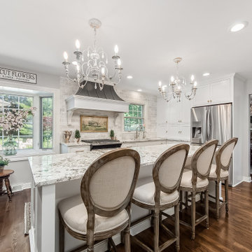
Large french country u-shaped dark wood floor and brown floor kitchen photo in Columbus with an island, an undermount sink, recessed-panel cabinets, white cabinets, gray backsplash, stainless steel appliances and white countertops
 TKS Design Group
Download our free ebook, Creating the Ideal Kitchen. DOWNLOAD NOW
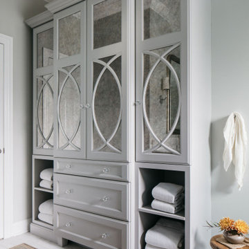
Our clients were in the market for an upgrade from builder grade in their Glen Ellyn bathroom! They came to us requesting a more spa like experience and a designer’s eye to create a more refined space.
A large steam shower, bench and rain head replaced a dated corner bathtub. In addition, we added heated floors for those cool Chicago months and several storage niches and built-in cabinets to keep extra towels and toiletries out of sight. The use of circles in the tile, cabinetry and new window in the shower give this primary bath the character it was lacking, while lowering and modifying the unevenly vaulted ceiling created symmetry in the space. The end result is a large luxurious spa shower, more storage space and improvements to the overall comfort of the room. A nice upgrade from the existing builder grade space!
Photography by @margaretrajic
Photo stylist @brandidevers
Do you have an older home that has great bones but needs an upgrade? Contact us here to see how we can help!
 Platinum Poolcare
Request Free Quote
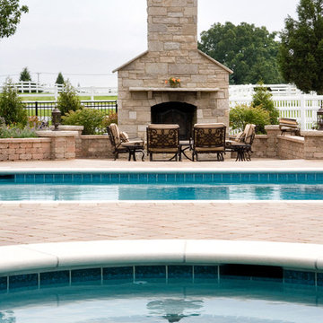
This pool, measuring 20'0" x 45'0" is right in the middle of Horse country. The separate, raised 8'0" hot tub gives the bathers a great vantage point from which to watch the Equestrian activities. Pool and Spa coping is Valder's Wisconsin Limestone. The pool has an automatic safety cover with custom stone walk-on lid system. The pool finish is Exposed Aggregate. Photos by Linda Oyama Bryan

 Vetter Architects
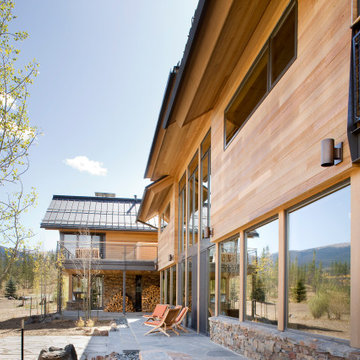
The owners requested that their home harmonize with the spirit of the surrounding Colorado mountain setting and enhance their outdoor recreational lifestyle - while reflecting their contemporary architectural tastes. The site was burdened with a myriad of strict design criteria enforced by the neighborhood covenants and architectural review board. Creating a distinct design challenge, the covenants included a narrow interpretation of a “mountain style” home which established predetermined roof pitches, glazing percentages and material palettes - at direct odds with the client‘s vision of a flat-roofed, glass, “contemporary” home.
Our solution finds inspiration and opportunities within the site covenant’s strict definitions. It promotes and celebrates the client’s outdoor lifestyle and resolves the definition of a contemporary “mountain style” home by reducing the architecture to its most basic vernacular forms and relying upon local materials.
The home utilizes a simple base, middle and top that echoes the surrounding mountains and vegetation. The massing takes its cues from the prevalent lodgepole pine trees that grow at the mountain’s high altitudes. These pine trees have a distinct growth pattern, highlighted by a single vertical trunk and a peaked, densely foliated growth zone above a sparse base. This growth pattern is referenced by placing the wood-clad body of the home at the second story above an open base composed of wood posts and glass. A simple peaked roof rests lightly atop the home - visually floating above a triangular glass transom. The home itself is neatly inserted amongst an existing grove of lodgepole pines and oriented to take advantage of panoramic views of the adjacent meadow and Continental Divide beyond.
The main functions of the house are arranged into public and private areas and this division is made apparent on the home’s exterior. Two large roof forms, clad in pre-patinated zinc, are separated by a sheltering central deck - which signals the main entry to the home. At this connection, the roof deck is opened to allow a cluster of aspen trees to grow – further reinforcing nature as an integral part of arrival.
Outdoor living spaces are provided on all levels of the house and are positioned to take advantage of sunrise and sunset moments. The distinction between interior and exterior space is blurred via the use of large expanses of glass. The dry stacked stone base and natural cedar cladding both reappear within the home’s interior spaces.
This home offers a unique solution to the client’s requests while satisfying the design requirements of the neighborhood covenants. The house provides a variety of indoor and outdoor living spaces that can be utilized in all seasons. Most importantly, the house takes its cues directly from its natural surroundings and local building traditions to become a prototype solution for the “modern mountain house”.
Overview
Ranch Creek Ranch
Winter Park, Colorado
Completion Date
October, 2007
Services
Architecture, Interior Design, Landscape Architecture
13