
Search results for "Deciding locations" in Home Design Ideas

 Kitchen Solvers of Emerald Coast
Kitchen remodeling project where the homeowners decided to update their kitchen to a more modern look by installing new custom cabinets. They went with the Bellmont 1900 Madrid door in Rift White Oak and the color is Folkstone. We also removed the heavy paneling for the pantry and installed a new door. We also moved the refrigerator to a new location and then installed new floating shelves. We also made the island larger, creating more function and work space. We also installed 12 volt LED puck lighting under the floating shelves and well as under cabinet lighting. To finish the new look we also refaced the exiting cabinets for the bar area with the same cabinets as the rest of the kitchen.

 ODS Architecture
Located in Menlo Park, California, this 3,000 sf. remodel was carefully crafted to generate excitement and make maximum use of the owner’s strict budget and comply with the city’s stringent planning code. It was understood that not everything was to be redone from a prior owner’s quirky remodel which included odd inward angled walls, circular windows and cedar shingles.
Remedial work to remove and prevent dry rot ate into the budget as well. Studied alterations to the exterior include a new trellis over the garage door, pushing the entry out to create a new soaring stair hall and stripping the exterior down to simplify its appearance. The new steel entry stair leads to a floating bookcase that pivots to the family room. For budget reasons, it was decided to keep the existing cedar shingles.
Upstairs, a large oak multi-level staircase was replaced with the new simple run of stairs. The impact of angled bedroom walls and circular window in the bathroom were calmed with new clean white walls and tile.
Photo Credit: John Sutton Photography.


Find the right local pro for your project

 Jonathan Salmon
This kitchen, located in Santa Ana, is a practical kitchen designed for usability. This kitchen features a double bowl Franke sink that blends in effortlessly with the granite countertop. The designer, Jonathan Salmon, added in a second sink for easy preparation for meals. This kitchen has a custom hood over the stainless steel Décor range. To give this kitchen some flare, the designer added in a custom tile back splash and maple Brookhaven cabinets with a custom nutmeg finish. To keep the simplistic theme the designer decided to use an integrated Sub Zero refrigerator with a panel to make it blend in.
 Kitchen Solvers of Emerald Coast
Kitchen remodeling project where the homeowners decided to update their kitchen to a more modern look by installing new custom cabinets. They went with the Bellmont 1900 Madrid door in Rift White Oak and the color is Folkstone. We also removed the heavy paneling for the pantry and installed a new door. We also moved the refrigerator to a new location and then installed new floating shelves. We also made the island larger, creating more function and work space. We also installed 12 volt LED puck lighting under the floating shelves and well as under cabinet lighting. To finish the new look we also refaced the exiting cabinets for the bar area with the same cabinets as the rest of the kitchen.
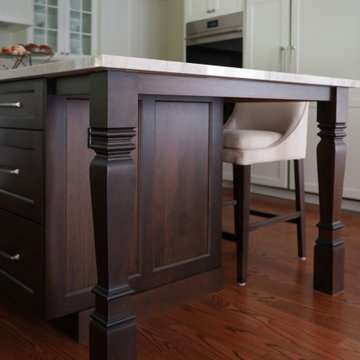
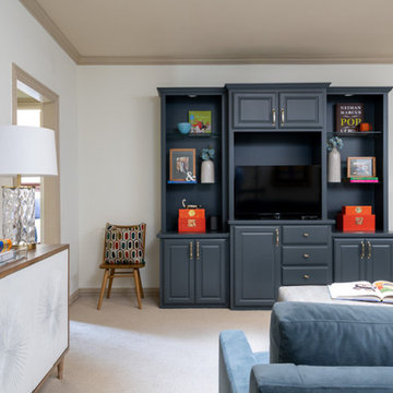
 Drury Design
This house was 45 years old and the most recent kitchen update was past its due date. It was also time to update an adjacent family room, eating area and a nearby bar. The idea was to refresh the space with a transitional design that leaned classic – something that would be elegant and comfortable. Something that would welcome and enhance natural light.
The objectives were:
-Keep things simple – classic, comfortable and easy to keep clean
-Cohesive design between the kitchen, family room, eating area and bar
-Comfortable walkways, especially between the island and sofa
-Get rid of the kitchen’s dated 3D vegetable tile and island top shaped like a painters pallet
Design challenges:
-Incorporate a structural beam so that it flows with the entire space
-Proper ventilation for the hood
-Update the floor finish to get rid of the ’90s red oak
Design solutions:
-After reviewing multiple design options we decided on keeping appliances in their existing locations
-Made the cabinet on the back wall deeper than standard to fit and conceal the exhaust vent within the crown molding space and provide proper ventilation for the rangetop
-Omitted the sink on the island because it was not being used
-Squared off the island to provide more seating and functionality
-Relocated the microwave from the wall to the island and fitted a warming drawer directly below
-Added a tray partition over the oven so that cookie sheets and cutting boards are easily accessible and neatly stored
-Omitted all the decorative fillers to make the kitchen feel current
-Detailed yet simple tile backsplash design to add interest
Refinished the already functional entertainment cabinetry to match new cabinets – good flow throughout area
Even though the appliances all stayed in the same locations, the cabinet finish created a dramatic change. This is a very large kitchen and the client embraces minimalist design so we decided to omit quite a few wall cabinets.
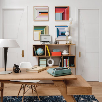
 Nicole Arnold Interiors
This quaint home, located in Plano’s prestigious Willow Bend Polo Club, underwent some super fun updates during our renovation and refurnishing project! The clients’ love for bright colors, mid-century modern elements, and bold looks led us to designing a black and white bathroom with black paned glass, colorful hues in the game room and bedrooms, and a sleek new “work from home” space for working in style. The clients love using their new spaces and have decided to let us continue designing these looks throughout additional areas in the home!
Sponsored
Columbus, OH
Free consultation for landscape design!

Peabody Landscape Group
Columbus' Reliable Landscape Design & Contracting


 Breathe Design Studio: San Francisco
Our Austin studio decided to go bold with this project by ensuring that each space had a unique identity in the Mid-Century Modern style bathroom, butler's pantry, and mudroom. We covered the bathroom walls and flooring with stylish beige and yellow tile that was cleverly installed to look like two different patterns. The mint cabinet and pink vanity reflect the mid-century color palette. The stylish knobs and fittings add an extra splash of fun to the bathroom.
The butler's pantry is located right behind the kitchen and serves multiple functions like storage, a study area, and a bar. We went with a moody blue color for the cabinets and included a raw wood open shelf to give depth and warmth to the space. We went with some gorgeous artistic tiles that create a bold, intriguing look in the space.
In the mudroom, we used siding materials to create a shiplap effect to create warmth and texture – a homage to the classic Mid-Century Modern design. We used the same blue from the butler's pantry to create a cohesive effect. The large mint cabinets add a lighter touch to the space.
 Drury Design
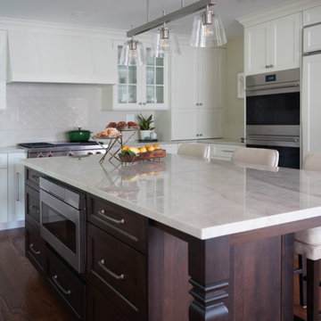
This house was 45 years old and the most recent kitchen update was past its due date. It was also time to update an adjacent family room, eating area and a nearby bar. The idea was to refresh the space with a transitional design that leaned classic – something that would be elegant and comfortable. Something that would welcome and enhance natural light.
The objectives were:
-Keep things simple – classic, comfortable and easy to keep clean
-Cohesive design between the kitchen, family room, eating area and bar
-Comfortable walkways, especially between the island and sofa
-Get rid of the kitchen’s dated 3D vegetable tile and island top shaped like a painters pallet
Design challenges:
-Incorporate a structural beam so that it flows with the entire space
-Proper ventilation for the hood
-Update the floor finish to get rid of the ’90s red oak
Design solutions:
-After reviewing multiple design options we decided on keeping appliances in their existing locations
-Made the cabinet on the back wall deeper than standard to fit and conceal the exhaust vent within the crown molding space and provide proper ventilation for the rangetop
-Omitted the sink on the island because it was not being used
-Squared off the island to provide more seating and functionality
-Relocated the microwave from the wall to the island and fitted a warming drawer directly below
-Added a tray partition over the oven so that cookie sheets and cutting boards are easily accessible and neatly stored
-Omitted all the decorative fillers to make the kitchen feel current
-Detailed yet simple tile backsplash design to add interest
Refinished the already functional entertainment cabinetry to match new cabinets – good flow throughout area
Even though the appliances all stayed in the same locations, the cabinet finish created a dramatic change. This is a very large kitchen and the client embraces minimalist design so we decided to omit quite a few wall cabinets.
 Nicole Arnold Interiors
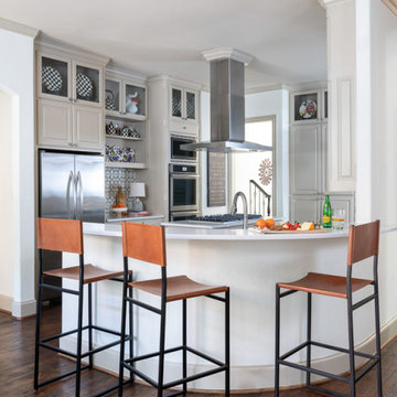
This quaint home, located in Plano’s prestigious Willow Bend Polo Club, underwent some super fun updates during our renovation and refurnishing project! The clients’ love for bright colors, mid-century modern elements, and bold looks led us to designing a black and white bathroom with black paned glass, colorful hues in the game room and bedrooms, and a sleek new “work from home” space for working in style. The clients love using their new spaces and have decided to let us continue designing these looks throughout additional areas in the home!
 Drury Design
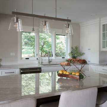
This house was 45 years old and the most recent kitchen update was past its due date. It was also time to update an adjacent family room, eating area and a nearby bar. The idea was to refresh the space with a transitional design that leaned classic – something that would be elegant and comfortable. Something that would welcome and enhance natural light.
The objectives were:
-Keep things simple – classic, comfortable and easy to keep clean
-Cohesive design between the kitchen, family room, eating area and bar
-Comfortable walkways, especially between the island and sofa
-Get rid of the kitchen’s dated 3D vegetable tile and island top shaped like a painters pallet
Design challenges:
-Incorporate a structural beam so that it flows with the entire space
-Proper ventilation for the hood
-Update the floor finish to get rid of the ’90s red oak
Design solutions:
-After reviewing multiple design options we decided on keeping appliances in their existing locations
-Made the cabinet on the back wall deeper than standard to fit and conceal the exhaust vent within the crown molding space and provide proper ventilation for the rangetop
-Omitted the sink on the island because it was not being used
-Squared off the island to provide more seating and functionality
-Relocated the microwave from the wall to the island and fitted a warming drawer directly below
-Added a tray partition over the oven so that cookie sheets and cutting boards are easily accessible and neatly stored
-Omitted all the decorative fillers to make the kitchen feel current
-Detailed yet simple tile backsplash design to add interest
Refinished the already functional entertainment cabinetry to match new cabinets – good flow throughout area
Even though the appliances all stayed in the same locations, the cabinet finish created a dramatic change. This is a very large kitchen and the client embraces minimalist design so we decided to omit quite a few wall cabinets.
 Drury Design
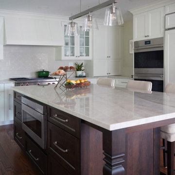
This house was 45 years old and the most recent kitchen update was past its due date. It was also time to update an adjacent family room, eating area and a nearby bar. The idea was to refresh the space with a transitional design that leaned classic – something that would be elegant and comfortable. Something that would welcome and enhance natural light.
The objectives were:
-Keep things simple – classic, comfortable and easy to keep clean
-Cohesive design between the kitchen, family room, eating area and bar
-Comfortable walkways, especially between the island and sofa
-Get rid of the kitchen’s dated 3D vegetable tile and island top shaped like a painters pallet
Design challenges:
-Incorporate a structural beam so that it flows with the entire space
-Proper ventilation for the hood
-Update the floor finish to get rid of the ’90s red oak
Design solutions:
-After reviewing multiple design options we decided on keeping appliances in their existing locations
-Made the cabinet on the back wall deeper than standard to fit and conceal the exhaust vent within the crown molding space and provide proper ventilation for the rangetop
-Omitted the sink on the island because it was not being used
-Squared off the island to provide more seating and functionality
-Relocated the microwave from the wall to the island and fitted a warming drawer directly below
-Added a tray partition over the oven so that cookie sheets and cutting boards are easily accessible and neatly stored
-Omitted all the decorative fillers to make the kitchen feel current
-Detailed yet simple tile backsplash design to add interest
Refinished the already functional entertainment cabinetry to match new cabinets – good flow throughout area
Even though the appliances all stayed in the same locations, the cabinet finish created a dramatic change. This is a very large kitchen and the client embraces minimalist design so we decided to omit quite a few wall cabinets.
Sponsored
Columbus, OH
Free consultation for landscape design!
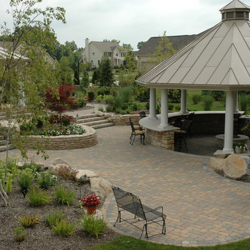
Peabody Landscape Group
Columbus' Reliable Landscape Design & Contracting

 Clairmont Design Build
Interior Design: Lucy Interior Design Builder: Clairmont Design + Build Photography: SPACECRAFTING


 Nielsen's Remodeling & Construction
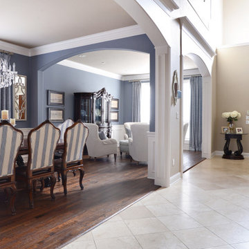
This beautiful house located in LAKES OF LA CIMA IN PROSPER TX with a half acre lot in lot was built in 2007 and although it had great bones, the majority of the house was original and a year after the new homeowners moved in they decided to renovated and at their own touches to make it feel like their dream home, those touches included, removing the carpet from the living room and installing solid hardwood to match the other areas in the house, redesigning the mantel and adding space for artwork and family portraits and take advantage of the20 ft soaring ceilings with an open view from the foyer, we added character to the arches by installing custom trim, and moldings, in the formal living and dining we added judges panel to the walls, as well as window coverings and furniture upholstery to bring its traditional look to life!
 Nielsen's Remodeling & Construction
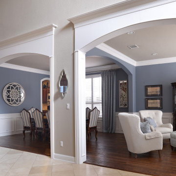
This beautiful house located in LAKES OF LA CIMA IN PROSPER TX with a half acre lot in lot was built in 2007 and although it had great bones, the majority of the house was original and a year after the new homeowners moved in they decided to renovated and at their own touches to make it feel like their dream home, those touches included, removing the carpet from the living room and installing solid hardwood to match the other areas in the house, redesigning the mantel and adding space for artwork and family portraits and take advantage of the20 ft soaring ceilings with an open view from the foyer, we added character to the arches by installing custom trim, and moldings, in the formal living and dining we added judges panel to the walls, as well as window coverings and furniture upholstery to bring its traditional look to life!

 Drury Design
This house was 45 years old and the most recent kitchen update was past its due date. It was also time to update an adjacent family room, eating area and a nearby bar. The idea was to refresh the space with a transitional design that leaned classic – something that would be elegant and comfortable. Something that would welcome and enhance natural light.
The objectives were:
-Keep things simple – classic, comfortable and easy to keep clean
-Cohesive design between the kitchen, family room, eating area and bar
-Comfortable walkways, especially between the island and sofa
-Get rid of the kitchen’s dated 3D vegetable tile and island top shaped like a painters pallet
Design challenges:
-Incorporate a structural beam so that it flows with the entire space
-Proper ventilation for the hood
-Update the floor finish to get rid of the ’90s red oak
Design solutions:
-After reviewing multiple design options we decided on keeping appliances in their existing locations
-Made the cabinet on the back wall deeper than standard to fit and conceal the exhaust vent within the crown molding space and provide proper ventilation for the rangetop
-Omitted the sink on the island because it was not being used
-Squared off the island to provide more seating and functionality
-Relocated the microwave from the wall to the island and fitted a warming drawer directly below
-Added a tray partition over the oven so that cookie sheets and cutting boards are easily accessible and neatly stored
-Omitted all the decorative fillers to make the kitchen feel current
-Detailed yet simple tile backsplash design to add interest
Refinished the already functional entertainment cabinetry to match new cabinets – good flow throughout area
Even though the appliances all stayed in the same locations, the cabinet finish created a dramatic change. This is a very large kitchen and the client embraces minimalist design so we decided to omit quite a few wall cabinets.

 Advance Design Studio, Ltd.
Quinn and Paige, residents of this tired 1960’s tri-level home hated their kitchen. As a matter of fact, prior to making plans to renovate the first floor - they considered selling the home, but were reluctant because of its enviable location near the heart of downtown Barrington which was within walking distance to local stores and all their favorite places. So instead they contacted Advance Design Studio after hearing about them from a neighbor, to rescue their tired home and give it new life.
The very first plan was to remove the constricting walls surrounding the original kitchen, and open the expansive first floor living room and dining area to the new heart of the space; a stunning state of the art coastal designed kitchen. Exposing attractive beams in the vaulted ceiling created an interesting structural detail that suits the open plan and salutes the original architecture of the home, further emphasizing the height of the new space enjoyed now by the family as a great room.
The stage was set for the seaside feel of this kitchen by pairing crisp white painted maple cabinets with Dura Supreme’s one of kind hand weathered finish on the island in soft blue-green finish. But the authentic feeling of being on your favorite beach was supremely achieved by the matching of unique Mt. Claire marble on the island and the specialty Wareham acid washed stone on the perimeter counter tops. Pictures don’t do justice to the feel of this stone under your hand; its water-washed texture reminds instantly of summer vacations collecting rocks softly etched by hundreds of waves.
Stainless steel appliances and satin nickel hardware shine brightly against the backdrop of bright white subway tiles accentuated by subtle grey grout lines contributing to the nautical feel of this comfortable kitchen. Seeded glass door cabinetry reminiscent of beach grasses dress up the space just enough, and a proud 6” stacked crown molding extends above 36” wall cabinets into the expanse of the now taller space; balancing this kitchen nicely within its newly integrated home.
Features in this kitchen include a built in standard depth refrigerator, pull out spice racks, tall tray dividers and wood super Susan with double pull out trash and recycling. A cutlery divider holds sharp knives, and an angled cabinet was customized to hold a secret USB charging station. The bright white Kohler farm sink is graced by an elegant bridge faucet in brushed nickel. This now airy and spacious kitchen has room for guest and family to congregate around the large island, complete with stools and attractive hidden storage for seldom used entertainment pieces.
“I was sold when I saw the drawings. My designer nailed it, down to every last storage idea and coastal detail I envisioned, it was all in there. It was unbelievable how accurate her interpretation was of what was in my head; working with her made my kitchen renovation so easy, it’s as if she literally read my mind”, said Paige enthusiastically.
The woman of the house expressed upon completion not only her love for her fantastic new cooking space, but how renovating her kitchen has given new life to the entire home. Talk of moving has been relegated to the recycling bin, and instead the family is discussing plans to renovate the master bath now that they’ve decided to stay for the long term. Friends who visit the home do a double-take as they recognize the new space’s dramatic transformation from original cramped and closed spaces - to the now amazingly fresh open kitchen that has become the center of every gathering and family meal.
Designer: Nicole Ryan
Photographer: Joe Nowak

 First Option Design Build LLC
This corner shelf/seat allows for a perch in this narrow shower without taking up too much space.
Inspiration for a small timeless master multicolored tile and porcelain tile porcelain tile bathroom remodel in Phoenix with furniture-like cabinets, medium tone wood cabinets, a two-piece toilet, blue walls, a drop-in sink and tile countertops
Inspiration for a small timeless master multicolored tile and porcelain tile porcelain tile bathroom remodel in Phoenix with furniture-like cabinets, medium tone wood cabinets, a two-piece toilet, blue walls, a drop-in sink and tile countertops
56