
Search results for "Deciding locations" in Home Design Ideas
 Nicole Arnold Interiors
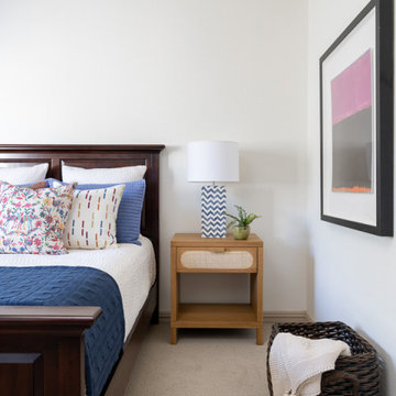
This quaint home, located in Plano’s prestigious Willow Bend Polo Club, underwent some super fun updates during our renovation and refurnishing project! The clients’ love for bright colors, mid-century modern elements, and bold looks led us to designing a black and white bathroom with black paned glass, colorful hues in the game room and bedrooms, and a sleek new “work from home” space for working in style. The clients love using their new spaces and have decided to let us continue designing these looks throughout additional areas in the home!


Find the right local pro for your project

 Studio Saxe
Overview:
Wing-like roofline houses a dramatic white villa in Costa Rica jungle.
Studio Saxe was commissioned to design a villa on the hilltops of Santiago in Santa Teresa, Costa Rica. The primary objective was not only to provide dwellers with a connection with its jungle surroundings but also to generate an intimate relationship with an amazing view of the shoreline which brings its dwellers back to a more profound appreciation of the natural world.
Concept
Studio Saxe decided to create a large roof that would house within a series of bedrooms and living spaces that would all be turned sideways in order to face the prominent views. Interstitial spaces within the living volumes create gaps that enhance a deeper connection to the natural surroundings whilst moving about the dwelling.
Design
Every space in the home has been angled to view the ocean, and this twist creates a geometric relationship between the roofline and the spaces that became the primary element of design that both addresses the need for large overhangs (for climate control and comfort) but also generates a literal connection between the view and every space.
This white house in the jungle acts as a canvas so that morning and sunset light reflect on its surfaces creating an array of colors that vary throughout the day. The angled surfaces also allow for the reflection of shadows and the textures of nature to play within the interstitial spaces that exist between the living spaces.
Construction
Due to the remoteness of the location and difficult access, Studio Saxe decided to create a light steel frame that could be prefabricated off-site, brought, and assembled in a fast and effective way. This not only ensured the quality of the construction in a very remote location, but it also allowed the process of construction to be very light touch and the intervention on the site to be very minimal while creating the sensation of large open spaces that bring the view in and at the same time are protected by a large roof held by steel “I” beams.
Sustainability
At Studio Saxe we believe that proper design with nature should be the first focus of sustainability and thus, this villa has been oriented properly to take advantage of predominant winds for cooling. Also, long overhangs protect from the sun and the rain in the most critical parts of the day creating comfort without the use of energy. A light touch construction method meant that the impact on the site was minimal during the implementation of the villa and the extended roofline also serves as a means to collect water and energy generation.
 Nicole Arnold Interiors
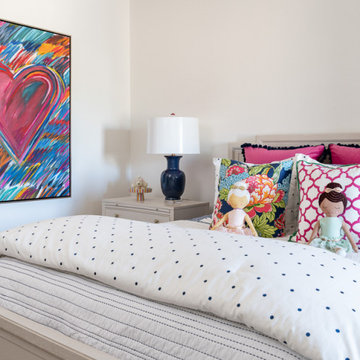
This quaint home, located in Plano’s prestigious Willow Bend Polo Club, underwent some super fun updates during our renovation and refurnishing project! The clients’ love for bright colors, mid-century modern elements, and bold looks led us to designing a black and white bathroom with black paned glass, colorful hues in the game room and bedrooms, and a sleek new “work from home” space for working in style. The clients love using their new spaces and have decided to let us continue designing these looks throughout additional areas in the home!
 Breathe Design Studio
Our Austin studio decided to go bold with this project by ensuring that each space had a unique identity in the Mid-Century Modern style bathroom, butler's pantry, and mudroom. We covered the bathroom walls and flooring with stylish beige and yellow tile that was cleverly installed to look like two different patterns. The mint cabinet and pink vanity reflect the mid-century color palette. The stylish knobs and fittings add an extra splash of fun to the bathroom.
The butler's pantry is located right behind the kitchen and serves multiple functions like storage, a study area, and a bar. We went with a moody blue color for the cabinets and included a raw wood open shelf to give depth and warmth to the space. We went with some gorgeous artistic tiles that create a bold, intriguing look in the space.
In the mudroom, we used siding materials to create a shiplap effect to create warmth and texture – a homage to the classic Mid-Century Modern design. We used the same blue from the butler's pantry to create a cohesive effect. The large mint cabinets add a lighter touch to the space.

 Creative Spaces Interior Design, Inc.
We were hired to select all new fabric, space planning, lighting, and paint colors in this three-story home. Our client decided to do a remodel and to install an elevator to be able to reach all three levels in their forever home located in Redondo Beach, CA.
We selected close to 200 yards of fabric to tell a story and installed all new window coverings, and reupholstered all the existing furniture. We mixed colors and textures to create our traditional Asian theme.
We installed all new LED lighting on the first and second floor with either tracks or sconces. We installed two chandeliers, one in the first room you see as you enter the home and the statement fixture in the dining room reminds me of a cherry blossom.
We did a lot of spaces planning and created a hidden office in the family room housed behind bypass barn doors. We created a seating area in the bedroom and a conversation area in the downstairs.
I loved working with our client. She knew what she wanted and was very easy to work with. We both expanded each other's horizons.
Tom Queally Photography
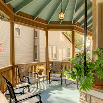
Sponsored
Columbus, OH

Hope Restoration & General Contracting
Columbus Design-Build, Kitchen & Bath Remodeling, Historic Renovations

 ACH Design LLC
Clarity Northwest
Bathroom - large traditional master beige tile and marble tile ceramic tile and brown floor bathroom idea in Seattle with raised-panel cabinets, beige walls, an undermount sink, quartzite countertops, beige countertops and beige cabinets
Bathroom - large traditional master beige tile and marble tile ceramic tile and brown floor bathroom idea in Seattle with raised-panel cabinets, beige walls, an undermount sink, quartzite countertops, beige countertops and beige cabinets
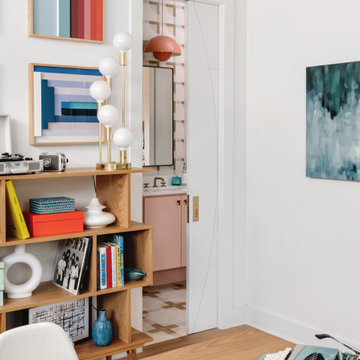 Breathe Design Studio
Our Austin studio decided to go bold with this project by ensuring that each space had a unique identity in the Mid-Century Modern style bathroom, butler's pantry, and mudroom. We covered the bathroom walls and flooring with stylish beige and yellow tile that was cleverly installed to look like two different patterns. The mint cabinet and pink vanity reflect the mid-century color palette. The stylish knobs and fittings add an extra splash of fun to the bathroom.
The butler's pantry is located right behind the kitchen and serves multiple functions like storage, a study area, and a bar. We went with a moody blue color for the cabinets and included a raw wood open shelf to give depth and warmth to the space. We went with some gorgeous artistic tiles that create a bold, intriguing look in the space.
In the mudroom, we used siding materials to create a shiplap effect to create warmth and texture – a homage to the classic Mid-Century Modern design. We used the same blue from the butler's pantry to create a cohesive effect. The large mint cabinets add a lighter touch to the space.

 Dan Nelson, Designs Northwest Architects
View from walking path. Photography by Lucas Henning.
Inspiration for a small modern gray three-story metal house exterior remodel in Seattle with a shed roof and a metal roof
Inspiration for a small modern gray three-story metal house exterior remodel in Seattle with a shed roof and a metal roof
 Studio Saxe
Overview:
Wing-like roofline houses a dramatic white villa in Costa Rica jungle.
Studio Saxe was commissioned to design a villa on the hilltops of Santiago in Santa Teresa, Costa Rica. The primary objective was not only to provide dwellers with a connection with its jungle surroundings but also to generate an intimate relationship with an amazing view of the shoreline which brings its dwellers back to a more profound appreciation of the natural world.
Concept
Studio Saxe decided to create a large roof that would house within a series of bedrooms and living spaces that would all be turned sideways in order to face the prominent views. Interstitial spaces within the living volumes create gaps that enhance a deeper connection to the natural surroundings whilst moving about the dwelling.
Design
Every space in the home has been angled to view the ocean, and this twist creates a geometric relationship between the roofline and the spaces that became the primary element of design that both addresses the need for large overhangs (for climate control and comfort) but also generates a literal connection between the view and every space.
This white house in the jungle acts as a canvas so that morning and sunset light reflect on its surfaces creating an array of colors that vary throughout the day. The angled surfaces also allow for the reflection of shadows and the textures of nature to play within the interstitial spaces that exist between the living spaces.
Construction
Due to the remoteness of the location and difficult access, Studio Saxe decided to create a light steel frame that could be prefabricated off-site, brought, and assembled in a fast and effective way. This not only ensured the quality of the construction in a very remote location, but it also allowed the process of construction to be very light touch and the intervention on the site to be very minimal while creating the sensation of large open spaces that bring the view in and at the same time are protected by a large roof held by steel “I” beams.
Sustainability
At Studio Saxe we believe that proper design with nature should be the first focus of sustainability and thus, this villa has been oriented properly to take advantage of predominant winds for cooling. Also, long overhangs protect from the sun and the rain in the most critical parts of the day creating comfort without the use of energy. A light touch construction method meant that the impact on the site was minimal during the implementation of the villa and the extended roofline also serves as a means to collect water and energy generation.
 Studio Saxe
Overview:
Wing-like roofline houses a dramatic white villa in Costa Rica jungle.
Studio Saxe was commissioned to design a villa on the hilltops of Santiago in Santa Teresa, Costa Rica. The primary objective was not only to provide dwellers with a connection with its jungle surroundings but also to generate an intimate relationship with an amazing view of the shoreline which brings its dwellers back to a more profound appreciation of the natural world.
Concept
Studio Saxe decided to create a large roof that would house within a series of bedrooms and living spaces that would all be turned sideways in order to face the prominent views. Interstitial spaces within the living volumes create gaps that enhance a deeper connection to the natural surroundings whilst moving about the dwelling.
Design
Every space in the home has been angled to view the ocean, and this twist creates a geometric relationship between the roofline and the spaces that became the primary element of design that both addresses the need for large overhangs (for climate control and comfort) but also generates a literal connection between the view and every space.
This white house in the jungle acts as a canvas so that morning and sunset light reflect on its surfaces creating an array of colors that vary throughout the day. The angled surfaces also allow for the reflection of shadows and the textures of nature to play within the interstitial spaces that exist between the living spaces.
Construction
Due to the remoteness of the location and difficult access, Studio Saxe decided to create a light steel frame that could be prefabricated off-site, brought, and assembled in a fast and effective way. This not only ensured the quality of the construction in a very remote location, but it also allowed the process of construction to be very light touch and the intervention on the site to be very minimal while creating the sensation of large open spaces that bring the view in and at the same time are protected by a large roof held by steel “I” beams.
Sustainability
At Studio Saxe we believe that proper design with nature should be the first focus of sustainability and thus, this villa has been oriented properly to take advantage of predominant winds for cooling. Also, long overhangs protect from the sun and the rain in the most critical parts of the day creating comfort without the use of energy. A light touch construction method meant that the impact on the site was minimal during the implementation of the villa and the extended roofline also serves as a means to collect water and energy generation.

 re:architecture
Living room - mid-sized 1960s gray floor, wood ceiling and wood wall living room idea in Denver with a wood stove and a tile fireplace
Sponsored
Columbus, OH
Free consultation for landscape design!

Peabody Landscape Group
Columbus' Reliable Landscape Design & Contracting

 FA Design Build
To stay or to go? This is the question our clients are still pondering. Yet, as their youngest child heads off to college, they are ready to enjoy their new kitchen or feature it in a real estate listing. Since they were unsure of their plans, we decided a pull and replace renovation was the logical — and most economical—choice. While all appliances remain in their same locations, we were able to make easy adjustments with cabinetry to update the space: convert a desk to a beverage center; increase the size of the island; install an island countertop with overhang for seating; and lengthen the perimeter cabinetry and add a tip-up, on-counter cabinet to house small appliances. The color palette was based on introducing warm grays to the space while ensuring the existing Brazilian cherry floor remained compatible with the new design. A combination of light gray and dark gray painted cabinetry (Medallion, Irish Crème and Frappe) updates the space, along with bronze finishes. A unique hex-patterned white tile backsplash with contrasting gray grout on the perimeter adds interest yet keeps the focus on the island. We installed the understated Cambria Whitehall on the perimeter with the vivid Cambria Skara Brae on the island. We worked closely with the stone fabricator to ensure the Skara Brae’s veining pattern matched the client’s vision. Above the island countertop, we installed two oversized pendants to add intensity and beauty as you enter the room.

 WS Design
The homeowners were planning on just a kitchen face lift-add an island and paint the perimeter cabinetry. We saw the kitchen's potential and pushed them to do a complete remodel. A large island, pantry storage, and countertop space were top priorities for this family of five. The homeowners knew the exact look they were going for- a clean transitional kitchen with a rustic farmhouse touch. We brought that idea to life by making the tapered hood a focal point by flanking it with glass cabinets. Your eye moves through the kitchen to the decorative wine hutch and contrasting Stone island with a bookshelf end cap. We're so happy they decided to transform their kitchen. The results are absolutely stunning!
 Creative Spaces Interior Design, Inc.
We were hired to select all new fabric, space planning, lighting, and paint colors in this three-story home. Our client decided to do a remodel and to install an elevator to be able to reach all three levels in their forever home located in Redondo Beach, CA.
We selected close to 200 yards of fabric to tell a story and installed all new window coverings, and reupholstered all the existing furniture. We mixed colors and textures to create our traditional Asian theme.
We installed all new LED lighting on the first and second floor with either tracks or sconces. We installed two chandeliers, one in the first room you see as you enter the home and the statement fixture in the dining room reminds me of a cherry blossom.
We did a lot of spaces planning and created a hidden office in the family room housed behind bypass barn doors. We created a seating area in the bedroom and a conversation area in the downstairs.
I loved working with our client. She knew what she wanted and was very easy to work with. We both expanded each other's horizons.
Tom Queally Photography

 Bianchi Design
This project is a (new) pool within an (existing) pool! The client asked me to remodel their extra large 1970s trapezoid pool that was lacking a spa and seating area. They wanted to make it into a focal feature of their yard allowing them to entertain and capture there scenic view in ways that the previous configuration prevented.
On this property, it made sense for the new spa to be on the uphill side adjacent to the master bedroom -- not only for convenience but also for enjoying the views, and allowing us to overflow the spa so that the water could return downhill back to the pool. This is where the cylindrical glass tile “jewel” is situated. The vibrant color of glass was chosen to compliment (be the opposite of, in order to visually resonate and create a higher energy feel) with the ocher seen in the natural stone palette that the house gave us as precedent.
Once the spas location was decided, the best views enjoyed by this property are located where the chaise lounges are now in the finished design. The previous pool occupied the space, and this prime area could not be accessed at all! Our second order of business was to carve out a destination space from the previous pool and give it back to be a furniture area for entertaining.
Locating the chaise lounger deck across the pool presented a challenge that became a fun opportunity not to be passed up. The overflowing spa water had to return to the pool somehow, and the flowing water had to be crossed over to get to the Chaise lounge viewing deck. The solution? A bridge of course! And with the stairs ascending up to the spa, why not have a stairway like water feature underneath the bridge?
The final touch on this design was omitting the weak and poorly executed vanishing edge, which had a horizon line finishing right into the rooftops of the homes below. Not the best aesthetic!
To block the roof lines of the homes below and direct your eyes up to the mountain peaks beyond, a stone clad raised planter became the central focal point of the yard, allowing us to create a beautiful agave, yucca, and cacti display to be enjoyed from every angle of the home.
Altogether the new configuration really plays off the angular shapes of the home, extends the pallet of materials around the yard, and makes the new space all that more enjoyable for the owners private and public entertainment.


 Dream Kitchens
The kitchen in this contemporary style home seemed to be an afterthought. While the rest of the house is open and expansive, the kitchen was small and detached, especially for a couple who loves to entertain. The very large and adjacent dining room seemed a more likely location for a kitchen, but they resisted the thought of swapping the two spaces. So their designer created a layout that allowed for a second – and larger – opening to the dining room and the expansive, light-filled living space beyond.
A peninsula attaches to the wall that remained between the two openings. There the sink is located so that during food preparation or cleanup there is a view through the windows and the opportunity to socialize with people gathered at the countertop. The seating area is curved to encourage people to gather and chat. The granite countertop choice was a case of love at first sight for this homeowner since it brought his favorite shade of blue into the kitchen.
The cooking center is spread out along the wall at the back of the house. There the eye-catching stainless steel hood creates a focal point above the sleek, low-profile cooktop. Glass tile pulls color from the countertops onto the wall where it glimmers in the light. One oven combined with a microwave/convection oven meet their cooking needs and the stainless steel adds brightness to the room.
The stainless steel refrigerator is just a few steps away from the work center and the seating area and is easily accessible from other parts of the house. The original kitchen featured only one small window in addition to the sliding glass doors. Since it was almost new and the house had been resided, a second window was joined to the first, and cabinetry beneath them anchors them in the space. A tall pantry cabinet completes the kitchen, providing high quality storage and visual balance in this redesign.
Sleek cherry cabinets give this kitchen a decidedly contemporary style. They were stained just enough to add warmth and color and are enhanced with oversized stainless steel pulls.
From this redesigned space you can see into the main house and see out through the many windows there. When combined with a new layout that provides better traffic flow, there’s a new feeling of spaciousness to the kitchen. It’s no longer an afterthought. It’s an integral part of this home’s living space, enhancing the home and the lifestyle of its owners.
Photography By Scott Sherman
 FA Design Build
To stay or to go? This is the question our clients are still pondering. Yet, as their youngest child heads off to college, they are ready to enjoy their new kitchen or feature it in a real estate listing. Since they were unsure of their plans, we decided a pull and replace renovation was the logical — and most economical—choice. While all appliances remain in their same locations, we were able to make easy adjustments with cabinetry to update the space: convert a desk to a beverage center; increase the size of the island; install an island countertop with overhang for seating; and lengthen the perimeter cabinetry and add a tip-up, on-counter cabinet to house small appliances. The color palette was based on introducing warm grays to the space while ensuring the existing Brazilian cherry floor remained compatible with the new design. A combination of light gray and dark gray painted cabinetry (Medallion, Irish Crème and Frappe) updates the space, along with bronze finishes. A unique hex-patterned white tile backsplash with contrasting gray grout on the perimeter adds interest yet keeps the focus on the island. We installed the understated Cambria Whitehall on the perimeter with the vivid Cambria Skara Brae on the island. We worked closely with the stone fabricator to ensure the Skara Brae’s veining pattern matched the client’s vision. Above the island countertop, we installed two oversized pendants to add intensity and beauty as you enter the room.

 Amazing Spaces
Eat-in kitchen - mid-sized transitional l-shaped ceramic tile and brown floor eat-in kitchen idea in New York with shaker cabinets, red cabinets, marble countertops, stainless steel appliances, an island, an undermount sink, gray backsplash and subway tile backsplash
62