
Search results for "Deciding locations" in Home Design Ideas

 Northwest Heritage Renovations
One of the client's design goals was to have this ADU separate from the main house but with easy access. We aligned the back door of the main home with the entry door to the ADU for a direct/easy access path back and forth. We decided to repeat certain elements of the main home in the ADU i.e. matching the front door to the main house.
Anna Campbell Photography

 Bennett Design Co.
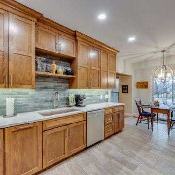
For this kitchen remodel, the clients opted to maintain the location and footprint of the original kitchen in their 1960’s ranch style home. That meant we had our work cut out for us to maximize the counter space while providing enough storage for this growing family. We ultimately decided to maximize the working counter space by the sink and range and added a large pantry wall in the adjacent dining room for bulky items and food storage. We chose a lightly stained slab style cabinet to capture the era of the home but paired it with white high-gloss upper cabinets and white quartz to make the space also look fresh and functional. A light green paint helps pull in the accent color featured in the backsplash while adding warmth to the home. We finished the space with a unique light fixture and a perfectly modern dining table.
Photos By: Michael Kaskel Photography

 Creative Spaces Interior Design, Inc.
We were hired to select all new fabric, space planning, lighting, and paint colors in this three-story home. Our client decided to do a remodel and to install an elevator to be able to reach all three levels in their forever home located in Redondo Beach, CA.
We selected close to 200 yards of fabric to tell a story and installed all new window coverings, and reupholstered all the existing furniture. We mixed colors and textures to create our traditional Asian theme.
We installed all new LED lighting on the first and second floor with either tracks or sconces. We installed two chandeliers, one in the first room you see as you enter the home and the statement fixture in the dining room reminds me of a cherry blossom.
We did a lot of spaces planning and created a hidden office in the family room housed behind bypass barn doors. We created a seating area in the bedroom and a conversation area in the downstairs.
I loved working with our client. She knew what she wanted and was very easy to work with. We both expanded each other's horizons.
Tom Queally Photography
Find the right local pro for your project

 TKS Design Group
Download our free ebook, Creating the Ideal Kitchen. DOWNLOAD NOW
This homeowner’s daughter originally contacted us on behalf of her parents who were reluctant to begin the remodeling process in their home due to the inconvenience and dust. Once we met and they dipped their toes into the process, we were off to the races. The existing bathroom in this beautiful historical 1920’s home, had not been updated since the 70’/80’s as evidenced by the blue carpeting, mirrored walls and dropped ceilings. In addition, there was very little storage, and some health setbacks had made the bathroom difficult to maneuver with its tub shower.
Once we demoed, we discovered everything we expected to find in a home that had not been updated for many years. We got to work bringing all the electrical and plumbing up to code, and it was just as dusty and dirty as the homeowner’s anticipated! Once the space was demoed, we got to work building our new plan. We eliminated the existing tub and created a large walk-in curb-less shower.
An existing closet was eliminated and in its place, we planned a custom built in with spots for linens, jewelry and general storage. Because of the small space, we had to be very creative with the shower footprint, so we clipped one of the walls for more clearance behind the sink. The bathroom features a beautiful custom mosaic floor tile as well as tiled walls throughout the space. This required lots of coordination between the carpenter and tile setter to make sure that the framing and tile design were all properly aligned. We worked around an existing radiator and a unique original leaded window that was architecturally significant to the façade of the home. We had a lot of extra depth behind the original toilet location, so we built the wall out a bit, moved the toilet forward and then created some extra storage space behind the commode. We settled on mirrored mullioned doors to bounce lots of light around the smaller space.
We also went back and forth on deciding between a single and double vanity, and in the end decided the single vanity allowed for more counter space, more storage below and for the design to breath a bit in the smaller space. I’m so happy with this decision! To build on the luxurious feel of the space, we added a heated towel bar and heated flooring.
One of the concerns the homeowners had was having a comfortable floor to walk on. They realized that carpet was not a very practical solution but liked the comfort it had provided. Heated floors are the perfect solution. The room is decidedly traditional from its intricate mosaic marble floor to the calacutta marble clad walls. Elegant gold chandelier style fixtures, marble countertops and Morris & Co. beaded wallpaper provide an opulent feel to the space.
The gray monochromatic pallet keeps it feeling fresh and up-to-date. The beautiful leaded glass window is an important architectural feature at the front of the house. In the summertime, the homeowners love having the window open for fresh air and ventilation. We love it too!
The curb-less shower features a small fold down bench that can be used if needed and folded up when not. The shower also features a custom niche for storing shampoo and other hair products. The linear drain is built into the tilework and is barely visible. A frameless glass door that swings both in and out completes the luxurious feel.
Designed by: Susan Klimala, CKD, CBD
Photography by: Michael Kaskel
For more information on kitchen and bath design ideas go to: www.kitchenstudio-ge.com

 Studio Saxe
Overview:
Wing-like roofline houses a dramatic white villa in Costa Rica jungle.
Studio Saxe was commissioned to design a villa on the hilltops of Santiago in Santa Teresa, Costa Rica. The primary objective was not only to provide dwellers with a connection with its jungle surroundings but also to generate an intimate relationship with an amazing view of the shoreline which brings its dwellers back to a more profound appreciation of the natural world.
Concept
Studio Saxe decided to create a large roof that would house within a series of bedrooms and living spaces that would all be turned sideways in order to face the prominent views. Interstitial spaces within the living volumes create gaps that enhance a deeper connection to the natural surroundings whilst moving about the dwelling.
Design
Every space in the home has been angled to view the ocean, and this twist creates a geometric relationship between the roofline and the spaces that became the primary element of design that both addresses the need for large overhangs (for climate control and comfort) but also generates a literal connection between the view and every space.
This white house in the jungle acts as a canvas so that morning and sunset light reflect on its surfaces creating an array of colors that vary throughout the day. The angled surfaces also allow for the reflection of shadows and the textures of nature to play within the interstitial spaces that exist between the living spaces.
Construction
Due to the remoteness of the location and difficult access, Studio Saxe decided to create a light steel frame that could be prefabricated off-site, brought, and assembled in a fast and effective way. This not only ensured the quality of the construction in a very remote location, but it also allowed the process of construction to be very light touch and the intervention on the site to be very minimal while creating the sensation of large open spaces that bring the view in and at the same time are protected by a large roof held by steel “I” beams.
Sustainability
At Studio Saxe we believe that proper design with nature should be the first focus of sustainability and thus, this villa has been oriented properly to take advantage of predominant winds for cooling. Also, long overhangs protect from the sun and the rain in the most critical parts of the day creating comfort without the use of energy. A light touch construction method meant that the impact on the site was minimal during the implementation of the villa and the extended roofline also serves as a means to collect water and energy generation.
 Aleto Construction Group
After building a home in North Carolina and using their smaller St. Louis Home when they were in town our clients decided to move to St. Louis permanently and contacted us to completely gut their existing non-functional kitchen into something that works for their storage and cooking needs. Functionality was top of mind as both homeowners are exquisite chefs. They needed room to store all their cooking essentials in easy to access locations, they wanted to open the kitchen up by removing a peninsula that shrunk the room and left space for only one cook at a time. They also wanted to brighten and lighten the finishes. The kitchen felt heavy with black countertops, dark floors and lighting that was subpar. We completely gutted the kitchen by moving the location of the sink and dishwasher from the peninsula, putting cabinetry along the two main walls in the kitchen. Cabinets were replaced with thoughtfully planned out drawers for easy access and convenient pantry cabinets with pull out shelves. The cabinets were taken to the ceiling to take advantage of extra space for storage as well as making the room feel taller. White countertops and well-placed lighting throughout the kitchen and under the cabinets brighten the room while the green handmade tiles bring dimension and interest that compliment the earth tones of the cabinetry.

 Touijer Designs
beautifully styled bookcase with books, photos and accessories. Sofa from West Elm gives extra seating in the nursery with an adorable wall decal behind the sofa.
photo credits: Regan Wood Photography
Sponsored
Columbus, OH

Structural Remodeling
Franklin County's Heavy Timber Specialists | Best of Houzz 2020!
 Aleto Construction Group
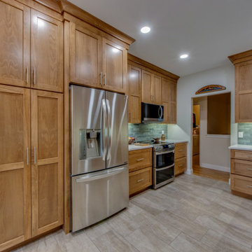
After building a home in North Carolina and using their smaller St. Louis Home when they were in town our clients decided to move to St. Louis permanently and contacted us to completely gut their existing non-functional kitchen into something that works for their storage and cooking needs. Functionality was top of mind as both homeowners are exquisite chefs. They needed room to store all their cooking essentials in easy to access locations, they wanted to open the kitchen up by removing a peninsula that shrunk the room and left space for only one cook at a time. They also wanted to brighten and lighten the finishes. The kitchen felt heavy with black countertops, dark floors and lighting that was subpar. We completely gutted the kitchen by moving the location of the sink and dishwasher from the peninsula, putting cabinetry along the two main walls in the kitchen. Cabinets were replaced with thoughtfully planned out drawers for easy access and convenient pantry cabinets with pull out shelves. The cabinets were taken to the ceiling to take advantage of extra space for storage as well as making the room feel taller. White countertops and well-placed lighting throughout the kitchen and under the cabinets brighten the room while the green handmade tiles bring dimension and interest that compliment the earth tones of the cabinetry.
 Nicole Arnold Interiors
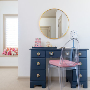
This quaint home, located in Plano’s prestigious Willow Bend Polo Club, underwent some super fun updates during our renovation and refurnishing project! The clients’ love for bright colors, mid-century modern elements, and bold looks led us to designing a black and white bathroom with black paned glass, colorful hues in the game room and bedrooms, and a sleek new “work from home” space for working in style. The clients love using their new spaces and have decided to let us continue designing these looks throughout additional areas in the home!

 Cantoni Irvine
Designed By: Richard Bustos Photos By: Jeri Koegel
Ron and Kathy Chaisson have lived in many homes throughout Orange County, including three homes on the Balboa Peninsula and one at Pelican Crest. But when the “kind of retired” couple, as they describe their current status, decided to finally build their ultimate dream house in the flower streets of Corona del Mar, they opted not to skimp on the amenities. “We wanted this house to have the features of a resort,” says Ron. “So we designed it to have a pool on the roof, five patios, a spa, a gym, water walls in the courtyard, fire-pits and steam showers.”
To bring that five-star level of luxury to their newly constructed home, the couple enlisted Orange County’s top talent, including our very own rock star design consultant Richard Bustos, who worked alongside interior designer Trish Steel and Patterson Custom Homes as well as Brandon Architects. Together the team created a 4,500 square-foot, five-bedroom, seven-and-a-half-bathroom contemporary house where R&R get top billing in almost every room. Two stories tall and with lots of open spaces, it manages to feel spacious despite its narrow location. And from its third floor patio, it boasts panoramic ocean views.
“Overall we wanted this to be contemporary, but we also wanted it to feel warm,” says Ron. Key to creating that look was Richard, who selected the primary pieces from our extensive portfolio of top-quality furnishings. Richard also focused on clean lines and neutral colors to achieve the couple’s modern aesthetic, while allowing both the home’s gorgeous views and Kathy’s art to take center stage.
As for that mahogany-lined elevator? “It’s a requirement,” states Ron. “With three levels, and lots of entertaining, we need that elevator for keeping the bar stocked up at the cabana, and for our big barbecue parties.” He adds, “my wife wears high heels a lot of the time, so riding the elevator instead of taking the stairs makes life that much better for her.”
 Creative Spaces Interior Design, Inc.
We were hired to select all new fabric, space planning, lighting, and paint colors in this three-story home. Our client decided to do a remodel and to install an elevator to be able to reach all three levels in their forever home located in Redondo Beach, CA.
We selected close to 200 yards of fabric to tell a story and installed all new window coverings, and reupholstered all the existing furniture. We mixed colors and textures to create our traditional Asian theme.
We installed all new LED lighting on the first and second floor with either tracks or sconces. We installed two chandeliers, one in the first room you see as you enter the home and the statement fixture in the dining room reminds me of a cherry blossom.
We did a lot of spaces planning and created a hidden office in the family room housed behind bypass barn doors. We created a seating area in the bedroom and a conversation area in the downstairs.
I loved working with our client. She knew what she wanted and was very easy to work with. We both expanded each other's horizons.
Tom Queally Photography
 Breathe Design Studio
Our Austin studio decided to go bold with this project by ensuring that each space had a unique identity in the Mid-Century Modern style bathroom, butler's pantry, and mudroom. We covered the bathroom walls and flooring with stylish beige and yellow tile that was cleverly installed to look like two different patterns. The mint cabinet and pink vanity reflect the mid-century color palette. The stylish knobs and fittings add an extra splash of fun to the bathroom.
The butler's pantry is located right behind the kitchen and serves multiple functions like storage, a study area, and a bar. We went with a moody blue color for the cabinets and included a raw wood open shelf to give depth and warmth to the space. We went with some gorgeous artistic tiles that create a bold, intriguing look in the space.
In the mudroom, we used siding materials to create a shiplap effect to create warmth and texture – a homage to the classic Mid-Century Modern design. We used the same blue from the butler's pantry to create a cohesive effect. The large mint cabinets add a lighter touch to the space.
 Breathe Design Studio
Our Austin studio decided to go bold with this project by ensuring that each space had a unique identity in the Mid-Century Modern style bathroom, butler's pantry, and mudroom. We covered the bathroom walls and flooring with stylish beige and yellow tile that was cleverly installed to look like two different patterns. The mint cabinet and pink vanity reflect the mid-century color palette. The stylish knobs and fittings add an extra splash of fun to the bathroom.
The butler's pantry is located right behind the kitchen and serves multiple functions like storage, a study area, and a bar. We went with a moody blue color for the cabinets and included a raw wood open shelf to give depth and warmth to the space. We went with some gorgeous artistic tiles that create a bold, intriguing look in the space.
In the mudroom, we used siding materials to create a shiplap effect to create warmth and texture – a homage to the classic Mid-Century Modern design. We used the same blue from the butler's pantry to create a cohesive effect. The large mint cabinets add a lighter touch to the space.
Sponsored
Columbus, OH
Free consultation for landscape design!

Peabody Landscape Group
Columbus' Reliable Landscape Design & Contracting
 Aleto Construction Group
After building a home in North Carolina and using their smaller St. Louis Home when they were in town our clients decided to move to St. Louis permanently and contacted us to completely gut their existing non-functional kitchen into something that works for their storage and cooking needs. Functionality was top of mind as both homeowners are exquisite chefs. They needed room to store all their cooking essentials in easy to access locations, they wanted to open the kitchen up by removing a peninsula that shrunk the room and left space for only one cook at a time. They also wanted to brighten and lighten the finishes. The kitchen felt heavy with black countertops, dark floors and lighting that was subpar. We completely gutted the kitchen by moving the location of the sink and dishwasher from the peninsula, putting cabinetry along the two main walls in the kitchen. Cabinets were replaced with thoughtfully planned out drawers for easy access and convenient pantry cabinets with pull out shelves. The cabinets were taken to the ceiling to take advantage of extra space for storage as well as making the room feel taller. White countertops and well-placed lighting throughout the kitchen and under the cabinets brighten the room while the green handmade tiles bring dimension and interest that compliment the earth tones of the cabinetry.
 TKS Design Group
Download our free ebook, Creating the Ideal Kitchen. DOWNLOAD NOW
This homeowner’s daughter originally contacted us on behalf of her parents who were reluctant to begin the remodeling process in their home due to the inconvenience and dust. Once we met and they dipped their toes into the process, we were off to the races. The existing bathroom in this beautiful historical 1920’s home, had not been updated since the 70’/80’s as evidenced by the blue carpeting, mirrored walls and dropped ceilings. In addition, there was very little storage, and some health setbacks had made the bathroom difficult to maneuver with its tub shower.
Once we demoed, we discovered everything we expected to find in a home that had not been updated for many years. We got to work bringing all the electrical and plumbing up to code, and it was just as dusty and dirty as the homeowner’s anticipated! Once the space was demoed, we got to work building our new plan. We eliminated the existing tub and created a large walk-in curb-less shower.
An existing closet was eliminated and in its place, we planned a custom built in with spots for linens, jewelry and general storage. Because of the small space, we had to be very creative with the shower footprint, so we clipped one of the walls for more clearance behind the sink. The bathroom features a beautiful custom mosaic floor tile as well as tiled walls throughout the space. This required lots of coordination between the carpenter and tile setter to make sure that the framing and tile design were all properly aligned. We worked around an existing radiator and a unique original leaded window that was architecturally significant to the façade of the home. We had a lot of extra depth behind the original toilet location, so we built the wall out a bit, moved the toilet forward and then created some extra storage space behind the commode. We settled on mirrored mullioned doors to bounce lots of light around the smaller space.
We also went back and forth on deciding between a single and double vanity, and in the end decided the single vanity allowed for more counter space, more storage below and for the design to breath a bit in the smaller space. I’m so happy with this decision! To build on the luxurious feel of the space, we added a heated towel bar and heated flooring.
One of the concerns the homeowners had was having a comfortable floor to walk on. They realized that carpet was not a very practical solution but liked the comfort it had provided. Heated floors are the perfect solution. The room is decidedly traditional from its intricate mosaic marble floor to the calacutta marble clad walls. Elegant gold chandelier style fixtures, marble countertops and Morris & Co. beaded wallpaper provide an opulent feel to the space.
The gray monochromatic pallet keeps it feeling fresh and up-to-date. The beautiful leaded glass window is an important architectural feature at the front of the house. In the summertime, the homeowners love having the window open for fresh air and ventilation. We love it too!
The curb-less shower features a small fold down bench that can be used if needed and folded up when not. The shower also features a custom niche for storing shampoo and other hair products. The linear drain is built into the tilework and is barely visible. A frameless glass door that swings both in and out completes the luxurious feel.
Designed by: Susan Klimala, CKD, CBD
Photography by: Michael Kaskel
For more information on kitchen and bath design ideas go to: www.kitchenstudio-ge.com

 Touie, Inc.
Located in the desirable San Francisco Bay, CA this room is full of family memories. It blends European, Asian and African elements creating a rich and culturally diverse look.
The client has lived in Spain for many years and wanted the room to be casual, comfortable with pops of color. They have traveled extensively throughout the world and collected a few furniture pieces, rug and home accessories that were required to be incorporated into the space.
We decided to bring the most memorable elements and enhance the color scheme with bold, bright and soft hues of reds, yellows and grays. In the end, the room became a true reflection of the owners’ eclectic taste, personality and life history.
The atmosphere is rustic, yet coexists harmoniously with some modern elements. An invitation to enjoy and relax just like when they were living in Spain.
Photo by David Duncan Livingston
 Studio Saxe
Overview:
Wing-like roofline houses a dramatic white villa in Costa Rica jungle.
Studio Saxe was commissioned to design a villa on the hilltops of Santiago in Santa Teresa, Costa Rica. The primary objective was not only to provide dwellers with a connection with its jungle surroundings but also to generate an intimate relationship with an amazing view of the shoreline which brings its dwellers back to a more profound appreciation of the natural world.
Concept
Studio Saxe decided to create a large roof that would house within a series of bedrooms and living spaces that would all be turned sideways in order to face the prominent views. Interstitial spaces within the living volumes create gaps that enhance a deeper connection to the natural surroundings whilst moving about the dwelling.
Design
Every space in the home has been angled to view the ocean, and this twist creates a geometric relationship between the roofline and the spaces that became the primary element of design that both addresses the need for large overhangs (for climate control and comfort) but also generates a literal connection between the view and every space.
This white house in the jungle acts as a canvas so that morning and sunset light reflect on its surfaces creating an array of colors that vary throughout the day. The angled surfaces also allow for the reflection of shadows and the textures of nature to play within the interstitial spaces that exist between the living spaces.
Construction
Due to the remoteness of the location and difficult access, Studio Saxe decided to create a light steel frame that could be prefabricated off-site, brought, and assembled in a fast and effective way. This not only ensured the quality of the construction in a very remote location, but it also allowed the process of construction to be very light touch and the intervention on the site to be very minimal while creating the sensation of large open spaces that bring the view in and at the same time are protected by a large roof held by steel “I” beams.
Sustainability
At Studio Saxe we believe that proper design with nature should be the first focus of sustainability and thus, this villa has been oriented properly to take advantage of predominant winds for cooling. Also, long overhangs protect from the sun and the rain in the most critical parts of the day creating comfort without the use of energy. A light touch construction method meant that the impact on the site was minimal during the implementation of the villa and the extended roofline also serves as a means to collect water and energy generation.
Sponsored
Columbus, OH
Free consultation for landscape design!
Peabody Landscape Group
Columbus' Reliable Landscape Design & Contracting
 Studio Saxe
Overview:
Wing-like roofline houses a dramatic white villa in Costa Rica jungle.
Studio Saxe was commissioned to design a villa on the hilltops of Santiago in Santa Teresa, Costa Rica. The primary objective was not only to provide dwellers with a connection with its jungle surroundings but also to generate an intimate relationship with an amazing view of the shoreline which brings its dwellers back to a more profound appreciation of the natural world.
Concept
Studio Saxe decided to create a large roof that would house within a series of bedrooms and living spaces that would all be turned sideways in order to face the prominent views. Interstitial spaces within the living volumes create gaps that enhance a deeper connection to the natural surroundings whilst moving about the dwelling.
Design
Every space in the home has been angled to view the ocean, and this twist creates a geometric relationship between the roofline and the spaces that became the primary element of design that both addresses the need for large overhangs (for climate control and comfort) but also generates a literal connection between the view and every space.
This white house in the jungle acts as a canvas so that morning and sunset light reflect on its surfaces creating an array of colors that vary throughout the day. The angled surfaces also allow for the reflection of shadows and the textures of nature to play within the interstitial spaces that exist between the living spaces.
Construction
Due to the remoteness of the location and difficult access, Studio Saxe decided to create a light steel frame that could be prefabricated off-site, brought, and assembled in a fast and effective way. This not only ensured the quality of the construction in a very remote location, but it also allowed the process of construction to be very light touch and the intervention on the site to be very minimal while creating the sensation of large open spaces that bring the view in and at the same time are protected by a large roof held by steel “I” beams.
Sustainability
At Studio Saxe we believe that proper design with nature should be the first focus of sustainability and thus, this villa has been oriented properly to take advantage of predominant winds for cooling. Also, long overhangs protect from the sun and the rain in the most critical parts of the day creating comfort without the use of energy. A light touch construction method meant that the impact on the site was minimal during the implementation of the villa and the extended roofline also serves as a means to collect water and energy generation.


 McCall Design & Planning
The clients for this project wanted a clean lined form, an open floor plan and nothing non-essential to daily life. They also required their home be under 2,500 square feet for their family of four. Exterior materials consist of untreated cedar siding and galvanized corrugated metal. The heavy gauge “horse fence” guard rails allow an unobstructed view to the adjacent pond. This project was our first installed green roof, and after much research we decided upon a modular system. Other sustainable components include day-lighting, super-insulation, on demand water heaters, plans for a water collection cistern, radiant floor heat, gabion retaining walls filled with local rock, FSC certified flooring, reclaimed structural members, and infrastructure for an active solar collection system. The owners have since installed a remotely located photovoltaic array.
60