
Search results for "Deciding locations" in Home Design Ideas
 TKS Design Group
Download our free ebook, Creating the Ideal Kitchen. DOWNLOAD NOW
Lakefront property in the northwest suburbs of Chicago is hard to come by, so when we were hired by this young family with exactly that, we were immediately inspired by not just the unusually large footprint of this 1950’s colonial revival but also the lovely views of the manmade lake it was sited on. The large 5-bedroom home was solidly stuck in the 1980’s, but we saw tons of potential. We started out by updating the existing staircase with a fresh coat of paint and adding new herringbone slate to the entry hall.
The powder room off the entryway also got a refresh - new flooring, new cabinets and fixtures. We ran the new slate right through into this space for some consistency. A fun wallpaper and shiplap trim add a welcoming feel and set the tone for the home.
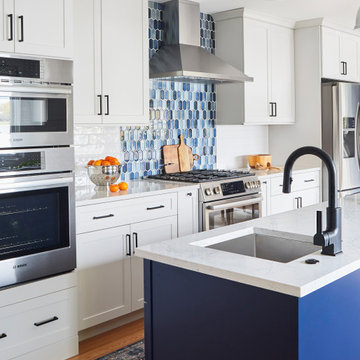
Next, we tackled the kitchen. Located away from the rest of the first floor, the kitchen felt a little isolated, so we immediately began planning for how to better connect it to the rest of the first floor. We landed on removing the wall between the kitchen and dining room and designed a modified galley style space with separate cooking and clean up zones. The cooking zone consists of the refrigerator, prep sink and cooktop, along with a nice long run of prep space at the island. The cleanup side of the kitchen consists of the main sink and dishwasher. Both areas are situated so that the user can view the lake during prep work and cleanup!
One of the home’s main puzzles was how to incorporate the mudroom and area in front of the patio doors at the back of the house. We already had a breakfast table area, so the space by the patio doors was a bit of a no man’s land. We decided to separate the kitchen proper from what became the new mudroom with a large set of barn doors. That way you can quickly hide any mudroom messes but have easy access to the light coming in through the patio doors as well as the outdoor grilling station. We also love the impact the barn doors add to the overall space.
The homeowners’ first words to us were “it’s time to ditch the brown,” so we did! We chose a lovely blue pallet that reflects the home’s location on the lake which is also vibrant yet easy on the eye. Countertops are white quartz, and the natural oak floor works well with the other honey accents. The breakfast table was given a refresh with new chairs, chandelier and window treatments that frame the gorgeous views of the lake out the back.
We coordinated the slate mudroom flooring with that used in the home’s main entrance for a consistent feel. The storage area consists of open and closed storage to allow for some clutter control as needed.
Next on our “to do” list was revamping the dated brown bar area in the neighboring dining room. We eliminated the clutter by adding some closed cabinets and did some easy updates to help the space feel more current. One snag we ran into here was the discovery of a beam above the existing open shelving that had to be modified with a smaller structural beam to allow for our new design to work. This was an unexpected surprise, but in the end we think it was well worth it!
We kept the colors here a bit more muted to blend with the homeowner’s existing furnishings. Open shelving and polished nickel hardware add some simple detail to the new entertainment zone which also looks out onto the lake!
Next we tackled the upstairs starting with the homeowner’s son’s bath. The bath originally had both a tub shower and a separate shower, so we decided to swap out the shower for a new laundry area. This freed up some space downstairs in what used to be the mudroom/laundry room and is much more convenient for daily laundry needs.
We continued the blue palette here with navy cabinetry and the navy tile in the shower. Porcelain floor tile and chrome fixtures keep maintenance to a minimum while matte black mirrors and lighting add some depth the design. A low maintenance runner adds some warmth underfoot and ties the whole space together.
We added a pocket door to the bathroom to minimize interference with the door swings. The left door of the laundry closet is on a 180 degree hinge to allow for easy full access to the machines. Next we tackled the master bath which is an en suite arrangement. The original was typical of the 1980’s with the vanity outside of the bathroom, situated near the master closet. And the brown theme continued here with multiple shades of brown.
Our first move was to segment off the bath and the closet from the master bedroom. We created a short hall from the bedroom to the bathroom with his and hers walk-in closets on the left and right as well as a separate toilet closet outside of the main bathroom for privacy and flexibility.
The original bathroom had a giant soaking tub with steps (dangerous!) as well as a small shower that did not work well for our homeowner who is 6’3”. With other bathtubs in the home, they decided to eliminate the tub and create an oversized shower which takes up the space where the old tub was located. The double vanity is on the opposite wall and a bench is located under the window for morning conversations and a place to set a couple of towels.
The pallet in here is light and airy with a mix of blond wood, creamy porcelain and marble tile, and brass accents. A simple roman shade adds some texture and it’s top-down mechanism allows for light and privacy.
This large whole house remodel gave our homeowners not only the ability to maximize the potential of their home but also created a lovely new frame from which to view their fabulous lake views.
Designed by: Susan Klimala, CKD, CBD
Photography by: Michael Kaskel
For more information on kitchen and bath design ideas go to: www.kitchenstudio-ge.com

 Just the Thing
We opened the wall between the former living room and family room to create a large entertaining area. Because the home's architecture made it impossible to recess new support beams, we were faced with dealing with bulkheads and posts. We decided to turn these into a feature and created a grid of angled archways to set the spaces apart from each other. The front hall closet was removed (left side of pic) and an opening cut into its back wall to allow natural light into the foyer. A built-in bench sits handily near the front door, with pullout storage beneath.
The former living room now serves as a large dining area for a 12-foot long custom table. The live edges of the wood slabs were located at the centre of the table, creating a stream-like opening covered in glass.
 O'Brien Harris LLC
This project is new construction located in Hinsdale, Illinois. The scope included the kitchen, butler’s pantry, and mudroom. The clients are on the verge of being empty nesters and so they decided to right size. They came from a far more traditional home, and they were open to things outside of their comfort zone. O’Brien Harris Cabinetry in Chicago (OBH) collaborated on the project with the design team but especially with the builder from J. Jordan Homes. The architecture of this home is interesting and defined by large floor to ceiling windows. This created a challenge in the kitchen finding wall space for large appliances.
“In essence we only had one wall and so we chose to orient the cooking on that wall. That single wall is defined on the left by a window and on the right by the mudroom. That left us with another challenge – where to place the ovens and refrigerator. We then created a vertically clad wall disguising appliances which floats in between the kitchen and dining room”, says Laura O’Brien.
The room is defined by interior transom windows and a peninsula was created between the kitchen and the casual dining for separation but also for added storage. To keep it light and open a transparent brass and glass shelving was designed for dishes and glassware located above the peninsula.
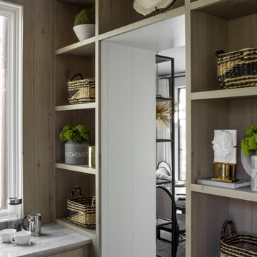
The butler’s pantry is located behind the kitchen and between the dining room and a lg exterior window to front of the home. Its main function is to house additional appliances. The wall at the butler’s pantry portal was thickened to accommodate additional shelving for open storage. obrienharris.com
Find the right local pro for your project

 Bennett Design Co.
For this kitchen remodel, the clients opted to maintain the location and footprint of the original kitchen in their 1960’s ranch style home. That meant we had our work cut out for us to maximize the counter space while providing enough storage for this growing family. We ultimately decided to maximize the working counter space by the sink and range and added a large pantry wall in the adjacent dining room for bulky items and food storage. We chose a lightly stained slab style cabinet to capture the era of the home but paired it with white high-gloss upper cabinets and white quartz to make the space also look fresh and functional. A light green paint helps pull in the accent color featured in the backsplash while adding warmth to the home. We finished the space with a unique light fixture and a perfectly modern dining table.
Photos By: Michael Kaskel Photography

 Melissa Hill Home Design
This beautiful home located near a central Connecticut wine vineyard was purchased by a growing family as their dream home. They decided to make their informal entry into their home a priority. We truly are believers in combining function with elegance. This mudroom opens up to their kitchen so why not create some amazing storage that looks great too! This space speaks to their transitional style with a touch of tradition. From mixing the metal finishes to the herringbone floor pattern we were able to create a timeless, functional first impression to a beautiful home. Every family can benefit from having a space called “Home Central” from pre-school on…come in and take your shoes off.
Custom designed by Hartley and Hill Design. All materials and furnishings in this space are available through Hartley and Hill Design. www.hartleyandhilldesign.com 888-639-0639

 ODS Architecture
Atherton has many large substantial homes - our clients purchased an existing home on a one acre flag-shaped lot and asked us to design a new dream home for them. The result is a new 7,000 square foot four-building complex consisting of the main house, six-car garage with two car lifts, pool house with a full one bedroom residence inside, and a separate home office /work out gym studio building. A fifty-foot swimming pool was also created with fully landscaped yards.
Given the rectangular shape of the lot, it was decided to angle the house to incoming visitors slightly so as to more dramatically present itself. The house became a classic u-shaped home but Feng Shui design principals were employed directing the placement of the pool house to better contain the energy flow on the site. The main house entry door is then aligned with a special Japanese red maple at the end of a long visual axis at the rear of the site. These angles and alignments set up everything else about the house design and layout, and views from various rooms allow you to see into virtually every space tracking movements of others in the home.
The residence is simply divided into two wings of public use, kitchen and family room, and the other wing of bedrooms, connected by the living and dining great room. Function drove the exterior form of windows and solid walls with a line of clerestory windows which bring light into the middle of the large home. Extensive sun shadow studies with 3D tree modeling led to the unorthodox placement of the pool to the north of the home, but tree shadow tracking showed this to be the sunniest area during the entire year.
Sustainable measures included a full 7.1kW solar photovoltaic array technically making the house off the grid, and arranged so that no panels are visible from the property. A large 16,000 gallon rainwater catchment system consisting of tanks buried below grade was installed. The home is California GreenPoint rated and also features sealed roof soffits and a sealed crawlspace without the usual venting. A whole house computer automation system with server room was installed as well. Heating and cooling utilize hot water radiant heated concrete and wood floors supplemented by heat pump generated heating and cooling.
A compound of buildings created to form balanced relationships between each other, this home is about circulation, light and a balance of form and function. Built by Exact Builders, landscape design by Shades Of Green, photos by John Sutton Photography & Philip Liang Photography.
 Aleto Construction Group
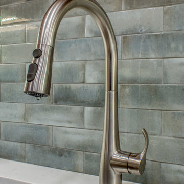
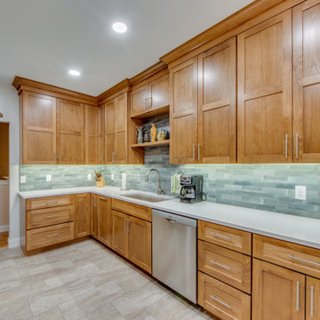
After building a home in North Carolina and using their smaller St. Louis Home when they were in town our clients decided to move to St. Louis permanently and contacted us to completely gut their existing non-functional kitchen into something that works for their storage and cooking needs. Functionality was top of mind as both homeowners are exquisite chefs. They needed room to store all their cooking essentials in easy to access locations, they wanted to open the kitchen up by removing a peninsula that shrunk the room and left space for only one cook at a time. They also wanted to brighten and lighten the finishes. The kitchen felt heavy with black countertops, dark floors and lighting that was subpar. We completely gutted the kitchen by moving the location of the sink and dishwasher from the peninsula, putting cabinetry along the two main walls in the kitchen. Cabinets were replaced with thoughtfully planned out drawers for easy access and convenient pantry cabinets with pull out shelves. The cabinets were taken to the ceiling to take advantage of extra space for storage as well as making the room feel taller. White countertops and well-placed lighting throughout the kitchen and under the cabinets brighten the room while the green handmade tiles bring dimension and interest that compliment the earth tones of the cabinetry.
Sponsored
Columbus, OH

Structural Remodeling
Franklin County's Heavy Timber Specialists | Best of Houzz 2020!


 Drewett Works
The genesis of design for this desert retreat was the informal dining area in which the clients, along with family and friends, would gather.
Located in north Scottsdale’s prestigious Silverleaf, this ranch hacienda offers 6,500 square feet of gracious hospitality for family and friends. Focused around the informal dining area, the home’s living spaces, both indoor and outdoor, offer warmth of materials and proximity for expansion of the casual dining space that the owners envisioned for hosting gatherings to include their two grown children, parents, and many friends.
The kitchen, adjacent to the informal dining, serves as the functioning heart of the home and is open to the great room, informal dining room, and office, and is mere steps away from the outdoor patio lounge and poolside guest casita. Additionally, the main house master suite enjoys spectacular vistas of the adjacent McDowell mountains and distant Phoenix city lights.
The clients, who desired ample guest quarters for their visiting adult children, decided on a detached guest casita featuring two bedroom suites, a living area, and a small kitchen. The guest casita’s spectacular bedroom mountain views are surpassed only by the living area views of distant mountains seen beyond the spectacular pool and outdoor living spaces.
Project Details | Desert Retreat, Silverleaf – Scottsdale, AZ
Architect: C.P. Drewett, AIA, NCARB; Drewett Works, Scottsdale, AZ
Builder: Sonora West Development, Scottsdale, AZ
Photographer: Dino Tonn
Featured in Phoenix Home and Garden, May 2015, “Sporting Style: Golf Enthusiast Christie Austin Earns Top Scores on the Home Front”
See more of this project here: http://drewettworks.com/desert-retreat-at-silverleaf/
 TKS Design Group
Our clients had been in their home since the early 1980’s and decided it was time for some updates. We took on the kitchen, two bathrooms and a powder room.
We started first on the hall bath which was basically just in need of a face lift. The floor is porcelain tile made to look like carrera marble. The vanity is white Shaker doors fitted with a white quartz top. We re-glazed the cast iron tub.
Designed by: Susan Klimala, CKD, CBD
Photography by: Michael Alan Kaskel
For more information on kitchen and bath design ideas go to: www.kitchenstudio-ge.com

 Ehrlich Yanai Rhee Chaney Architects
The site is a deep, narrow, one-acre hillside property in Beverly Hills. (Photography by EYRC Architects)
Inspiration for a modern white two-story flat roof remodel in Los Angeles
Inspiration for a modern white two-story flat roof remodel in Los Angeles
 Aleto Construction Group
After building a home in North Carolina and using their smaller St. Louis Home when they were in town our clients decided to move to St. Louis permanently and contacted us to completely gut their existing non-functional kitchen into something that works for their storage and cooking needs. Functionality was top of mind as both homeowners are exquisite chefs. They needed room to store all their cooking essentials in easy to access locations, they wanted to open the kitchen up by removing a peninsula that shrunk the room and left space for only one cook at a time. They also wanted to brighten and lighten the finishes. The kitchen felt heavy with black countertops, dark floors and lighting that was subpar. We completely gutted the kitchen by moving the location of the sink and dishwasher from the peninsula, putting cabinetry along the two main walls in the kitchen. Cabinets were replaced with thoughtfully planned out drawers for easy access and convenient pantry cabinets with pull out shelves. The cabinets were taken to the ceiling to take advantage of extra space for storage as well as making the room feel taller. White countertops and well-placed lighting throughout the kitchen and under the cabinets brighten the room while the green handmade tiles bring dimension and interest that compliment the earth tones of the cabinetry.

 FA Design Build
To stay or to go? This is the question our clients are still pondering. Yet, as their youngest child heads off to college, they are ready to enjoy their new kitchen or feature it in a real estate listing. Since they were unsure of their plans, we decided a pull and replace renovation was the logical — and most economical—choice. While all appliances remain in their same locations, we were able to make easy adjustments with cabinetry to update the space: convert a desk to a beverage center; increase the size of the island; install an island countertop with overhang for seating; and lengthen the perimeter cabinetry and add a tip-up, on-counter cabinet to house small appliances. The color palette was based on introducing warm grays to the space while ensuring the existing Brazilian cherry floor remained compatible with the new design. A combination of light gray and dark gray painted cabinetry (Medallion, Irish Crème and Frappe) updates the space, along with bronze finishes. A unique hex-patterned white tile backsplash with contrasting gray grout on the perimeter adds interest yet keeps the focus on the island. We installed the understated Cambria Whitehall on the perimeter with the vivid Cambria Skara Brae on the island. We worked closely with the stone fabricator to ensure the Skara Brae’s veining pattern matched the client’s vision. Above the island countertop, we installed two oversized pendants to add intensity and beauty as you enter the room.
Sponsored
Columbus, OH
Free consultation for landscape design!

Peabody Landscape Group
Columbus' Reliable Landscape Design & Contracting
 O'Brien Harris LLC
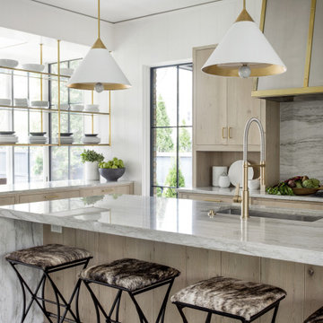
This project is new construction located in Hinsdale, Illinois. The scope included the kitchen, butler’s pantry, and mudroom. The clients are on the verge of being empty nesters and so they decided to right size. They came from a far more traditional home, and they were open to things outside of their comfort zone. O’Brien Harris Cabinetry in Chicago (OBH) collaborated on the project with the design team but especially with the builder from J. Jordan Homes. The architecture of this home is interesting and defined by large floor to ceiling windows. This created a challenge in the kitchen finding wall space for large appliances.
“In essence we only had one wall and so we chose to orient the cooking on that wall. That single wall is defined on the left by a window and on the right by the mudroom. That left us with another challenge – where to place the ovens and refrigerator. We then created a vertically clad wall disguising appliances which floats in between the kitchen and dining room”, says Laura O’Brien.
The room is defined by interior transom windows and a peninsula was created between the kitchen and the casual dining for separation but also for added storage. To keep it light and open a transparent brass and glass shelving was designed for dishes and glassware located above the peninsula.
The butler’s pantry is located behind the kitchen and between the dining room and a lg exterior window to front of the home. Its main function is to house additional appliances. The wall at the butler’s pantry portal was thickened to accommodate additional shelving for open storage. obrienharris.com

 Studio Saxe
Overview:
Wing-like roofline houses a dramatic white villa in Costa Rica jungle.
Studio Saxe was commissioned to design a villa on the hilltops of Santiago in Santa Teresa, Costa Rica. The primary objective was not only to provide dwellers with a connection with its jungle surroundings but also to generate an intimate relationship with an amazing view of the shoreline which brings its dwellers back to a more profound appreciation of the natural world.
Concept
Studio Saxe decided to create a large roof that would house within a series of bedrooms and living spaces that would all be turned sideways in order to face the prominent views. Interstitial spaces within the living volumes create gaps that enhance a deeper connection to the natural surroundings whilst moving about the dwelling.
Design
Every space in the home has been angled to view the ocean, and this twist creates a geometric relationship between the roofline and the spaces that became the primary element of design that both addresses the need for large overhangs (for climate control and comfort) but also generates a literal connection between the view and every space.
This white house in the jungle acts as a canvas so that morning and sunset light reflect on its surfaces creating an array of colors that vary throughout the day. The angled surfaces also allow for the reflection of shadows and the textures of nature to play within the interstitial spaces that exist between the living spaces.
Construction
Due to the remoteness of the location and difficult access, Studio Saxe decided to create a light steel frame that could be prefabricated off-site, brought, and assembled in a fast and effective way. This not only ensured the quality of the construction in a very remote location, but it also allowed the process of construction to be very light touch and the intervention on the site to be very minimal while creating the sensation of large open spaces that bring the view in and at the same time are protected by a large roof held by steel “I” beams.
Sustainability
At Studio Saxe we believe that proper design with nature should be the first focus of sustainability and thus, this villa has been oriented properly to take advantage of predominant winds for cooling. Also, long overhangs protect from the sun and the rain in the most critical parts of the day creating comfort without the use of energy. A light touch construction method meant that the impact on the site was minimal during the implementation of the villa and the extended roofline also serves as a means to collect water and energy generation.
 Studio Saxe
Overview:
Wing-like roofline houses a dramatic white villa in Costa Rica jungle.
Studio Saxe was commissioned to design a villa on the hilltops of Santiago in Santa Teresa, Costa Rica. The primary objective was not only to provide dwellers with a connection with its jungle surroundings but also to generate an intimate relationship with an amazing view of the shoreline which brings its dwellers back to a more profound appreciation of the natural world.
Concept
Studio Saxe decided to create a large roof that would house within a series of bedrooms and living spaces that would all be turned sideways in order to face the prominent views. Interstitial spaces within the living volumes create gaps that enhance a deeper connection to the natural surroundings whilst moving about the dwelling.
Design
Every space in the home has been angled to view the ocean, and this twist creates a geometric relationship between the roofline and the spaces that became the primary element of design that both addresses the need for large overhangs (for climate control and comfort) but also generates a literal connection between the view and every space.
This white house in the jungle acts as a canvas so that morning and sunset light reflect on its surfaces creating an array of colors that vary throughout the day. The angled surfaces also allow for the reflection of shadows and the textures of nature to play within the interstitial spaces that exist between the living spaces.
Construction
Due to the remoteness of the location and difficult access, Studio Saxe decided to create a light steel frame that could be prefabricated off-site, brought, and assembled in a fast and effective way. This not only ensured the quality of the construction in a very remote location, but it also allowed the process of construction to be very light touch and the intervention on the site to be very minimal while creating the sensation of large open spaces that bring the view in and at the same time are protected by a large roof held by steel “I” beams.
Sustainability
At Studio Saxe we believe that proper design with nature should be the first focus of sustainability and thus, this villa has been oriented properly to take advantage of predominant winds for cooling. Also, long overhangs protect from the sun and the rain in the most critical parts of the day creating comfort without the use of energy. A light touch construction method meant that the impact on the site was minimal during the implementation of the villa and the extended roofline also serves as a means to collect water and energy generation.
 Breathe Design Studio: San Francisco
Our Austin studio decided to go bold with this project by ensuring that each space had a unique identity in the Mid-Century Modern style bathroom, butler's pantry, and mudroom. We covered the bathroom walls and flooring with stylish beige and yellow tile that was cleverly installed to look like two different patterns. The mint cabinet and pink vanity reflect the mid-century color palette. The stylish knobs and fittings add an extra splash of fun to the bathroom.
The butler's pantry is located right behind the kitchen and serves multiple functions like storage, a study area, and a bar. We went with a moody blue color for the cabinets and included a raw wood open shelf to give depth and warmth to the space. We went with some gorgeous artistic tiles that create a bold, intriguing look in the space.
In the mudroom, we used siding materials to create a shiplap effect to create warmth and texture – a homage to the classic Mid-Century Modern design. We used the same blue from the butler's pantry to create a cohesive effect. The large mint cabinets add a lighter touch to the space.
Sponsored
Columbus, OH
Free consultation for landscape design!
Peabody Landscape Group
Columbus' Reliable Landscape Design & Contracting

 Hyde Park Renovations
The premise for this remodel was to update their cramped white kitchen with an open concept. With the laminate peeling off of the doors and the kitchen lacking functionality, it was up to us to achieve a more flowing space. They decided on using Merillat cabinetry in cherry wood with a Paprika stain, finished on a Bayville door. This combination matched their already gorgeous entertainment center perfectly.
To achieve a more aesthetically pleasing space we removed half of the wall that was bordering the hallway. With that, we also had to remove the arch that was separating the hallway with the living room. This opened up the whole room and allowed us to give the homeowners a large peninsula low bar with plenty of overhang to seat 7 guests comfortably. We removed the standard drywall pantry and installed a 8' tall pantry that matched the cabinetry. In the hallway we opted for a classic wine bar set up with an X wine cube above and a wine refrigerator below. Stacked cabinets throughout give the entire area a grandiose feel while also adding much needed storage. Other subtleties included changing the refrigerator and sink locations to attain a kitchen that made sense to the homeowners.

 Associate Interiors
When a 20-year-old built-in refrigerator became irreparable, the clients decided to take the leap to a full remodel. Their requests included: separate zones for cooking and entertaining, staying consistent to the traditional style of the home, keeping true to their practical approach to living, and being environmentally responsible. The client’s desire to reuse their traditional furnishings makes this kitchen unique to their taste, reflecting their personal style. The request for zones led to re-configuring the existing footprint. Capturing space from a small pantry and an adjacent wet bar made room for the larger kitchen island with additional seating and a better flow for casual gatherings of family and friends. The seldom used built- in desk was replaced with a coffee bar and beverage center; now centrally located across from the island.
 Story LLC
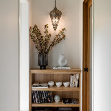
Our clients wanted to add on to their 1950's ranch house, but weren't sure whether to go up or out. We convinced them to go out, adding a Primary Suite addition with bathroom, walk-in closet, and spacious Bedroom with vaulted ceiling. To connect the addition with the main house, we provided plenty of light and a built-in bookshelf with detailed pendant at the end of the hall. The clients' style was decidedly peaceful, so we created a wet-room with green glass tile, a door to a small private garden, and a large fir slider door from the bedroom to a spacious deck. We also used Yakisugi siding on the exterior, adding depth and warmth to the addition. Our clients love using the tub while looking out on their private paradise!
59