
Search results for "Deciding simply" in Home Design Ideas
 Denca Distributors
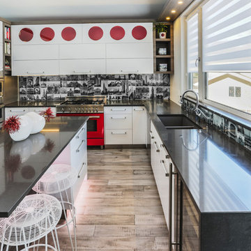
It is all about colour. When designer Anna Scurfield and her husband Sergei Scurfield decided to renovate their own home they started at the Denca Showroom. When they saw the Red Bertazzoni range, all the design details began to fall into place. Anna was already inspired to do a grey palette for her home. However, grey is so tricky when done wrong it can be clinical or boring.
The powerful pro range was what she was looking for in performance and red gave the drama and excitement needed to balance the quiet shades in grey. We picked up that red by simply having the large lift cabinets above have a matching Red finished interior. With the circular peek a boo windows it was just enough to accentuate the red without throwing it everywhere.
The backsplash is made from travel photos in black and white. The urban scenes were laminated onto a tempered clear glass, for fire protection. The detail of the images again concentrates attention to the range wall as all other shapes in the room are pure geometry.
The dark waterfall countertops wrap the cabinets just like the dark floor to ceiling gables frame the tall pantry units. The simplest of shapes – with one giant punch of colour balances and warms the design.
The kitchen is a showstopper. The bravery to be bold was inspired from the beautiful lines and design of the Italian range.
 Castle Building & Remodeling
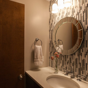
This 1968 Fridley home was overall in good condition. After 10 years, the family of 5 was simply ready to make some updates to suit their needs and style. On the main floor, previous remodels had left the homeowners with layers of mismatch flooring. From carpet to parquet, tile to engineered wood, this house had it all. The family decided to unify the front entry, ½ bath, kitchen, dinette, and family room with a new modern tile. Removing a large closet between the dinette and family room also helped modify the space to make it seamless. A large new 8’ glass patio door and new fireplace with surrounding shelving became focal pieces of the new space. A ½ bath refresh rounded out the main floor improvements. In the basement, a family room, bedroom, and ¾ bathroom were added so the family had more space to spread out.
 Windows Dressed Up
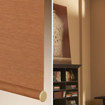
Home office ideas - Roller Shades and Screen Shades. Hunter Douglas Designer Roller Shades have hundreds of fabric choices, patterns and colors and are good ideas used for home office, bedrooms, living rooms, bathrooms where blackout or privacy is needed. Designer Screen Shades / Solar Shades are excellent for UV protection while maintaining a view to the outdoors. Sturdy and easy to clean, perfect solar roller blind for large windows, patio or sunroom. Alustra Screen Shades and Alustra Roller Shades have luxury fabric selections with unique features. What is the difference between a roller shade and a screen / solar shade? Simply a roller shade or roller blind will be defined by its OPACITY. Opacity generally ranges from 1 to 5, with 5 being a complete blackout shade or blind and one letting in some light. A patterned roller shade with a 1 opacity will most likely have the pattern visible to the outside. A screen shade is defined by its OPENNESS FACTOR of anywhere from 1% to 15%. An Openness factor of 7% means that the roller shade fabric will block 93% of the UV rays. Perfect for large windows, sunrooms and patios where you want to block the sun, but not the view. Motorized roller shades available. Electric or battery operated window shades option. Automatic blinds can be controlled from you smart phone or tablet.
If you are looking for window treatments to add value to your home before the sale, or to make your new home your own, Windows Dressed Up has blinds, shades, shutters, from Hunter Douglas, Graber & Lafayette. custom curtains, drapes, bedding & drapery hardware too. Over 3,000 designer fabrics. Window treatments vary from budget to indulgence.
Preparing a home for sale, or deciding on what window treatments are right for your new home, Windows Dressed Up in Denver can help. Stop by our showroom at 38th on Tennyson St. and talk to a Certified Interior Designer to get more home decorating ideas.
Hunter Douglas home office ideas roller blind shade photo.
Find the right local pro for your project
 Zapata Design, LLC
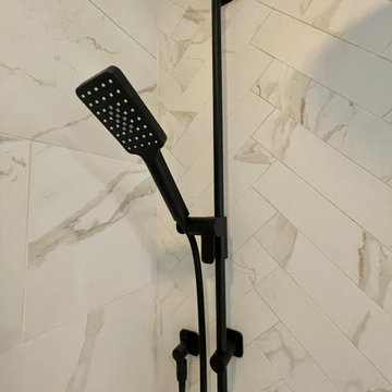
This Primary bathroom needed an update to be a forever space, with clean lines, and a timeless look. Now my clients can simply walk into the shower space, for easy access, easy maintenance, and plenty of room. An American Standard step in tub is opposite the shower, which was on their wish list. The outcome is a lovely, relaxing space that they will enjoy for years to come. We decided to mix brushed gold finishes with matte black fixtures. The geometric Herringbone and Hex porcelain tile selections add interest to the overall design.
 Artscape Garden Associates Ltd
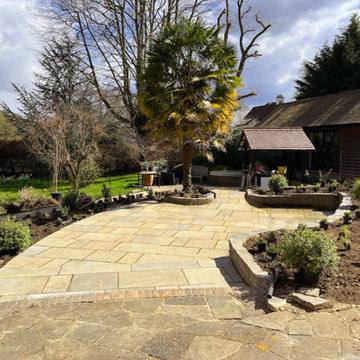
This paving and planting scheme features new hard landscaping elements and a new planting scheme. Artscape was initially briefed to extend and enhance the patio in the garden of a lovely home in the village of Cookham Dean in Berkshire. Our clients wanted to increase the size of the paved area so they could use it more frequently for relaxing and dining in the sun during the day. As well as increasing its size and practicality, they wanted the terrace to look and feel more inviting. The existing site was a mixture of brick paving, which was slippery underfoot, and tired concrete crazy paving. The patio also had stone retaining walls surrounded by sloped lawns and a few poorly maintained and mismatched shrubs.
Redesigned and repaved area
We first created a new, larger layout with a series of wider steps closer to the house, making a more inviting and welcoming area. Our landscapers paved the area with coursed sandstone, renowned for its incredible strength and durability. The earthy tones and unique texture of the sandstone gives it a natural timeless look which blends sympathetically with the garden setting. The worn finish of the paving also makes the surface safer to walk on. The edge of the paving curves in line from the end of the house to visually link the areas.
Bullnosed edges enhance looks and safety
Bullnosing provides the garden step edges with a smooth, luxury appearance, which also enhance safety. Safety is an important factor to consider when renovating or building new steps and paved areas. Smooth, rounded bullnosed steps or edges means there won’t be any harshly cut, sharp edges to injure someone should they trip or fall. Our Artscape paving experts can advise on the best bespoke, professionally profiled bullnose edges to suit the needs of your garden project.
Replacing sloped lawns with plants
Our initial brief was to create a new planted border just around the paved area. However, after various discussions and designs, our clients decided to follow our recommendation to expand the planting, so it included the whole sloping bank. The planting design also included the addition of small trees to create vertical interest.
New nature-friendly planting
The planting features an easy-to-maintain mix of perennials, grasses, and shrubs. This adds softness to the seating area and brings an everchanging display of flowers, foliage, textures and colours to the garden. The plants will attract more birds and butterflies to the garden, and will be beneficial for insects too.
The lawn was doing very little to support a diversity of insects and birds. Replacing even a small section of lawn with perennial flowers, shrubs, grasses, wildflowers, or groundcovers will benefit nature and wildlife. As well as supporting greater biodiversity, plants are more environmentally friendly than maintaining a lawn. Lawns are drought tolerant and will recover even if the grass has turned brown and patchy in a heatwave. But to keep the lawn looking lush, green, and beautiful in a hot, dry spell will require constant and wasteful watering.
The planting is informal and includes grasses, taking inspiration from the fields opposite. Ornamental grasses soften the scheme and bring movement to the garden as they shimmer in the slightest of breezes. Grasses are easy to grow and require little ongoing care. The main maintenance task is to cut the planting back in spring ready for the new growth to come through.
To keep the whole project within our client’s budget, we retained the existing walls, simply carrying out some small repairs and modifications where necessary. We were also able to add stunning new atmospheric lighting to the older existing lighting circuit to illuminate the area at night.
 RAJ Kitchen and Bath, LLC
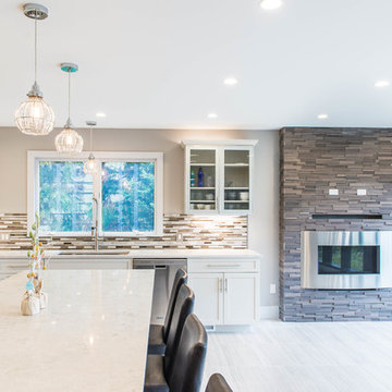
There were a few difficulties in making this kitchen any better than how it was. There was a separate staircase that had access to the second floor which was located in the kitchen. This left just enough room to push the dining room to one side. Then, there was the porch. A really nice panoramic view of the back, but was somehow under-used by the family during the summer months. Then, it was the size of the kitchen. It simply was way too small for a growing family, and while it had a peninsular in place, the flow just didn’t work. I remember watching them one day demonstrating how awkward it was using the kitchen. We got it! We had our marching orders to go and figure out how to make this kitchen work for this family.
Everything in the room was fair play. The design was done to make the kitchen very open. For a few ideas, we incorporated the porch in the kitchen by using the nana wall idea but it ended up being too cost prohibitive to do so. We then decided to do a permanent fix by using a commercial glass wall application. Once we figured that out, we moved back inside and removed the staircase. This gave us two added benefits. One allowed us to really reconfigure the kitchen and the other opened up the second floor for a huge built in closet system.
We relocated the windows, added a fire place with a built In TV above. From there, it was onto the kitchen itself which contained a huge Island with seating, large kitchen sink and built in appliances which was set up in a way to take advantage of the new layout. We re-positioned the kitchen facing the beautiful views outside rather than looking towards a wall. Now, when you enter the house up the entry stairs, the kitchen now draws you into the magnificent new open space. This is now setup for entertaining, relaxation, hanging out and most of all, preparing meals in a room where you only have to leave if you want to.
This one was all about the design. Design was what made this space. Setting this space up for success was crucial, and this kitchen is a great example of how design can cover a multitude of sins in Kitchen designs.
… Just close your eyes for a second and imagine waking up one winter morning and having a cup of coffee and watching the snow fall through those huge windows, leaning up against those 3D feature walls while watching the kids sitting around the table enjoying those warm radiant heated floors in this spacious kitchen…..

 Strobel Design Build
Creating an elegant spa-like retreat suitable for a multi-million-dollar high-rise condo was the request of our client. Leaving the details to the design team, our client simply said she envisioned a bright white contemporary design with warm contrasts, a bathtub that is actually inviting, and the ability to look out at the waterfront view from the shower. Given the “triangle” shape of the bathroom, we decided to design the bathroom around straight lines to juxtapose the angles in a modern aesthetic. Sleek floating cabinetry with accent lighting and glossy white floors give this bathroom a relaxing light feel, as if you are floating in the clouds.
Sponsored
Columbus, OH

Hope Restoration & General Contracting
Columbus Design-Build, Kitchen & Bath Remodeling, Historic Renovations
 SunSwallow Design, LLC
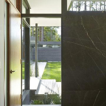
 The clients called me on the recommendation from a neighbor of mine who had met them at a conference and learned of their need for an architect. They contacted me and after meeting to discuss their project they invited me to visit their site, not far from White Salmon in Washington State.
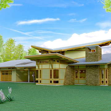
Initially, the couple discussed building a ‘Weekend’ retreat on their 20± acres of land. Their site was in the foothills of a range of mountains that offered views of both Mt. Adams to the North and Mt. Hood to the South. They wanted to develop a place that was ‘cabin-like’ but with a degree of refinement to it and take advantage of the primary views to the north, south and west. They also wanted to have a strong connection to their immediate outdoors.
Before long my clients came to the conclusion that they no longer perceived this as simply a weekend retreat but were now interested in making this their primary residence. With this new focus we concentrated on keeping the refined cabin approach but needed to add some additional functions and square feet to the original program.
They wanted to downsize from their current 3,500± SF city residence to a more modest 2,000 – 2,500 SF space. They desired a singular open Living, Dining and Kitchen area but needed to have a separate room for their television and upright piano. They were empty nesters and wanted only two bedrooms and decided that they would have two ‘Master’ bedrooms, one on the lower floor and the other on the upper floor (they planned to build additional ‘Guest’ cabins to accommodate others in the near future). The original scheme for the weekend retreat was only one floor with the second bedroom tucked away on the north side of the house next to the breezeway opposite of the carport.
Another consideration that we had to resolve was that the particular location that was deemed the best building site had diametrically opposed advantages and disadvantages. The views and primary solar orientations were also the source of the prevailing winds, out of the Southwest.
The resolve was to provide a semi-circular low-profile earth berm on the south/southwest side of the structure to serve as a wind-foil directing the strongest breezes up and over the structure. Because our selected site was in a saddle of land that then sloped off to the south/southwest the combination of the earth berm and the sloping hill would effectively created a ‘nestled’ form allowing the winds rushing up the hillside to shoot over most of the house. This allowed me to keep the favorable orientation to both the views and sun without being completely compromised by the winds.
 ODS Architecture
Atherton has many large substantial homes - our clients purchased an existing home on a one acre flag-shaped lot and asked us to design a new dream home for them. The result is a new 7,000 square foot four-building complex consisting of the main house, six-car garage with two car lifts, pool house with a full one bedroom residence inside, and a separate home office /work out gym studio building. A fifty-foot swimming pool was also created with fully landscaped yards.
Given the rectangular shape of the lot, it was decided to angle the house to incoming visitors slightly so as to more dramatically present itself. The house became a classic u-shaped home but Feng Shui design principals were employed directing the placement of the pool house to better contain the energy flow on the site. The main house entry door is then aligned with a special Japanese red maple at the end of a long visual axis at the rear of the site. These angles and alignments set up everything else about the house design and layout, and views from various rooms allow you to see into virtually every space tracking movements of others in the home.
The residence is simply divided into two wings of public use, kitchen and family room, and the other wing of bedrooms, connected by the living and dining great room. Function drove the exterior form of windows and solid walls with a line of clerestory windows which bring light into the middle of the large home. Extensive sun shadow studies with 3D tree modeling led to the unorthodox placement of the pool to the north of the home, but tree shadow tracking showed this to be the sunniest area during the entire year.
Sustainable measures included a full 7.1kW solar photovoltaic array technically making the house off the grid, and arranged so that no panels are visible from the property. A large 16,000 gallon rainwater catchment system consisting of tanks buried below grade was installed. The home is California GreenPoint rated and also features sealed roof soffits and a sealed crawlspace without the usual venting. A whole house computer automation system with server room was installed as well. Heating and cooling utilize hot water radiant heated concrete and wood floors supplemented by heat pump generated heating and cooling.
A compound of buildings created to form balanced relationships between each other, this home is about circulation, light and a balance of form and function.
Photo by Philip Liang Photography.
 Reico Kitchen & Bath
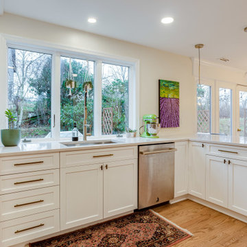
Designed by Carolina Maholik of Reico Kitchen & Bath in Chantilly, VA in collaboration with NOVA Fine Homes, this modern farmhouse style inspired kitchen design features kitchen cabinets from Ultracraft Cabinetry in the door style Rockford with a Simply White finish (perimeter) and Cherry Natural finish (island).
“This kitchen is a perfect combination of clan and simple, while respecting and embracing the farmhouse style of the home,” said Carolina. “We decided to remove the back door as to allow for the range and hood to be the focal point and create a more dynamic work space flow.”
Photos courtesy of BTW Images.
 Sire Design
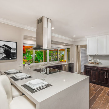
After meeting our clients at a design tradeshow, we embarked on a design journey. The couple wanted to remodel their complete home, which welcomed us with 60's wallpaper, a yellow kitchen and wall-to-wall fuzzy carpet. Our clients were fully involved and enthusiastic which made the space even more personal. We decided on a contemporary design with an mix of modern & traditional elements. We gutted walls, installed a brand new kitchen, brighten rooms up and simply imprinted the spirit of these amazing home owners in each detail of the home.
Interior Design: Sire Design
Photography: Lux Hunters
 RAJ Kitchen and Bath, LLC
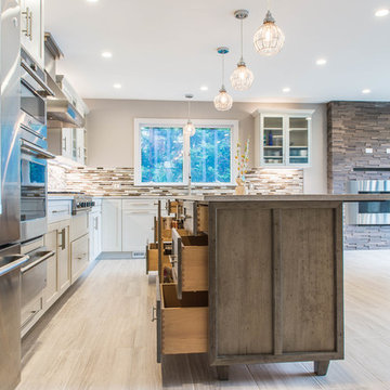
There were a few difficulties in making this kitchen any better than how it was. There was a separate staircase that had access to the second floor which was located in the kitchen. This left just enough room to push the dining room to one side. Then, there was the porch. A really nice panoramic view of the back, but was somehow under-used by the family during the summer months. Then, it was the size of the kitchen. It simply was way too small for a growing family, and while it had a peninsular in place, the flow just didn’t work. I remember watching them one day demonstrating how awkward it was using the kitchen. We got it! We had our marching orders to go and figure out how to make this kitchen work for this family.
Everything in the room was fair play. The design was done to make the kitchen very open. For a few ideas, we incorporated the porch in the kitchen by using the nana wall idea but it ended up being too cost prohibitive to do so. We then decided to do a permanent fix by using a commercial glass wall application. Once we figured that out, we moved back inside and removed the staircase. This gave us two added benefits. One allowed us to really reconfigure the kitchen and the other opened up the second floor for a huge built in closet system.
We relocated the windows, added a fire place with a built In TV above. From there, it was onto the kitchen itself which contained a huge Island with seating, large kitchen sink and built in appliances which was set up in a way to take advantage of the new layout. We re-positioned the kitchen facing the beautiful views outside rather than looking towards a wall. Now, when you enter the house up the entry stairs, the kitchen now draws you into the magnificent new open space. This is now setup for entertaining, relaxation, hanging out and most of all, preparing meals in a room where you only have to leave if you want to.
This one was all about the design. Design was what made this space. Setting this space up for success was crucial, and this kitchen is a great example of how design can cover a multitude of sins in Kitchen designs.
… Just close your eyes for a second and imagine waking up one winter morning and having a cup of coffee and watching the snow fall through those huge windows, leaning up against those 3D feature walls while watching the kids sitting around the table enjoying those warm radiant heated floors in this spacious kitchen…..
 ALL Renovation & Design LLC
A 20-year old builder kitchen that desperately needed an update. That is why the Louds called us. A few years previously, we had completed a finished basement project for them that you can view here: https://www.allrd.com/project/loud-basement/
To connect the kitchen a little more with the dining room, we opened the doorway as wide and high as we could.
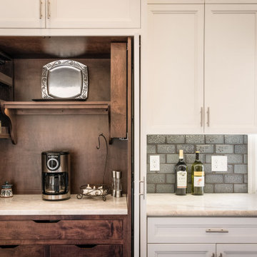
One special feature of the kitchen is the beverage pantry. It was something the homeowner had seen online and wanted to make practical. Because pull outdoors would have been in the way, we went with slide-in, fold-out doors like what you would see in an entertainment center.
The other unique feature of the kitchen is the center island. The blue was chosen to match the color theme of the connecting living room. The solid wood countertop is a striking centerpiece that steals the show. The cooktop was moved to the island, but because the homeowner did not want a bulky range hood hanging from the ceiling, we had to get creative with a downdraft range vent and a fan mounted on the outside of the house to pull the air out.
Another interesting aspect to the cooktop is that we had originally recommended an induction cooktop instead of regular electric cooktop. The reason being that an induction cooktop cools instantly the moment the pot is removed whereas an electric cooktop stays hot but with no visual cue to warn you. The homeowner initially decided to go with the less expensive electric cooktop. But, before we had even finished construction, one of the family members slid their hand over the cooktop while walking by just after a pan had been removed and got burned. Immediately the homeowner requested we install the induction cooktop instead.
Soft Maple Cabinets painted Simply White, Taj Mihal Granite countertops, farmhouse sink, 3” x 6” Antiqua Ceramic tile backsplash in Feelings Grigio, 30” Dacor HoodDowndraft vent, Luxury Vinyl tile floor, and LED i-Lighting undercabinet lighting.
Sponsored
Columbus, OH
Hope Restoration & General Contracting
Columbus Design-Build, Kitchen & Bath Remodeling, Historic Renovations
 ADR Garage Door Repair Now
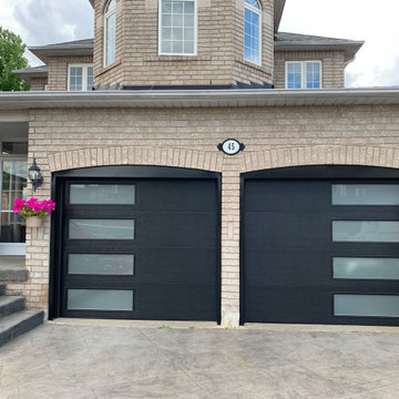
If you're a homeowner, you know that your garage door is an important part of your home's functionality and aesthetic appeal. Over time, however, your garage door may start to show signs of wear and tear, and it may be time to consider a replacement. We'll explore some of the key factors to consider when deciding whether it's time to upgrade your garage door. We'll look at issues such as age, damage, and energy efficiency, and we'll offer tips on how to choose the best replacement garage door for your home. Whether you're dealing with a malfunctioning garage door or you're simply looking to give your home a fresh new look, this article will provide you with the information you need to make an informed decision about garage door replacement.
 Traditions In Tile At Brier Creek
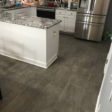
Natural stone is a look that simply cannot be beat. However, porcelain that looks like natural stone captures the beauty of it while also taking away the headache of maintaining a natural product. This homeowner had a very neutral and cool vibe going on in their kitchen and decided to do an Ardesia Marrone stone look porcelain on the floor. The 12x24's are laid in a 1/3 offset brick joint which really allows you to see the movement and color variation in each tile. The Ardesia has enough interest in it that it compliments the backslash and counter top movement without taking away from any of the other elements in the kitchen. Great contrast between the white cabinets and bead board as well!
 User
UserReference: TB202W-US
Model: KALOO WHITE
Color: White (available in black)
Shape: Rectangular + Faucet (middle)
Finish: Polish inside and outside
US Dimensions: 15-3/4" x 9"
US Draine size: standard hole size (1.5")
Material: Human white marble grade A
Shipping: CA=$28 - NY=$79 - FL=$73 - IL=$51...
Weight: 44 lbs - 20 Kgs
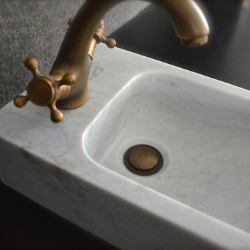
KALOO WHITE 15-3/4" x 9" is the smallest Natural stone wash-hands sink made in a genuine Human White marble with a simple and useful style, carved from a block of stone. Its shape, matte finish, without forgetting its very convenient slope give KALOO WHITE harmony and serenity. Doubly waterproofed by our care this model is ready to use. You will definitely not let anyone feel indifferent with this 100% natural stone unique in the US and exclusively available on Living'ROC.net.
Feel free to click on our facebook portfolio page to inspire yourself with our clients' projects...Simply our living'ROC style.
This natural stone Wash-hand sink will delight lovers of beautiful work, looking for rare, products. Add value to your home by transforming your bathroom into an oasis of elegance, calm, and tranquillity. Discover the well-being and the restful feeling our stone creation can offer you.
KALOO WHITE is one of the most fashionable in our bathrooms range. This vessel sink is not only beautiful to look at it is also functional with its height and its edges allowing a large amount of water. Human white marble is dominant in strength of great value and authentic in look and feel.
Our creation is delivered without an overflow drain and faucet (not included) - every US drains and faucets models you can find on the market will fit perfectly on LivingROC's sinks.
The photos you see online have been taken with extreme care by our Founder CEO - Florent LEPVREAU to give our visitors an idea on how it might looks like. However product may vary from block to block as only mother nature decides what you may receive because each sink is unique. Therefore, we invite you to browse on our product portfolio to see the differences in each piece. We also draw your attention to the fact that veining, crystallization, that may appear to be cracks, but are actually indigenous to the stone, and other variations of colors up to 30% and more sometime (often on marble and onyx) and various stone features make all the charm of the stone and distinguish it from non-natural materials! Torrence White , Bali White, Toji White, Pegasus white, tahiti White, Rondo White are all made and carved from the same Guangxi White Marble and it can't be considered as a pure white as you can see. Our Quality Control photos shown on our portfolio are not available to choose by numbers.
 Pro-Tile & Marble
Pro-Tile & Marble, Inc.
Kitchen Backsplash
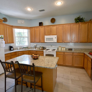
Your first step toward having a backsplash installed is to define exactly how much backsplash your kitchen needs. First, you'll need to decide if you want the backsplash to cover the entire wall area above your countertops, or simply a portion thereof. Pro-Tile can help. Give us a call.
904-731-6471
 Renovisions
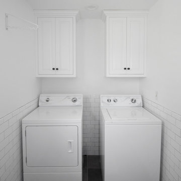
After several years on the remodeling to-do list, the homeowners decided to update to add a sense of style to their half-bath/laundry and called the Renovisions team in to help create their vision for this space. The main goal was to provide a clean, open and inviting feel, while adding a nice balance of texture and interest.
Upon a few visits to the Renovisions showroom, to discuss a suitable style, the final CAD design was approved and de-construction began. A new double-hung window replaced the old window, and measurements were taken for the new painted wood shutters. Out with the existing tile flooring, vanity, drop-in sink, toilet and outdated wall cabinets over laundry pair and window. In with the stylish, now taller shaker style vanity in stunning blue-green paint color. Pretty quartz countertop with under mount sink, and energy efficient comfort height toilet. The white subway wall tiles provide a classic look with timeless appeal fabulous with black porcelain floor tiles and contrasting light grey grout. Black and white provides a more dramatic look without compromising the rooms longevity.
Overall. The client is thrilled with the simple and fresh look of her now more interesting and stylish bath/laundry room. The vintage industrial design with stylish mini pendant light fixtures with clear seedy glass shades in old bronze finish is a perfect addition to this newly remodeled space and ties in nicely with the oil rubbed bronze hardware and accessories.
“The bathroom is SIMPLY BEAUTIFUL…….floor, tile, vanity, countertop, cabinets, lighting, and the faucet….I could not be more pleased!!!!!!” - Susan M. (Hanover)
 Van Kirk & Sons Pools and Spas
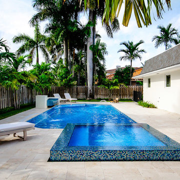
When the Grossman’s located in Miami area decided it was time to transform their tired, old pool into the tranquil retreat they’ve always wanted, Van Kirk & Sons was there every step of the transformation process. At the end of a long day the family can enjoy unwinding in their spa, or simply listening to the serene sounds of the cleanly designed, floating water fountain. This stunning water feature also doubles as a unique, refreshing waterbed for sprawling out on in the sun. On the weekends, the Grossmans can finally entertain their friends by the pool, and by the looks of it, they’ll never want to leave.
 RAJ Kitchen and Bath, LLC
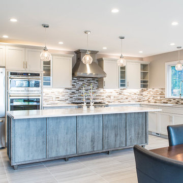
There were a few difficulties in making this kitchen any better than how it was. There was a separate staircase that had access to the second floor which was located in the kitchen. This left just enough room to push the dining room to one side. Then, there was the porch. A really nice panoramic view of the back, but was somehow under-used by the family during the summer months. Then, it was the size of the kitchen. It simply was way too small for a growing family, and while it had a peninsular in place, the flow just didn’t work. I remember watching them one day demonstrating how awkward it was using the kitchen. We got it! We had our marching orders to go and figure out how to make this kitchen work for this family.
Everything in the room was fair play. The design was done to make the kitchen very open. For a few ideas, we incorporated the porch in the kitchen by using the nana wall idea but it ended up being too cost prohibitive to do so. We then decided to do a permanent fix by using a commercial glass wall application. Once we figured that out, we moved back inside and removed the staircase. This gave us two added benefits. One allowed us to really reconfigure the kitchen and the other opened up the second floor for a huge built in closet system.
We relocated the windows, added a fire place with a built In TV above. From there, it was onto the kitchen itself which contained a huge Island with seating, large kitchen sink and built in appliances which was set up in a way to take advantage of the new layout. We re-positioned the kitchen facing the beautiful views outside rather than looking towards a wall. Now, when you enter the house up the entry stairs, the kitchen now draws you into the magnificent new open space. This is now setup for entertaining, relaxation, hanging out and most of all, preparing meals in a room where you only have to leave if you want to.
This one was all about the design. Design was what made this space. Setting this space up for success was crucial, and this kitchen is a great example of how design can cover a multitude of sins in Kitchen designs.
… Just close your eyes for a second and imagine waking up one winter morning and having a cup of coffee and watching the snow fall through those huge windows, leaning up against those 3D feature walls while watching the kids sitting around the table enjoying those warm radiant heated floors in this spacious kitchen…..
29