
Search results for "Decorative objects" in Home Design Ideas
 Drury Design
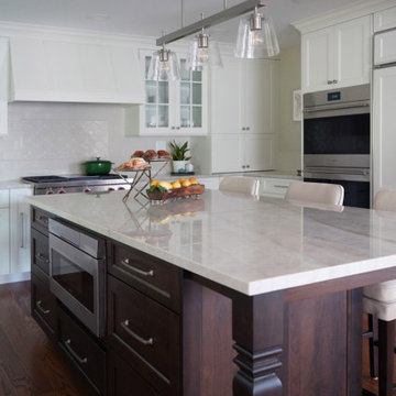
This house was 45 years old and the most recent kitchen update was past its due date. It was also time to update an adjacent family room, eating area and a nearby bar. The idea was to refresh the space with a transitional design that leaned classic – something that would be elegant and comfortable. Something that would welcome and enhance natural light.
The objectives were:
-Keep things simple – classic, comfortable and easy to keep clean
-Cohesive design between the kitchen, family room, eating area and bar
-Comfortable walkways, especially between the island and sofa
-Get rid of the kitchen’s dated 3D vegetable tile and island top shaped like a painters pallet
Design challenges:
-Incorporate a structural beam so that it flows with the entire space
-Proper ventilation for the hood
-Update the floor finish to get rid of the ’90s red oak
Design solutions:
-After reviewing multiple design options we decided on keeping appliances in their existing locations
-Made the cabinet on the back wall deeper than standard to fit and conceal the exhaust vent within the crown molding space and provide proper ventilation for the rangetop
-Omitted the sink on the island because it was not being used
-Squared off the island to provide more seating and functionality
-Relocated the microwave from the wall to the island and fitted a warming drawer directly below
-Added a tray partition over the oven so that cookie sheets and cutting boards are easily accessible and neatly stored
-Omitted all the decorative fillers to make the kitchen feel current
-Detailed yet simple tile backsplash design to add interest
Refinished the already functional entertainment cabinetry to match new cabinets – good flow throughout area
Even though the appliances all stayed in the same locations, the cabinet finish created a dramatic change. This is a very large kitchen and the client embraces minimalist design so we decided to omit quite a few wall cabinets.
 Drury Design
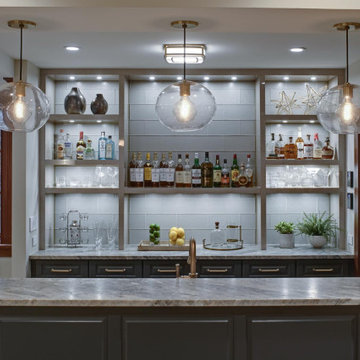
Some long-time repeat Drury customers were ready to update their wine cellar and bar area. The right design would make the space more functional and relaxing while increasing viewable wine storage capacity.
The homeowners appreciate craftsmanship and dedication – it’s the difference between good and truly great whiskies and wines. A relaxing space to appreciate such mastery would need to reflect the same kind of care and attention to detail.
Design Objectives:
-Remove heavy posts and archway to open the bar to the basement entertainment area
-Add an undercounter ice maker
-Create a clean, open display for liquor and glassware
-Create a cabinet-matching rolling cart for transporting cases of wine from the area’s entryway to the wine cellar
-Add drama and improve lighting
-Expand the wine cellar and add ceiling-mounted cooling
-Add a concealed area in the wine cellar for wine case storage
-Update task and decorative lighting
Design Challenges:
-Complement the existing stained-cherry trim in the basement area
-Determine how to include a separate area for case storage accessible from the main wine cellar
-Create an updated look that integrates seamlessly with the upscale traditional Tudor home
-The curved staircase called for creativity in the floor tile layout
Design Solutions:
-For cabinetry, a rich smoky blue-grey paint was chosen to complement the cherry stain
-Gorgeous leather-finished Tiempo Cielo quartzite countertops pair beautifully with the flooring
-Elegant textured-glass tile creates an interesting backdrop to open shelving
-High Gloss veneer shelving elevates the space and feels more modern than the previous cabinetry
-Realistic wood-look porcelain tile in a light greige tone creates a durable surface for this high traffic area
-A custom rolling cart was included to move cases into the wine cellar with ease
-Fresh decorative lighting in the bar and wine cellar adds drama while updating the overlook look and feel
Removing the heavy posts and archway between the bar and the rest of the entertainment area made the entire space feel more welcoming and inviting. The steel blue finish on the cabinetry blends beautifully with the existing woodwork, giving the basement a fresh look. The homeowners are more than pleased with how their renewed bar and wine cellar elevates the experience of celebrating fine spirits and enjoying them with friends.

 LaMantia Design and Remodeling
The previous award winning remodel of their Burr Ridge home brought these clients back to LaMantia and designers Jackie Prazak and Katie Suva, CKD, CBD when they decided it was time to build out their unfinished lower level. As before, their main objective was to create areas to accommodate their extended (and now grown) family.
During the 2013 main floor remodel, a bedroom and Powder Room had been given up to gain the large award winning kitchen, so recapturing those two spaces were high on the “list of desires.” Also on the list was the need for a pool table, a comfortable movie/TV space, lots of game storage and plenty of open area for grandchildren game playing.
The stairway into the lower level was the main challenge in this build-out; both the stair run and tread depth needed to be lengthened to perform to code. To create greater head room on the staircase the main beam was cut and a portion was relocated 18”. A second column at the end of the stair run was added to match the required structural column, allowing the last tread to wrap decoratively onto each side.
Throughout the design planning many details built-into the main level project were repeated to marry the main and lower levels together. The built-in cabinetry and the mirrored doors in the bedroom can also be found in the Guest Room on the main level. The mirrored element over the bed is actually an interior door glazed with mirrors and hung on its side. The parquet look tile flooring of the new bath is reminiscent of the main level wood parquet flooring while the carpenter built wainscoting also can be found in the main hall of the first floor.
The custom walnut stair spindles were fabricated from a photo the homeowner found and loved. In the Movie/TV area the theatre seats are fully powered to accept iPhones, iPads, Laptops, etc. Also note the large chalkboard scorekeeping area with seating for the game players. And, one very special detail can be found under the (now longer) staircase; a private room under the stairs was created with touch-lighting and bean bag chairs for anyone seeking a quiet space.
Find the right local pro for your project
 Drury Design
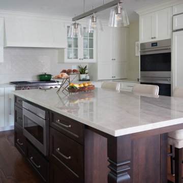
This house was 45 years old and the most recent kitchen update was past its due date. It was also time to update an adjacent family room, eating area and a nearby bar. The idea was to refresh the space with a transitional design that leaned classic – something that would be elegant and comfortable. Something that would welcome and enhance natural light.
The objectives were:
-Keep things simple – classic, comfortable and easy to keep clean
-Cohesive design between the kitchen, family room, eating area and bar
-Comfortable walkways, especially between the island and sofa
-Get rid of the kitchen’s dated 3D vegetable tile and island top shaped like a painters pallet
Design challenges:
-Incorporate a structural beam so that it flows with the entire space
-Proper ventilation for the hood
-Update the floor finish to get rid of the ’90s red oak
Design solutions:
-After reviewing multiple design options we decided on keeping appliances in their existing locations
-Made the cabinet on the back wall deeper than standard to fit and conceal the exhaust vent within the crown molding space and provide proper ventilation for the rangetop
-Omitted the sink on the island because it was not being used
-Squared off the island to provide more seating and functionality
-Relocated the microwave from the wall to the island and fitted a warming drawer directly below
-Added a tray partition over the oven so that cookie sheets and cutting boards are easily accessible and neatly stored
-Omitted all the decorative fillers to make the kitchen feel current
-Detailed yet simple tile backsplash design to add interest
Refinished the already functional entertainment cabinetry to match new cabinets – good flow throughout area
Even though the appliances all stayed in the same locations, the cabinet finish created a dramatic change. This is a very large kitchen and the client embraces minimalist design so we decided to omit quite a few wall cabinets.
 Janvrin & Co.
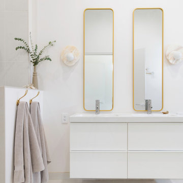
A transformation of a modest raised ranch into a modern oasis. I was the interior designer and general contractor from mechanicals to finishing. It’s also my personal home.
The interior design style is that of modern minimalist meets organic modern. I wanted a space that reduced distractions and let the eyes, head, and soul rest. Where everything inside the home has a specific use and purpose. The objects in our home are fewer but each hold a great personal value. You might expect to see this airy aesthetic, with its gallery white walls, in California or New York. Not nestled in a modest 50 year old neighborhood in Omaha, Nebraska. Creating a minimal aesthetic is one of the trickiest design styles to pull off. It is more than just less stuff and lots of white. It means sticking to these design principals:
-weaving in an abundance of textures
-incorporating natural finishes
-keenly curating art
-giving extra attention to scale
-limiting purely decorative items
-maximizing natural light
This style is not to be confused with the frugality of reductive design. I have incorporated many elevated basics that create an aesthetic of quiet luxury:
-architectural bead for trim-less doors
-first-of-its kind interior door hardware made of terrazzo
-historical marble found in landmark interiors like the NY Public Library
-premium flush air vents that disappear out of site
-luxury appliances from GE Café and Signature
-elegant and resilient terrazzo field tiles
Ours was not a simple interior remodel and addition:
-gutted and remodeled the existing 2,000 SF
-added on approximately another 1,000 SF
-moved and installed all new major mechanicals i.e. heating, plumbing and electrical.
-knocked through foundation walls to extend the space back
-dug down and built up
 LaMantia Design and Remodeling
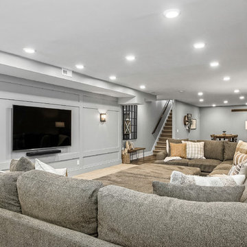
The previous award winning remodel of their Burr Ridge home brought these clients back to LaMantia and designers Jackie Prazak and Katie Suva, CKD, CBD when they decided it was time to build out their unfinished lower level. As before, their main objective was to create areas to accommodate their extended (and now grown) family.
During the 2013 main floor remodel, a bedroom and Powder Room had been given up to gain the large award winning kitchen, so recapturing those two spaces were high on the “list of desires.” Also on the list was the need for a pool table, a comfortable movie/TV space, lots of game storage and plenty of open area for grandchildren game playing.
The stairway into the lower level was the main challenge in this build-out; both the stair run and tread depth needed to be lengthened to perform to code. To create greater head room on the staircase the main beam was cut and a portion was relocated 18”. A second column at the end of the stair run was added to match the required structural column, allowing the last tread to wrap decoratively onto each side.
Throughout the design planning many details built-into the main level project were repeated to marry the main and lower levels together. The built-in cabinetry and the mirrored doors in the bedroom can also be found in the Guest Room on the main level. The mirrored element over the bed is actually an interior door glazed with mirrors and hung on its side. The parquet look tile flooring of the new bath is reminiscent of the main level wood parquet flooring while the carpenter built wainscoting also can be found in the main hall of the first floor.
The custom walnut stair spindles were fabricated from a photo the homeowner found and loved. In the Movie/TV area the theatre seats are fully powered to accept iPhones, iPads, Laptops, etc. Also note the large chalkboard scorekeeping area with seating for the game players. And, one very special detail can be found under the (now longer) staircase; a private room under the stairs was created with touch-lighting and bean bag chairs for anyone seeking a quiet space.
 Drury Design
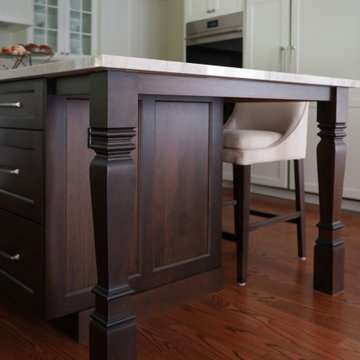
This house was 45 years old and the most recent kitchen update was past its due date. It was also time to update an adjacent family room, eating area and a nearby bar. The idea was to refresh the space with a transitional design that leaned classic – something that would be elegant and comfortable. Something that would welcome and enhance natural light.
The objectives were:
-Keep things simple – classic, comfortable and easy to keep clean
-Cohesive design between the kitchen, family room, eating area and bar
-Comfortable walkways, especially between the island and sofa
-Get rid of the kitchen’s dated 3D vegetable tile and island top shaped like a painters pallet
Design challenges:
-Incorporate a structural beam so that it flows with the entire space
-Proper ventilation for the hood
-Update the floor finish to get rid of the ’90s red oak
Design solutions:
-After reviewing multiple design options we decided on keeping appliances in their existing locations
-Made the cabinet on the back wall deeper than standard to fit and conceal the exhaust vent within the crown molding space and provide proper ventilation for the rangetop
-Omitted the sink on the island because it was not being used
-Squared off the island to provide more seating and functionality
-Relocated the microwave from the wall to the island and fitted a warming drawer directly below
-Added a tray partition over the oven so that cookie sheets and cutting boards are easily accessible and neatly stored
-Omitted all the decorative fillers to make the kitchen feel current
-Detailed yet simple tile backsplash design to add interest
Refinished the already functional entertainment cabinetry to match new cabinets – good flow throughout area
Even though the appliances all stayed in the same locations, the cabinet finish created a dramatic change. This is a very large kitchen and the client embraces minimalist design so we decided to omit quite a few wall cabinets.
Sponsored
Sunbury, OH

J.Holderby - Renovations
Franklin County's Leading General Contractors - 2X Best of Houzz!
 Joe McGuire Design
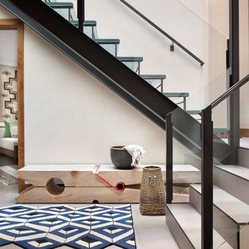
Embracing the challenge of grounding this open, light-filled space, our Boulder studio focused on comfort, ease, and high design. The built-in lounge is flanked by storage cabinets for puzzles and games for this client who loves having people over. The high-back Living Divani sofa is paired with U-Turn Benson chairs and a "Rabari" rug from Nanimarquina for casual gatherings. The throw pillows are a perfect mix of Norwegian tapestry fabric and contemporary patterns. In the child's bedroom, we added an organically shaped Vitra Living Tower, which also provides a cozy reading niche. Bold Marimekko fabric colorfully complements more traditional detailing and creates a contrast between old and new. We loved collaborating with our client on an eclectic bedroom, where everything is collected and combined in a way that allows distinctive pieces to work together. A custom walnut bed supports the owner's tatami mattress. Vintage rugs ground the space and pair well with a vintage Scandinavian chair and dresser.
Combining unexpected objects is one of our favorite ways to add liveliness and personality to a space. In the little guest bedroom, our client (a creative and passionate collector) was the inspiration behind an energetic and eclectic mix. Similarly, turning one of our client's favorite old sweaters into pillow covers and popping a Native American rug on the wall helped pull the space together. Slightly eclectic and invitingly cozy, the twin guestroom beckons for settling in to read, nap or daydream. A vintage poster from Omnibus Gallery in Aspen and an antique nightstand add period whimsy.
---
Joe McGuire Design is an Aspen and Boulder interior design firm bringing a uniquely holistic approach to home interiors since 2005.
For more about Joe McGuire Design, see here: https://www.joemcguiredesign.com/
To learn more about this project, see here:
https://www.joemcguiredesign.com/aspen-eclectic
 LaMantia Design and Remodeling
The previous award winning remodel of their Burr Ridge home brought these clients back to LaMantia and designers Jackie Prazak and Katie Suva, CKD, CBD when they decided it was time to build out their unfinished lower level. As before, their main objective was to create areas to accommodate their extended (and now grown) family.
During the 2013 main floor remodel, a bedroom and Powder Room had been given up to gain the large award winning kitchen, so recapturing those two spaces were high on the “list of desires.” Also on the list was the need for a pool table, a comfortable movie/TV space, lots of game storage and plenty of open area for grandchildren game playing.
The stairway into the lower level was the main challenge in this build-out; both the stair run and tread depth needed to be lengthened to perform to code. To create greater head room on the staircase the main beam was cut and a portion was relocated 18”. A second column at the end of the stair run was added to match the required structural column, allowing the last tread to wrap decoratively onto each side.
Throughout the design planning many details built-into the main level project were repeated to marry the main and lower levels together. The built-in cabinetry and the mirrored doors in the bedroom can also be found in the Guest Room on the main level. The mirrored element over the bed is actually an interior door glazed with mirrors and hung on its side. The parquet look tile flooring of the new bath is reminiscent of the main level wood parquet flooring while the carpenter built wainscoting also can be found in the main hall of the first floor.
The custom walnut stair spindles were fabricated from a photo the homeowner found and loved. In the Movie/TV area the theatre seats are fully powered to accept iPhones, iPads, Laptops, etc. Also note the large chalkboard scorekeeping area with seating for the game players. And, one very special detail can be found under the (now longer) staircase; a private room under the stairs was created with touch-lighting and bean bag chairs for anyone seeking a quiet space.
 Janvrin & Co.
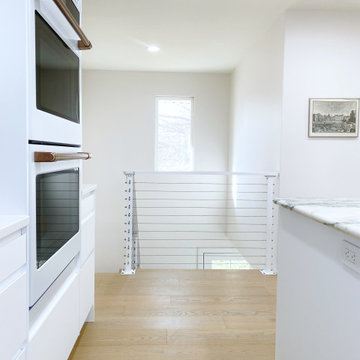
A transformation of a modest raised ranch into a modern oasis. I was the interior designer and general contractor from mechanicals to finishing. It’s also my personal home.
The interior design style is that of modern minimalist meets organic modern. I wanted a space that reduced distractions and let the eyes, head, and soul rest. Where everything inside the home has a specific use and purpose. The objects in our home are fewer but each hold a great personal value. You might expect to see this airy aesthetic, with its gallery white walls, in California or New York. Not nestled in a modest 50 year old neighborhood in Omaha, Nebraska. Creating a minimal aesthetic is one of the trickiest design styles to pull off. It is more than just less stuff and lots of white. It means sticking to these design principals:
-weaving in an abundance of textures
-incorporating natural finishes
-keenly curating art
-giving extra attention to scale
-limiting purely decorative items
-maximizing natural light
This style is not to be confused with the frugality of reductive design. I have incorporated many elevated basics that create an aesthetic of quiet luxury:
-architectural bead for trim-less doors
-first-of-its kind interior door hardware made of terrazzo
-historical marble found in landmark interiors like the NY Public Library
-premium flush air vents that disappear out of site
-luxury appliances from GE Café and Signature
-elegant and resilient terrazzo field tiles
Ours was not a simple interior remodel and addition:
-gutted and remodeled the existing 2,000 SF
-added on approximately another 1,000 SF
-moved and installed all new major mechanicals i.e. heating, plumbing and electrical.
-knocked through foundation walls to extend the space back
-dug down and built up
 Janvrin & Co.
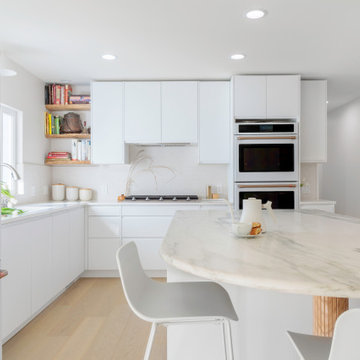
A transformation of a modest raised ranch into a modern oasis. I was the interior designer and general contractor from mechanicals to finishing. It’s also my personal home.
The interior design style is that of modern minimalist meets organic modern. I wanted a space that reduced distractions and let the eyes, head, and soul rest. Where everything inside the home has a specific use and purpose. The objects in our home are fewer but each hold a great personal value. You might expect to see this airy aesthetic, with its gallery white walls, in California or New York. Not nestled in a modest 50 year old neighborhood in Omaha, Nebraska. Creating a minimal aesthetic is one of the trickiest design styles to pull off. It is more than just less stuff and lots of white. It means sticking to these design principals:
-weaving in an abundance of textures
-incorporating natural finishes
-keenly curating art
-giving extra attention to scale
-limiting purely decorative items
-maximizing natural light
This style is not to be confused with the frugality of reductive design. I have incorporated many elevated basics that create an aesthetic of quiet luxury:
-architectural bead for trim-less doors
-first-of-its kind interior door hardware made of terrazzo
-historical marble found in landmark interiors like the NY Public Library
-premium flush air vents that disappear out of site
-luxury appliances from GE Café and Signature
-elegant and resilient terrazzo field tiles
Ours was not a simple interior remodel and addition:
-gutted and remodeled the existing 2,000 SF
-added on approximately another 1,000 SF
-moved and installed all new major mechanicals i.e. heating, plumbing and electrical.
-knocked through foundation walls to extend the space back
-dug down and built up
 Janvrin & Co.
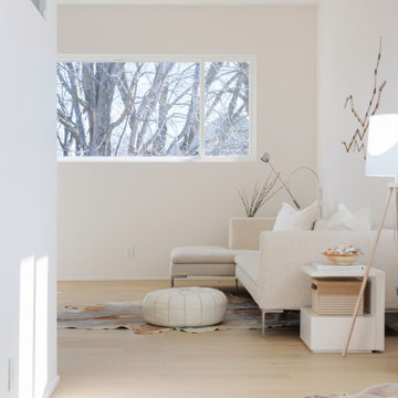
A transformation of a modest raised ranch into a modern oasis. I was the interior designer and general contractor from mechanicals to finishing. It’s also my personal home.
The interior design style is that of modern minimalist meets organic modern. I wanted a space that reduced distractions and let the eyes, head, and soul rest. Where everything inside the home has a specific use and purpose. The objects in our home are fewer but each hold a great personal value. You might expect to see this airy aesthetic, with its gallery white walls, in California or New York. Not nestled in a modest 50 year old neighborhood in Omaha, Nebraska. Creating a minimal aesthetic is one of the trickiest design styles to pull off. It is more than just less stuff and lots of white. It means sticking to these design principals:
-weaving in an abundance of textures
-incorporating natural finishes
-keenly curating art
-giving extra attention to scale
-limiting purely decorative items
-maximizing natural light
This style is not to be confused with the frugality of reductive design. I have incorporated many elevated basics that create an aesthetic of quiet luxury:
-architectural bead for trim-less doors
-first-of-its kind interior door hardware made of terrazzo
-historical marble found in landmark interiors like the NY Public Library
-premium flush air vents that disappear out of site
-luxury appliances from GE Café and Signature
-elegant and resilient terrazzo field tiles
Ours was not a simple interior remodel and addition:
-gutted and remodeled the existing 2,000 SF
-added on approximately another 1,000 SF
-moved and installed all new major mechanicals i.e. heating, plumbing and electrical.
-knocked through foundation walls to extend the space back
-dug down and built up
 Drury Design
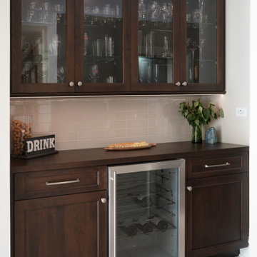
This house was 45 years old and the most recent kitchen update was past its due date. It was also time to update an adjacent family room, eating area and a nearby bar. The idea was to refresh the space with a transitional design that leaned classic – something that would be elegant and comfortable. Something that would welcome and enhance natural light.
The objectives were:
-Keep things simple – classic, comfortable and easy to keep clean
-Cohesive design between the kitchen, family room, eating area and bar
-Comfortable walkways, especially between the island and sofa
-Get rid of the kitchen’s dated 3D vegetable tile and island top shaped like a painters pallet
Design challenges:
-Incorporate a structural beam so that it flows with the entire space
-Proper ventilation for the hood
-Update the floor finish to get rid of the ’90s red oak
Design solutions:
-After reviewing multiple design options we decided on keeping appliances in their existing locations
-Made the cabinet on the back wall deeper than standard to fit and conceal the exhaust vent within the crown molding space and provide proper ventilation for the rangetop
-Omitted the sink on the island because it was not being used
-Squared off the island to provide more seating and functionality
-Relocated the microwave from the wall to the island and fitted a warming drawer directly below
-Added a tray partition over the oven so that cookie sheets and cutting boards are easily accessible and neatly stored
-Omitted all the decorative fillers to make the kitchen feel current
-Detailed yet simple tile backsplash design to add interest
Refinished the already functional entertainment cabinetry to match new cabinets – good flow throughout area
Even though the appliances all stayed in the same locations, the cabinet finish created a dramatic change. This is a very large kitchen and the client embraces minimalist design so we decided to omit quite a few wall cabinets.
Sponsored
Columbus, OH

Hope Restoration & General Contracting
Columbus Design-Build, Kitchen & Bath Remodeling, Historic Renovations
 Janvrin & Co.
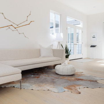
A transformation of a modest raised ranch into a modern oasis. I was the interior designer and general contractor from mechanicals to finishing. It’s also my personal home.
The interior design style is that of modern minimalist meets organic modern. I wanted a space that reduced distractions and let the eyes, head, and soul rest. Where everything inside the home has a specific use and purpose. The objects in our home are fewer but each hold a great personal value. You might expect to see this airy aesthetic, with its gallery white walls, in California or New York. Not nestled in a modest 50 year old neighborhood in Omaha, Nebraska. Creating a minimal aesthetic is one of the trickiest design styles to pull off. It is more than just less stuff and lots of white. It means sticking to these design principals:
-weaving in an abundance of textures
-incorporating natural finishes
-keenly curating art
-giving extra attention to scale
-limiting purely decorative items
-maximizing natural light
This style is not to be confused with the frugality of reductive design. I have incorporated many elevated basics that create an aesthetic of quiet luxury:
-architectural bead for trim-less doors
-first-of-its kind interior door hardware made of terrazzo
-historical marble found in landmark interiors like the NY Public Library
-premium flush air vents that disappear out of site
-luxury appliances from GE Café and Signature
-elegant and resilient terrazzo field tiles
Ours was not a simple interior remodel and addition:
-gutted and remodeled the existing 2,000 SF
-added on approximately another 1,000 SF
-moved and installed all new major mechanicals i.e. heating, plumbing and electrical.
-knocked through foundation walls to extend the space back
-dug down and built up
 Drury Design
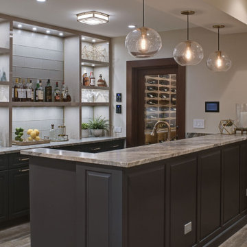
Some long-time repeat Drury customers were ready to update their wine cellar and bar area. The right design would make the space more functional and relaxing while increasing viewable wine storage capacity.
The homeowners appreciate craftsmanship and dedication – it’s the difference between good and truly great whiskies and wines. A relaxing space to appreciate such mastery would need to reflect the same kind of care and attention to detail.
Design Objectives:
-Remove heavy posts and archway to open the bar to the basement entertainment area
-Add an undercounter ice maker
-Create a clean, open display for liquor and glassware
-Create a cabinet-matching rolling cart for transporting cases of wine from the area’s entryway to the wine cellar
-Add drama and improve lighting
-Expand the wine cellar and add ceiling-mounted cooling
-Add a concealed area in the wine cellar for wine case storage
-Update task and decorative lighting
Design Challenges:
-Complement the existing stained-cherry trim in the basement area
-Determine how to include a separate area for case storage accessible from the main wine cellar
-Create an updated look that integrates seamlessly with the upscale traditional Tudor home
-The curved staircase called for creativity in the floor tile layout
Design Solutions:
-For cabinetry, a rich smoky blue-grey paint was chosen to complement the cherry stain
-Gorgeous leather-finished Tiempo Cielo quartzite countertops pair beautifully with the flooring
-Elegant textured-glass tile creates an interesting backdrop to open shelving
-High Gloss veneer shelving elevates the space and feels more modern than the previous cabinetry
-Realistic wood-look porcelain tile in a light greige tone creates a durable surface for this high traffic area
-A custom rolling cart was included to move cases into the wine cellar with ease
-Fresh decorative lighting in the bar and wine cellar adds drama while updating the overlook look and feel
Removing the heavy posts and archway between the bar and the rest of the entertainment area made the entire space feel more welcoming and inviting. The steel blue finish on the cabinetry blends beautifully with the existing woodwork, giving the basement a fresh look. The homeowners are more than pleased with how their renewed bar and wine cellar elevates the experience of celebrating fine spirits and enjoying them with friends.

 Décor Aid
Everyone deserves to end the day in a comfortable, tranquil home. And for those with children, it can seem impossible to reconcile the challenges of family life with the need to have a well-designed space. Our client—a financial executive and her family of four—had not considered a design makeover since moving into their apartment, which was more than ten years ago. So when she reached out to Decor Aid, she asked us to modernize and brighten her home, in addition to creating a space for her family to hang out and relax.
The apartment originally featured sunflower-yellow walls and a set of brown suede living room furniture, all of which significantly darkened the space. The living room also did not have sufficient seating options, so the client was improvising seating arrangements when guests would come over.
With no outward facing windows, the living room received little natural light, and so we began the redesign by painting the walls a classic grey, and adding white crown molding.
As a pathway from the front door to the kitchen, the living room functions as a high-traffic area of the home. So we sourced a geometric indoor-outdoor area rug, and established a layout that’s easy to walk through. We also sourced a coffee table from Serena & Lily. Our client has teenage twins, and so we sourced a sturdy sectional couch from Restoration Hardware, and placed it in a corner which was previously being underused.
We hired an electrician to hide all of the cables leading to the media console, and added custom window treatments. In the kitchen, we painted the cabinets a semi-gloss white, and added slate flooring, for a clean, crisp, modern look to match the living room.
The finishing touches included a set of geometric table objects, comfortable throw rugs, and plush high-shine pillows. The final result is a fully functional living room for this family of four.
 LaMantia Design and Remodeling
The previous award winning remodel of their Burr Ridge home brought these clients back to LaMantia and designers Jackie Prazak and Katie Suva, CKD, CBD when they decided it was time to build out their unfinished lower level. As before, their main objective was to create areas to accommodate their extended (and now grown) family.
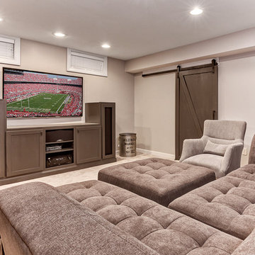
During the 2013 main floor remodel, a bedroom and Powder Room had been given up to gain the large award winning kitchen, so recapturing those two spaces were high on the “list of desires.” Also on the list was the need for a pool table, a comfortable movie/TV space, lots of game storage and plenty of open area for grandchildren game playing.
The stairway into the lower level was the main challenge in this build-out; both the stair run and tread depth needed to be lengthened to perform to code. To create greater head room on the staircase the main beam was cut and a portion was relocated 18”. A second column at the end of the stair run was added to match the required structural column, allowing the last tread to wrap decoratively onto each side.
Throughout the design planning many details built-into the main level project were repeated to marry the main and lower levels together. The built-in cabinetry and the mirrored doors in the bedroom can also be found in the Guest Room on the main level. The mirrored element over the bed is actually an interior door glazed with mirrors and hung on its side. The parquet look tile flooring of the new bath is reminiscent of the main level wood parquet flooring while the carpenter built wainscoting also can be found in the main hall of the first floor.
The custom walnut stair spindles were fabricated from a photo the homeowner found and loved. In the Movie/TV area the theatre seats are fully powered to accept iPhones, iPads, Laptops, etc. Also note the large chalkboard scorekeeping area with seating for the game players. And, one very special detail can be found under the (now longer) staircase; a private room under the stairs was created with touch-lighting and bean bag chairs for anyone seeking a quiet space.

Sponsored
Sunbury, OH
J.Holderby - Renovations
Franklin County's Leading General Contractors - 2X Best of Houzz!
 Drury Design
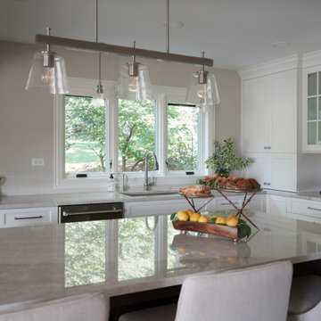
This house was 45 years old and the most recent kitchen update was past its due date. It was also time to update an adjacent family room, eating area and a nearby bar. The idea was to refresh the space with a transitional design that leaned classic – something that would be elegant and comfortable. Something that would welcome and enhance natural light.
The objectives were:
-Keep things simple – classic, comfortable and easy to keep clean
-Cohesive design between the kitchen, family room, eating area and bar
-Comfortable walkways, especially between the island and sofa
-Get rid of the kitchen’s dated 3D vegetable tile and island top shaped like a painters pallet
Design challenges:
-Incorporate a structural beam so that it flows with the entire space
-Proper ventilation for the hood
-Update the floor finish to get rid of the ’90s red oak
Design solutions:
-After reviewing multiple design options we decided on keeping appliances in their existing locations
-Made the cabinet on the back wall deeper than standard to fit and conceal the exhaust vent within the crown molding space and provide proper ventilation for the rangetop
-Omitted the sink on the island because it was not being used
-Squared off the island to provide more seating and functionality
-Relocated the microwave from the wall to the island and fitted a warming drawer directly below
-Added a tray partition over the oven so that cookie sheets and cutting boards are easily accessible and neatly stored
-Omitted all the decorative fillers to make the kitchen feel current
-Detailed yet simple tile backsplash design to add interest
Refinished the already functional entertainment cabinetry to match new cabinets – good flow throughout area
Even though the appliances all stayed in the same locations, the cabinet finish created a dramatic change. This is a very large kitchen and the client embraces minimalist design so we decided to omit quite a few wall cabinets.
 LaMantia Design and Remodeling
The previous award winning remodel of their Burr Ridge home brought these clients back to LaMantia and designers Jackie Prazak and Katie Suva, CKD, CBD when they decided it was time to build out their unfinished lower level. As before, their main objective was to create areas to accommodate their extended (and now grown) family.
During the 2013 main floor remodel, a bedroom and Powder Room had been given up to gain the large award winning kitchen, so recapturing those two spaces were high on the “list of desires.” Also on the list was the need for a pool table, a comfortable movie/TV space, lots of game storage and plenty of open area for grandchildren game playing.
The stairway into the lower level was the main challenge in this build-out; both the stair run and tread depth needed to be lengthened to perform to code. To create greater head room on the staircase the main beam was cut and a portion was relocated 18”. A second column at the end of the stair run was added to match the required structural column, allowing the last tread to wrap decoratively onto each side.
Throughout the design planning many details built-into the main level project were repeated to marry the main and lower levels together. The built-in cabinetry and the mirrored doors in the bedroom can also be found in the Guest Room on the main level. The mirrored element over the bed is actually an interior door glazed with mirrors and hung on its side. The parquet look tile flooring of the new bath is reminiscent of the main level wood parquet flooring while the carpenter built wainscoting also can be found in the main hall of the first floor.
The custom walnut stair spindles were fabricated from a photo the homeowner found and loved. In the Movie/TV area the theatre seats are fully powered to accept iPhones, iPads, Laptops, etc. Also note the large chalkboard scorekeeping area with seating for the game players. And, one very special detail can be found under the (now longer) staircase; a private room under the stairs was created with touch-lighting and bean bag chairs for anyone seeking a quiet space.
 Janvrin & Co.
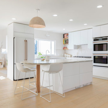
A transformation of a modest raised ranch into a modern oasis. I was the interior designer and general contractor from mechanicals to finishing. It’s also my personal home.
The interior design style is that of modern minimalist meets organic modern. I wanted a space that reduced distractions and let the eyes, head, and soul rest. Where everything inside the home has a specific use and purpose. The objects in our home are fewer but each hold a great personal value. You might expect to see this airy aesthetic, with its gallery white walls, in California or New York. Not nestled in a modest 50 year old neighborhood in Omaha, Nebraska. Creating a minimal aesthetic is one of the trickiest design styles to pull off. It is more than just less stuff and lots of white. It means sticking to these design principals:
-weaving in an abundance of textures
-incorporating natural finishes
-keenly curating art
-giving extra attention to scale
-limiting purely decorative items
-maximizing natural light
This style is not to be confused with the frugality of reductive design. I have incorporated many elevated basics that create an aesthetic of quiet luxury:
-architectural bead for trim-less doors
-first-of-its kind interior door hardware made of terrazzo
-historical marble found in landmark interiors like the NY Public Library
-premium flush air vents that disappear out of site
-luxury appliances from GE Café and Signature
-elegant and resilient terrazzo field tiles
Ours was not a simple interior remodel and addition:
-gutted and remodeled the existing 2,000 SF
-added on approximately another 1,000 SF
-moved and installed all new major mechanicals i.e. heating, plumbing and electrical.
-knocked through foundation walls to extend the space back
-dug down and built up
194