
Search results for "Decorative objects" in Home Design Ideas

 Neil Kelly Company
The main objective for this project was to create a beautiful outdoor cooking and entertaining space. The clients wanted the new space to have an open concept while being protected from the elements year round. Stylistically they wanted the design to have a Pacific Northwest feel, to blend with the existing house and work well among their natural, forested backyard. We needed to include a BBQ, smoker, sink, refrigerator, gas fireplace and wall mounted heater as well as a large screen TV. The details were going to be a main focus for the design process, as we knew this would ensure the cohesive blend of function and aesthetic appeal.
One of the main challenges was working with the existing deck. The 1000 SF deck needed new decking and guardrails as well as some framing repair. We were worried that the existing deck structure would not support the weight of the new construction.
Another challenge we faced was designing the roof planes to aesthetically blend with the existing house. The layout of the first and second floor had us working through multiple design revisions until we landed on the final stepped roof structure.
We designed the new roof to be supported by the house and columns set directly on the ground, thereby minimizing weight added to the existing deck. This allowed us to use the deck to support the lighter components, including the kitchen and BBQ area.
Oversized beams, exposed raw wood rafters, and sealed car decking worked well with the new cedar deck surface. Stainless steel cabinetry and appliances are accented by solid surface countertops and small mosaic backsplash. All colors were selected to fall within the natural hues of the seasonally changing foliage surrounding the clients’ property.
Maintaining the same footprint of the existing deck, we used the angles to our advantage and created additional seating with a custom built storage bench. New powder coated posts and cable guardrails were topped with an LED lined wood handrail. A decorative chandelier and subtle metal pendants provide ambient light. An electric heater mounted to the inside of one of the beams as well as the gas fireplace provides ample heat for colder months.
The clerestory windows between the two roof planes provide additional light to the space while protecting against the elements. The gas fireplace and cultured stone wrapped chimney is a visual anchor and centerpiece for the deck. The chimney provided an opportunity to hide one of the supporting columns as well as a protected space for the wall mounted TV and soundbar.
The cabinetry layout was selected to offer plenty of storage and special features including a pull out garbage and recycling center, drawers for dishes and utensils, and a concealed paper towel holder.
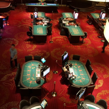
 Shanhua Carpet
about 10,000 square meters
pattern matching
High Qualtity and perfect installation
China Leading carpet manufacturer produced
intlnetbiz @ gmail.com
Example of a classic carpeted home design design in Auckland
Example of a classic carpeted home design design in Auckland

 Robin's Nest Interiors
It was a pleasure to help this single dad transform a previous French Country motif into a Handsome Space with Masculine Vibe. The homeowner loves the blues you find in the Caribbean so we used those as accent colors throughout the rooms.
Entry
We painted the walls Sherwin Williams’ Latte (SW6108) to add warmth. We accessorized the homeowner’s beautiful burl wood cabinet with vibrant artwork and whimsical Chinese horses. I always recommend task lighting in a Foyer, if possible, and the rectangular lamp shade is the perfect shape to fit on the small end of the cabinet.
Powder Room
I adore the Candace Olson wallpaper we used in the Powder Room. The blocks look like sections of wood. It works great with the existing granite. Other examples of wallpaper here and here.
Great Room
We touched every surface in this Great Room from painting the walls Nomadic Desert (SW6107) to painting the ceiling Double Latte (SW9108) to make the room feel cozier to replacing the carpet with this transitional style with striated pattern to painting the white built-ins.
Furniture placement was a real challenge because the grand piano needed to stay without blocking the traffic flow through the space. The homeowner also wanted us to incorporate his chess table and chairs. We centered a small seating area in front of the fireplace utilizing two oversized club chairs and an upholstered ottoman with a wood tray that slides. The wood bases on the chairs helps their size not overpower the room. The velvet ottoman fabric with navy, azure, and teal blues is a showstopper.
We used the homeowner’s wonderful collection of unique puzzle boxes to accessorize the built-ins. We just added some pops of blues, greens and silver. The homeowner loves sculptural objects so the nickel twig wall decor was the perfect focal point above the mantle. We opted not to add anything to the mantle so it would not distract from the art piece.
We added decorative drapery panels installed on short rods between each set of doors. The homeowner was open to this abstract floral pattern in greens and blues!
We reupholstered the cushions for the chess table chairs in a fun geometric fabric that coordinates with the panel fabric. The homeowner does not use this set of doors to access the deck so we were able to position the table directly in front of them.
Kelly Sisler of Kelly Faux Creations worked her magic on the built-ins. We used Sherwin Williams’ Mega Greige (SW7031) as the base and then applied a heavy bronze glaze. It completely transformed the Great Room. Other examples of painting built-ins here and here.
We hoped you enjoyed this Handsome Space with Masculine Vibe. It was quite a transformation!
Find the right local pro for your project
 Drury Design
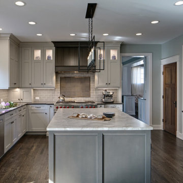
There were some druthers with the kitchen and there was a desire to make certain rooms more grown-up again. Unlike some of our clients who get rid of their formal dining rooms, this family wanted to keep theirs. They saw it as good space for entertaining and doing work – why not make it more stylish and purposeful?
THE REMODEL
Design Objectives
Keep the craftsman style of the home but make it more modern
Update the dining room to be more formal for entertaining and provide storage for china, stemware, wine, etc.
Open up the kitchen to improve flow
Incorporate new decorative lighting throughout the home to accent the home’s style
Transform the staircase into a statement piece that greets visitors – redesign it with arts & crafts details in the balusters, newel posts and handrails
Design Challenges:
Open up the dining room window for more light and a better view of the backyard. The previous window felt closed in with heavy shutters.
Improve kitchen flow without making the footprint larger
Make the entire home feel updated and cohesive while staying true to the house’s style.
THE RENEWED SPACES
We bumped out the dining room window to make a new bay window. The glass mullion design mimics the craftsman style, setting the tone for the room while letting plenty of light in. It really opened up that end of the dining room. The view of the backyard is much bigger now, too. It’s also a great nook for playing board games, doing puzzles and playing with Legos.
We actually got rid of a walk-in pantry that had cut off a corner of the kitchen, and were able to keep all the main walls intact. The old pantry room is where the fridge is now, as well as a tall pantry cabinet, some additional cabinets and a new countertop surface. The flow is much better and it’s roomy now, with a kitchen table that’s great for informal meals, homework and kids seating when adults are entertaining in the dining room.
The cabinet, tile and countertop colors are still neutral but offer a more muted palette. To bring in the craftsman style, simple architectural details were added such as the hood and window valance, decorative furniture toes, a shaker door on the perimeter cabinets and a more modern cabinet door style on the island, pantry and refrigerator areas. New decorative lighting was added in the kitchen, dining room, living room, foyer and second-floor hallway to make the entire first floor feel updated. Also, the entire staircase was revamped. The existing hardwood was kept in place but stained medium brown to bring in some warmth.
“The Drury process made this project turn out better than we imagined,” one of the homeowners told us during the final photoshoot. “There were so many features we didn’t know about – like charging drawers – and ways of going about the remodel that didn’t come to us naturally. We’re so glad Alicia had so much experience and so many checklists. We got to think through everything and arrive at the best possible design for our family.”


 Robin's Nest Interiors
It was a pleasure to help this single dad transform a previous French Country motif into a Handsome Space with Masculine Vibe. The homeowner loves the blues you find in the Caribbean so we used those as accent colors throughout the rooms.
Entry
We painted the walls Sherwin Williams’ Latte (SW6108) to add warmth. We accessorized the homeowner’s beautiful burl wood cabinet with vibrant artwork and whimsical Chinese horses. I always recommend task lighting in a Foyer, if possible, and the rectangular lamp shade is the perfect shape to fit on the small end of the cabinet.
Powder Room
I adore the Candace Olson wallpaper we used in the Powder Room. The blocks look like sections of wood. It works great with the existing granite. Other examples of wallpaper here and here.
Great Room
We touched every surface in this Great Room from painting the walls Nomadic Desert (SW6107) to painting the ceiling Double Latte (SW9108) to make the room feel cozier to replacing the carpet with this transitional style with striated pattern to painting the white built-ins.
Furniture placement was a real challenge because the grand piano needed to stay without blocking the traffic flow through the space. The homeowner also wanted us to incorporate his chess table and chairs. We centered a small seating area in front of the fireplace utilizing two oversized club chairs and an upholstered ottoman with a wood tray that slides. The wood bases on the chairs helps their size not overpower the room. The velvet ottoman fabric with navy, azure, and teal blues is a showstopper.
We used the homeowner’s wonderful collection of unique puzzle boxes to accessorize the built-ins. We just added some pops of blues, greens and silver. The homeowner loves sculptural objects so the nickel twig wall decor was the perfect focal point above the mantle. We opted not to add anything to the mantle so it would not distract from the art piece.
We added decorative drapery panels installed on short rods between each set of doors. The homeowner was open to this abstract floral pattern in greens and blues!
We reupholstered the cushions for the chess table chairs in a fun geometric fabric that coordinates with the panel fabric. The homeowner does not use this set of doors to access the deck so we were able to position the table directly in front of them.
Kelly Sisler of Kelly Faux Creations worked her magic on the built-ins. We used Sherwin Williams’ Mega Greige (SW7031) as the base and then applied a heavy bronze glaze. It completely transformed the Great Room. Other examples of painting built-ins here and here.
We hoped you enjoyed this Handsome Space with Masculine Vibe. It was quite a transformation!

Sponsored
Sunbury, OH

J.Holderby - Renovations
Franklin County's Leading General Contractors - 2X Best of Houzz!
 Drury Design
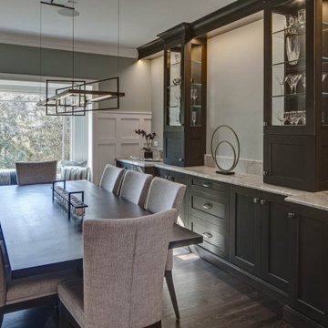
There were some druthers with the kitchen and there was a desire to make certain rooms more grown-up again. Unlike some of our clients who get rid of their formal dining rooms, this family wanted to keep theirs. They saw it as good space for entertaining and doing work – why not make it more stylish and purposeful?
THE REMODEL
Design Objectives
Keep the craftsman style of the home but make it more modern
Update the dining room to be more formal for entertaining and provide storage for china, stemware, wine, etc.
Open up the kitchen to improve flow
Incorporate new decorative lighting throughout the home to accent the home’s style
Transform the staircase into a statement piece that greets visitors – redesign it with arts & crafts details in the balusters, newel posts and handrails
Design Challenges:
Open up the dining room window for more light and a better view of the backyard. The previous window felt closed in with heavy shutters.
Improve kitchen flow without making the footprint larger
Make the entire home feel updated and cohesive while staying true to the house’s style.
THE RENEWED SPACES
We bumped out the dining room window to make a new bay window. The glass mullion design mimics the craftsman style, setting the tone for the room while letting plenty of light in. It really opened up that end of the dining room. The view of the backyard is much bigger now, too. It’s also a great nook for playing board games, doing puzzles and playing with Legos.
We actually got rid of a walk-in pantry that had cut off a corner of the kitchen, and were able to keep all the main walls intact. The old pantry room is where the fridge is now, as well as a tall pantry cabinet, some additional cabinets and a new countertop surface. The flow is much better and it’s roomy now, with a kitchen table that’s great for informal meals, homework and kids seating when adults are entertaining in the dining room.
The cabinet, tile and countertop colors are still neutral but offer a more muted palette. To bring in the craftsman style, simple architectural details were added such as the hood and window valance, decorative furniture toes, a shaker door on the perimeter cabinets and a more modern cabinet door style on the island, pantry and refrigerator areas. New decorative lighting was added in the kitchen, dining room, living room, foyer and second-floor hallway to make the entire first floor feel updated. Also, the entire staircase was revamped. The existing hardwood was kept in place but stained medium brown to bring in some warmth.
“The Drury process made this project turn out better than we imagined,” one of the homeowners told us during the final photoshoot. “There were so many features we didn’t know about – like charging drawers – and ways of going about the remodel that didn’t come to us naturally. We’re so glad Alicia had so much experience and so many checklists. We got to think through everything and arrive at the best possible design for our family.”
 Pennsylvania Landscape & Nursery Association
Keeping It Green http://keepingitgreenoutdoors.com
2014 PLNA Awards for Landscape Excellence Winner
Category: Residential $0-$15,000
Award Level: Honorable Mention
Project Description:
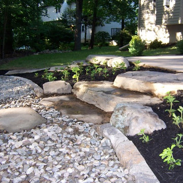
The objective of this project was to match the surrounding natural woodland setting with the new landscaping and outdoor area. The homeowners enjoy being outside and wanted an extension of their house that they could enjoy with family and friends. After returning from vacations in their cabin, they wanted to re-create the same feeling at their home. To complete their new cabin feel they wanted somewhere to have a camp fire with good company. I wanted to create flow from each area, and maximize space in a very limited area. The overall look of the project needed to blend with the natural environment and appear as though is has been there for years. The clients were very open minded and great to work with through the design process and we were able to achieve everything we needed while working with budgets and preferences.
The area was shaded with very poor drainage, which created a unusable space full of mud. The wet area made an already tight area with difficult access more challenging. It was also important to place the fire-pit at a safe distance from the house, and the tree canopy. The area was regarded to allow for better drainage and the downspouts were buried. A decorative river stone was selected to aide with drainage.
All plant material needed to be shade tolerant and provide color. As a result, I chose plants with terrific foliage color, and texture; Aucuba, Heuchera, Athyrium and Hosta. The construction materials to build the steps, walls and fire-pit needed to be a stone that would match the existing stone and environment. For this I chose PA flagstone and fieldstone of varying sizes for interest and to create a more natural look.
This project is special because of the limited space that needed to have its potential discovered and created. With the strong wooded environment the new outdoor area had to blend into that while working with the house and existing concrete patio. We exceeded our clients expectations by creating a new area that looked like it had been there forever.
Plant List:
5 Astilbe chinensis ‘Vision in Pink’
6 Heuchera x villosa ‘Citronella’
6 Hosta x ‘Sum and Substance’
2 Hydrangea macrophylla ‘Endless Summer
5 Buxus x ‘Green Velvet’
1 Leucothoe fontsiana ‘Rainbow’
4 Rhododendron ‘PJM’
2 Chamaecyparis obtusa ‘Aurea Nana’
1 Aucuba japonica ‘Variegata’
3 Athyrium filix-femina
24 Pachysandra terminalis
16 Torenia fournieri
Photo Credit:
Keeping It Green
 Drury Design
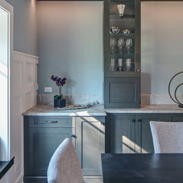
There were some druthers with the kitchen and there was a desire to make certain rooms more grown-up again. Unlike some of our clients who get rid of their formal dining rooms, this family wanted to keep theirs. They saw it as good space for entertaining and doing work – why not make it more stylish and purposeful?
THE REMODEL
Design Objectives
Keep the craftsman style of the home but make it more modern
Update the dining room to be more formal for entertaining and provide storage for china, stemware, wine, etc.
Open up the kitchen to improve flow
Incorporate new decorative lighting throughout the home to accent the home’s style
Transform the staircase into a statement piece that greets visitors – redesign it with arts & crafts details in the balusters, newel posts and handrails
Design Challenges:
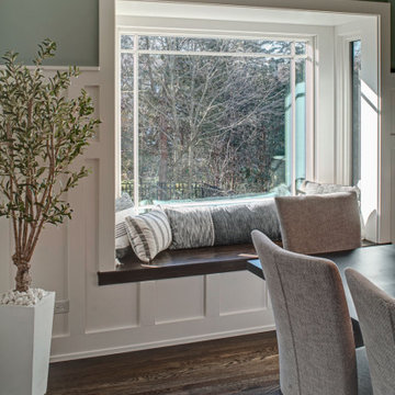
Open up the dining room window for more light and a better view of the backyard. The previous window felt closed in with heavy shutters.
Improve kitchen flow without making the footprint larger
Make the entire home feel updated and cohesive while staying true to the house’s style.
THE RENEWED SPACES
We bumped out the dining room window to make a new bay window. The glass mullion design mimics the craftsman style, setting the tone for the room while letting plenty of light in. It really opened up that end of the dining room. The view of the backyard is much bigger now, too. It’s also a great nook for playing board games, doing puzzles and playing with Legos.
We actually got rid of a walk-in pantry that had cut off a corner of the kitchen, and were able to keep all the main walls intact. The old pantry room is where the fridge is now, as well as a tall pantry cabinet, some additional cabinets and a new countertop surface. The flow is much better and it’s roomy now, with a kitchen table that’s great for informal meals, homework and kids seating when adults are entertaining in the dining room.
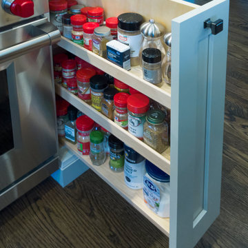
The cabinet, tile and countertop colors are still neutral but offer a more muted palette. To bring in the craftsman style, simple architectural details were added such as the hood and window valance, decorative furniture toes, a shaker door on the perimeter cabinets and a more modern cabinet door style on the island, pantry and refrigerator areas. New decorative lighting was added in the kitchen, dining room, living room, foyer and second-floor hallway to make the entire first floor feel updated. Also, the entire staircase was revamped. The existing hardwood was kept in place but stained medium brown to bring in some warmth.
“The Drury process made this project turn out better than we imagined,” one of the homeowners told us during the final photoshoot. “There were so many features we didn’t know about – like charging drawers – and ways of going about the remodel that didn’t come to us naturally. We’re so glad Alicia had so much experience and so many checklists. We got to think through everything and arrive at the best possible design for our family.”
 Drury Design
There were some druthers with the kitchen and there was a desire to make certain rooms more grown-up again. Unlike some of our clients who get rid of their formal dining rooms, this family wanted to keep theirs. They saw it as good space for entertaining and doing work – why not make it more stylish and purposeful?
THE REMODEL
Design Objectives
Keep the craftsman style of the home but make it more modern
Update the dining room to be more formal for entertaining and provide storage for china, stemware, wine, etc.
Open up the kitchen to improve flow
Incorporate new decorative lighting throughout the home to accent the home’s style
Transform the staircase into a statement piece that greets visitors – redesign it with arts & crafts details in the balusters, newel posts and handrails
Design Challenges:
Open up the dining room window for more light and a better view of the backyard. The previous window felt closed in with heavy shutters.
Improve kitchen flow without making the footprint larger
Make the entire home feel updated and cohesive while staying true to the house’s style.
THE RENEWED SPACES
We bumped out the dining room window to make a new bay window. The glass mullion design mimics the craftsman style, setting the tone for the room while letting plenty of light in. It really opened up that end of the dining room. The view of the backyard is much bigger now, too. It’s also a great nook for playing board games, doing puzzles and playing with Legos.
We actually got rid of a walk-in pantry that had cut off a corner of the kitchen, and were able to keep all the main walls intact. The old pantry room is where the fridge is now, as well as a tall pantry cabinet, some additional cabinets and a new countertop surface. The flow is much better and it’s roomy now, with a kitchen table that’s great for informal meals, homework and kids seating when adults are entertaining in the dining room.
The cabinet, tile and countertop colors are still neutral but offer a more muted palette. To bring in the craftsman style, simple architectural details were added such as the hood and window valance, decorative furniture toes, a shaker door on the perimeter cabinets and a more modern cabinet door style on the island, pantry and refrigerator areas. New decorative lighting was added in the kitchen, dining room, living room, foyer and second-floor hallway to make the entire first floor feel updated. Also, the entire staircase was revamped. The existing hardwood was kept in place but stained medium brown to bring in some warmth.
“The Drury process made this project turn out better than we imagined,” one of the homeowners told us during the final photoshoot. “There were so many features we didn’t know about – like charging drawers – and ways of going about the remodel that didn’t come to us naturally. We’re so glad Alicia had so much experience and so many checklists. We got to think through everything and arrive at the best possible design for our family.”
 Drury Design
There were some druthers with the kitchen and there was a desire to make certain rooms more grown-up again. Unlike some of our clients who get rid of their formal dining rooms, this family wanted to keep theirs. They saw it as good space for entertaining and doing work – why not make it more stylish and purposeful?
THE REMODEL
Design Objectives
Keep the craftsman style of the home but make it more modern
Update the dining room to be more formal for entertaining and provide storage for china, stemware, wine, etc.
Open up the kitchen to improve flow
Incorporate new decorative lighting throughout the home to accent the home’s style
Transform the staircase into a statement piece that greets visitors – redesign it with arts & crafts details in the balusters, newel posts and handrails
Design Challenges:
Open up the dining room window for more light and a better view of the backyard. The previous window felt closed in with heavy shutters.
Improve kitchen flow without making the footprint larger
Make the entire home feel updated and cohesive while staying true to the house’s style.
THE RENEWED SPACES
We bumped out the dining room window to make a new bay window. The glass mullion design mimics the craftsman style, setting the tone for the room while letting plenty of light in. It really opened up that end of the dining room. The view of the backyard is much bigger now, too. It’s also a great nook for playing board games, doing puzzles and playing with Legos.
We actually got rid of a walk-in pantry that had cut off a corner of the kitchen, and were able to keep all the main walls intact. The old pantry room is where the fridge is now, as well as a tall pantry cabinet, some additional cabinets and a new countertop surface. The flow is much better and it’s roomy now, with a kitchen table that’s great for informal meals, homework and kids seating when adults are entertaining in the dining room.
The cabinet, tile and countertop colors are still neutral but offer a more muted palette. To bring in the craftsman style, simple architectural details were added such as the hood and window valance, decorative furniture toes, a shaker door on the perimeter cabinets and a more modern cabinet door style on the island, pantry and refrigerator areas. New decorative lighting was added in the kitchen, dining room, living room, foyer and second-floor hallway to make the entire first floor feel updated. Also, the entire staircase was revamped. The existing hardwood was kept in place but stained medium brown to bring in some warmth.
“The Drury process made this project turn out better than we imagined,” one of the homeowners told us during the final photoshoot. “There were so many features we didn’t know about – like charging drawers – and ways of going about the remodel that didn’t come to us naturally. We’re so glad Alicia had so much experience and so many checklists. We got to think through everything and arrive at the best possible design for our family.”

 Verboys Interiors
,
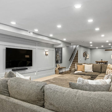
Living room library - mid-sized transitional open concept carpeted and brown floor living room library idea with beige walls, no fireplace and a wall-mounted tv
Living room library - mid-sized transitional open concept carpeted and brown floor living room library idea with beige walls, no fireplace and a wall-mounted tv
Sponsored
Sunbury, OH
J.Holderby - Renovations
Franklin County's Leading General Contractors - 2X Best of Houzz!
 Drury Design
There were some druthers with the kitchen and there was a desire to make certain rooms more grown-up again. Unlike some of our clients who get rid of their formal dining rooms, this family wanted to keep theirs. They saw it as good space for entertaining and doing work – why not make it more stylish and purposeful?
THE REMODEL
Design Objectives
Keep the craftsman style of the home but make it more modern
Update the dining room to be more formal for entertaining and provide storage for china, stemware, wine, etc.
Open up the kitchen to improve flow
Incorporate new decorative lighting throughout the home to accent the home’s style
Transform the staircase into a statement piece that greets visitors – redesign it with arts & crafts details in the balusters, newel posts and handrails
Design Challenges:
Open up the dining room window for more light and a better view of the backyard. The previous window felt closed in with heavy shutters.
Improve kitchen flow without making the footprint larger
Make the entire home feel updated and cohesive while staying true to the house’s style.
THE RENEWED SPACES
We bumped out the dining room window to make a new bay window. The glass mullion design mimics the craftsman style, setting the tone for the room while letting plenty of light in. It really opened up that end of the dining room. The view of the backyard is much bigger now, too. It’s also a great nook for playing board games, doing puzzles and playing with Legos.
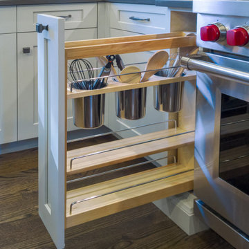
We actually got rid of a walk-in pantry that had cut off a corner of the kitchen, and were able to keep all the main walls intact. The old pantry room is where the fridge is now, as well as a tall pantry cabinet, some additional cabinets and a new countertop surface. The flow is much better and it’s roomy now, with a kitchen table that’s great for informal meals, homework and kids seating when adults are entertaining in the dining room.
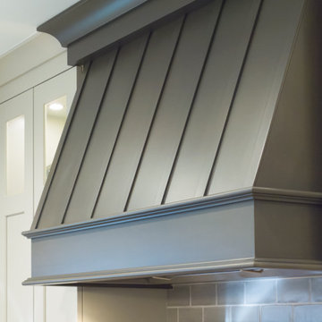
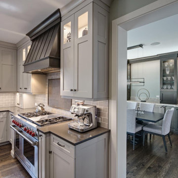
The cabinet, tile and countertop colors are still neutral but offer a more muted palette. To bring in the craftsman style, simple architectural details were added such as the hood and window valance, decorative furniture toes, a shaker door on the perimeter cabinets and a more modern cabinet door style on the island, pantry and refrigerator areas. New decorative lighting was added in the kitchen, dining room, living room, foyer and second-floor hallway to make the entire first floor feel updated. Also, the entire staircase was revamped. The existing hardwood was kept in place but stained medium brown to bring in some warmth.
“The Drury process made this project turn out better than we imagined,” one of the homeowners told us during the final photoshoot. “There were so many features we didn’t know about – like charging drawers – and ways of going about the remodel that didn’t come to us naturally. We’re so glad Alicia had so much experience and so many checklists. We got to think through everything and arrive at the best possible design for our family.”
 Drury Design
There were some druthers with the kitchen and there was a desire to make certain rooms more grown-up again. Unlike some of our clients who get rid of their formal dining rooms, this family wanted to keep theirs. They saw it as good space for entertaining and doing work – why not make it more stylish and purposeful?
THE REMODEL
Design Objectives
Keep the craftsman style of the home but make it more modern
Update the dining room to be more formal for entertaining and provide storage for china, stemware, wine, etc.
Open up the kitchen to improve flow
Incorporate new decorative lighting throughout the home to accent the home’s style
Transform the staircase into a statement piece that greets visitors – redesign it with arts & crafts details in the balusters, newel posts and handrails
Design Challenges:
Open up the dining room window for more light and a better view of the backyard. The previous window felt closed in with heavy shutters.
Improve kitchen flow without making the footprint larger
Make the entire home feel updated and cohesive while staying true to the house’s style.
THE RENEWED SPACES
We bumped out the dining room window to make a new bay window. The glass mullion design mimics the craftsman style, setting the tone for the room while letting plenty of light in. It really opened up that end of the dining room. The view of the backyard is much bigger now, too. It’s also a great nook for playing board games, doing puzzles and playing with Legos.
We actually got rid of a walk-in pantry that had cut off a corner of the kitchen, and were able to keep all the main walls intact. The old pantry room is where the fridge is now, as well as a tall pantry cabinet, some additional cabinets and a new countertop surface. The flow is much better and it’s roomy now, with a kitchen table that’s great for informal meals, homework and kids seating when adults are entertaining in the dining room.
The cabinet, tile and countertop colors are still neutral but offer a more muted palette. To bring in the craftsman style, simple architectural details were added such as the hood and window valance, decorative furniture toes, a shaker door on the perimeter cabinets and a more modern cabinet door style on the island, pantry and refrigerator areas. New decorative lighting was added in the kitchen, dining room, living room, foyer and second-floor hallway to make the entire first floor feel updated. Also, the entire staircase was revamped. The existing hardwood was kept in place but stained medium brown to bring in some warmth.
“The Drury process made this project turn out better than we imagined,” one of the homeowners told us during the final photoshoot. “There were so many features we didn’t know about – like charging drawers – and ways of going about the remodel that didn’t come to us naturally. We’re so glad Alicia had so much experience and so many checklists. We got to think through everything and arrive at the best possible design for our family.”
 Drury Design
There were some druthers with the kitchen and there was a desire to make certain rooms more grown-up again. Unlike some of our clients who get rid of their formal dining rooms, this family wanted to keep theirs. They saw it as good space for entertaining and doing work – why not make it more stylish and purposeful?
THE REMODEL
Design Objectives
Keep the craftsman style of the home but make it more modern
Update the dining room to be more formal for entertaining and provide storage for china, stemware, wine, etc.
Open up the kitchen to improve flow
Incorporate new decorative lighting throughout the home to accent the home’s style
Transform the staircase into a statement piece that greets visitors – redesign it with arts & crafts details in the balusters, newel posts and handrails
Design Challenges:
Open up the dining room window for more light and a better view of the backyard. The previous window felt closed in with heavy shutters.
Improve kitchen flow without making the footprint larger
Make the entire home feel updated and cohesive while staying true to the house’s style.
THE RENEWED SPACES
We bumped out the dining room window to make a new bay window. The glass mullion design mimics the craftsman style, setting the tone for the room while letting plenty of light in. It really opened up that end of the dining room. The view of the backyard is much bigger now, too. It’s also a great nook for playing board games, doing puzzles and playing with Legos.
We actually got rid of a walk-in pantry that had cut off a corner of the kitchen, and were able to keep all the main walls intact. The old pantry room is where the fridge is now, as well as a tall pantry cabinet, some additional cabinets and a new countertop surface. The flow is much better and it’s roomy now, with a kitchen table that’s great for informal meals, homework and kids seating when adults are entertaining in the dining room.
The cabinet, tile and countertop colors are still neutral but offer a more muted palette. To bring in the craftsman style, simple architectural details were added such as the hood and window valance, decorative furniture toes, a shaker door on the perimeter cabinets and a more modern cabinet door style on the island, pantry and refrigerator areas. New decorative lighting was added in the kitchen, dining room, living room, foyer and second-floor hallway to make the entire first floor feel updated. Also, the entire staircase was revamped. The existing hardwood was kept in place but stained medium brown to bring in some warmth.
“The Drury process made this project turn out better than we imagined,” one of the homeowners told us during the final photoshoot. “There were so many features we didn’t know about – like charging drawers – and ways of going about the remodel that didn’t come to us naturally. We’re so glad Alicia had so much experience and so many checklists. We got to think through everything and arrive at the best possible design for our family.”
 Drury Design
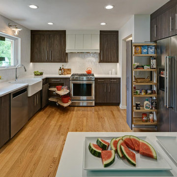
The owners of this true mid-century ranch in Wheaton were ready for a kitchen update. The home’s main living room area is decorated in a very cool, sparse way with plenty of nods to mid-century design. A new kitchen would need to bridge classic and modern notions of Mid-Century expression through the style’s characteristic clean lines and artistic notions of simplicity and straightforward functionality.
The idea was to keep a hint of mid-century influence in a modern design that could somehow be more open while accommodating more storage
The objectives were:
• Stay within the existing space while creating an open feel and winning more storage room
• Make the space brighter while using a darker cabinet finish
• Create proper ventilation for the range
Design challenges we solved for:
• Open the kitchen to the adjacent dining room without sacrificing storage
• Remove multiple layers of flooring to make the kitchen floor level with the rest of the house
• Match the new kitchen flooring to the flooring in nearby dining and living spaces
Problems solved. Here’s what we did:
• Took out soffits around the kitchen to allow for taller cabinets with more storage
• Added cabinet pull-outs that maximize under-cabinet storage space
• Used large cabinets in standard sizes
• Skipped cabinets on the window wall, opting for space- and light-friendly floating shelves
• Enhanced overall brightness with bright, white counters and textured white tile that offered a connecting contrast to the darker woodgrain cabinets
• Took out a post between the kitchen and dining room to make the space feel more open
• Added under-cabinet lights – unobtrusive and handy for task lighting
The owners love the look, feel and functionality of their new kitchen. Its sleek, modern character and notions of mid-century spirit add new excitement to the home’s original 1958 personality.
Sponsored
Columbus, OH

Hope Restoration & General Contracting
Columbus Design-Build, Kitchen & Bath Remodeling, Historic Renovations
 Drury Design
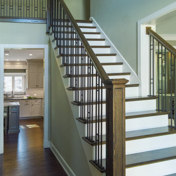
There were some druthers with the kitchen and there was a desire to make certain rooms more grown-up again. Unlike some of our clients who get rid of their formal dining rooms, this family wanted to keep theirs. They saw it as good space for entertaining and doing work – why not make it more stylish and purposeful?
THE REMODEL
Design Objectives
Keep the craftsman style of the home but make it more modern
Update the dining room to be more formal for entertaining and provide storage for china, stemware, wine, etc.
Open up the kitchen to improve flow
Incorporate new decorative lighting throughout the home to accent the home’s style
Transform the staircase into a statement piece that greets visitors – redesign it with arts & crafts details in the balusters, newel posts and handrails
Design Challenges:
Open up the dining room window for more light and a better view of the backyard. The previous window felt closed in with heavy shutters.
Improve kitchen flow without making the footprint larger
Make the entire home feel updated and cohesive while staying true to the house’s style.
THE RENEWED SPACES
We bumped out the dining room window to make a new bay window. The glass mullion design mimics the craftsman style, setting the tone for the room while letting plenty of light in. It really opened up that end of the dining room. The view of the backyard is much bigger now, too. It’s also a great nook for playing board games, doing puzzles and playing with Legos.
We actually got rid of a walk-in pantry that had cut off a corner of the kitchen, and were able to keep all the main walls intact. The old pantry room is where the fridge is now, as well as a tall pantry cabinet, some additional cabinets and a new countertop surface. The flow is much better and it’s roomy now, with a kitchen table that’s great for informal meals, homework and kids seating when adults are entertaining in the dining room.
The cabinet, tile and countertop colors are still neutral but offer a more muted palette. To bring in the craftsman style, simple architectural details were added such as the hood and window valance, decorative furniture toes, a shaker door on the perimeter cabinets and a more modern cabinet door style on the island, pantry and refrigerator areas. New decorative lighting was added in the kitchen, dining room, living room, foyer and second-floor hallway to make the entire first floor feel updated. Also, the entire staircase was revamped. The existing hardwood was kept in place but stained medium brown to bring in some warmth.
“The Drury process made this project turn out better than we imagined,” one of the homeowners told us during the final photoshoot. “There were so many features we didn’t know about – like charging drawers – and ways of going about the remodel that didn’t come to us naturally. We’re so glad Alicia had so much experience and so many checklists. We got to think through everything and arrive at the best possible design for our family.”
 Drury Design
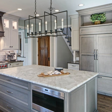
There were some druthers with the kitchen and there was a desire to make certain rooms more grown-up again. Unlike some of our clients who get rid of their formal dining rooms, this family wanted to keep theirs. They saw it as good space for entertaining and doing work – why not make it more stylish and purposeful?
THE REMODEL
Design Objectives
Keep the craftsman style of the home but make it more modern
Update the dining room to be more formal for entertaining and provide storage for china, stemware, wine, etc.
Open up the kitchen to improve flow
Incorporate new decorative lighting throughout the home to accent the home’s style
Transform the staircase into a statement piece that greets visitors – redesign it with arts & crafts details in the balusters, newel posts and handrails
Design Challenges:
Open up the dining room window for more light and a better view of the backyard. The previous window felt closed in with heavy shutters.
Improve kitchen flow without making the footprint larger
Make the entire home feel updated and cohesive while staying true to the house’s style.
THE RENEWED SPACES
We bumped out the dining room window to make a new bay window. The glass mullion design mimics the craftsman style, setting the tone for the room while letting plenty of light in. It really opened up that end of the dining room. The view of the backyard is much bigger now, too. It’s also a great nook for playing board games, doing puzzles and playing with Legos.
We actually got rid of a walk-in pantry that had cut off a corner of the kitchen, and were able to keep all the main walls intact. The old pantry room is where the fridge is now, as well as a tall pantry cabinet, some additional cabinets and a new countertop surface. The flow is much better and it’s roomy now, with a kitchen table that’s great for informal meals, homework and kids seating when adults are entertaining in the dining room.
The cabinet, tile and countertop colors are still neutral but offer a more muted palette. To bring in the craftsman style, simple architectural details were added such as the hood and window valance, decorative furniture toes, a shaker door on the perimeter cabinets and a more modern cabinet door style on the island, pantry and refrigerator areas. New decorative lighting was added in the kitchen, dining room, living room, foyer and second-floor hallway to make the entire first floor feel updated. Also, the entire staircase was revamped. The existing hardwood was kept in place but stained medium brown to bring in some warmth.
“The Drury process made this project turn out better than we imagined,” one of the homeowners told us during the final photoshoot. “There were so many features we didn’t know about – like charging drawers – and ways of going about the remodel that didn’t come to us naturally. We’re so glad Alicia had so much experience and so many checklists. We got to think through everything and arrive at the best possible design for our family.”
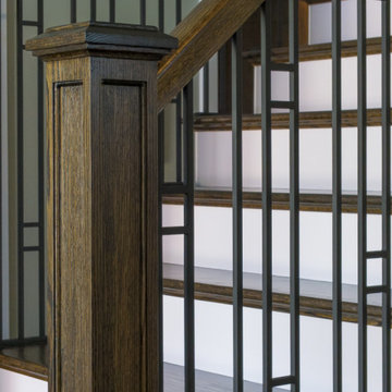 Drury Design
There were some druthers with the kitchen and there was a desire to make certain rooms more grown-up again. Unlike some of our clients who get rid of their formal dining rooms, this family wanted to keep theirs. They saw it as good space for entertaining and doing work – why not make it more stylish and purposeful?
THE REMODEL
Design Objectives
Keep the craftsman style of the home but make it more modern
Update the dining room to be more formal for entertaining and provide storage for china, stemware, wine, etc.
Open up the kitchen to improve flow
Incorporate new decorative lighting throughout the home to accent the home’s style
Transform the staircase into a statement piece that greets visitors – redesign it with arts & crafts details in the balusters, newel posts and handrails
Design Challenges:
Open up the dining room window for more light and a better view of the backyard. The previous window felt closed in with heavy shutters.
Improve kitchen flow without making the footprint larger
Make the entire home feel updated and cohesive while staying true to the house’s style.
THE RENEWED SPACES
We bumped out the dining room window to make a new bay window. The glass mullion design mimics the craftsman style, setting the tone for the room while letting plenty of light in. It really opened up that end of the dining room. The view of the backyard is much bigger now, too. It’s also a great nook for playing board games, doing puzzles and playing with Legos.
We actually got rid of a walk-in pantry that had cut off a corner of the kitchen, and were able to keep all the main walls intact. The old pantry room is where the fridge is now, as well as a tall pantry cabinet, some additional cabinets and a new countertop surface. The flow is much better and it’s roomy now, with a kitchen table that’s great for informal meals, homework and kids seating when adults are entertaining in the dining room.
The cabinet, tile and countertop colors are still neutral but offer a more muted palette. To bring in the craftsman style, simple architectural details were added such as the hood and window valance, decorative furniture toes, a shaker door on the perimeter cabinets and a more modern cabinet door style on the island, pantry and refrigerator areas. New decorative lighting was added in the kitchen, dining room, living room, foyer and second-floor hallway to make the entire first floor feel updated. Also, the entire staircase was revamped. The existing hardwood was kept in place but stained medium brown to bring in some warmth.
“The Drury process made this project turn out better than we imagined,” one of the homeowners told us during the final photoshoot. “There were so many features we didn’t know about – like charging drawers – and ways of going about the remodel that didn’t come to us naturally. We’re so glad Alicia had so much experience and so many checklists. We got to think through everything and arrive at the best possible design for our family.”
197