
Search results for "Decorative objects" in Home Design Ideas
 lavish
Warm, Natural & Quietly Luxurious — Primary Bathroom Remodel | Raleigh, NC
This primary bathroom remodel is a masterclass in restraint. No loud statements, no trend-chasing — just a beautifully considered combination of natural materials, soft color, and hardware that ties it all together. The result feels like a boutique hotel bathroom that also happens to feel completely personal.
The vanity is the anchor of the space. Custom white oak cabinetry in a warm, medium-toned stain brings natural grain and texture to the room without competing with anything around it. Brushed brass hardware — bar pulls with decorative rosette ends — reads elevated without being fussy. White quartz countertops with soft veining sit cleanly above, and a large arched black-framed mirror grounds the wall in a shape that echoes the soft, organic tone of the whole room. Flanking the mirror, a pair of sage green and gold wall sconces add a layer of unexpected color that feels completely right — designer without being obvious.
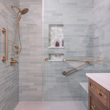
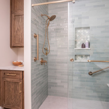
The shower is where this project truly shines. Floor-to-ceiling sea glass green linear tile wraps every wall in a luminous, slightly irregular pattern that catches light beautifully. Brushed brass fixtures — a hand shower, slide bar, grab bars, and frameless sliding door hardware — run throughout, keeping the palette tight. Two built-in niches lined with arabesque marble mosaic tile provide both function and a moment of pattern within the serene field of green. A quartz bench seat and large-format floor tile with a center drain complete the enclosure with the same calm intentionality found everywhere else.
Live-edge floating shelves in rich, burl-patterned wood add warmth to the open wall space, styled with a mix of black iron candleholders, organic wooden objects, and natural accessories. Every detail — down to the wooden tray and hand-thrown vase on the vanity — was chosen to feel grounded, tactile, and lived-in.
 Janvrin & Co.
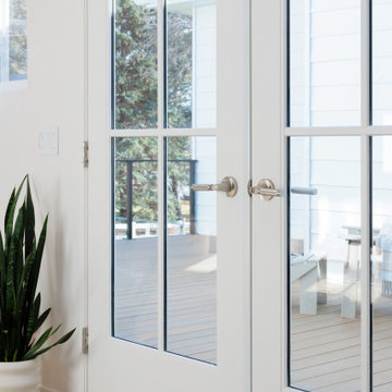
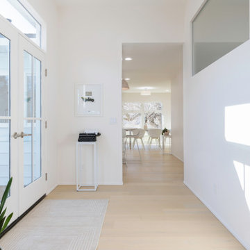
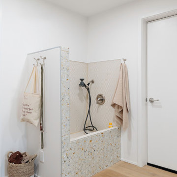
A transformation of a modest raised ranch into a modern oasis. I was the interior designer and general contractor from mechanicals to finishing. It’s also my personal home.
The interior design style is that of modern minimalist meets organic modern. I wanted a space that reduced distractions and let the eyes, head, and soul rest. Where everything inside the home has a specific use and purpose. The objects in our home are fewer but each hold a great personal value. You might expect to see this airy aesthetic, with its gallery white walls, in California or New York. Not nestled in a modest 50 year old neighborhood in Omaha, Nebraska. Creating a minimal aesthetic is one of the trickiest design styles to pull off. It is more than just less stuff and lots of white. It means sticking to these design principals:
-weaving in an abundance of textures
-incorporating natural finishes
-keenly curating art
-giving extra attention to scale
-limiting purely decorative items
-maximizing natural light
This style is not to be confused with the frugality of reductive design. I have incorporated many elevated basics that create an aesthetic of quiet luxury:
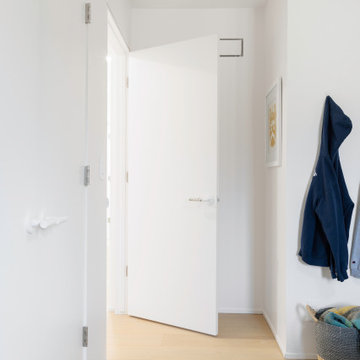
-architectural bead for trim-less doors
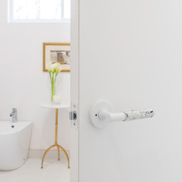
-first-of-its kind interior door hardware made of terrazzo
-historical marble found in landmark interiors like the NY Public Library
-premium flush air vents that disappear out of site
-luxury appliances from GE Café and Signature
-elegant and resilient terrazzo field tiles
Ours was not a simple interior remodel and addition:
-gutted and remodeled the existing 2,000 SF
-added on approximately another 1,000 SF
-moved and installed all new major mechanicals i.e. heating, plumbing and electrical.
-knocked through foundation walls to extend the space back
-dug down and built up
 Janvrin & Co.
A transformation of a modest raised ranch into a modern oasis. I was the interior designer and general contractor from mechanicals to finishing. It’s also my personal home.
The interior design style is that of modern minimalist meets organic modern. I wanted a space that reduced distractions and let the eyes, head, and soul rest. Where everything inside the home has a specific use and purpose. The objects in our home are fewer but each hold a great personal value. You might expect to see this airy aesthetic, with its gallery white walls, in California or New York. Not nestled in a modest 50 year old neighborhood in Omaha, Nebraska. Creating a minimal aesthetic is one of the trickiest design styles to pull off. It is more than just less stuff and lots of white. It means sticking to these design principals:
-weaving in an abundance of textures
-incorporating natural finishes
-keenly curating art
-giving extra attention to scale
-limiting purely decorative items
-maximizing natural light
This style is not to be confused with the frugality of reductive design. I have incorporated many elevated basics that create an aesthetic of quiet luxury:
-architectural bead for trim-less doors
-first-of-its kind interior door hardware made of terrazzo
-historical marble found in landmark interiors like the NY Public Library
-premium flush air vents that disappear out of site
-luxury appliances from GE Café and Signature
-elegant and resilient terrazzo field tiles
Ours was not a simple interior remodel and addition:
-gutted and remodeled the existing 2,000 SF
-added on approximately another 1,000 SF
-moved and installed all new major mechanicals i.e. heating, plumbing and electrical.
-knocked through foundation walls to extend the space back
-dug down and built up
Find the right local pro for your project
 orly eran - architecture & design
English
אשמח לענות על כל שאלה שלכם. לקבלת הצעה המתאימה במיוחד לכם, אנא צרו קשר.
שם
טלפון
המדריך למשפץ המבולבל
expandהמלצות
collapseUncategorized
גינה חדשה בעיר
שיפוץ דירה במודיעין
שיפוץ דירה במודיעין: שילוב של טבע וצבע
expandפרוייקטים
expandמאמרים
expandפרסומים בעיתונות
expandאודות
Remodeling and Home Design
house and garden in Israel
House and garden in Israel – how to create a connection between them
Here are some ideas.
All of the photos are from projects designed by my office.
1. Think about a good connection between the inside of the house and the garden – this is important for both!
A garden is always better and more useful if it is open to the main living area.
2. Two windows looking out to the garden in different directions are always better than one.
3. Using the same floor inside and outside will connect them and enlarge both.
In this project we used old -fashioned concrete tiles for the house and garden. We used old tiles which we found in the garden to guard the renovated house against the evil eye…..
4. Treat at least part of the garden as you would treat a room inside the house a room wth a floor, ceiling, walls, furniture. This is especially true for gardens in countries like Israel, where gardens can be used almost all the time
5. Even narrow side paths and akward corners can become worthwhile outdoor spaces if you treat them well!
Add benches, plants, beautiful floors and furniture and make them part of your home design.
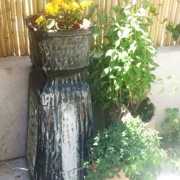
With the help of beautiful furniture and a large flowerpot, we created a small outdoor "living room" between different levels of the garden:
6. Use flowerpots, sculpures, decorations, lights, in all different hights and shapes and colors, as you would inside – and more!
use beautiful objects, create beautiful compositions.
 Janvrin & Co.
A transformation of a modest raised ranch into a modern oasis. I was the interior designer and general contractor from mechanicals to finishing. It’s also my personal home.
The interior design style is that of modern minimalist meets organic modern. I wanted a space that reduced distractions and let the eyes, head, and soul rest. Where everything inside the home has a specific use and purpose. The objects in our home are fewer but each hold a great personal value. You might expect to see this airy aesthetic, with its gallery white walls, in California or New York. Not nestled in a modest 50 year old neighborhood in Omaha, Nebraska. Creating a minimal aesthetic is one of the trickiest design styles to pull off. It is more than just less stuff and lots of white. It means sticking to these design principals:
-weaving in an abundance of textures
-incorporating natural finishes
-keenly curating art
-giving extra attention to scale
-limiting purely decorative items
-maximizing natural light
This style is not to be confused with the frugality of reductive design. I have incorporated many elevated basics that create an aesthetic of quiet luxury:
-architectural bead for trim-less doors
-first-of-its kind interior door hardware made of terrazzo
-historical marble found in landmark interiors like the NY Public Library
-premium flush air vents that disappear out of site
-luxury appliances from GE Café and Signature
-elegant and resilient terrazzo field tiles
Ours was not a simple interior remodel and addition:
-gutted and remodeled the existing 2,000 SF
-added on approximately another 1,000 SF
-moved and installed all new major mechanicals i.e. heating, plumbing and electrical.
-knocked through foundation walls to extend the space back
-dug down and built up
 Janvrin & Co.
A transformation of a modest raised ranch into a modern oasis. I was the interior designer and general contractor from mechanicals to finishing. It’s also my personal home.
The interior design style is that of modern minimalist meets organic modern. I wanted a space that reduced distractions and let the eyes, head, and soul rest. Where everything inside the home has a specific use and purpose. The objects in our home are fewer but each hold a great personal value. You might expect to see this airy aesthetic, with its gallery white walls, in California or New York. Not nestled in a modest 50 year old neighborhood in Omaha, Nebraska. Creating a minimal aesthetic is one of the trickiest design styles to pull off. It is more than just less stuff and lots of white. It means sticking to these design principals:
-weaving in an abundance of textures
-incorporating natural finishes
-keenly curating art
-giving extra attention to scale
-limiting purely decorative items
-maximizing natural light
This style is not to be confused with the frugality of reductive design. I have incorporated many elevated basics that create an aesthetic of quiet luxury:
-architectural bead for trim-less doors
-first-of-its kind interior door hardware made of terrazzo
-historical marble found in landmark interiors like the NY Public Library
-premium flush air vents that disappear out of site
-luxury appliances from GE Café and Signature
-elegant and resilient terrazzo field tiles
Ours was not a simple interior remodel and addition:
-gutted and remodeled the existing 2,000 SF
-added on approximately another 1,000 SF
-moved and installed all new major mechanicals i.e. heating, plumbing and electrical.
-knocked through foundation walls to extend the space back
-dug down and built up
 lavish
Warm, Natural & Quietly Luxurious — Primary Bathroom Remodel | Raleigh, NC
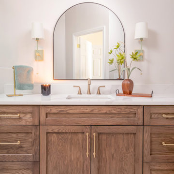
This primary bathroom remodel is a masterclass in restraint. No loud statements, no trend-chasing — just a beautifully considered combination of natural materials, soft color, and hardware that ties it all together. The result feels like a boutique hotel bathroom that also happens to feel completely personal.
The vanity is the anchor of the space. Custom white oak cabinetry in a warm, medium-toned stain brings natural grain and texture to the room without competing with anything around it. Brushed brass hardware — bar pulls with decorative rosette ends — reads elevated without being fussy. White quartz countertops with soft veining sit cleanly above, and a large arched black-framed mirror grounds the wall in a shape that echoes the soft, organic tone of the whole room. Flanking the mirror, a pair of sage green and gold wall sconces add a layer of unexpected color that feels completely right — designer without being obvious.
The shower is where this project truly shines. Floor-to-ceiling sea glass green linear tile wraps every wall in a luminous, slightly irregular pattern that catches light beautifully. Brushed brass fixtures — a hand shower, slide bar, grab bars, and frameless sliding door hardware — run throughout, keeping the palette tight. Two built-in niches lined with arabesque marble mosaic tile provide both function and a moment of pattern within the serene field of green. A quartz bench seat and large-format floor tile with a center drain complete the enclosure with the same calm intentionality found everywhere else.
Live-edge floating shelves in rich, burl-patterned wood add warmth to the open wall space, styled with a mix of black iron candleholders, organic wooden objects, and natural accessories. Every detail — down to the wooden tray and hand-thrown vase on the vanity — was chosen to feel grounded, tactile, and lived-in.
Sponsored
Sunbury, OH

J.Holderby - Renovations
Franklin County's Leading General Contractors - 2X Best of Houzz!
 Janvrin & Co.
A transformation of a modest raised ranch into a modern oasis. I was the interior designer and general contractor from mechanicals to finishing. It’s also my personal home.
The interior design style is that of modern minimalist meets organic modern. I wanted a space that reduced distractions and let the eyes, head, and soul rest. Where everything inside the home has a specific use and purpose. The objects in our home are fewer but each hold a great personal value. You might expect to see this airy aesthetic, with its gallery white walls, in California or New York. Not nestled in a modest 50 year old neighborhood in Omaha, Nebraska. Creating a minimal aesthetic is one of the trickiest design styles to pull off. It is more than just less stuff and lots of white. It means sticking to these design principals:
-weaving in an abundance of textures
-incorporating natural finishes
-keenly curating art
-giving extra attention to scale
-limiting purely decorative items
-maximizing natural light
This style is not to be confused with the frugality of reductive design. I have incorporated many elevated basics that create an aesthetic of quiet luxury:
-architectural bead for trim-less doors
-first-of-its kind interior door hardware made of terrazzo
-historical marble found in landmark interiors like the NY Public Library
-premium flush air vents that disappear out of site
-luxury appliances from GE Café and Signature
-elegant and resilient terrazzo field tiles
Ours was not a simple interior remodel and addition:
-gutted and remodeled the existing 2,000 SF
-added on approximately another 1,000 SF
-moved and installed all new major mechanicals i.e. heating, plumbing and electrical.
-knocked through foundation walls to extend the space back
-dug down and built up
 Janvrin & Co.
A transformation of a modest raised ranch into a modern oasis. I was the interior designer and general contractor from mechanicals to finishing. It’s also my personal home.
The interior design style is that of modern minimalist meets organic modern. I wanted a space that reduced distractions and let the eyes, head, and soul rest. Where everything inside the home has a specific use and purpose. The objects in our home are fewer but each hold a great personal value. You might expect to see this airy aesthetic, with its gallery white walls, in California or New York. Not nestled in a modest 50 year old neighborhood in Omaha, Nebraska. Creating a minimal aesthetic is one of the trickiest design styles to pull off. It is more than just less stuff and lots of white. It means sticking to these design principals:
-weaving in an abundance of textures
-incorporating natural finishes
-keenly curating art
-giving extra attention to scale
-limiting purely decorative items
-maximizing natural light
This style is not to be confused with the frugality of reductive design. I have incorporated many elevated basics that create an aesthetic of quiet luxury:
-architectural bead for trim-less doors
-first-of-its kind interior door hardware made of terrazzo
-historical marble found in landmark interiors like the NY Public Library
-premium flush air vents that disappear out of site
-luxury appliances from GE Café and Signature
-elegant and resilient terrazzo field tiles
Ours was not a simple interior remodel and addition:
-gutted and remodeled the existing 2,000 SF
-added on approximately another 1,000 SF
-moved and installed all new major mechanicals i.e. heating, plumbing and electrical.
-knocked through foundation walls to extend the space back
-dug down and built up
 lavish
Warm, Natural & Quietly Luxurious — Primary Bathroom Remodel | Raleigh, NC
This primary bathroom remodel is a masterclass in restraint. No loud statements, no trend-chasing — just a beautifully considered combination of natural materials, soft color, and hardware that ties it all together. The result feels like a boutique hotel bathroom that also happens to feel completely personal.
The vanity is the anchor of the space. Custom white oak cabinetry in a warm, medium-toned stain brings natural grain and texture to the room without competing with anything around it. Brushed brass hardware — bar pulls with decorative rosette ends — reads elevated without being fussy. White quartz countertops with soft veining sit cleanly above, and a large arched black-framed mirror grounds the wall in a shape that echoes the soft, organic tone of the whole room. Flanking the mirror, a pair of sage green and gold wall sconces add a layer of unexpected color that feels completely right — designer without being obvious.
The shower is where this project truly shines. Floor-to-ceiling sea glass green linear tile wraps every wall in a luminous, slightly irregular pattern that catches light beautifully. Brushed brass fixtures — a hand shower, slide bar, grab bars, and frameless sliding door hardware — run throughout, keeping the palette tight. Two built-in niches lined with arabesque marble mosaic tile provide both function and a moment of pattern within the serene field of green. A quartz bench seat and large-format floor tile with a center drain complete the enclosure with the same calm intentionality found everywhere else.
Live-edge floating shelves in rich, burl-patterned wood add warmth to the open wall space, styled with a mix of black iron candleholders, organic wooden objects, and natural accessories. Every detail — down to the wooden tray and hand-thrown vase on the vanity — was chosen to feel grounded, tactile, and lived-in.
 Janvrin & Co.
A transformation of a modest raised ranch into a modern oasis. I was the interior designer and general contractor from mechanicals to finishing. It’s also my personal home.
The interior design style is that of modern minimalist meets organic modern. I wanted a space that reduced distractions and let the eyes, head, and soul rest. Where everything inside the home has a specific use and purpose. The objects in our home are fewer but each hold a great personal value. You might expect to see this airy aesthetic, with its gallery white walls, in California or New York. Not nestled in a modest 50 year old neighborhood in Omaha, Nebraska. Creating a minimal aesthetic is one of the trickiest design styles to pull off. It is more than just less stuff and lots of white. It means sticking to these design principals:
-weaving in an abundance of textures
-incorporating natural finishes
-keenly curating art
-giving extra attention to scale
-limiting purely decorative items
-maximizing natural light
This style is not to be confused with the frugality of reductive design. I have incorporated many elevated basics that create an aesthetic of quiet luxury:
-architectural bead for trim-less doors
-first-of-its kind interior door hardware made of terrazzo
-historical marble found in landmark interiors like the NY Public Library
-premium flush air vents that disappear out of site
-luxury appliances from GE Café and Signature
-elegant and resilient terrazzo field tiles
Ours was not a simple interior remodel and addition:
-gutted and remodeled the existing 2,000 SF
-added on approximately another 1,000 SF
-moved and installed all new major mechanicals i.e. heating, plumbing and electrical.
-knocked through foundation walls to extend the space back
-dug down and built up
 Janvrin & Co.
A transformation of a modest raised ranch into a modern oasis. I was the interior designer and general contractor from mechanicals to finishing. It’s also my personal home.
The interior design style is that of modern minimalist meets organic modern. I wanted a space that reduced distractions and let the eyes, head, and soul rest. Where everything inside the home has a specific use and purpose. The objects in our home are fewer but each hold a great personal value. You might expect to see this airy aesthetic, with its gallery white walls, in California or New York. Not nestled in a modest 50 year old neighborhood in Omaha, Nebraska. Creating a minimal aesthetic is one of the trickiest design styles to pull off. It is more than just less stuff and lots of white. It means sticking to these design principals:
-weaving in an abundance of textures
-incorporating natural finishes
-keenly curating art
-giving extra attention to scale
-limiting purely decorative items
-maximizing natural light
This style is not to be confused with the frugality of reductive design. I have incorporated many elevated basics that create an aesthetic of quiet luxury:
-architectural bead for trim-less doors
-first-of-its kind interior door hardware made of terrazzo
-historical marble found in landmark interiors like the NY Public Library
-premium flush air vents that disappear out of site
-luxury appliances from GE Café and Signature
-elegant and resilient terrazzo field tiles
Ours was not a simple interior remodel and addition:
-gutted and remodeled the existing 2,000 SF
-added on approximately another 1,000 SF
-moved and installed all new major mechanicals i.e. heating, plumbing and electrical.
-knocked through foundation walls to extend the space back
-dug down and built up
 Janvrin & Co.
A transformation of a modest raised ranch into a modern oasis. I was the interior designer and general contractor from mechanicals to finishing. It’s also my personal home.
The interior design style is that of modern minimalist meets organic modern. I wanted a space that reduced distractions and let the eyes, head, and soul rest. Where everything inside the home has a specific use and purpose. The objects in our home are fewer but each hold a great personal value. You might expect to see this airy aesthetic, with its gallery white walls, in California or New York. Not nestled in a modest 50 year old neighborhood in Omaha, Nebraska. Creating a minimal aesthetic is one of the trickiest design styles to pull off. It is more than just less stuff and lots of white. It means sticking to these design principals:
-weaving in an abundance of textures
-incorporating natural finishes
-keenly curating art
-giving extra attention to scale
-limiting purely decorative items
-maximizing natural light
This style is not to be confused with the frugality of reductive design. I have incorporated many elevated basics that create an aesthetic of quiet luxury:
-architectural bead for trim-less doors
-first-of-its kind interior door hardware made of terrazzo
-historical marble found in landmark interiors like the NY Public Library
-premium flush air vents that disappear out of site
-luxury appliances from GE Café and Signature
-elegant and resilient terrazzo field tiles
Ours was not a simple interior remodel and addition:
-gutted and remodeled the existing 2,000 SF
-added on approximately another 1,000 SF
-moved and installed all new major mechanicals i.e. heating, plumbing and electrical.
-knocked through foundation walls to extend the space back
-dug down and built up
Sponsored
Delaware, OH

Buckeye Basements, Inc.
Central Ohio's Basement Finishing ExpertsBest Of Houzz '13-'21

 LaMantia Design and Remodeling
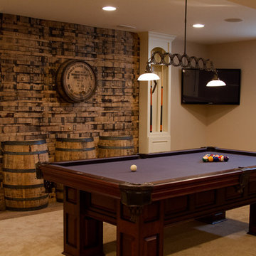
The previous award winning remodel of their Burr Ridge home brought these clients back to LaMantia and designers Jackie Prazak and Katie Suva, CKD, CBD when they decided it was time to build out their unfinished lower level. As before, their main objective was to create areas to accommodate their extended (and now grown) family.
During the 2013 main floor remodel, a bedroom and Powder Room had been given up to gain the large award winning kitchen, so recapturing those two spaces were high on the “list of desires.” Also on the list was the need for a pool table, a comfortable movie/TV space, lots of game storage and plenty of open area for grandchildren game playing.
The stairway into the lower level was the main challenge in this build-out; both the stair run and tread depth needed to be lengthened to perform to code. To create greater head room on the staircase the main beam was cut and a portion was relocated 18”. A second column at the end of the stair run was added to match the required structural column, allowing the last tread to wrap decoratively onto each side.
Throughout the design planning many details built-into the main level project were repeated to marry the main and lower levels together. The built-in cabinetry and the mirrored doors in the bedroom can also be found in the Guest Room on the main level. The mirrored element over the bed is actually an interior door glazed with mirrors and hung on its side. The parquet look tile flooring of the new bath is reminiscent of the main level wood parquet flooring while the carpenter built wainscoting also can be found in the main hall of the first floor.
The custom walnut stair spindles were fabricated from a photo the homeowner found and loved. In the Movie/TV area the theatre seats are fully powered to accept iPhones, iPads, Laptops, etc. Also note the large chalkboard scorekeeping area with seating for the game players. And, one very special detail can be found under the (now longer) staircase; a private room under the stairs was created with touch-lighting and bean bag chairs for anyone seeking a quiet space.
 lavish
Warm, Natural & Quietly Luxurious — Primary Bathroom Remodel | Raleigh, NC
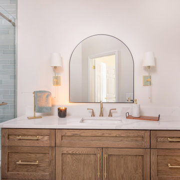
This primary bathroom remodel is a masterclass in restraint. No loud statements, no trend-chasing — just a beautifully considered combination of natural materials, soft color, and hardware that ties it all together. The result feels like a boutique hotel bathroom that also happens to feel completely personal.
The vanity is the anchor of the space. Custom white oak cabinetry in a warm, medium-toned stain brings natural grain and texture to the room without competing with anything around it. Brushed brass hardware — bar pulls with decorative rosette ends — reads elevated without being fussy. White quartz countertops with soft veining sit cleanly above, and a large arched black-framed mirror grounds the wall in a shape that echoes the soft, organic tone of the whole room. Flanking the mirror, a pair of sage green and gold wall sconces add a layer of unexpected color that feels completely right — designer without being obvious.
The shower is where this project truly shines. Floor-to-ceiling sea glass green linear tile wraps every wall in a luminous, slightly irregular pattern that catches light beautifully. Brushed brass fixtures — a hand shower, slide bar, grab bars, and frameless sliding door hardware — run throughout, keeping the palette tight. Two built-in niches lined with arabesque marble mosaic tile provide both function and a moment of pattern within the serene field of green. A quartz bench seat and large-format floor tile with a center drain complete the enclosure with the same calm intentionality found everywhere else.
Live-edge floating shelves in rich, burl-patterned wood add warmth to the open wall space, styled with a mix of black iron candleholders, organic wooden objects, and natural accessories. Every detail — down to the wooden tray and hand-thrown vase on the vanity — was chosen to feel grounded, tactile, and lived-in.
 Janvrin & Co.
A transformation of a modest raised ranch into a modern oasis. I was the interior designer and general contractor from mechanicals to finishing. It’s also my personal home.
The interior design style is that of modern minimalist meets organic modern. I wanted a space that reduced distractions and let the eyes, head, and soul rest. Where everything inside the home has a specific use and purpose. The objects in our home are fewer but each hold a great personal value. You might expect to see this airy aesthetic, with its gallery white walls, in California or New York. Not nestled in a modest 50 year old neighborhood in Omaha, Nebraska. Creating a minimal aesthetic is one of the trickiest design styles to pull off. It is more than just less stuff and lots of white. It means sticking to these design principals:
-weaving in an abundance of textures
-incorporating natural finishes
-keenly curating art
-giving extra attention to scale
-limiting purely decorative items
-maximizing natural light
This style is not to be confused with the frugality of reductive design. I have incorporated many elevated basics that create an aesthetic of quiet luxury:
-architectural bead for trim-less doors
-first-of-its kind interior door hardware made of terrazzo
-historical marble found in landmark interiors like the NY Public Library
-premium flush air vents that disappear out of site
-luxury appliances from GE Café and Signature
-elegant and resilient terrazzo field tiles
Ours was not a simple interior remodel and addition:
-gutted and remodeled the existing 2,000 SF
-added on approximately another 1,000 SF
-moved and installed all new major mechanicals i.e. heating, plumbing and electrical.
-knocked through foundation walls to extend the space back
-dug down and built up
 Mr Shishir
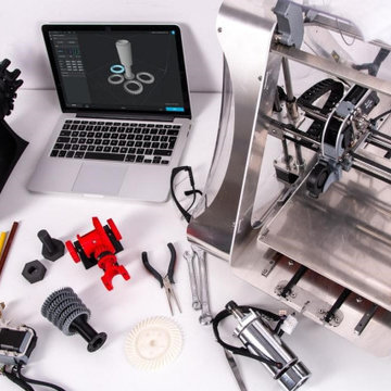
Computer numerical control or CNC machining is an automated manufacturing process used to make components of devices or appliances. It employs computer-aided software and codes to control complex machinery, including mills, grinders, lathes, and cutters. It is used to manufacture multiple parts from diverse raw materials such as aluminium, brass, acrylic, plastics, and wood.
It is a subtractive process in which a solid piece of material is carved into a 2D or 3D object of any shape or size. This enables the creation of prototypes for parts and finished products. It also enables automated mass production of parts such as fittings, housings, brackets, gears, fasteners, shafts, electrical contacts, and moulds using specific materials.
This process is a quick, safe, versatile, precise, and cost-effective production method. These advantages allow it to be used for various applications in industries ranging from healthcare and electronics to aerospace and the military. Moreover, it is used to create parts for several objects you use at home every day.
Here are 10 things in your house that you may not know are manufactured using CNC machining:
1. Kitchen Appliances
Several manufacturers employ CNC machines to create heavy-duty parts for durable kitchen appliances. Through pre-programmed software, the machine produces parts of different shapes, sizes, colours, and textures using a variety of materials like metals and plastic.
CNC-machined components of kitchen appliances include metal plates, covers, textured handles, pins, rings, and wires. These small but essential parts improve the utility of your everyday kitchen appliances such as the electric can opener, dishwasher, hand blender, grinder, and coffee brewing machine.
2. Electronic Devices
Components of electronic devices are usually small in size and have fine details and shapes that require precision machining. CNC machines offer the flexibility and efficiency to manufacture large and small parts of various shapes, sizes, and materials required to complete electronic appliances.
CNC machining enables accurate, computerized prototyping and the production of detailed, intricate, and sensitive parts from a wide range of metals. It can be used to produce parts such as connectors, housing, wires, heat sinks, semiconductors, and fixtures. It can also be used to create the chassis or the framework of various electronic appliances.
You can find CNC-machined parts in the following electronic home appliances:
- Laptops and Computers
- Mobile phones
- Cameras
- Television
- Speakers
- Keyboard
- Mouse
- Router
- Refrigerator
- Air conditioner
- Washing machine
- Fans, air purifiers, and humidifiers
- Robotic vacuum cleaners
- Remote control
Sponsored
Columbus, OH

Hope Restoration & General Contracting
Columbus Design-Build, Kitchen & Bath Remodeling, Historic Renovations
 Drury Design
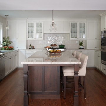
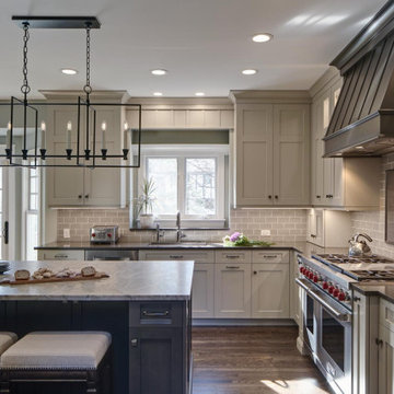
This house was 45 years old and the most recent kitchen update was past its due date. It was also time to update an adjacent family room, eating area and a nearby bar. The idea was to refresh the space with a transitional design that leaned classic – something that would be elegant and comfortable. Something that would welcome and enhance natural light.
The objectives were:
-Keep things simple – classic, comfortable and easy to keep clean
-Cohesive design between the kitchen, family room, eating area and bar
-Comfortable walkways, especially between the island and sofa
-Get rid of the kitchen’s dated 3D vegetable tile and island top shaped like a painters pallet
Design challenges:
-Incorporate a structural beam so that it flows with the entire space
-Proper ventilation for the hood
-Update the floor finish to get rid of the ’90s red oak
Design solutions:
-After reviewing multiple design options we decided on keeping appliances in their existing locations
-Made the cabinet on the back wall deeper than standard to fit and conceal the exhaust vent within the crown molding space and provide proper ventilation for the rangetop
-Omitted the sink on the island because it was not being used
-Squared off the island to provide more seating and functionality
-Relocated the microwave from the wall to the island and fitted a warming drawer directly below
-Added a tray partition over the oven so that cookie sheets and cutting boards are easily accessible and neatly stored
-Omitted all the decorative fillers to make the kitchen feel current
-Detailed yet simple tile backsplash design to add interest
Refinished the already functional entertainment cabinetry to match new cabinets – good flow throughout area
Even though the appliances all stayed in the same locations, the cabinet finish created a dramatic change. This is a very large kitchen and the client embraces minimalist design so we decided to omit quite a few wall cabinets.
 Drury Design
There were some druthers with the kitchen and there was a desire to make certain rooms more grown-up again. Unlike some of our clients who get rid of their formal dining rooms, this family wanted to keep theirs. They saw it as good space for entertaining and doing work – why not make it more stylish and purposeful?
THE REMODEL
Design Objectives
Keep the craftsman style of the home but make it more modern
Update the dining room to be more formal for entertaining and provide storage for china, stemware, wine, etc.
Open up the kitchen to improve flow
Incorporate new decorative lighting throughout the home to accent the home’s style
Transform the staircase into a statement piece that greets visitors – redesign it with arts & crafts details in the balusters, newel posts and handrails
Design Challenges:
Open up the dining room window for more light and a better view of the backyard. The previous window felt closed in with heavy shutters.
Improve kitchen flow without making the footprint larger
Make the entire home feel updated and cohesive while staying true to the house’s style.
THE RENEWED SPACES
We bumped out the dining room window to make a new bay window. The glass mullion design mimics the craftsman style, setting the tone for the room while letting plenty of light in. It really opened up that end of the dining room. The view of the backyard is much bigger now, too. It’s also a great nook for playing board games, doing puzzles and playing with Legos.
We actually got rid of a walk-in pantry that had cut off a corner of the kitchen, and were able to keep all the main walls intact. The old pantry room is where the fridge is now, as well as a tall pantry cabinet, some additional cabinets and a new countertop surface. The flow is much better and it’s roomy now, with a kitchen table that’s great for informal meals, homework and kids seating when adults are entertaining in the dining room.
The cabinet, tile and countertop colors are still neutral but offer a more muted palette. To bring in the craftsman style, simple architectural details were added such as the hood and window valance, decorative furniture toes, a shaker door on the perimeter cabinets and a more modern cabinet door style on the island, pantry and refrigerator areas. New decorative lighting was added in the kitchen, dining room, living room, foyer and second-floor hallway to make the entire first floor feel updated. Also, the entire staircase was revamped. The existing hardwood was kept in place but stained medium brown to bring in some warmth.
“The Drury process made this project turn out better than we imagined,” one of the homeowners told us during the final photoshoot. “There were so many features we didn’t know about – like charging drawers – and ways of going about the remodel that didn’t come to us naturally. We’re so glad Alicia had so much experience and so many checklists. We got to think through everything and arrive at the best possible design for our family.”

 Robin's Nest Interiors
It was a pleasure to help this single dad transform a previous French Country motif into a Handsome Space with Masculine Vibe. The homeowner loves the blues you find in the Caribbean so we used those as accent colors throughout the rooms.
Entry
We painted the walls Sherwin Williams’ Latte (SW6108) to add warmth. We accessorized the homeowner’s beautiful burl wood cabinet with vibrant artwork and whimsical Chinese horses. I always recommend task lighting in a Foyer, if possible, and the rectangular lamp shade is the perfect shape to fit on the small end of the cabinet.
Powder Room
I adore the Candace Olson wallpaper we used in the Powder Room. The blocks look like sections of wood. It works great with the existing granite. Other examples of wallpaper here and here.
Great Room
We touched every surface in this Great Room from painting the walls Nomadic Desert (SW6107) to painting the ceiling Double Latte (SW9108) to make the room feel cozier to replacing the carpet with this transitional style with striated pattern to painting the white built-ins.
Furniture placement was a real challenge because the grand piano needed to stay without blocking the traffic flow through the space. The homeowner also wanted us to incorporate his chess table and chairs. We centered a small seating area in front of the fireplace utilizing two oversized club chairs and an upholstered ottoman with a wood tray that slides. The wood bases on the chairs helps their size not overpower the room. The velvet ottoman fabric with navy, azure, and teal blues is a showstopper.
We used the homeowner’s wonderful collection of unique puzzle boxes to accessorize the built-ins. We just added some pops of blues, greens and silver. The homeowner loves sculptural objects so the nickel twig wall decor was the perfect focal point above the mantle. We opted not to add anything to the mantle so it would not distract from the art piece.
We added decorative drapery panels installed on short rods between each set of doors. The homeowner was open to this abstract floral pattern in greens and blues!
We reupholstered the cushions for the chess table chairs in a fun geometric fabric that coordinates with the panel fabric. The homeowner does not use this set of doors to access the deck so we were able to position the table directly in front of them.
Kelly Sisler of Kelly Faux Creations worked her magic on the built-ins. We used Sherwin Williams’ Mega Greige (SW7031) as the base and then applied a heavy bronze glaze. It completely transformed the Great Room. Other examples of painting built-ins here and here.
We hoped you enjoyed this Handsome Space with Masculine Vibe. It was quite a transformation!
196