
Search results for "Decorative objects" in Home Design Ideas
 lavish
Warm, Natural & Quietly Luxurious — Primary Bathroom Remodel | Raleigh, NC
This primary bathroom remodel is a masterclass in restraint. No loud statements, no trend-chasing — just a beautifully considered combination of natural materials, soft color, and hardware that ties it all together. The result feels like a boutique hotel bathroom that also happens to feel completely personal.
The vanity is the anchor of the space. Custom white oak cabinetry in a warm, medium-toned stain brings natural grain and texture to the room without competing with anything around it. Brushed brass hardware — bar pulls with decorative rosette ends — reads elevated without being fussy. White quartz countertops with soft veining sit cleanly above, and a large arched black-framed mirror grounds the wall in a shape that echoes the soft, organic tone of the whole room. Flanking the mirror, a pair of sage green and gold wall sconces add a layer of unexpected color that feels completely right — designer without being obvious.
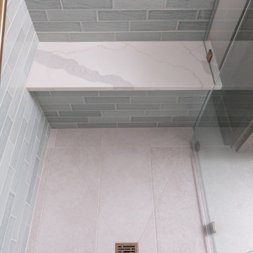
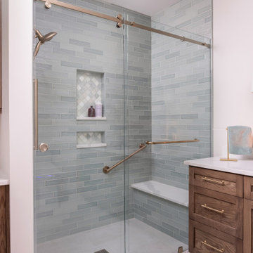
The shower is where this project truly shines. Floor-to-ceiling sea glass green linear tile wraps every wall in a luminous, slightly irregular pattern that catches light beautifully. Brushed brass fixtures — a hand shower, slide bar, grab bars, and frameless sliding door hardware — run throughout, keeping the palette tight. Two built-in niches lined with arabesque marble mosaic tile provide both function and a moment of pattern within the serene field of green. A quartz bench seat and large-format floor tile with a center drain complete the enclosure with the same calm intentionality found everywhere else.
Live-edge floating shelves in rich, burl-patterned wood add warmth to the open wall space, styled with a mix of black iron candleholders, organic wooden objects, and natural accessories. Every detail — down to the wooden tray and hand-thrown vase on the vanity — was chosen to feel grounded, tactile, and lived-in.

 Advance Design Studio, Ltd.
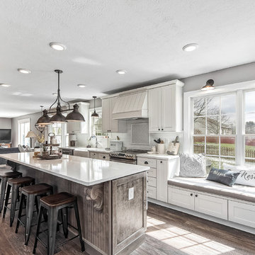
After six years of living in their Huntley IL home, Chris and Meghan were tired of their dark, dingy, outdated kitchen and it was finally time for a long-anticipated change. “The kitchen is the place where we live, it’s where we do everything,” Meghan said. “It was important that it be a space where we wanted to be.” Meghan loves cooking and enjoys including their girls in healthy meal prepping, this led them to want a brighter, more enjoyable kitchen with increased functionality and improved storage.
For Chris especially, the laundry room was an entirely dysfunctional eyesore. “We had a washer and a dryer, but it was all kind-of cobbled together!” Chris said. “There were always laundry piles everywhere, we weren’t really sure what we wanted to do in there, but it was time for us to make a change.” The mess of the space was stressful every time they walked in the door from the garage each day. Kids’ backpacks and shoes piled up haphazardly in the makeshift boot-bench closet left the family feeling disorganized and stressed. They needed space for folding clothes and locker cubbies to help keep the family organized.
Having known Christine and Todd in the Huntley community for years, Chris and Meghan were familiar with their work. “We already trusted them personally and having seen their projects for years we knew they did top notch work. After we reviewed the initial round of designs, we knew that hiring them was definitely the right choice,” Meghan and Chris said. Although Chris had done a lot of work in their home himself, the kitchen and laundry room renovation was such a large undertaking that he didn’t want to steal time away from his family to spend what would surely be many long weekends doing the job himself. “That would not have been a wise choice for us,” Chris laughed.
“Our designer, Michelle was very, very, easy to work with; anything we wanted to see or weren’t sure about, she went above and beyond to make this easy for us. She was easy to get hold of and always quick to respond,” the couple said. Michelle pulled ideas that mirrored the couple’s taste and style and was adept at directing the couple to limited choices that didn’t overwhelm them and kept the process moving. “I have a hard time making decisions. Michelle made the decision-making process so easy. I loved how she listened to what I liked and then presented three great options for me to choose from,” Meghan said.
The main objectives for the kitchen were better storage solutions, they wanted the space to reflect their lifestyle and taste, and they wanted it to last for years with low maintenance. One of the first steps in creating a more functional kitchen was relocating the refrigerator, creating an improved workflow for the busy family.
“We didn’t know that we could even move the refrigerator to a new location where it is now, that was something that we never would have thought of,” Chris said. “The new refrigerator location makes the kitchen feel so much bigger. We didn’t add any space, but our whole kitchen with the new design just seems like it’s so much larger than before!” Meghan said.
The perimeter mist colored cabinets helped warm and brighten the entire room, while the graphite colored cabinets on the island added contrast. Using this fresh, clean color palette satisfied the couple’s desire for a bright space that was the exact opposite of what they had before. Organization accessories were also added to the cabinets such as a spice drawer tray and roll outs to create hidden convenience.
“I absolutely love the hidden spices – it makes cooking so much more enjoyable!” Chris said. “And all the pull outs, and the double trash bin, who would think you could get so excited about organization!” the couple said in unison.
One thing they hated in their original kitchen was how dark the space felt. Added lighting on the ceiling with the new light fixtures combined with the lighter cabinetry colors throughout solved this problem. “Our new kitchen has this warm, almost cozy feeling that our old kitchen never had, it’s just a space that I love spending my time in now,” Meghan said. The light airy feeling was accentuated with the use of floating white shelves on either side of the decorative range hood. “We have so much cabinetry space, the new design is amazing we actually have more storage space than we will ever need,” Meghan said.
The island was extended to create more work surface and added space for stool seating. “The new island changes how we live. Now the kids can be in the kitchen with us, doing homework, eating breakfast, and the three of us have special dinners there when Chris is working late,” Meghan said.
The Carrara Marmi Quartz countertops were chosen because they are, not only beautiful, but are made from hard-working material that doesn’t require maintenance. The white subway tile backsplash that wraps to the ceiling behind the focal point cooktop range/hood compliments the crisp white countertops perfectly, while brushed brass hardware and light fixtures keep the design fresh and new.
The couple had a few fears at the beginning of the project, as most homeowners do. Their biggest fear was being out of their kitchen and laundry room for an extended time. The crew made it very easy for the family to work in a limited space keeping the washer and dryer hooked up the majority of the time, and also getting appliances working with minimal downtime.
“They above and beyond accommodated us to get us through the process,” Meghan said. “They did a great job making sure we were as comfortable as possible throughout the process,” Chris added.
“Our project manager DJ did a great job. He was very good at updating us on schedule changes, getting guys in as quickly as possible. Everyone that stepped in the house was nice and did great work,” said Chris. They thought Advance’s carpenter was phenomenal and were impressed when he took a conceptual idea from a photograph and worked with designer Michelle to create a one of a kind range/hood that has become the topic of conversation with friends and family who visit the new kitchen. “He was in our house literally every day for several weeks. He was easy to work with and good at what he did,” Meghan and Chris said.
The focal point of the kitchen; a hand-crafted, custom-built ventilation hood was clad with handpicked reclaimed barnwood. Advance Design’s carpenter built the framework and the cladding to create a one-of-a-kind design element that the couple loves.
“I think it was especially fun for him to create something unique from scratch, showcasing his talent in this area,” Meghan said. “I love that my kitchen is not like everyone else’s. I got to pick out the wood on my hood and watch it being built and was able to choose what pieces of wood went where on it. It’s totally unique.”
Red Oak flooring was toothed-in throughout the kitchen and the rest of the first floor anywhere changes were made. Then the whole floor was refinished to tone down the orange undertones in the existing floor stain, ultimately changing the color complexion of the entire first floor. The result is a completely new feeling to the entire home.
Renovating the laundry room was extremely important to Meghan and Chris, but they had trouble visualizing what the possibilities were for the seemingly small space. Michelle produced beautiful 3D illustrations that helped them envision the space in a whole new way.
“I must have told Michelle 100 times that I am a visual person, seeing the designs in 3D made it so easy to make decisions and see what we could really do with our space,” Meghan said.
A dividing wall and doorway were removed between the existing laundry room and hallway formerly containing a coat closet, providing space to design specialized graphite colored cabinetry matching the kitchen island to house custom storage cubbies for each family member. Adding the tall utility cabinetry in the new laundry area helped solve the storage issue, tucking away cleaning supplies, household items, and even the cat got its own cubby.
“I love how everything is now hidden in its own space. I can’t tell you how much I hated coming home and seeing everything sitting around on counters,” Chris said.
Electrical outlets were planned for the inside of utility cabinets, so devices could charge in hidden locations. Stacking the washer and dryer allowed for wider countertop space to provide a folding area and a special space for clothes to hang. “The way I do laundry has been completely transformed! I can actually fold clothes and hang them now right out of the washer and dryer,” Meghan said.
“The end result in the kitchen and the laundry/mud room was an updated light and bright space, with a smarter work flow that better meets the needs of this family,” Michelle said.
“I would totally recommend Advance Design,” Meghan said. “Sometimes I sit and just look at my kitchen and laundry room and think ‘Wow, I can’t believe I get to live here!’ It’s an understatement to say we love our new space.”

 Robin's Nest Interiors
It was a pleasure to help this single dad transform a previous French Country motif into a Handsome Space with Masculine Vibe. The homeowner loves the blues you find in the Caribbean so we used those as accent colors throughout the rooms.
Entry
We painted the walls Sherwin Williams’ Latte (SW6108) to add warmth. We accessorized the homeowner’s beautiful burl wood cabinet with vibrant artwork and whimsical Chinese horses. I always recommend task lighting in a Foyer, if possible, and the rectangular lamp shade is the perfect shape to fit on the small end of the cabinet.
Powder Room
I adore the Candace Olson wallpaper we used in the Powder Room. The blocks look like sections of wood. It works great with the existing granite. Other examples of wallpaper here and here.
Great Room
We touched every surface in this Great Room from painting the walls Nomadic Desert (SW6107) to painting the ceiling Double Latte (SW9108) to make the room feel cozier to replacing the carpet with this transitional style with striated pattern to painting the white built-ins.
Furniture placement was a real challenge because the grand piano needed to stay without blocking the traffic flow through the space. The homeowner also wanted us to incorporate his chess table and chairs. We centered a small seating area in front of the fireplace utilizing two oversized club chairs and an upholstered ottoman with a wood tray that slides. The wood bases on the chairs helps their size not overpower the room. The velvet ottoman fabric with navy, azure, and teal blues is a showstopper.
We used the homeowner’s wonderful collection of unique puzzle boxes to accessorize the built-ins. We just added some pops of blues, greens and silver. The homeowner loves sculptural objects so the nickel twig wall decor was the perfect focal point above the mantle. We opted not to add anything to the mantle so it would not distract from the art piece.
We added decorative drapery panels installed on short rods between each set of doors. The homeowner was open to this abstract floral pattern in greens and blues!
We reupholstered the cushions for the chess table chairs in a fun geometric fabric that coordinates with the panel fabric. The homeowner does not use this set of doors to access the deck so we were able to position the table directly in front of them.
Kelly Sisler of Kelly Faux Creations worked her magic on the built-ins. We used Sherwin Williams’ Mega Greige (SW7031) as the base and then applied a heavy bronze glaze. It completely transformed the Great Room. Other examples of painting built-ins here and here.
We hoped you enjoyed this Handsome Space with Masculine Vibe. It was quite a transformation!
Find the right local pro for your project
 Janvrin & Co.
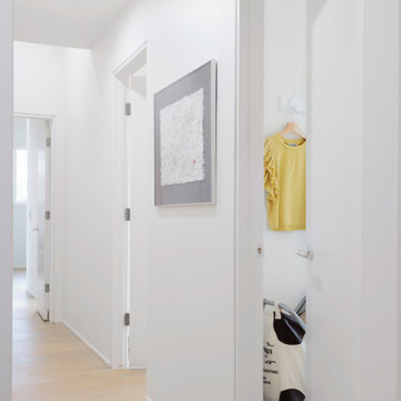
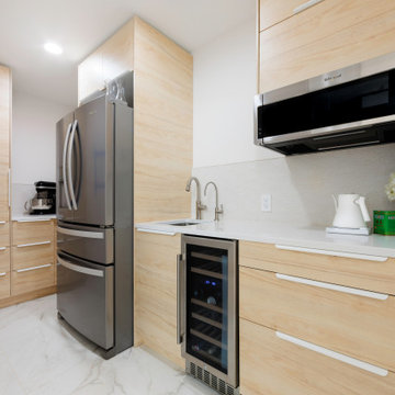
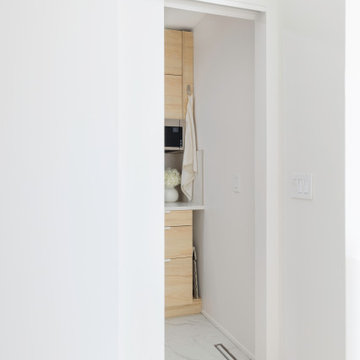
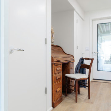
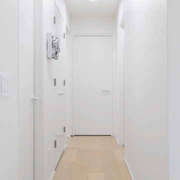
A transformation of a modest raised ranch into a modern oasis. I was the interior designer and general contractor from mechanicals to finishing. It’s also my personal home.
The interior design style is that of modern minimalist meets organic modern. I wanted a space that reduced distractions and let the eyes, head, and soul rest. Where everything inside the home has a specific use and purpose. The objects in our home are fewer but each hold a great personal value. You might expect to see this airy aesthetic, with its gallery white walls, in California or New York. Not nestled in a modest 50 year old neighborhood in Omaha, Nebraska. Creating a minimal aesthetic is one of the trickiest design styles to pull off. It is more than just less stuff and lots of white. It means sticking to these design principals:
-weaving in an abundance of textures
-incorporating natural finishes
-keenly curating art
-giving extra attention to scale
-limiting purely decorative items
-maximizing natural light
This style is not to be confused with the frugality of reductive design. I have incorporated many elevated basics that create an aesthetic of quiet luxury:
-architectural bead for trim-less doors
-first-of-its kind interior door hardware made of terrazzo
-historical marble found in landmark interiors like the NY Public Library
-premium flush air vents that disappear out of site
-luxury appliances from GE Café and Signature
-elegant and resilient terrazzo field tiles
Ours was not a simple interior remodel and addition:
-gutted and remodeled the existing 2,000 SF
-added on approximately another 1,000 SF
-moved and installed all new major mechanicals i.e. heating, plumbing and electrical.
-knocked through foundation walls to extend the space back
-dug down and built up

 LaMantia Design and Remodeling
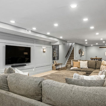
The previous award winning remodel of their Burr Ridge home brought these clients back to LaMantia and designers Jackie Prazak and Katie Suva, CKD, CBD when they decided it was time to build out their unfinished lower level. As before, their main objective was to create areas to accommodate their extended (and now grown) family.
During the 2013 main floor remodel, a bedroom and Powder Room had been given up to gain the large award winning kitchen, so recapturing those two spaces were high on the “list of desires.” Also on the list was the need for a pool table, a comfortable movie/TV space, lots of game storage and plenty of open area for grandchildren game playing.
The stairway into the lower level was the main challenge in this build-out; both the stair run and tread depth needed to be lengthened to perform to code. To create greater head room on the staircase the main beam was cut and a portion was relocated 18”. A second column at the end of the stair run was added to match the required structural column, allowing the last tread to wrap decoratively onto each side.
Throughout the design planning many details built-into the main level project were repeated to marry the main and lower levels together. The built-in cabinetry and the mirrored doors in the bedroom can also be found in the Guest Room on the main level. The mirrored element over the bed is actually an interior door glazed with mirrors and hung on its side. The parquet look tile flooring of the new bath is reminiscent of the main level wood parquet flooring while the carpenter built wainscoting also can be found in the main hall of the first floor.
The custom walnut stair spindles were fabricated from a photo the homeowner found and loved. In the Movie/TV area the theatre seats are fully powered to accept iPhones, iPads, Laptops, etc. Also note the large chalkboard scorekeeping area with seating for the game players. And, one very special detail can be found under the (now longer) staircase; a private room under the stairs was created with touch-lighting and bean bag chairs for anyone seeking a quiet space.
 Janvrin & Co.
A transformation of a modest raised ranch into a modern oasis. I was the interior designer and general contractor from mechanicals to finishing. It’s also my personal home.
The interior design style is that of modern minimalist meets organic modern. I wanted a space that reduced distractions and let the eyes, head, and soul rest. Where everything inside the home has a specific use and purpose. The objects in our home are fewer but each hold a great personal value. You might expect to see this airy aesthetic, with its gallery white walls, in California or New York. Not nestled in a modest 50 year old neighborhood in Omaha, Nebraska. Creating a minimal aesthetic is one of the trickiest design styles to pull off. It is more than just less stuff and lots of white. It means sticking to these design principals:
-weaving in an abundance of textures
-incorporating natural finishes
-keenly curating art
-giving extra attention to scale
-limiting purely decorative items
-maximizing natural light
This style is not to be confused with the frugality of reductive design. I have incorporated many elevated basics that create an aesthetic of quiet luxury:
-architectural bead for trim-less doors
-first-of-its kind interior door hardware made of terrazzo
-historical marble found in landmark interiors like the NY Public Library
-premium flush air vents that disappear out of site
-luxury appliances from GE Café and Signature
-elegant and resilient terrazzo field tiles
Ours was not a simple interior remodel and addition:
-gutted and remodeled the existing 2,000 SF
-added on approximately another 1,000 SF
-moved and installed all new major mechanicals i.e. heating, plumbing and electrical.
-knocked through foundation walls to extend the space back
-dug down and built up
 Janvrin & Co.
A transformation of a modest raised ranch into a modern oasis. I was the interior designer and general contractor from mechanicals to finishing. It’s also my personal home.
The interior design style is that of modern minimalist meets organic modern. I wanted a space that reduced distractions and let the eyes, head, and soul rest. Where everything inside the home has a specific use and purpose. The objects in our home are fewer but each hold a great personal value. You might expect to see this airy aesthetic, with its gallery white walls, in California or New York. Not nestled in a modest 50 year old neighborhood in Omaha, Nebraska. Creating a minimal aesthetic is one of the trickiest design styles to pull off. It is more than just less stuff and lots of white. It means sticking to these design principals:
-weaving in an abundance of textures
-incorporating natural finishes
-keenly curating art
-giving extra attention to scale
-limiting purely decorative items
-maximizing natural light
This style is not to be confused with the frugality of reductive design. I have incorporated many elevated basics that create an aesthetic of quiet luxury:
-architectural bead for trim-less doors
-first-of-its kind interior door hardware made of terrazzo
-historical marble found in landmark interiors like the NY Public Library
-premium flush air vents that disappear out of site
-luxury appliances from GE Café and Signature
-elegant and resilient terrazzo field tiles
Ours was not a simple interior remodel and addition:
-gutted and remodeled the existing 2,000 SF
-added on approximately another 1,000 SF
-moved and installed all new major mechanicals i.e. heating, plumbing and electrical.
-knocked through foundation walls to extend the space back
-dug down and built up
Sponsored
Columbus, OH

Hope Restoration & General Contracting
Columbus Design-Build, Kitchen & Bath Remodeling, Historic Renovations
 Janvrin & Co.
A transformation of a modest raised ranch into a modern oasis. I was the interior designer and general contractor from mechanicals to finishing. It’s also my personal home.
The interior design style is that of modern minimalist meets organic modern. I wanted a space that reduced distractions and let the eyes, head, and soul rest. Where everything inside the home has a specific use and purpose. The objects in our home are fewer but each hold a great personal value. You might expect to see this airy aesthetic, with its gallery white walls, in California or New York. Not nestled in a modest 50 year old neighborhood in Omaha, Nebraska. Creating a minimal aesthetic is one of the trickiest design styles to pull off. It is more than just less stuff and lots of white. It means sticking to these design principals:
-weaving in an abundance of textures
-incorporating natural finishes
-keenly curating art
-giving extra attention to scale
-limiting purely decorative items
-maximizing natural light
This style is not to be confused with the frugality of reductive design. I have incorporated many elevated basics that create an aesthetic of quiet luxury:
-architectural bead for trim-less doors
-first-of-its kind interior door hardware made of terrazzo
-historical marble found in landmark interiors like the NY Public Library
-premium flush air vents that disappear out of site
-luxury appliances from GE Café and Signature
-elegant and resilient terrazzo field tiles
Ours was not a simple interior remodel and addition:
-gutted and remodeled the existing 2,000 SF
-added on approximately another 1,000 SF
-moved and installed all new major mechanicals i.e. heating, plumbing and electrical.
-knocked through foundation walls to extend the space back
-dug down and built up
 Janvrin & Co.
A transformation of a modest raised ranch into a modern oasis. I was the interior designer and general contractor from mechanicals to finishing. It’s also my personal home.
The interior design style is that of modern minimalist meets organic modern. I wanted a space that reduced distractions and let the eyes, head, and soul rest. Where everything inside the home has a specific use and purpose. The objects in our home are fewer but each hold a great personal value. You might expect to see this airy aesthetic, with its gallery white walls, in California or New York. Not nestled in a modest 50 year old neighborhood in Omaha, Nebraska. Creating a minimal aesthetic is one of the trickiest design styles to pull off. It is more than just less stuff and lots of white. It means sticking to these design principals:
-weaving in an abundance of textures
-incorporating natural finishes
-keenly curating art
-giving extra attention to scale
-limiting purely decorative items
-maximizing natural light
This style is not to be confused with the frugality of reductive design. I have incorporated many elevated basics that create an aesthetic of quiet luxury:
-architectural bead for trim-less doors
-first-of-its kind interior door hardware made of terrazzo
-historical marble found in landmark interiors like the NY Public Library
-premium flush air vents that disappear out of site
-luxury appliances from GE Café and Signature
-elegant and resilient terrazzo field tiles
Ours was not a simple interior remodel and addition:
-gutted and remodeled the existing 2,000 SF
-added on approximately another 1,000 SF
-moved and installed all new major mechanicals i.e. heating, plumbing and electrical.
-knocked through foundation walls to extend the space back
-dug down and built up
 orly eran - architecture & design
English
אשמח לענות על כל שאלה שלכם. לקבלת הצעה המתאימה במיוחד לכם, אנא צרו קשר.
שם
טלפון
המדריך למשפץ המבולבל
expandהמלצות
collapseUncategorized
גינה חדשה בעיר
שיפוץ דירה במודיעין
שיפוץ דירה במודיעין: שילוב של טבע וצבע
expandפרוייקטים
expandמאמרים
expandפרסומים בעיתונות
expandאודות
Remodeling and Home Design
house and garden in Israel
House and garden in Israel – how to create a connection between them
Here are some ideas.
All of the photos are from projects designed by my office.
1. Think about a good connection between the inside of the house and the garden – this is important for both!
A garden is always better and more useful if it is open to the main living area.
2. Two windows looking out to the garden in different directions are always better than one.
3. Using the same floor inside and outside will connect them and enlarge both.
In this project we used old -fashioned concrete tiles for the house and garden. We used old tiles which we found in the garden to guard the renovated house against the evil eye…..
4. Treat at least part of the garden as you would treat a room inside the house a room wth a floor, ceiling, walls, furniture. This is especially true for gardens in countries like Israel, where gardens can be used almost all the time
5. Even narrow side paths and akward corners can become worthwhile outdoor spaces if you treat them well!
Add benches, plants, beautiful floors and furniture and make them part of your home design.
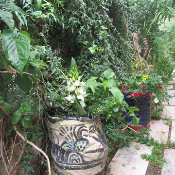
With the help of beautiful furniture and a large flowerpot, we created a small outdoor "living room" between different levels of the garden:
6. Use flowerpots, sculpures, decorations, lights, in all different hights and shapes and colors, as you would inside – and more!
use beautiful objects, create beautiful compositions.
 lavish
Warm, Natural & Quietly Luxurious — Primary Bathroom Remodel | Raleigh, NC
This primary bathroom remodel is a masterclass in restraint. No loud statements, no trend-chasing — just a beautifully considered combination of natural materials, soft color, and hardware that ties it all together. The result feels like a boutique hotel bathroom that also happens to feel completely personal.
The vanity is the anchor of the space. Custom white oak cabinetry in a warm, medium-toned stain brings natural grain and texture to the room without competing with anything around it. Brushed brass hardware — bar pulls with decorative rosette ends — reads elevated without being fussy. White quartz countertops with soft veining sit cleanly above, and a large arched black-framed mirror grounds the wall in a shape that echoes the soft, organic tone of the whole room. Flanking the mirror, a pair of sage green and gold wall sconces add a layer of unexpected color that feels completely right — designer without being obvious.
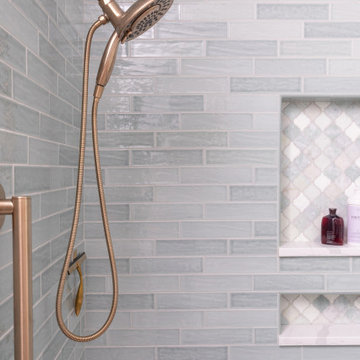
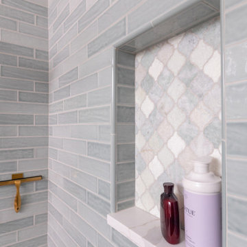
The shower is where this project truly shines. Floor-to-ceiling sea glass green linear tile wraps every wall in a luminous, slightly irregular pattern that catches light beautifully. Brushed brass fixtures — a hand shower, slide bar, grab bars, and frameless sliding door hardware — run throughout, keeping the palette tight. Two built-in niches lined with arabesque marble mosaic tile provide both function and a moment of pattern within the serene field of green. A quartz bench seat and large-format floor tile with a center drain complete the enclosure with the same calm intentionality found everywhere else.
Live-edge floating shelves in rich, burl-patterned wood add warmth to the open wall space, styled with a mix of black iron candleholders, organic wooden objects, and natural accessories. Every detail — down to the wooden tray and hand-thrown vase on the vanity — was chosen to feel grounded, tactile, and lived-in.
 lavish
Warm, Natural & Quietly Luxurious — Primary Bathroom Remodel | Raleigh, NC
This primary bathroom remodel is a masterclass in restraint. No loud statements, no trend-chasing — just a beautifully considered combination of natural materials, soft color, and hardware that ties it all together. The result feels like a boutique hotel bathroom that also happens to feel completely personal.
The vanity is the anchor of the space. Custom white oak cabinetry in a warm, medium-toned stain brings natural grain and texture to the room without competing with anything around it. Brushed brass hardware — bar pulls with decorative rosette ends — reads elevated without being fussy. White quartz countertops with soft veining sit cleanly above, and a large arched black-framed mirror grounds the wall in a shape that echoes the soft, organic tone of the whole room. Flanking the mirror, a pair of sage green and gold wall sconces add a layer of unexpected color that feels completely right — designer without being obvious.
The shower is where this project truly shines. Floor-to-ceiling sea glass green linear tile wraps every wall in a luminous, slightly irregular pattern that catches light beautifully. Brushed brass fixtures — a hand shower, slide bar, grab bars, and frameless sliding door hardware — run throughout, keeping the palette tight. Two built-in niches lined with arabesque marble mosaic tile provide both function and a moment of pattern within the serene field of green. A quartz bench seat and large-format floor tile with a center drain complete the enclosure with the same calm intentionality found everywhere else.
Live-edge floating shelves in rich, burl-patterned wood add warmth to the open wall space, styled with a mix of black iron candleholders, organic wooden objects, and natural accessories. Every detail — down to the wooden tray and hand-thrown vase on the vanity — was chosen to feel grounded, tactile, and lived-in.
 Janvrin & Co.
A transformation of a modest raised ranch into a modern oasis. I was the interior designer and general contractor from mechanicals to finishing. It’s also my personal home.
The interior design style is that of modern minimalist meets organic modern. I wanted a space that reduced distractions and let the eyes, head, and soul rest. Where everything inside the home has a specific use and purpose. The objects in our home are fewer but each hold a great personal value. You might expect to see this airy aesthetic, with its gallery white walls, in California or New York. Not nestled in a modest 50 year old neighborhood in Omaha, Nebraska. Creating a minimal aesthetic is one of the trickiest design styles to pull off. It is more than just less stuff and lots of white. It means sticking to these design principals:
-weaving in an abundance of textures
-incorporating natural finishes
-keenly curating art
-giving extra attention to scale
-limiting purely decorative items
-maximizing natural light
This style is not to be confused with the frugality of reductive design. I have incorporated many elevated basics that create an aesthetic of quiet luxury:
-architectural bead for trim-less doors
-first-of-its kind interior door hardware made of terrazzo
-historical marble found in landmark interiors like the NY Public Library
-premium flush air vents that disappear out of site
-luxury appliances from GE Café and Signature
-elegant and resilient terrazzo field tiles
Ours was not a simple interior remodel and addition:
-gutted and remodeled the existing 2,000 SF
-added on approximately another 1,000 SF
-moved and installed all new major mechanicals i.e. heating, plumbing and electrical.
-knocked through foundation walls to extend the space back
-dug down and built up
Sponsored
Sunbury, OH

J.Holderby - Renovations
Franklin County's Leading General Contractors - 2X Best of Houzz!
 Janvrin & Co.
A transformation of a modest raised ranch into a modern oasis. I was the interior designer and general contractor from mechanicals to finishing. It’s also my personal home.
The interior design style is that of modern minimalist meets organic modern. I wanted a space that reduced distractions and let the eyes, head, and soul rest. Where everything inside the home has a specific use and purpose. The objects in our home are fewer but each hold a great personal value. You might expect to see this airy aesthetic, with its gallery white walls, in California or New York. Not nestled in a modest 50 year old neighborhood in Omaha, Nebraska. Creating a minimal aesthetic is one of the trickiest design styles to pull off. It is more than just less stuff and lots of white. It means sticking to these design principals:
-weaving in an abundance of textures
-incorporating natural finishes
-keenly curating art
-giving extra attention to scale
-limiting purely decorative items
-maximizing natural light
This style is not to be confused with the frugality of reductive design. I have incorporated many elevated basics that create an aesthetic of quiet luxury:
-architectural bead for trim-less doors
-first-of-its kind interior door hardware made of terrazzo
-historical marble found in landmark interiors like the NY Public Library
-premium flush air vents that disappear out of site
-luxury appliances from GE Café and Signature
-elegant and resilient terrazzo field tiles
Ours was not a simple interior remodel and addition:
-gutted and remodeled the existing 2,000 SF
-added on approximately another 1,000 SF
-moved and installed all new major mechanicals i.e. heating, plumbing and electrical.
-knocked through foundation walls to extend the space back
-dug down and built up
 Janvrin & Co.
A transformation of a modest raised ranch into a modern oasis. I was the interior designer and general contractor from mechanicals to finishing. It’s also my personal home.
The interior design style is that of modern minimalist meets organic modern. I wanted a space that reduced distractions and let the eyes, head, and soul rest. Where everything inside the home has a specific use and purpose. The objects in our home are fewer but each hold a great personal value. You might expect to see this airy aesthetic, with its gallery white walls, in California or New York. Not nestled in a modest 50 year old neighborhood in Omaha, Nebraska. Creating a minimal aesthetic is one of the trickiest design styles to pull off. It is more than just less stuff and lots of white. It means sticking to these design principals:
-weaving in an abundance of textures
-incorporating natural finishes
-keenly curating art
-giving extra attention to scale
-limiting purely decorative items
-maximizing natural light
This style is not to be confused with the frugality of reductive design. I have incorporated many elevated basics that create an aesthetic of quiet luxury:
-architectural bead for trim-less doors
-first-of-its kind interior door hardware made of terrazzo
-historical marble found in landmark interiors like the NY Public Library
-premium flush air vents that disappear out of site
-luxury appliances from GE Café and Signature
-elegant and resilient terrazzo field tiles
Ours was not a simple interior remodel and addition:
-gutted and remodeled the existing 2,000 SF
-added on approximately another 1,000 SF
-moved and installed all new major mechanicals i.e. heating, plumbing and electrical.
-knocked through foundation walls to extend the space back
-dug down and built up
 Janvrin & Co.
A transformation of a modest raised ranch into a modern oasis. I was the interior designer and general contractor from mechanicals to finishing. It’s also my personal home.
The interior design style is that of modern minimalist meets organic modern. I wanted a space that reduced distractions and let the eyes, head, and soul rest. Where everything inside the home has a specific use and purpose. The objects in our home are fewer but each hold a great personal value. You might expect to see this airy aesthetic, with its gallery white walls, in California or New York. Not nestled in a modest 50 year old neighborhood in Omaha, Nebraska. Creating a minimal aesthetic is one of the trickiest design styles to pull off. It is more than just less stuff and lots of white. It means sticking to these design principals:
-weaving in an abundance of textures
-incorporating natural finishes
-keenly curating art
-giving extra attention to scale
-limiting purely decorative items
-maximizing natural light
This style is not to be confused with the frugality of reductive design. I have incorporated many elevated basics that create an aesthetic of quiet luxury:
-architectural bead for trim-less doors
-first-of-its kind interior door hardware made of terrazzo
-historical marble found in landmark interiors like the NY Public Library
-premium flush air vents that disappear out of site
-luxury appliances from GE Café and Signature
-elegant and resilient terrazzo field tiles
Ours was not a simple interior remodel and addition:
-gutted and remodeled the existing 2,000 SF
-added on approximately another 1,000 SF
-moved and installed all new major mechanicals i.e. heating, plumbing and electrical.
-knocked through foundation walls to extend the space back
-dug down and built up
 lavish
Warm, Natural & Quietly Luxurious — Primary Bathroom Remodel | Raleigh, NC
This primary bathroom remodel is a masterclass in restraint. No loud statements, no trend-chasing — just a beautifully considered combination of natural materials, soft color, and hardware that ties it all together. The result feels like a boutique hotel bathroom that also happens to feel completely personal.
The vanity is the anchor of the space. Custom white oak cabinetry in a warm, medium-toned stain brings natural grain and texture to the room without competing with anything around it. Brushed brass hardware — bar pulls with decorative rosette ends — reads elevated without being fussy. White quartz countertops with soft veining sit cleanly above, and a large arched black-framed mirror grounds the wall in a shape that echoes the soft, organic tone of the whole room. Flanking the mirror, a pair of sage green and gold wall sconces add a layer of unexpected color that feels completely right — designer without being obvious.
The shower is where this project truly shines. Floor-to-ceiling sea glass green linear tile wraps every wall in a luminous, slightly irregular pattern that catches light beautifully. Brushed brass fixtures — a hand shower, slide bar, grab bars, and frameless sliding door hardware — run throughout, keeping the palette tight. Two built-in niches lined with arabesque marble mosaic tile provide both function and a moment of pattern within the serene field of green. A quartz bench seat and large-format floor tile with a center drain complete the enclosure with the same calm intentionality found everywhere else.
Live-edge floating shelves in rich, burl-patterned wood add warmth to the open wall space, styled with a mix of black iron candleholders, organic wooden objects, and natural accessories. Every detail — down to the wooden tray and hand-thrown vase on the vanity — was chosen to feel grounded, tactile, and lived-in.
Sponsored
Sunbury, OH
J.Holderby - Renovations
Franklin County's Leading General Contractors - 2X Best of Houzz!
 Robin's Nest Interiors
It was a pleasure to help this single dad transform a previous French Country motif into a Handsome Space with Masculine Vibe. The homeowner loves the blues you find in the Caribbean so we used those as accent colors throughout the rooms.
Entry
We painted the walls Sherwin Williams’ Latte (SW6108) to add warmth. We accessorized the homeowner’s beautiful burl wood cabinet with vibrant artwork and whimsical Chinese horses. I always recommend task lighting in a Foyer, if possible, and the rectangular lamp shade is the perfect shape to fit on the small end of the cabinet.
Powder Room
I adore the Candace Olson wallpaper we used in the Powder Room. The blocks look like sections of wood. It works great with the existing granite. Other examples of wallpaper here and here.
Great Room
We touched every surface in this Great Room from painting the walls Nomadic Desert (SW6107) to painting the ceiling Double Latte (SW9108) to make the room feel cozier to replacing the carpet with this transitional style with striated pattern to painting the white built-ins.
Furniture placement was a real challenge because the grand piano needed to stay without blocking the traffic flow through the space. The homeowner also wanted us to incorporate his chess table and chairs. We centered a small seating area in front of the fireplace utilizing two oversized club chairs and an upholstered ottoman with a wood tray that slides. The wood bases on the chairs helps their size not overpower the room. The velvet ottoman fabric with navy, azure, and teal blues is a showstopper.
We used the homeowner’s wonderful collection of unique puzzle boxes to accessorize the built-ins. We just added some pops of blues, greens and silver. The homeowner loves sculptural objects so the nickel twig wall decor was the perfect focal point above the mantle. We opted not to add anything to the mantle so it would not distract from the art piece.
We added decorative drapery panels installed on short rods between each set of doors. The homeowner was open to this abstract floral pattern in greens and blues!
We reupholstered the cushions for the chess table chairs in a fun geometric fabric that coordinates with the panel fabric. The homeowner does not use this set of doors to access the deck so we were able to position the table directly in front of them.
Kelly Sisler of Kelly Faux Creations worked her magic on the built-ins. We used Sherwin Williams’ Mega Greige (SW7031) as the base and then applied a heavy bronze glaze. It completely transformed the Great Room. Other examples of painting built-ins here and here.
We hoped you enjoyed this Handsome Space with Masculine Vibe. It was quite a transformation!
 Drury Design
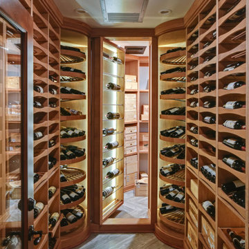
Some long-time repeat Drury customers were ready to update their wine cellar and bar area. The right design would make the space more functional and relaxing while increasing viewable wine storage capacity.
The homeowners appreciate craftsmanship and dedication – it’s the difference between good and truly great whiskies and wines. A relaxing space to appreciate such mastery would need to reflect the same kind of care and attention to detail.
Design Objectives:
-Remove heavy posts and archway to open the bar to the basement entertainment area
-Add an undercounter ice maker
-Create a clean, open display for liquor and glassware
-Create a cabinet-matching rolling cart for transporting cases of wine from the area’s entryway to the wine cellar
-Add drama and improve lighting
-Expand the wine cellar and add ceiling-mounted cooling
-Add a concealed area in the wine cellar for wine case storage
-Update task and decorative lighting
Design Challenges:
-Complement the existing stained-cherry trim in the basement area
-Determine how to include a separate area for case storage accessible from the main wine cellar
-Create an updated look that integrates seamlessly with the upscale traditional Tudor home
-The curved staircase called for creativity in the floor tile layout
Design Solutions:
-For cabinetry, a rich smoky blue-grey paint was chosen to complement the cherry stain
-Gorgeous leather-finished Tiempo Cielo quartzite countertops pair beautifully with the flooring
-Elegant textured-glass tile creates an interesting backdrop to open shelving
-High Gloss veneer shelving elevates the space and feels more modern than the previous cabinetry
-Realistic wood-look porcelain tile in a light greige tone creates a durable surface for this high traffic area
-A custom rolling cart was included to move cases into the wine cellar with ease
-Fresh decorative lighting in the bar and wine cellar adds drama while updating the overlook look and feel
Removing the heavy posts and archway between the bar and the rest of the entertainment area made the entire space feel more welcoming and inviting. The steel blue finish on the cabinetry blends beautifully with the existing woodwork, giving the basement a fresh look. The homeowners are more than pleased with how their renewed bar and wine cellar elevates the experience of celebrating fine spirits and enjoying them with friends.
 kul grilles
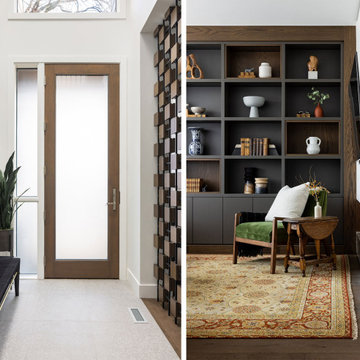
The image captures the elegance and sophistication of a kul grilles vent cover in Glacier Frost, serving as a captivating focal point in a front entrance. The vent cover, crafted with meticulous attention to detail, exudes a sense of modernity and refinement.
Positioned within the front entrance, the vent cover seamlessly integrates into the surrounding architecture. Its rectangular shape and linear design complements the clean lines and contemporary design elements of the space. The glacier frost color, with it’s powder coated finish, adds a touch of serenity and sophistication to the area.
The vent cover is not only visually appealing but also highly functional. Designed to facilitate proper air circulation, it ensures a comfortable and well-ventilated environment. The cover features carefully placed perforations that allow air to flow freely while preventing debris or unwanted objects from entering the vent.
The Glacier Frost vent cover serves as a stylish and practical addition to the front entrance. Its polished surface reflects light, adding a subtle shimmer and enhancing the overall ambiance of the space. The cover's presence exudes a sense of attention to detail and quality craftsmanship, making it an impressive feature that elevates the entrance's aesthetic appeal.
In addition to its visual impact, the vent cover showcases the importance of integrating functional elements into the overall design scheme. The careful consideration given to even the smallest details reflects the commitment to creating a cohesive and visually pleasing environment.
The kul grilles vent cover in Glacier Frost serves as an exquisite addition to the front entrance. Its modern design, refined craftsmanship, and ability to seamlessly blend into the surrounding architecture make it a standout feature that enhances the overall impression of style and elegance.
195