
Search results for "Decorative objects" in Home Design Ideas
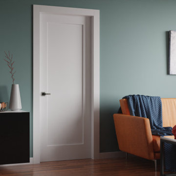
 Almesedoors
THE DOOR NAME ORIGIN - "SHAKER STYLE 1 PANEL"
How many panels should your interior door have? Well! If you’re looking for a truly no-frills product that is nonetheless elegant, this is an interior door you should consider first. This one-panel model is a truly minimal shaker-style design. While just as reliable as the interior doors in our other collections, these interior doors cost less. A lot less, in fact. Again, if simplicity is your thing, do consider this model. The original Shakers (or Shaking Quackers, as they were styled back in the Nineteenth Century) would be immensely pleased to have this product, as it most certainly adheres to their principle of utter simplicity combined with reliability. In its heyday, the community was highly influential when it came to matters of taste, not just in the United States, but in many other countries. The Baroque period that emphasized and worshipped unapologetic, insolent luxury had come to an end. Austere clas... Show more!
FINISH: WHITE
This is a bit tricky. Isn’t White the default finish that would look great on any interior door? Well, not quite.
W. is the color most often associated with perfection, honesty, cleanliness, newness, neutrality, and exactitude. The pigment has been known and used by humans since prehistoric times. In ancient Egypt, W. symbolized purity. Roman patricians paraded around in W. togas to distinguish themselves from the common folk. It was the color of choice of French monarchs. Architects of all epochs used W., with considerable enthusiasm, in various projects and for various reasons. In the United States, architects favored it when designing churches, capitols, and municipal buildings – which is, in fact, a tradition they inherited from classical and Renaissance architecture. According to some experts, most of the buildings in the celebrated Forum were either made of, or clad in, W. marble. In Taoism, it represents the yang or masculine energy, one of the two complementary natures of the universe. Many authors, both classical and contemporary, have referred to W. as a sign of purity, either physical (like William Shakespeare, whose treacherous usurper monarch wishes a heavenly rain would cleanse his blood-stained hand, washing it “white as snow”) or spiritual (like Tennessee Williams, who named his lead character Blanche (derived, incidentally, from the Germanic word blanc)) as a symbol of her innocent child-like spirit, perceptible from the moment she makes her first entrance (through the interior door stage-left).
Back in the Seventeenth Century, Sir Isaac Newton discovered that sunlight is composed of light with wavelengths across the visible spectrum which the human eye perceives as W. It is the lightest of the spectrum, and achromatic (hue-less) to boot, because it fully reflects and scatters all visible wavelengths of light, absorbing none. W. objects stand out in the dark. Depending on the surroundings, an interior door with W. finish might come off as emphatic or tactful, dominant or complementary. It blends seamlessly into most types of decor and, once the owner’s needs and disposition are taken into account, can symbolize - oh, so many different things, while bringing back a myriad memories: from those glorious snowy Alpine slopes and peaks to the fluffy tops of the wayward herd of cumulus cloud heap over the horizon on a balmy afternoon in the Caribbean. Tropical sand beaches are W. due to the high quantity of calcium carbonate they get from tiny bits of seashells ground to powder by the waves. In a number of cultures W. can also symbolize festivity, and be used lavishly to brighten up weddings, birthdays, and anniversaries. It is beautiful. Make sure it goes well with your interior door model, though.
 Drury Design
There were some druthers with the kitchen and there was a desire to make certain rooms more grown-up again. Unlike some of our clients who get rid of their formal dining rooms, this family wanted to keep theirs. They saw it as good space for entertaining and doing work – why not make it more stylish and purposeful?
THE REMODEL
Design Objectives
Keep the craftsman style of the home but make it more modern
Update the dining room to be more formal for entertaining and provide storage for china, stemware, wine, etc.
Open up the kitchen to improve flow
Incorporate new decorative lighting throughout the home to accent the home’s style
Transform the staircase into a statement piece that greets visitors – redesign it with arts & crafts details in the balusters, newel posts and handrails
Design Challenges:
Open up the dining room window for more light and a better view of the backyard. The previous window felt closed in with heavy shutters.
Improve kitchen flow without making the footprint larger
Make the entire home feel updated and cohesive while staying true to the house’s style.
THE RENEWED SPACES
We bumped out the dining room window to make a new bay window. The glass mullion design mimics the craftsman style, setting the tone for the room while letting plenty of light in. It really opened up that end of the dining room. The view of the backyard is much bigger now, too. It’s also a great nook for playing board games, doing puzzles and playing with Legos.
We actually got rid of a walk-in pantry that had cut off a corner of the kitchen, and were able to keep all the main walls intact. The old pantry room is where the fridge is now, as well as a tall pantry cabinet, some additional cabinets and a new countertop surface. The flow is much better and it’s roomy now, with a kitchen table that’s great for informal meals, homework and kids seating when adults are entertaining in the dining room.
The cabinet, tile and countertop colors are still neutral but offer a more muted palette. To bring in the craftsman style, simple architectural details were added such as the hood and window valance, decorative furniture toes, a shaker door on the perimeter cabinets and a more modern cabinet door style on the island, pantry and refrigerator areas. New decorative lighting was added in the kitchen, dining room, living room, foyer and second-floor hallway to make the entire first floor feel updated. Also, the entire staircase was revamped. The existing hardwood was kept in place but stained medium brown to bring in some warmth.
“The Drury process made this project turn out better than we imagined,” one of the homeowners told us during the final photoshoot. “There were so many features we didn’t know about – like charging drawers – and ways of going about the remodel that didn’t come to us naturally. We’re so glad Alicia had so much experience and so many checklists. We got to think through everything and arrive at the best possible design for our family.”

 Sierra Living Concepts Inc
Dimension:
72" L X 16" D X 36" H
The shabby-chic industrial-rustic look is the pinnacle of fashionable these days, and you can get the best of this aesthetic in your homes with our beautiful Tescott Handcrafted Rustic Reclaimed Wood 4 Drawer Large Sideboard Cabinet.
This 72" Inch rustic sideboard is absolutely unique because it has been constructed out of salvaged wood, so each slat and board is one of a kind. This makes you appreciate the beauty of its handcraftsmanship even more. It has a bold, eye-catching presence, is functionally versatile and offers great heirloom quality. On top of it all, you can even personalize its placement. It would look just as great set up against a living room accent wall as it would in a large lobby or a foyer. You can even furnish it in your dining rooms as serve-ware storage.
As far as the design of this reclaimed wood sideboard is concerned, it’s artfully simple. This lets the beauty of the wood texture shine. It starts with an extended top frame where you can showcase various decoration pieces. The main body is comprised of 4 pullout drawers that are perfect for storing small everyday objects in. Underneath each drawer is a corresponding single-door cabinet whose interior is divided into 2 compartments. Here, you can keep jars, books, documents, first-aid kits and more. The cabinet facades consist of simple wood planks that highlight their distinct grain and faded blue impressions. A smooth platform base completes the whole look.
Special Features:
• 100% handcrafted
• Solid reclaimed wood craftsmanship
• Eco-friendly
• Extended top frame
• 4 pullout drawers
• 4 single-door cabinets with 2 organizational shelves each
• Platform base
• Heirloom quality
• Artfully distressed finish
• Visually versatile
• Easy maintenance
Note: Custom Options such as Size, Shape, Shade & Design are not applicable to this item. Furniture is subjected to have Slight Variations. Real wood is a product of nature, and as such, no two pieces are alike. Variations in solid wood grain patterns are to be expected and make each furniture uniquely beautiful, just like us humans.
Find the right local pro for your project
 Drury Design
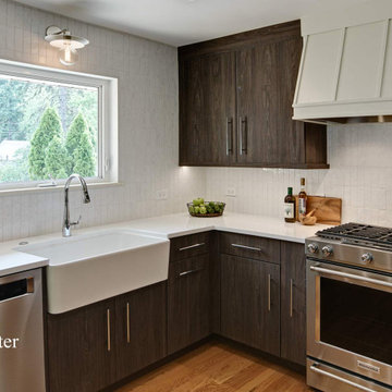
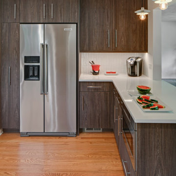
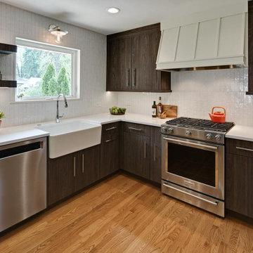
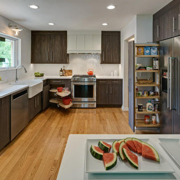
The owners of this true mid-century ranch in Wheaton were ready for a kitchen update. The home’s main living room area is decorated in a very cool, sparse way with plenty of nods to mid-century design. A new kitchen would need to bridge classic and modern notions of Mid-Century expression through the style’s characteristic clean lines and artistic notions of simplicity and straightforward functionality.
The idea was to keep a hint of mid-century influence in a modern design that could somehow be more open while accommodating more storage
The objectives were:
• Stay within the existing space while creating an open feel and winning more storage room
• Make the space brighter while using a darker cabinet finish
• Create proper ventilation for the range
Design challenges we solved for:
• Open the kitchen to the adjacent dining room without sacrificing storage
• Remove multiple layers of flooring to make the kitchen floor level with the rest of the house
• Match the new kitchen flooring to the flooring in nearby dining and living spaces
Problems solved. Here’s what we did:
• Took out soffits around the kitchen to allow for taller cabinets with more storage
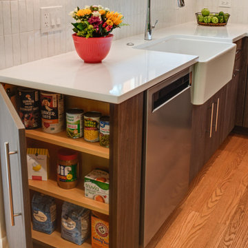
• Added cabinet pull-outs that maximize under-cabinet storage space
• Used large cabinets in standard sizes
• Skipped cabinets on the window wall, opting for space- and light-friendly floating shelves
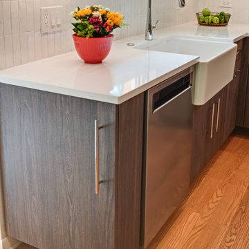
• Enhanced overall brightness with bright, white counters and textured white tile that offered a connecting contrast to the darker woodgrain cabinets
• Took out a post between the kitchen and dining room to make the space feel more open
• Added under-cabinet lights – unobtrusive and handy for task lighting
The owners love the look, feel and functionality of their new kitchen. Its sleek, modern character and notions of mid-century spirit add new excitement to the home’s original 1958 personality.
 Drury Design
The owners of this true mid-century ranch in Wheaton were ready for a kitchen update. The home’s main living room area is decorated in a very cool, sparse way with plenty of nods to mid-century design. A new kitchen would need to bridge classic and modern notions of Mid-Century expression through the style’s characteristic clean lines and artistic notions of simplicity and straightforward functionality.
The idea was to keep a hint of mid-century influence in a modern design that could somehow be more open while accommodating more storage
The objectives were:
• Stay within the existing space while creating an open feel and winning more storage room
• Make the space brighter while using a darker cabinet finish
• Create proper ventilation for the range
Design challenges we solved for:
• Open the kitchen to the adjacent dining room without sacrificing storage
• Remove multiple layers of flooring to make the kitchen floor level with the rest of the house
• Match the new kitchen flooring to the flooring in nearby dining and living spaces
Problems solved. Here’s what we did:
• Took out soffits around the kitchen to allow for taller cabinets with more storage
• Added cabinet pull-outs that maximize under-cabinet storage space
• Used large cabinets in standard sizes
• Skipped cabinets on the window wall, opting for space- and light-friendly floating shelves
• Enhanced overall brightness with bright, white counters and textured white tile that offered a connecting contrast to the darker woodgrain cabinets
• Took out a post between the kitchen and dining room to make the space feel more open
• Added under-cabinet lights – unobtrusive and handy for task lighting
The owners love the look, feel and functionality of their new kitchen. Its sleek, modern character and notions of mid-century spirit add new excitement to the home’s original 1958 personality.
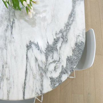
 Janvrin & Co.
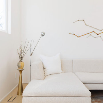
A transformation of a modest raised ranch into a modern oasis. I was the interior designer and general contractor from mechanicals to finishing. It’s also my personal home.
The interior design style is that of modern minimalist meets organic modern. I wanted a space that reduced distractions and let the eyes, head, and soul rest. Where everything inside the home has a specific use and purpose. The objects in our home are fewer but each hold a great personal value. You might expect to see this airy aesthetic, with its gallery white walls, in California or New York. Not nestled in a modest 50 year old neighborhood in Omaha, Nebraska. Creating a minimal aesthetic is one of the trickiest design styles to pull off. It is more than just less stuff and lots of white. It means sticking to these design principals:
-weaving in an abundance of textures
-incorporating natural finishes
-keenly curating art
-giving extra attention to scale
-limiting purely decorative items
-maximizing natural light
This style is not to be confused with the frugality of reductive design. I have incorporated many elevated basics that create an aesthetic of quiet luxury:
-architectural bead for trim-less doors
-first-of-its kind interior door hardware made of terrazzo
-historical marble found in landmark interiors like the NY Public Library
-premium flush air vents that disappear out of site
-luxury appliances from GE Café and Signature
-elegant and resilient terrazzo field tiles
Ours was not a simple interior remodel and addition:
-gutted and remodeled the existing 2,000 SF
-added on approximately another 1,000 SF
-moved and installed all new major mechanicals i.e. heating, plumbing and electrical.
-knocked through foundation walls to extend the space back
-dug down and built up
 Drury Design
The owners of this true mid-century ranch in Wheaton were ready for a kitchen update. The home’s main living room area is decorated in a very cool, sparse way with plenty of nods to mid-century design. A new kitchen would need to bridge classic and modern notions of Mid-Century expression through the style’s characteristic clean lines and artistic notions of simplicity and straightforward functionality.
The idea was to keep a hint of mid-century influence in a modern design that could somehow be more open while accommodating more storage
The objectives were:
• Stay within the existing space while creating an open feel and winning more storage room
• Make the space brighter while using a darker cabinet finish
• Create proper ventilation for the range
Design challenges we solved for:
• Open the kitchen to the adjacent dining room without sacrificing storage
• Remove multiple layers of flooring to make the kitchen floor level with the rest of the house
• Match the new kitchen flooring to the flooring in nearby dining and living spaces
Problems solved. Here’s what we did:
• Took out soffits around the kitchen to allow for taller cabinets with more storage
• Added cabinet pull-outs that maximize under-cabinet storage space
• Used large cabinets in standard sizes
• Skipped cabinets on the window wall, opting for space- and light-friendly floating shelves
• Enhanced overall brightness with bright, white counters and textured white tile that offered a connecting contrast to the darker woodgrain cabinets
• Took out a post between the kitchen and dining room to make the space feel more open
• Added under-cabinet lights – unobtrusive and handy for task lighting
The owners love the look, feel and functionality of their new kitchen. Its sleek, modern character and notions of mid-century spirit add new excitement to the home’s original 1958 personality.


 Murphy Deesign
This is a New York pre-war apartment that was done through E-Design (see more on designer's website). Jenny J. Norris photography
Mid-sized transitional enclosed dark wood floor living room photo in New York with beige walls and a wall-mounted tv
Mid-sized transitional enclosed dark wood floor living room photo in New York with beige walls and a wall-mounted tv
 Drury Design
The owners of this true mid-century ranch in Wheaton were ready for a kitchen update. The home’s main living room area is decorated in a very cool, sparse way with plenty of nods to mid-century design. A new kitchen would need to bridge classic and modern notions of Mid-Century expression through the style’s characteristic clean lines and artistic notions of simplicity and straightforward functionality.
The idea was to keep a hint of mid-century influence in a modern design that could somehow be more open while accommodating more storage
The objectives were:
• Stay within the existing space while creating an open feel and winning more storage room
• Make the space brighter while using a darker cabinet finish
• Create proper ventilation for the range
Design challenges we solved for:
• Open the kitchen to the adjacent dining room without sacrificing storage
• Remove multiple layers of flooring to make the kitchen floor level with the rest of the house
• Match the new kitchen flooring to the flooring in nearby dining and living spaces
Problems solved. Here’s what we did:
• Took out soffits around the kitchen to allow for taller cabinets with more storage
• Added cabinet pull-outs that maximize under-cabinet storage space
• Used large cabinets in standard sizes
• Skipped cabinets on the window wall, opting for space- and light-friendly floating shelves
• Enhanced overall brightness with bright, white counters and textured white tile that offered a connecting contrast to the darker woodgrain cabinets
• Took out a post between the kitchen and dining room to make the space feel more open
• Added under-cabinet lights – unobtrusive and handy for task lighting
The owners love the look, feel and functionality of their new kitchen. Its sleek, modern character and notions of mid-century spirit add new excitement to the home’s original 1958 personality.
 Drury Design
The owners of this true mid-century ranch in Wheaton were ready for a kitchen update. The home’s main living room area is decorated in a very cool, sparse way with plenty of nods to mid-century design. A new kitchen would need to bridge classic and modern notions of Mid-Century expression through the style’s characteristic clean lines and artistic notions of simplicity and straightforward functionality.
The idea was to keep a hint of mid-century influence in a modern design that could somehow be more open while accommodating more storage
The objectives were:
• Stay within the existing space while creating an open feel and winning more storage room
• Make the space brighter while using a darker cabinet finish
• Create proper ventilation for the range
Design challenges we solved for:
• Open the kitchen to the adjacent dining room without sacrificing storage
• Remove multiple layers of flooring to make the kitchen floor level with the rest of the house
• Match the new kitchen flooring to the flooring in nearby dining and living spaces
Problems solved. Here’s what we did:
• Took out soffits around the kitchen to allow for taller cabinets with more storage
• Added cabinet pull-outs that maximize under-cabinet storage space
• Used large cabinets in standard sizes
• Skipped cabinets on the window wall, opting for space- and light-friendly floating shelves
• Enhanced overall brightness with bright, white counters and textured white tile that offered a connecting contrast to the darker woodgrain cabinets
• Took out a post between the kitchen and dining room to make the space feel more open
• Added under-cabinet lights – unobtrusive and handy for task lighting
The owners love the look, feel and functionality of their new kitchen. Its sleek, modern character and notions of mid-century spirit add new excitement to the home’s original 1958 personality.
 Drury Design
The owners of this true mid-century ranch in Wheaton were ready for a kitchen update. The home’s main living room area is decorated in a very cool, sparse way with plenty of nods to mid-century design. A new kitchen would need to bridge classic and modern notions of Mid-Century expression through the style’s characteristic clean lines and artistic notions of simplicity and straightforward functionality.
The idea was to keep a hint of mid-century influence in a modern design that could somehow be more open while accommodating more storage
The objectives were:
• Stay within the existing space while creating an open feel and winning more storage room
• Make the space brighter while using a darker cabinet finish
• Create proper ventilation for the range
Design challenges we solved for:
• Open the kitchen to the adjacent dining room without sacrificing storage
• Remove multiple layers of flooring to make the kitchen floor level with the rest of the house
• Match the new kitchen flooring to the flooring in nearby dining and living spaces
Problems solved. Here’s what we did:
• Took out soffits around the kitchen to allow for taller cabinets with more storage
• Added cabinet pull-outs that maximize under-cabinet storage space
• Used large cabinets in standard sizes
• Skipped cabinets on the window wall, opting for space- and light-friendly floating shelves
• Enhanced overall brightness with bright, white counters and textured white tile that offered a connecting contrast to the darker woodgrain cabinets
• Took out a post between the kitchen and dining room to make the space feel more open
• Added under-cabinet lights – unobtrusive and handy for task lighting
The owners love the look, feel and functionality of their new kitchen. Its sleek, modern character and notions of mid-century spirit add new excitement to the home’s original 1958 personality.
 Pennsylvania Landscape & Nursery Association
Keeping It Green http://keepingitgreenoutdoors.com
2014 PLNA Awards for Landscape Excellence Winner
Category: Residential $0-$15,000
Award Level: Honorable Mention
Project Description:
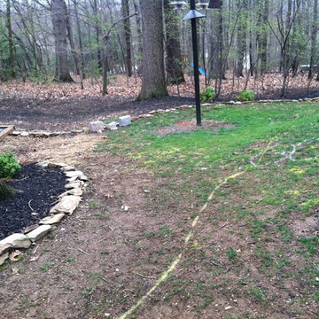
The objective of this project was to match the surrounding natural woodland setting with the new landscaping and outdoor area. The homeowners enjoy being outside and wanted an extension of their house that they could enjoy with family and friends. After returning from vacations in their cabin, they wanted to re-create the same feeling at their home. To complete their new cabin feel they wanted somewhere to have a camp fire with good company. I wanted to create flow from each area, and maximize space in a very limited area. The overall look of the project needed to blend with the natural environment and appear as though is has been there for years. The clients were very open minded and great to work with through the design process and we were able to achieve everything we needed while working with budgets and preferences.
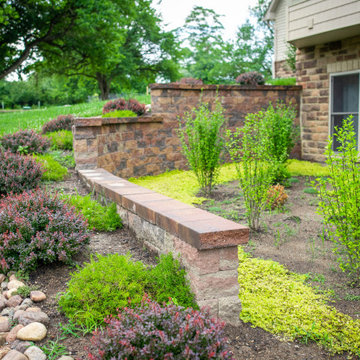
The area was shaded with very poor drainage, which created a unusable space full of mud. The wet area made an already tight area with difficult access more challenging. It was also important to place the fire-pit at a safe distance from the house, and the tree canopy. The area was regarded to allow for better drainage and the downspouts were buried. A decorative river stone was selected to aide with drainage.
All plant material needed to be shade tolerant and provide color. As a result, I chose plants with terrific foliage color, and texture; Aucuba, Heuchera, Athyrium and Hosta. The construction materials to build the steps, walls and fire-pit needed to be a stone that would match the existing stone and environment. For this I chose PA flagstone and fieldstone of varying sizes for interest and to create a more natural look.
This project is special because of the limited space that needed to have its potential discovered and created. With the strong wooded environment the new outdoor area had to blend into that while working with the house and existing concrete patio. We exceeded our clients expectations by creating a new area that looked like it had been there forever.
Plant List:
5 Astilbe chinensis ‘Vision in Pink’
6 Heuchera x villosa ‘Citronella’
6 Hosta x ‘Sum and Substance’
2 Hydrangea macrophylla ‘Endless Summer
5 Buxus x ‘Green Velvet’
1 Leucothoe fontsiana ‘Rainbow’
4 Rhododendron ‘PJM’
2 Chamaecyparis obtusa ‘Aurea Nana’
1 Aucuba japonica ‘Variegata’
3 Athyrium filix-femina
24 Pachysandra terminalis
16 Torenia fournieri
Photo Credit:
Keeping It Green
 Janvrin & Co.
A transformation of a modest raised ranch into a modern oasis. I was the interior designer and general contractor from mechanicals to finishing. It’s also my personal home.
The interior design style is that of modern minimalist meets organic modern. I wanted a space that reduced distractions and let the eyes, head, and soul rest. Where everything inside the home has a specific use and purpose. The objects in our home are fewer but each hold a great personal value. You might expect to see this airy aesthetic, with its gallery white walls, in California or New York. Not nestled in a modest 50 year old neighborhood in Omaha, Nebraska. Creating a minimal aesthetic is one of the trickiest design styles to pull off. It is more than just less stuff and lots of white. It means sticking to these design principals:
-weaving in an abundance of textures
-incorporating natural finishes
-keenly curating art
-giving extra attention to scale
-limiting purely decorative items
-maximizing natural light
This style is not to be confused with the frugality of reductive design. I have incorporated many elevated basics that create an aesthetic of quiet luxury:
-architectural bead for trim-less doors
-first-of-its kind interior door hardware made of terrazzo
-historical marble found in landmark interiors like the NY Public Library
-premium flush air vents that disappear out of site
-luxury appliances from GE Café and Signature
-elegant and resilient terrazzo field tiles
Ours was not a simple interior remodel and addition:
-gutted and remodeled the existing 2,000 SF
-added on approximately another 1,000 SF
-moved and installed all new major mechanicals i.e. heating, plumbing and electrical.
-knocked through foundation walls to extend the space back
-dug down and built up

 Janvrin & Co.
A transformation of a modest raised ranch into a modern oasis. I was the interior designer and general contractor from mechanicals to finishing. It’s also my personal home.
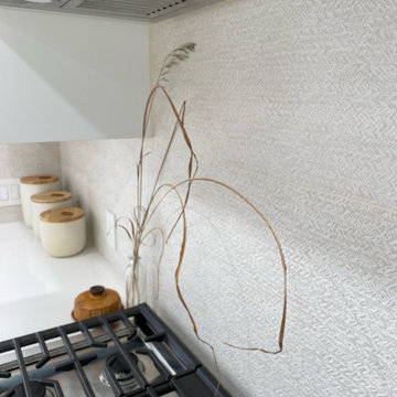
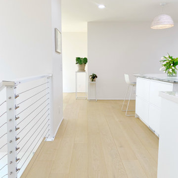
The interior design style is that of modern minimalist meets organic modern. I wanted a space that reduced distractions and let the eyes, head, and soul rest. Where everything inside the home has a specific use and purpose. The objects in our home are fewer but each hold a great personal value. You might expect to see this airy aesthetic, with its gallery white walls, in California or New York. Not nestled in a modest 50 year old neighborhood in Omaha, Nebraska. Creating a minimal aesthetic is one of the trickiest design styles to pull off. It is more than just less stuff and lots of white. It means sticking to these design principals:
-weaving in an abundance of textures
-incorporating natural finishes
-keenly curating art
-giving extra attention to scale
-limiting purely decorative items
-maximizing natural light
This style is not to be confused with the frugality of reductive design. I have incorporated many elevated basics that create an aesthetic of quiet luxury:
-architectural bead for trim-less doors
-first-of-its kind interior door hardware made of terrazzo
-historical marble found in landmark interiors like the NY Public Library
-premium flush air vents that disappear out of site
-luxury appliances from GE Café and Signature
-elegant and resilient terrazzo field tiles
Ours was not a simple interior remodel and addition:
-gutted and remodeled the existing 2,000 SF
-added on approximately another 1,000 SF
-moved and installed all new major mechanicals i.e. heating, plumbing and electrical.
-knocked through foundation walls to extend the space back
-dug down and built up
 Janvrin & Co.
A transformation of a modest raised ranch into a modern oasis. I was the interior designer and general contractor from mechanicals to finishing. It’s also my personal home.
The interior design style is that of modern minimalist meets organic modern. I wanted a space that reduced distractions and let the eyes, head, and soul rest. Where everything inside the home has a specific use and purpose. The objects in our home are fewer but each hold a great personal value. You might expect to see this airy aesthetic, with its gallery white walls, in California or New York. Not nestled in a modest 50 year old neighborhood in Omaha, Nebraska. Creating a minimal aesthetic is one of the trickiest design styles to pull off. It is more than just less stuff and lots of white. It means sticking to these design principals:
-weaving in an abundance of textures
-incorporating natural finishes
-keenly curating art
-giving extra attention to scale
-limiting purely decorative items
-maximizing natural light
This style is not to be confused with the frugality of reductive design. I have incorporated many elevated basics that create an aesthetic of quiet luxury:
-architectural bead for trim-less doors
-first-of-its kind interior door hardware made of terrazzo
-historical marble found in landmark interiors like the NY Public Library
-premium flush air vents that disappear out of site
-luxury appliances from GE Café and Signature
-elegant and resilient terrazzo field tiles
Ours was not a simple interior remodel and addition:
-gutted and remodeled the existing 2,000 SF
-added on approximately another 1,000 SF
-moved and installed all new major mechanicals i.e. heating, plumbing and electrical.
-knocked through foundation walls to extend the space back
-dug down and built up
 Drury Design
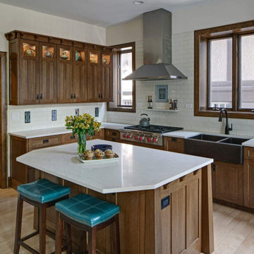
The 100-year old home’s kitchen was old and just didn’t function well. A peninsula in the middle of the main part of the kitchen blocked the path from the back door. This forced the homeowners to mostly use an odd, U-shaped corner of the kitchen.
Design objectives:
-Add an island
-Wow-factor design
-Incorporate arts and crafts with a touch of Mid-century modern style
-Allow for a better work triangle when cooking
-Create a seamless path coming into the home from the backdoor
-Make all the countertops in the space 36” high (the old kitchen had different base cabinet heights)
Design challenges to be solved:
-Island design
-Where to place the sink and dishwasher
-The family’s main entrance into the home is a back door located within the kitchen space. Samantha needed to find a way to make an unobstructed path through the kitchen to the outside
-A large eating area connected to the kitchen felt slightly misplaced – Samantha wanted to bring the kitchen and materials more into this area
-The client does not like appliance garages/cabinets to the counter. The more countertop space, the better!
Design solutions:
-Adding the right island made all the difference! Now the family has a couple of seats within the kitchen space. -Multiple walkways facilitate traffic flow.
-Multiple pantry cabinets (both shallow and deep) are placed throughout the space. A couple of pantry cabinets were even added to the back door wall and wrap around into the breakfast nook to give the kitchen a feel of extending into the adjoining eating area.
-Upper wall cabinets with clear glass offer extra lighting and the opportunity for the client to display her beautiful vases and plates. They add and an airy feel to the space.
-The kitchen had two large existing windows that were ideal for a sink placement. The window closest to the back door made the most sense due to the fact that the other window was in the corner. Now that the sink had a place, we needed to worry about the dishwasher. Samantha didn’t want the dishwasher to be in the way of people coming in the back door – it’s now in the island right across from the sink.
-The homeowners love Motawi Tile. Some fantastic pieces are placed within the backsplash throughout the kitchen. -Larger tiles with borders make for nice accent pieces over the rangetop and by the bar/beverage area.
-The adjacent area for eating is a gorgeous nook with massive windows. We added a built-in furniture-style banquette with additional lower storage cabinets in the same finish. It’s a great way to connect and blend the two areas into what now feels like one big space!
 Drury Design
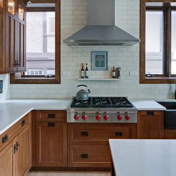
The 100-year old home’s kitchen was old and just didn’t function well. A peninsula in the middle of the main part of the kitchen blocked the path from the back door. This forced the homeowners to mostly use an odd, U-shaped corner of the kitchen.
Design objectives:
-Add an island
-Wow-factor design
-Incorporate arts and crafts with a touch of Mid-century modern style
-Allow for a better work triangle when cooking
-Create a seamless path coming into the home from the backdoor
-Make all the countertops in the space 36” high (the old kitchen had different base cabinet heights)
Design challenges to be solved:
-Island design
-Where to place the sink and dishwasher
-The family’s main entrance into the home is a back door located within the kitchen space. Samantha needed to find a way to make an unobstructed path through the kitchen to the outside
-A large eating area connected to the kitchen felt slightly misplaced – Samantha wanted to bring the kitchen and materials more into this area
-The client does not like appliance garages/cabinets to the counter. The more countertop space, the better!
Design solutions:
-Adding the right island made all the difference! Now the family has a couple of seats within the kitchen space. -Multiple walkways facilitate traffic flow.
-Multiple pantry cabinets (both shallow and deep) are placed throughout the space. A couple of pantry cabinets were even added to the back door wall and wrap around into the breakfast nook to give the kitchen a feel of extending into the adjoining eating area.
-Upper wall cabinets with clear glass offer extra lighting and the opportunity for the client to display her beautiful vases and plates. They add and an airy feel to the space.
-The kitchen had two large existing windows that were ideal for a sink placement. The window closest to the back door made the most sense due to the fact that the other window was in the corner. Now that the sink had a place, we needed to worry about the dishwasher. Samantha didn’t want the dishwasher to be in the way of people coming in the back door – it’s now in the island right across from the sink.
-The homeowners love Motawi Tile. Some fantastic pieces are placed within the backsplash throughout the kitchen. -Larger tiles with borders make for nice accent pieces over the rangetop and by the bar/beverage area.
-The adjacent area for eating is a gorgeous nook with massive windows. We added a built-in furniture-style banquette with additional lower storage cabinets in the same finish. It’s a great way to connect and blend the two areas into what now feels like one big space!
Sponsored
Columbus, OH

Hope Restoration & General Contracting
Columbus Design-Build, Kitchen & Bath Remodeling, Historic Renovations

 Neil Kelly Company
The main objective for this project was to create a beautiful outdoor cooking and entertaining space. The clients wanted the new space to have an open concept while being protected from the elements year round. Stylistically they wanted the design to have a Pacific Northwest feel, to blend with the existing house and work well among their natural, forested backyard. We needed to include a BBQ, smoker, sink, refrigerator, gas fireplace and wall mounted heater as well as a large screen TV. The details were going to be a main focus for the design process, as we knew this would ensure the cohesive blend of function and aesthetic appeal.
One of the main challenges was working with the existing deck. The 1000 SF deck needed new decking and guardrails as well as some framing repair. We were worried that the existing deck structure would not support the weight of the new construction.
Another challenge we faced was designing the roof planes to aesthetically blend with the existing house. The layout of the first and second floor had us working through multiple design revisions until we landed on the final stepped roof structure.
We designed the new roof to be supported by the house and columns set directly on the ground, thereby minimizing weight added to the existing deck. This allowed us to use the deck to support the lighter components, including the kitchen and BBQ area.
Oversized beams, exposed raw wood rafters, and sealed car decking worked well with the new cedar deck surface. Stainless steel cabinetry and appliances are accented by solid surface countertops and small mosaic backsplash. All colors were selected to fall within the natural hues of the seasonally changing foliage surrounding the clients’ property.
Maintaining the same footprint of the existing deck, we used the angles to our advantage and created additional seating with a custom built storage bench. New powder coated posts and cable guardrails were topped with an LED lined wood handrail. A decorative chandelier and subtle metal pendants provide ambient light. An electric heater mounted to the inside of one of the beams as well as the gas fireplace provides ample heat for colder months.
The clerestory windows between the two roof planes provide additional light to the space while protecting against the elements. The gas fireplace and cultured stone wrapped chimney is a visual anchor and centerpiece for the deck. The chimney provided an opportunity to hide one of the supporting columns as well as a protected space for the wall mounted TV and soundbar.
The cabinetry layout was selected to offer plenty of storage and special features including a pull out garbage and recycling center, drawers for dishes and utensils, and a concealed paper towel holder.
 Neil Kelly Company
The main objective for this project was to create a beautiful outdoor cooking and entertaining space. The clients wanted the new space to have an open concept while being protected from the elements year round. Stylistically they wanted the design to have a Pacific Northwest feel, to blend with the existing house and work well among their natural, forested backyard. We needed to include a BBQ, smoker, sink, refrigerator, gas fireplace and wall mounted heater as well as a large screen TV. The details were going to be a main focus for the design process, as we knew this would ensure the cohesive blend of function and aesthetic appeal.
One of the main challenges was working with the existing deck. The 1000 SF deck needed new decking and guardrails as well as some framing repair. We were worried that the existing deck structure would not support the weight of the new construction.
Another challenge we faced was designing the roof planes to aesthetically blend with the existing house. The layout of the first and second floor had us working through multiple design revisions until we landed on the final stepped roof structure.
We designed the new roof to be supported by the house and columns set directly on the ground, thereby minimizing weight added to the existing deck. This allowed us to use the deck to support the lighter components, including the kitchen and BBQ area.
Oversized beams, exposed raw wood rafters, and sealed car decking worked well with the new cedar deck surface. Stainless steel cabinetry and appliances are accented by solid surface countertops and small mosaic backsplash. All colors were selected to fall within the natural hues of the seasonally changing foliage surrounding the clients’ property.
Maintaining the same footprint of the existing deck, we used the angles to our advantage and created additional seating with a custom built storage bench. New powder coated posts and cable guardrails were topped with an LED lined wood handrail. A decorative chandelier and subtle metal pendants provide ambient light. An electric heater mounted to the inside of one of the beams as well as the gas fireplace provides ample heat for colder months.
The clerestory windows between the two roof planes provide additional light to the space while protecting against the elements. The gas fireplace and cultured stone wrapped chimney is a visual anchor and centerpiece for the deck. The chimney provided an opportunity to hide one of the supporting columns as well as a protected space for the wall mounted TV and soundbar.
The cabinetry layout was selected to offer plenty of storage and special features including a pull out garbage and recycling center, drawers for dishes and utensils, and a concealed paper towel holder.

 Olamar Interiors
These Northern Virginia residents have owned this vacation home for about ten years. With retirement imminent, they decided to give the entire home an over-haul. With it’s great bones and amazing location, this seemed like a very sound investment for their future. Paola McDonald from Olamar Interiors had been working with the clients for the past three years, helping them to renovate their Sterling, VA condominium and their Moorefield, WV weekend home. It seemed fitting that they would also hire her to help them renovate this home as well.
For this project we took the home down to the studs and practically rebuilt it. The renovation includes an addition to the basement level and main floor to create a new fitness room, additional guest bedroom and larger kitchen and dining area. It also included a renovation of the facade of the home. The exterior of the home was completely re-sided and painted, and we added the tall windows at the stairs. The lower entry deck was expanded and an upper deck was added just off the kitchen in order for the homeowner to keep his grill away from the strong ocean winds. A new deck was also added off of the master bedroom. New stainless steel railings were added to all the decks. We opened the homes stairwells, adding custom glass railings and new lighting to create a much more open feel and allow for natural light to flood the entire main living area. The original, tiny kitchen was expanded substantially, adding a large custom eat in bar, wine storage area and plenty of storage. We utilized Decora’s Marquis Cabinetry in an espresso finish to give the kitchen a very clean, contemporary feel. Carrara marble countertops paired with a grey quartz, single slap marble backsplash, and stainless appliances create a clean look. In the new dining area, a simple Modloft dining table was paired with a Regina Andrew bubbles chandelier and Jessica Charles dining chairs for a sophisticated feel accentuated perfectly by beachy colors and textures that tie in the beautiful views of the Ocean. A custom chandelier from John Pomp is the highlight of the family room, particularly at night when it is reminiscent to fireflies in the sky. A new custom designed, custom made sectional, cozy newly added Spark Modern Fires gas fireplace, custom rug by Julie Dasher and Lee Industries chairs create a cozy place to lounge and watch television after a long day at the beach. Guests feel like they are in a luxurious boutique hotel complete with spectacular views, comfortable Ann Gish linens and beautiful and unique lighting fixtures. All three full baths and the powder room received complete facelifts with new glass, marble and ceramic tiles, Decora cabinetry, new lighting fixtures, quartz countertops and unique features that make unique statements in each one. Phillip Jeffries mica wallpaper are used in the entryway and family room fireplace walls to add a sandy texture to each space. Phillip Jeffries grasscloth was added to the master bedroom accent wall to create a delicate feature. New flooring throughout includes gorgeous dark stained hardwood floors, ceramic tile and Karastan carpeting in the bedrooms. The crisp white and grey walls are accentuated throughout the home by beach inspired turquoises, navies and lime greens. Perfectly appointed furnishings, artwork, accessories and custom made window treatments complete the look and feel of this gorgeous vacation home.
Photography by Tinius Photography
198